Assessing Mobile Usability With Google Webmaster Tools

Email Newsletter
Weekly tips on front-end & UX.
Trusted by 182,000+ folks.

 Custom Web Forms for Angular, React, & Vue. Your backend.


 Celebrating 10 million developers
Back in 2013, Google officially announced that it would begin to penalize websites that provide a faulty user experience on mobile devices. Specific examples included redirecting inner URLs to a home page when viewed in a mobile version of a website, as well as showing 404 errors to people attempting to access pages on mobile.
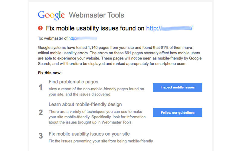
Toward the end of 2014, a Google spokesperson hinted that the mobile user experience would become a ranking factor. In January 2015, a number of website owners received messages warning about mobile usability issues on their websites, linking to a section of Webmaster Tools where they could review the problems.
In this article, we’ll review how to flag mobile issues in Webmaster Tools, explain the most common issues and learn how to assess mobile usability problems on your website based on these flags.
Because mobile usability has become a greater priority in Google’s ranking algorithm, ensuring an optimal mobile experience on every website has become more important than ever. See the search results below, where Google has marked a dedicated mobile website (DP Review) and a responsive website (CNET) as being mobile-friendly. The result for PC Magazine lacks this label.
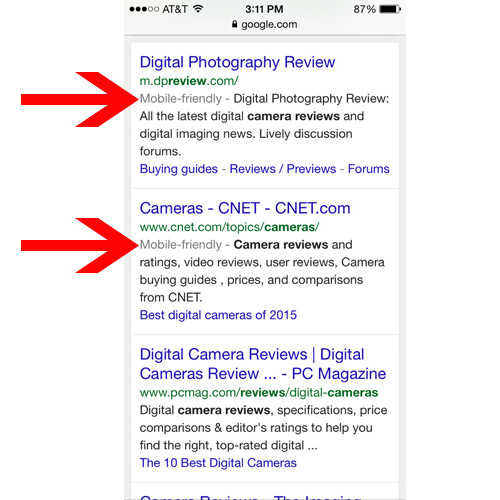
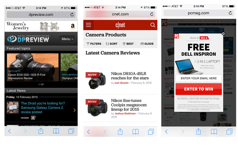
Taking a look at each URL shows us clear reasons why DP Review and CNET earned mobile-friendly labels and why PC Magazine did not and ranks below the others. Not only does the PC Mag link not go to the proper mobile version of the website (which does exist), but it also delivers a popup promotion with a tiny close button that’s awkward to tap on mobile.
Setting aside the legitimate mobile issues, not only will people drop off of your website after a poor experience, but also your organic search traffic might decline because rankings can suffer in mobile search results. On the flip side, when you do improve a problematic website, you could see a vast improvement in organic search traffic, as we’ll see in the following example.
My agency built a new website to replace one that had many of the mobile problems we’ll review in this article. The original website contained a number of Flash elements, lacked any viewport configuration, and contained tiny text and touch elements when viewed on a mobile screen. The new website was built in a responsive format, eliminating these issues. Within two months of relaunching, the website saw a 44% increase in new users from organic Google searches on mobile devices, twice the increase seen on desktop. While a number of other factors certainly played a role, such as content refinement, the fact that mobile showed such a significant increase reflects the value Google ascribes to mobile usability.
Finding Mobile Problems In Webmaster Tools
In order to review mobile issues flagged on your website, you’ll first need to install Google Webmaster Tools. While many websites already run Webmaster Tools, some do not, and so here are brief instructions to set up. Navigate to the Webmaster Tools page, and log in with your Google account. You’ll see a field to enter your URL. Then, select “Add a Site.”
Next, you’ll need to verify the website. Webmaster Tools will show the various methods of doing so, including uploading an HTML file to your website, adding a meta tag or signing into your domain name’s provider. You can also verify via Google Analytics or Google Tag Manager if either code is in place on your website and you have access to the account. If you’re running a Wordpress website, a plugin such as Yoast’s WordPress SEO will allow you to verify Webmaster Tools easily by copying and pasting a number from the meta tag into a field in the plugin.
After setting up Webmaster Tools on your website, you might not see any data in the interface for a few days. Submitting a site map could speed up the process of crawling and indexing your website.
You’ll find the “Mobile Usability” section under “Search Traffic” in the left navigation bar. This will show you what errors, if any, have been found on your website. Click any of the error categories to see specific URLs flagged for each.
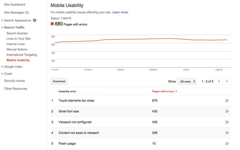
Google shows mobile issues in six main categories:
- Flash usage,
- viewport not configured,
- fixed-width viewport,
- content not sized to viewport,
- small font size,
- touch elements too close.
To fix these issues, look at the flagged URLs and determine what edits need to be made.
Regarding “Flash usage,” any Flash elements will not render properly on most mobile devices. For example, when I try to access We Choose the Moon from an iPhone, it prompts me to download Flash to experience the website. Well, I obviously can’t install Flash on my iPhone, so I can’t experience this website at all on mobile.

Fixing this problem simply means restructuring the website to not include any Flash when served on a mobile device.
“Viewport not configured” means that the website is not scaling properly to the device’s size. See the website below, parts of which are cut off in small browsers.

Use the meta viewport tag to ensure that the height and width of the website change based on the size of the phone or tablet’s screen. Inserting the following code into the head of the website will cause it to resize and rearrange elements to fit various screen sizes.
<meta name="viewport" content="width=device-width, initial-scale=1">In this code, width=device-width will automatically size the width of the website to the size of the window in which it is being viewed. And initial-scale=1 will set the zoom level of the website to 100%, scaling the website to fill the window regardless of the screen’s size. With this attribute in place, content will reflow when the phone or tablet is flipped from vertical to horizontal orientation.
“Fixed-width viewport” refers to pages that are set up to show at a specific pixel width. This is problematic when a website does not properly scale to an unexpected screen size. So, utilizing device-width in the viewport meta tag, as in the previous example, will enable the website to scale based on any device’s screen size.

For instance, note how the navigation cuts off on the right side of Anthem’s website, shown in the screenshot above. This website includes the viewport meta tag but uses it to define a specific width.
<meta name="viewport" content="width=1100" />Replacing width=1100 with device-width would cause the website to scale to the width of the browser, fixing the issue. Of course, the developer would likely want to address issues with how elements on the website adapt to changes in size, as well.
“Content not sized to viewport” indicates that the users with small browsers need to scroll from side to side to view elements (as in both the fitness and Anthem examples). This can prove annoying, especially on a phone. Replacing absolute positioning with relative positioning in the CSS would likely help to fix this problem. For example, note how elements in the website below are side by side in a larger browser but stack on top of each other when the browser is smaller.

“Small font size” flags text too small to easily read on a page. This can occur both from fonts that are too small as well as from insufficient vertical spacing between text. To avoid this, Google recommends starting with a base size of 16 CSS pixels and modifying up or down from there.

“Touch elements too close” indicates that a user might have trouble tapping a specific button, navigation element or form field if it’s too small and jammed next to other clickable elements. This problem can cause frustration because a user might select a different button than intended. For example, see how several links in the following image are stacked close together, making it difficult to select a particular one on a phone.
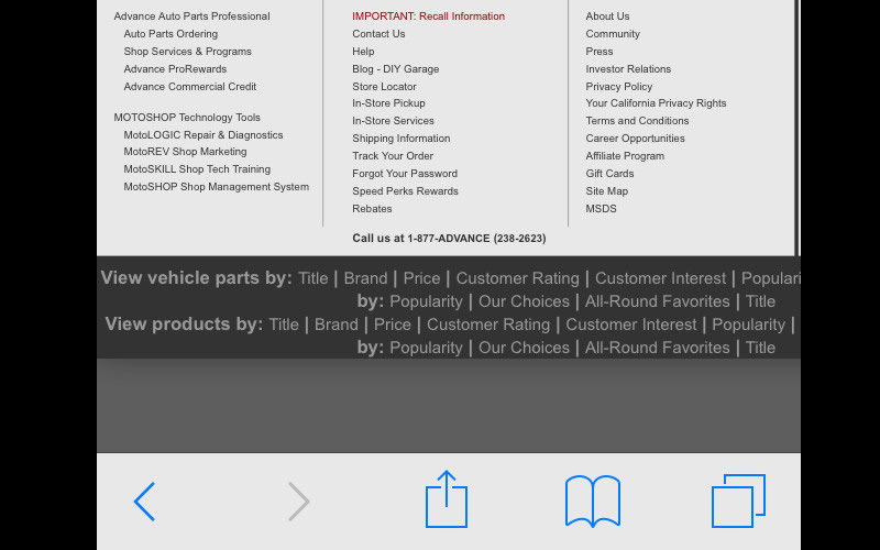
To fix this problem, put enough space between buttons and links so that even on the smallest devices users will not have trouble selecting one. Adequate spacing is least at least 7 millimeters or 48 CSS pixels for these elements. Tweak this spacing to ensure that users do not encounter annoyances on a mobile device. In addition, think about what elements you will actually need to show phone users. In the example shown above, these users likely wouldn’t need to see all of the links and could have a much simpler experience with a few important links.
Beware Of False Flags
In the example shown earlier, I took a closer look at URLs flagged for “Flash usage.” I found that several of these pages include blog posts with embedded YouTube videos, whose content is served within an iframe (via the default embedding code). While these videos do show up as Flash at times, such as when viewed on a desktop page, they appear in HTML5 format on phones, playing with no problem. Ironically, even though it owns YouTube, Google has not picked up on the fact that YouTube changes the format of videos served when embedded on websites, depending on the device.
So, be sure to actually check the flagged pages to see whether issues are indeed legitimate. Keep in mind that Google’s automated crawling might not always show 100% accurate results. Although you can’t keep warnings about these pages from showing up, you could select an issue and choose to recheck the live version. Over time, Google will likely refine its methods for testing to filter out false flags.
Don’t Rely Completely On Google
On the other hand, don’t expect Google to pick up all potential problems with mobile usability. Just because you don’t see any errors, your website might not necessarily appear perfectly on all mobile devices. Test your website thoroughly across multiple devices and browsers to ensure a positive experience with website speed, appearance and interactivity.
Keep an eye on mobile metrics in Google Analytics to find potential usability issues. A key report to watch is found in “Audience” → “Mobile” → “Overview,” showing data for mobile, tablet and desktop traffic and engagement. For example, watch to see whether a high percentage of users on mobile devices are bouncing, especially if this number is much higher than for the desktop. Also, look at the average session duration for mobile devices to see whether the experience seems abnormally short or long. Overly brief or lengthy time spent on a website could indicate that people are either leaving right away out of frustration or are confused, taking too long to find what they wanted.
In addition, use heatmapping tools such as CrazyEgg and HotJar to analyze website usage beyond what Google’s tools can tell you. All of these tools show how users interact with mobile specifically, including data such as where they click and how far they scroll. This data could reveal problems, such as users not scrolling all the way to the bottom on a long mobile page or not clicking buttons that appear too small on a mobile device.
For instance, based on heatmap data, we discovered that few users on phones were scrolling down to a form on a particular landing page. We then added functionality to allow users to tap a button at the top, causing the page to immediately scroll to the form. Afterward, we experienced an increase in form submissions.
Google Webmaster Tools is a helpful starting point for analyzing mobile issues on your website. If you receive warnings, don’t ignore them. Take time to look at the problems and identify opportunities to improve your website’s mobile usability. Ultimately, your goal is to make the website the best experience possible for mobile users, not just to obsess over your rankings in Google. However, Google will reward positive user experiences.
Final Notes
- “Building Your Mobile-Friendly Site: The Distilled Best Practice Guide,” Distilled
- “New Google Mobile Algo: Google Begins Reducing Visibility for Non-Mobile Friendly Sites That Received Warnings,” Jennifer Slegg, The SEM Post
- “Google: The Mobile-Friendly Ranking Factor Runs in Real Time and Is on a Page-By-Page Basis,” Barry Schwartz, Search Engine Land
- “Quick Tip: Don’t Forget the Viewport Meta Tag,” Ian Yates, Tuts+ An overview about properly implementing the
viewportmeta tag on your website. - “How Bing and Your Mobile Device Became Friends,” Bing Blogs Here is Bing’s approach to crawling and ranking mobile results.
Further Reading
- SEO For Responsive Websites
- What The Heck Is SEO? A Rebuttal
- How Content Creators Benefit From The New SEO
- The Importance Of HTML5 Sectioning Elements
 (da, al, ml, mrn)

