Using Sketch For Responsive Web Design (A Case Study)

Email Newsletter
Weekly tips on front-end & UX.
Trusted by 182,000+ folks.
 Register for Free
 Celebrating 10 million developers
 Custom Web Forms for Angular, React, & Vue. Your backend.


If you’re a member of the web or UI design community, it’s been hard to avoid talking about Sketch over the last year. The launch of this design app shook up an industry dominated by Adobe for more than two decades, and it has caused an ongoing debate about whether Sketch is better than Photoshop and Illustrator (and Fireworks).
A longtime Photoshop user myself, I made the switch to Sketch in early 2014 and haven’t looked back. I love certain features of the program, such as the simple interface, file autosave and infinite canvas. However, plenty of other programs out there have similar features, and until the most recent update (Sketch 3.2), users were battling a lot of bugs in the app.
So, why do I continue to use Sketch? Bugs or no bugs, it has become the best tool for UI design, including responsive web design.
Case Study: Fleet Feet Sports
Let’s look at a newly launched website design that I worked on for Fleet Feet, a running store with over 80 franchises across the United States. Unlike its old website, the new Fleet Feet has an ecommerce component to sell products online, and it’s responsive. With more than 15 templates to design for multiple devices and several rounds of revisions, this project was huge.
In Photoshop, staying organized amongst all of the documents and rounds of revisions would have been daunting and time-consuming. However, with Sketch’s tools, I was able to work through this project from start to finish more smoothly, easily and quickly than I could have done using another program. Let’s look at how creating a website in Sketch vastly improves the responsive design process.
A Look At The Basics
Firing up Sketch, you’ll immediately notice a clean, unbloated interface. Yes, Sketch’s toolset is certainly pared down compared to some other design programs. However, it includes only what can be recreated with HTML and CSS3. So, there are no unnecessary photo filters, 3D tools or other tools that would slow you down. The app provides only what’s necessary to do web and UI work, making for a much faster design process.
And what Sketch lacks, its plugins make up for. Sketch plugins are akin to Photoshop’s and cover everything from a simple tool that swaps the border and fill color to complete content generators. I waited several months to start using plugins myself because I wanted to be completely comfortable with the program. Big mistake — many of these plugins are huge time-savers and have become integral parts of my workflow.
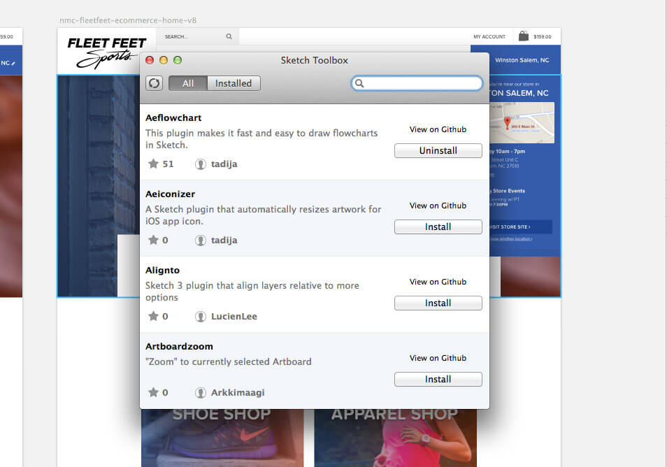
The first thing I recommend downloading when starting in Sketch is Sketch Toolbox. This plugin manager allows you to directly browse and install plugins and to keep track of what you’re using.
The second basic thing to note is that everything you create in Sketch is vector. In the age of responsive design, creating a design in vectors is key. Designers constantly have to think about high-definition versus normal-definition displays, narrow versus wide screens and so on. Building designs that rescale for all of these formats is essential, yet creating a separate mockup for each size is tedious and time-consuming. Sketch’s ability to freely resize objects saves time and energy.
What sets Sketch apart from other vector-based programs is that it’s also pixel-aware. The shapes you draw always snap to the nearest pixel, meaning you no longer have to worry about half-pixels or blurry lines. This makes the program ideal for screen design.
Getting Started
Now, let’s walk through how I used Sketch to design Fleet Feet’s new website. In the age of responsive design, being able to hop directly into designing a mockup is pretty rare.
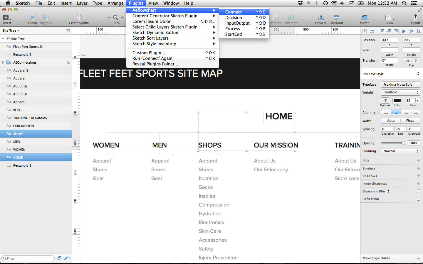
Because Fleet Feet would be adding new components to its website, first came the content strategy. I sat in on several meetings early on to discuss how the new website would be laid out. I like to use a handy Sketch plugin called AEFlowchart to create site trees for the websites I work on. For Fleet Feet in particular, it was useful for keeping track of the website’s new organization and for having something I could compare with my team. This was such a helpful reference aid in the design process, and I never would have spent the time creating it in another program simply because it would have been too time-consuming.
Sketch also makes moodboards simpler to create and a better project resource. First up, note that all of your files can live in one document. Sketch contains a page drawer in the artboard sidebar that allows you to quickly scroll between files. For large projects like this one, it was particularly nice to be able to quickly jump back and forth between the site tree, my moodboard and my mockups as I designed or made changes.
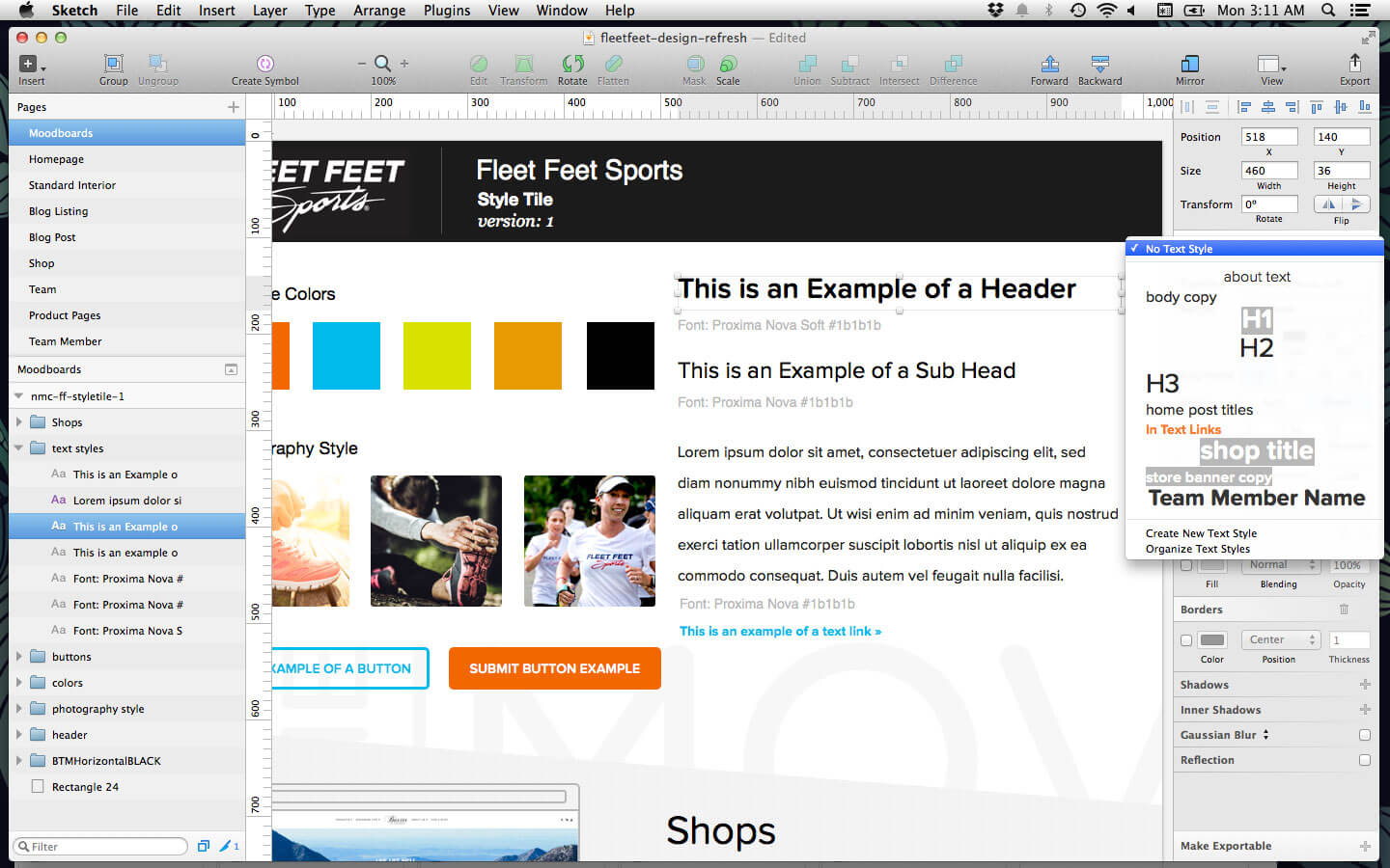
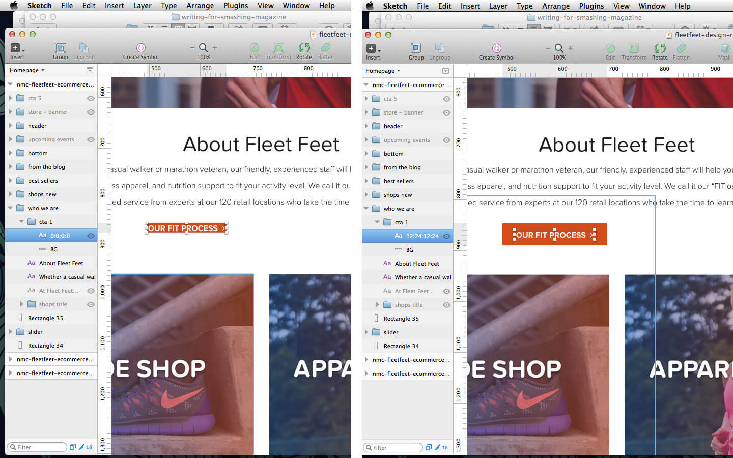
Let’s walk through an early version of one of Fleet Feet’s style tiles (of which a handy Sketch template is already available to download). Being able to create typographic elements is very useful because you can create text styles for inline styles such as headings and block quotes and then apply those styles later to text in other documents. If your client decides that they hate the h1’s font family later on in the design process, all you have to do is update one instance of the style and it will update every instance in your project’s files. The app also uses native text rendering (anti-aliasing) so that text appears in the browser exactly how it appears in the design file — no more wondering if the lightweight version of the typeface you chose for headings will be readable on screen.
Color management is also simplified with Sketch. Create the color palette in your moodboard, and the most common colors will be pulled out above all swatches for quick use later in the design process. In addition to common colors, the 3.1 update allows you to add custom colors to your document swatches (and according to 3.3’s beta notes, custom color palettes are coming soon).
Finally, just as you can scroll through each of your files in one document, you can also copy and paste objects and object styles (such as gradients and color fills) from one file into another. This feature has been impossible in Photoshop, but it’s very useful. Being able to copy and paste elements from a moodboard to your first mockup, and even objects from one mockup to the next, is great.
Designing The Home Page
Now that you’ve seen how to create some basic styles in a document, let’s look at how I created some of the elements on the home page.

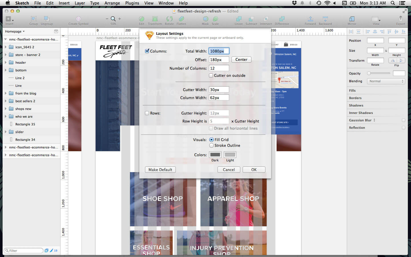
One of my favorite features of Sketch is the built-in layout grid. In Photoshop, I’d have to rely on a plugin, a series of guidelines or separate layers with a makeshift grid that wouldn’t be easily editable. In Sketch, you can easily toggle a transparent layout guide and quickly change the column and gutter sizes. To edit the layout grid, go to “View” → “Layout Settings.” I’ve created a default 1080-pixel, 12-column grid with 30-pixel gutters, which I just change from project to project as needed. Whenever I want to see the grid or turn it off, I simply hit Control + L.
As mentioned, anything possible in CSS is possible in Sketch. Creating rounded corners on an action button is as simple as clicking the object and adjusting the radius in the sidebar. Gradient overlays on images take just one click to add, don’t depend only on the colors in the swatches, and render faithfully to what a browser would show.
While the CSS3 tools are nifty, several other design programs out there have these same tools. Sketch takes it one step further by enabling designers to copy accurate CSS styles for these elements. Just right-click any object to copy the styles, including the layer’s name as a comment above the code. This makes for a more seamless experience between design and development.
In addition to creating and copying CSS styles, designing duplicated content is easier, too. Sketch allows you to turn a group of objects into a symbol that can be copied and repeated, and any changes to that object are automatically synced to all instances!
Look at the blog posts at the bottom of Feel Feet’s home page. Because there are only three, making changes to all of them wouldn’t be a huge deal, but it would still be tedious. Using symbols, we can play around with the sizes of the images, text and colors for all three at the same time, making life a little easier. Symbols even work between templates, so if we decide to use the same layout on the page listing blog posts, all we have to do is copy an instance of the symbol there, and the changes will sync between all of them. When you’re ready to add in real content, like a post image or a headline, all you have to do is right-click and detach the object from its original symbol.
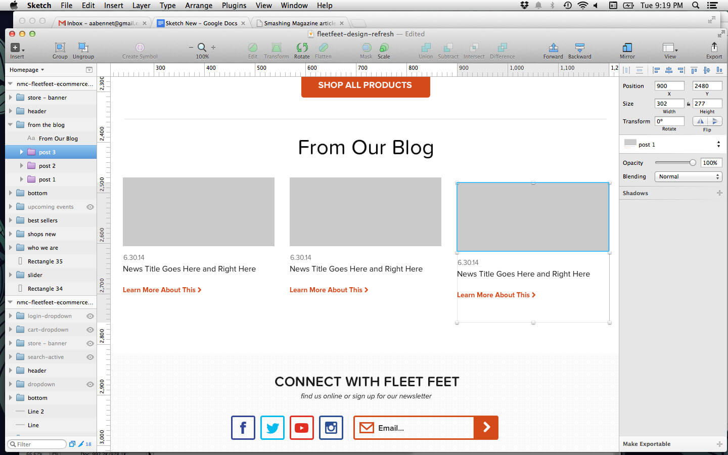
While I do use symbols for things like blog posts and product listings, I like to use the Dynamic Button plugin for buttons on the page. The plugin essentially creates a symbol for your button, but automatically adjusts the padding on the sides according to the length of the text. It’s a great time-saver with pages that have several buttons, such as this home page. Simply create a text layer with your initial button text, select the plugin, edit the layer’s name to reflect the padding of your button’s background (for example 10:20:10:20), hit Command + J and ta-da! You’ve now got a dynamic button that you can repeat consistently throughout the design just by editing the button’s text.
Creating A Product And Team Listing Page
I touched briefly on how helpful symbols can be on the home page, but what about with pages with a lot of repeated content, like product and team listing pages? While using a symbol to create an individual item in a listing would be helpful, content will eventually need to be added to all of these objects in order to look realistic to the client.
Adding content to 20+ items in a mockup would be a huge pain. Additionally, clients rarely have content ready before the design is approved. Thankfully, Sketch has several plugins to generate content automatically in a design.
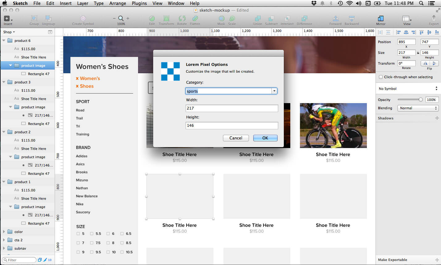
For something like a product listing page, we don’t want to spend a lot of time searching for shoe images with white backgrounds prior to the first round of revisions; instead, we just need a placeholder image. The Day Player plugin is a great resource that fills in placeholders from various image services. I like Placehold.it because that’s what the developers who I work with use, and I use Lorem Pixel to get specific images. Select the plugin and the image service you’d like to use, edit the options for your placeholder such as dimensions and color, and insert it in the product object group. That’s much easier than searching for images on Google to use as placeholders!
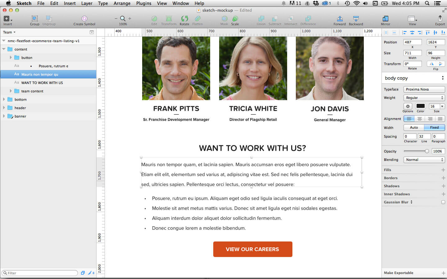
For mockups that need significantly more filler content, I like the Content Generator plugin. The team listing page, for instance, needed a male or female image, a name, a title and some contact information. Using the plugin, all I had to do was select the image placeholder boxes for each of the team members, go to the plugin options and choose between a male and female avatar. Filling in a name, along with an email address and phone number was also just as simple.
Sketch’s features aren’t just useful for mockups with repeated content, but for standard web pages as well. Let’s say we need to add some text to the bottom of the team page, where there’s a bit of text explaining careers with Fleet Feet. For placeholder text, we can again use the handy Content Generator plugin to fill in lorem ipsum text, completely eliminating the need to find an online service to generate the same thing. Also, did you notice the bullet points in the text? Another great feature of Sketch is the built-in generation of numbered and bulleted lists — a feature that has always been lacking in other design programs (including the almighty Photoshop and the screen design-oriented Fireworks) and painstakingly tedious to achieve. Being able to format text exactly how it will appear in the browser is great, and Sketch helps you do it!
Designing Mobile And Tablet Mockups
I’ve touched on how to create several elements for a standard web page. Now, let’s get into the nitty gritty of why Sketch is so great for responsive web design.
One of my favorite features of Sketch is the support for multiple artboards on one canvas. Photoshop forces you to create multiple PSD files and then switch between windows to work on various mockups. This process was such a hassle that I would create mobile and tablet mockups only for big-budget projects.
In Sketch, you can see desktop, tablet and mobile mockups all in one view, allowing you to work on the mockups simultaneously. For Fleet Feet in particular, multiple artboards proved to be especially helpful because of the sheer number of templates. When editing symbols, text styles and colors, I could see how changes affected all of the mockups at once. Seeing this also helps the designer to remain conscious of content flow and interactions going from desktop to mobile.
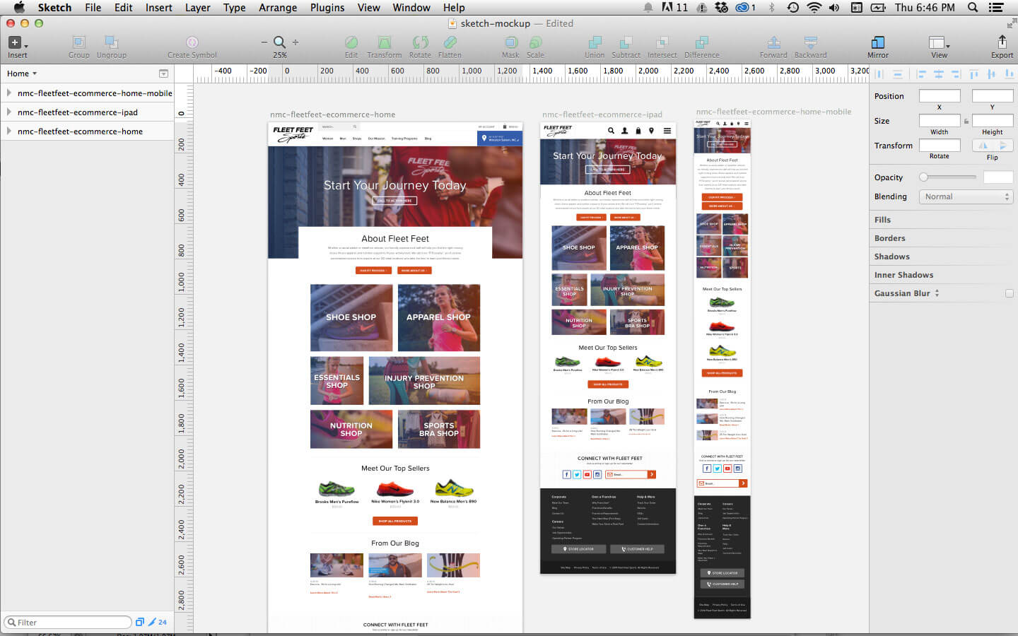
Creating these multiple artboards is also easy in Sketch. Simply press A to create an artboard, and Sketch will present a list suggesting 28 common screen and icon sizes to select from, including “Retina” sizes. This is particularly helpful in responsive design because you don’t have to worry about getting the dimensions right when creating mockups.
Another neat feature of Sketch is that you can preview designs on the device they are meant to be viewed on. Although not technically a built-in feature, the Sketch Mirror app syncs with your open document and allows you to see how your design would look on an iPhone or iPad and instantly preview changes. This app has proven to be great for making final tweaks and showing off designs to clients.
While creating static mockups in Sketch at different breakpoints can be a great way to show a client or developer how something should appear, it’s not always the most effective (or efficient) way. Giving a more fluid and realistic preview of how a responsive design will actually look through interactive prototyping is quickly becoming a necessity for web designers. While Sketch doesn’t have a built-in prototyping feature, thankfully other programs are integrating Sketch in their workflow models. Well-known interactive prototyping apps such as InVision, UXPin and Marvel can now directly use Sketch files. Even prototyping plugins look to be on the rise also. Sketch Framer uses FramerJS to help you create interactive prototypes directly from the canvas, and it currently works with Sketch’s latest beta (3.3).
Moving To Development
Once the Fleet Feet design was ready for development, it was time to export the assets. When I first started using Sketch, none of the developers I worked with had the app, and I wasn’t going to force them to purchase something that I was just testing. Thus, it was up to me to slice up all of the assets for the project.
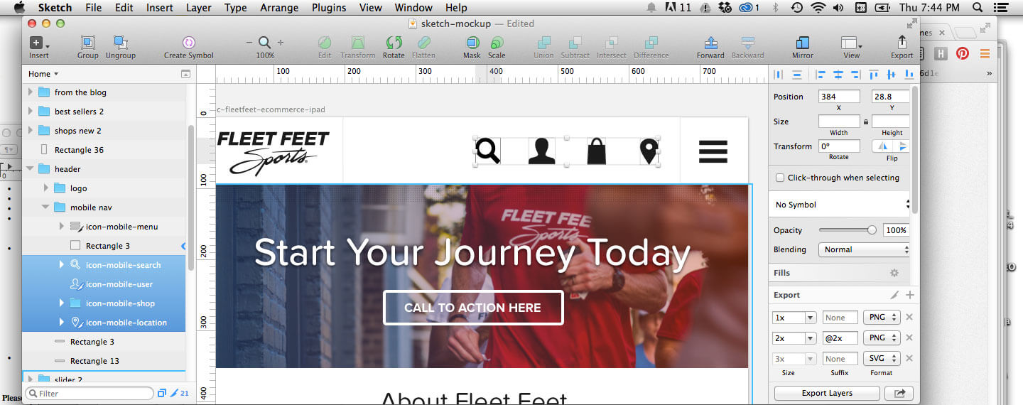
Thankfully, Sketch makes exporting all of the files super-easy. Take the icons we’re using in the mobile navigation, for instance. By just clicking the group of layers and then clicking the “Export” button in the bottom-right corner, I can save the icons for web in SVG or PNG format or in PNG @2x for Retina displays. This covers all of the bases for displaying the assets on various devices.
So, I’ve delivered graphic assets to the developers, but how exactly would they get by without knowing all of the colors, fonts and font sizes? Sketch makes this simple, too. Using the Sketch Style Inventory plugin, you can create in one click an inventory of all of the swatches and HEX codes of colors used on the page. Fonts work the same way. I like to use the plugin to create a text styles inventory as a reference guide for developers. Also, remember that I mentioned that you can copy the CSS styles for any element in a document? To get these text styles into a useable form for developers, all you have to do is select all of the layers in the type inventory, copy the CSS styles and paste them into a style sheet. Using Sketch, you can give developers all of the assets and styles they’ll need to get started without their ever having to touch the app!
What’s Missing?
I’ve talked a lot in this article about how great Sketch has been for my design workflow, but what about the downsides? Well, the app still cannot be the only design program in your toolbox. The bitmap-editing tools in Sketch leave a lot to be desired, and they don’t work for me most of the time, leaving me to crop or delete plain backgrounds in Photoshop. And while intensive illustration work can be done in Sketch, it often slows down the app.
Another downside of Sketch is its plugins. Although I’ve raved about many of them in this post, I wish many of these features were built directly into Sketch. Because these plugins are created by third parties, a simple update to Sketch or the plugin itself could render them inoperable. This means you can never completely rely on them in your workflow.
Finally, this program is still restricted to Mac OS X users. Not only does this rule out designers who use Windows, but it makes it very unlikely that you can ever share a native file with a developer, project manager or client.
Conclusion
Although it’s definitely still a work in progress, Sketch continues to be my go-to web design program. Its tools and interface prioritize design for the web. Things like the premade artboard templates, symbols and simple exporting functionality have drastically sped up my workflow and made the design process a little easier. Sketch has also improved my entire workflow, from moodboards to the early stages of development, making it an optimal tool for responsive design.
Have you tried Sketch yet? Has it become your tool of choice for responsive web design? Do you have any other tips or tricks from your workflow that I haven’t mentioned? Let us know in the comments!
Additional Resources
- Sketch App Resources A ton of free design mockups and tutorials to get you started
- “Sketch App,” Medium A nice roundup of posts on new features and tutorials
- “Sketch Keyboard Shortcuts,“ Jean-Marc Denis, Medium Extremely helpful when I was getting started with Sketch
- “Essential Sketch Plugins for Web Design,” Nathan Huening A more extensive list of plugins than what I’ve covered here and quick tutorials on how to use them
- Sketch, Facebook A great Facebook group to ask questions and get updates from Bohemian Coding
Further Reading
- Getting The Sketch Workflow Right: Meet “The Sketch Handbook”
- Sketch With Material Design
- Prototyping iOS And Android Apps With Sketch (With A Freebie!)
- Designing A Responsive Music Player In Sketch
 (mb, al, mrn)

