The Current State Of E-Commerce Filtering

Email Newsletter
Weekly tips on front-end & UX.
Trusted by 182,000+ folks.


 Celebrating 10 million developers
 Custom Web Forms for Angular, React, & Vue. Your backend.
When done right, filters enable users to narrow down a website’s selection of thousands of products to only those few items that match their particular needs and interests. Yet, despite it being a central aspect of the user’s e-commerce product browsing, most websites offer a lacklustre filtering experience. In fact, our 2015 benchmark reveals that only 16% of major e-commerce websites offer a reasonably good filtering experience.
Given the importance of filtering, we — the entire team at the Baymard Institute — spent the last nine months researching how users browse, filter and evaluate products in e-commerce product lists. We examined both search- and category-based product lists. At the core of this research was a large-scale usability study testing 19 leading e-commerce websites with real end users, following the think-aloud protocol.
Despite testing multi-million dollar websites, the test subjects ran into more than 700 usability problems related to product lists, filtering and sorting. All of these issues have been analyzed and distilled into 93 concise guidelines on product list usability, 35 of which are specific to filtering availability, design and logic.
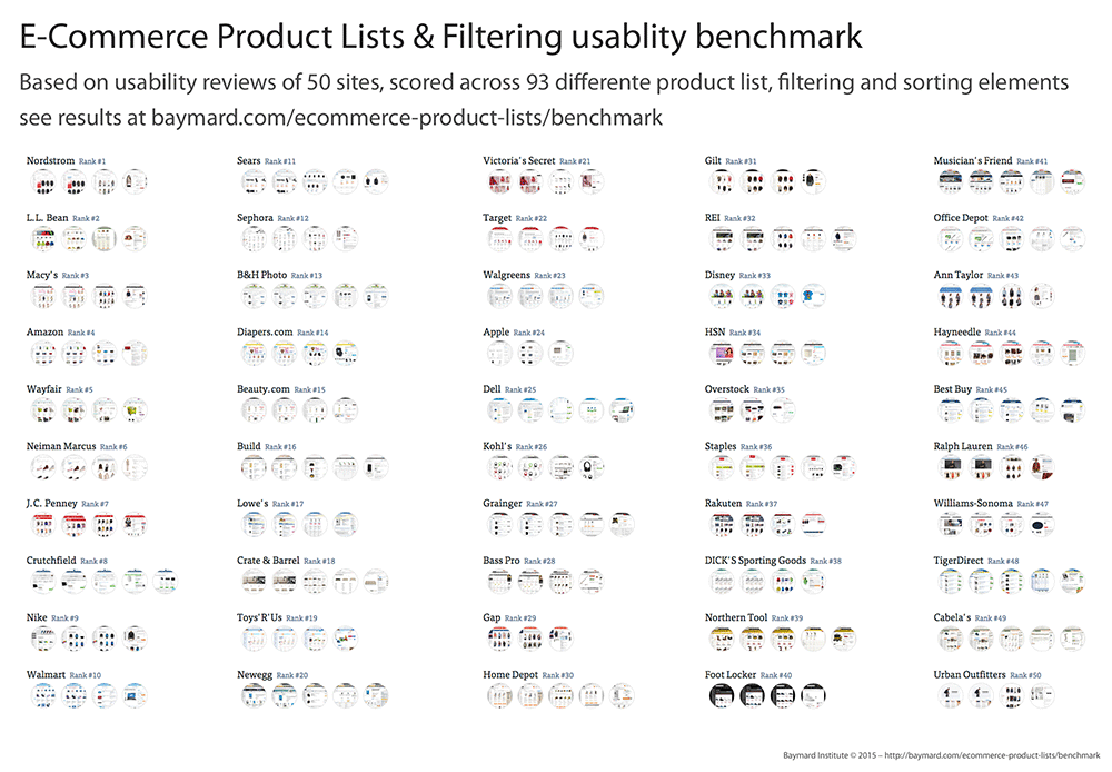
We subsequently benchmarked 50 major US e-commerce websites across these 93 guidelines to rank the websites and learn how major e-commerce websites design and implement their filtering and sorting features. This has led to a benchmark database with more than 4,500 benchmark data points on e-commerce product list design and performance, of which 1,750 are specific to the filtering experience. (You can view the websites’ rankings and implementations in the publicly available part of the product lists and filtering benchmark database).
In this article we’ll take a closer look at some of the research findings related to the users’ filtering experience. More specifically, we’ll delve into the following insights:
- Only 16% of major e-commerce websites provide users with a reasonably good filtering experience. This is often due to a lack of important filtering options, but from the benchmark data it’s clear that poor filtering logic and interfaces are also causal issues.
- 42% of top e-commerce websites lack category-specific filter types for several of their core product categories.
- 20% of top e-commerce websites lack thematic filters, despite selling products with obvious thematic attributes (season, style, etc).
- Of those websites that deal with compatibility-dependent products, 32% lack compatibility filters (for example, selling smartphone cases without a filter for device type or size).
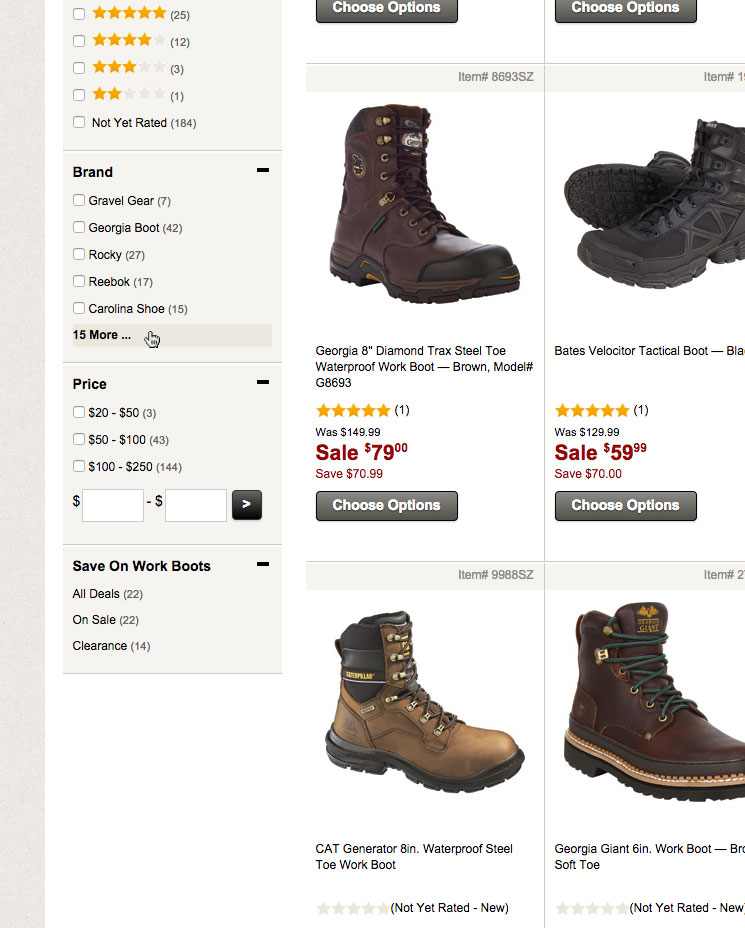
- Testing showed that 10+ filtering values require truncation — yet 32% of websites either have insufficient truncation design, causing users to overlook the truncated values (6%) or use what testing found to be even more troublesome, inline scrollable areas (24%).
- Only 16% of websites actively promote important filters on top of the product list (a prerequisite when relying more on filters than on categories).
- Filtering performance varies greatly by industry, with electronics and apparel websites generally suffering from insufficient filters (for each of their unique contexts), while hardware websites and mass merchants take the lead in the filtering game.
In this article we’ll walk through each of these seven filtering insights, showing you the usability test findings, examining the benchmark data and presenting best practice examples for creating a good e-commerce filtering experience.
1. Only 16% Of Websites Provide A Good Filtering Experience
When done right, filters enable users to see only the products that match their individual needs and interests, such as products of a particular type or style or with certain features or attributes. For example, a user might want to see all products in the “jackets” category for “men” (gender filter), for the “winter” season (thematic filter) and available in the color “black” and size “M” (variation filter). It’s the e-commerce equivalent of walking into a physical store and asking a salesperson for “a black, men’s, winter jacket in size medium.”
However, a prerequisite to these wonderful powers of filtering is having a vast range of filters available for the user to drill into the particular features and product aspects that are important to them and their particular interests. Most e-commerce websites already fall short here. However, a good filtering experience requires the necessarily filters not only to be present, but to be presented in a way that’s easy for the user to grasp and interact with and whose logic follows user expectations.
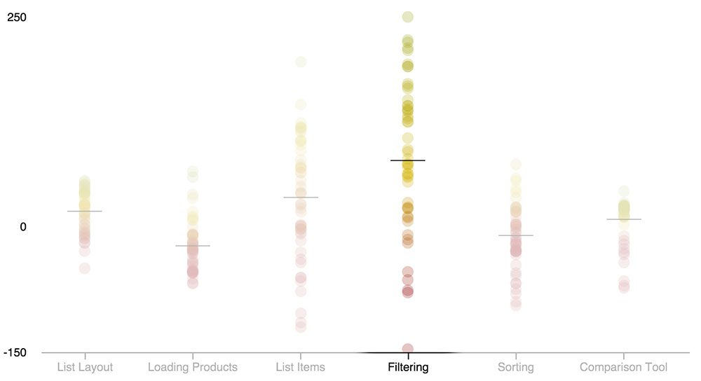
Benchmarking the 50 top-grossing US e-commerce websites across the 93 product list guidelines identified in the usability study revealed generally mediocre performance. Analyzing the 1,750 performance scores specific to filtering availability, filtering logic and filtering interfaces reveals that:
- 34% of websites have a poor filtering experience, severely limiting their users’ ability to browse products — even when they have the most basic of product requirements;
- 50% of websites offer a passable filtering experience — by no means good and with several areas that could be improved;
- only 16% of websites provide a good filtering experience, with sufficient filtering types available, a balanced filtering design and a filtering logic that aligns well with user expectations (although, even among these few good websites, most still have room for refinement).
In sections 2, 3 and 4 in this article, we’ll walk through the test findings for three of the core filtering types that typically cause issues: category-specific filters, compatibility filters and thematic filters — because 60% of major e-commerce websites lack one or more of these.
During testing, the filtering logic and filtering user interface often led to a poor experience, even on websites that have invested resources in product tagging (i.e. filter availability). Users need to be able to locate and apply relevant filtering values and to make their desired filtering combinations in order to draw value from a website’s filters. Yet a notable 40% of test subjects were at some point during testing unable to find a website’s filtering options — despite actively looking for them. This is critical, considering that unnoticed filters are — to the user — effectively the same as nonexistent filters. In section 5 and 6, then, we’ll walk through two filtering design patterns that proved effective at solving some of these user interface issues.
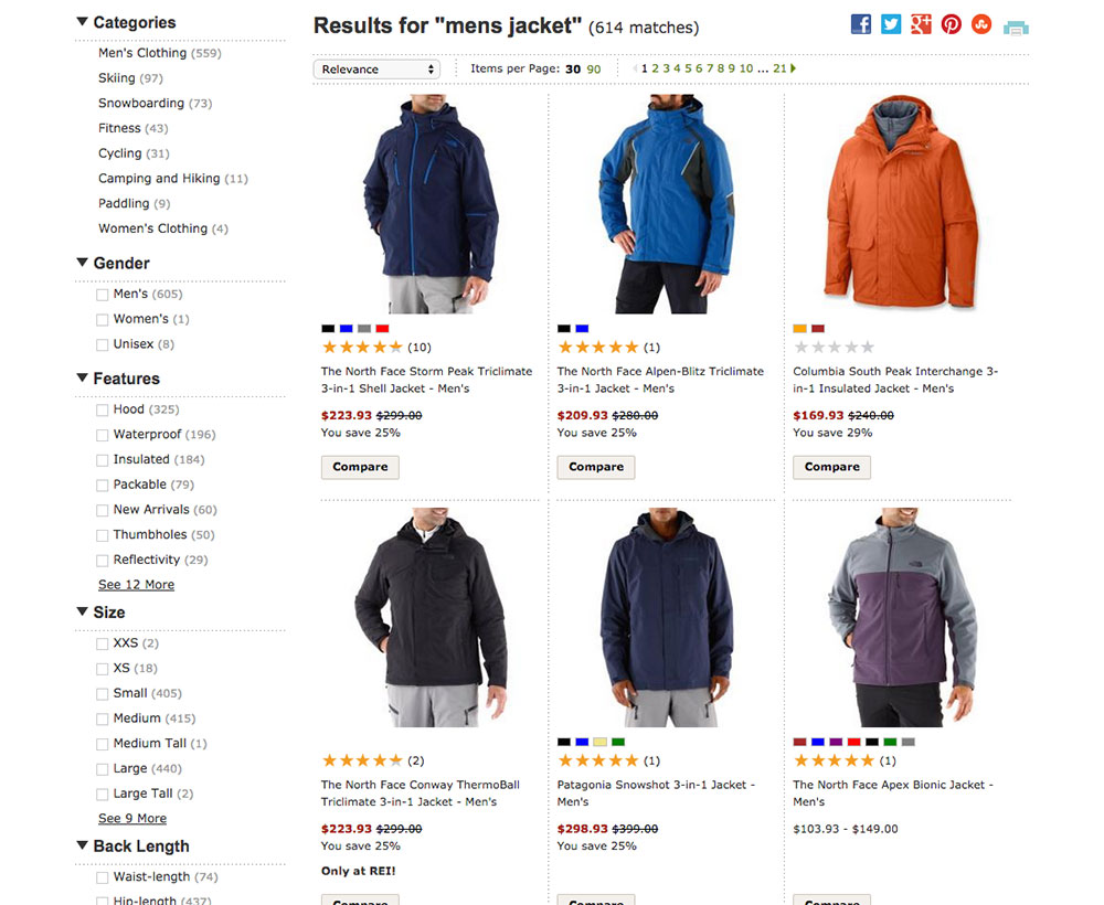
2. 42% Lack Category-Specific Filter Types
Most of the time, users are interested in filtering a product list across category-specific attributes, and not just the website-wide attributes (such as brand, price, user ratings, etc.). An example would be filtering a list of cameras by camera-specific attributes, such as megapixels, zoom level and lens mount — attributes that aren’t particularly meaningful for other types of electronics, such as TVs.
For example, sleeping bags would need a temperature rating filter, while furniture would need a color filter, and hard drives a capacity filter, and so on. A massive 42% of top e-commerce websites lack such category-specific filtering types for several of their core product verticals.
A good rule of thumb is that any product specification that is important enough to be shown in a product list item should also be available as a filter. Moreover, by virtue of displaying the information in front of the user, the website is reminding the user that that specification is important (or, in the case of users new to the domain, teaching them that it is). The very display of the specification, then, encourages users to filter by it.
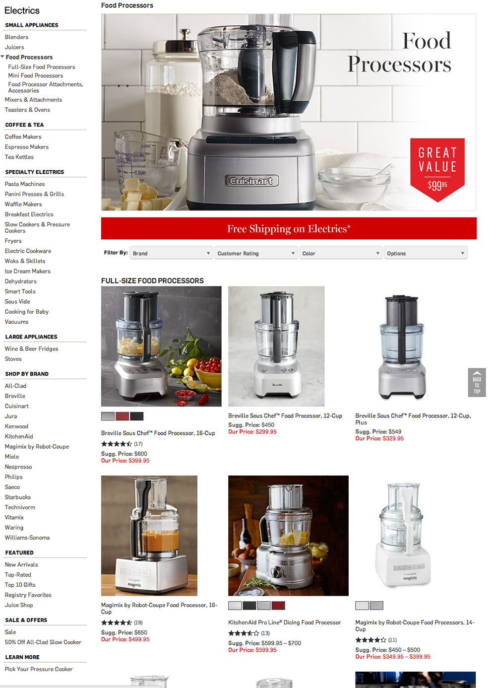
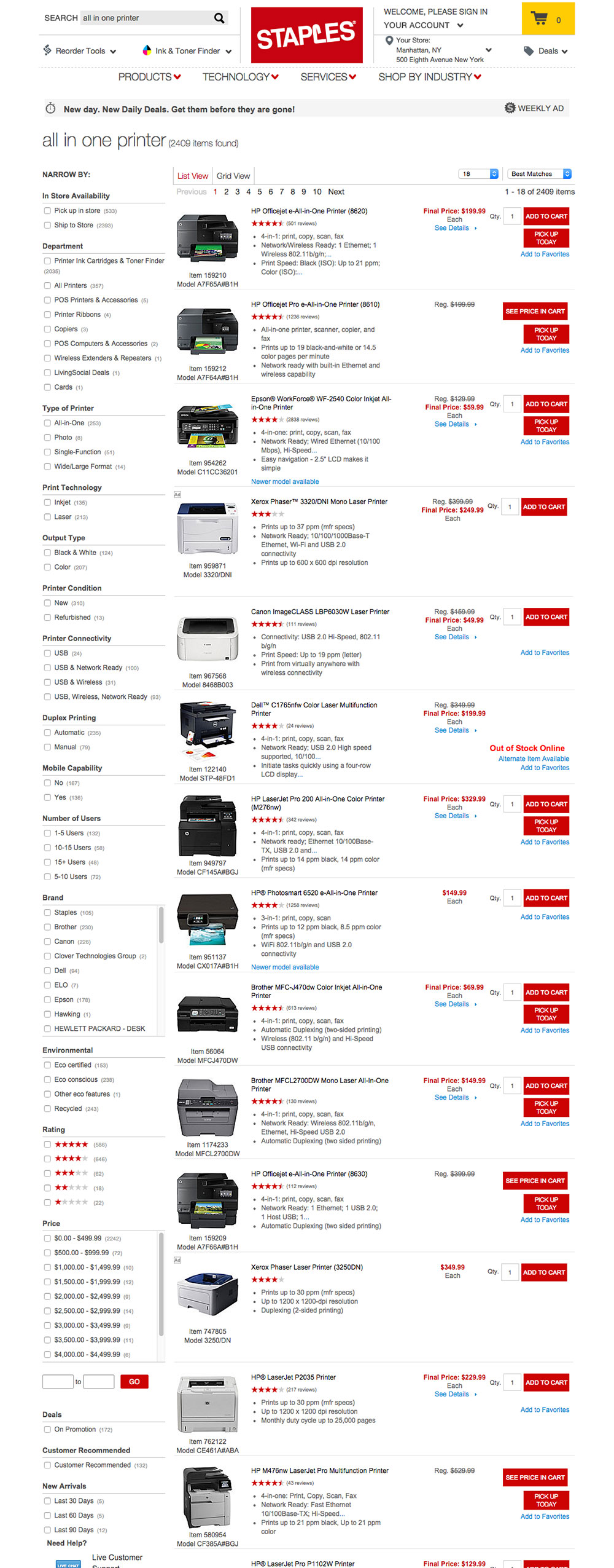
During testing, when users encountered websites that lack basic category-specific filtering, they would give up because they realized they would have to manually locate the items they want by browsing a generic product list containing hundreds of items (for example, to find jackets made of wool, food processors with capacities greater than 14 cups, etc.). Users often took quite a while to fully grasp that a website doesn’t offer such filters, with most simply assuming that “It must be there somewhere,” and not believing that the website could neglect such basics — and being forced to look through hundreds of products.
When a product list is a set of search results, faceted search should present the user with the best-matching product-specific filters, without the user having to specify a category. We touched on our test findings and the topic of faceted search (and how only 40% of top websites offer this) in section 6 in “The Current State of E-Commerce Search.”
Key Takeaway
Always ensure that each category has a unique set of filters specific to the type of product. At a minimum, the product specifications included in the list items will need to be available as filters as well, but a wider array of filters will nearly always be needed.
3. 20% Lack Thematic Filters
Thematic browsing patterns are quite common in physical retail stores, where any sales assistant would be able to help visitors with common requests, such as “a casual shirt,” “a spring jacket,” “a high-end pocket camera” or “an LED TV with good value for the money.” However, this is no easy task on most e-commerce websites.
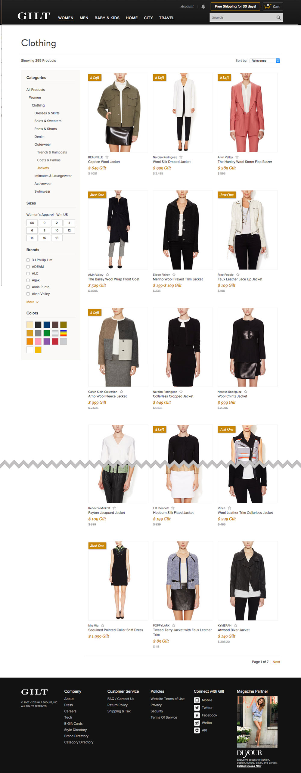
While TVs, cameras, jackets and shirts can all be easily located on most e-commerce websites, viewing products that match a certain “theme” can be nearly impossible. Despite such thematic attributes often being both common and central aspects of the user’s purchasing decision, our benchmarking revealed that 20% of top e-commerce websites still lack thematic filters (although support for it has grown to 66%, up from 48% since our last study and benchmarking of e-commerce search).
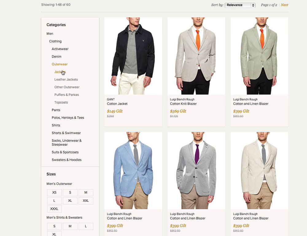
“I’m too impatient for this kind of thing. They would have lost me. If there were multiple pages, I would never have gotten through it,” one subject explained as he looked for a jacket for the spring season on Gilt. “Normally you can choose between winter jackets, spring jackets or the type of jacket.” He ended up abandoning the website.
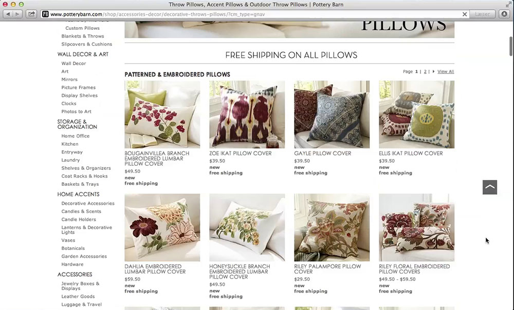
“I’d look at these to see what the style is like. And then I’d think, ‘Ayhh, these are all ugly.’ So, I go up again, to see if I can sort a little [filter, ed.], by ‘style’ or something,” one subject explained while she looked for a way to filter by style. With only a “pillow type” filter available on Pottery Barn, she had few options to try and ended up applying a random pillow type to see where that would take her — hardly a reliable way for users to find relevant items on a website.
Without thematic filtering options, viewing only the products of interest to them was often unreasonably time-consuming for users. This was especially the case when it came to actually selecting which item(s) to purchase, because the relevant products would be randomly scattered across a product list. During testing, a lack of thematic filters often led to website abandonment because the subjects prematurely concluded either that the store didn’t carry the type of product they wanted (for example, spring jackets) or, more often, that finding the few relevant items that might be hidden somewhere in a vast product list would be nearly impossible. On websites that do have thematic filters, the filters had very high usage rates, often above 50%.
The easiest way to technically implement thematic filters is by manually tagging products or groups of products. Typical examples of thematic types are style (casual, romantic, modern), season (spring, holiday), usage conditions (outdoors, underwater) and purchase-selection parameters (cheapest, value for money, high end). Some types are well suited to manual tagging (for example, style and season will often be both fast and accurate for a human to tag), whereas other filters require extensive domain knowledge to manually tag (for example, value for money).
Key Takeaway
Identify and offer key thematic filters unique to the website and product-type context. These will often need to be category-specific (see section 2). Common omissions are style, usage context and purchase-selection parameters.
4. 32% Lack Compatibility Filters
Some products are compatibility-dependent — that is, a product’s relevance is determined entirely by its compatibility with another product that the user already owns or plans on buying. Typical compatibility-dependent products are accessories (for example, a case for a laptop that has to fit), products used in conjunction with other products (an audio system that needs to plug into a TV and media players), spare parts (a laptop adapter that needs to have a charger tip and power rating that matches the user’s laptop) and consumables (ink that has to fit an exact printer model).
Finding a spare adapter for a laptop or buying a camera and matching case might sound like trivial tasks, but it turned out to be extremely difficult for our test subjects, who had a completion rate of only 35%. This means that 65% had to give up or, worse, ended up purchasing a product that they believed was compatible but was in fact not.
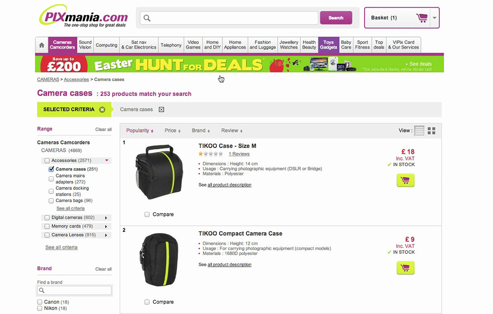
“Oh my gosh, I wouldn’t do this — not on a website which is this difficult to navigate. I would go to a camera store with my camera and find a case that fits. I wouldn’t go about looking into all of these options,” one subject explained while trying to find a camera bag and realizing there was no way to narrow the list of 253 bags by size. The subject elaborated, “I’d need to go back and forth between this and the camera to compare the dimensions. And then it also has to look nice.”
No matter how enticing the price, how great the specifications, how perfect the customer reviews pronounce the product to be or how appealing the product’s design, the end user will not be interested if the product is incompatible. This could be a dealbreaker, regardless of the product’s other attributes. This makes compatibility filters one of the most important filtering types (for compatibility-dependent product types only, of course). Giving users access to a list of products that are compatible with the item they already own is vital, then.
Despite compatibility filters being a prerequisite for finding and purchasing compatible items, 32% of websites that sell compatibility-dependent products have no compatibility filters.
While most websites have a “brand” filter, tests showed that this is completely inadequate as the only type of compatibility filter. First, brands often have multiple series or products with different compatibility aspects. For example, all Lenovo adapters will not fit all Lenovo laptops; so, simply applying a filter for “Lenovo” would not give the user a list of all products compatible with their particular Lenovo laptop. Secondly, for several compatibility dependencies, third-party products are a major consideration. For example, a “manufacturer” or “brand” filter would not provide the user with a full list of matching sleeves for their MacBook laptop.
Key Takeaway
Any product category that contains compatibility-dependent products (accessories, integrated systems, spare parts, consumables, etc.) will need a compatibility filter. This will often be a filter that allows the user to specify their model name and number, but it could also be a filter for a more generic specification, such as for size, capacity or power.
(See sections 4 and 6 of “An E-Commerce Study: Guidelines for Better Navigation and Categories” for more on compatibility-dependent products, including a discussion of complete interlinking to compatible products on product pages.)
5. 10+ Filtering Values Require Truncation, Yet 32% Do It Poorly
We tested three dominant patterns for displaying lists of 10+ filtering values:
- displaying all filtering values in one long list,
- using inline scrollable areas,
- truncating the filtering values.
All three methods caused severe usability issues. The first two performed the worst, while truncation proved to be the best performing of the three methods — but only as long as it was implemented with great attention to details of the user interface. Before diving into the details required to achieve a well-performing truncation design, let’s briefly present the core problems with the first two methods.
A. Displaying All Filtering Values
The problem observed with displaying all filtering values in one long list is that it makes it impossible for the user to get an overview of the different filtering types available.
During testing, users would see, for example, a brand filter with one to three screens of brand filtering values within — making it impossible to get an overview of the additional filter types offered below. The majority of test subjects completely overlooked the additional filter types below the long list of filtering values and were generally overwhelmed by the long filtering sidebar stretching two screens or more. On a positive note, our product list and filtering benchmark shows that only a small fraction (2%) of major e-commerce websites currently use this pattern.
B. Using Inline Scrollable Areas
Some lists of filtering values are given their own scrollable area (i.e. the area can be scrolled independent of the rest of the page), causing several interaction problems for the majority of test subjects, as well as conceptual challenges for a smaller group of subjects.
Implementing inline scrollable areas is far more common — 24% of major e-commerce websites use this pattern. It did not, however, turn out to perform any better, because it comes with a host of problems on its own. The most significant problems (which are also difficult to solve) are the following:
- Scrolling within scrolling (i.e. nested scrolling panes) turned out to be not a particularly easy concept for users to grasp. The inline scrollable area would be placed within the larger scrollable area of the web page — requiring the user to understand the difference in order to avoid problems.
- Users who wanted to apply a filter could not get an overview of all filtering options because the scrollable area was constrained in height. The usability problem, thus, shifted from not getting an overview of filtering types to not getting an overview of filtering values within each type.
- Inline scrollable areas often caused “scroll-hijacking,” whereby the user would scroll the web page when they wanted to scroll the filtering list, or vice versa. The user had to be constantly aware of their mouse cursor’s position whenever they wanted to scroll. In other words, a dominant page-browsing pattern on the web, vertical page scrolling, would be hijacked. (On touch devices, wide inline scrollable areas can trap the user, making it almost impossible to scroll the page instead of the inline scroll area.)
(If you want to further explore the problems of inline scrollable areas, we examine the findings in depth elsewhere.)
C. Truncating Filtering Values
The last pattern we tested turned out to perform better than the other two. Truncation has the benefit of giving users an overview of the different filtering types. This is important because a lack of one often caused our subjects to make poor filtering selections simply because they were inclined to interact with the filtering values that were first in the very long list of filters. The other main benefit of truncation is that, when users find a filter type of interest, they also have the option of getting a full overview of filtering values within that type (by clicking the truncation link). Truncation, therefore, combines the benefits of the other two methods.
However, the superior performance of truncation was observed only when the risk of users overlooking the truncation link was actively addressed in the interface. In fact, on the tested websites where the truncation link wasn’t sufficiently distinct, it performed (at least) as poorly as the two other patterns, because some users assumed that the truncated list showed all available filtering values. Currently, benchmarking shows that only 6% of major e-commerce websites have a truncation link that is inadequately designed. While that’s not many, it would still be worthwhile to touch on some of the implementations of truncation that testing showed to be effective:
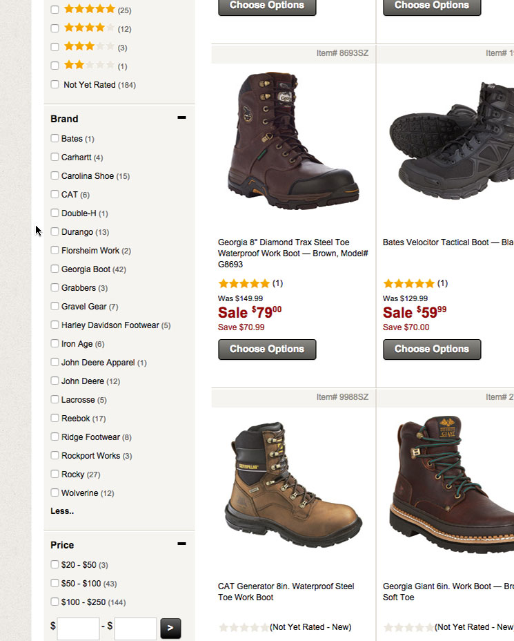
- Depending on the design of the filter, up to 10 filtering values can be displayed before the additional values are truncated. On websites that display too few values before truncating — for example, fewer than 6 values — users would often be confused by the reason for the truncation. When more than 10 values were displayed, the subjects’ overview of the filtering types began to drop rapidly. (These numbers were not found to be hard limits, but depended on the design of the filter and the number of filtering types available.)
- Before truncation sets in, the filtering values should be listed in order of popularity, not alphabetically or by number of matches. Users will often scan for the name of a specific filter value, rather than the name of a filter type. For example, they will scan a page of laptop chargers for a “Lenovo” filter, rather than for a filter type named “compatible with.” Consequently, the untruncated values are “representatives” of the filtering type and should therefore be the options that users are most likely to recognize when glancing at the page.
- The truncation link should be clearly styled, distinguishing it as an interactive element different from the filtering values right above it. Important clues include the following: using the website’s default link styling (color and/or underlining), using spatial indicators such as a plus sign (+) or arrow icon, indicating the number of matches in the link’s name (“View 23 more”), indenting differently than the filtering values (i.e. breaking the vertical alignment), and visually fading the last value in the truncated list.
More test findings on proper truncation design are explored further in this article.
Key Takeaway
Truncate long lists of filtering values (10+), rather than displaying all values or using inline scrollable areas. To ensure that users notice the truncation, display up to 10 values before triggering the truncation, display default values that users are most likely to recognize (i.e. the most popular), and style the truncation link to set it apart from the filtering values.
6. Only 16% Actively Promote Important Filters
Some categories have certain filters that are highly important and beneficial for the user to consider. However, displaying these merely as traditional filters in a filtering sidebar runs the risk of users either overlooking these options or not understanding the importance of making a selection.
Generally, during testing of e-commerce websites, we observed that users view categories as something the website suggests they select, whereas the traditional filtering sidebar options are perceived by most users as being purely optional. Following the principles of persuasive design, most websites, therefore, have a number of categories that need to promote certain filters or filter combinations. Luckily, a clear pattern emerged during testing for how websites can effectively promote a single set of highly important filters — although implementation requires a number of filtering design details to be in place.
For example, if a user navigates to a “movies” category, a highly important filter type to consider would be “format,” with filtering values such as “DVD,” “Bluray” and “digital download” as the types that would be important to most users’ process of selecting a product.
Another example would be a “digital cameras” category, where “camera type” would be a highly important filter to consider, with filtering values such as “point and shoot,” “DSLR,” “mirrorless” and “bridge.”
Promoting a limited and select number of filtering values makes sense only if the vast majority of users either have an interest in or would benefit significantly from applying them. Because a promoted filter encourages users to apply it, use the technique intelligently and sparingly, and avoid luring users into overly narrow filtered lists. For example, don’t simply use the technique website-wide for whatever is the most popular filter in each category. In practice, you will often need to manually curate those categories that have a structure that warrant the use of promoted filters.

Promoted filters don’t necessarily all need to be of the same type. They could simply be a combination of the most important product filters that users can apply before spending further time investigating the actual product list. Indeed, promoted filters could even apply multiple filters at once to provide the user with a shortcut to popular filter combinations.
Two additional implementation details to consider:
- Keep the promoted filtering values in the filtering sidebar, too (i.e. in addition to the “promotion” placement). Because users are trained that a filtering sidebar contains all available filters, the promoted filter must be represented in the filtering sidebar as well, since some users will look for the filtering value there.
- Never promote filters using banner-like graphics. A few of the websites we tested had promoted filters that were visually boxed. This caused some of subjects to completely overlook them, even when the boxes contained the very filter type they were looking for — all due to banner blindness.
Key Takeaway
For select categories where an initial filtering selection would be relevant and would benefit the vast majority of users, consider promoting those few filtering values above the product list (for example, using buttons, text links or thumbnails).
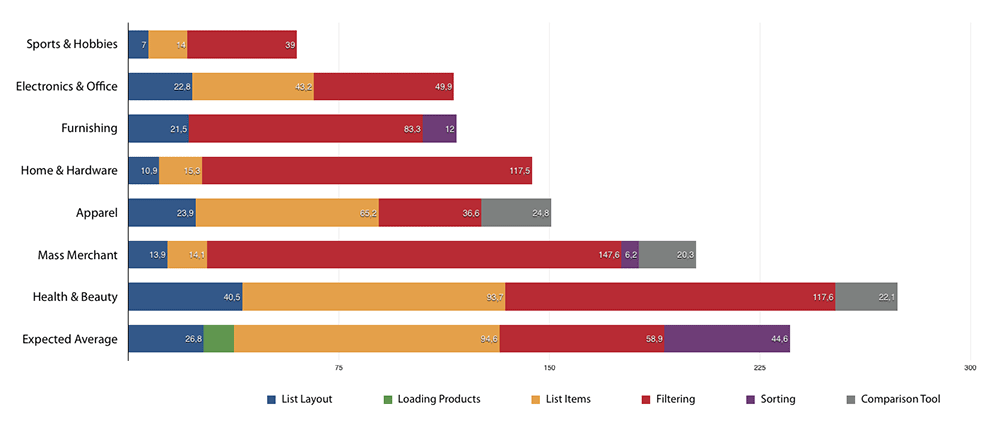
7. Filtering Performance Varies Greatly By Industry
If we look at filtering performance within the major e-commerce industries, we see that performance varies greatly. Below, the seven most dominant e-commerce industries have been plotted as stacked bar charts. The row “acceptable performance” is for reference and depicts the threshold for an “acceptable” (but not good) filtering performance — a minimum based on the typical issues that test subjects encountered. Note that the performance difference takes the industry into account; for example, an apparel website needs fewer filters than an electronics website due to the type of products it carries and, therefore, needs a less advanced design for its filters to achieve a higher score.
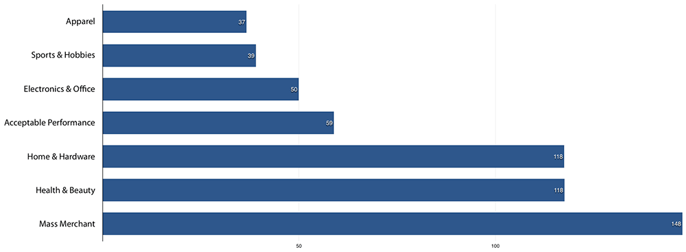
Despite having the lowest barrier to provide a good filtering experience, apparel websites notably have the worst performance of all industries for filtering, due to an unfortunate combination of inadequate filtering options and poor filtering interfaces. The subpar filtering interfaces are likely due to a deliberate prioritization of aesthetics over a clear and informative interface (a case of false simplicity). Despite dealing with a product type that requires only a limited number of filtering types (compared to other industries), many apparel websites lack even basic filtering options, such as for product material and user ratings.
Sports and hobby websites suffer from poor filtering performance as well. While part of the reason is a prioritization of simple website aesthetics, similar to the apparel industry, another cause may be the mix of visual- and spec-driven product verticals in the industry. Many products on these websites tend to be fairly visual (toys, outdoor goods, sports equipment, hobby equipment), yet many also have two to three technical attributes that could completely invalidate themselves if they don’t match the user’s criteria, such as performance, weight and age. Consequently, users will have more complex filtering needs for sports and hobby products than they typically do for regular apparel websites.
The electronics and office industry has historically been one of those e-commerce industries that offer users a broad variety of filters, simply because finding many products would otherwise be nearly impossible for users. When looking closer at the lacklustre filtering performance in electronics and office, the problem is often poor filtering logic and interfaces. Particularly common flaws include the following: allowing only one filtering value to be selected at a time, no user-defined ranges for numeric filters, and a lack of explanation of industry jargon. Despite a generally high number of filter types being offered on several electronics and office websites, the products’ technical nature — several attributes of which are vital to the user’s purchasing decision — still result in a lack of compatibility filters (see section 4 of this article) and a lack of category-specific filtering types (see section 2).
Home and hardware websites offer decent filtering performance. This aligns well with the technical nature of the industry, and the score can be explained by a historical focus on offering sufficient filters (in particular, compatibility filters), which enables users to find the particular washing machine or cordless drill that meets their specific criteria. However, poor product data and a widespread lack of structured product specifications hold back filtering performance.
Health and beauty websites have decent filtering performance as well. In fairness, health and beauty products have fewer key product attributes (quantity being an exception), which means the websites can get away with much simpler filters than ones with highly spec-driven products. E-commerce websites in other industries, therefore, should not model their filtering experience on health and beauty websites because their filtering needs are likely different.
Mass merchants have vast and diverse product catalogs that have strict requirements for product data structures, processing and categorization — all things that can be incredibly difficult to get right. Combine that with a mixed catalog of highly spec-driven and visual product types, and mass merchants have the most complex filtering needs. Yet, it is clear that most mass merchants are aware of these challenges and have made very active efforts to resolve them, often through advanced filtering logic and data post-processing. This leads to a broad variety of filters being offered (including category-specific ones), which is one of the main reasons mass merchant websites achieve the best filtering performance — even taking their users’ more complex filtering requirements into account.
Improving E-Commerce Filtering
Overall, the filtering performance of the websites we benchmarked is passable at best. When it comes to filtering, the majority of even the top e-commerce websites come up short compared to physical retail, where a customer request such as “a light casual spring jacket in size medium” or “a rugged case for this digital camera” isn’t out of the ordinary.
Some websites do actively focus on filtering and spend resources on product tagging. For those websites, many of the lingering filter-related usability issues have to do with aligning user expectations and website implementation (specifically, filtering design and logic). Filtering thus represents an opportunity to vastly improve the return on investment that most large e-commerce vendors have already made in product tagging and data collection.
Filtering on e-commerce websites is a major topic that obviously cannot be fully explored in a single article. However, the filtering insights covered in this article hopefully lay the foundation for understanding the current state of e-commerce filtering and for creating a good filtering experience:
- While mediocre filtering performance is often due to a lack of important filtering options, benchmarking also reveals that filtering logic and filtering interfaces cause severe problems for users. When looking at the users’ entire filtering experience, only 16% of the top 50 US e-commerce websites offer a good experience, while 50% offer a passable filtering experience, and 34% have a poor filtering experience, without filters for users’ most basic product preferences.
- To ensure filtering availability, always ensure that each category has a unique set of filters specific to the type of products it contains. At a minimum, the product specifications included in the list items will need to be available as filters as well, but a wider array of filters will nearly always be needed. Currently, 42% of the top e-commerce websites lack category-specific filter types for several of their core product verticals.
- Identify and offer key thematic filters unique to the website and product-type context. These will often need to be category-specific, and common omissions are a lack of style, usage context or purchase selection parameters. Currently, 20% lack thematic filters.
- Any product category that contains compatibility-dependent products (accessories, integrated systems, spare parts, consumables, etc.) will need a compatibility filter. This is often a filter that allows the user to specify a model name and number, but it could also be a filter for a more generic specification, such as a filter for size, capacity or power. Currently, 32% of websites that sell compatibility-dependent products lack compatibility filters.
- Long lists of filtering values (10+) should be truncated rather than be displayed in full (as 2% do) or use inline scrollable areas (24%). To ensure that users notice the truncation, do a few things: display up to 10 values before the truncation sets in; make sure the default displayed values are the values that users are most likely to recognize (i.e. the most popular); and style the truncation link itself to set it apart from the filtering values.
- For select categories where an initial filtering selection would be relevant and would benefit the vast majority of users, consider promoting those few filtering values above the product list (for example, using buttons, text links or thumbnails). Currently, only 16% actively promote highly important filters on top of the product list.
- Filtering performance varies greatly by industry, and the key players in your industry might not be a good source of inspiration. Even when adjusted for the different levels of filtering needs, websites in the apparel, electronics and sports industries are significantly behind in the filtering experience offered by mass merchant and hardware websites.
If you want to further explore the filtering implementation and performance of the 50 benchmarked websites, you can do so in the interactive version of the product lists and filtering benchmark database. (Note that the benchmark database also covers e-commerce product lists and list item design — areas we’ll cover in a separate follow-up article.) You may want to start out by exploring some of the few websites that offer a good filtering experience:
You can find all 93 filtering and product list guidelines in our report “Product Lists and Filtering” (not free).
Further Reading
- The Current State Of E-Commerce Search
- Responsive Upscaling: Large-Screen E-Commerce Design
- Creating A Client-Side Shopping Cart
- UI Patterns For Mobile Apps: Search, Sort And Filter


