Design Principles: Compositional Flow And Rhythm
Email Newsletter
Weekly tips on front-end & UX.
Trusted by 200,000+ folks.


 Flexible CMS. Headless & API 1st
When someone lands on a page of your site what do you want that person to do? Where do you want them to look? What information do you want your visitors to notice and in what order?
Ideally, you want people to see your most important information first and your next most important information second. You want potential customers to see the copy that will convince them to buy before they see the “Buy Now” button. You want people to be presented with the right information at the right time, and one way to do that is to control the flow of your composition.
Compositional flow determines how the eye is led through a design: where it looks first, where it looks next, where the eye pauses, and how long it stays.
Note: This is the sixth post in a series on design principles. You can find the first five posts in the series here:
- Design Principles: Visual Perception and the Principles of Gestalt
- Design Principles: Space and the Figure-Ground Relationship
- Design Principles: Connecting And Separating Elements
- Design Principles: Visual Weight and Visual Direction
- Design Principles: Dominance, Focal points, and Hierarchy
Design Patterns: Flow In The Absence Of Design
A couple of articles back in this series I talked about visual direction and I mentioned Rudolph Arnheim’s structural net. You should read that post for details, but the general idea is that in a rectangular canvas the center and the four corners of the canvas act as magnets to pull the eye. Along with these natural focal points, there are axes running between them and your eye moves along them from focal point to focal point.
Arnheim’s structural net is not the only pattern that suggests where and how the eye naturally moves through a composition. The Gutenberg diagram, the F-pattern layout, and Z-pattern layout all suggest how a viewer’s eye will move and they assume a natural flow to a design.
Note: These patterns are described for languages that are read left to right. Adjust for other reading directions.
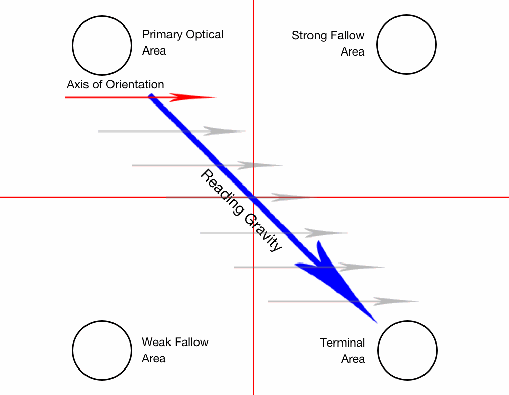
- Gutenberg diagram: In this pattern the eye generally sweeps from the top-left to the bottom-right, passing through Arnheim’s optical center. Less attention is paid to the other corners which are called fallow areas. Since the eye movesto the right as it moves down, the top-right corner is a strong fallow area, while the bottom-left corner is mostly ignored.
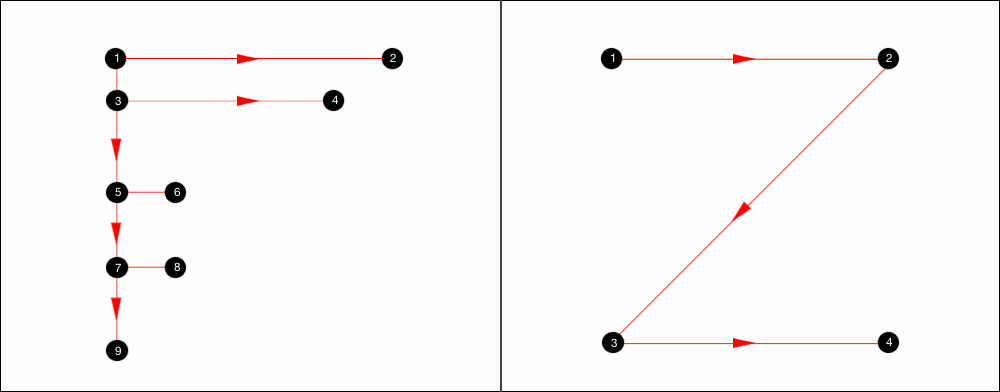
- F-pattern layout: In this pattern the eye starts in the top-left and moves across the page to the right before moving down a little and repeating the movement across the page. The general pattern follows the shape of the letter F.
- Z-pattern layout: The eye starts in the top-left and moves right. At the top-right corner it moves down and to the left in a diagonal before moving once again to the right. Overall it follows the shape of the letter Z and repeats the pattern down the page until it reaches the bottom-right.
I’m sure you’ve seen eye tracking studies and discussions of the above patterns before. What rarely gets mentioned is how these patterns describe text-heavy pages. They describe how our eye moves through columns of text.
The F-pattern is often mentioned in combination with search results pages. Why is that? It’s because search results pages are text-heavy pages presented as lists of bite-sized information to scan. An F-pattern is a natural way to scan these pages.
Add hierarchy, direction, movement and rhythm, and the flow through your design won’t follow the patterns above. The patterns fall away in the presence of design.
They’re still useful because you can take advantage of the patterns and place important information where the eye would naturally fall to increase the visual prominence of the information. You can take advantage of these natural patterns, but do understand they describe text-heavy pages only.
A viewer’s eye will move through a composition in some way regardless of whether or not you control the movement. You might as well control the movement.
Compositional Flow
You might have seen the word “storytelling” appear more and more often in discussions about design and conversion optimization. Compositional flow can help you tell your story by presenting information in the right order.
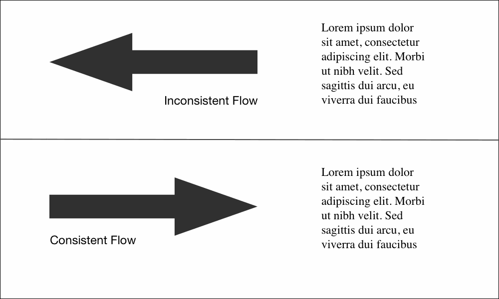
Flow is about movement and direction, and leading the eye from one part of a composition to another in the direction you want it to move. You create flow through a combination of visual weight and visual direction.
Elements of greater visual weight (focal points) pull the eye and become resting places. Other elements impart direction and move your eye from one point to another through visual cues such as arrows and lines.
Flow starts with your dominant element, which should be the entry point into your composition. From there you provide directional cues for the eye to follow through your design.
The most obvious directional cue is an arrow pointing at something. An image of a face looking in one direction is another strong and easy directional cue. Others include.
- Repetition of elements
- Rhythm
- Implied action
- Diagonal lines
- Gestural lines
- Directional lines
- Perspective
- Subject matter of elements
- Gradation
You’ll notice lines feature in the list above. Showing direction is one of the primary characteristics of lines. Lines can also be used to cut off motion in one direction by being perpendicular to that motion. When this happens they act as barriers, stopping or possibly reversing the path the eye was following.
Create direction and movement through the items mentioned above. Add elements that serve as barriers to change the direction the eye is moving. Create open paths in empty space to allow easy movement through and between your positive design elements.
Flow And Harmony
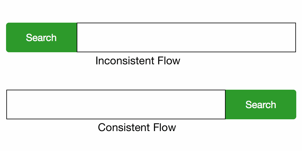
On a micro level you want the path the eye follows to align well with whatever action you want someone to take. For example, it makes sense to place the button to search after the form field, because the natural process is to fill in the field and then click the button. Placing the button first would move your visitor in one direction until the end, when they have to move all the way back to the start.
It makes more sense to have arrows point to the thing you want someone to look at instead of away from that thing. You’re creating flow even when the arrows point away, but not a flow that makes any sense to achieve the goals of the site.
Movement
Movement is closely related to direction. Motion implies a direction and direction implies movement. If you want someone to look to the right, one way is to have something on the page move to the right. The eye will follow it.
There are several types of movement.
- Literal (physical) movement: occurs when some physical activity is present.
- Static movement: occurs when the eye jumps around from point to point in the hierarchy.
- Compositional movement: occurs when design elements lead the viewer’s eye from one point to another through a composition.
Animation can be used to create literal movement on the page. Dominance, focal points and hierarchy create static movement. When elements that impart direction and movement are added between focal points you create compositional flow.
The same list of directional cues I presented earlier are used to show movement through a composition.
Rhythm
Rhythm can help control the pace of flow in a composition; it’s patterned movement. Rhythmic patterns are built from elements and the intervals between them, and just as your ear will follow along with the rhythm of a song, your eye will follow rhythm created visually.
A pattern and a rhythm will exist as soon as you add multiple elements to the page. Two of anything implies a structure. It’s going to be there no matter what you do so, again, you should learn to control it.
Repetition creates flow and rhythm through the repeated elements. When the eye sees a red circle it notices other red circles in the composition and seeks to establish a pattern. In addition to repetition you can use alternation and gradation to create rhythm.
- Repetition: creates patterns through predictability.
- Alternation: creates patterns through contrasting pairs.
- Gradation: creates patterns through a progression of regular steps.
Rhythm is created both through the elements the eye follows and the intervals between them. Changes to either alter the pattern. Variations in the pattern add interest. Emphasis of something in the pattern can break the rhythm and pause the flow momentarily.
There are three primary types of rhythm:
- Regular rhythm: occurs when the intervals between elements are predictable, or the elements themselves are similar in size and length. Placing repeating elements at regular intervals would be an example.
- Flowing rhythm: occurs when the elements or intervals are organic. This creates natural patterns that evoke a feeling of organic movement. Stripes on a tiger or zebra are good examples.
- Progressive rhythm: occurs when the sequence of forms or shapes is shown through progressive steps. Some characteristics of elements might have stepped changes, or the interval might have stepped changes. This gradual increase or decrease in sequence creates movement. A color gradient is a good example.
Any of the above types of rhythm can be used to create movement and compositional flow. Which you would choose depends on the specifics of your design: if the design is trying to communicate consistency, a regular rhythm is probably best; if the design is trying to communicate something more natural and organic, a flowing rhythm would likely be preferred.
Flow And Gestalt
The further along we get in this series, the more gestalt principles contribute to the design principles we’re looking at.
Dominance and focal points create areas in your design that pull the eye. Similarity and contrast are used to create pattern and rhythm.
All the gestalt principles that connect or show commonality among elements will help lead the eye from one element in the group to the others.
Uniform connectedness leads the eye through the thing that connects the elements. Elements with a common fate appear to move in the same direction carrying the eye along with them. The principle of continuation is specifically about continuing to move in one direction.
Examples
Let’s take a look at screenshots from a few sites and think about how their designs flow and move, and what kind of rhythm they might have.
As I’ve mentioned previously in the series, this is my opinion. You might look at these same screenshots and see a different flow and rhythm than I do. That’s fine. It’s more important for both of us to think critically about the designs we see than it is for us to agree about what we think.
Dorigati
When I look at the Dorigati home page my eye is quickly drawn to the hero image of wine barrels at the top of the page. It doesn’t take long to be pulled from here to focal points like the site logo and the image of the wine bottle to the right.
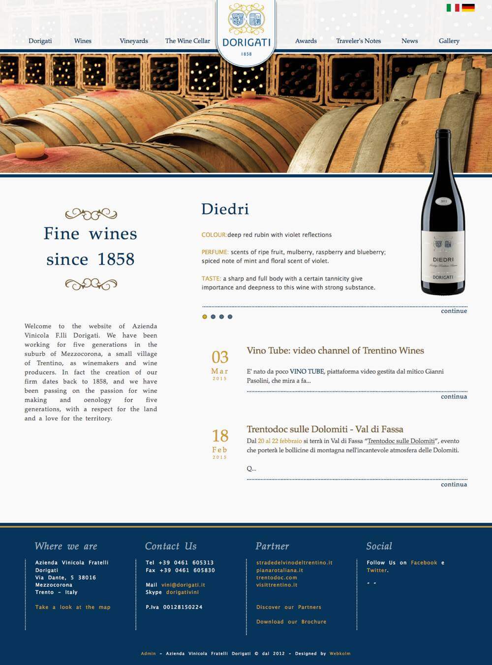
There’s a strong implied diagonal flow between the logo and bottle, and your eye likely flows back and forth between them. Think how quickly that connects the company name with the products the site offers.
The curve at the bottom of the logo appears to point downward leading your eye to the name of the wine being presented. Notice that the heading to the left and the name of the wine are the same blue and similar to the blue in the logo. The repetition of color creates a rhythm and flow through all three items.
The rhythm of color is used again with the gold headings down the page and the decorative flourishes to the left. A similar color is used for the dates. While the interval can vary depending on the length of the text in each entry, it’s fairly predictable and a regular rhythm.
The wine bottle also serves to connect the header with the main content, creating a vertical flow through the hero image and serving as a bridge across it. Without the image of the wine bottle it requires more effort for your eye to cross the horizontal lines that create barriers to movement.
Dress Responsively
There’s a strong horizontal flow at the top of the Dress Responsively home page. The navigation and text both lead your eye horizontally and make it very easy to scan left and right across the header.
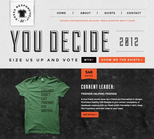
My eye tends to start with the “YOU DECIDE” text and easily moves right and left where it can take in the logo, navigation, and the remaining text in the header.
Notice at the end of “YOU DECIDE” your eye is also pulled down. There’s a repetition of rectangular and orange shapes that creates a vertical rhythm. The shape of the “WTH?” button is echoed in the mostly rectangular “548 votes” shape and the “SEE DETAILS” button below the text. This vertical flow is strengthened by a strong vertical line that’s created by aligning the left edge of these shapes with the text between them.
The orange color repeats itself as text in both the header and also further down the page (not shown in the screenshot). Having encountered the color repetition at the top of the page, your eye follows it down the page increasing the vertical flow.
Incredible Types
The header of the Incredible Types home page also has a horizontal flow due to the shape of the lines and block of text. The light grid lines create a subtle pull down and also create a regular rhythm horizontally across the page.
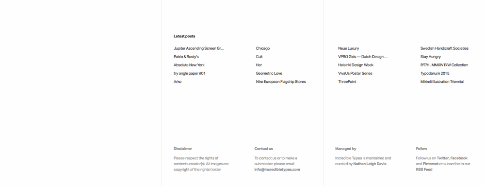
Below the header is a grid of images. Notice how the gutters (both horizontal and vertical) between images provide a channel for your eye to move through. They help your eye flow from image to image in either direction. They also create a regular rhythm in both directions.
In the footer, text is grouped into two rows and four columns once again creating both horizontal and vertical flow and rhythm. I think the horizontal flow stronger than the vertical and so my eye tends to move left and right more than up and down, but the flow exists in both directions.
Love & Luxe
The Events page on the Love &Luxe site is another design that shows both horizontal and vertical flow.
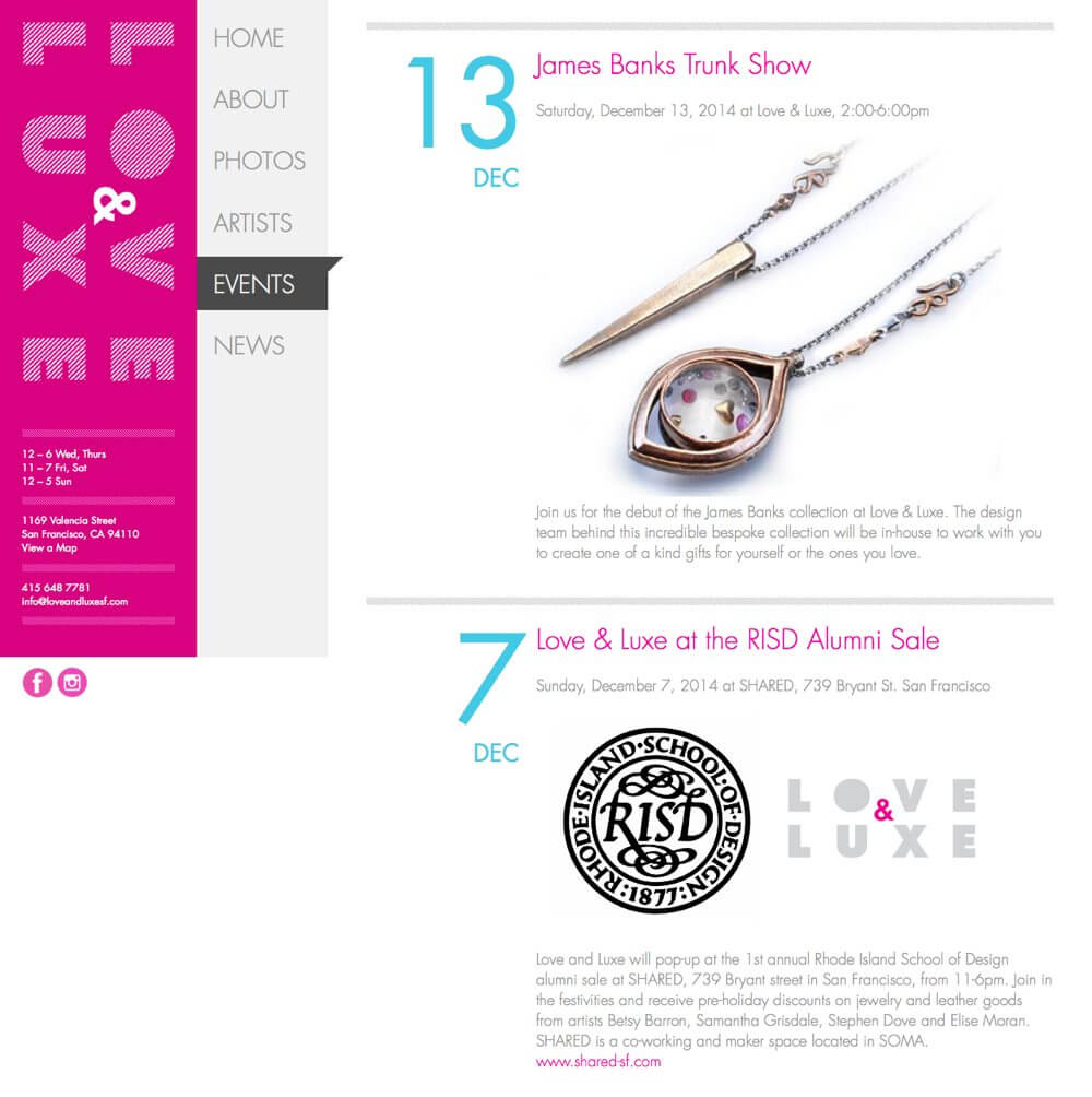
The pink in the left column draws my eye and creates vertical flow through its shape. Note how the site name is rotated so it too creates a vertical flow. The contrast in color with the menu next to it creates a strong vertical line where the two meet.
The text at the bottom of this column repeats, creating a vertical rhythm as you read one block then the one below it. However, the horizontal nature of the lines changes the flow to horizontal and moves your eye to the right.
The dark background behind the current menu items creates an even stronger horizontal flow because your eye is drawn to the contrast. The triangle it displays at its top-right corner points to the right.
On the right, in the main content, the color and size of the dates creates a regular vertical rhythm through repetition. The screenshot only shows two of these, but they continue further down the page. The pink headlines work to reinforce the rhythm created by the repeating blue dates.
The horizontal lines between each entry stop the vertical flow momentarily, keeping you in each entry a little longer. The rhythm of the repeating colors in the dates and headlines pulls you further down the page once you’re ready to cross the horizontal line and move to another entry.
The images naturally change with each entry, but the one in this screenshot directs your eye down and to the left diagonally.
Summary
You have a lot of control over where people look when they’re viewing a webpage you’ve designed. On a text-heavy and graphic-light page, a visitor’s eye likely follows something like a Z-pattern or F-pattern across and down the page.
However, as soon as you design page elements and add graphics, those patterns no longer apply. Your visitor’s eye will follow the flow, movement and rhythm you create.
Think about the priority of the information you’re communicating. Think if it would be more useful when seen in a specific order. Think about where on the page you want someone to look first, second, and third.
Then create visual cues to lead them through the page in the order you think best. Add a line for someone to follow, or create one by aligning various elements. Repeat a color or text size to create a rhythm for the eye to follow. Present images of moving objects to direct the eye.
Don’t leave it to a default pattern to lead your visitor’s eye. Create compositional flow through the page and lead them yourself.
There’s one last topic I want to share with you in this series on design principles, and that’s balance. I’ll talk about compositional balance in general and then walk you through the four different types of balance (symmetrical, asymmetrical, radial and mosaic) you can create.
Additional Resources
- “How To Control Flow Within Your Web Designs” by Steven Bradley
- “Does Your Design Flow?” by Steven Bradley
- “Eye Tracking in 2014: How Users View and Interact with Today’s Google SERPs” by Rebecca Maynes
- “The wrong-sided arrow in 1Password” by Dr. Drang
- “The Gutenburg Diagram in Design” by Ross Johnson
- “F-Shaped Pattern For Reading Web Content” by Jakob Nielsen
- “Understanding the F-Layout in Web Design” by Brandon Jones
- “Understanding the Z-Layout in Web Design” by Brandon Jones
Further Reading
- Falling In Love With The Web: Inspiring Websites And Tools
- Designing Accessible Text Over Images: Best Practices, Techniques, And Resources (Part 1)
- The Principles Of Visual Communication
- Creativity In A World Of Technology: Does It Exist?


