Sketch With Material Design

Email Newsletter
Weekly tips on front-end & UX.
Trusted by 182,000+ folks.
 Celebrating 10 million developers

 Custom Web Forms for Angular, React, & Vue. Your backend.

In the past year, adoption of Sketch at Google, where I work at, has taken off and is now a widely preferred tool. The more tools in our belts, the better, so here’s my take on why Sketch and the new material design system are a great match.
Tools are an extension of our hands, and as such, they should be versatile, quick and intuitive. A lot has changed between the print era of offset presses and the digital era of cross-platform screens. Developers have attempted to adapt our tools, but Sketch is perhaps the most successful app in this regard — its creators have removed the bloat, started afresh and presented a smaller, fit-for-purpose feature set. What may seem on the surface to be a simple drawing tool in fact nails the core workflows of digital design.
The latest version of Sketch (3.2) ships with something special for those interested in Google’s latest visual design language: the material design sticker sheet. In this tutorial, we’ll design a test app with the help of Sketch and the material design sticker sheet.
Let’s Create A Notes App!
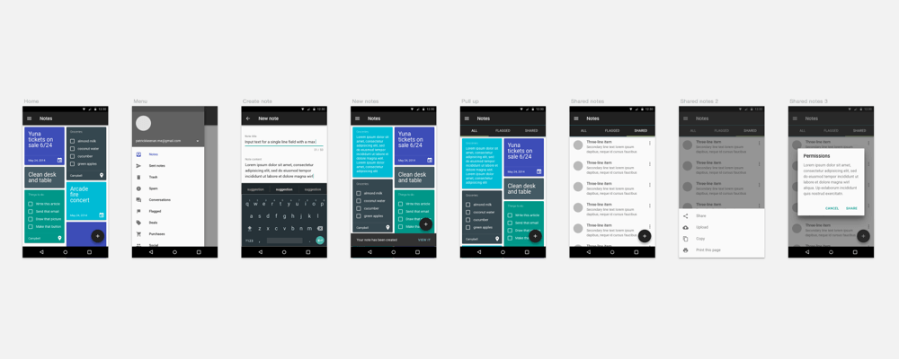
In this article, we’re going to make a very simple app — a notes app. Luckily for us, all of the components we need are already available in the latest Sketch app. These are the screens we’ll create:
You can also download the Sketch file (ZIP) that was used to make this notes app prototype; it could help you along in the tutorial.
The Template
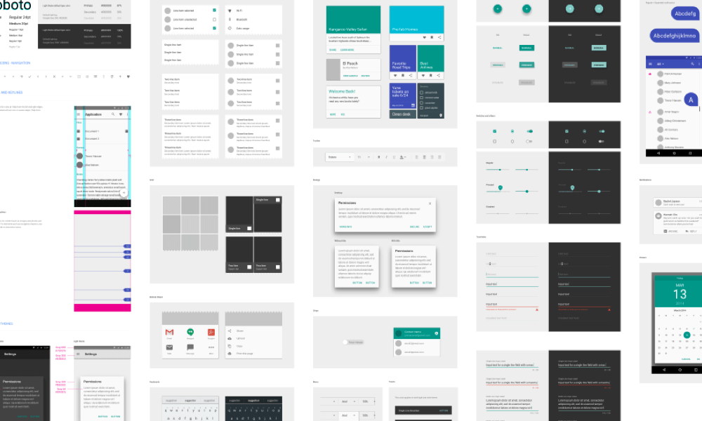
In our template — File → New from Template → Material Design — you’ll see a wide set of components, icons and layouts. The sheet itself was designed by the hardworking material design team at Google and has been ported with the love and care of Amar Sagoo and myself. The groups and objects are named, styled and organized in a truly Sketch-friendly way.
It All Starts With An Artboard
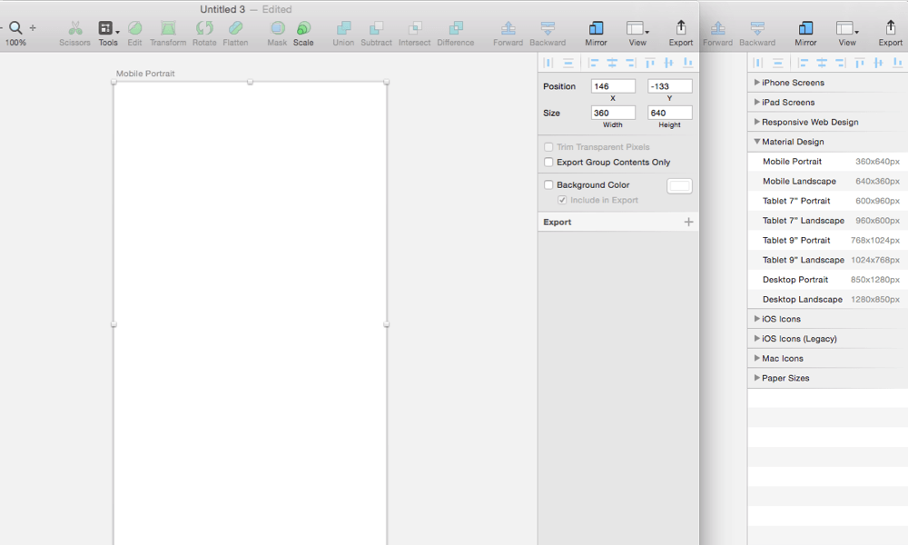
With your new document open — File → New (or Command + N) — press the A key (which is a shortcut for the Artboard tool). You can draw an artboard just as you would draw a shape, a slice or any other object. That’s because Sketch has a simple set of objects that all work the same way (more on that later). When the Artboard tool is selected, you can see on the right side a list of artboard sizes, including — you guessed it — all of the material design sizes. Click on the “Mobile Portrait” size and a white box should appear.
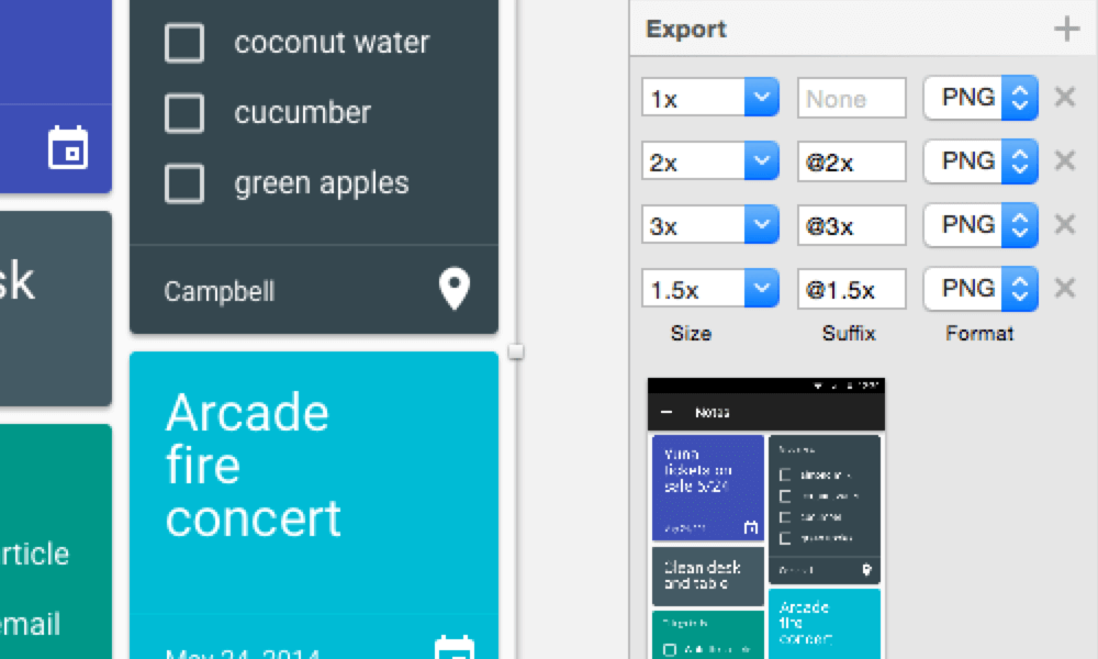
Sketch’s Killer Feature 1: Scale-Independent Exports
Note: Material design is defined using density-independent pixels. As the Android Developers page explains, a density-independent pixel (DP) unit corresponds to the physical size of a pixel at 160 DPI. Though we’ll be using pixel units (px) in this Sketch tutorial, these are really density-independent pixels because you can scale them up or down upon exporting.
In today’s world, you can’t depend on the same pixel density, so DP units allow us to talk the same language when dealing with different device layouts. Sometimes you may be compelled to work at double or triple pixel size because you want to match the pixel size of your surface — don’t go down that route.
Stay at 1x pixels and then just export at the upscaled sizes. Sketch makes that as easy as a simple drag and drop. You’ll see a panel in the bottom left showing you the sizes slotted for exports, and you can even add your own suffix conventions for file names. When you do an “Export All” operation (Command + Shift + E), you’ll see that artboard, and Sketch will export all versions of the bitmap.
Now, head to the sticker sheet template and select the “mobile global elements” artboard. Only the important stuff there is selectable, so just click on that artboard and copy and paste into your document. You now have the basic layout of a mobile material design app. As you can see in the Layers panel, you have a group named “screen”. You’ll only need the contents of that group, so just go ahead and ungroup (Command + Shift + G) the “screen” group. You’ll now see four layers:
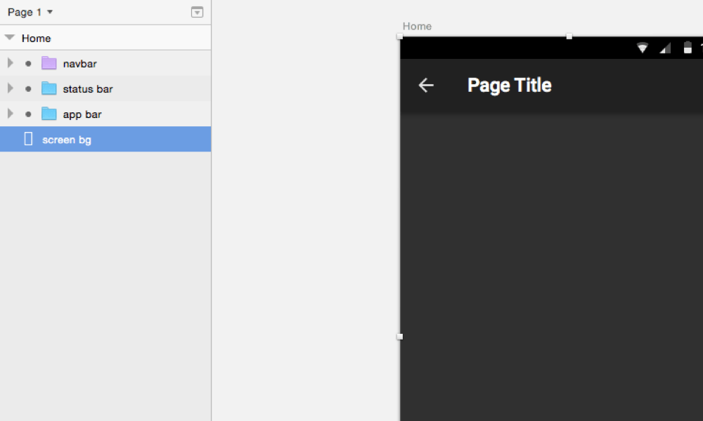
- navbar. This is a symbol (symbols in the Layers panel are marked with purple color), which means it will be the same everywhere, and if you change the contents of the symbol, it will change everywhere in the file.
- status bar. This is the top bar on the screen with Wi-Fi, time and status information.
- app bar. This is your main navigation header, which displays the name of the current page and a button to go up or open the drawer.
- screen bg. This is a background color, but it’s also a mask. You can delete this because your artboard will act as the mask for your screen.
Masks In Sketch Work… Upward!
In Sketch, masks work upward, meaning that layers above a masking object are cropped by that object. In Adobe Illustrator, however, you would place a shape on top of other layers to create a clipping mask; this threw me off at first. For more on masks, check Bohemian Coding’s documentation.
If you move these layers around within an artboard, you’ll see that they are masked by that artboard. That’s the only case when an object that is higher in the Layers panel masks the objects below. Artboards always mask their contents and also house the coordinate space; so, an x value of 0 and a y value of 0 would mean the top-left corner.
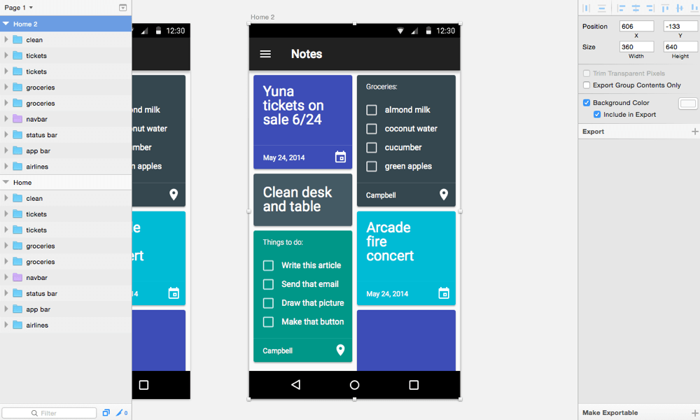
Let’s go back to the sticker sheet. Let’s grab the half-width card components and paste them in our composition. The suggested margins for these cards is 8 pixels, so go ahead and space them out.
Sketch’s Killer Feature 2: Hover Guides
One of Sketch’s most useful features has to do with spacing: Select an object, hold down Alt, and then mouse around to see distances from your selection to other objects. And holding down Command + Alt and mousing around will measure objects that are deep within the hierarchy relative to other objects contained in groups.
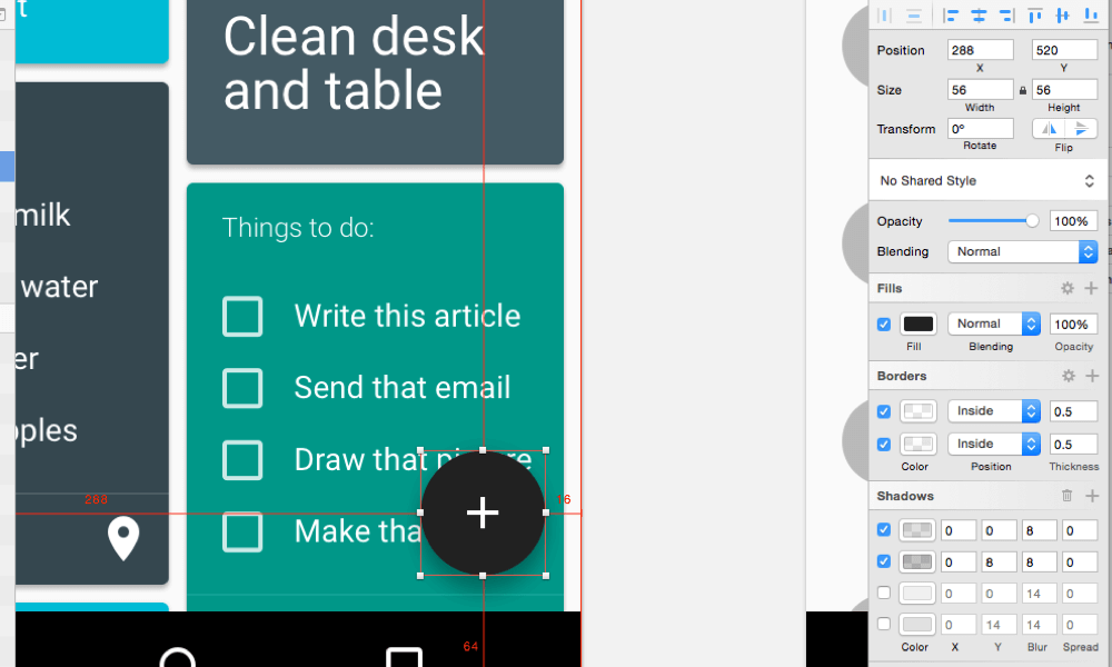
Finally, let’s get the floating action button from our buttons components and put that in. It should be 16 pixels from the navbar and 16 pixels from the right side.
Great! So, we’ve got the composition for our first Material app. It’s a scrolling card view.
The Navigation Drawer
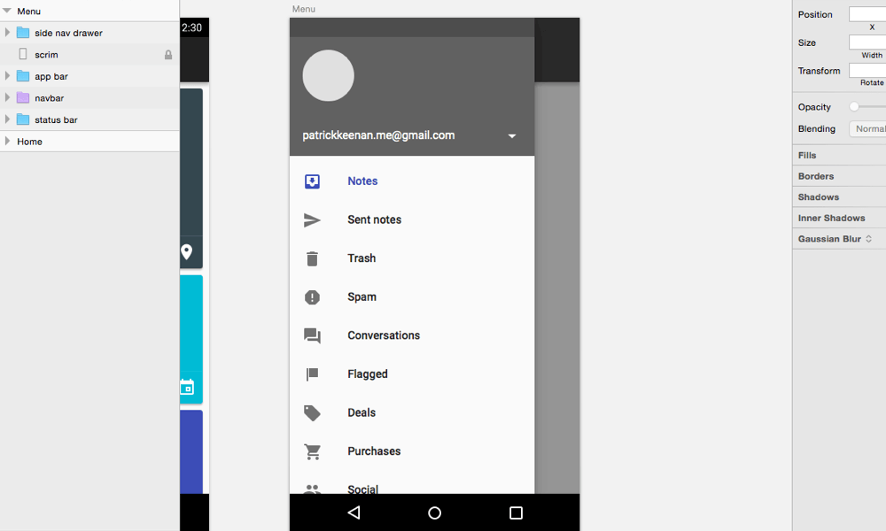
To get around the various areas of our app, we’ll make use of the navigation drawer component. Let’s duplicate our original artboard: Click on the artboard in the Layers panel list or on the title of the artboard on the page, then press Command + D. This will duplicate the artboard and move the new artboard 100 pixels to the right. You can continue your flow simply by duplicating and modifying, which is what we’ll do now.
Grab the navigation drawer from the mobile artboard — the layer is called “side nav.” Paste it onto your new artboard. You can change the categories in the navigation, but the top area is reserved for switching user accounts.
Material Forms
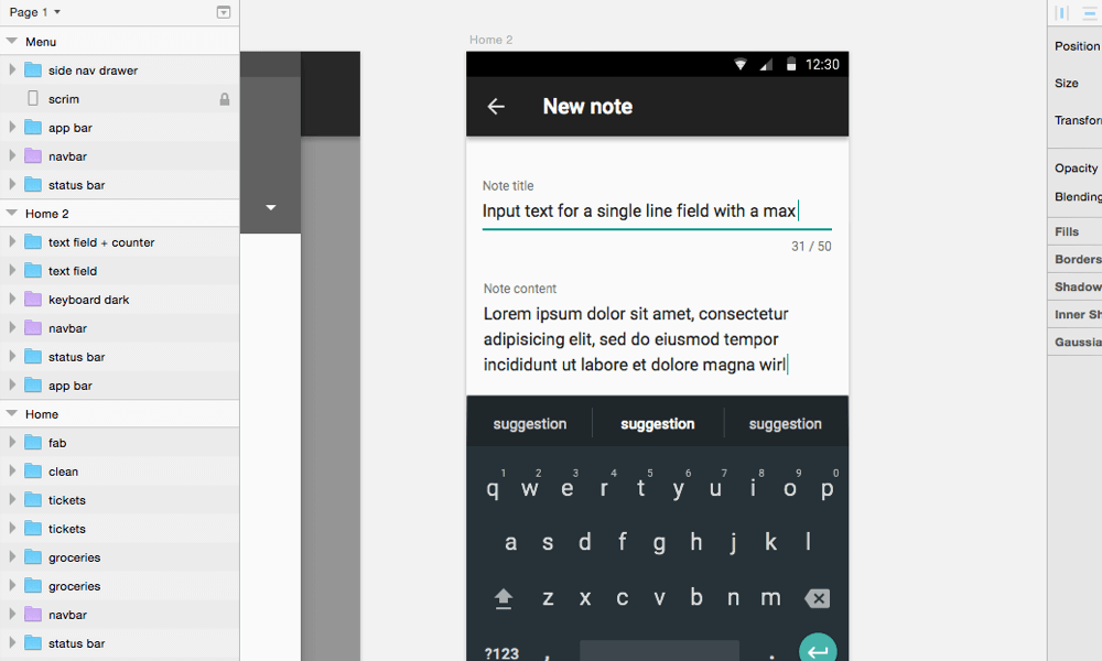
What happens when you tap that big plus button? Well, you should probably be able to make a note. Let’s grab some of the form’s components in the sticker sheet and make a new artboard for them. Here, we can make use of the keyboard, which is a symbol that can be placed whenever we need it. We’ll use the dark one to fit our dark app.
Reusing Artboards
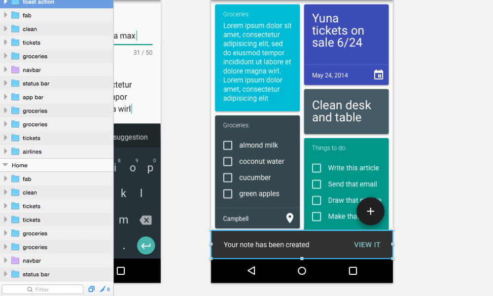
Of course, after you’ve created a note, you should see it added to the card view. Let’s duplicate the first screen and add in our new note. Just click on the name of the artboard right above the artboard itself. Now that the artboard is selected, press Command + D. That will duplicate the artboard and move it 100 pixels to the right, perfect for quickly mocking up a flow.
Sketch’s Killer Feature 3: The Color Picker
Sketch provides a powerful color picker. Just press Control + C to select a color anywhere on the screen. Combining this with Command + click to click through to any element, you can easily recolor any object in no time.
Covering The Tabs
Tabs are a great way to show different sets of content. In our app, we will have notes of importance and notes shared with others. Let’s make some tabs for “saved” and “shared” notes, with our current view being “all” notes. Jump back to the sticker sheet and click on the “tabs” component. Copy and paste that and position it next to the app bar. If you’ve grabbed the whole “app bar” tab from the sticker sheet, you’ll notice that it’s the wrong color. So, change the background color: Click through (Command + click) to the background of the tabs, and change the color to our main color. Move the tabs to the top, and you’re set.
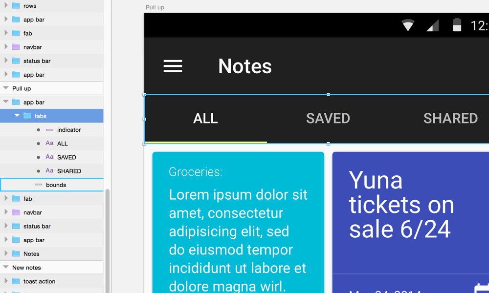
When copying components from the sticker sheet, you can take any level of elements. This means you can take a whole screen, just the components within or even just the icons. The tabs, as well as other components, have been prepared with a transparent background. Move within the “app bar” group and you’ll be able to copy the “tabs” group and paste onto any existing background. The advantage of a transparent background is that you will get the proper spacing around the component, but you can quickly place it on top of an existing background or toolbar.
Making A List
You’ll use lists a lot. They’re a fundamental component to any app, and material design gives us a number of options. We’ll have our “shared” tab contain a list view.
Copy the “three-line item” list from the sticker sheet and paste it in a new artboard. Ungroup the list and then just Alt + drag to duplicate an item, a set of items or a group. Do this until you have a full page of rows.
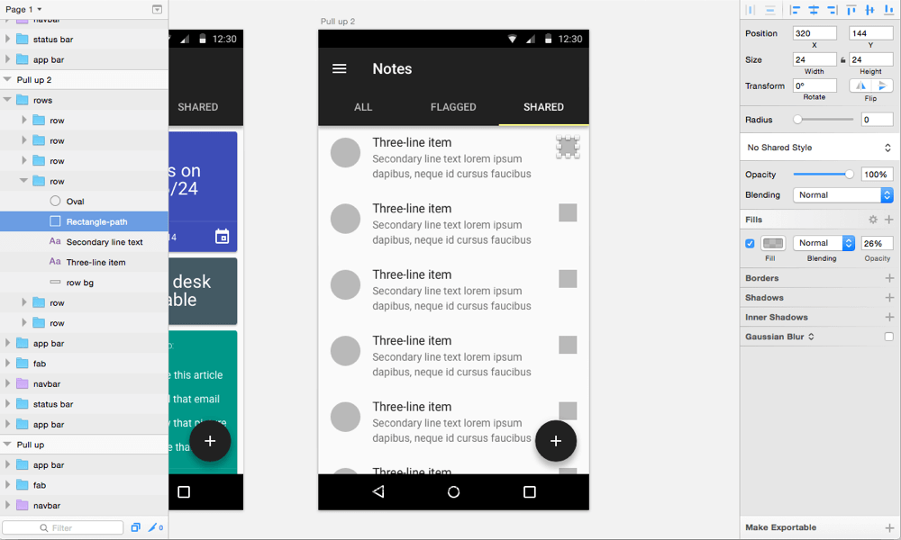
Secondary Actions Are Shortcuts
You’ll notice a box on the right side of the list. This box is a secondary action. Tapping anywhere to the right of this action would open up that list item; but for quick actions (such as calling a contact or opening information about a document) you can use the secondary action. We’ll replace this placeholder box with a heart so that the user can quickly save notes.
In the sticker sheet you’ll find a small set of icons in the top left under “typography.” Grab the heart icon and paste it where the gray box is located. The icon should be in a group containing the heart icon and a transparent 24 × 24 box. This box helps with spacing, so make sure to grab the whole group.
Sketch’s Killer Feature 4: Shared Symbols And Styles
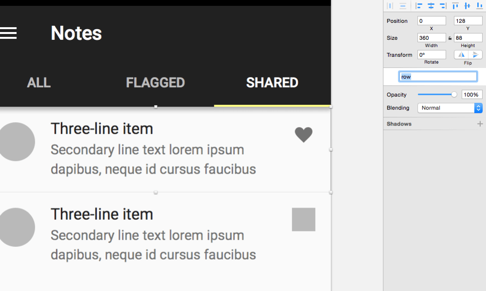
Now, let’s make the row group into a symbol. This will allow us to edit its contents in many places at once. When you select a group, you’ll see a field in the toolbar that says “No symbol.” Click on this field and select “Create new symbol.” The name will default to the selected group’s name: “row.” Now you’ve got a symbol!
Select each of the other row groups you’ve positioned on the artboard and, once again, click on the area that says “No symbol.” This time you’ll see your row symbol available for use; select it. Now that you’ve got a bunch of rows using the row symbol, when you change one, they will all change. Just like that, you have an interconnected set of elements.
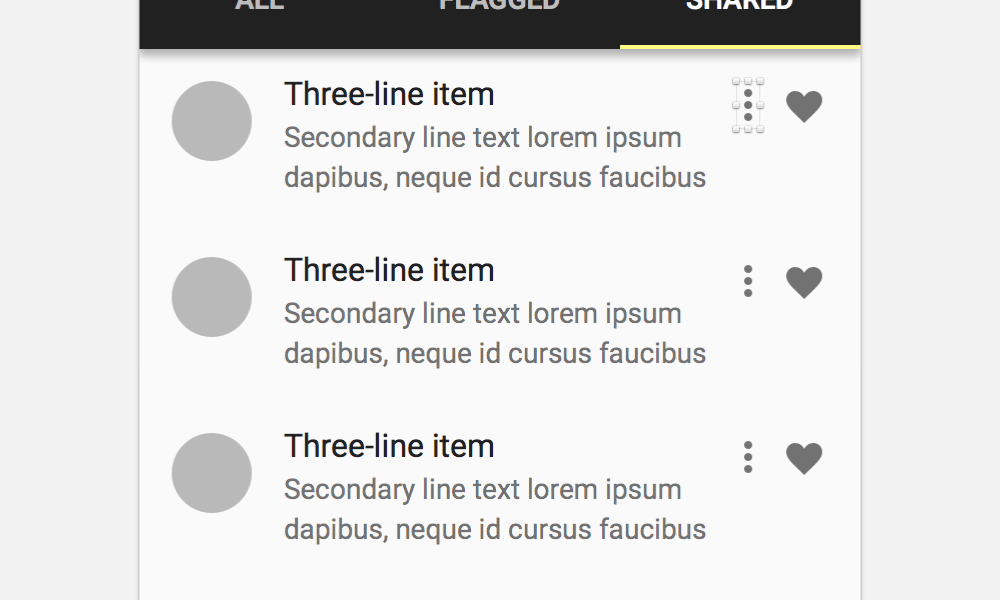
Using our newfound power, let’s replace the heart with an overflow icon. The overflow icon is a set of three vertically stacked dots and indicates that more than one action is available. All you have to do is copy the “overflow icon” group (along with the padding) from the sticker sheet and paste it right beside the existing heart icon. Line it up with the heart icon, and then delete the heart icon. As you’re doing this, you should see the other rows automatically update. Yay for symbols!
With Sketch’s symbols, there is no editing mode. Symbols act just like groups and update immediately. This makes it easy to change symbols. Watch out, though: You may be editing a symbol in one place only to find that it has also changed in many other places across the canvas!

Bottom Sheets
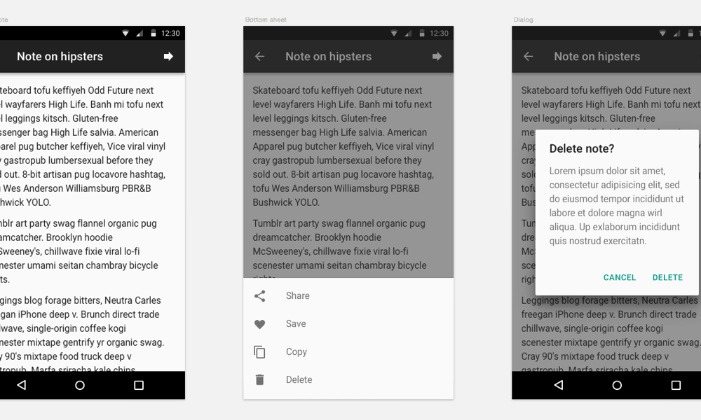
In material design, bottom sheets are a great way for the user to take action without leaving the current context. These enter from the bottom of the screen and display a set of actions. In our app, the bottom sheet will be invoked when the user taps the forward icon in the top right.
Let’s grab the bottom sheet from the sticker sheet and paste it in a new artboard. Also, grab the scrim (semitransparent background) from the previous navigation drawer artboard and paste it behind the bottom sheet.
Dialogs When Needed
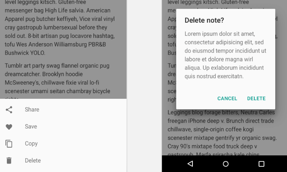
As a last step, we’ll add in a dialog. This will be invoked when the user selects the delete action from the bottom sheet. In this case, we want to be really really sure that they want to delete this note. And finally, speaking of deleting, I encourage you to start fresh with your own designs. Sketch is such a quick program and material design is such an enabling guide that you can think big and different about how to delight users in your app. So, happy sketching!
Quick Start With Sketch Resources
Here’s a list of material design resources built for Sketch to get you up and running quickly:
- Material design sticker sheet This is the latest sticker sheet. It holds a good set of components and styles, and it is easy to copy and paste in your new compositions.
- Material design icon sheet This set of icons is ripped from the Material design repository on GitHub.
- Material design whiteframes This set of colors and icons is also ripped from the Material design repository on GitHub.
Conclusion: Keep The Principle In Mind With The Tool In Hand
Thanks for walking through material design in Sketch with me and making an awesome notes app. We have not only learned a new tool, but also started on our way to a new design system.
One final note of caution: Sometime we focus on existing components and miss an opportunity to address our users’ needs in a new way. You can always check your designs against material design’s principles:
- Material is the metaphor. A material metaphor is the unifying theory of a rationalized space and a system of motion. The material is grounded in tactile reality, inspired by the study of paper and ink, yet technologically advanced and open to imagination and magic.
- Bold, graphic, intentional. The foundational elements of print-based design — typography, grids, space, scale, color, and use of imagery — guide visual treatments. These elements do far more than please the eye. They create hierarchy, meaning, and focus.
- Motion provides meaning. Motion respects and reinforces the user as the prime mover. Primary user actions are inflection points that initiate motion, transforming the whole design.
Remember, no matter how good it looks, the greater focus is not on the pixels, but on the user. If your sight is true, all else will follow.
Further Reading
- Getting The Sketch Workflow Right: Meet “The Sketch Handbook”
- Using Sketch For Responsive Web Design (A Case Study)
- Material Design Icons, Goodies And Starter Kits
- Prototyping iOS And Android Apps With Sketch (With A Freebie!)
 (mb, al, ml, mrn)

