The Art Of SVG Filters And Why It Is Awesome

Email Newsletter
Weekly tips on front-end & UX.
Trusted by 182,000+ folks.
 Register for Free

 Celebrating 10 million developers

 Custom Web Forms for Angular, React, & Vue. Your backend.
After almost 20 years of evolution, today’s web typography, with its high-density displays and support for OpenType features, is just a step away from the typographic quality of the offline world. But there’s still one field of graphic design where we still constantly fall back to bitmap replacements instead of using native text: display typography, the art of staging letters in illustrative, gorgeous, dramatic, playful, experimental or unexpected ways.

A Case For Display Text In HTML
Sure, we’re able choose from thousands of web fonts and use CSS effects for type, some with wide browser support (like drop-shadows and 3D transforms) and others that are more experimental (like background-clip and text-stroke), but that’s basically it. If we want really outstanding display typography on our websites, we’ll usually embed it as an image.

The disadvantages of using images for type on the web are obvious: file size, lack of feasibility for frequently altered or user-generated content, accessibility, time-consuming production of assets, etc.
Wouldn’t it be great if we could style letters the same way we usually style text with CSS? Apply multiple borders with different colors? Add inner and outer bevels? Add patterns, textures and 3D-effects? Give type a used look? Use multiple colors and distorted type? Give type a distressed look?
Sophisticated SVG Filters: CSS For Type
Most of this is already possible: The trick is to unleash the magic of SVG filters. SVG filters (and CSS filters) are usually considered a way to spice up bitmaps via blur effects or color manipulation. But they are much more. Like CSS rules, an SVG filter can be a set of directives to add another visual layer on top of conventional text. With the CSS filter property, these effects can be used outside of SVG and be applied directly to HTML content.

Talking about filters in CSS and SVG can be a bit confusing: SVG filters are defined in an SVG filter element and are usually applied within an SVG document. CSS filters can be applied to any HTML element via the filter property. CSS filters such as blur, contrast and hue-rotate are shortcuts for predefined, frequently used SVG filter effects. Beyond that, the specification allows us to reference user-defined filters from within an SVG. A further point of confusion is the proprietary -ms- filter tag, which was deprecated in Internet Explorer (IE) 9 and removed when IE 10 was released.
This article mostly deals with the first case: SVG filters used in an SVG document embedded on an HTML page, but later we’ll experiment with SVG filters applied to HTML content.

feImage to fill text with a repeating pattern (demo)The illustrations in this article are taken from demos of SVG filter effects applied to text. Click on any one of them to see the original (modern, SVG-capable browsers only). I call them "sophisticated" SVG filters because under the hood these filters are crafted by combining multiple effects into one output. And even though the appearance of the letters has been altered dramatically, under the hood the text is still crawlable and accessible and can be selected and copied. Because SVG filters are supported in every modern browser, these effects can be displayed in browsers beginning from IE 10.

Understanding SVG filters is challenging. Even simple effects like drop-shadows require a complicated, verbose syntax. Some filers, such as feColorMatrix and feComposite, are difficult to grasp without a thorough understanding of math and color theory. This article will not be a tutorial on learning SVG filters. Instead I will describe a set of standard building blocks to achieve certain effects, but I will keep explanations to the bare minimum, focusing on documenting the individual steps that make up an effect. You will mostly read about the how; for those who want to know the why, I've put a reading list at the end of this article.

Constructing A Filter
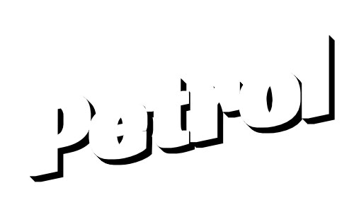
Below is a sophisticated SVG fiter in action. The output of this filter is a weathered text effect, and we will use this for a step-by-step walkthrough:

Let’s break down this effect into its building blocks:
- green text;
- red extrusion;
- text and extrusion are separated by a transparent gap;
- text has a grungy, weathered look.
Our SVG filter effect will be constructed by combining multiple small modules, so-called "filter primitives." Every building block is constructed from a set of one or more primitives that are then combined into a unified output. This process is easier to understand when shown as a graph:

Adding A Filter
We’ll start with a boilerplate SVG that contains an empty filter and text:
<svg version="1.1" id="Ebene_1" xmlns="https://www.w3.org/2000/svg" xmlns:xlink="https://www.w3.org/1999/xlink">
  <defs>
    <style type="text/css">
      <![CDATA[
        .filtered{
          filter: url(#myfilter);
          …
        }
      ]]>
    </style>

    <filter id="myfilter">
      <!-- filter stuff happening here -->
    </filter>
  </defs>

  <g class="filtered">
    <text x="0" y="200" transform="rotate(-12)">Petrol</text>
  </g>
</svg>
The filter Element
We have to start somewhere, and the filter tag is the element to begin with. Between its start and end tag, we will put all of the rules for transformation, color, bitmap manipulation, etc. The filter can then be applied to a target as an attribute or via CSS. The target will usually be an element inside an SVG, but later on we will learn about another exciting option: applying SVG filters to HTML elements.
A handful of attributes exist to control the filter element:
- x and y positions (default -10%);
- width and height (default 120%);
- an ID, which is necessary to refer to later on;
filterRes, which predefines a resolution (deprecated with the “Filter Effects Module Level 1” specification);- relative (
objectBoundingBoxis the default) or absolute (userSpaceOnUse)filterUnits.
A Word On Filter Primitives
As we've learned, filter primitives are the building blocks of SVG filters. To have any effect, an SVG filter should contain at least one primitive. A primitive usually has one or two inputs (in, in2) and one output (result). Primitives exist for blurring, moving, filling, combining or distorting inputs.
The specification allows us to take several attributes of the filtered element as an input source. Because most of these do not work reliably across browsers anyway, in this article we will stick with SourceGraphic (the unfiltered source element with colors, strokes, fill patterns, etc.) and SourceAlpha (the opaque area of the alpha channel — think of it as the source graphic filled black), which do have very good browser support.
How To Thicken The Input Text
The first filter primitive we will get to know is feMorphology, a primitive meant to extend (operator="dilate") or thin (operator="erode") an input — therefore, perfectly suited to creating outlines and borders.
Here is how we would fatten the SourceAlpha by four pixels:

<feMorphology operator="dilate" radius="4" in="SourceAlpha" result="BEVEL_10" />
Creating An Extrusion
The next step is to create a 3D extrusion of the result from the last primitive. Meet feConvolveMatrix. This filter primitive is one of the mightiest and most difficult to grasp. Its main purpose is to enable you to create your own filter. In short, you would define a pixel raster (a kernel matrix) that alters a pixel according to the values of its neighbouring pixels. This way, it becomes possible to create your own filter effects, such as a blur or a sharpening filter, or to create an extrusion.
Here is the feConvolveMatrix to create a 45-degree, 3-pixel deep extrusion. The order attribute defines a width and a height, so that the primitive knows whether to apply a 3×3 or a 9×1 matrix:

feConvolveMatrix to create an extrusion on the fattened input<feConvolveMatrix order="3,3" kernelMatrix=
"1 0 0
0 1 0
0 0 1" in="BEVEL_10" result="BEVEL_20" />
Be aware that IE 11 and Microsoft Edge (at the time of writing) cannot handle matrices with an order greater than 8×8 pixels, and they do not cope well with multiline matrix notation, so removing all carriage returns before deploying this code would be best.
The primitive will be applied equally to the left, top, right and bottom. Because we want it to extrude only to the right and bottom, we must offset the result. Two attributes define the starting point of the effect, targetX and targetY. Unfortunately, IE interprets them contrary to all other browsers. Therefore, to maintain compatibility across browsers, we will handle offsetting with another filter primitive, feOffset.
Offsetting
As the name implies, feOffset takes an input and, well, offsets it:
<feOffset dx="4" dy="4" in="BEVEL_20" result="BEVEL_30"/>
Cutting Off The Extruded Part
feComposite is one of the few filter primitives that take two inputs. It then combines them by applying a method for composing two images called Porter-Duff compositing. feComposite can be used to mask or cut elements. Here’s how to subtract the output of feMorphology from the output of feConvolveMatrix:
<feComposite operator="out" in="BEVEL_20" in2="BEVEL_10" result="BEVEL_30"/>
### Coloring The Extrusion This is a two-step process:
First, we create a colored area with feFlood. This primitive will simply output a rectangle the size of the filter region in a color we define:
<feFlood flood-color="#582D1B" result="COLOR-red" />
We then cut off the transparent part of BEVEL_30 with one more feComposite:

<feComposite in="COLOR-red" in2="BEVEL_30" operator="in" result="BEVEL_40" />
Mixing Bevel And Source Into One Output
feMerge does just that, mix bevel and source into one output:

<feMerge result="BEVEL_50">
   <feMergeNode in="BEVEL_40" />
   <feMergeNode in="SourceGraphic" />
</feMerge>
Looks pretty much like the desired result. Let’s make it a little more realistic by giving it a weathered look.
Adding A Fractal Texture
feTurbulence is one of the most fun primitives to play with. However, it can melt your multicore CPU and make your fans rotate like the turbojet engines of a Boeing 747. Use it wisely, especially on a mobile device, because this primitive can have a really, really bad effect on rendering performance.
Like feFlood, feTurbulence outputs a filled rectangle but uses a noisy, unstructured texture.
We have several values on hand to alter the appearance and rhythm of the texture. This way, we can create surfaces that look like wood, sand, watercolor or cracked concrete. These settings have a direct influence on the performance of the filter, so test thoroughly. Here’s how to create a pattern that resembles paint strokes:
<feTurbulence baseFrequency=".05,.004" width="200%" height="200%" top="-50%" type="fractalNoise" numOctaves="4" seed="0" result="FRACTAL-TEXTURE_10" />
By default, feTurbulence outputs a colored texture — not exactly what we want. We need a grayscale alpha map; a bit more contrast would be nice, too. Let’s run it through an feColorMatrix to increase the contrast and convert it to grayscale at the same time:

<feColorMatrix type="matrix" values=
   "0 0 0 0 0,
   0 0 0 0 0,
   0 0 0 0 0,
   0 0 0 -1.2 1.1"
   in="FRACTAL-TEXTURE_10" result="FRACTAL-TEXTURE_20" />
The last thing to do is compose the textured alpha into the letterforms with our old friend feComposite:
<feComposite in="BEVEL_50" in2="FRACTAL-TEXTURE_20" operator="in"/>
Done!
How To Apply SVG Filters To SVG Content
There are two methods of applying SVG filters to an SVG text element:
1. Via CSS
.filtered {
   filter: url(#filter);
}
2. Via Attribute
<text filter="url(#filter)">Some text</text>
Applying SVG Filters To HTML Content
One of the most exciting features of filters is that it’s possible to embed an SVG, define a filter in it and then apply it to any HTML element with CSS:
filter: url(#mySVGfilter);
At the time of writing, Blink and WebKit require it to be prefixed:
-webkit-filter: url(#mySVGfilter);
As easy as it sounds in theory, this process is a dark art in the real world:
- SVG filters on HTML content are currently supported in WebKit, Firefox and Blink. IE and Microsoft Edge will display the unfiltered element, so make sure that the default look is good enough.
- The SVG that contains the filter may not be set to
display: none. However, you can set it tovisibility: hidden. - Sometimes the size of the SVG has a direct influence on how much of the target element is filtered.
- Did I say that WebKit, Blink and Firefox understand this syntax? Well, Safari (and its little brother mobile Safari) is a special case. You can get most of these demos working in Safari, but you will pull your hair out and bite pieces out of your desk in the process. At the time of writing, I can’t recommend using SVG filters on HTML content in the current version of Safari (8.0.6). Results are unpredictable, and the technique is not bulletproof. To make things worse, if Safari fails to render your filter for some reason, it will not display the HTML target at all, an accessibility nightmare. As a rule of thumb, you increase your chances of getting Safari to display your filter with absolute positioning and fixed sizing of your target. As a proof of concept, I’ve set up a “pop” filter effect, optimized for desktop Safari. Applying
feImageto HTML elements seems to be impossible in Safari.
Previous Demos, Applied To HTML Content
In these demos, the wrappers are set to contenteditable = "true for convenient text editing. (Be aware that these demos are experimental and will not work in Safari, IE or Edge.)
- Image filled text
- Extruded and filled with pattern
- Extruded and illuminated
- Grungy look with the help of fractal filters
- feTurbulence to achieve spilled water effect
- Some pop-arty color effects
- Sketchy style
Structuring A Filter
Depending on its complexity, a filter can quickly become a messy thing. During authoring, you could be adding and removing rules and changing their order and values, and soon you’re lost. Here are some rules I've made for myself that help me keep track of what’s going on. People and projects vary; what seems logical and structured for me might be chaotic and incomprehensible for you, so take these recommendations with a grain of salt.
Grouping
I group my filter primitives into modules depending on their functionality — for example, "border," "fill," "bevel," etc. At the start and end of a module, I put a comment with the name of this group.
Naming
A good naming convention will help you structure your filter and keep track of what’s going in and outside of a primitive. After experimenting with BEM-like schemas, I finally settled on a very simple naming structure:
NAME-OF-GROUP_order-number
For example, you would have BEVEL_10, BEVEL_20, OUTLINE_10 and so on. I start with 10 and increment by 10 to make it easier to change the order of primitives or to add a primitive in between or to the beginning of a group. I prefer full caps because they stand out and help me to scan the source faster.
Always Declare Input And Result
Though not necessary, I always declare an "in" and a "result." (If omitted, the output of a primitive will be the input of its successor.)
Some Building Blocks
Let’s look at some single techniques to achieve certain effects. By combining these building blocks, we can create new sophisticated filter effects.
Text Stroke

<!-- 1. Thicken the input with feMorphology: -->

<feMorphology operator="dilate" radius="2"
in="SourceAlpha" result="thickened" />

<!-- 2. Cut off the SourceAlpha -->

<feComposite operator="out" in="SourceAlpha" in2="thickened" />
This method is not guaranteed to look good. Especially when you apply dilate in conjunction with big values for radius, the result can look worse than the geometry created via stroke-width. Depending on the situation, a better alternative would be to store the text in a symbol element, and then insert it when needed via use, and thicken the instance with CSS' stroke-width property. Be aware that stroke-width cannot be applied to HTML content, though.
Torn Look

<!-- 1. create an feTurbulence fractal fill -->

<feTurbulence result="TURBULENCE" baseFrequency="0.08"
numOctaves="1" seed="1" />

<!-- 2. create a displacement map that takes the fractal fill as an input to distort the target: -->

<feDisplacementMap in="SourceGraphic" in2="TURBULENCE" scale="9" />
Color Fill

<!-- 1. Create a colored filled area -->

<feFlood flood-color="#F79308" result="COLOR" />

<!-- 2. Cut off the SourceAlpha -->

<feComposite operator="in" in="COLOR" in2="SourceAlpha" />
It should be mentioned that, besides feFlood, feColorMatrix is another method of altering the source input’s color, even though that concept is more difficult to grasp.
Offsetting

<!-- Offset the input graphic by the amount defined in its "dx" and "dy" attributes: -->

<feOffset in="SourceGraphic" dx="10" dy="10" />
Extrusion

<!-- Define a convolve matrix that applies a bevel. -->

<!-- Order defines the depth of the extrusion; angle is defined by the position of "1" in the matrix. Here we see a 45-degree, 4-pixel deep extrusion: -->

<feConvolveMatrix order="4,4"
   kernelMatrix="
   1 0 0 0
   0 1 0 0
   0 0 1 0
   0 0 0 1" in="SourceAlpha" result="BEVEL" />

<!-- offset extrusion: -->

<feOffset dx="2" dy ="2" in="BEVEL" result="OFFSET" />

<!-- merge offset with Source: -->

<feMerge>
   <feMergeNode in="OFFSET" />
   <feMergeNode in="SourceGraphic" />
</feMerge>
Noise Fill

The feTurbulence filter primitive will create a noisy texture by applying the so-called Perlin noise algorithm (invented by Ken Perlin during his work on TRON in 1981). This will generate a rectangle filled with noise that looks like what you could see on old TV sets late at night before cable TV was invented.
The appearance of the noise structure can be modified by several parameters:
typein its default state will produce a liquid texture.typecan be set tofractalNoiseinstead, which will output a sandy result.baseFrequencyis there to control x and y pattern repetition.numOctaveswill increase the level of detail and should have a low value if performance is an issue.- The number to start randomization with is determined by
seed.
<feTurbulence type="fractalNoise" baseFrequency="0.1" numOctaves="5" seed="2" />
Image Fill

feImage’s purpose is to fill the target with a texture. If we want to apply a repeating pattern, it must be used in conjunction with feTile.
<!-- The following code will create a 100 × 200-pixel square filled with "myfill.svg": -->

<feImage xlink:href="myfill.svg" x="0" y="0" width="100" height="200" result="IMAGEFILL"/>

<!-- We then use this fill as an input for feTile, creating a repeating pattern this way: -->

<feTile in="IMAGEFILL" resulte="TILEPATTERN"/>

<!-- Now we will use feComposite to "cut off" SourceAlpha’s transparent areas from the fill: -->

<feComposite operator="in" in="TILEPATTERN" in2="SourceAlpha" />
The cool thing about this filter is that the specification allows us to use any SVG element as an input and to create a pattern fill from it. So, in theory, you could create pattern fills from symbols, groups and fragments within your SVG and then apply them as a texture, even to HTML elements. Unfortunately, because of an old bug, Firefox accepts only external resources as input. If you prefer to keep things self-contained and want to avoid the additional HTTP request, there’s hope: Embed the pattern fill as an UTF-8 data URI:
<feImage xlink:href='data:image/svg+xml;charset=utf-8,<svg width="100" height="100"><rect width="50" height="50 /></svg>' />
Some browsers do not understand UTF-8 data URIs when they aren’t URL-encoded, so make URL encoding a default:
<feImage xlink:href='data:image/svg+xml;charset=utf-8,%3Csvg%20width%3D%22100%22%20height%3D%22100%22%3E%3Crect%20width%3D%2250%22%20height%3D%2250%20%2F%3E%3C%2Fsvg%3E' />
If you want to apply feImage to HTML content, be aware that size matters. The SVG that contains the filter must cover the area where it is being applied. The easiest way to achieve this is by making it an absolutely positioned child within the block element it is being applied to:
<style>
  h1{
    position: relative;
    filter: url(#myImageFilter);
  }
  h1 svg{
    position: absolute;
    visibility: hidden;
    width: 100%;
    height: 100%;
    left: 0;
    top: 0;
  }
</style>
<h1>
  My Filtered Text
  <svg>
    <filter id="myImageFilter">…</filter>
  </svg>
</h1>
Lighting Effect

This is one "Wow" effect that quickly becomes boring when used too often. This filter has a serious effect on performance, so use it wisely.
<!--We create a heightmap by blurring the source: -->

<feGaussianBlur stdDeviation="5" in="SourceAlpha" result="BLUR"/>

<!-- We then define a lighting effect with a point light that is positioned at virtual 3D coordinates x: 40px, y: -30px, z: 200px: -->

<feSpecularLighting surfaceScale="6" specularConstant="1" specularExponent="30" lighting-color="#white" in="BLUR" result="SPECULAR">
    <fePointLight x="40" y="-30" z="200" />
</feSpecularLighting>

<!-- We cut off the parts that overlap the source graphic… -->

<feComposite operator="in" in="SPECULAR" in2="SourceAlpha" result="COMPOSITE"/>

<!-- … and then merge source graphic and lighting effect: -->

<feMerge>
    <feMergeNode in="SourceGraphic" />
    <feMergeNode in="COMPOSITE"/>
</feMerge>
Conclusion
There is a gap between pure CSS layout and custom design elements created in software such as Photoshop or Illustrator. External assets embedded as background images, icon sprites and SVG symbols will always have their place in the design of websites. But sophisticated SVG filters give us more independence from third-party design tools and bridge this gap by enabling us to create visual styles directly in the browser.
In this article we've seen how SVG filters help us to create playful, decorative web typography. But nothing says we have to stop here. Soon, browser support will be good enough for us to use these effects on every HTML element as easily as we use CSS today. Even though the effects behave differently from native CSS techniques (an SVG filter will affect not only an element but all its children), it will be exciting to see how inventive web designers use these techniques in the near future.
Resources From This Article
- Sophisticated Filter Effects, GitHub The repository of demos
- Sophisticated Filter Effects, Codepen Play around with the code.
Reading List
- “Filter Effects Module Level 1” (working draft), W3C
- “SVG Filters,” Mike Sierra, WebPlatform.org
- “Filter Effects in SVG,” David Dailey
- “SVG Filters” (tutorial), Jakob Jenkov
- “Filter Primitives Overview,” Manfred Moitzi
- “Using Filters to Add Raster Images,” SVGBasics
- “Filters,” Matthew Bystedt
- “Cirque du Filter: A Journey Into Advanced SVG Filter Effects” (slidedeck), Michael Mullany, CSS Dev Conf 2013
- “How to Go Beyond the Basics With SVG Filters,” Michael Mullany, Creative Bloq
- “Porter/Duff Compositing and Blend Modes,” Søren Sandmann Pedersen
- “Matrix Operations for Image Processing,” Paul Haeberli
- “Image Processing Using 2D-Convolution,”
- “3×3 Convolution Kernels With Online Demo,” Zoltán Fegyver
- “The Perlin Noise Math FAQ,” Matt Zucker
- “A Look at SVG Light Source Filters,” Joni Trythall, CSS-Tricks
Further Reading
- Web Image Effects Performance Showdown
- Animating Clipped Elements In SVG
- Styling And Animating SVGs With CSS
- Rethinking Responsive SVG
 (ds, al, il, mrn)

