Constructing CSS Quantity Queries On The Fly

Email Newsletter
Weekly tips on front-end & UX.
Trusted by 200,000+ folks.


 Flexible CMS. Headless & API 1st
Often within a project, the presentation of our content changes based on certain needs. We see this when we use media queries to change our styles based on the user device. CSS quantity queries follow the same concept of changing the styles based on a condition: the condition within a quantity query being the number of sibling elements.
An example would be navigation where items are 25% wide when four items are available; yet when there are five items available, the width of the navigation items changes to 20%. This is a common problem with dynamic site frameworks like WordPress or Ghost.
A client might not realize the complications that could arise, for example, by adding one more menu item when the CSS is not set up to fit it in. Now, you could easily solve this problem with Flexbox (and many other problems), but what about a smart fallback for browsers not supporting Flexbox — preferably with CSS alone, without JavaScript altogether? Ideally, we could use @supports — but you can probably guess which browsers don’t support the property.

Sometimes Flexbox won’t cut it though. What if you are designing a gallery with an uneven number of items and you’d like to highlight the image in the center without tracking with JavaScript how many items fit the screen? Or what about a table in which some columns might need different styling based on how many items can be displayed at a given resolution — e.g. in an airline flight selection, or cinema tickets reservation?
The same goes for pretty much every module that could suffer from some dynamic addition or subtraction of elements. Can you avoid too many media queries and JavaScript workarounds?
Yes, you can. This is where quantity queries are best used. By being creative with CSS selectors, we can count the number of sibling items and apply styles if they meet the conditions. Using these queries, we can future-proof our designs and projects, and allow them to scale gracefully.
An Example Of A Quantity Query
Using CSS selectors like nth-last-child(), last-child and ~, we can craft selectors that match our requirements. If you’re interested in reading more about how they work, Lea Verou, Heydon Pickering and myself have written articles on the subject.
Here’s an example of a quantity query that will apply styles if there are at least five sibling elements:
ul li:nth-last-child(n+5), ul li:nth-last-child(n+5) ~ li {
  // styles go here
}
We can take this further and change the query to select all sibling elements up to a certain amount:
ul li:nth-last-child(-n+5):first-child, ul li:nth-last-child(-n+5):first-child ~ li {
  // styles go here
}
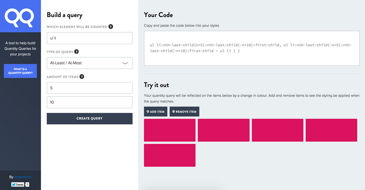
Extending further still, we can set boundaries and apply styles if the sibling items are within a certain range.
ul li:nth-last-child(n+5):nth-last-child(-n+10):first-child, ul li:nth-last-child(-n+5):nth-last-child(-n+10):first-child ~ li {
  // styles go here
}
A Solution To Writing Quantity Queries
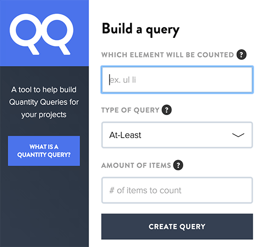
As you can see, these queries can be a bit verbose and difficult to write. This is why I created QuantityQueries.com: a tool I needed to help construct and demonstrate quantity queries for my own projects.
Written as an experiment with React, the project evolved into a dynamic tool for our web design community to use and understand how best to apply these quantity queries.
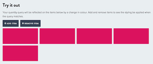
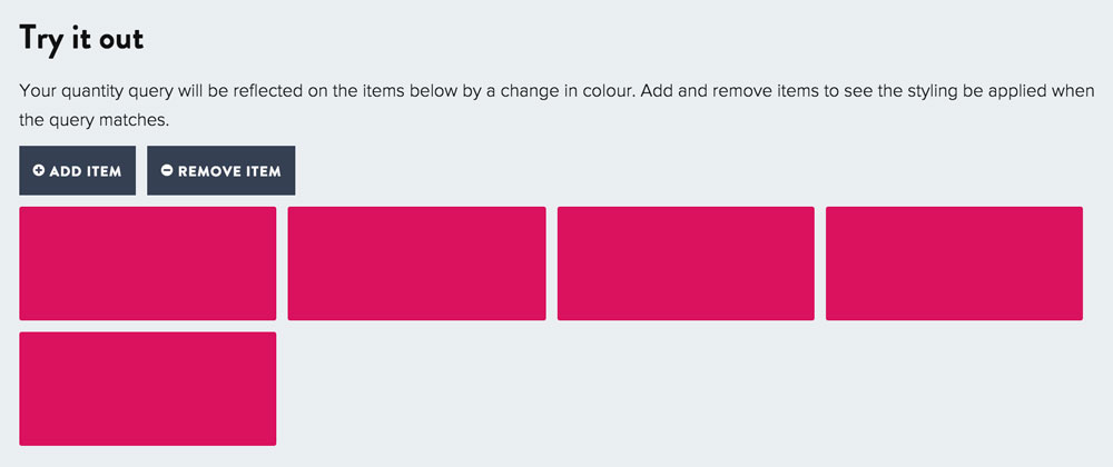
The app allows a query to be built through three questions: the elements to be counted, the type of query, and the amount of items to count. Based on the questions, a CSS selector is created that can be used within your project, as well as a small demo that will react to your query.
Within the demo, as items are added or removed, the colour of the items will change to pink to reflect the query being applied to the demo.
“But I Have To Support Browser X…”
Quantity queries are constructed using modern CSS properties to perform the selection. They will work in all modern browsers (both desktop and mobile, including Opera Mini 8), back to IE9. Selectors such as nth-last-child(), ~ and last-child were introduced in CSS3, and first-child was introduced by CSS2.1. Obviously you can treat them as progressive enhancement, but if you absolutely have to support legacy browsers, you can use Selectivizr and Modernizr.
Using It Today
Feel free to bookmark the site and keep it handy in your toolbelt. Each project has different requirements and will need to be tailored to client needs, but the tool might come in handy when you need a quite complex selector and don’t want to spend hours figuring out the math. You can also use Lea Verou’s CSS3 structural pseudo-class selector tester, CSS Tricks’ :nth tester and nth-test for testing.
If you would like to help improve the tool or you discover any bugs, you can help improve the app, or report any issues. I hope that the project will be helpful for your projects!
Further Reading
- It’s Time To Start Using CSS Custom Properties
- Quantity Ordering With CSS
- How To Scale React Applications
- Truly Fluid Typography With vh And vw Units
 (og, mrn)

