Designing A Flexible, Maintainable CSS Pie Chart With SVG

Email Newsletter
Weekly tips on front-end & UX.
Trusted by 200,000+ folks.

 Flexible CMS. Headless & API 1st

Pie charts, even in their simplest two-color form, have traditionally been anything but simple to create with web technologies, despite being incredibly common for information ranging from simple stats to progress indicators and timers. Implementations usually involved either using an external image editor to create multiple images for multiple values of the pie chart, or large JavaScript frameworks designed for much more complex charts.
Although the feat is not as impossible as it once was, there’s still no simple one-liner for it. However, there are many better, more maintainable ways to achieve it today.
Creating Cel Animations With SVG
What if there was an image format like GIF, but it worked with vectors? The image format, SVG, already exists. Let’s take a somewhat primitive art and breath new life into it.
Transform-Based Solution
This solution is the best in terms of markup: it only needs one element and the rest is done with pseudo-elements, transforms and CSS gradients. Let‘s start with a simple element:
<div class="pie"></div>
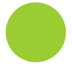
For now, let’s assume we want a pie chart that displays the hardcoded percentage 20%. We will work on making it flexible later. Let’s first style the element as a circle, which will be our background (Figure 1):
.pie {
  width: 100px; height: 100px;
  border-radius: 50%;
  background: yellowgreen;
}
Our pie chart will be green (specifically yellowgreen) with brown (#655) showing the percentage. We might be tempted to use skew transforms for the percentage part, but as a little experimentation shows, they prove to be a very messy solution. Instead, we will color the left and right parts of our circle in our two colors, and use a rotating pseudo-element to uncover only the percentage we need.
To color the right part of our circle brown, we will use a simple linear gradient:
background-image:
  linear-gradient(to right, transparent 50%, #655 0);
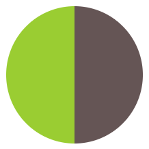
As you can see in Figure 2, this is all that’s needed. Now, we can proceed to styling the pseudo-element that will act as a mask:
.pie::before {
  content: ’;
  display: block;
  margin-left: 50%;
  height: 100%;
}
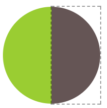
You can see in Figure 3 where our pseudo-element currently lies relative to the pie element. Currently, it’s not styled and it doesn’t cover anything. It’s merely an invisible rectangle. To start styling it, let’s make a few observations:
- Because we want it to cover the brown part of our circle, we need to apply a green background to it, using
background-color: inheritto avoid duplication, as we want it to have the same background color as its parent. - We want it to rotate around the circle’s center, which is on the middle of the pseudo-element’s left side, so we should apply a
transform-originof0 50%to it, or justleft. - We don’t want it to be a rectangle, as it makes it bleed past the edges of the pie chart, so we need to either apply
overflow: hiddento the.pie, or an appropriateborder-radiusto make it a semicircle.
Putting it all together, our pseudo-element’s CSS will look like this:
.pie::before {
  content: ’;
  display: block;
  margin-left: 50%;
  height: 100%;
  border-radius: 0 100% 100% 0 / 50%;
  background-color: inherit;
  transform-origin: left;
}
Note: Take care not to usebackground: inherit;, instead of thebackground-color: inherit;, otherwise the gradient will be inherited too!
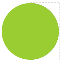
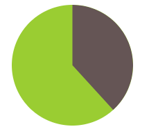
Our pie chart currently looks like Figure 4. This is where the fun begins! We can start rotating the pseudo-element, by applying a rotate() transform. For the 20% we were trying to achieve, we can use a value of 72deg (0.2 × 360 = 72), or .2turn, which is much more readable. You can see how it looks for a few other values as well, in Figure 5.
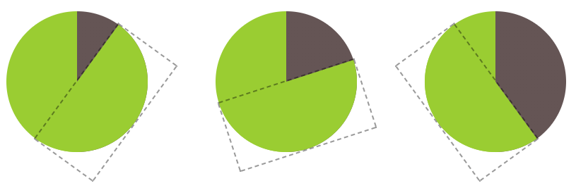
36deg or .1turn), 20% (72deg or .2turn), 40% (144deg or .4turn)We might be tempted to think we’re done, but unfortunately it’s not that simple. Our pie chart works great for displaying percentages from 0 to 50%, but if we try to depict a 60% rotation (by applying .6turn), Figure 6 happens. Don’t lose hope yet, though, as we can — and we will — fix this!
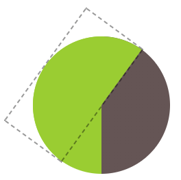
If we think about 50%–100% percentages as a separate problem, we might notice that we can use an inverted version of the previous solution for them: a brown pseudo-element, rotating from 0 to .5turn, respectively. So, for a 60% pie, the pseudo-element code would look like this:
.pie::before {
  content: ’;
  display: block;
  margin-left: 50%;
  height: 100%;
  border-radius: 0 100% 100% 0 / 50%;
  background: #655;
  transform-origin: left;
  transform: rotate(.1turn);
}
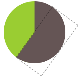
You can see this in action in Figure 7. Because we’ve now worked out a way to depict any percentage, we could even animate the pie chart from 0% to 100% with CSS animations, creating a fancy progress indicator:
@keyframes spin {
  to { transform: rotate(.5turn); }
}

@keyframes bg {
  50% { background: #655; }
}

.pie::before {
  content: ’;
  display: block;
  margin-left: 50%;
  height: 100%;
  border-radius: 0 100% 100% 0 / 50%;
  background-color: inherit;
  transform-origin: left;
  animation: spin 3s linear infinite,
             bg 6s step-end infinite;
}
Animated Pie
All this is good, but how do we style multiple static pie charts with different percentages, which is the most common use case? Ideally, we want to be able to type something like this:
<div class="pie">20%</div>
<div class="pie">60%</div>
…and get two pie charts, one showing 20%, and the other one showing 60%. First, we will explore how we can do it with inline styles, and then we could always write a short script to parse the text content and add said inline styles, for code elegance, encapsulation, maintainability, and perhaps most importantly, accessibility.
The challenge to controlling the pie chart percentage with inline styles is that the CSS code that is responsible for setting the percentage is set on the pseudo-element. As you already know, we cannot set inline styles on pseudo-elements, so we need to be inventive.
Note: You can use the same technique for other cases where you want to use values from a spectrum without repetition and complex calculations, as well as for debugging animations by stepping through them. View a simpler, isolated example of the technique.
The solution comes from one of the most unlikely places. We are going to use the animation we already presented, but it will be paused. Instead of running it like a normal animation, we are going to use negative animation delays to step through to any point in the animation statically and stay there. Confused? Yes, a negative animation-delay is not only allowed by the specification, but is very useful for cases like this:
"A negative delay is valid. Similar to a delay of ‘0s’, it means that the animation executes immediately, but is automatically progressed by the absolute value of the delay, as if the animation had started the specified time in the past, and so it appears to start partway through its active duration."
—CSS Animations Level 1Because our animation is paused, the first frame of it (defined by our negative animation-delay), will be the only one displayed. The percentage shown on the pie chart will be the percentage of the total duration our animation-delay is. For example, with the current duration of 6s, we would need an animation-delay of -1.2s to display a 20% percentage. To simplify the math, we will set a duration of 100s. Keep in mind that because the animation is paused forever, the duration we specify has no other effect.
There is one last issue: the animation is on the pseudo-element, but we want to set an inline style on the .pie element. However, because there is no animation on the <div>, we can set the animation-delay on that as an inline style, and then use animation-delay: inherit; on the pseudo-element. To put it together, our markup for the 20% and 60% pie charts will look like this:
<div class="pie"
     style="animation-delay: -20s"></div>
<div class="pie"
     style="animation-delay: -60s"></div>
And the CSS code we just presented for this animation would now become (not including the .pie rule, as that stays the same):
@keyframes spin {
  to { transform: rotate(.5turn); }
}

@keyframes bg {
  50% { background: #655; }
}

.pie::before {
  /* [Rest of styling stays the same] */
  animation: spin 50s linear infinite,
             bg 100s step-end infinite;
  animation-play-state: paused;
  animation-delay: inherit;
}
At this point, we can convert the markup to use percentages as content, as we originally aimed for, and add the animation-delay inline styles via a simple script:
$$('.pie').forEach(function(pie) {
  var p = parseFloat(pie.textContent);
  pie.style.animationDelay = '-' + p + 's';
});
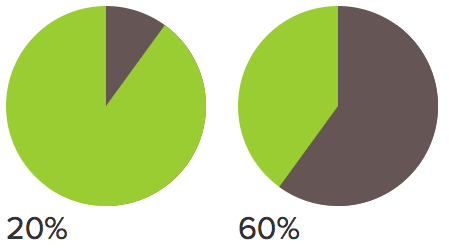
Note that we left the text intact, because we need it for accessibility and usability reasons. Currently, our pie charts look like Figure 8. We need to hide the text, which we can do accessibly via color: transparent, so that it remains selectable and printable. As extra polish, we can center the percentage in the pie chart, so that it’s not in a random place when the user selects it. To do that, we need to:
- Convert the pie’s
heighttoline-height(or add aline-heightequal to theheight, but that’s pointless code duplication, becauseline-heightwould set the computed height to that as well). - Size and position the pseudo-element via absolute positioning, so that it doesn’t push the text down
- Add
text-align: center;to horizontally center the text.
The final code looks like this:
.pie {
  position: relative;
  width: 100px;
  line-height: 100px;
  border-radius: 50%;
  background: yellowgreen;
  background-image:
    linear-gradient(to right, transparent 50%, #655 0);
  color: transparent;
  text-align: center;
}

@keyframes spin {
  to { transform: rotate(.5turn); }
}
@keyframes bg {
  50% { background: #655; }
}

.pie::before {
  content: ’;
  position: absolute;
  top: 0; left: 50%;
  width: 50%; height: 100%;
  border-radius: 0 100% 100% 0 / 50%;
  background-color: inherit;
  transform-origin: left;
  animation: spin 50s linear infinite,
             bg 100s step-end infinite;
  animation-play-state: paused;
  animation-delay: inherit;
}
SVG Solution
SVG makes a lot of graphical tasks easier and pie charts are no exception. However, instead of creating a pie chart with paths, which would require complex math, we are going to use a little trick instead.
Let’s start with a circle:
<svg width="100" height="100">
<circle r="30" cx="50" cy="50" />
</svg>
Now, let’s apply some basic styling to it:
circle {
  fill: yellowgreen;
  stroke: #655;
  stroke-width: 30;
}
Note: As you might know, these CSS properties are also available as attributes on the SVG element, which might be convenient if portability is a concern.

#655 strokeYou can see our stroked circle in Figure 9. SVG strokes don’t just consist of the stroke and stroke-width properties. There are many other less popular stroke-related properties to fine-tune strokes. One of them is stroke-dasharray, intended for creating dashed strokes. For example, we could use it like this:
stroke-dasharray: 20 10;

stroke-dasharrayThis means we want dashes of length 20 with gaps of length 10, like the ones in Figure 10. At this point, you might be wondering what on earth this SVG stroke primer has to do with pie charts. It starts getting clearer when we apply a stroke with a dash width of 0 and a gap width greater than or equal to the circumference of our circle (C = 2πr, so in our case C = 2π × 30 ≈ 189):
stroke-dasharray: 0 189;

stroke-dasharray values and their effect; from left to right:0 189; 40 189; 95 189; 150 189As you can see in the first circle in Figure 11, this completely removes any stroke, and we’re left with just a green circle. However, the fun begins when we start increasing the first value (Figure 11): because the gap is so long, we no longer get a dashed stroke, just a stroke that covers the percentage of the circle’s circumference that we specify.
You might have started to figure out where this is going: if we reduce the radius of our circle enough that it’s completely covered by its stroke, we end up with something that resembles a pie chart quite closely. For example, you can see in Figure 12 how that looks when applied to a circle with a radius of 25 and a stroke-width of 50, like what’s produced by the following code:

<svg width="100" height="100">
  <circle r="25" cx="50" cy="50" />
</svg>
circle {
  fill: yellowgreen;
  stroke: #655;
  stroke-width: 50;
  stroke-dasharray: 60 158; /* 2π × 25 ≈ 158 */
}
Now, turning it into a pie chart like the ones we made in the previous solution is rather easy: we just need to add a larger green circle underneath the stroke, and rotate it 90° counterclockwise so that it starts from the top-middle. Because the <svg> element is also an HTML element, we can just style that:
svg {
  transform: rotate(-90deg);
  background: yellowgreen;
  border-radius: 50%;
}
You can see the final result in Figure 13. This technique makes it even easier to animate the pie chart from 0% to 100%. We just need to create a CSS animation that animates stroke-dasharray from 0 158 to 158 158:
@keyframes fillup {
  to { stroke-dasharray: 158 158; }
}

circle {
  fill: yellowgreen;
  stroke: #655;
  stroke-width: 50;
  stroke-dasharray: 0 158;
  animation: fillup 5s linear infinite;
}
As an additional improvement, we can specify a certain radius on the circle so that the length of its circumference is (infinitesimally close to) 100, so that we can specify the stroke-dasharray lengths as percentages, without having to make calculations. Because the circumference is 2πr, our radius needs to be 100 ÷ 2π ≈ 15.915494309, which for our needs could be rounded up to 16. We will also specify the SVG’s dimensions in the viewBox attribute instead of the width and height attributes, to make it adjust to the size of its container.
After these modifications, the markup for the pie chart of Figure 13 would now become:
<svg viewBox="0 0 32 32">
  <circle r="16" cx="16" cy="16" />
</svg>
And the CSS would become:
svg {
  width: 100px; height: 100px;
  transform: rotate(-90deg);
  background: yellowgreen;
  border-radius: 50%;
}

circle {
  fill: yellowgreen;
  stroke: #655;
  stroke-width: 32;
  stroke-dasharray: 38 100; /* for 38% */
}
Note how easy it now is to change the percentage. Of course, even with this simplification, we don’t want to have to repeat all this SVG markup for every pie chart. It’s time for JavaScript to lend us its helping hand for a little bit of automation. We will write a small script to take simple HTML markup like the following…
<div class="pie">20%</div>
<div class="pie">60%</div>
…and add an inline SVG inside every .pie element, with all necessary elements and attributes. It will also add a <title> element, for accessibility, so that screen reader users can also know what percentage is displayed. The final script will look like this:p>
$$('.pie').forEach(function(pie) {
  var p = parseFloat(pie.textContent);
  var NS = "https://www.w3.org/2000/svg";
  var svg = document.createElementNS(NS, "svg");
  var circle = document.createElementNS(NS, "circle");
  var title = document.createElementNS(NS, "title");
  circle.setAttribute("r", 16);
  circle.setAttribute("cx", 16);
  circle.setAttribute("cy", 16);
  circle.setAttribute("stroke-dasharray", p + " 100");
  svg.setAttribute("viewBox", "0 0 32 32");
  title.textContent = pie.textContent;
  pie.textContent = ’;
  svg.appendChild(title);
  svg.appendChild(circle);
  pie.appendChild(svg);
});
That’s it! You might be thinking that the CSS method is better, because its code is simpler and less alien. However, the SVG method has certain benefits over the pure CSS solution:
- It’s very easy to add a third color: just add another stroked circle and shift its stroke with
stroke-dashoffset. Alternatively, add its stroke length to the stroke length of the circle before (underneath) it. How exactly do you picture adding a third color to pie charts made with the first solution? - We don’t have to take any extra care for printing, as SVG elements are considered content and are printed, just like
<img>elements. The first solution depends on backgrounds, and thus, will not print. - We can change the colors with inline styles, which means we can easily change them via scripting (e.g., depending on user input). The first solution relies on pseudo-elements, which cannot take inline styles except via inheritance, which is not always convenient.
Future Pie Charts
Conical gradients would be immensely helpful here too. All it would take for a pie chart would be a circular element, with a conical gradient of two color stops. For example, the 40% pie chart in Figure 5 would be as simple as:
.pie {
  width: 100px; height: 100px;
  border-radius: 50%;
  background: conic-gradient(#655 40%, yellowgreen 0);
}
Furthermore, once the updated attr() function defined in CSS Values Level 3 is widely implemented, you will be able to control the percentage with a simple HTML attribute:
background: conic-gradient(#655 attr(data-value %), yellowgreen 0);
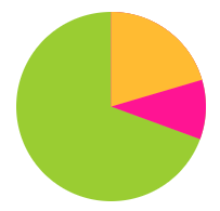
This also makes it incredibly easy to add a third color. For example, for a pie chart like the one shown on the pie chart above, we would just add two more color stops:
background: conic-gradient(deeppink 20%, #fb3 0, #fb3 30%, yellowgreen 0);
Editor’s note: You can use conic gradients today thanks to Lea’s Conic Gradient polyfill, published shortly after her SmashingConf talk. And this is how you would design a simple pie chart with CSS! What method would you use and why? Or perhaps you’ve come up with an entirely different solution? Let us know in the comments to this post!
Further Reading
- Those HTML Attributes You Never Use
- An Introduction To AWS Cloud Development Kit (CDK)
- GraphQL On The Front-End (React And Apollo)
- Creating A Magento PWA: Customizing Themes vs. Coding From Scratch
 (vf, ml, mh, og, il, mrn)

