Beyond The Boring: The Hunt For The Web’s Lost Soul

Email Newsletter
Weekly tips on front-end & UX.
Trusted by 200,000+ folks.


 Flexible CMS. Headless & API 1st
Has web design lost its soul? And is responsive design to blame? These questions, posed by my friend and colleague Noah Stokes, are provocative to say the least. After all, the responsive web has made browsing on our ever increasing collection of Internet-connected screens not only possible, but enjoyable.
Our priority as designers must be to solve problems; perhaps more than anything else, this is what we do. Responsive web design is a fantastic solution to the problem of creating virtual experiences that adapt to different devices. There are other problems out there that we’re called on to solve, though, not least of which is to make content of all kinds appear interesting and engaging. A page of plain text becomes a beautiful blog post, a mess of unconnected JPGs becomes a professional portfolio.
The question, then, becomes: can we succeed at solving both of these problems?
What We’ve Gained
There’s no doubt about it, the web has become an aesthetically beautiful place. Simple, attractive sites that are built on solid grid layouts have become the standard. The wild west of the web has been tamed. Law and order in the form of frameworks and fluid grids have taken over and peace reigns throughout the land.
All of this is a good thing. The benefits of simple, attractive sites are both clear and plentiful:
- Familiar and easy for users to navigate (when done correctly).
- Prototyping is (relatively) fast and easy.
- Heavy standardization of site-building techniques (assembly lines have replaced artisans).
- Fast layout leads to big cost savings (which may or may not be passed down to the customer).
- Strict grid layouts lend themselves to responsive design (the minimal layout trend is driven heavily by this need).
It can’t be overstated that there is immense value in standardization and associated techniques. Countless individuals and small businesses benefit from having simple, attractive (and not at all unique) sites to share their brand with the world. However, that’s just one side of the story.
What We’ve Lost
Taken in individual doses, the average professional website today looks great. Compare even a lowly designer’s portfolio site today to the best design agency sites ten years ago, and you’ll have to concede that we’ve gotten a lot better at this web design thing. However, as you look around, it’s easy to come to the conclusion that everything is starting to look the same.
Have designers lost that pioneer spirit? Has creativity been sacrificed on the altar of convenience? Before answering these questions, let’s take a look at what’s causing the lack of variation in web design today.
Reasons Why Sites All Look The Same
What’s the driving force behind the feeling of sameness that we get as we look around the web today? What’s to blame? As it turns out, it’s not as simple as pinning it all on one tool or method. RWD might contribute, but it’s just one item in a long list. Here are a few of the likely suspects.
Layout
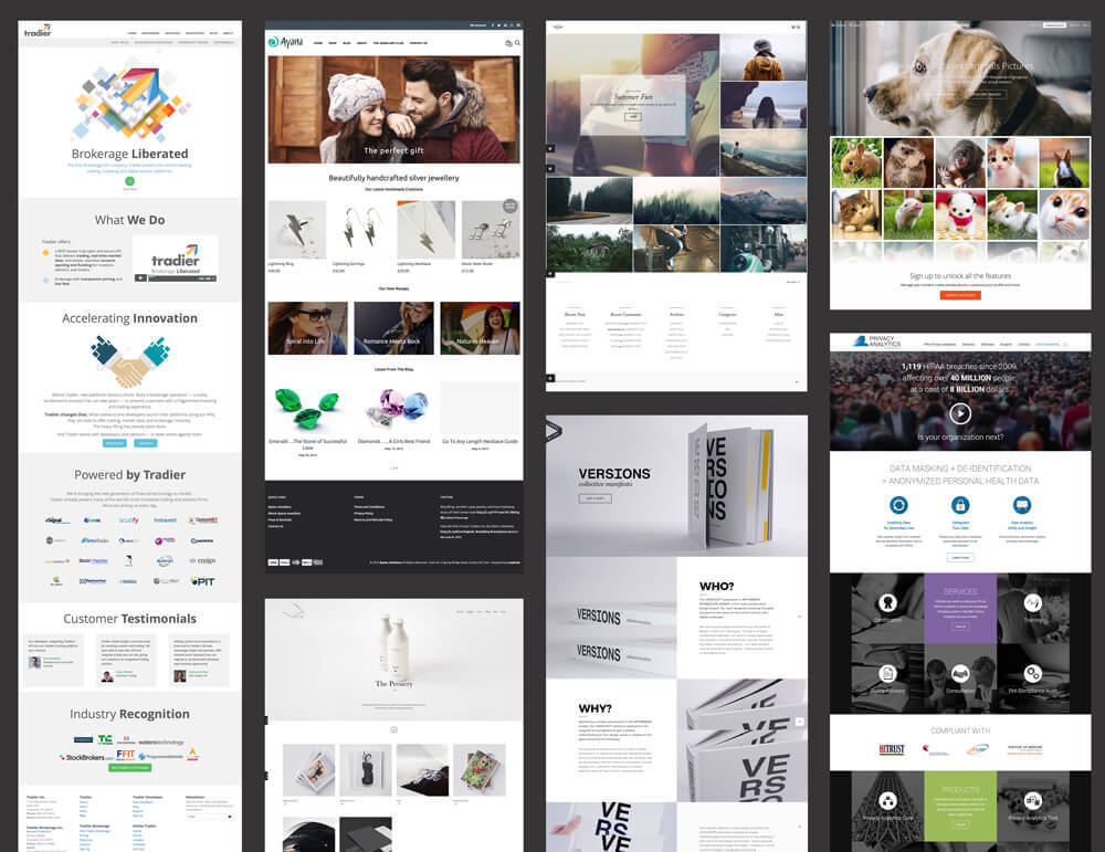
Limited layout ideas are one of the most prominent and obvious reasons for a lack of variation on the web. Strip out colors, animations, parallax scrolling effects and the like, and you start to see that a few basic layouts rule the web. How many sites can you name that use only slight variations of these five layouts?
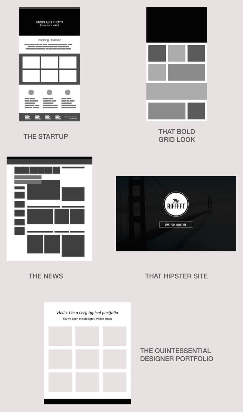
This is what Noah meant when he lamented that all he saw were “boxes and grids everywhere.” We seem to have reached a stagnation point where unique layouts are a lost art.
Responsive Web Design
Once upon a time, you could guarantee that everyone visiting your website would be doing so on a low-resolution desktop computer screen. These days, websites that look great on almost any viewport at any resolution aren’t a luxury, they’re a necessity. Basic, fluid-width, collapsing grids make responsive web design a much simpler process than more organic layouts.
Frameworks
Web design frameworks have the potential to rapidly speed up both design and development workflows. For many, they’re the safest, most straightforward route to a responsive, cross-browser website. As a bonus, they also take care of simple styling for all manner of common elements, from buttons to forms. The incredible popularity of tools like Bootstrap and Foundation leads to thousands of web designers using the exact same codebase, layouts, and even aesthetic style on every project they take on.
Prototyping Tools And Processes
Even our blank-canvas design process has intentionally reduced creativity from the design process. Most prototyping tools encourage and perhaps even force you to use standardized, boxy elements that conform to strict grid layouts.
High-Quality Free Photos And Graphics
Never before have beautiful, free design assets been so readily available. Again, convenience and affordability reign supreme, so we see designers flocking to free photo sites, pulling from the same small (but growing) pool of resources.
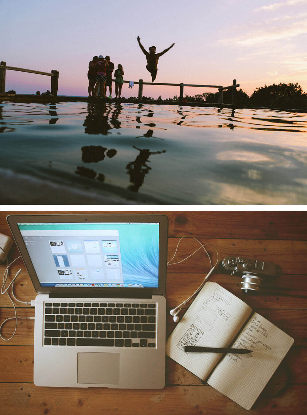
In the last two years, how many sites have you seen using one (or both) of the two photos above? If you browse the web regularly, I’d wager the number is in the dozens.
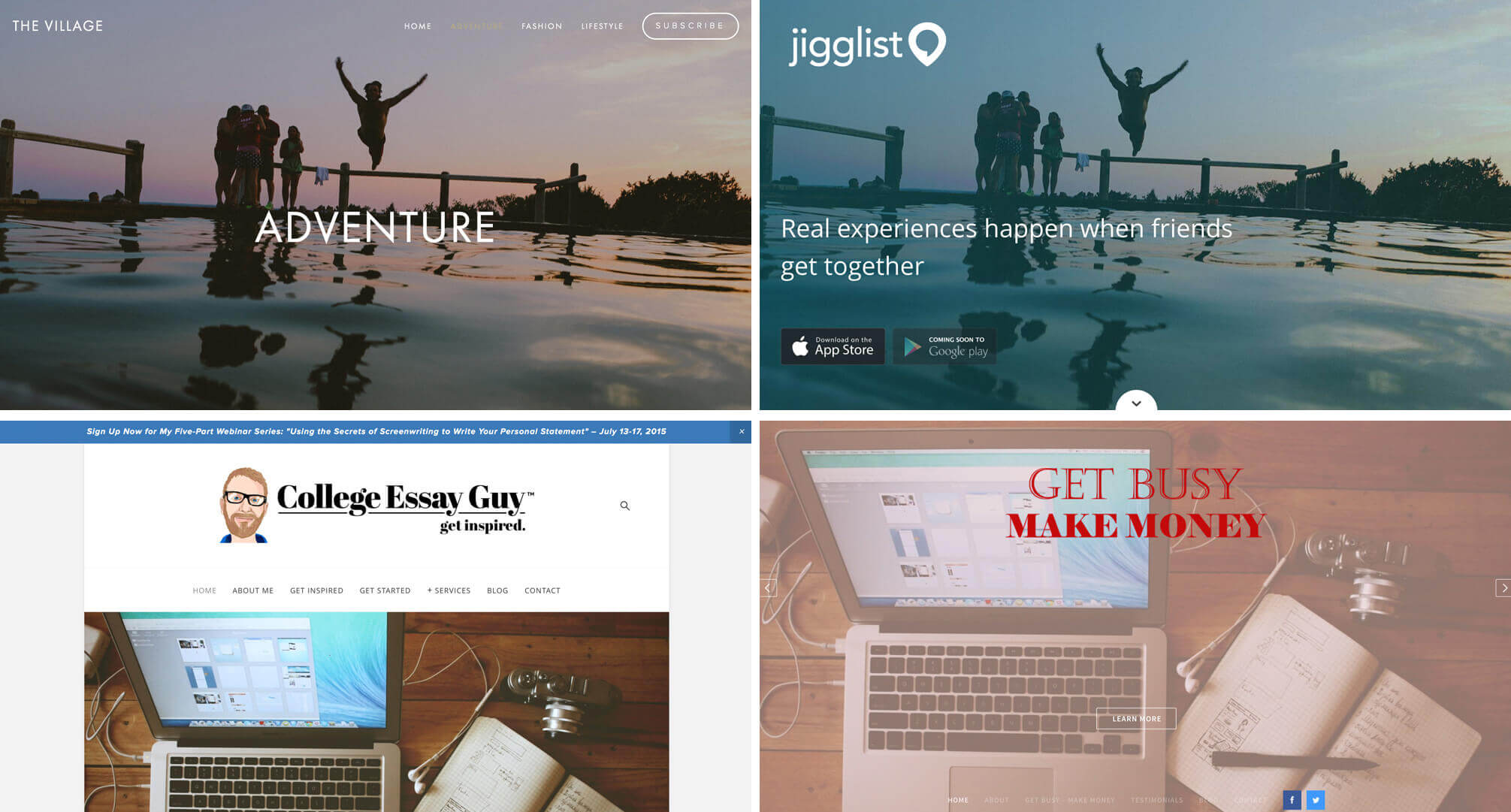
This goes way beyond photos, extending to icons, fonts, patterns, and so on. The upside here is that designers with zero budget can still make great looking sites; the downside is that every other designer is doing the same thing with the same resources.
Design Trends
To some designers, “trend” is a dirty word. It shouldn’t be though. Pick a decade in the 20th century and examine its design trends. What you find is fascinating. It gives that time period its own distinct style and personality, and is often a reflection of the entire culture. Even if you can’t see it, it’s happening right now in your work. Everything you see and experience is affecting what you do, and the web amplifies this like never before. The result is a lot of designers gaining inspiration from the same sources and pursuing the same trends.
You And Me
Every tool and resource listed above is incredibly valuable. These things make our jobs easier, open up web design and development to more people, and save clients money. I didn’t choose them arbitrarily, I use them. If we’re looking for someone to blame for a lack of variation in web design, I’ll raise my hand. It’s me. And while I don’t think every project merits a unique design, I’d like to tip my hat to the designers out there who are trying to do something more interesting.
It’s also important to note that you can use any or all of the above and still create a unique design. It’s all in how you wield the tools that are available to you.
How To Challenge The Status Quo
At this point, you’ve already decided whether or not you care if your site designs are unique. Maybe that’s not your thing — that’s completely acceptable. If you find yourself wanting to break out of your typical workflow, though, here are a few ideas to get you going and some sites that serve as great examples.
Get Weird With Layout
Close your prototyping app, take out a pen and some paper, and think about how you can make an interesting, usable layout that’s not something you’ve ever done before.
Phases Magazine
Phases Magazine is a good example of a site doing something unexpected with layout. It’s boxy — there is a grid at play here — and yet somehow they made it feel totally outside the typical web design experience (the screenshot doesn’t really give you a good feel for it; be sure to visit the site). If you see this and think, “Whoa, that’s weird,” good! That’s what they’re going for. Some will love it, some will hate it, but I really like that they’re trying something different.
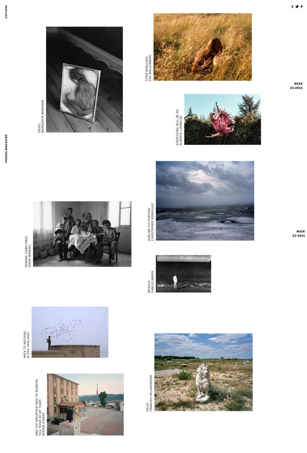
Unfortunately, the site’s overall experience is quite poor. There’s some unnecessary scrolljacking, and the seemingly responsive layout breaks massively in certain viewports.

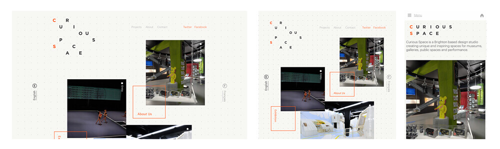
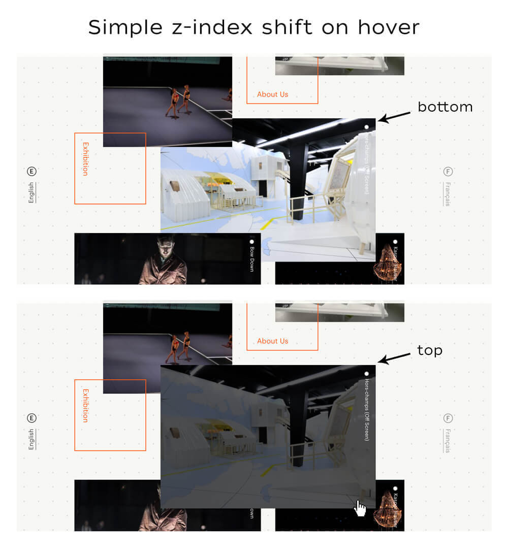
Curious Space
A better implementation of a similar idea is Curious Space.
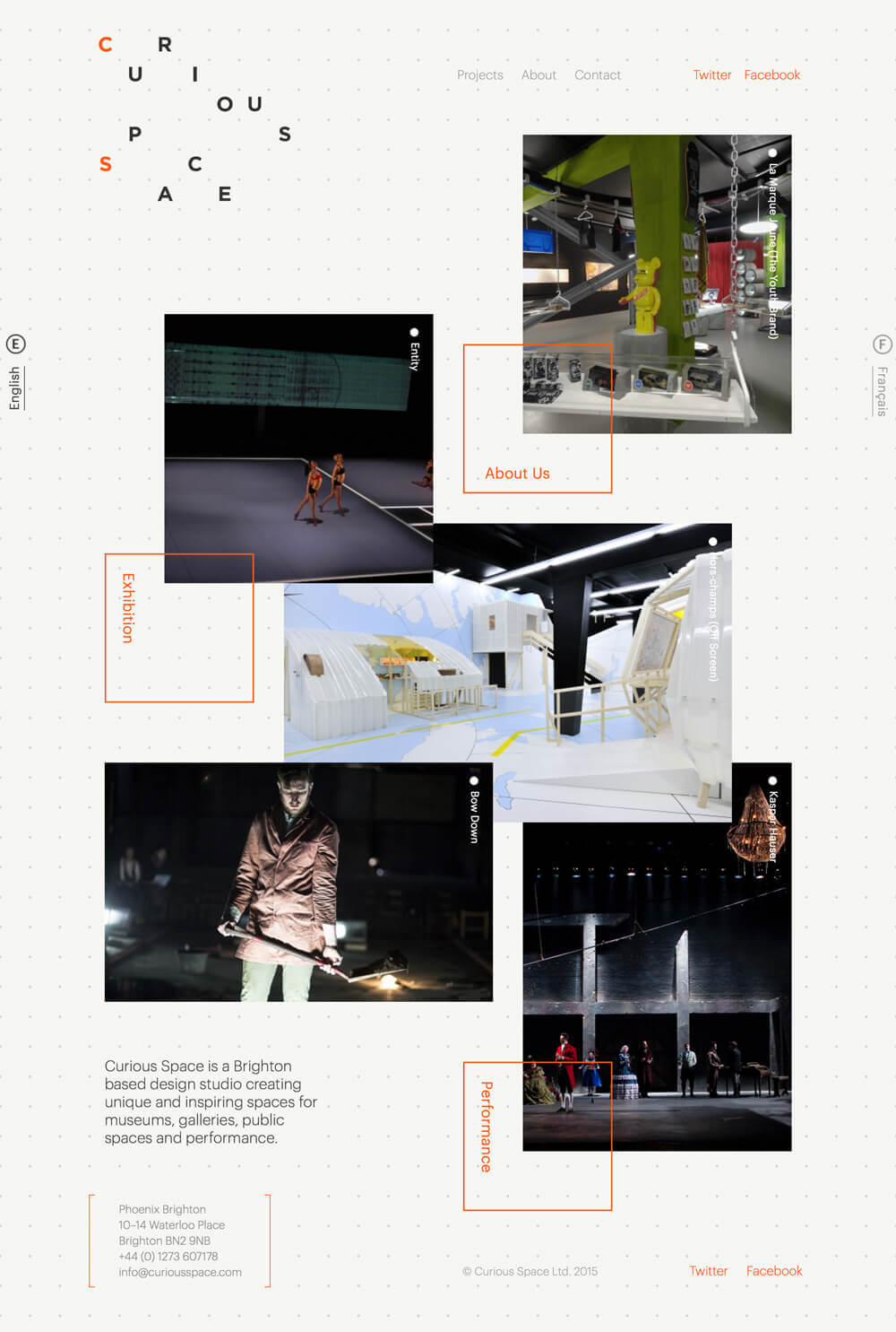
Here the grid still has a more organic feel, but scrolling functionality is normal and the breakpoints are perfectly functional.
There are a lot of nice little design touches that you notice as you interact with the site. For instance, the image stack order changes on hover:
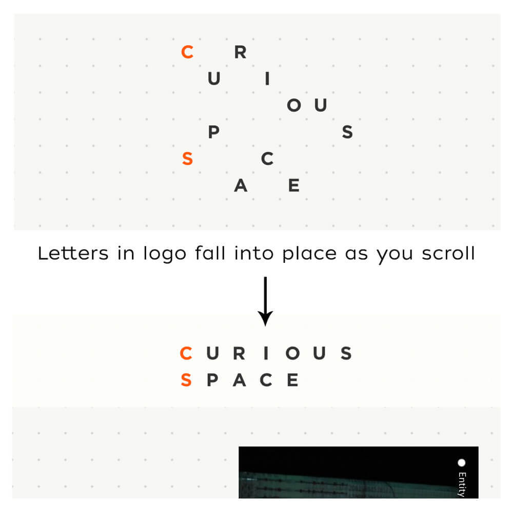
Also, they have a bit of fun with scrolling, but it’s not disrupting in the least, and it fits with the haphazard visual theme of the site. The logo starts off as a jumble of letters, but as you scroll, they fall into place and form “Curious Space” in the navigation bar.
Le Temps D’un Trajet
Another interesting example is Le Temps d’un trajet. Once again, we see a non-standard grid, but instead of being sporadic, the layout is more intentional and clustered.
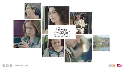
Each block in the arrangement is a static image that turns into a short video on hover. The coolest part, though, is how the grid shifts fluidly to accommodate focusing on different nodes.
Don’t Be A Square
One easy way to give your site a different atmosphere is to think outside the box. As cringeworthy as that sounds, when you open yourself up to different geometry, things can get really interesting.
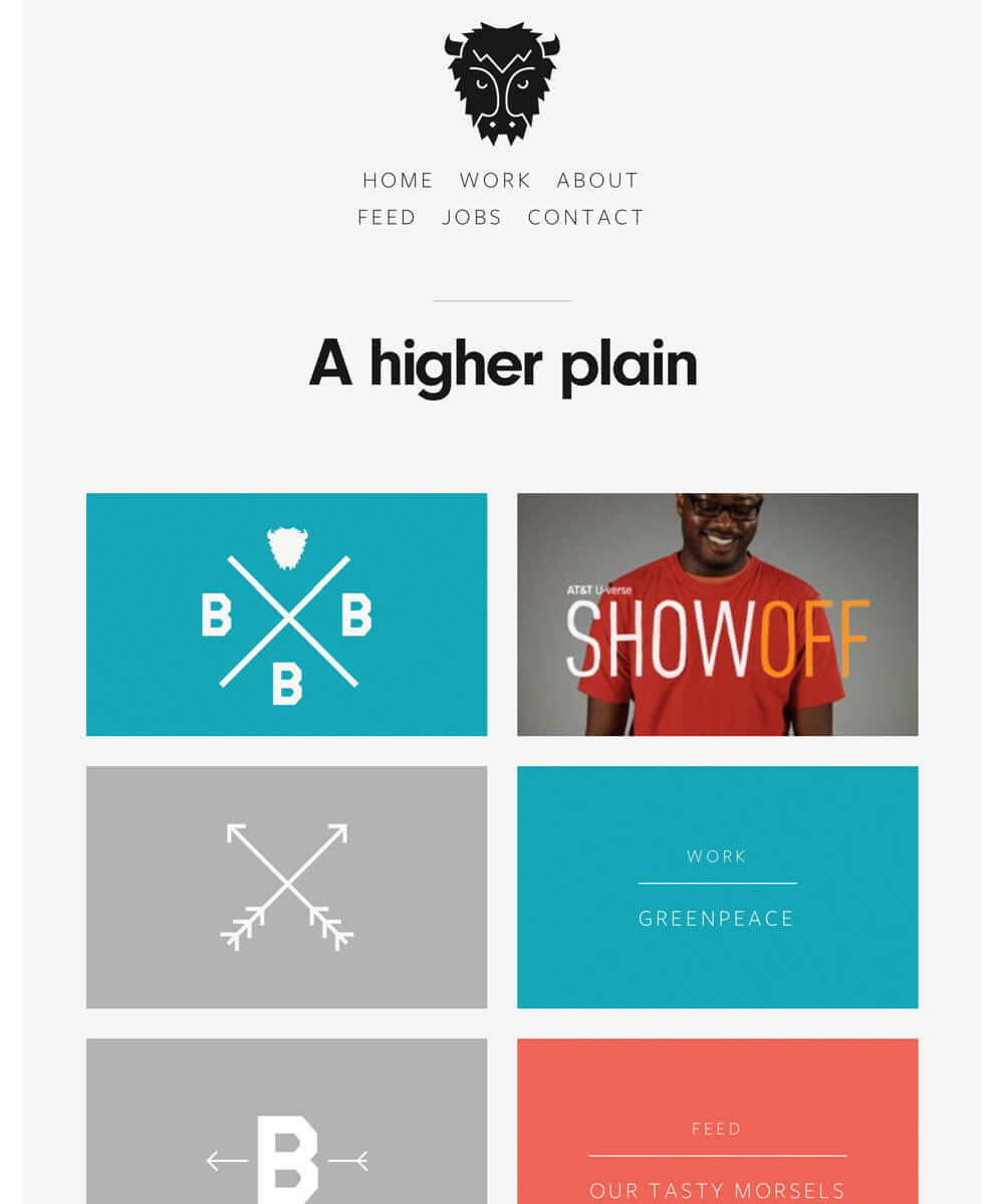
Built By Buffalo
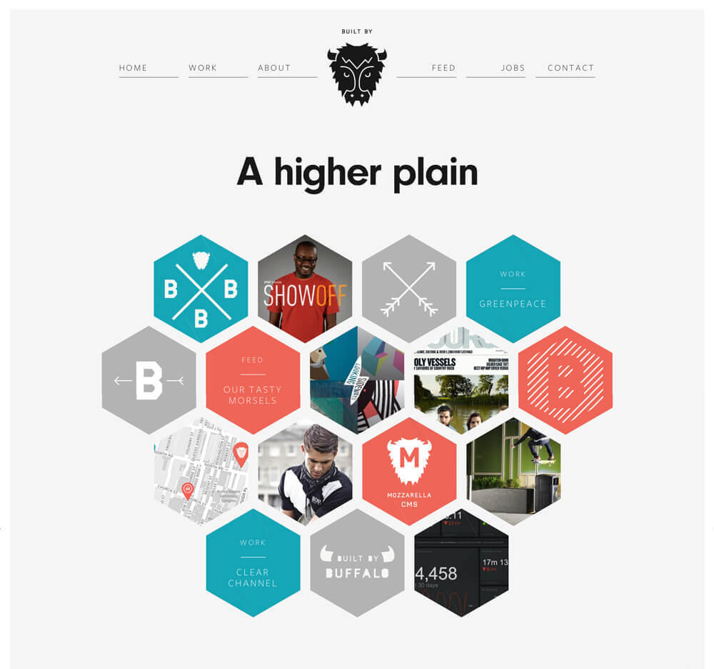
Check out the hexagon hive that Built By Buffalo has going on. This gallery design doesn’t translate nicely to mobile, so they simply switch to rectangles at one of their breakpoints. This is a great example of doing something unique where appropriate, but realizing where the boundary should be drawn to give your users the best possible experience.
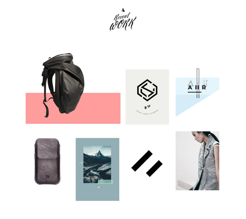
Anakin Design Studio
One of my favorite sites in this vein that I’ve seen recently is Anakin Design Studio. Not only is the layout beautiful and unpredictable, the shapes at play here are all far outside what you’d expect scrolling through today’s websites.
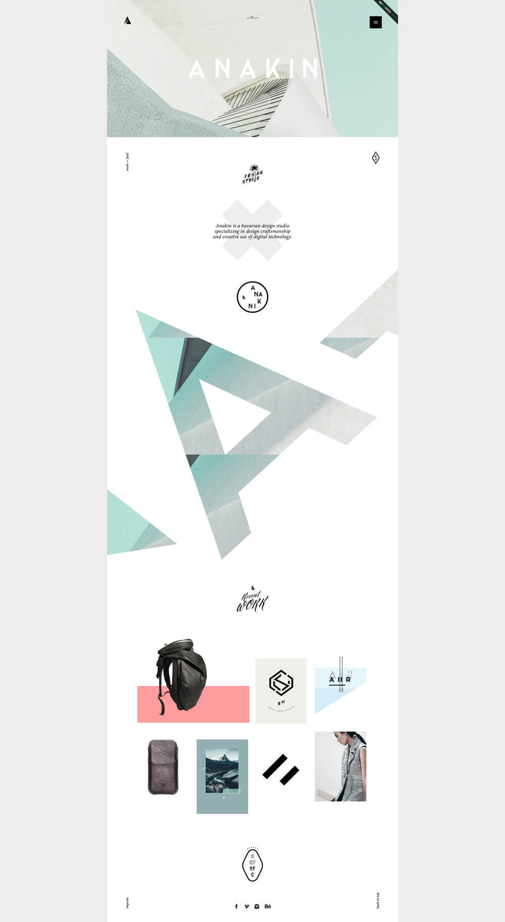
As you can see, the huge, masked typography makes a bold impression. Beyond that though, if you move down the page you see a display of recent work. Most designers would put a simple rectangular thumbnail grid here and call it a day, but Anakin has played with the shapes to make it a lot more interesting. They’re still rectangular images, but they’ve used white backgrounds to create the illusion of varying shapes.
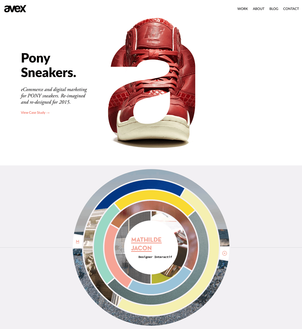
Avex Designs; Mathilde Jacon
Here are some other sites doing unexpected experiments with interesting shapes.
Go Organic
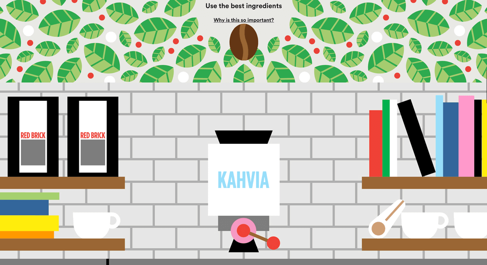
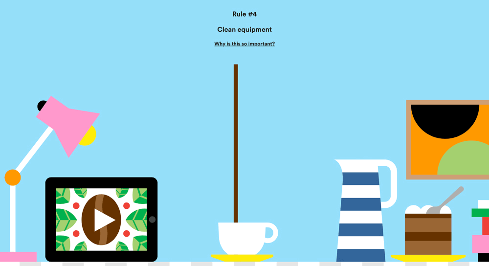
Fixate; For Better Coffee
Sites like Fixate and For Better Coffee combine illustration with organic, crazy-busy layouts that make for powerful and memorable experiences.
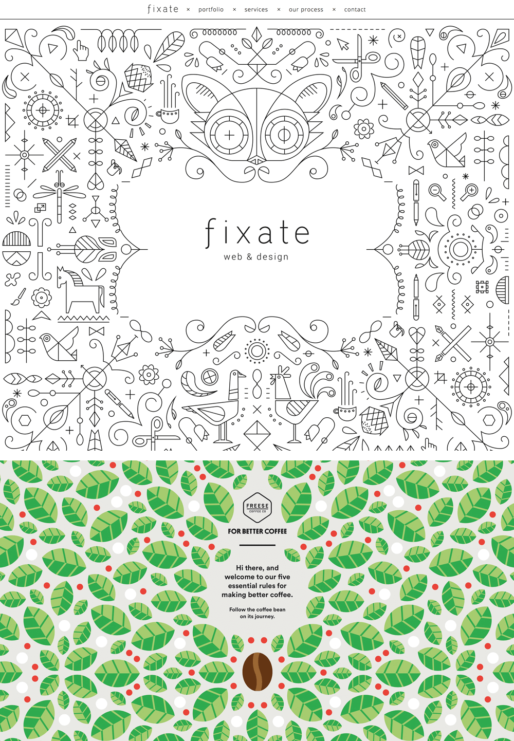
The layouts above only seem complex because of the artwork; in reality, they can be pulled off fairly easily. Custom illustration work is a fantastic way to communicate a unique brand personality in a world lost in minimal thumbnail grids that all look the same.
For Better Coffee uses entertaining animations to track the coffee bean through the coffee creation process as you scroll. The experience is smooth, and it doesn’t jump the page to predefined points, so scrolling becomes a story-telling feature.
HappyFunCorp
While we’re on the topic of beautifully illustrated sites, you should check out HappyFunCorp.
At first, it seems like a fairly normal site with some fun little animations. The cool part happens when you start to navigate. The scene on the homepage serves as the basis for the rest of the site, so when you follow a link, instead of loading a brand-new page it zooms in to a detail of the whole scene.
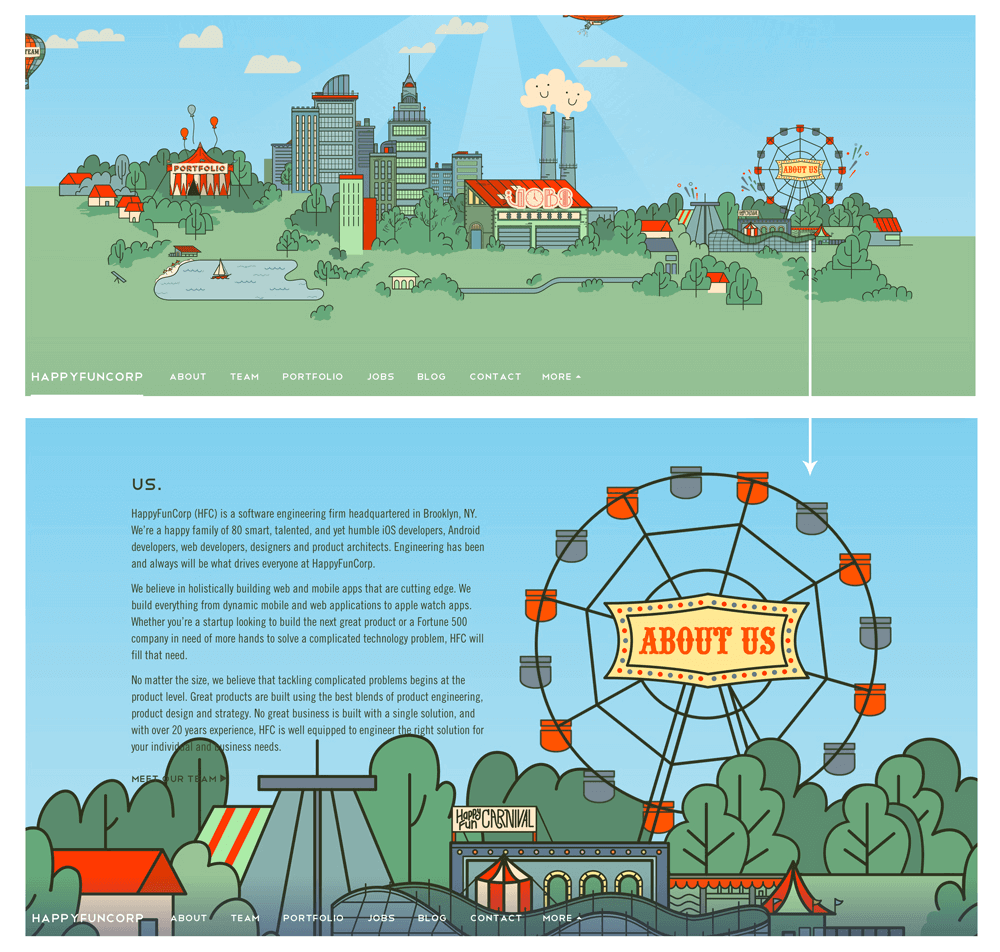
It’s quirky, but I love the original thinking that went into it. Also, because the navigation is still presented in a standard way means that there’s no learning curve for users. The whole experience in delightfully unexpected, but in a way that doesn’t contradict how you normally interact with a site.
Vary The Experience
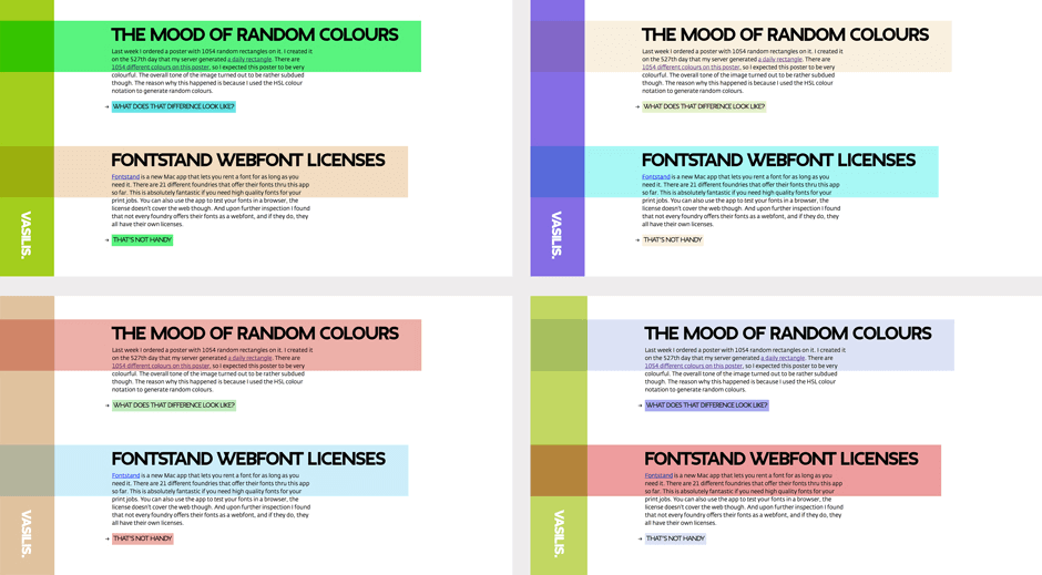
One basic expectation that users have is that everyone who lands on the same site will receive the same experience; a fun way to do something different is to toss that out the window. Vasilis van Gemert’s site not only uses a unique, overlapping box layout, it also changes its entire color scheme for every visit.
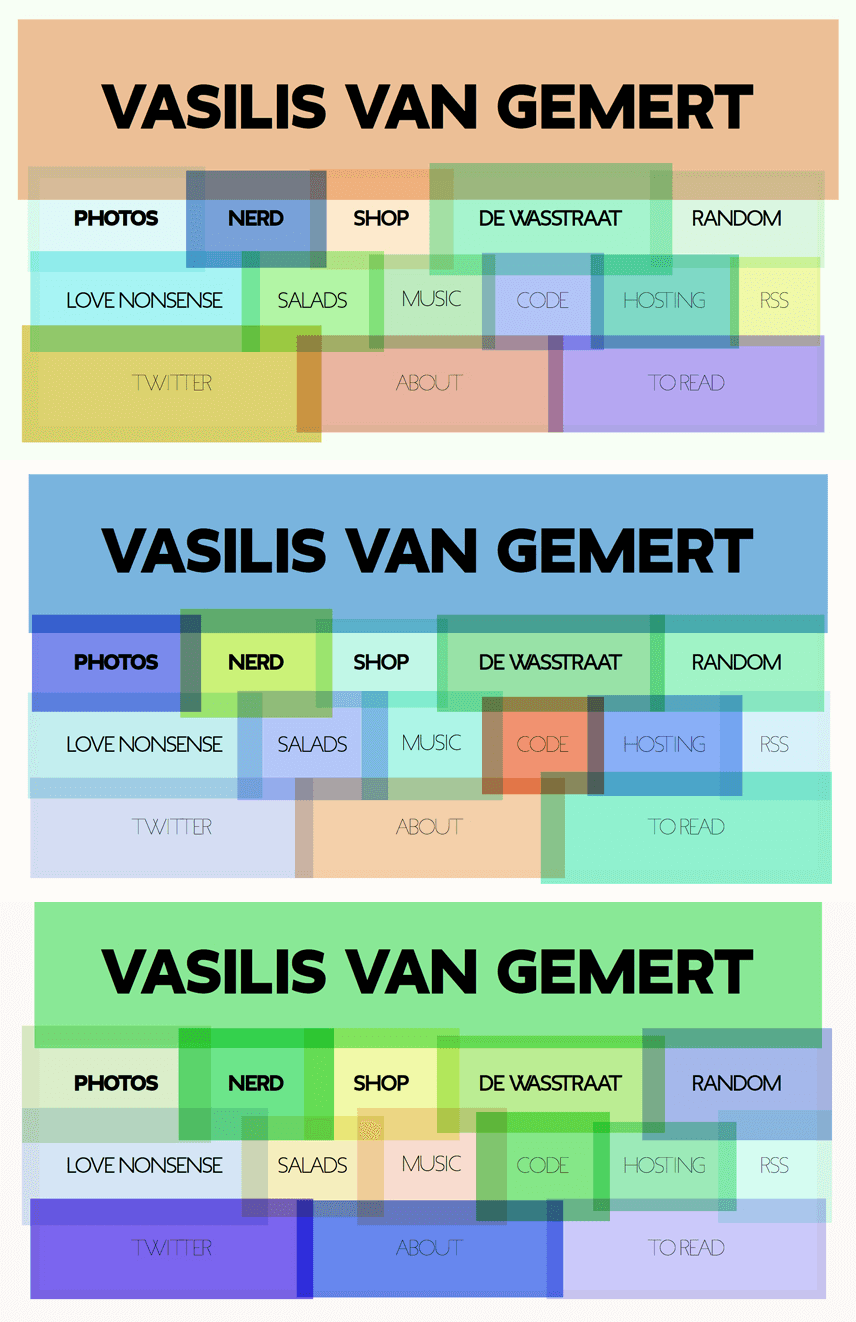
This creative feature extends beyond the homepage to all of the major subpages.
Create A Unique Visual Theme
Another way to make your site design unique is to decide on an entertaining or interesting theme that you can use as the basis of all your design decisions. This provides a nice framework for everything you do and encourages you to explore beyond traditional UI.
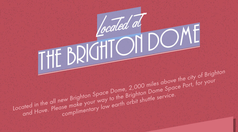
While not appropriate for all sites (a government website, for instance), for things like event announcements or small company pages it can be refreshing. The new site for dConstruct 2015 is a great example of this idea.
As you can see, they went for a retro-futuristic vibe, heavily reminiscent of The Jetsons. The result is a site that’s flat out fun to scroll through as you discover the how they present each new section.
There are a couple of really great things to note about this site. First of all, the headline treatments are wonderfully retro, using a combination of Lamplighter Script and Andes.
The best part, though, is that these are live web fonts with the diagonal direction implemented via a simple CSS skew. The repetition of diagonal lines throughout the site helps the design feel both consistent and creative.
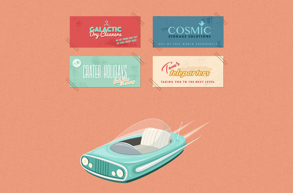
This site is a great example of how responsive design doesn’t have to be boring. The layout doesn’t feel boxy or typical, and yet it manages to reflow nicely to any viewport size. In fact, I really love how creative they were with transforming elements for smaller screens. For instance, as your viewport shrinks, the ticket graphic shown below jumps into an animated transform that shifts from horizontal to vertical orientation. It’s a tiny detail, but it’s clever and shows how much thought was put into every aspect of the layout.
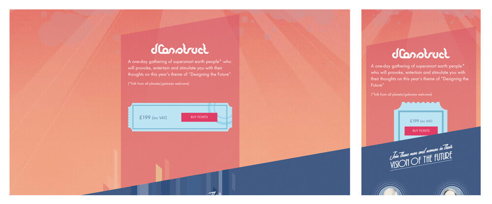
Hats off to Clearleft for the great work on this one.
Use Stock As An Input, Not An End Result
I work at Creative Market, so I’m absolutely in favor of using great stock graphics, fonts, photos, and more. Quality stock resources can be immensely helpful for every designer, but how you use them is an important consideration. Whether you’re using some interesting vector artwork, an icon set, or a full-blown website theme, consider putting in some extra effort so that your implementation doesn’t look exactly like that of everyone else. The vast majority of people downloading that asset won’t bother with much or any customization, so a little bit goes a long way.
The Trouble With Unique Sites
Finding sites that are truly surprising and unique is a tall order. I put in hours of site searching to prepare for this article and still feel like I have very little to show for it. One overwhelming trend I’ve found is that it often feels like the only designers really pursuing unique web design are producing sites with wonky user experiences.
Experimentation is great, but sites that confuse users with weird, unexpected and unpleasant UX often fall short of their goals. Many of these sites take a step backwards by presenting us with Flash-like experiences: long loading times, overly ornate animations, jumpy scrolling, and complex user flows. There is a middle ground. You can create beautiful, unique looking websites without trying to reinvent the interaction wheel.
Web Design Lives
Standardization and predictable design will always have their place on the web. In fact, they may be the best possible solution for presenting most types of content to most screens. That said, we should let our creative instincts fight it out with our analytical instincts from time to time.
Let’s do our part to make sure the web remains what it has always been: a place for technology, art and design to overlap in new and interesting ways. Be a pioneer, try something you’ve never seen anyone do — and yes, make lots of mistakes along the way. It’s great to create something weird every now and then, even if other people hate it. That’s how this crazy thing called the web was built, and that’s how we’ll keep pushing it forward.
Ultimately, despite the fact that plenty of sites look pretty similar, I don’t believe that web design has reached a point of stagnation. There are countless extremely talented designers creating unbelievable sites, constantly raising the bar for their peers. This topic is wide open for debate, though. I’d love to hear your thoughts about the state of design on the web, and who you think is doing the most interesting work.
Further Reading
- Web Design Is Dead. No, It Isn’t.
- Is The Internet Killing Creativity?
- It’s Not All Doom And Gloom On The Web
- The “Wow” Factor in Web Design
 (ml, og, mrn)

