Think Fast! Using Heuristics To Increase Use Of Your Product

Email Newsletter
Weekly tips on front-end & UX.
Trusted by 200,000+ folks.


 Flexible CMS. Headless & API 1st

 Register!
People have many tough decisions to make; whether they should use your application or website to accomplish a task shouldn’t be one of them. Your design team can take advantage of our knowledge of the human mind and human behavior by accounting for a number of heuristics, or mental shortcuts, that researchers have identified.
You might be familiar with the term “heuristic” from the UX research method of heuristic evaluation. A heuristic evaluation involves experts evaluating the interface and interactions of a system based on accepted usability best practices. Forget about that for now. In psychology, a heuristic is simply a fancy word meaning mental shortcut. We have so many decisions to make on a daily basis; there is no way we could think about all of the pros and cons of each option. Our minds would be overloaded and we would stop functioning. Some of our decisions become habitual and we make them without thinking. We use heuristics for many other decisions that are routine or that we need to make quickly.
Daniel Kahneman and Amos Tversky, two highly regarded academics in the field of economics are responsible for much of what we know about heuristics. In 1979, the researchers published an influential article in the journal Econometrica (PDF). The researchers’ thinking on heuristics and decision-making was well received, with Kahneman being honored with a Nobel Prize in economics based in part on this work.
People frequently use heuristics to make decisions; you should use them to your advantage in your design. Here, we’ll discuss four common heuristics that researchers have identified, with examples of how to address them in digital design.
Default Effect
The default effect is the tendency for people not to adjust the default settings of a product. For example, someone purchasing a new car insurance policy is most likely to default to the most popular policy that meets the minimum standards. Why would they spend time becoming an expert on insurance terminology when the insurance company has clearly labeled one policy as meeting the standard? Similarly, someone purchasing a new stereo might not adjust the factory settings. Most people don’t know much about the intricate details of how to tune a stereo; they would assume that the experts who built the stereo shipped it with the best settings as the default.
Not accounting for the default effect could lead to users experiencing frustration and inconvenience and selecting incorrect options, such as with a household item or a website.
Beyond this, researchers have tied the default effect to life or death consequences. Default settings are credited with affecting public health campaigns (PDF). Researchers studied differences in European countries that have organ donation defaulted to opt-in versus ones defaulted to opt-out. Countries that default to opt-in had statistically significant lower donor rates, when controlling for other relevant variables. It seems that making people opt-in to organ donation is as big of a barrier as making them opt-out. In this situation, making opt-out the default can passively save lives; making opt-in the default can do the opposite.
How The Default Effect Applies To Design
Your product’s default settings are critical; users assume you have their best interests in mind. Jared Spool of UIE reports on a study he conducted that found fewer than 5% of users adjusted any of the default settings in Microsoft Word. At the time, auto-save was defaulted to inactive; people were not actively auto-saving their work because they assumed that functions like that were already defaulted to be active. Similarly, a 2011 study (PDF) found that Facebook users are confused about the privacy settings and usually assume they have more privacy by default than they really do. Account for the users’ best interest when setting defaults — even if it means more work in coding and design.
Each product will have unique needs and options for default settings. Your design team will need to conduct research with users or potential users. Interview or survey as many users as possible to get a feel for the following:
- What default settings do users assume will exist?
- Through which channel do users assume they will receive notifications of product updates (for example, via email or through push notifications)? Is auto-update the preferred default setting?
- Do users assume that your product is pre-set to consume minimal power, or would they prefer the fastest, most-power-consuming experience out of the box?
- Do users assume their posts or comments are shared with only certain groups, or are posts public?
- Do users assume your product automatically backs up information on a regular basis?
- What products will users expect or need yours to be compatible with out of the box? How are you communicating this to them?
- How do users want information to be communicated — including, what default alerts will users receive?
- What is the main context of use? For example, should your product default to invitation-only mode if it is something that enables users to share information or files with others?
Your team can use this information to inform the default settings of your product, as well as to communicate your product to new users. You will need to account for two issues in your communication to users: what the default settings are and how users can change them. You can do this through a comprehensive onboarding experience, one that takes new users through the settings and explains the default options and how to update them. You can also do this through effective messaging and guidance within your product.
Slack, the team communication platform, provides a good example of how to make users aware of the default settings and how to update them. As you can see in the screenshot below, Slack provides clear notifications about settings both within the preferences section and when the product is being used.
Scarcity Heuristic
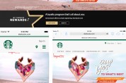
People are motivated to action when they perceive an item’s availability to be limited in quantity or time. People like to feel they are members of an exclusive group or have access to things that others would consider valuable. The more scarce something is perceived to be, the more it is assumed to be valuable, thus promoting action. We see this when an e-commerce website shows us that a product’s quantity is limited or that a limited number of users will have access to a product.
How The Scarcity Heuristic Applies To Design
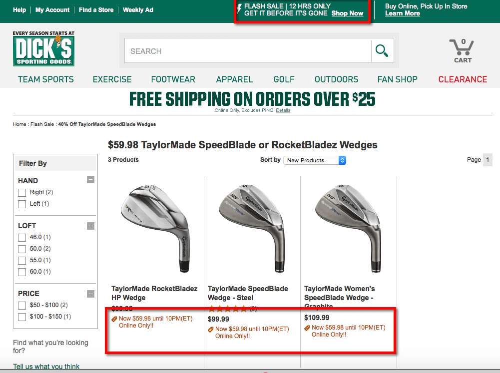
Your design team should identify opportunities to enhance the user’s perception of scarcity of your product’s availability or exclusivity. Are you able to offer a pre-release to people who agree to purchase the final product? If so, consider doing that. Can you offer different levels of membership or access to your product? A certain number of users will want to enjoy the feeling that they have access to features or functionality that others don’t have. Can you show users how much of your product remains? Dick’s Sporting Goods (shown below) is an example of how many e-commerce websites apply the scarcity heuristic: putting certain items on sale for a limited time.
Scarcity is a powerful motivator to get users to commit to your product, but it can also backfire. I have unsubscribed from countless retailers that have bombarded me with daily emails promoting a “24-hour-only sale” or the like. I not only unsubscribe from these emails, but lose trust in that retailer. Your users don’t have the time or desire to delete your daily “24-hour-only sale” emails. Send them one email, occasionally, that offers a real limited deal — or else find a different strategy.
Naïve Diversification
The naïve diversification heuristic states that people tend to make choices that are more diverse when multiple options are presented to them at once, rather than sequentially. For example, when asked to choose five candies from a selection of ten types, people will tend to choose a variety. On the other hand, when asked to choose one candy from among ten types once a week for five weeks in a row, people are more likely to select the same one. This heuristic has major implications for when and how we present our users with options. People choose what they really want when forced to make a single choice, but are more random when given the option.
How Naïve Diversification Applies To Design
Naïve diversification is relevant to digital design because people are easily distracted. Keep them on task by making your interactions as user-friendly and focused as possible. Consider the desired outcome of your users’ engagement with your product: Do you want them to make one particular choice or a variety of choices. If you want users to make one choice, present them with one choice at a time, over time. If you want them to select multiple or diverse options, allow them to select from all available options at once.
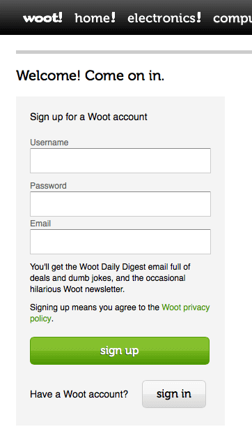
Woot, a discount goods website, focuses on one screen of information when users are creating an account. Users are asked to provide only basic information on one screen to begin. The vendor can get more detailed information once users have signed up and have seen the value of the product.
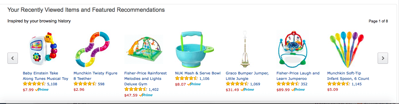
Offer a personalized experience that focuses the user’s attention on the information or products they need, based on who they are. You can also combat naïve diversification by surfacing recommendations based on affinity analysis and the user’s past behavior. Amazon provides an excellent example of how to address naïve diversification; it attempts to do most of the thinking for the customer when it surfaces various data:
- “buy it again” (previously purchased items);
- previously viewed items;
- recommendations based on current and past purchases;
- what other users have purchased when they have purchased a product you are viewing.
Users know they will have a quick experience when they go to Amazon to purchase a product they have viewed or purchased in the past; this keeps them coming back. As it turns out, users don’t want to go somewhere else and start all over with a new browsing and purchasing history.
Fluency Heuristic
People tend to make decisions based on which option is easiest to process; speed is king. The fluency heuristic comes into play when someone has to choose from among multiple options that lead to similar outcomes. An example would be someone being asked what they would like to eat for lunch. Ten things might come to mind very quickly. The fluency heuristic suggests that the person will end up choosing the option that comes to mind most quickly; they would assign a higher value to that option because they can retrieve it from memory most quickly.
Another example would be to ask someone about the best way to bake a cake. The solution that comes to mind will most likely be based on the person’s experience and preference. They will likely value that option as the highest (or best), even if they subsequently think of other (potentially better) options, due to the speed at which they were able to process the original thought.
What would your first thought be if you suddenly felt a sharp pain in your chest as you are reading this article: Heart attack? Heartburn? Too much coffee? Pulled muscle? Your first reaction will likely be the one you consider the most valid. If you thought it was a heart attack and called an ambulance, only to find it is heartburn, you would feel embarrassed. If you thought it was heartburn and took an antacid but it turned out to be a heart attack, you would be dead. Your initial thought will likely dictate the action you take.
How The Fluency Heuristic Applies To Design
The fluency heuristic suggests that users will choose the option that they can process the fastest, because they will think that is the best option. This speaks to the need for your team to understand the user’s point of view when you present them with information and options. You need to understand the user’s current reference point for the functions you want to include in your design. You also need to communicate in language that is free of jargon and easily understood. Some areas to apply these principles include the following:
- Search. How are you presenting search results to users? They will assume that the results they easily understand have priority over others. Is that true? Do your results highlight key words and phrases that make the connection to the initial query clear to users?
- Content. How are your presenting content and topics? Users will assume that content that is easier to understand (quicker to process) is more important. Present content that is easy to understand first in order to coax users to a more in-depth exploration of the topic. Also, don’t, for example, use four fonts and four colors in the same paragraph; that would impede the reader’s ability to process the information.
- Updates and alerts. How are you ordering and titling alerts? Users will regard the first alerts they can process as the most critical. “Security warning!” is faster to process than “Potential unauthorized account usage detected!”
- Navigation. Is your navigation’s hierarchy inline with the user’s understanding of each major content area? If your website is about food and recipes, you wouldn’t include “Food” as a submenu of “Recipes”; you’d want them both to be immediately visible to users.
The fluency heuristic has implications for how you market your product. Will potential users receive and process the message that your product meets their need? Have you made sure your product is the first one that comes to mind as a solution to the problem you are designing for? Do users have an immediate positive reaction upon hearing of your product? Try to keep your product near the top of all review lists (with positive reviews) and any other websites that consolidate and list what is available for users in your field. Users associate the quickest and easiest option to process — most likely the one at the top of the list — as being the best option.
The fluency heuristic also applies to those of us on design teams. We, too, might assume that the first option that comes to mind is the best. Have we verified this with users? If the first solution that comes to mind is to make a product social or to make it mobile-focused, what are you basing that on? Do you tend to assume that users want the thing that comes up first in team meetings? If so, you need to step back and make better-informed decisions. Testing ideas through usability testing, contextual inquiry and other UX research methods of gathering direct feedback from potential users will help us avoid assuming that the idea most quickly processed is the best.
Case Study: Expedia
There is no one-size-fits-all solution for applying heuristics to a design. Work with your design team (including researchers and developers) to identify which heuristics most apply to your product. Let’s walk through a brief case study of how Expedia, the online travel company, hits and misses the marks covered in this article.
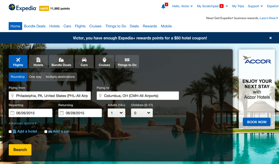
I frequently use Expedia to research and book trips for work and leisure. Expedia has accounted for a number of heuristics that make it easier for me to book a trip. As you see in the image below, Expedia defaults to my home airport (Philadelphia) when I land on its home page. It knows my home airport because it asked me to identify it during the onboarding process. Otherwise, I’d probably not have taken the time to update my settings.
Expedia also defaults to searching for roundtrip flights. I’m not sure if this is based on my behavior, but I am sure that I have never used Expedia to do anything other than book a roundtrip flight. I don’t mix my flight bookings with hotel bookings. Finally, Expedia provides a default alert at the top of the page informing me of credit I have to use as a result of points earned through its loyalty program. Although I wouldn’t normally book a hotel room through Expedia, I might do so if the room were free. I would not have any idea of my rewards balance if the default was to hide this message.
Expedia addresses naïve diversification in at least two ways in the image below. First, it defaults to booking a flight from my home city to the last city I searched for. This is great if I am picking up where I left off: My dates are set, my location is set, I don’t need any more options, and I am focused on this flight. However, I can easily diversify by clicking “Add a hotel” and/or “Add a car.” This will bring up additional search options, diversifying my experience if I want. If I don’t come back to book this trip to Columbus, I can navigate to the “My Scratchpad” area and see all of the flights I have searched for over a period of time. This also addresses naïve diversification, allowing me to easily stay focused on booking the flight I need, not getting lost daydreaming about a fantasy trip to some exotic location. If I am traveling for business and in a hurry, Expedia has met my needs by focusing on the naïve diversification heuristic.
Expedia addresses scarcity in a number of ways. The image below shows some of the sales Expedia highlights on its home page. Each deal is tied to a specific timeframe. The “Daily deal” description states that a new deal is offered daily (if so, I approve). The Father’s Day coupon is a promotion to encourage use of the Expedia app. Unfortunately, the Expedia app suffers many usability issues and is disconnected from the desktop experience. I would not recommend driving traffic to another channel until you have made that channel’s experience fully functional.

Expedia’s product inherently addresses fluency. If it didn’t, Expedia wouldn’t stand a chance in its market. Expedia consolidates a number of airline and hotel websites. Users will recognize the ease with which they can compare a number of airlines, hotels and car rental providers on Expedia’s website alone, rather than navigating to multiple websites for each category of travel.
Take another look at the images above and see whether you can find other ways in which Expedia addresses the heuristics we’ve covered. Can you find any ways that Expedia could improve on how they address any of the heuristics? Again, you don’t need to address every heuristic in every experience, as long as the approach is seamless and makes for a better experience.
Conclusion
We strengthen a design when we reduce the user’s cognitive load. We can accomplish this by accounting for heuristics. Heuristics do not involve trickery or deceit; they take advantage of an understanding of users and human behavior. We have discussed four of the many heuristics you can account for in a design. Review your current design and any future designs to determine how you might account for one or more of them. Also, try to recognize where you or your colleagues might be using a heuristic (for example, the fluency heuristic) in your assumptions about users and the features in your design.
Additional Resources
- “Heuristics and Biases in Retirement Savings Behavior,” Shlomo Benartzi and Richard H. Thaler, The Journal of Economic Perspectives (2007), pages 81–104
- “Heuristic Decision Making,” Gerd Gigerenzer and Wolfgang Gaissmaier, Annual Review of Psychology (2011: 62), pages 451–482
- “Why Heuristics Work,” Gerd Gigerenzer, Perspectives on Psychological Science (2008: 3⁄1), pages 20–29
- “Prospect Theory: An Analysis of Decision Under Risk,” Daniel Kahneman and Amos Tversky, Econometrica: Journal of the Econometric Society, (1979), pages 263—291.
You can learn about the application of more heuristics and other psychological concepts to digital design in my upcoming book Design for the Mind. Order the early-access version of the book from Manning Publications.
Image credit (Excerpt): Markus Spiske
Further Reading
- A Guide To Heuristic Website Reviews
- Social Influence: Incorporating Social Identity Theory Into Design
- Five Characteristics Of An Innovation
- Changing Perspective: A New Look At Old Problems


