What A/B Testing Taught Us About App Store Optimization

Email Newsletter
Weekly tips on front-end & UX.
Trusted by 200,000+ folks.


 Click here to kickstart your project for free in a matter of minutes.
 Take a break with a 3D game built on Netlify!
 Start with a free demo —
 Check the frontend report!
1.5 million apps in Apple’s App Store and another 1.5 million in Google’s Play store. That’s a lot of apps, and for a growing number of mobile users. An average user in the US will download only three new apps per month (at best), according to comScore’s “US Mobile App Report.”
Competition in the App Store is fierce, and if an indie app developer wants to get noticed, having an amazing product is no longer enough.
Lost And Found In The App Store
The truth is that if an app doesn’t show up in the App Store’s top rankings or featured lists, its chances of hitting a high number of views and downloads are slim. If your app hasn’t been featured or “noted” by Apple’s editors or has yet to acquire tens of thousands of downloads to rank in the top 10, then the only way to reach users is via so-called “organic discovery,” or search.
In fact, app store optimization (ASO) is an emerging popular term in mobile technology these days. Some call it the new SEO, and many app marketers have jumped on the trend to support their user acquisition goals. To drive organic traffic to your app’s store page and convert views to downloads, you have to be strategic about the app page’s content.
Hacking The App Store’s Search: A/B Testing
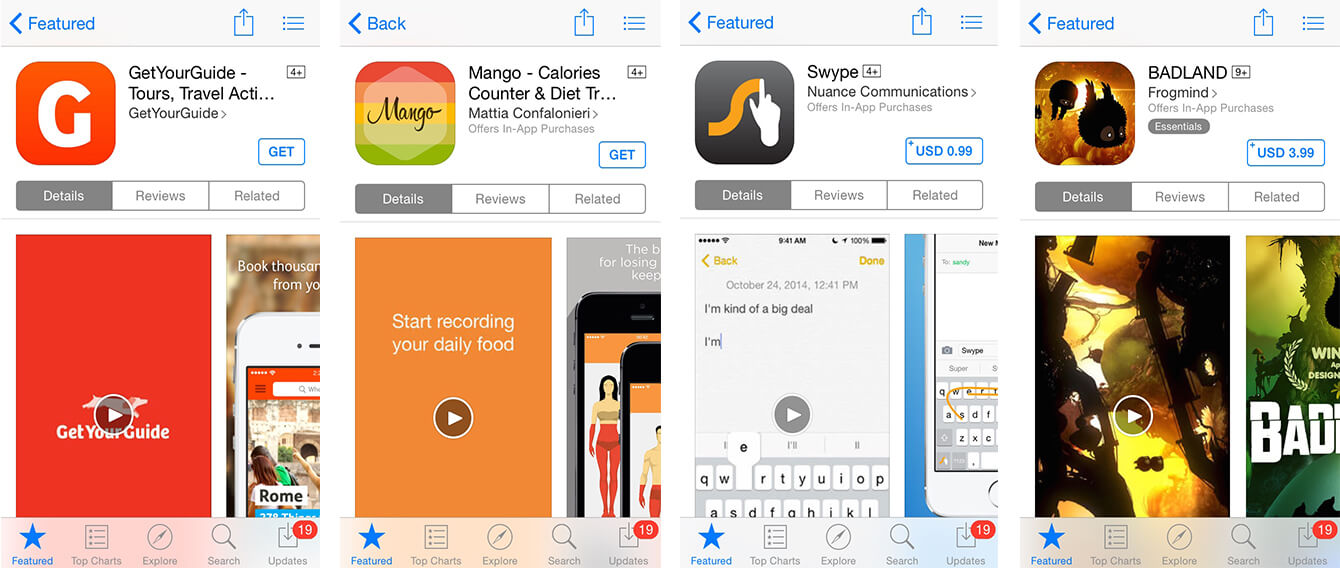
When planning your app’s page, you’re ultimately deciding on the following elements: title, icon, screenshots, description and keywords.
How does one decide? For one, you can just go with your gut or ask someone you consider an expert for advice. Many app publishers do exactly that: They either come up with an idea in-house or ask a content strategist or marketing consultant. Alternatively, you can generate several of these go-with-your-gut options and then run a couple of tests to see which one works better. Obviously, A/B testing is a way to figure out which of the two variants tested in a controlled experiment gets better results — in the case of the App Store page, it means a better conversion from page views to app downloads.
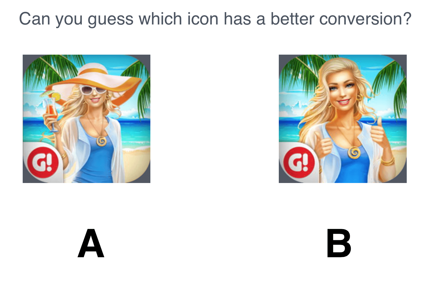
We all know how it works: to set up an A/B test, first come up with a hypothesis (for example, the icon of a person wearing a hat and sunglasses will convert better than the one of a person without any beach accessories). Then, you’d run a test, splitting your advertising traffic into two equal parts. Drive 50% to your app page with the first icon, while sending the other 50% to an altered landing page that looks and functions exactly like the real one, except for one little detail: the “hatless” character on the icon. The winner gets the glory of having the next 100% of your ad traffic all to itself.
The outcome of a simple split test can be significant for a business. When Google rolled out A/B testing feature for the Play store at the I/O developer conference in San Francisco last month, it shared the success story of a pre-launch pilot with Kongregate, a mobile gaming company that increased its conversion rate by 30% with ta simple split testing.
In our own experience, we saw an even higher change in conversion in the iOS App Store — as much as 150% for a travel app. For a mobile gaming company that tested its video cover images, the experiment resulted in an increased number of views — from 25% to 43%. In a recent Skoda Auto app case study, a simple rearrangement of screenshots resulted in a 50% increase in conversion from views to downloads on the page. In a more recent Splitmetrics’ case study, Rovio’s Angry Birds improved conversion by a staggering 13% after experimenting with portrait/landscape and caption variations.
Whether it was the hat and sunglasses that added a layer of mystery to the image or the bright cocktail that caught the eye, we can’t say for sure, but the hat-clad character won. The correct answer is A: A showed a 7.2% conversion against B’s 5%.
A/B Testing App Store Pages: Lessons Learned
You can run A/B tests to find a winning icon, screenshot or any other element of an App Store page. The results of such tests will vary, because user behavior is often hard to predict, but I thought I’d share some insights that we learned after running a number of A/B tests with various apps.
Plain Icon Always Works Better
Imagine a user scrolling through dozens of apps on the search results page, looking for the one. The icon is often the first element of your product that users see. You want it to stand out and be pretty. Our experiments have shown that optimizing the icon can increase an app’s installation rate by 3 to 5 points (for example, from 10% to 13%). Here are some key takeaways from our A/B tests of icons:
- Avoid cramming elements together in one icon. Less is more.
- For your background, go with one soft color. Don’t distract users from the main element with bright colors or clutter.
- For the main element in the icon, choose one simple visual, like the main character of the game or the app’s logo. It should really pop against the background.
For icon ideas and best practices, check out “iPhone Top App Matrix” on App Annie, which publishes market reports for app developers.
Screenshots: Show Experience, Tell A Story And Personalize By Device
A picture is worth a thousand words, and a good picture on an App Store page is worth more than a thousand downloads. Screenshots will sell your app — literally. In a variety of A/B testing experiments, optimized screenshots have shown an increase in conversions from 35% to 49%, from 55% to 66% and from 13% to 24%, respectively (the app publishers that reported results chose to remain anonymous.)
When planning a page for a utility app, for example, consider including one of the utility’s tools in the screenshot to better show the experience, and explain the key features in captions.
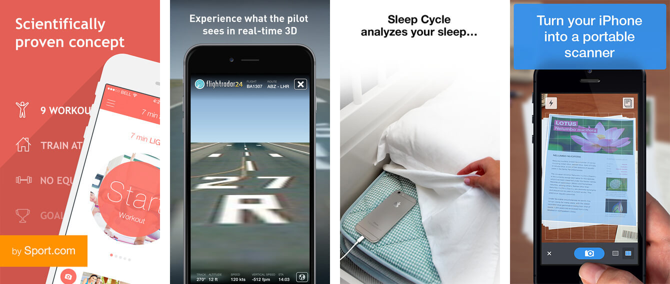
For a game app, your main goal is to appeal to emotion (not to show functionality). Choose the game’s most epic scenes and breathtaking graphics to capture the fun of the game. Give a sneak preview so that users get the point of the game before installing it. Use captions to tell a story, and showcase badges and awards to lure gamers in.

Landscape orientation screenshots are more difficult for users to scan. Still, they remain the top choice for mobile game developers. Bigger pictures simply look better on the iPad and appear more impressive in search results.
Apple requires developers to submit screenshots that are optimized for different iOS devices. This is your chance to personalize your app’s story for the user through screenshots: You can present a 1136 × 640-pixel screenshot for the iPhone 5s, a 960 × 640-pixel one for the iPhone 4s and so on. The same goes for the Play store: Upload up to eight screenshots for phones, 7-inch tablets, 10-inch tablets and Android TV.
Video Preview: Costly, No Study Confirms Increase In CVR
Video previews are a powerful way to show gameplay in action. The interactivity, sound and graphics drive user engagement and, likely, more downloads, right? Not so fast. To our knowledge, no single study has yet shown any impact on conversion. Some developers of utility apps who have run A/B tests claim to have tracked no significant changes after adding a video preview. Making a preview takes time and money, so the question of whether you should have it remains open.
Here are some quick tips if you decide to go with a video preview:
- Remember that the “Play” button is right in the center of the preview thumbnail, so don’t put your logo there. Make it bigger or, better yet, move up to be clearly seen.
- Use action words in the video preview thumbnail to encourage users to press play. Words such as “Start” and “Go” work well.
- Snap a cool scene from your game or a nice UI from your app for the cover screen. The goal is to get users curious to press play and see what happens next.
- If you’re offering a bundle with your app, always put captions on top on the screenshot. The lower part will be hidden below the fold, and you want to give users a glimpse of what’s below to capture their interest.
Summary: Roll Up Your Sleeves And Get Testing
So many apps, so little time. As the number of mobile users grows, new apps pop up daily. To make yours a success, be strategic about how you design the “shop window” for your app — the app’s page. A/B testing and optimization of the icon, screenshots and video preview will give you a better chance of higher conversions, a higher volume of organic downloads and a better return on your investment in user acquisition.
So what experience did you have with designing for the App Store or Google Play? What worked, and what failed, and why? Share your stories in the comments below! —Ed.
Further Reading
- A Roadmap To Becoming An A/B Testing Expert
- Multivariate Testing 101: A Scientific Method Of Optimizing Design
- Multivariate Testing In Action: Five Simple Steps
- In Defense Of A/B Testing


