Laying Out A Flexible Future For Web Design With Flexbox Best Practices

Email Newsletter
Weekly tips on front-end & UX.
Trusted by 182,000+ folks.
 See User Testing Live

 Custom Web Forms for Angular, React, & Vue. Your backend.

 Celebrating 10 million developers
CSS floats and clears define web layout today. Based on principles derived from centuries of print design, they’ve worked well enough — even if, strictly speaking, floats weren’t meant for that purpose. Neither were tables, but that didn’t stop us in the 1990s.
Nevertheless, the future of web layout is bright, thanks to flexbox. The CSS layout mechanism lets us arrange elements in a truly web-like way. Some elements can be fixed, while others scroll. The order in which they appear can be independent of the source order. And everything can fit a range of screen sizes, from widescreen TVs to smartphones — and even devices as yet unimagined. Browser support is fantastic (except you-know-who). Yep, it’s a great time to jump into flexbox if you haven’t done so yet.
But changing our ways isn’t easy. Flexbox has a dizzying array of features, few of which are familiar. It’s a lot to take in. Luckily, for layout purposes, you need to know only a few basics. Let’s take a look at how we could create a basic Gmail-like, flexbox-based interface. If you haven’t explored or fully understood flexbox yet, this piece will revisit and explain a few things that might be confusing at first.
The Flexbox Mindset
Flexbox requires a new way of thinking. Instead of arranging items in left-to-right, top-to-bottom rows and columns, we arrange blocks on a line — two lines, in fact, a main axis and a cross axis, the first of which we’ll use today. Think of the main axis as a rope along which boxes (divs or other HTML elements) are strung. The metaphorical rope runs from one end of its container to the other, a taut and invisible axis. This leads to four interesting concepts.
Alignment
First, we can slide the “boxes” to one side of the “rope” or the other, center them or distribute them evenly. That means objects can stick to one side of a layout or the other — say, to the left or right edge of the screen, no matter the screen’s width. Even distribution means they will adapt well to any size screen, which is ideal in our multi-screen world.

Direction
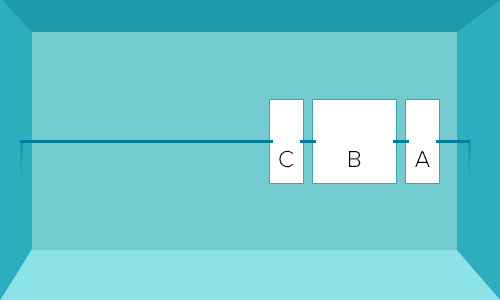
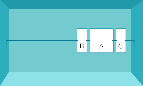
We can also reverse the string, so that boxes run in the opposite direction, without editing the HTML. This is similar to the sort-order technique that lets us flip columns around — except the third trait takes that a step further.
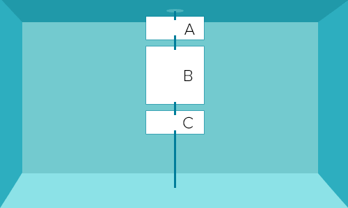
Orientation
Thirdly, we can turn the rope by 90 degrees to dangle from the top of its container, instead of running from side to side. Media queries and flexbox’s ability make it possible to run items — say, a header, article and footer — down a smartphone’s screen but left to right on a desktop computer. What used to be called rows can now run top to bottom or bottom to top with a dash of CSS.
Order
Finally, we can control which boxes come first, second, third and so forth on the rope without editing the HTML. This is huge. It means we can structure an HTML document for, say, SEO, accessibility or plain ol’ semantics — independent of layout. Want to center elements vertically? No problem. Want navigation at the end of your HTML but at the beginning of your layout? Sure. Want to experiment with different layouts? It’s all in the CSS. And just like that, we’re already thinking in terms of content and devices, not rigid grids.
There’s more, but this covers the basics for now. To recap:
- Blocks are strung along an invisible line.
- We can push them to and fro along that line.
- We can reverse the line, thus reversing the boxes’ order.
- The line can turn 90 degrees.
- We can shuffle things along the line in any order we please, regardless of the HTML.
Order
Order is an important concept in flexbox. Let’s take a basic HTML document: A typical blog post would include certain bits of information.
- header website title, description, search form (These frame the content and inform people where they are.)
- meta data author/publisher, date, topic(s) (These help people decide whether the content is relevant to their needs.)
- main content what the page is all about (the reason the page exists)
- supplemental content related information (teasers, links, “See also”)
- navigation links to elsewhere on the website (high-level topics)
- footer copyright, RSS, social media, newsletter registration
These elements are listed in order of what search engines or screen readers might scan. Now, let’s dangle a “rope” from the top of a mobile device and reorder them to put content first.
- main content
- meta data
- supplemental content
- header
- navigation
- footer
Meanwhile, desktop computers would have a different view.
- header
- meta data
- main content
- supplemental content
- navigation
- footer
Wait, that’s not quite right. We want navigation at the top, and flexbox makes that a snap.
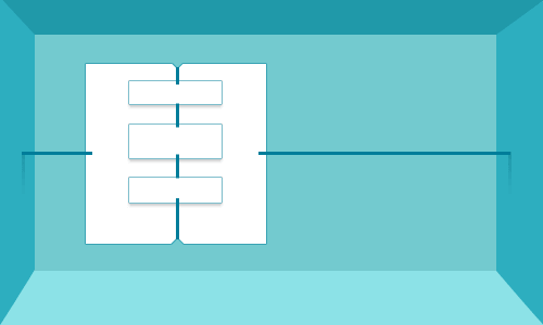
It follows that you can also put “ropes” inside of boxes, and all of the rules apply anew. But first, let’s talk about order. Here’s where things get tricky.
Nesting Ropes And Boxes
Each flexbox layout — each box — can contain another set of boxes strung along their own rope. That rope can run from left to right or vice versa, from top to bottom or vice versa, and push objects to either end, center them or distribute them. And while that flexibility opens up many possibilities, it also means we need to plan our layouts carefully.
Let’s start with some content to understand why things get complicated; this isn’t necessarily in order of layout (i.e. the order in which people see it). Imagine giving a presentation to an audience. You tell them what you’re going to say, then you say it, and you wrap up with a summary of what you’ve said. Our hypothetical page follows a familiar structure:
- header
- the current message
- message list
- links to inbox(es), archive, etc.
- footer
Sketch A Design
To keep things simple, we’ll work with a familiar layout.
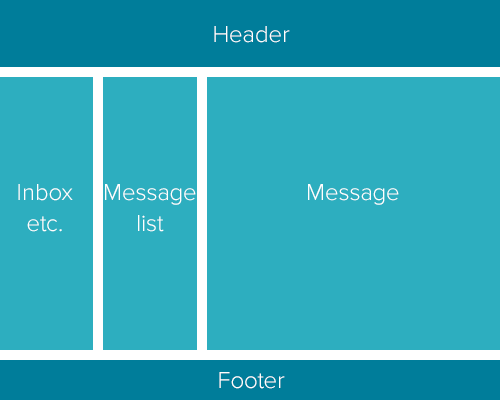
There are two flexbox layouts here. The first has three boxes from top to bottom. The second layout resides inside the middle box, from right to left.
The header and footer span the width of the viewport. The navigation fits in a small column to the left, and the content area lets the user scroll when it contains more information than can be displayed. We could achieve this with a few floats and fixed positions, but flexbox gives us more options with less markup. Let’s take a look.
Set Up The Document
The outer container has only three sections, wrapped in a .flex-container element:
<body>
  <div class="flex-container">
    <header>…</header>
    <main class="flex-container">…</main>
    <footer>…</footer>
  </div>
</body>
We call it flex-container to describe its purpose in a somewhat semantic way. At least our CSS will make sense.
Inside the main element, we need three blocks:
<main class="flex-container content">
  <article class="message">…</article>
  <div class="message-list">…</div>
  <nav class="mailbox-list">…</nav>
</main>
This example uses article as an independent entity, not in the magazine sense.
Declare These Elements As Flexbox
We need to tell browsers that these elements will be, um, flexible.
.flex-container,
.flex-container header,
.flex-container footer {
  display: -webkit-box;
  display: -moz-box;
  display: -ms-flexbox;
  display: -webkit-flex;
  display: flex;
}
Note that this applies flexbox to the major containers, not the content.
Add Some Dimensions
Based on the design sketch, we know that certain elements will have widths and heights. The body’s header and footer, for example, will be long, thin strips compared to the main’s tall, relatively narrow left-hand navigation bars. The article’s content area fills the rest of the space. In the interest of staying flexible regardless of screen size (and clarity in this tutorial), these areas won’t have fixed widths.
.message {
  flex-basis: 70%;
}
.message-list {
  flex-basis: 15%;
}
.mailbox-list {
  flex-basis: 15%;
}
.flex-container header,
.flex-container footer {
  width: 100%;
  height: 5rem;
}
Here, flex-basis is like width — as long as the main axis is horizontal. If we dangle the rope from the top, then flex-basis becomes height automatically. Handy!
Make The Main Section Scrollable
This one’s easy. Just add overflow: scroll to the main element to keep it from overriding the header and footer. Handy tip: Try overflow: auto to hide scroll bars (when they’re unnecessary) in most browsers.
.message {
  flex-basis: 70%;
  overflow: scroll;
}
Test The Content
At this point, the header’s form should float with a little margin, even when the browser is resized. The content should flow well in browser windows of any size. And if a browser doesn’t support flexbox, then the page will turn into a content-first layout.
That’s important because you-know-who doesn’t support flexbox yet. Every modern version does, however, so it’s a matter of when users update their software. So, where is flexbox supported?
- Chrome 31 and later
- Firefox 31 and later
- Internet Explorer 10 and later
- Safari for Mac version 7 and later
- Safari for iOS 7.1 and later
- Android browser 4.4 and later
- Chrome for Android 42 and later
- Opera 27 and later
Clicky has a graph of the marketshare of assorted mobile browsers.
What about older browsers? Solutions vary wildly depending on the layout you’re trying to achieve, although we can derive a few tips.
The safest way to support flexbox-incapable browsers is to write CSS in the order in which you want it to appear. Start by thinking semantically. Old versions of Internet Explorer will ignore flexbox properties — thankfully, good ol’ conditional comments enable us to apply floats and clears to semantic layouts. Old versions of other browsers tend to give you mobile-friendly layouts that stack content in a logical order. So flexbox can co-exist with floats, display: table-cell and positioning, so that smart browsers will apply flexbox properties while legacy browsers will ignore them. Finally, if you’re feeling experimental, then try Flexie, which amends old browsers with a JavaScript-based polyfill.
Give flexbox a go. While it offers many options, most — such as alignment — come into play after you’ve settled on how elements are arranged. The central techniques, which we’ve covered here, are alignment, direction, orientation, order and nesting. We’ve found these to be critical in Foundation’s new layout framework: If you can wrap your head around alignment, direction, orientation and order, then you’re well on your way to a flexible future. Check out my demo to see it in action (keep in mind that it’s not responsive just yet).
Other Resources
To learn more about flexbox, check out the following:
- Flexbox in 5 Minutes, a flexbox playground tool
- Flexbugs, a community-curated list of flexbox issues and cross-browser workarounds for them.
- Flexy Boxes: Flexbox Playground and Code Generator, Pete Boere
- “Using Flexbox to Lay Out Web Applications,” Mozilla Developer Network
- “Flexbox,” Sara Soueidan, Codrops A reference article
- “A Visual Guide to CSS3 Flexbox Properties,” Dimitar Stojanov
- “CSS Flexible Box Layout Module Level 1,” W3C The official specification
Further Reading
- Flexbox Is As Easy As Pie – Designing CSS Layouts
- CSS Grid, Flexbox And Box Alignment
- The Flexbox Reading List: Techniques And Tools
- Harnessing Flexbox For Today’s Web Apps
 (da, ml, al, mrn)

