Understanding Critical CSS

Email Newsletter
Weekly tips on front-end & UX.
Trusted by 200,000+ folks.


 Flexible CMS. Headless & API 1st
The web is slow, yet there are a few simple strategies to make websites faster. One of them is inlining critical CSS into the `` of your pages, yet how exactly do you do it if your site contains hundreds of pages, or even worse, hundreds of different templates? You can't do it manually. Dean Hume explains an easy way to get it done. If you're a seasoned web developer, you might find the article obvious and self-explanatory, but it's a good piece to show to your clients and junior developers for sure. — Ed.
Delivering a fast, smooth web experience is an important part of building websites today. Most of the time, we develop websites without understanding what the browser is actually doing under the hood. How exactly does the browser render our web pages from the HTML, CSS and JavaScript that we create? How can we use this knowledge to speed up the rendering of our web pages?
If I’m looking to quickly improve the performance of a website, Google’s PageSpeed Insights tool is the first place I go. It can be very helpful when trying to profile a web page and find areas for improvement. You simply enter the URL of the page that you want to test, and the tool provides you with a list of performance suggestions.
If you’ve ever run one of your own websites through the PageSpeed Insights tool, you may have come across the following suggestion.
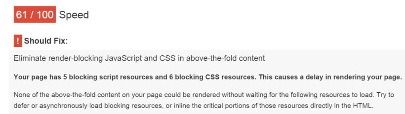
I must admit, the first time I saw this, I was a little confused. The suggestion reads:
“None of the above-the-fold content on your page could be rendered without waiting for the following resources to load. Try to defer or asynchronously load blocking resources, or inline the critical portions of those resources directly in the HTML.”
Fortunately, the solution to this problem is simpler than it seems! The answer lies in the way that the CSS and JavaScript are loaded in your web page.
What Is Critical CSS?
A request for a CSS file can significantly increase the time it takes a web page to render. The reason is that by default the browser will delay page rendering until it has finished loading, parsing and executing all the CSS files referenced in the <head> of your page. It does this because it needs to calculate the layout of the page.
Unfortunately, this means that if we have a really large CSS file and it takes a while to download, our users will end up waiting until the whole file has been downloaded before the browser can begin rendering the page. Fortunately, there is a sneaky technique that allows us to optimize the delivery of our CSS and mitigate the blocking. This technique is known as optimizing the critical rendering path.
The critical rendering path represents the steps that the browser takes to render a page. We want to find the minimum set of blocking CSS, or the critical CSS, that we need to make the page appear to the user. A critical resource is any resource that may block the initial rendering of the page. The idea behind this is that the website should get the first screen’s worth of content (or “above-the-fold” content) to the user in the first few TCP packets of response. To give you a brief idea of how this would work for a web page, take a look at the image below.
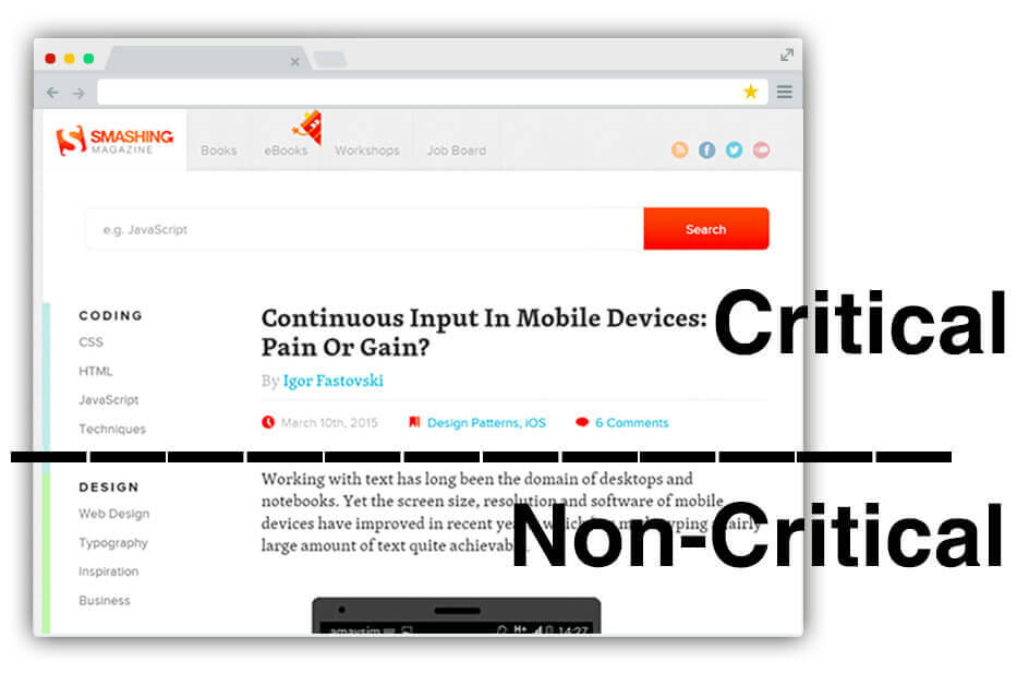
In the example above, the critical part of the web page is only what the user can see when they first load the page. This means that we only need to load the minimum amount of CSS required to render the top portion of the page across all breakpoints. For the remainder of the CSS, we don’t need to worry as we can load it asynchronously.
How do we determine what is considered critical CSS? Determining the critical CSS for a page is rather complex and requires you to walk through the web page’s DOM. Next, we need to determine the list of styles that currently apply to each element in view. Doing this manually would be a tedious process, but there are a number of great tools that will do this automatically.
In this article I am going to show you how to improve your web page rendering speed using critical CSS, and show you a tool that will help you do this automatically.
Critical CSS In Action
To start working with the critical CSS for our web page, we need to change our approach to the way we handle the CSS – this means splitting it into two files. For the first file, we extract only the minimum set of CSS required to render the above-the-fold content, and then we inline it in the web page. For the second file, or the non-critical CSS, we asynchronously load it so as not to block the web page.
It might seem a bit weird at first, but by inlining the critical CSS into our HTML, we can eliminate the additional round-trips in the critical path. This allows us to deliver the critical CSS in one round-trip and present something to users as soon as possible.
In order to understand what this might look like represented as HTML, the code below gives a basic example.
<!doctype html>
<head>
  <style> /* inlined critical CSS */ </style>
  <script> loadCSS('non-critical.css'); </script>
</head>
<body>
  ...body goes here
</body>
</html>
In the code above, we are extracting the critical CSS and inlining it in the HTML between the style tags. Next, we are using the loadCSS(); function to asynchronously load the remaining, non-critical CSS. This is important because we are essentially off-loading the bulkier (non-critical) CSS and injecting it into the web page in the background.
At first, this may seem like a nightmare to maintain. Why would you manually want to inline a snippet of CSS in every page? There is good news, though – the process can be automated and in this example, I am going to run through a tool called Critical. Originally created by Addy Osmani, it is a Node.js package that allows you to automatically extract and inline critical-path CSS in HTML pages.
We are going to combine this with Grunt, the JavaScript task runner, to automatically process the CSS. If you have never used Grunt before, the website has some very detailed documentation, as well as a variety of tips for configuring your project. I have also previously blogged about this awesome tool.
Getting Started
Let’s begin by firing up the Node.js console and navigating to the path of your website. Install the Grunt command line interface by typing the following command into your console:
npm install -g grunt-cliThis will put the grunt command in your system path, allowing it to be run from any directory. Next, install the Grunt task runner with the following command:
npm install grunt --save-devThen install the grunt-critical plugin.
npm install grunt-critical --save-devNext, you need to create a Gruntfile that contains the task configuration for your project. Mine looks a little like the code below.
module.exports = function (grunt) {

grunt.initConfig({
  critical: {
    dist: {
      options: {
        base: './'
      },
      // The source file
      src: 'page.html',
      // The destination file
      dest: 'result.html'
      }
    }
  });

  // Load the plugins
  grunt.loadNpmTasks('grunt-critical');

  // Default tasks.
  grunt.registerTask('default', ['critical']);
};
In the code above, I configured the Critical plugin to look at my page.html file. It will then process the CSS against the given page and calculate the critical CSS. Next, it will inline the critical CSS and update the HTML page accordingly.
Run the plugin by typing grunt into the console.
If you navigate to the folder, you should now notice a file called result.html that contains the inlined critical CSS and the remaining CSS loaded asynchronously. Your web page is now ready to rock and roll!
Behind the scenes, this plugin actually uses PhantomJS, a headless WebKit browser, to capture the required critical CSS. This means it is able to silently load your web page and test for the optimal critical CSS. This functionality also gives the plugin flexibility when it comes to different screen sizes. For example, you can provide different screen dimensions and the plugin will capture and inline your critical CSS accordingly.
critical: {
  dist: {
    options: {
      base: './',
      dimensions: [{
        width: 1300,
        height: 900
      },
      {
        width: 500,
        height: 900
      }]
    },
    files: [
      {src: ['index.html'], dest: 'dist/index.html'}
    ]
  }
}
The code above will process the given file against multiple dimensions and inline the appropriate critical CSS. This means that you can run your site against a number of screen widths and ensure that your users will still have the same experience throughout. As we know, mobile connections using 3G and 4G can be flaky at the best of times – that’s why this technique is so important to mobile users.
Using Critical In A Production Environment
Using a tool like Critical is a great way to automatically extract and inline your critical CSS without having to change the way you develop your websites, but how does this fit into the real world? To put the newly updated files into action, you simply deploy as you normally would – nothing needs to change on your production environment. You need only remember that you will need to run Grunt every time you build or make changes to your CSS files.
The code samples we have run through in this article have covered the use of a single file, but what happens when you need to process the critical CSS for multiple files, or even an entire folder? Your Gruntfile can be updated to handle multiple files, similar to the example below.
critical: {
  dist: {
    options: {
      base: './',
      dimensions: [{
        width: 1300,
        height: 900
       },
       {
        width: 500,
        height: 900
      }]
    },
    files: [
      {src: ['index.html'], dest: 'dist/index.html'},
      {src: ['blog.html'], dest: 'dist/blog.html'}
      {src: ['about.html'], dest: 'dist/about.html'}
      {src: ['contact.html'], dest: 'dist/contact.html'}
    ]
  }
}
You could also run the task against every HTML file in a given folder using the code below:
critical: {
  dist: {
    options: {
      base: './',
      dimensions: [{
        width: 1300,
        height: 900
      },
      {
        width: 500,
        height: 900
      }],
      src: '*.html',
      dest:  'dist/'
    }
  }
}
The code samples above provide an insight into how this could be achieved across your website.
Testing
As always, testing any new changes is very important. If you’d like to test your changes, there are some amazing tools that are freely available online. Head over to Google’s PageSpeed Insights and run your URL through the tool. You should notice that your web page now no longer has any blocking resources and your performance improvements suggestion has gone green – woohoo! And you are probably familiar with another great tool, WebPagetest, too.
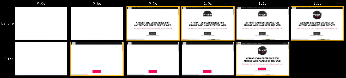
It is a free tool that allows you to run a website speed test from multiple locations around the globe. Apart from an informative analytical review of your web page, if you choose “Visual Comparison”, the tool will compare two web pages with each other. This is a great way to compare your results before and after updating your critical CSS and play back the differences.
The idea behind using critical CSS is that our web pages render sooner, thus presenting something to users as soon as possible. The best way to measure this is to use the speed index. It is a measurement, taken by WebPagetest, that measures how quickly the page contents are visually populated. The SpeedIndex measures the visual progress of the visible page loading and computes an overall score for how quickly the content was painted. Try to compare your SpeedIndex measurement before and after you have made changes by inlining your critical CSS. You will be impressed at how much of a difference it can make to your render times.
Diving A Little Deeper
As with most optimization techniques, there are always pros and cons that might affect your site. One of the downsides with inlining your critical CSS is that you miss out on caching CSS in the browser because it has been inlined in the page. If we are dealing with dynamic pages that change often, we wouldn’t want to cache the HTML pages themselves. This means that the CSS inlined in the HTML is redownloaded every time. There is a lot to be said for inlining only the critical CSS and instead asynchronously loading the remaining non-critical CSS. We can always cache this non-critical CSS. Depending on which side of the fence you sit with this, there are a lot of arguments for and against the concept of inling your CSS in the <head>, but for more information I recommend reading “A counter statement: Putting the CSS in the head” by Hans Christian Reinl.
If you use a content delivery network (CDN), it is also worth remembering that you should still serve your non-critical CSS from the CDN. Doing so allows you to serve cached resources directly from the edge, delivering much faster response times, instead of routing all the way to the origin server to get them.
For traditional web pages, the technique of inlining your CSS works well, but it might not always be applicable depending on your situation. What if you have client-side JavaScript that generates HTML? What if you work on a single page application? If you can output as much of the critical CSS as soon as possible, it will boost page rendering, too. It’s important to understand how critical CSS works and if it applies to you. I like Guy Podjarny’s stance on this:
"Despite all these limitations, Inlining is still a good and important tool in the world of Front-End Optimization. As such, you should use it, but be careful not to abuse it." —Guy Podjarny
In “Why Inlining Everything Is NOT The Answer”, he provides good recommendations as to when you should and shouldn’t inline your CSS.
It’s Not Perfect
While many of the tools required to generate and inline critical CSS are constantly improving, there might be a few areas for improvement. If you notice any bugs in your project, open up an issue or pull request and help contribute to the project on GitHub.
Optimizing the critical rendering path for your website can go a long way towards improving your page load times. Using this technique allows us to use a responsive layout without compromising on its well-known benefits. It’s also a great way to ensure that your page loads quickly without holding back on your design.
Other Resources
If you prefer to use another build system such as Gulp, you can use the plugin directly without downloading Grunt. There is also a useful tutorial showing how to optimize a basic page with Gulp.
There are other plugins that will extract your critical CSS, such as Penthouse, and criticalCSS from the Filament Group. I also thoroughly recommend reading “How we make RWD sites load fast as heck” by the Filament Group for a good overview of how they use this technique to ensure that their web pages load as quickly as possible.
The editor-in-chief of Smashing Magazine, Vitaly Friedman, wrote an article about how Smashing Magazine improved the performance of this website using this technique. If you would like to learn more about the critical rendering path, there is a useful course available for free on the Udacity website. The Google Developers website also has some good content that covers optimizing CSS delivery. Patrick Hamman also wrote a great piece on how to identify critical CSS in his workshop, Building a Faster Web.
Are you inlining critical CSS in your project by default? What tools are you using? What problems have you been running into? Share your experiences in the comments to this article!
Further Reading
- Improving Smashing Magazine’s Performance: A Case Study
- An Introduction To PostCSS
- Preload: What Is It Good For?
- Front-End Performance Checklist
 (il, rb, ml, og, mrn)

