Approaches For Multiplatform UI Design Adaptation: A Case Study

Email Newsletter
Weekly tips on front-end & UX.
Trusted by 200,000+ folks.

 Flexible CMS. Headless & API 1st

There is no winner in the battle between iOS and Android, and we all know that. If a product succeeds on one platform, it will undoubtedly be ported to the other. Sometimes app developers don’t even bother waiting, and release apps for both platforms simultaneously. For designers this means only one thing — they will have to adapt an application’s UI and UX to another platform while ensuring a consistent design language across the product.
There are three different scenarios for UI multiplatform adaptation: retaining brand consistency; aligning with the conventions specific to the platform; and seeking a balance between the two. We decided to analyze these three approaches by looking at the most popular apps out there so that you get some insight into what method might work best for you.
The Brand-Oriented Approach
Sticking to the brand and ignoring “parents’ rules” is the fastest, easiest and most cost-efficient approach, but only in relation to UI design, not software engineering. Custom UI is rather complex in implementation, so development effort would cost you more if compared to the price of building standard components.
Furthermore, choosing brand as a priority in UI design can be a pretty dangerous approach to take. I call such apps “teenagers” because they don’t feel at home, don’t follow the rules, and can be pretty annoying sometimes. They think they’re different, but really they’re the same as everybody else at their age. There are exceptions though.
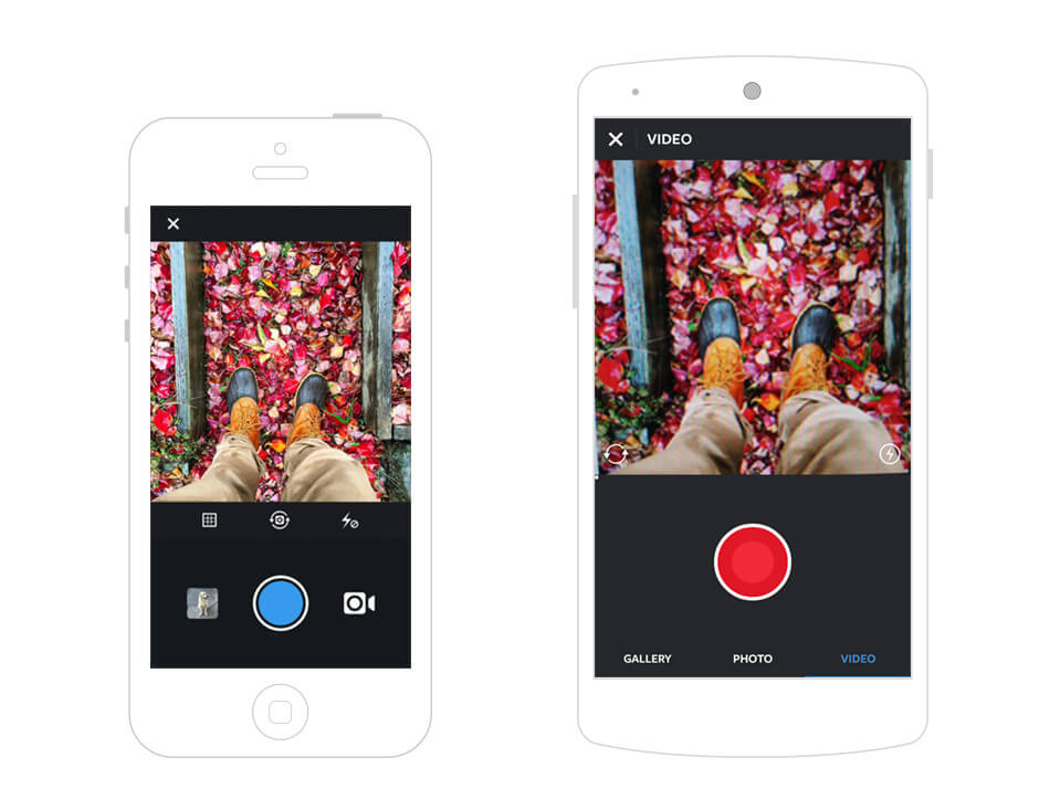
VSCO Cam
Visual Supply Co.’s first VSCO Cam app for iOS came out in 2012. A year later, the popular photo editing product was ported to Android. The Android version of the app copied the iOS version’s interface almost entirely. Interestingly enough, neither version of the VSCO Cam app correlates with the standards specific to the platform it was designed for.
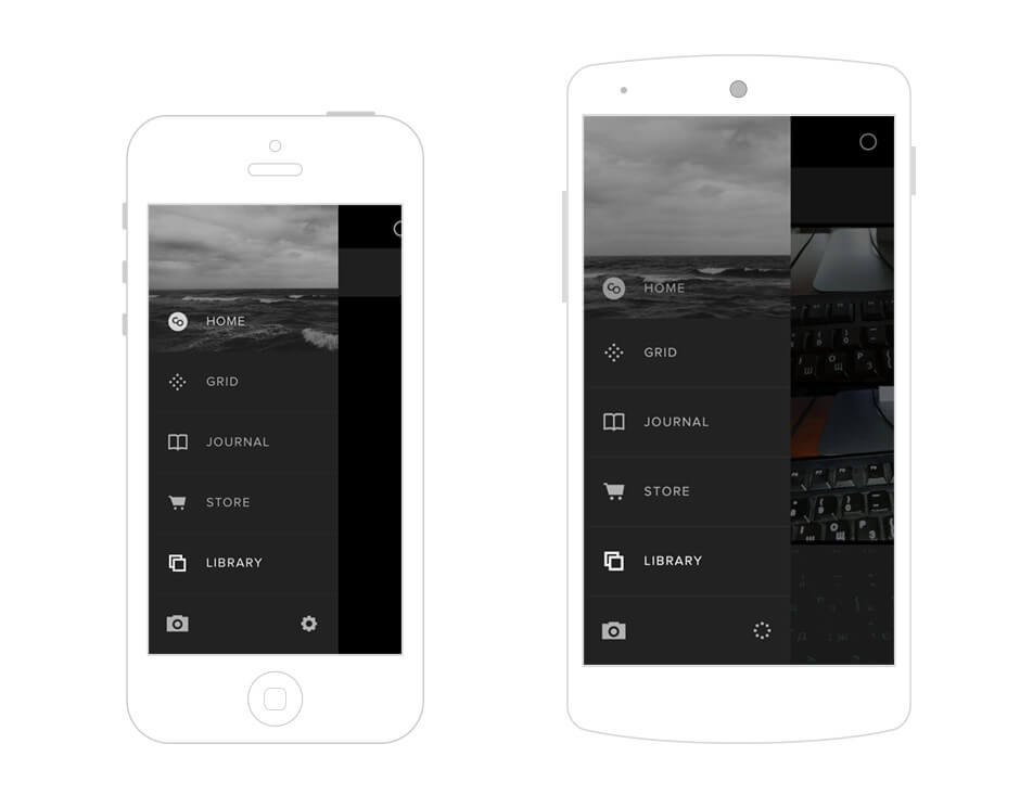
Dropping platform guidelines in favor of brand identity is well justified in this case. The VSCO Cam’s founders deem creativity as massively important, which explains their vision of the product they’re building. They developed an app to be part of the brand and the brand to be part of the artistic community, which is why the creative integrity of the brand is more important for VSCO Cam.
Like the VSCO Cam app, Instagram was launched in the App Store way before it became available for Android. The iPhone app, which strongly corresponded to iOS guidelines experienced huge success; in this case, the typical UI for Apple devotees became Instagram’s distinctive feature. This explains why Instagram’s creators didn’t spend a lot of time creating a unique UI for Android. Even though the app’s overall aesthetics don’t conform to what Android users have come to expect, Instagram garnered over 1 million downloads from Google Play on day one.
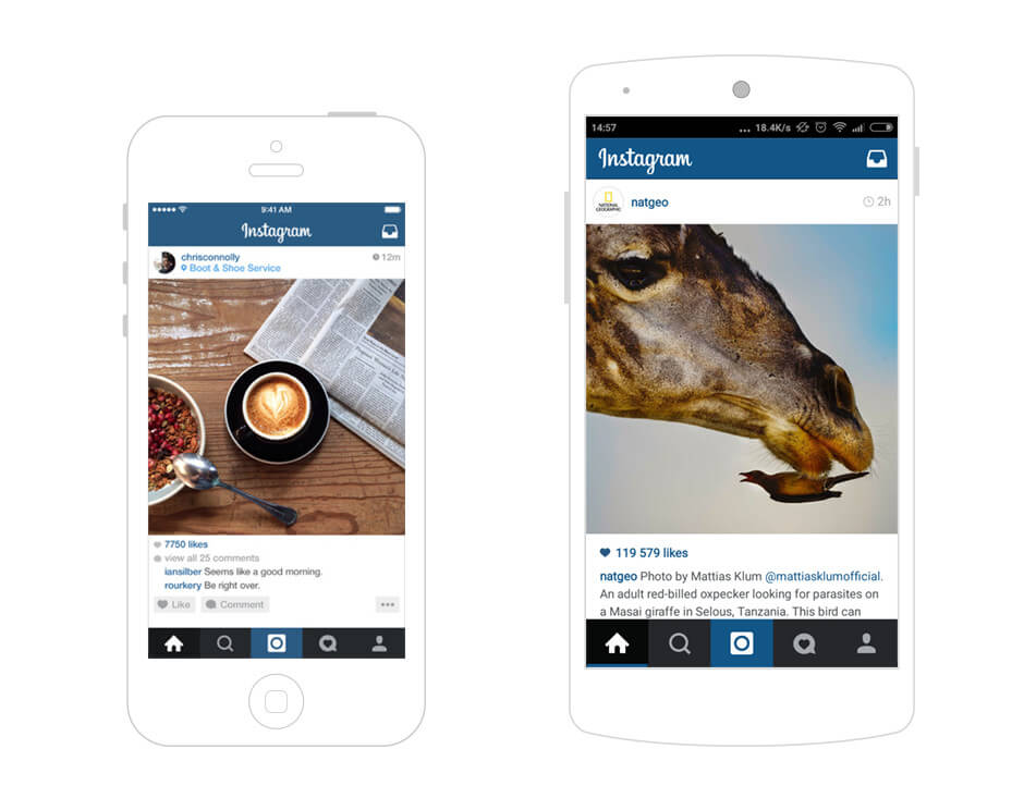
The current iOS and Android versions of Instagram do look like twins, but there are still a few elements that set them apart. For example, the search bar looks native to both platforms. The camera interface in the latest Android version is also a bit different from the iOS version. What’s more, Instagram’s logo is located in the center of the navigation bar on the iPhone app, but was moved to the left of the tool bar in the Android version.
The Instagram app for Android fails to comply with the platform design standards, but it still feels convenient to users.
Wire
Co-founded and backed by Skype’s creators, Wire is another messaging app. It doesn’t differ much from its counterparts, except in one thing — it has a strikingly beautiful user interface which never fails to leave an impression, especially on the hipsters who use it. Wire’s designers used non-standard gesture-driven solutions, the main purpose of which is to hide as many things from the user’s eye as possible.
"We are building an elegant and useful tool to communicate across all modalities — text, voice, video and media. Media is at the core of the Wire experience, so we have chosen to reduce chrome and remove any unnecessary clutter in favor of the content. We also put a lot of effort into typography and readability." —Priidu Zilmer, Wire's head of design
It takes quite a bit of guess work for a user trying to navigate through the app for the first time. But on the other hand, Wire uses lots of micro-interactions which make user experience more fun and engaging. A simplified contact search, nice color palette, the option to choose a background image, and color all contribute to the uniqueness of Wire in a world where online communication is ruled by Telegram, WhatsApp, Viber, and a bunch of other typical-looking messaging apps.
"We invest a lot in design, and we could not do it three radically different ways (for Android, iOS, desktop/web), especially as the platform conventions themselves are often moving targets. Getting too close to them means you can suddenly look out of sync — much like when iOS 7 and Android L shipped. At the same time, we know the risk of not following familiar platform conventions. Therefore, we are constantly working to find the right balance by iterating and adjusting so that our design can be simple enough to translate well across the platforms." —Priidu Zilmer, Wire's head of design
The iOS and Android interfaces of the Wire app are absolutely identical, including UX design and icons. Wire apps lack any reference to the original guidelines (except for the size of the clickable elements). This app is another example of the user interface design being given more weight than platform requirements.
According to Zilmer, the Wire’s design team did not feel that elevating how users connect to and share with the people in their lives could be done staying purely within the conventions.
VSCO Cam, Instagram, and Wire chose to focus on brand in the interface design. But does this mean that a smaller mobile startup that follows in their footsteps can become just as successful? There are a few situations where I believe following a brand-oriented approach can be a winning strategy.
When Should I Follow The Brand-Oriented Approach?
The Same User Accesses Your Product From Multiple Channels (Desktop, iPad, iPhone, Android)
Quite often, brands that employ multiple channels to interact with customers follow a brand-oriented approach. However, this is only reasonable if the same user accesses a product from different platforms and device types (iPad, Android phone, web). For example, the same user of iBroadcast, a music service, accesses it from iOS and Android devices, and even desktop. The app’s versions look similar everywhere because the highest priority for iBroadcast is creating a smooth transition from one platform to another one so that a user doesn’t feel any difference.
"Our service has people bouncing between the website, the iOS app, and the Android app. We want to make the transition as consistent as possible so it is easy for our users." —Rod Collen, co-founder of iBroadcast
In case your app falls under this description even if it’s a multiplatform product, you might want to think twice before taking a brand-oriented approach. For instance, Facebook (which we’ll consider a bit later) follows a mixed approach to multiplatform UI design adaptation. The thing is that Facebook’s users tend to interact with the social network using one or the other platform (iOS or Android), not both of them.
Custom UI Components Provide Intuitive User Interactions, And Are Eye-Catching At The Same Time
One research study suggests four components of intuitive interaction: gut feeling, verbalizability, effortlessness, and magical experience. The combination of these components allows designers to create seamless user experiences regardless of whether they follow a platform’s guidelines or not. After all, some custom components can provide a superior presentational or interactive experience than platform standards.
It’s also worth noting that the differences between platforms can be the reason why an app might feel convenient to use on one platform, but inconvenient on another.
The creators of HowAboutWe, a dating app, argue that the only way to truly ensure style and layout consistency across various Android OS versions, manufacturers, screen sizes and densities is to use custom UI solutions. Native UI components do have some limitations, but you can always innovate to improve user experience with your product.
For example, an Android budget managing app, Receipt, has quite unusual drop-down animations that ignore the platform’s guidelines but manage to engage users.
"I wasn’t happy with how the guidelines suggested implementing certain features and thought I could come up with better solutions. Generally, I’ve only ignored the guidelines when I thought there was a clear advantage to doing things my way, such as providing better feedback to the user, removing unnecessary steps, or preventing workflow interruptions. Replacing modal popups or unnecessary screens with inline elements are a big part of this." —Bogdan Mihaiciuc, founder of Receipt
Unless unique and beautiful UI solutions in an app complicate user experience, they make a great first impression on users and draw them into a product. One of the reasons why users feel attracted to My Day countdown app is its uniquely designed interface, identical on both platforms.
Excellent UI design in Citymapper makes the app stand out across all platforms, including web.
"For us it was always about the balance. Feeling familiar in the behaviour of our UI but also making a clear and unique statement about who we are as a brand. I think the value of a unique design language is often underestimated… You mean Citymapper? Yes "The green one." That in itself is hugely valuable. Sometimes designers can be too precious about the pixel-perfection and "correctness" of their designs. Life’s chaotic, and so is building a product. So why hide that fact? We’re in this together — the people who build a product, and the people who use it." — Gilbert Wedam, lead design at Citymapper
When adapting UI to another platform, you should put yourself in the user’s shoes regardless of the approach you use. The ability to create frictionless user experience while keeping brand consistency is one of the virtues of a great designer.
The Platform-Oriented Approach
Contrary to the brand-oriented approach, following platform-specific standards requires significantly more time and money (if we speak about UI design exclusively). When you port design, many UX and UI elements need to be recreated from scratch to align with the conventions of the target platform.
In this case, the focus shifts from brand identity to familiar user experience, since users are accustomed to the platform conventions. They have an intuitive grasp of the design rules around their platform, which you can use to your advantage — which is exactly what Telegram and WhatsApp did very well.
Telegram
Telegram is a popular messaging app co-founded by Pavel Durov, the man behind the biggest Russian social network, Vkontakte. Telegram has a minimalist design style and supports a secure encryption protocol for private messaging which gives the app a great competitive advantage.
Telegram launched on both iOS and Android at the same time, and chose to focus on functionality rather than looks. Therefore, its designers decided to stick to a platform-oriented approach.
The iOS and Android versions of one and the same product are as different as typical iOS and Android apps can be. The iOS version fully follows Apple guidelines, and looks exactly like an app designed for iOS 7⁄8: on the right of the navigation bar there is an icon for typing a new message and on the left there is a button for editing; at the bottom of the screen there is a tab bar with sections, and on the top you can find the name of the current section.
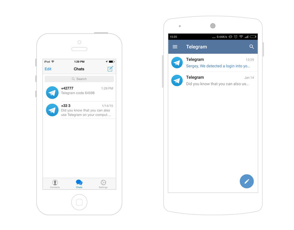
The Android version of Telegram complies with Google’s Material Design guidelines. It has a hamburger menu for navigating through the app’s sections, a simple search button at the upper right, and a floating button — the heart and soul of material design.
The apps use platform-standard controls and UX interaction elements. I bet Telegram’s designers were guided by the most general principles of usability when creating the app.
We’re going to stick to the theme of messaging apps for a while. Another candidate we’ll look at is the so-called evangelist of messaging — WhatsApp, now Facebook’s property. The iOS app was released back in 2009, followed shortly after by versions for BlackBerry and Symbian. The WhatsApp app for Android hit the market only in 2012. It looked exactly like an app Android users would recognize and love.
Since WhatsApp is available on almost every platform, it’s natural that it sticks to the platform-oriented method. The iOS and Android versions of WhatsApp look completely different from each other. Its designers did a great job on the multiplatform adaptation. They changed everything from the UX to the message look to the icons to the location of elements and menu items.
At present the iPhone app version corresponds to iOS 8 standards. The version for Android? You guessed it …received a material design visual refresh in the latest update.
Komoot
Komoot is the go-to app for hikers and bikers that belongs to a startup from Germany. The first app’s version came to iOS in 2010 and a year after it was followed by the Android version. Both old versions of the Komoot app have nothing in common with the current products of the startup.
The iOS and Android apps compile through guidelines and best practices for designing apps for their respective platforms. The apps contain a lot of travel content including topographic maps, turn-by-turn navigation, recommendations on cool places, and much more. All this functionality has to be easily accessible for a user.
"We decided to stick to each platform's rules since native user interface is more predictable and is therefore easier for a user. More than that, Apple and Google give preference to the apps that follow their requirements for UI design. This can be really important for promotion on Apple's App Store and Google Play." —Dmytro Prudnikov, UI and UX designer at Komoot
Komoot has been repeatedly featured in Apple’s App Store. It was named one of Google Play’s Best Apps of 2014, and is currently one of the top apps in Google Play in Germany.
Now we’re through with these exemplary apps, let’s discuss when sticking to a platform’s rules can be the most reasonable method.
When Should I Follow The Platform-Oriented Approach?
A Highly Competitive Market Environment Prompts You To Make A Fast Launch And Rapidly Grow A User Base
Even though you need to spend time redesigning an app’s concept entirely, a platform-oriented approach allows your software engineers to implement your idea much quicker. Once an app has been launched, users who download it will find interaction patterns familiar. More than that, you don’t need to wait for inspiration to design something special. All you should do is follow the guidelines.
Some Of The Design Trends Rolled Out By Apple Or Google Proved Successful Among Users
A super-smart branding move on Google’s part leaves us with a single choice: if you port an app from iOS to Android, it’s almost a must to profess material design as your religion. But this hot trend has also been attracting glances from iPhone users. As a result, we can see some iOS apps featuring material design style UI. I only mention this to emphasize the importance for an app to align with design trends, even if that means occasionally disregarding a platform’s specifics. By the way, here is a great piece from InVision on how to avoid looking like Google but still take its material design principles into account.
Your App Has Complex Functionality And User Interface
Any mobile app has to be as simple to use as possible, even if it has a load of functions. Following a platform-oriented approach makes a lot of sense for apps with rich functionality and a lot of content. To illustrate, Accent Kit, an app we developed for the UK’s leading accent and dialect coaches, contains a wide variety of features, from audio playback to recording to text and images all aimed at helping actors learn accents. When Yalantis had to port the app to Android, we didn’t consider any other method, but the one that’s oriented to the platform. Otherwise, users would’ve had a hard time trying to figure out all the useful features the app provides.
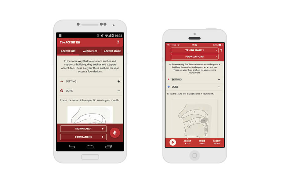
Sticking to platform conventions and providing users with experiences native to their platforms allows us to meet their expectations.
Where some apps succeed, others may not. A platform-oriented approach isn’t always so awesome for companies that want to retain the strength of their own brand. After all, it’s the brand that makes you a living, so try not to make your app just another “teacher’s pet” who follows all the rules but doesn’t receive much love from its classmates.
The Mixed Approach
With a little ingenuity we can achieve sufficient correspondence to platform specifics while remaining true to a brand’s values. This mixed approach to multiplatform design adaptation is a balanced combination of the two approaches mentioned above, and it’s also the most complicated one.
In this case, you need to take into account two types of users: those familiar with your product, and those who have never used it before. The former adhere to a brand, while the latter are accustomed to the particularities of their platform. Designers who choose the mixed method are diplomats whose job is to represent the interests of the brand, as well as promote friendly relations with users. They need to figure out what UI elements make a product stand out, and also find platform-specific solutions which won’t hurt the brand.
Let’s see how SoundCloud, Facebook, Airbnb and Viber have handled this challenge.
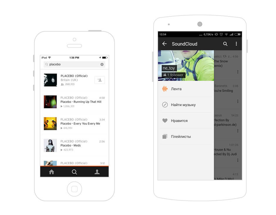
SoundCloud
A well-known audio streaming app, SoundCloud came out on both markets at the same time. Even though SoundCloud’s designers adopted the design for each platform specifically, they made a significant effort to maintain the brand’s integrity.
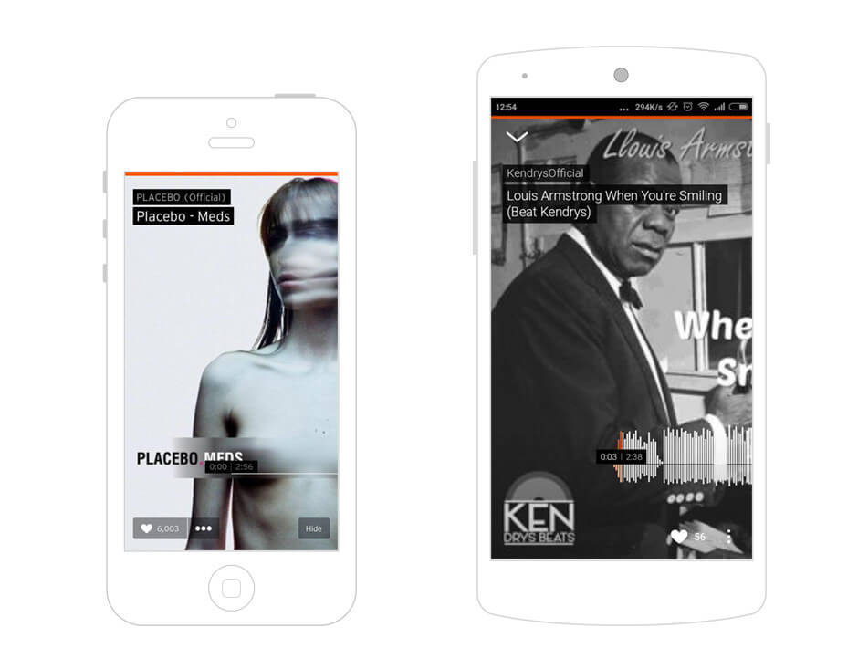
"On mobile, we aim to strike a good balance between users’ familiarity with their iOS and Android devices, and the patterns that are specific to our product and reflect our brand. For example, skipping along a track on our signature waveform player (which we call scrubbing) operates differently to any other comparable services." —Sylvain Grande, VP product, creators & monetization at SoundCloud
Among the platform-specific features, there is iOS’s standard tab bar at the bottom of the screen (with some design modifications), and a search bar at the top. The Android version has a typical tool bar at the top of the screen, a hamburger menu on the left, and a search icon which expands the search bar. Both the iOS and Android versions of the app use platform-specific interactions.
Facebook’s mobile incarnation started with HTML5, but it was a big mistake, as the company’s founder Mark Zuckerberg admitted. Eventually, Facebook decided to work on improving the native mobile experience on iOS, Android and other platforms.
On the one hand, Facebook’s brand has a huge impact. On the other, it’s a multiplatform network with an enormous number of users. That’s why the mixed approach which harmoniously combines brand identity and platform was the most appropriate for its situation.
The iOS and Android versions of Facebook’s app look similar, but also feel quite native to users of both platforms. Facebook follows Apple and Google design guidelines for the sake of their users. Since content is the key feature of the Facebook app, its creators chose a minimalistic design style to leave more room for the app’s content.
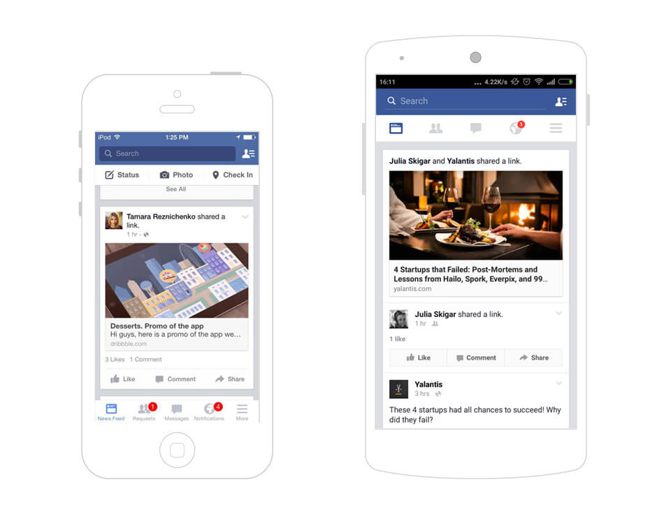
The iOS version uses a typical iOS navigation bar at the bottom of the screen and a standard search bar. In the Android version switching between sections is done with the help of a tab bar, which is located at the top just like the majority of Android apps.
Airbnb
One of the fastest growing startups, Airbnb managed to gain a strong position on the market, largely because of its simplicity and fantastic customer experience.
Airbnb’s designers chose the mixed approach when transporting their service to mobile. The brand itself is unique and attracts the attention of people all over the world. However, it’s the content that makes this app work. Therefore, Airbnb’s creators made their product convenient for the users of both platforms.
"We want our apps to feel familiar for all our users, which means taking on conventions they are accustomed to. But we also want to make sure they experience one Airbnb. Coherence between platforms — mobile, web, email, etc. — is important to the confidence and trust we build, and therefore our decisions can't solely be driven by the norms of various platforms. The thread of continuity unifying the experience is brand." —Katie Dill, head of experience design at Airbnb
At first sight, the main difference between Airbnb’s iOS and Android apps is the location of the navigation bar: bottom in the iOS version and top in the Android.
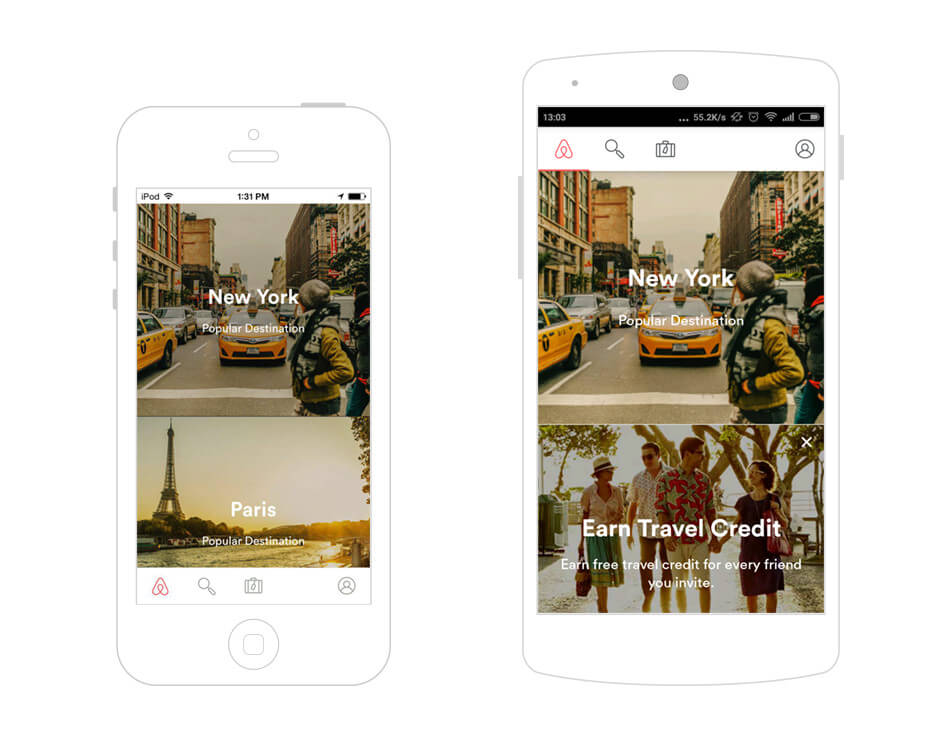
If not for this small but crucial particularity, I would’ve considered Airbnb among the apps which use the brand-oriented design approach. However, if we look closer, the difference between the iOS and Android apps becomes more apparent.
Given the simplicity of Airbnb’s functionality, a fuller correlation with the platform specifics would have complicated the app.
Viber
We almost forgot one more incredibly popular messaging app! I believe Viber is the best representative of the mixed design approach.
Unlike WhatsApp and Telegram, Viber’s designers perfectly complied with the brand identity while following platform requirements to the app’s UI. The mixed approach allowed them to make the app both recognizable on any platform, and convenient for any user. In other words, users won’t mix up Viber with any other messenger, neither they will have any difficulty trying to figure out how to perform a given action.
Compliance with the brand identity is achieved by using custom colors and icons identical on both platforms. To make the iOS and Android apps easy to use, the navigation between the apps’ screens is platform-specific.
Despite strong adherence to the brand, Viber perfectly meets user expectations in the interface and interactions, and pays a lot of attention to the functionality.
When Should I Follow The Mixed Approach?
When You’re Incrementally Developing And Refining Your Product’s Design Based On Feedback And Evaluation
The mixed approach implies continuous work on user experience which is one basis of iterative design methodology. This means you should analyze metrics to understand how a user is interacting with your product, roll out regular updates and improvements, analyze the metrics again, and maintain growth rates. Iterative design represents a form of research carried out within a cyclic process of prototyping, testing, analyzing and refining each successive version of a product.
The mixed approach is a singular case where you let the experience speak for the brand. I believe it’s the best path to the ideal multiplatform adaptation. It allows you to stay true to the platform, brand and user. Besides, using this approach lets a designer alter the balance either in favor of the brand or the platform guidelines, and as a result deliver a great product.
The only disadvantage of the mixed method is that it’s close to impossible for small startup companies that can’t afford investing that much time and money into enhancing their app’s design. Moreover, making the right guess in the first version of an app without testing UI features on users is a matter of luck, I’d say.
Which Approach Wins?
Even though the mixed method seems to be the way to go, I’d say none of the approaches mentioned in this article is perfect.
Sometimes choosing brand identity over the platform standards leads to specific user experience problems, no matter how beautiful your app is. After all, users decide how a menu should slide in, where to swipe to access a certain function, and how to go back to the profile page.
The apps that use platform-oriented approaches risk acquiring a look that’s too standardized and doesn’t work well for the brand. But on the other hand, you’re most likely to succeed using the platform-oriented approach, especially if your app is full of features, and targets a large user audience.
The apps I used to illustrate the mixed approach are great examples of successful multiplatform adaptation. Such cases are pretty rare. However, it doesn’t mean you shouldn’t try to achieve the same results.
When we design apps, we should always remember that we do it for real people to use on real devices in the real world. In fact, it’s not a brand, or a platform, or even your creativity that’s important. The only thing that matters is users. They don’t care about approaches you applied in your multiplatform UI design adaptation. Whether we like it or not, all that users are interested in is their overall experience with a company — and when it’s positive, a company succeeds.
We’d love to hear your opinion about UI multiplatform design adaptation and which approach you think is the best. If there are any other apps that you feel are good examples in each of these three approaches, please share them in the comments.
Further Reading
- Improve Mobile Support With Server-Side Responsive Design
- Approaches For Multiplatform UI Design Adaptation: A Case Study
- How To Sketch For Better Mobile Experiences
- Notes On Client-Rendered Accessibility
 (da, ml, og, mrn)

