Designing Healthcare Apps With Delight

Email Newsletter
Weekly tips on front-end & UX.
Trusted by 200,000+ folks.


 Flexible CMS. Headless & API 1st
Apps and devices designed to improve people’s health are becoming more pervasive. I serve as VP, Director of User Experience, in the New York office of a global agency with both healthcare and consumer clients. During my 13 years of working in the healthcare space I have never before had such a rich opportunity to directly affect health behavior.
In this article I’ll guide you through best practices when designing consumer-facing healthcare apps. (We’re not covering medical devices that need to be approved by authorities.) We’ll explore how to plan and conduct research, design moments of delight, integrate data from third-party devices and develop a messaging matrix. We’ll also look at examples of apps live in the wild that have been designed for delight at every moment of interaction.
Insights From User Research
User research is a critical planning tool to ensure that an app is easy to use and delightful and aligns with the user’s needs. Keep in mind some key points when planning user research:
- Conduct research with a minimum of eight people, which will mitigate any issues that may be related to their disease condition and is especially important if a full findings report with quotes and videos is to be delivered.
- We’ve found in most cases that the incremental issues uncovered with additional users are quite minimal and largely validate initial findings.
- A small percentage of the recruits may include friends and loved ones of the primary user of the app.
We typically use certain key research tools, depending on the amount of time and budget available:
Card Sorting
Conducting card sorting with users yields rich insight into the features and themes that resonate the most. When planning this low-fi, minimal-budget method, keep in mind the following:
- Expose users to third-party devices to gauge their interest.
- Plan an open sort to allow for flexibility.
- Keep features or content at a fairly high level, and avoid prescriptive solutions.
- Conduct a dotting or prioritization exercise with the client after the session.
In a card-sorting session we once conducted, we realized that patients would not use one of the devices we were considering pairing with. Even though technically they could use it, participants had the perception that it would interfere with another healthcare device they were already using. We were able to pivot without getting too involved in the technical integration of that particular device. We were also able to craft guiding principles for the app (based on our prioritization exercise) that ensured our app would not suffer from feature bloat (a common problem prior to introducing this methodology).
One-On-One Interviews
Like card sorting, one-on-one interviews are a fairly low-fi option and can be planned pretty rapidly. They will take longer to conduct, however, depending on how many users you plan to speak with. Choose one-on-one interviews when you are optimizing an app that is already in the market, when your competitors have already entered the market or when you need to gain buy-in from executives. Here are some important points to consider:
- Define the learning goals and gain alignment from your client.
- Write a discussion guide, while being very careful not to lead users with your questions.
- We typically conduct interviews in person if possible, or else over the phone.
- We use Morae to record the sessions, or Google Voice if done by phone.
- Use a transcription service if the budget allows.
- Hold a “synergy session”, in which the team maps out the high-level learnings on a whiteboard and aligns on the structure of the findings report.
When we brought this methodology to our clients, we found that we were able to talk to a wider audience of stakeholders to gain buy-in for a larger scope of work. The quotes and videos from these sessions were so compelling that they supported our case for developing a much larger enterprise solution for our client. We were able to get the company’s leadership on board early on in a way that we had never been able to in the past, solely by conducting usability testing.
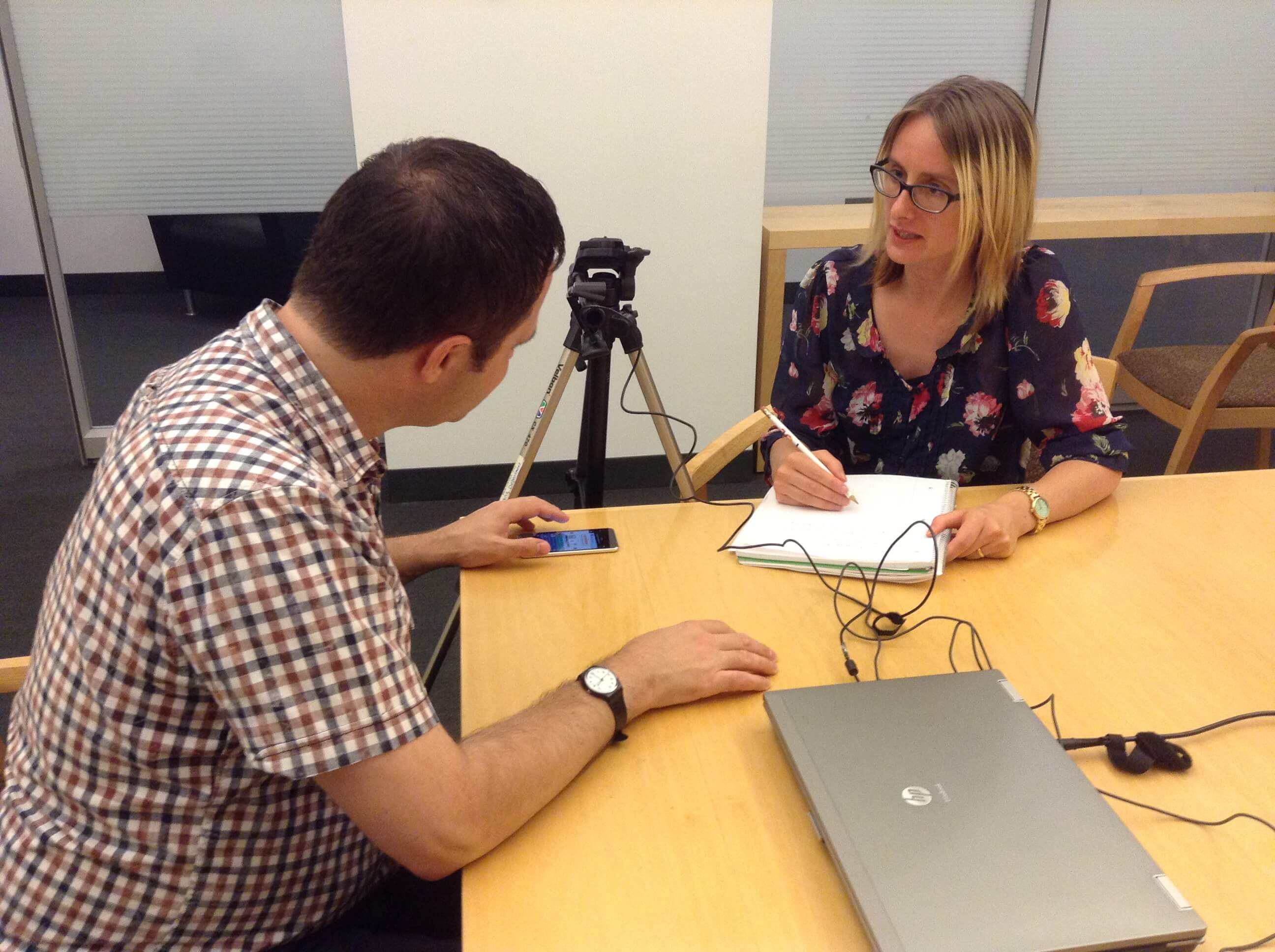
Usability Testing
Usability testing is at the core of the process of designing any successful app, and if you don’t have the time or budget for the other methods, ensure that this one is built into your plan. Consider informally recruiting users through your own office or LinkedIn network. We recommend using Morae software, HUE cameras and Mr. Tappy for mobile testing. Also keep in mind these points:
- Axure works very well when you’re creating the prototype because it allows for tapping, swiping and basic microinteractions.
- Similar to one-on-one interviewing, you’ll need to carefully write a moderation guide.
- Schedule a couple of trial runs of the usability test with volunteer users.
- Modify the moderation guide based on the above.
- Enter the test plan into Morae and ensure that it matches your moderation guide.
On the day of testing, don’t be afraid to make changes to the moderation guide and to take questions from the back room; being flexible will allow you to learn even more. Be aware that the process of creating the findings report after formal testing is often time-consuming, so leave plenty of room in your schedule for that phase. A lot of the feedback that emerges from users won’t directly translate to the final app, so you’ll need to brainstorm on how to deliver a solution that fits the business’ goals as well as users’ needs.
Designing Moments Of Delight
At this stage in development, your app will be focused and easy to use, and you’ll have full buy-in from stakeholders. Now it’s time to focus on bringing delight to your users at every moment of their interaction with the app. Google recently released research findings called “Micro-Moments,” and it found that “90% of smartphone users have used their phone to make progress toward a long term goal or multi-step process while ‘out and about.’” Keep the following points in mind:
- Every manual input of data should be as quick and painless as possible.
- If you prompt the user to input data, ensure that you are interrupting them at the right time of the day and at the right time in their own personal journey.
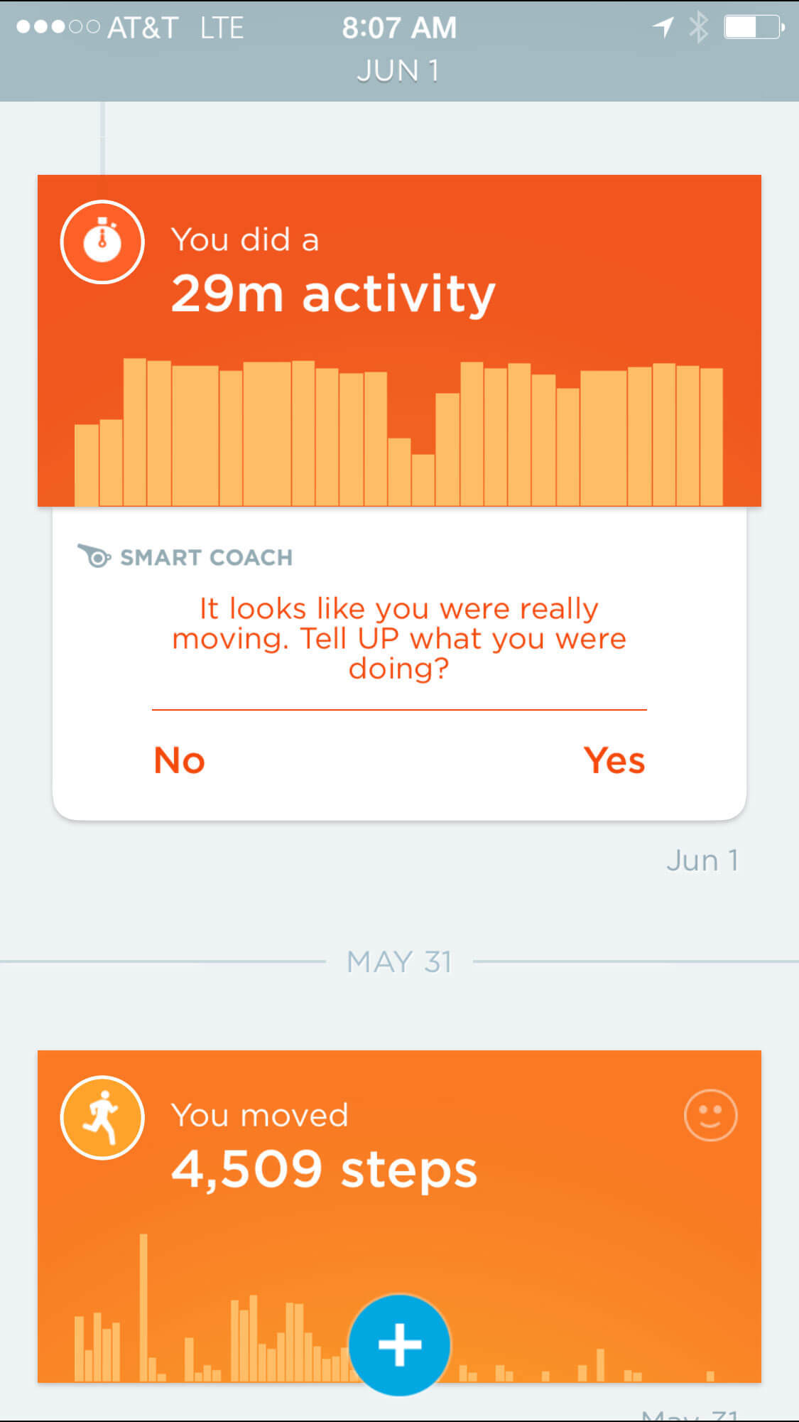
- A much as possible, utilize passive inputs, so that the app can make some assumptions for the user.
For a long time, I was frustrated by my Jawbone UP24 because I had to remember to double-press it with both a short and long press before going for a run and when I was finished. Now, Jawbone detects that I’m running, and the UP app simply asks me to confirm it with a tap.
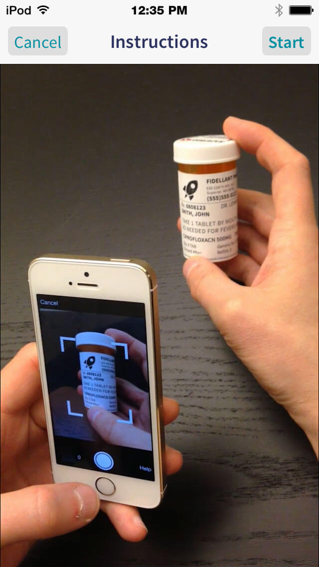
CareZone also does a beautiful job of utilizing passive inputs by allowing users to take a photo of their medication, saving them the arduous process of manually inputting this information.
Designing For Health Behavior Change
Integrating with third-party devices takes passive inputs to a whole new level of passive monitoring and can be a strong motivation for behavior change. You’ve already chosen devices based on which ones users gravitated towards in the card-sorting research. The next challenge is to decide which data points to pull in. A few principles to keep in mind:
- Review the legal guidelines from each device carefully.
- Many devices track multiple activities and health statistics. Don’t recreate another app.
- Pairing devices can be confusing. Offer help for this within the app.
- Provide feedback from the system, even when passively monitoring.
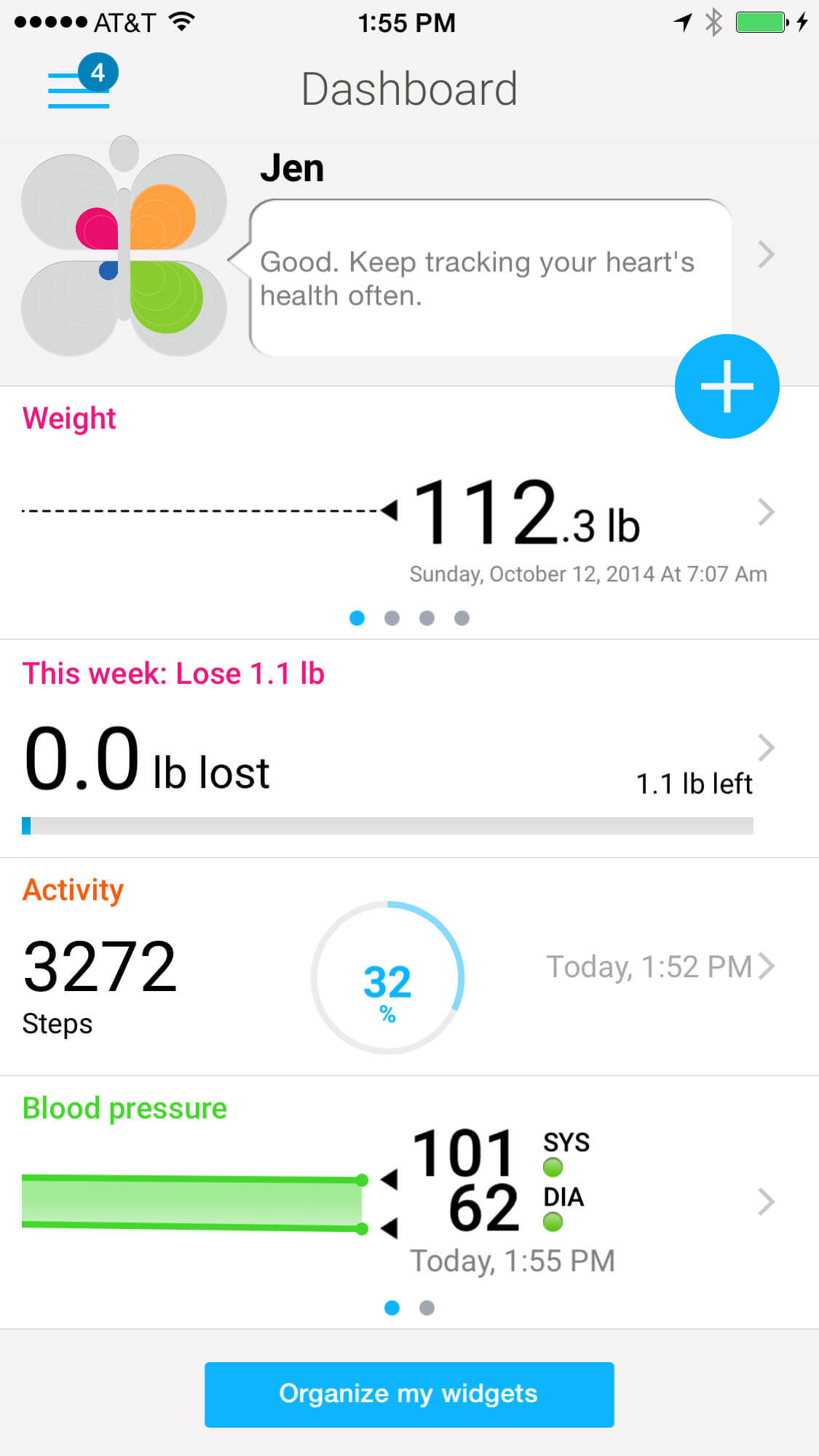
Both Withings and Fitbit track similar data and present it in a dashboard view, but Withings does a better job of presenting this information. Withings uses icons with black text on a white background in a minimalist, hierarchical layout. Vitals are timestamped so that users know they’ve been updated.
People have The Power Of Data
It’s all very nice to design a great experience, but none of that will matter if you don’t spend time sweating the details of your app’s privacy and security. For one of our health apps, we required that the user login nearly every time they re-entered the app. However, we did allow for a small window of time during which the user could enter the app again without logging in. We also thought about the sections of our app that would be most important to have quick access to in the event of an emergency, for example, the Doctor’s phone number and previous hospitalizations. Additional points to consider:
- Build in offline access for data needed in an emergency
- Back up data in the cloud in case of a lost or stolen phone
- Obtain the proper patient permissions if your app has a caregiver component
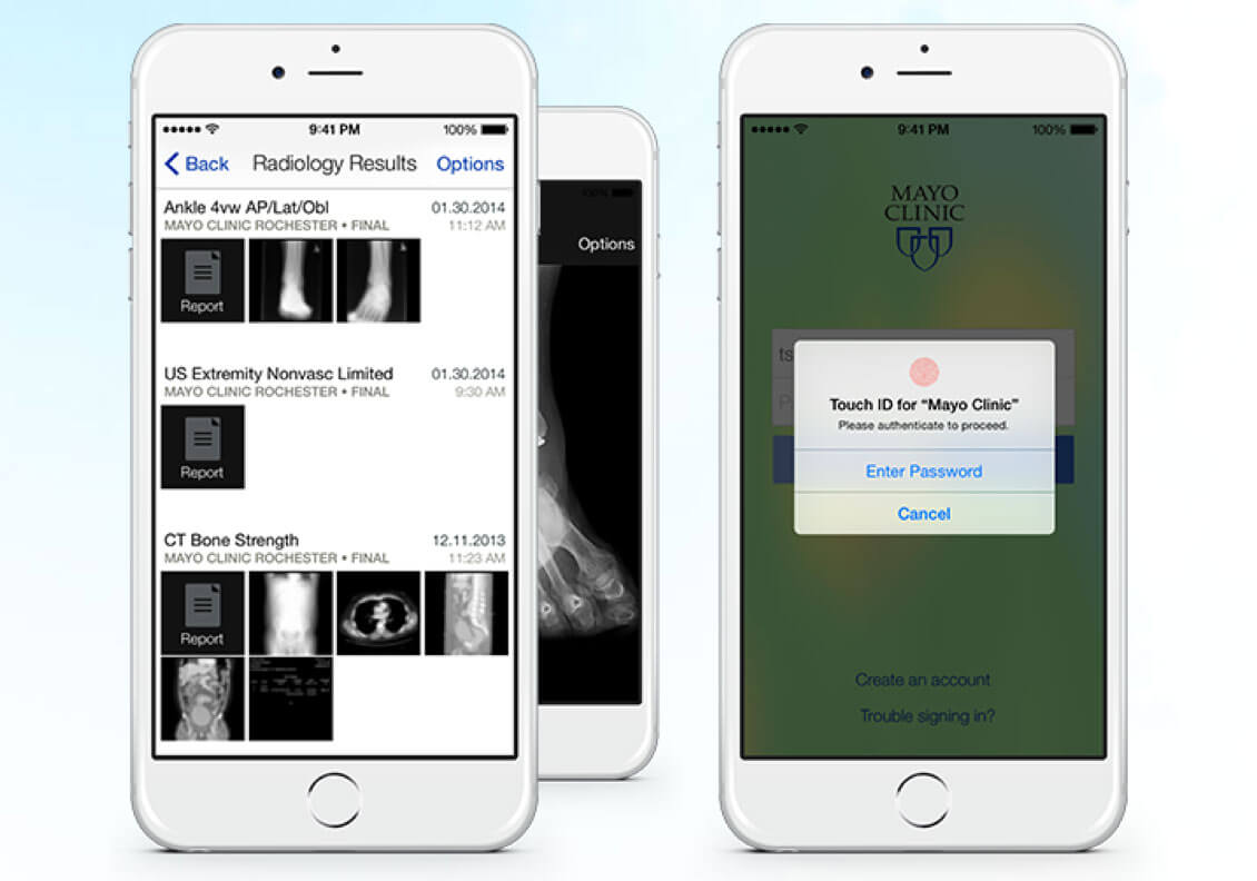
Providing this data to doctors is a request we’ve heard again and again in research. However, there are strict laws surrounding the privacy and sharing of this data. To add to the challenge is the fragmented nature of Electronic Health Record systems throughout the world, and the lack of a consistent standard. The Mayo clinic has solved this conundrum quite elegantly, albeit with the benefit of focusing on one network of hospitals.
Making Sense Of The Data
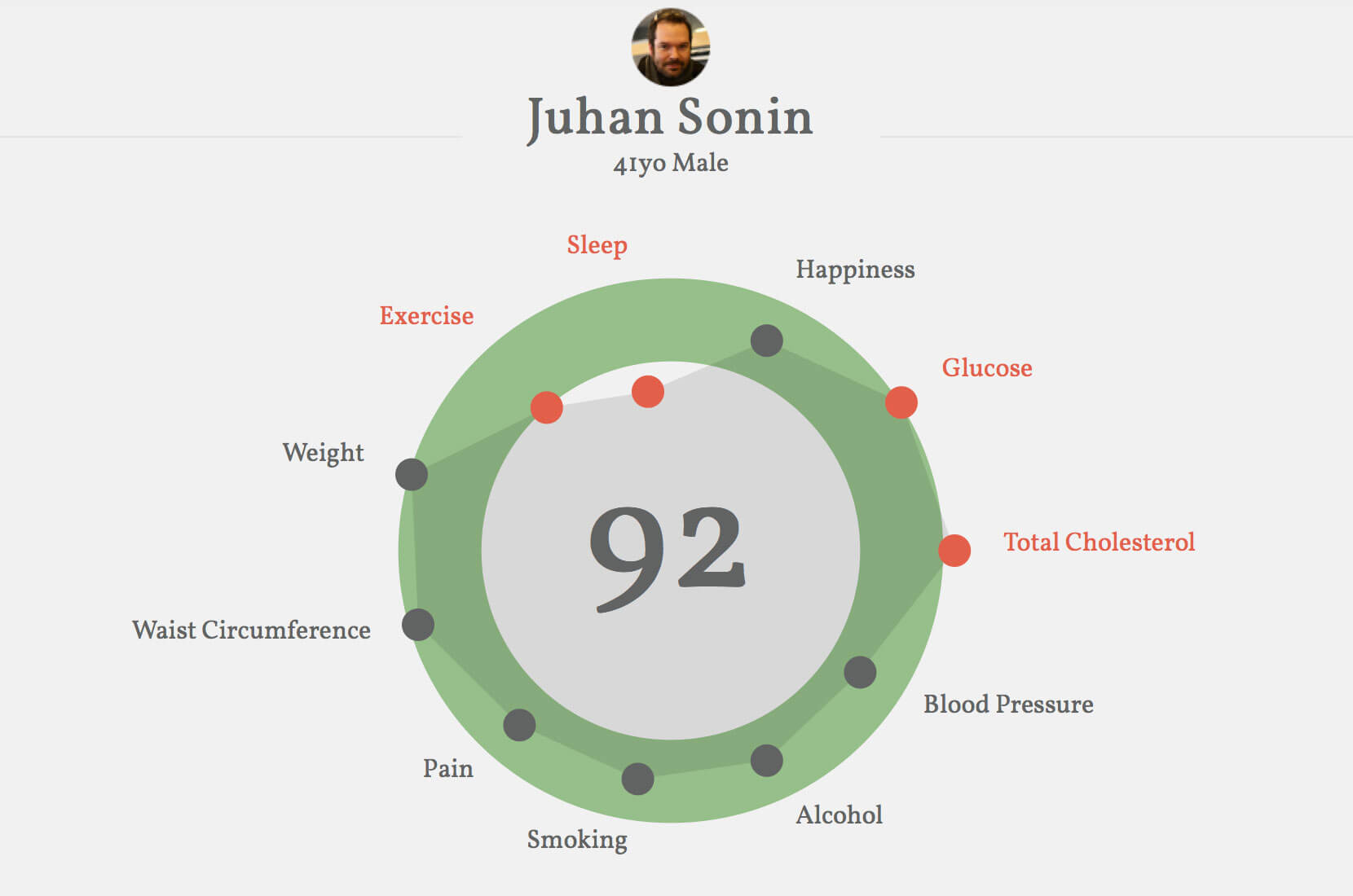
At this point, you have an app that is passively monitoring vitals for the user. Now it’s time to add a layer of intelligence to the app by creating an algorithm that uses the data to offer helpful suggestions to the user. A great example of this is Juhan Sonin’s redesign of his electronic health record app, which allows a patient to see their entire health status in one view and maps the data points on an easy-to-read scale.
Once the intelligent algorithm for your app is in place, you’ll want to focus on tone of voice and messaging. Tone of voice will already have been explored in your up-front research. For example, if you hear in research that users engage in frank and open discussion on message boards about their condition, aim for that in the app. Tone of voice lays the foundation for the detailed messaging matrix that you will develop.
Developing A Messaging Matrix
The messaging matrix is a critical step to ensure that any notifications coming from the app, whether in-app or push notifications, appear at the right time and introduce delight into the app. The messaging matrix is a comprehensive spreadsheet of if/then statements, prioritized according to the guiding principles of the app. It covers the following:
- notification category,
- type of notification (i.e. in-app or push notification),
- priority level,
- recommended character limits.
In addition, both new users and power users must be considered in your messaging matrix. Power users of the app might become bored with the same rewards and notifications, discontinuing use of your app. To this end, you’ll need to have an editorial calendar in place for your messaging matrix. By carefully crafting a detailed and delightful messaging matrix and updating it over time, the designers of Coach.me were able to create a highly engaging and effective behavior change app.
Meaningful Messaging
Once a messaging matrix structure is in place, the next step is to write app’s messages so that they are truly meaningful to users. The self-determination theory guides our approach. This theory, which is backed up by strong empirical research, posits that people are strongly guided by intrinsic motivation and that they do activities that are enjoyable and satisfy their basic needs. To this end, we avoid weighting the app’s messages in the realm of extrinsic motivation — that is, doing an activity simply because it leads to a separate consequence. Keep in mind these points while writing:
- Avoid language like “You should…”
- Be very sparing in the use of rewards.
- Clearly explain the benefits of taking an action.
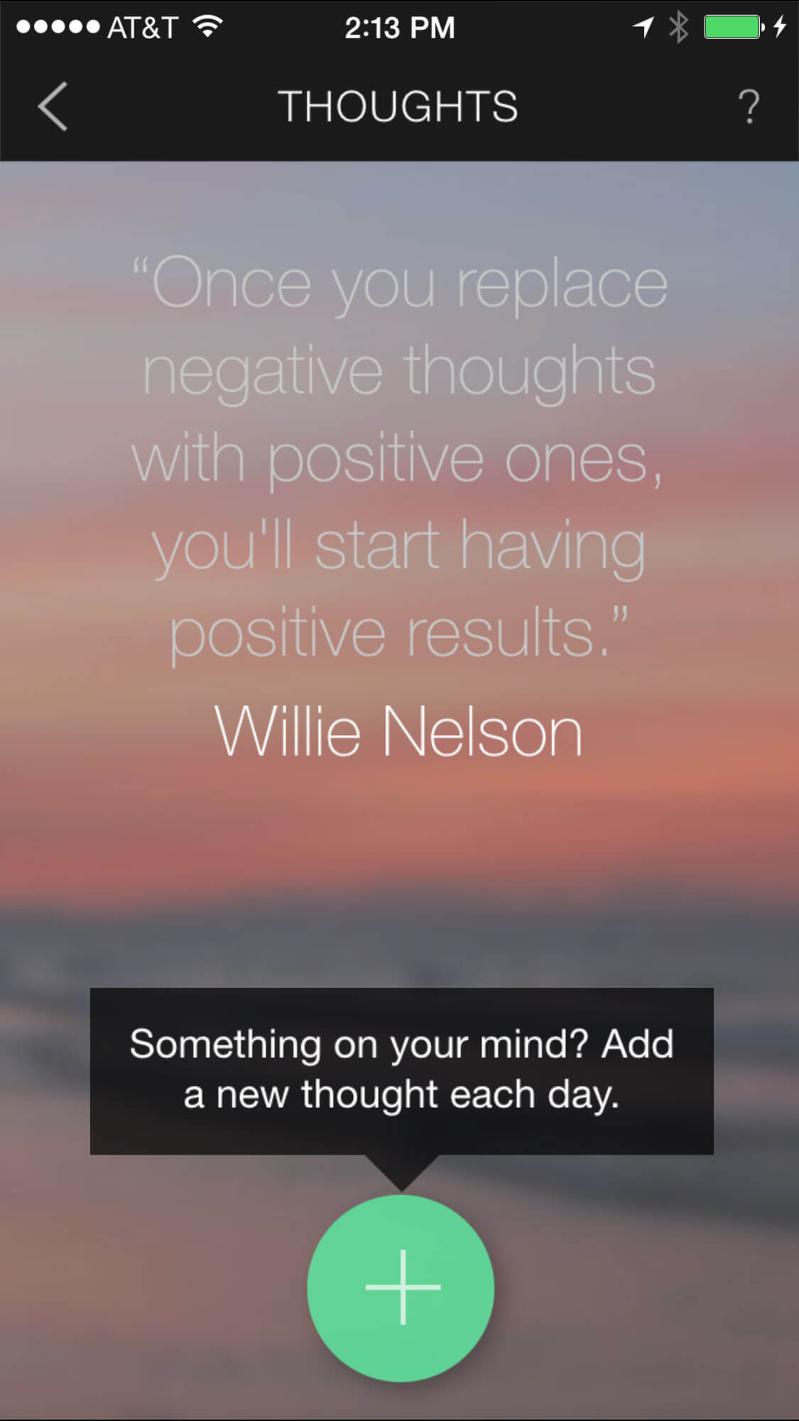
Pacifica, an app designed to help anxiety sufferers, elegantly combines a personal, warm and supportive style of writing with evidence-based quotes from experts and peers.
Bringing It All Back To Meaning And Delight
From a 40-year-old woman running her first half-marathon to a grandfather lowering his cholesterol, what positive health behaviors will your app facilitate? As a designer, you have the power to help millions of people live longer, healthier and happier lives. But a truly delightful and meaningful app doesn’t happen by magic. Start by mapping out a strong user research plan, developing guiding principles and gaining stakeholder alignment. Then, build on this foundation by designing passive inputs, an intelligent data-driven algorithm, actionable messages and a system of variable rewards. You now hold the building blocks that will enable you to harness the power of modern healthcare technology for the greater good.
Resources
- Card-Sorting Blog, Donna Spencer, Rosenfeld A compilation of card-sorting resources curated by the definitive expert in the method
- “In Search of Excellence: The Influence of Peter Cooper on Qualitative Research” (PDF), Alan Branthwaite and Simon Patterson, International Journal of Market Research, Volume 54, Issue 5 An in-depth analysis of classic research models developed by Peter Cooper
- “AEIOU Framework,” Rick Robinson, Ilya Prokopoff, John Cain and Julie Pokorny, EthnoHub A framework to facilitate interpretation of user research in preparation for a findings report
- “Designing for the Wrist, Not the Drawer” (video) Video of an Interaction 15 panel on user research, behavior change and how to evolve an app ecosystem over time (Wendy March of Intel moderates)
- “Hooking Users in 3 Steps: An Intro to Habit Testing ,” Nir Eyal A strategy for user testing to identify and amplify the “habit path,” a behavior set shared by an app’s most loyal users
- BJ Fogg’s Behavior Model Describes the three elements that must converge at the same moment for a behavior to occur and that guides development of the message matrix
Further Reading
- What You Need To Know About Anticipatory Design
- Getting Started With Wearables: How To Plan, Build And Design
- The Thumb Zone: Designing For Mobile Users
- How To Poison The Mobile User


