No Hard Feelings: The Wait For “Hardboiled Web Design” Is Over

Email Newsletter
Weekly tips on front-end & UX.
Trusted by 200,000+ folks.


 Flexible CMS. Headless & API 1st
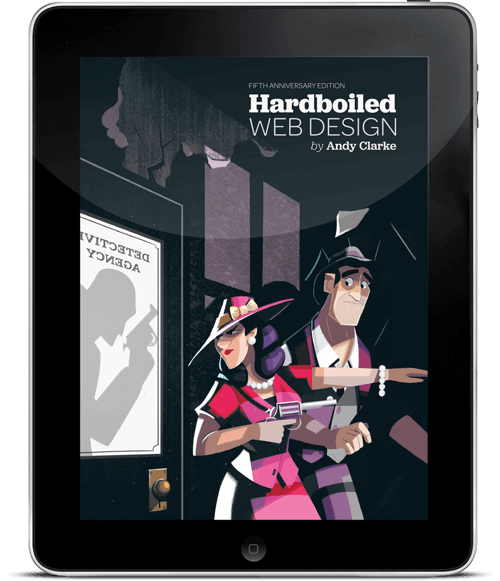
Some books deserve a spot at your desk. The brand new Hardboiled Web Design by Andrew Clarke is one of them. In its 5th anniversary edition, Andy explains how you can use HTML/CSS efficiently in responsive design — and how to reduce wasted time in the process with developers, designers and clients. No fluff, no theory — just insights into his own experiences with clients such as ISO and WWF.
If you get a printed copy (free worldwide shipping), you’ll get the eBook for free — available in PDF, ePUB, Amazon Kindle. All printed copies will ship from Dec 8th. Softcover, 441 pages. Jump to the table of contents. Proudly published by yours truly Smashing Magazine.
About The Book
With a reputation for being a reference book that “spends more time open on the desk than closed in the bookcase”, Hardboiled Web Design: Fifth Anniversary Edition features a wealth of updated front-end techniques, strategies and attitude overhauls that anyone working on the web can benefit from.


Across 441 pages with plenty of code samples, Andy sets out the “hardboiled” ethos, stripping markup to the bone, making it more flexible and scalable. You’ll also get insights into Andy’s workflow and learn how to establish a design atmosphere and develop a design style guide, create type proofs, use brand personality interviews and reduce wasted time in the process.


You’ll also learn how to avoid predictable generic layouts and embrace creativity within a responsive mindset and how to establish a better “responsive” process with clients. If you want to explore a workflow that will not hold you back, freeing your potential for crafting rich and expressive responsive websites today, this book is your new constant companion.
What’s In It For You?
If you’re a front-end developer, you’re in for a treat: the book focuses on practical cutting-edge techniques and a better process between developers, designers and clients. Build quickly and make fewer mistakes because you can use the actual technologies much earlier, using HTML and CSS to design, prototype and develop.


If you’re a designer, you’ll learn how to embrace creativity within a responsive mindset and how to work better with clients. Explore a workflow that will not hold you back, and will not limit your potential for crafting rich and expressive responsive websites today.
Table Of Contents
| CHAPTER | DETAILS | |
|---|---|---|
| Part I | ||
Summary • In Getting Hardboiled, you’ll learn what it means to be hardboiled. You’ll discover why it’s important to constantly re-evaluate concepts such as progressive enhancement and graceful degradation, and you’ll find out the cold, hard truth about how standards are really developed. You’ll find out how to create the atmosphere of a design independent of responsive layouts and how to demonstrate those designs to our bosses and clients. Above all else, you’ll learn that responsive web design is an opportunity to make fabulous creative work, an opportunity that you should grab with both mitts. | ||
| What The Hell Is Hardboiled? | ||
Summary • You’ll discover what it means to be hardboiled for you, your designs and your workflow. Think again about what we can do instead of what we couldn’t. Embrace the possible, instead of complaining about limitations. | ||
| (Give Me That) Ol’ Time Religion | ||
Summary • You’ll discover why it’s important to constantly re-evaluate concepts such as progressive enhancement and graceful degradation. Learn about the basics of how a page should work in first place, not necessarily how a design should look. Get away from limiting your creativity to the capabilities of a lowest common denominator browser. | ||
| The Way Standards Develop | ||
Summary • You’ll find out the cold, hard truth about how standards are really developed. Learn about ten CSS modules that are most relevant to the work we do, its vendor-specific prefixes, and how to manage them with your favorite tools effectively. | ||
| It Doesn’t Have To Look The Same | ||
Summary • You’ll learn that responsive web design is an opportunity to make fabulous creative work, an opportunity that you should grab with both mitts. Embrace that not all browsers should render websites in the same way and focus on providing the most appropriate experience for the capabilities of a browser or device. All that without anyone being left unable to access content or features. | ||
| Atoms And Elements | ||
Summary • You’ll learn about designing atoms and elements and how web design style guides help you presenting designs in a more effective way. Learn how to present the atmosphere of a design while designing components separate from layout with Style Guides. | ||
| Designing Atmosphere | ||
Summary • You’ll find out how to design a great atmosphere by starting with typographic elements, how to select the right typeface, weight, line-height, and more. Learn how to use type proofs for presentation, how to balance them the right way and how to make them legible and readable on many different screens. Last but not least, you'll dig into color accessibility and add decorative aspects that help give a design its personality. | ||
| Part II | ||
Summary • In Hardboiled HTML, you’ll learn about the latest semantic elements. You’ll also discover microformats2 — an evolution of those simple patterns for giving your markup added structure — and investigate WAI-ARIA roles. All of these will reduce your reliance on presentational elements and attributes. | ||
| Destination HTML5 | ||
Summary • You’ll learn how to use HTML’s semantic elements alongside the BEM naming system. You'll repeat the widely supported contemporary HTML5 standards such | ||
| Hardboiled Microformats2 | ||
Summary • Because your SEO ranking matters, you’ll discover the updated microformats2 — simple markup patterns for making your data machine-readable and therefore search engine friendly. | ||
| WAI-ARIA Roles | ||
Summary • While microformats2 are dedicated to make your website machine-readable, WAI-ARIA roles have different but complementary goals. You'll learn how to make your web content easier to use by people who use assistive technologies such as navigation menus, sliders, progress meters, properties that define dynamically updated sections of a page, ways to enable keyboard navigation and roles to describe the structure of a page, including headings, regions, and tables (grids). | ||
| Part III | ||
Summary • In Hardboiled CSS, you’ll learn about Flexbox, web fonts for better type and typography, how to layer colour with RGBa and how to use opacity. You’ll discover how use multiple background images and how to make borders rounded and full of images. You’ll wind up knowing how to replace many images with CSS gradients to make your designs lighter and more responsive. All the while you’ll be making your design look fabulous across responsive breakpoints and that’s where we’ll start, with CSS media queries. | ||
| Hardboiled Foundations | ||
Summary • In this chapter, you’ll dive deep into CSS Media Queries. By organizing it into six groups of elements that consider site-wide page styles, typography, form elements, tables, and images, you'll learn how to style small screens first and how to choose breakpoints that are based on content rather than devices. | ||
| Flexible Box Layout | ||
Summary • You’ll investigate new Flexible Box layouts and how to visually reorder content without laying a hand on your markup, how to overcome common frustrations such as equal height backgrounds on unequal height columns, and more. | ||
| Responsive Typography | ||
Summary • Much of the web content we consume every day consists of the written word. Learn about the different web font formats and how to implement them properly, with fallback fonts and website performance in mind. You'll learn how to specify the web fonts to low-resolution and high-resolution display, and how to test them on different resolution screens. | ||
| RGBa and opacity | ||
Summary • With your hardboiled HTML all set and your smaller screen styling in place, you’ll now give your design an extra level of fidelity and interaction that makes the most of the space available on larger screens. You’ll redevelop our vertical list into a grid of eight magazine covers that reveal their descriptions when we press on them. You'll do this by applying relative positioning but without any horizontal or vertical offsets. | ||
| Borders | ||
Summary • CSS borders can be exciting because they include properties that open up a wealth of creative opportunities. You'll investigate new design possibilites with properties such as | ||
| Background Images | ||
Summary • Since we’re also able use multiple background images and to change their origin point and size, there's a vast variety new creative opportunities. You'll get started by making a design using multiple background images. Background properties give us precise control over the size of our background images and how they’re rendered behind our elements. | ||
| Gradients | ||
Summary • Flat design aesthetic has become the norm. Almost every site you see these days include large, flat areas of colour, often laid out across horizontal bands, almost always the full width of our screens, with flat or outlined buttons, and icon graphics that are also flat. You'll learn how to move on from the mediocrity this flat aesthetic epitomises and you'll see web design that’s rich and full of life. Whether you like linear gradients, radial, repeating or with multiple background images — you’ll need to know how to handle them. | ||
| Part IV | ||
Summary • In More Hardboiled CSS, you’ll learn about the background blends and CSS filters, how to translate, scale, rotate and skew elements using CSS transforms in two and three dimensions. You’ll find out how to make state changes smoother with a host of CSS transitions, and finish off by discovering how to add columns to your layout without a extra division in sight. | ||
| Background Blends And Filters | ||
Summary • The rapidly increasing pace of change is a good thing for designers and developers, businesses and brands, and the internet in general. New technologies like CSS filters and background blends are not only being introduced faster, but they’re being implemented in browsers and turned into standards faster, too. Now’s not a time to kick back — it’s a time to use these exciting new tools to make creative work with depth and subtlety, work that’s hardboiled. | ||
| Transforms | ||
Summary • CSS layouts can sometimes be a little strait-laced. You'll learn how two-dimensional and three-dimensional transforms can help your designs break out of the box. | ||
| Transitions | ||
Summary • In web pages and applications, changes in state can have a huge impact on how it feels to use an interface. Make a change too fast and an interaction can feel unnatural. Make it too slow, even by a few milliseconds, and an interface will feel sluggish. You'll learn how to make state changes smoother with a host of CSS transitions. | ||
| Multi-column Layout | ||
Summary • You might be surprised how unimaginative most website layouts are today, particularly since the responsive web design came up. But there's so much to learn from print design that should inspire your work on the web. The different ways that magazine designers use columns of text to make their publications individual are an enormous inspiration. In this chapter, we'll learn how to use CSS multicolumn layout and how to use it for today’s responsive designs. | ||
Takeaways From The Book
Technologies should never hold you back, and this book is nothing short of a strategic guide on how to use them efficiently to build flexible, scalable responsive systems today.
- Ready-to-use HTML/CSS code samples for your responsive sites,
- Insights from actual RWD projects ranging from small businesses to household brand names,
- Move towards designing atoms and elements first, and learn how to establish style guides,
- Find out how to design atmosphere and choose breakpoints wisely with type proofs,
- Dive deep into how to actually apply mobile first to a design workflow,
- Benefit from HTML’s semantic elements, WAI-ARIA roles and microformats2 alongside the BEM naming system,
- Explore new CSS feature queries, Flexbox, background blends, CSS filters and how to make state changes smoother with CSS transitions,
- Learn about the multi-column layout and how you can use it today.
Further Reading
- Understanding Privacy: Protect Your Users, Protect Yourself
- Touch Design For Mobile Interfaces: Defining Mobile Devices (Excerpt)
- How To Become A Better Speaker At Conferences
- What Was SmashingConf In San Franciso Like?
 (mrn)
(mrn)

