Getting Started With CSS calc ()

Email Newsletter
Weekly tips on front-end & UX.
Trusted by 200,000+ folks.


 Flexible CMS. Headless & API 1st
 Register!
calc()? It’s a function that should work as a value in all places where a number value — with or without specified units — works. However, while basic support is really good, you might run into trouble depending on where you use it. In this article, Ana Tudor will look at a few examples of how to use calc() including what support problems they have (if any) and whether they’re ultimately the best solution.I first discovered the calc() function more than four years ago, thanks to CSS3 Click Chart, and I was absolutely delighted to see that basic mathematical computations — addition, subtraction, multiplication and division — had found their way into CSS.
A lot of people think preprocessors fully cover the realm of logic and computation, but the calc() function can do something that no preprocessor can: mix any kind of units. Preprocessors can only mix units with a fixed relation between them, like angular units, time units, frequency units, resolution units and certain length units.
1turn is always 360deg, 100grad is always 90deg, and 3.14rad is always 180deg. 1s is always 1000ms, and 1kHz is always 1000Hz. 1in is always 2.54cm or 25.4mm or 96px, and 1dppx is always equivalent to 96dpi. This is why preprocessors are able to convert between them and mix them in computations. However, preprocessors cannot resolve how much 1em or 1% or 1vmin or 1ch is in pixels because they lack context.
Let’s look at a few basic examples:
div {
   font-size: calc(3em + 5px);
   padding: calc(1vmax + -1vmin);
   transform: rotate(calc(1turn - 32deg));
   background: hsl(180, calc(2*25%), 65%);
   line-height: calc(8/3);
   width: calc(23vmin - 2*3rem);
}
On some occasions, we might want to use variables in the calc() function. This is totally possible with the most popular preprocessors.
First, with Sass, we have variable interpolation, just as with any other native CSS function:
$a: 4em
height: calc(#{$a} + 7px)
Here is LESS:
@a: 4em;
height: ~"calc(@{a} + 7px)";
And here is Stylus:
a = 4em
height: "calc(%s + 7px)" % a
We can also use native CSS variables, but note that this only works in Firefox 31+ for the moment, because no other browser supports CSS variables yet.
Update: Safari and Chrome/Opera now support CSS variables as well and they are listed as “in development” for Edge.
--a: 4em;
height: calc(var(--a) + 7px);
We need to keep a few things in mind to ensure that the calc() function works. First, division by zero obviously won’t work. Having a space between the function name and the parenthesis is not allowed. And the plus and minus operators must be surrounded by white space. This means that the following are not valid:
calc(50% / 0)
calc (1em + 7px)
calc(2rem+2vmin)
calc(2vw-2vh)
The calc() function should work as a value in all places where a number value, with or without specified units, works. However, while basic support is really good, we might run into trouble depending on where we use it. Let’s look at a few examples, including what support problems they have (if any) and whether they’re ultimately the best solution.
Easier To Understand Computed Values
Let’s say we want a rainbow gradient. The CSS for this is really simple:
background: linear-gradient(#f00, #ff0, #0f0, #0ff, #00f, #f0f, #f00);
But those HEX values don’t make much sense. Using hsl() and calc(), although more verbose, makes things a lot clearer:
background: linear-gradient(hsl(calc(0*60), 100%, 50%),
                            hsl(calc(1*60), 100%, 50%),
                            hsl(calc(2*60), 100%, 50%),
                            hsl(calc(3*60), 100%, 50%),
                            hsl(calc(4*60), 100%, 50%),
                            hsl(calc(5*60), 100%, 50%),
                            hsl(calc(6*60), 100%, 50%));
Sadly, using calc() in hsl(), rgb(), hsla() or rgba() doesn’t work at the moment in Firefox or Internet Explorer (IE), which means this version works only in WebKit browsers for now. So, in practice, it’s still probably better to let a preprocessor handle it all at this point, including the computations. And the best thing about using a preprocessor is that it lets us generate the list in a loop:
$n: 6;
$l: ();

@for $i from 0 through $n {
   $l: append($l, hsl($i*360/$n, 100%, 50%), comma);
}

background: linear-gradient($l);
More Efficient Gradient Backgrounds For Flexible Elements
Let’s say we want a background with a fixed 1em stripe both at the top and at the bottom. The only problem is we don’t know the height of the element. One solution would be to use two gradients:
background:
   linear-gradient(#e53b2c 1em, transparent 1em),
   linear-gradient(0deg, #e53b2c 1em, #f9f9f9 1em);
But we’d need only one gradient if we use calc():
background:
   linear-gradient(#e53b2c 1em, #f9f9f9 1em,
                   #f9f9f9 calc(100% - 1em),
                   #e53b2c calc(100% - 1em));
This should work fine in all browsers that support calc() and gradients, and because it involves mixing units, it isn’t something that preprocessors have an equivalent for. We can, however, make it more maintainable by using variables:
$s: 1em;
$c: #e53b2c;
$bg: #f9f9f9;

background:
   linear-gradient($c $s,
                   $bg $s,
                   $bg calc(100% - #{$s}),
                   $c calc(100% - #{$s}));
Note: For some reason, one of the stripes appears to be slightly blurry and narrower than the other in Chrome and Opera.
Diagonal Gradient Stripes
Let’s say we want an element with a thick diagonal stripe extending on both sides of its actual diagonal. We could do it using percentage-based stops:
background:
   linear-gradient(to right bottom,
                   transparent 42%, #000 0, #000 58%,
                   transparent 0);
In this case, the width of the stripe would depend on the element’s dimensions. Sometimes, that’s exactly what we want. For example, this is how we’d do things if we wanted to reproduce a flag in CSS. Adding a bit of green, yellow and blue to the gradient above gives us a flag that fine-chocolate lovers probably recognize — the flag of Tanzania.
background:
   linear-gradient(to right bottom,
                   #1eb53a 38%, #fcd116 0,
                   #fcd116 42%, #000 0,
                   #000 58%, #fcd116 0,
                   #fcd116 62%, #00a3dd 0);

But what if we want our diagonal stripe to have a fixed width that doesn’t depend on the element’s dimensions? Well, we’d use calc() and put the stops at 50% minus half of the fixed stripe’s width and at 50% plus half of the fixed stripe’s width. If we want the stripe’s width to be 4em, then we’d have this:
background:
   linear-gradient(to right bottom,
                   transparent calc(50% - 2em),
                   #000 0,
                   #000 calc(50% + 2em),
                   transparent 0);
You can test this live by resizing the window. The element’s dimensions are expressed in viewport units and, therefore, change with the viewport, but the diagonal stripe always stays the same width.
Positioning Children Of Known Dimensions In The Middle
You’ve likely seen the little trick of absolutely positioning an element dead in the middle of its parent:
position: absolute;
top: 50%;
left: 50%;
margin: -2em -2.5em;
width: 5em;
height: 4em;
With calc(), we can get rid of the margin rule:
position: absolute;
top: calc(50% - 2em);
left: calc(50% - 2.5em);
width: 5em;
height: 4em;
And we can make it more maintainable using variables for width and height:
$w: 5em;
$h: 4em;

position: absolute;
top: calc(50% - #{.5*$h});
left: calc(50% - #{.5*$w});
width: $w;
height: $h;
Note that, while using offsets (top, left) for initial positioning is safe, if you plan on animating the position of the element afterwards, you should use transforms instead. This is because changing transforms requires only compositing, whereas changing offsets also triggers a relayout and repaint — thus, impairing performance.
System Of Coordinates And Grid With Origin In The Middle
Since discovering the four-value background-position, I haven’t been too keen on using calc() to position backgrounds relative to the right or bottom side of the element. But calc() turned out to be a great solution for positioning a certain point of the background relative to the middle of the element.
A couple of years ago, I found myself wanting to create a background that represents a system of coordinates with a grid behind and whose origin would be dead in the middle of the screen.
The system of coordinates and the grid part were easy to achieve:
background-image:
   linear-gradient(#e53b2c .5em, transparent .5em) /* horizontal axis */,
   linear-gradient(90deg, #e53b2c .5em, transparent .5em) /* vertical axis */,
   linear-gradient(#333 .25em, transparent .25em) /* major horizontal gridline */,
   linear-gradient(90deg, #333 .25em, transparent .25em) /* major vertical gridline */,
   linear-gradient(#777 .125em, transparent .125em) /* minor horizontal gridline */,
   linear-gradient(90deg, #777 .125em, transparent .125em) /* minor vertical gridline */;

background-size:
   100vw 100vh, 100vw 100vh,
   10em 10em, 10em 10em,
   1em 1em, 1em 1em;
But how do we make the origin of the background dead in the middle and not in the top-left corner? First, background-position: 50% 50% won’t work because it makes the 50% 50% point of the gradient coincide with the 50% 50% point of the element, but the lines are at the top and at the left of the gradients, respectively. The solution is to use calc() and position the gradients so that their top left is almost in the middle of the viewport, just offset to the top and left by half the axis or the grid line’s width:
background-position:
    0 calc(50vh - .25em), calc(50vw - .25em),
    0 calc(50vh - .125em), calc(50vw - .125em),
    0 calc(50vh - .0625em), calc(50vw - .0625em);
Again, we can make it all more maintainable by using variables:
See the Pen system of coordinates + grid #2 by Ana Tudor (@thebabydino) on CodePen.
Maintaining Aspect Ratio And Covering A Viewport Dimension
One thing I’ve always wanted when creating HTML slides was for each slide to be a box of a certain fixed-aspect ratio that always covers at least one dimension of the viewport and that is, of course, in the middle along the other axis.
Let’s start by assuming that the desired aspect ratio for the slides is 4:3 and that I’m on a widescreen display. This means the slides cover the viewport vertically but still have some space on the left and the right.

Covering the viewport vertically means a height of 100vh. Knowing the height and the aspect ratio, we can get the width, which is 4/3*100vh. And to get it in the middle, we need to offset it from the left by half the viewport’s width (100vw/2) minus half the slide’s width (4/3*100vh/2). This is where we need the calc() function because we have to mix units.
.slide {
   position: absolute;
   left: calc(100vw/2 - 4/3*100vh/2);
   width: calc(4/3*100vh);
   height: 100vh;
}
Things change, however, for a display with an aspect ratio that’s less than 4:3. In this case, the slides cover the viewport horizontally, with some space left at the top and the bottom.

Covering the viewport horizontally means a width of 100vw. Knowing this and the aspect ratio will give us the height, which is 3/4*100vw. Finally, the top offset is half the viewport’s height minus half the slide’s height; so, 100vh/2 - 3/4*100vw/2.
@media (max-aspect-ratio: 4/3) {
   .slide {
      top: calc(100vh/2 - 3/4*100vw/2);
      left: auto; /* Undo style set outside media query  */
      width: 100vw;
      height: calc(3/4*100vh);
   }
}
We can, of course, make things more flexible by not hardcoding the aspect ratio and using two variables instead (one for width and one for height). Here is the Sass version, which you can also test live by resizing the window:
$a: 4;
$b: 3;

.slide {
   position: absolute;
   top: 0;
   left: calc(50vw - #{$a/$b/2*100vh});
   width: $a/$b*100vh;
   height: 100vh;

   @media (max-aspect-ratio: #{$a}/#{$b}) {
      top: calc(50vh - #{$b/$a/2*100vw});
      left: 0;
      width: 100vw;
      height: $b/$a*100vw;
   }
}
Even better, we could turn this into a mixin, which is generally a better practice than using global variables:
@mixin proportional-box($a: 1, $b: $a) {
   position: absolute;
   top: 0;
   left: calc(50vw - #{$a/$b/2*100vh});
   width: $a/$b*100vh;
   height: 100vh;

   @media (max-aspect-ratio: #{$a}/#{$b}) {
      top: calc(50vh - #{$b/$a/2*100vw}); left: 0;
      width: 100vw; height: $b/$a*100vw;
   }
}

.slide {
   @include proportional-box(4, 3);
}
Note that $a and $b must be integers in order for the media query to work.
This is supported in all current versions of major browsers. However, WebKit browsers didn’t support the use of viewport units in the calc() function until recently. This has been fixed in Safari 8 and Chrome 34, respectively, with Opera trailing.
Short Slide Title In The Middle
I wanted two more things for slide presentations.
The first was for the slides not to really cover the entire viewport because the edges might get cut off. This was an easy fix. I simply set their box-sizing to border-box and also set a border on them.
The second thing I wanted was to mark sections by starting each with a slide that had nothing but a short and memorable title right in the middle.

I didn’t want to use absolute positioning, so I thought I’d go with setting an appropriate line-height.
In case the slide’s height, including the border, covers the entire height of the viewport, I would have a line-height of 100vh minus twice the slide’s border-width:
$slide-border-width: 5vmin;

.slide {
   /* The other styles */
   box-sizing: border-box;
   border: solid $slide-border-width dimgrey;

   h1 {
      line-height: calc(100vh - #{2*$slide-border-width});
   }
}
In case the slide, including the borders, covers the viewport horizontally (and was vertically in the middle), its height would be $b/$a*100vw. So, the line-height for the title would be that minus twice the slide’s border-width:
line-height: calc(#{$b/$a*100vw} - #{2*$slide-border-width});
This was my initial idea, which, in theory, should work just fine. And it does in WebKit browsers and IE. However, it turns out that calc() values don’t work for — they work now; so, line-height (and some other properties) in Firefoxcalc() is not the best solution there. Luckily, there are a lot of other ways to solve this problem (flexbox, absolute positioning and more).
Fixed Point Of View
One thing I enjoy playing with a lot is CSS 3D — creating geometric 3D shapes with CSS in particular. If I create just one shape, then I’d normally position it in the middle of the scene it’s contained in. The scene is the element on which I set the perspective and also the parent of the shape element. The shape element will have its own descendants, which are the shape faces, but we won’t go into detail about them here; if you want to learn how they are positioned, then check out my guest article on CSS-Tricks.
Setting a perspective on a scene ensures we’ll see everything that is closer as being bigger and everything that is further away as being smaller. The perspective property accepts length values, and the smaller these values are, the greater the contrast between what’s closer to us and what’s further away.
Now, let’s say we have a very simple 3D shape — a cube, for example — right in the middle of our scene. It doesn’t look very 3D: It’s way too symmetrical, and if the faces are fully opaque, we can only see the front one.
We could rotate it a bit, let’s say by 30°, around its y axis (i.e. the vertical axis passing through the middle of the cube) or around its x axis. This looks better, but we can only see two faces. Plus, the cube is now visibly rotated, which was not the intention.
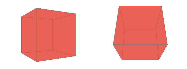
Something else we could do is change our point of view. We do this via a property called perspective-origin. Its initial value is 50% 50%. This is relative to the scene, and we know that the 50% 50% point of the scene is where the central point of the shape is positioned. Now, let’s say we want to move this up and to the right. The simplest way to do this is to set perspective-origin: 100% 0. But this creates a problem: How we now see the cube depends on the dimensions of the scene (you can test this live by resizing the viewport).
A perspective-origin of 100% 0 is measured from the top right corner of the scene, while the cube is always in the middle of the scene. Because of this, changing the scene’s dimensions will change the distance between the 50% 50% point (where the cube is positioned) and the 100% 0 point (where we have set the perspective-origin).
A solution for this to use calc() for perspective-origin, of course, is simply to add or subtract a fixed value from the initial 50%:
perspective-origin: calc(50% + 15em) calc(50% - 10em);
What About You?
Have you used calc()? If yes, what for?
Further Reading
- A Detailed Introduction To Custom Elements
- Houdini: Maybe The Most Exciting Development In CSS
- It’s Time To Start Using CSS Custom Properties
- A Deep Look At The Model-View-Controller Pattern
 (ds, ml, jb, al, il, mrn)

