Currency Design: Designing The Most Desirable Product

Email Newsletter
Weekly tips on front-end & UX.
Trusted by 200,000+ folks.


 Register!
 Flexible CMS. Headless & API 1st
There is a lot to learn from banknotes design: focus on accessibility, on what is easier, safer and more convenient for the users. These principles may lead to more credible and more long–lasting designs, including web designs. How do you maintain trust in a collection of pixels that represents a whole brand? Think of your project as a banknote.
As digital technologies are implanted deeper in the world, making more and more aspects of life intangible, it’s hard to imagine the world without any kind of banknotes, or paper money. In the dramatic history of our world, money became not just generic objects of payment, but also symbols of societies.
Combining utility and exclusivity, currency is one of the challenging objects to design. And as with any complex task, currency design holds some valuable lessons for us, web designers. This article is an attempt to formulate some of these lessons and, therefore, draw your attention to the inspirational nature of paper money.
Ancient Chinese Banknotes
The notion of using paper as money is probably as old as paper itself. The practice of using paper to transfer letters of credit over large distances appeared in China about 618 AD. The ancient Chinese, responsible not only for ingenious concepts but also for ingeniously describing them, named this practice fei–chien or “flying money”.
The oldest surviving paper notes were issued during the rule of the Ming Dynasty, between 1368 and 1399. The Ming dynasty’s 200 Kwan note is nearly the size of a legal document. The note was manufactured from recycled gray mulberry bark paper.
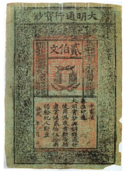
Marco Polo was impressed by the efficiency of the Chinese currency system. However, by the 15th century, China had almost given up paper money, due to the rapid inflation it caused. It was still many years before paper currency would appear in Europe and three centuries before it was commonly recognized.
Takeaway: Accessibility Matters
Even with the limited design tools and resources that the ancient Chinese had 14 centuries ago, the designers of the first banknotes paid attention to accessibility — or, in other words, designed the notes to be coherent and accessible (readable) to as many people as possible. In particular, the Kwan note shown above depicts two strings each holding 10 coins that were in circulation back then. This way, people who could not read would still understand the banknotes.
This pictorial presentation of the cash equivalent, as well as the written denomination code and legal description are surrounded by complex patterns, dragons and clouds, which both enhance visual appeal and protect against forgery. By clearly supporting key content with the graphics, the ancient Chinese currency notes remained accessible yet appealing to the eye.
For us, accessibility means keeping content as easy to understand and interact with for people with disabilities as for those without (since it’s accessible by default). An obvious remind worth mentioning: when working on accessibility, make sure that content can be perceived, navigated and interacted with regardless of the styles and interaction used to present it.
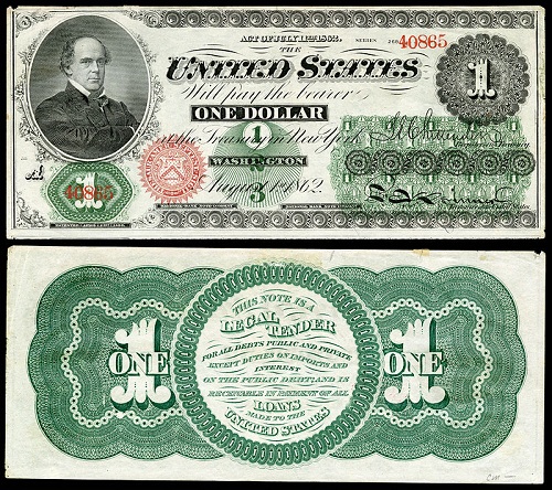
US Dollar
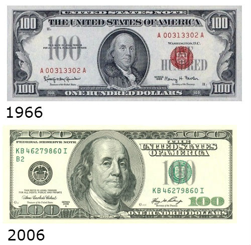
The dollar became the sole currency of the United States during the early 1860s, when the US Treasury issued banknotes to help finance the Civil War. The first US dollar banknote resembled a formal certificate and featured a portrait of Salmon P. Chase.
During the American Civil War, the back of the dollar bill was printed in green because the color was associated with stability and growth. These “greenbacks” started a tradition of printing US banknotes in green. This traditional color scheme of US banknotes, dominated by green and black, combined with the uniformity of banknote sizes, has been heavily criticized for not being accessible, especially for the visually impaired.
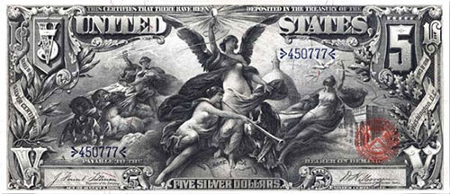
The US Educational Series banknotes of 1896 are commonly considered one of the most beautiful designs ever created for US currency. However, the particular note shown above was the subject of controversy due to the classical female figure depicted on it. After causing a burst of indignation from senators’ wives, the entire series was abandoned.
By the 1930s, all of the bill denominations in US currency looked pretty much as they do today. During the 20th century, the currency incorporated numerous features, mostly as part of anti–counterfeiting efforts.
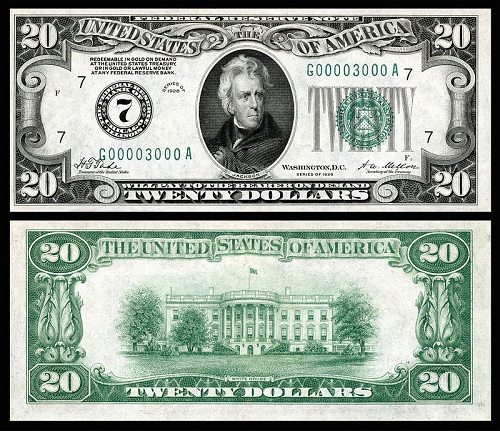
The ongoing tweaks and additions resulted in a rather controversial design of the US dollar, which was highly criticized in the media for a lack of aesthetic and legibility. For example, the well–known design critic Michael Bierut wrote in his article for The Atlantic magazine, “Anyone trying to understand our national values would be baffled by the rococo Victoriana and Masonic mumbo jumbo that festoon a dollar bill.”
The current $100 bill, in circulation as of October 2013, is the latest banknote to get an updated look and more accessibility features. The new “Benjamin” bears a number of innovative anti–counterfeiting features, one of which is an intricate effect when the bill is directly exposed to light.
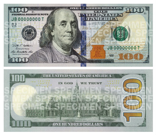
Innovation was also evident in the design process of the new $100 banknote. In particular, the designer of the new bill, Brian Thompson, wanted to make light an integral element of the design. Upon a close look, one can detect a subtle beam, guiding the eye across the face of the bill, from the bottom–left 100 to the upper–right 100.
Even though Benjamin Franklin’s portrait has been used on the hundred–dollar bill since 1914, Brian Thompson’s design is the first to capture facets of Franklin other than facial detail. Thus, the newly added quill, inkwell and script from the Declaration of Independence remind us that Franklin was among the Declaration’s drafters and signers.
Intaglio printing is among the features that have given US currency its distinctive appearance over the years. The portrait of Benjamin Franklin on the $100 bill since 1996 was created by Joseph–Siffred Duplessis and painstakingly engraved by Thomas Hipschen in 1992. Following that major redesign of the bill in 1996, the portrait was made larger and moved to the left so that it would wear out less from the bill being folded.
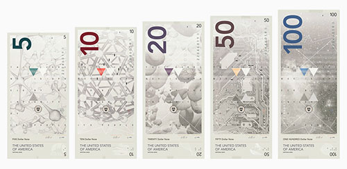
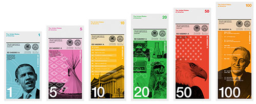
At the height of the US recession in the spring of 2009, Richard Smith started the Dollar ReDe$ign Project. Anyone was welcome to submit their idea to rebrand US currency, as a way to stimulate the US economy. The project got its share of detractors; however, many people thought that redesigning something as cherished as currency was a brilliant idea. As of today, the competition is not active, but submissions from enthusiasts continue to come from all over the world.
Takeaway: Redesign Wisely
The history of US currency proves that redesigning can be harder than designing from scratch, especially for widely used objects. The fear of a new design being less effective than the established one often tempts product owners and designers to go the tweak–here–alter–there route, avoiding major changes. While this might seem like a safer way to update something, it can lead to a loss of accessibility and usability (for instance, a $5 bill being easily confused with a $10 because they are the same size) and water down the strong points of the original design.
However, the latest makeover of the $100 bill is an example of balancing tradition and innovation, resulting in a contemporary yet historically sensitive design. Below are a couple of suggestions for a redesign project:
- Engraved elements have been present on US currency since the first dollar bills. We can figure out which elements of your website are responsible for its distinctive look, and transfer them to the new design.
- The new $100 bill tells a story. Who or what does your website represent? What makes this cause, person or brand special? We can use visual storytelling elements to make the new design connect with users on an emotional level.
Notgeld
The German term notgeld, or “emergency money”, refers to a form of currency that is issued by a body other than a central bank. The most obvious example of notgeld is the paper money that was printed in Germany during the period of hyperinflation following World War I. During this period, over 36,000 types of notes were issued by over 3,500 companies, towns and cities. Notgeld went beyond being just bills, evolving into a powerful force for raising the spirits of a desperate society.
While the majority of notgeld had very little intrinsic monetary value (paper notes were printed almost nightly in every area), the quasi–currency played a huge role in the visual culture and history of Germany.
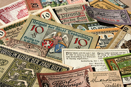
The design of most notgeld was based on the historical subjects and heraldic images, offering a way for a defeated country to seek comfort in a glorious past. Some notgeld series, such as the one created by Herbert Bayer, incorporated a minimal, modernist aesthetic, calling people to think of a better future, instead of recalling the past.
At that unstable period, notgeld became a means of expression for contemporary artists and designers; therefore, they quickly became more of a target for collectors than actual currency. Another reason for some of the intricate designs relates to finance: If a bill was left as a collectible, the debt would not have to be paid.
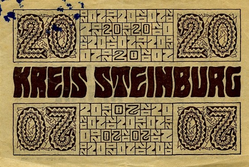
Notgeld is a goldmine for typography enthusiasts. Many of the designs, such as the one above, created by Wenzel Hablik, were purely typographic. They came from various artistic movements that either began or moved forward during that time, including Expressionism, Dadaism, New Objectivity and Modernism.
The largest collection of notgeld bills online can be found in the Flickr account of Miguel Oks, whose German grandfather started collecting this currency in the 1930s.
Takeaway: Loud Visuals Draw Attention (Duh!)
As a vehicle for some bold and expressive visual art movements, notgeld also became more effective in its original purpose. Issuers of this currency derived extra income from selling directly to collectors at prices higher than face value.
A striking, attractive look can be achieved by modifying colors, contrast and gradients, as well as by using ornate elements. Make sure that your visuals are not over the top and that they perform well and actually attract attention.
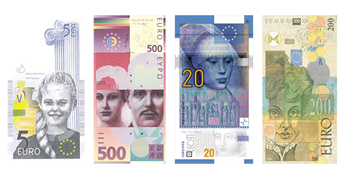
Euro
In February 1996, the European Monetary Institute (EMI) launched a competition for the design of the Euro banknotes. The Euro posed a serious challenge to designers because it had to be a multinational currency; thus, any bias would have to be avoided. And just like any national banknote, Euro bills would have to be easy to recognize, secure against counterfeiting and aesthetically attractive, not to mention accessible to people with impaired vision.
At the end of a seven–month competition, the EMI’s council decided on a winner, a series designed by Robert Kalina from Austria. The winning design was based on the “ages and styles of Europe” and featured windows, gateways and bridges, each representing a period of European history.
Beginning in May 2013, a new series of Euro notes has been released. The design of this “Europa” series follows on the “ages and styles” theme of the original series. The new banknotes, designed by Berlin–based Reinhold Gerstetter, have been given a fresh look and include a number of security enhancements.
The design process for both series of Euro notes included multiple surveys to ensure that the currency would be rooted in multinational and multicultural Europe. A thorough examination of end users enabled the designers of the EU currency to meet another important goal.
Even though the Euro’s design is not the most colorful and perhaps doesn’t incorporate any extraordinary ideas, it does an excellent job of balancing the utility of an everyday object and the uniqueness of this social symbol.
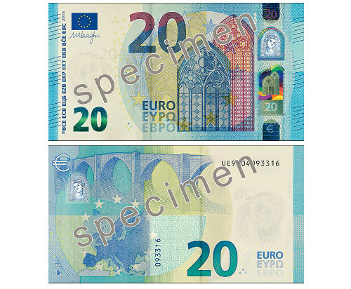
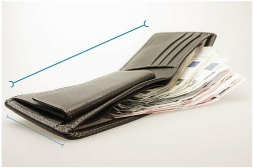
The size of a wallet is just one of the hundreds of aspects that central banks and currency designers study when designing banknotes. According to a survey conducted by the Dutch central bank in 2004, 94% of respondents called the height of the €20 banknote (72 millimeters) “exactly right.”
Have you ever wondered why banknotes use portraits? Some studies show that people have more confidence in a banknote that shows a human face. This principle might also apply to “About” pages that show photos of real people instill more trust than text–only pages.
Takeaway: The Universal Design Approach
Presenting a cultural and political message that is equally acceptable to all European citizens, as well as incorporating a number of accessibility features, the Euro currency serves as a good example of universal design. Universal design can be defined as being accessible and usable to the greatest extent possible, in the easiest manner possible and in the broadest range of situations.
While universality is expected by default in multinational currency, you don’t have to work on a project on the scale of the Euro to apply the principle. Whether you’re working on a social network, corporate website or personal site, the principles of universal design can help you make a design concept more comprehensive and, thus, as accessible and usable as possible. Here are some guidelines to follow:
- Ensure that the means of use are the same for all users: equal when possible, sufficient when not.
- Make the design as appealing to as many users as possible.
- Arrange the content and design elements in a way that is consistent with user expectations, that highlights the most important information, that accommodates different literacy and language skills, that removes unnecessary complexity and that makes it easy to leave feedback at any time during the user’s interaction with the website.
Swiss Franc
Switzerland triggers three main images in most people’s minds: cheese, chocolate and banks. So, it would be a shame if the Swiss did not have currency that celebrates at least one of these national symbols. Swiss currency has obviously been designed with special care and attention to detail, as if each banknote were a piece of art with numbers and labels. The resulting Swiss franc meets the high expectations of users, not only being the most secure banknote in the world, but also providing a one–of–a–kind aesthetic experience.
Eight series of Swiss franc notes have been printed since 1907. Each series relies on a different note size and color scheme for its ease of use. With every new release, the francs feature more elaborate layouts, typography and color schemes. The eighth series, in circulation since 1995, reaches a new level in its bold design.
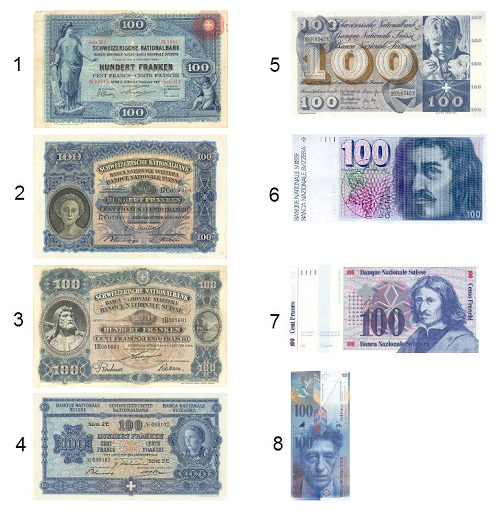
The current series of Swiss franc notes was designed by Jörg Zintzmeyer and is circling around the art, featuring motifs from Swiss artists such as Alberto Giacometti and Le Corbusier.
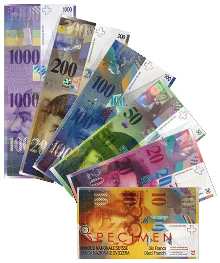
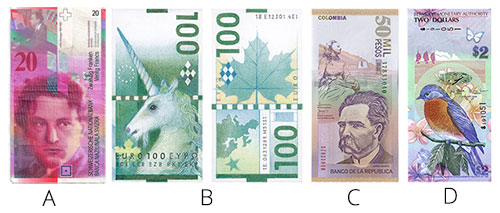
With its eighth series of franc notes, Switzerland has reintroduced a vertical format for banknote design, a format subsequently adopted by a number of nations, including Mexico, Colombia ©, Bermuda (D), Venezuela and Nicaragua. Could you have imagined a vertically designed Euro with a unicorn on it (B)?
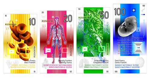
In 2005, Zurich–based designer Manuel Krebs won a competition held by the Swiss National Bank to guide the design of the ninth series of banknotes. It was a revolutionary attempt to improve the human factor in banknote design by incorporating emotion into it. However, the winning design, which includes images of blood cells and embryos, faced severe criticism from the public.
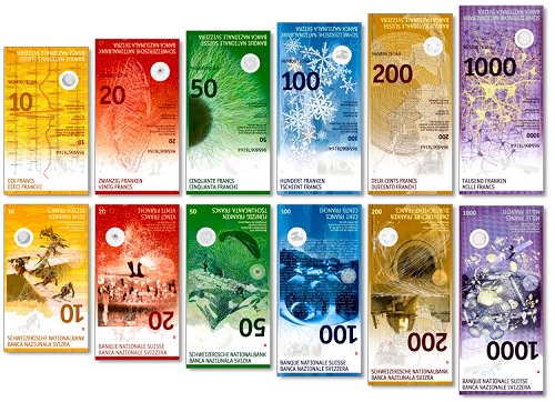
Therefore, the Swiss National Bank went instead with the second–place design, by Manuela Pfrunder. The series is scheduled to be issued in 2015, with a promise that the denominations and color scheme will remain the same.
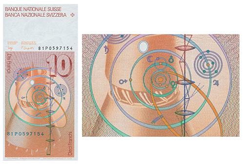
The Swiss franc appears to be a subject of interest not only for numismatists, but also for the X–Files fans. For example, there is a theory that the mysterious Planet X or Nibiru is depicted on the 1981 10–franc banknote.
We should risk getting creative with our designs, while relying on elements and techniques that prove their effectiveness over time.
Takeaway: Paying Attention To Orientation
The portrait–oriented Swiss franc banknote revived the fashion for a vertical format 20 years ago. Because a vertical format is more ergonomic for feeding notes into payment terminals and other research shows that people tend to handle notes vertically rather than horizontally, this orientation will likely take hold of currency design in the coming years.
Banknote designers care about being responsive, too. One concept being mulled over in the currency world is to make one face of the note horizontal, optimized for the wallet, and the other vertical, for quick use with a banknote terminal. A banknote with a similar concept was actually issued in 1981 in Switzerland — the 10 franc note mentioned above. When designing the orientation of your website, consider the priority of the content throughout devices. The level of attention that central banks pay to orientation indicates its importance to the user experience.
Also, in that shift between vertical and horizontal positions, provide more ways for users to process your content. For instance, additional data or a different context of the same data might enhance engagement.
Norwegian Krone
In October 2014, Norges Bank (Norway’s central bank) announced the design themes of its new banknote series. From the eight proposals submitted in the final round of the competition, two were selected by the jury. The faces of the new banknotes will be based on concepts by the firm Metric System, while the concepts for the back sides were rendered by Snøhetta Design.
One of the main objectives given to participants in the competition was to strengthen the security level of the Norwegian currency. So, designers had to incorporate numerous anti–counterfeiting features in their concepts.
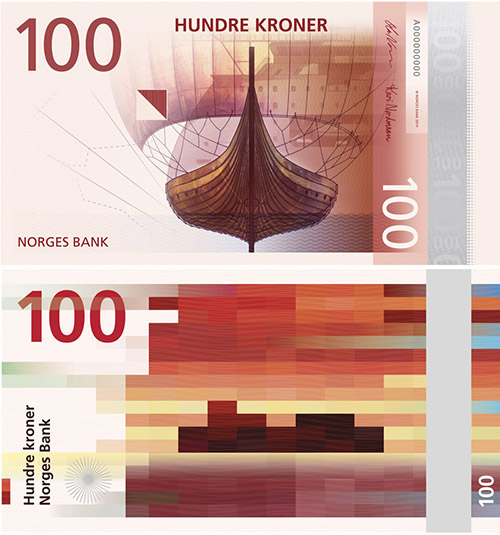
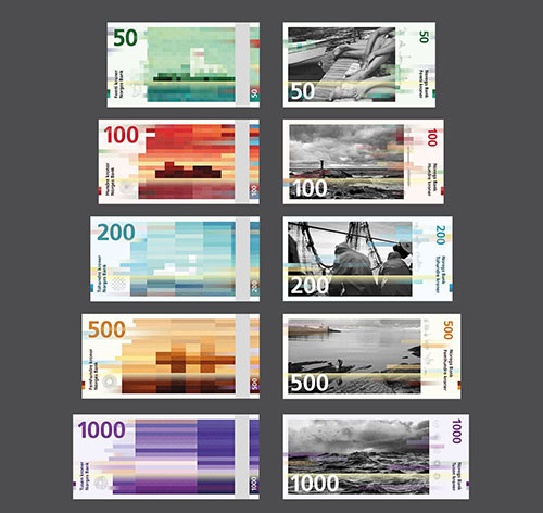
Designers could work with only one theme, the sea. With beautiful pictures of ships, fish, a lighthouse and people resting by the sea, Metric System’s design gives the new krone bills a classic look. It makes for a surprisingly sleek companion to Snøhetta’s abstract, pixelated patterns representing the sea and wind.
Among the interesting features of Norway’s new banknote, rainbow printing seems to have been given new life by this krone. Rainbow printing, which is a kind of controlled color gradation, was a typical element of banknote design created by special printing presses. Along with guilloches, it used to be one of the strongest security features of banknotes. But the technique lost ground with the development of other printing methods, such as screen and scan traps.
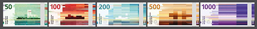
Norway’s redesigned banknote is ingenious on so many levels. Take, for instance, its impressive connecting power, from the bridge between the past and present built by the pixel–mosaic reverse theme, to the seamless blend of classic and avangarde implemented by the combination of motifs, to the revolutionary new look that communicates the country’s values to both citizens and the world.
Takeaway: Embrace Constraints
Like any banknote design, the Krone project came with many limitations. “You kind of feel it’s a little bit hard to ideate and to be creative when you have such strong guidelines and direction”. Martin Gran, a partner in Snøhetta Oslo, told Co.Design. Given the outcome, though, the designers clearly managed to turn those constraints into creative assets.
When dealing with a tightly directed project, look at the constraints as guidelines rather than barriers. Constraints force you to become creative and explore interesting solutions within given limitations. Splitting a complicated specification into a list of specific challenges, and embracing those challenges can keep your mind open to innovation.
Learning From Currency Design
In terms of visual design, currency is about so much more than framing a portrait of a famous personality and adding a few watermarks. The perfect combination of utility and creativity is what make banknotes sought after by both consumers and collectors.
Finding this balance of visual elements is good practice for us, too. Are you stuck in your design project, or just looking for a new challenge?
Think of your project as a banknote. The currency designer’s main challenge is to maintain trust in a sheet of paper whose purchasing power is significantly higher than its production costs. Web design is not all that different. How do you maintain trust in a collection of pixels that represent a large corporation, a talented entrepreneur or your own personal brand?
To recap, here are lessons we can learn from designers of banknotes:
- Accessibility is important.
Even in the 14th century, paper money was designed to be understandable to people with different abilities. It is essential that the web works for all people, regardless of their physical or mental condition, language, location or device. - Redesign wisely.
The US dollar bill has undergone several redesigns that draw our attention to the importance of balancing familiarity and innovation. - Loud visuals draw attention.
Notgeld were meant to be ephemeral but turned into a lasting works of art due to their impressive illustrations. By revising your website graphics to be more impressive, the design will more effectively get the visitor’s attention. - Consider a universal design.
Designed to represent the values of the multinational European Union, the Euro banknote is a good reference for designers who are striving to create products that are easier, safer and more convenient for all users. - Pay attention to orientation.
The Swiss franc set the trend for portrait orientation in banknotes. Orientation is an important consideration in creating usable and accessible layouts. - Embrace constraints.
Like any banknote design, Norway’s new krone was born of strict constraints. It proves, however, that approaching constraints as guidelines can be effective for creating beautiful, outstanding solutions.
Try to incorporate these principles in your work to create more credible, long–lasting designs. Or else, at least they’ll be good exercise as you’re architecting those pixel castles.
Further Reading
- “Inspiring Everyday Graphic Design,” Cosima Mielke
- “33 Tempting E–Commerce Icons For Free,” Vitaly Friedman
- “Breaking Out Of The Box: Design Inspiration,” Vitaly Friedman
- “Modern Art Movements To Inspire Your Logo Design,” Daniel Eckler, Glenn Manucdoc


