Transforming Lufthansa’s Brand Strategy: A Case Study
The first time I became aware of brand inconsistency was four, maybe five years ago. Companies were extending their appearances to apps, social media and other digital channels. And so did the bank I worked for back then. Unfortunately, no style guides were available to cover these channels.
I remember the dilemma while writing specifications: there were some older corporate identity manuals and some static UI style guides. Then, you’d look at newer web projects and none of them reflected the guidelines. So, what was I to do? Strictly obey the guidelines and produce something that looks outdated, or adapt to modern channels and risking a user experience that diverged from existing customer touch points?
Fast forward: Today, living style guides are en vogue and mitigate some of those issues. They have many advantages over printed or PDF guidelines. But do they increase a brand’s consistency? It’s certainly gotten better. However, you’ll still see companies vary in their representation across channels. The whole topic has become a matter of the heart for me, and so I joined a local startup called Frontify. We’ve taken up the cause of easing the lives of people suffering from useless style guides.
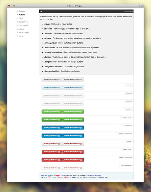
In the last two years, while we were building Frontify Style Guide (an online editor for techies and non-techies), we’ve talked about the topic with many companies and conducted a small survey (n=85), which revealed that almost all participating companies were not satisfied with their brand consistency. Across companies of all sizes, the variety of channels (especially digital ones) was one of the main reasons why a brand was assessed as being inconsistent.
Small companies with newer brands (such as startups) suffer from not yet having established a culture and the difficulty of conveying their inner values in external communication (due to missing guidelines, such as for voice and tone). While medium-sized firms do have style guides, their biggest challenge is maintaining and versioning them without letting them become impractical. According to the survey, large companies with multiple brands or sub-brands struggle with distributing and ensuring compliance with their style guides.
This case study sheds light on how we worked with Lufthansa to create a living style guide (including for UI component libraries) and to manage its design and web projects. Our involvement in this undertaking was to conceptually advise Lufthansa on how to create a style guide and UI library and how to use both in its design-to-development collaborations.
After a short introduction about Lufthansa and a few words about the evolution of brand implementation, you’ll read about the challenges Lufthansa faced and how it overcame them. Finally, we’ll look at how you can adopt an integrated workflow like Lufthansa’s and list some tools to help you achieve that.
Lufthansa’s Brand Story
Lufthansa is known for its iconic brand. As one would say, over the years, its design has not only helped to shape the aviation industry, but also inspired thousands of boys and girls to become pilots (or to revel in the dream).

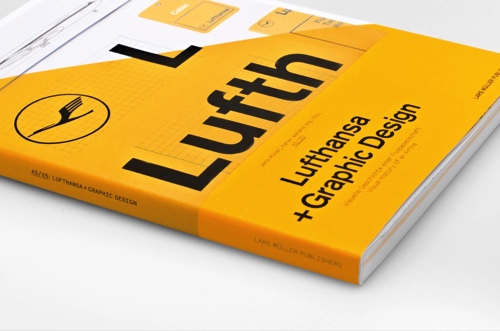
Lufthansa’s brand history is worth more than a rainy afternoon spent studying it, not just from a design perspective. Books such as Lufthansa + Graphic Design tell us stories about how Otl Aicher and his students developed the visual appearance of Lufthansa, the branding that has persisted from 1962 to the present day and has become known as “Ulmer studie.” You’ll also see extracts from its first brand manual, with the mysterious name “Lufthansa-Werbung Richtlinien und Normen CGN XE 3.”
Despite its rich history, it would be wrong for Lufthansa to simply walk into the promised land of social and interactive user experience without carefully thinking about the way brand guidelines are created and applied. To understand that, let’s take a brief look at the evolution of brand implementation.
Evolution Of Brand Implementation
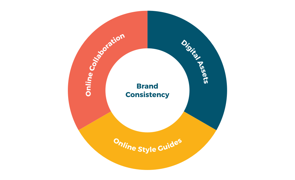
Among all facets of brand management, implementation is most strongly related to brand consistency. Basically it determines whether a brand is perceived consistently by the target group across all channels. The following instruments influence it:
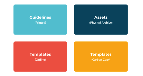
- Guidelines. What are the brand’s usage rules?
- Assets. What materials are used?
- Templates. How are those assets used?
- Collaboration. How is this carried out? Who are involved, and what are their jobs?
While a target group or core message might not vary often, communication channels will change: some appear, while others will vanish. As a result, uncertainty about a brand’s usage in new channels will lead to brand inconsistency and volatility in public perception. For one thing, a company will be tempted to adapt to new channels with its existing instruments. However, if there is a major shift in the landscape (such as the introduction of social media or the app economy), then existing methods will translate to those channels rather poorly and brand consistency will suffer.
However, once instruments are adapted to the new channels, consistency will return. This doesn’t mean that your brand’s reputation will automatically improve: A corporate social media policy will make your brand appear more consistent, but if it’s too restrictive or doesn’t allow for personality, then the perception of your brand could suffer.
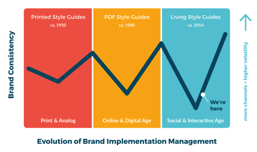
The Print And Analog Age
Until the late ’80s, a brand’s contact points with people were relatively limited: TV, radio, print magazines, billboards and, of course, on site.
Ever seen Mad Men? Exactly like that.
The Online And Digital Age
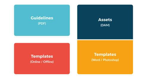
When the Internet gradually arrived, every company needed to be online. Sooner or later, the instruments for brand implementation needed to change. Digital asset management tools replaced physical archives: Storing brand assets and slideshow templates offline proved to be terrifyingly useless. Thanks to email, PDF guidelines could be distributed easily, and with VoIP technology and webcams, widespread collaboration was affordable to everyone. Also, it had one more advantage: Brand assets and templates were no longer physically separated.
The Social And Interactive Age
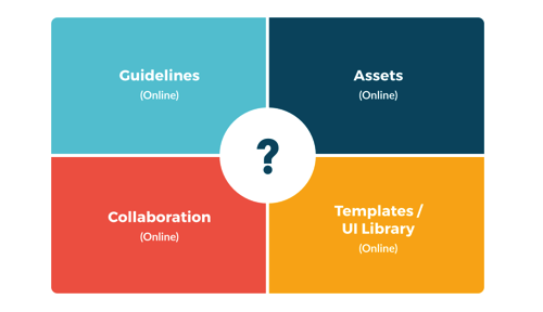
That brings us to the current playing field. Everything is mobile, interactive and social. This means that every employee contributes to a brand’s perception, knowingly or not. People who use Facebook and list their employer visibly in their profile could cause harm to the company’s reputation. So, we need to think about instruments that fit all needs — instruments that are simple and fast to use, yet give employees sufficient (but not overwhelming) guidance for today’s ambiguous world.
But what about the future? How do we keep a style guide adaptable to new channels? Projects will often overtake the current version of a style guide, and updating the guide would be dull manual labor. We need to keep a style guide alive, like the limbic system keeps the human body alive: automatic, without additional effort. Is there a way to make brand implementation self-sustaining?
Transformation From Online To Interactive: Challenges And Goals
Together with Lufthansa, we went on a journey to find a way to a strategy of self-sustaining brand implementation and to master this (and future) transformation. So, let’s look at the challenges, goals and approach of Lufthansa’s digital brand transformation.
Brand Challenges
Trust is the most valuable asset of a brand. The digital world is getting more and more diverse and extensive. Complexity is increasing, and its user and customer experience is getting more and more varied. People who don’t experience a brand consistently will sooner or later lose their trust in that company.
Lufthansa realized that outdated instruments lead to heterogenous customer journeys: because no specific UI guidelines existed, the app development team was interpreting the brand’s style guide differently than the web team. As a result, the apps had a different look and feel than the website.
Style Guide Challenges
Lufthansa identified various reasons to substantially update its style guide: Its brand-related guidelines were distributed across different platforms in various formats (like CMS, wikis, PDF, slideshows). People who needed the guidelines (like marketers, internal and external design and development teams) didn’t know where to find them.
And once they found them, they still had to solve the versioning dilemma: Were the guidelines still valid, and was this the latest version? Source code-generated style guides weren’t an option, because non-technical people (like brand managers) required simple maintenance, not to mention their inability to document social media, apps and other interactive elements (such as UI components) in static guidelines such as PDFs and wikis.
But one of the most pressing needs was to integrate the style guide into their creative workflow, without media disruption or manual work.
Collaboration Challenges
The ever-increasing number of channels forced Lufthansa to assess these factors on collaboration: In order to master new channels, costly external experts were called into projects. Those experts were proficient in their areas but lacked knowledge of other fields (for example, web versus print). Getting people onto common ground and fostering comprehension was time-consuming.
Once collaboration was running smoothly, work was being duplicated by different agencies, without the preliminary results being considered. Existing best practices and expertise lay idle, and knowledge was acquired anew for every project.
Digital Asset Challenges
Lufthansa’s storage and distribution of brand assets is handled by a management system. While this allows users to retrieve all sorts of assets quickly, it still separates the assets from the guidelines; so, assets that were linked in earlier guidelines would not exist today or have been updated and are no longer consistent with the examples in the guidelines.
Due to this missing integration, manual labor and costly editing were needed to keep them aligned. Manual labor is prone to failure and could lead to versioning problems with duplicate or outdated content.
Goals
The main goal was to strengthen Lufthansa’s brand — to make it a trusted brand that is recognized in today’s and future channels and that allows Lufthansa to stay competitive. Breaking this down into actionable goals, Lufthansa wanted to maintain a client service that was consistently high quality by unifying the experience.
Consistency would be achieved by implementing a holistic platform that integrates documentation, guidelines and design management and that serves as one source for digital design guidelines, code patterns and UI elements. However, operational advantages should go hand in hand with economies.
By basing its conceptual and technical collaboration on the guidelines, Lufthansa would be able to foster transparency between internal and external providers. By reusing best practices from designs, digital media content and UI patterns, Lufthansa would also be able to decrease a project’s duration. In the end, Lufthansa wanted not only to reduce expenses, but also increase velocity when releasing new digital products.
So we discussed Lufthansa’s challenges and goals already. Now, what approach did we take to make it all work? It took us a number of steps: it wasn’t enough to just create a style guide and build a pattern library. We also had to ensure that they would be applied properly, and that maintenance wouldn’t become a nightmare in a few months.
The Lufthansa’s Approach
While Lufthansa initiated the People Interactive project, its lead agency for digital products was responsible for both the design and UX of Lufthansa’s brand. Together with other agencies, People Interactive is the intended audience of the guidelines and will use them to realize future websites, apps, portals and related projects. Our role was to advise the project’s core team on the process of creating the style guide and UI library and integrating it in the collaborative design process.
Phase 1: Collaboration
Right from the start, Lufthansa emphasized trust as being an important goal for the project. By organizing an “agency day,” all people involved were able to discuss the organization and agree on an approach. Bringing all stakeholders to one table was regarded as being useful and was repeated in later stages. When you agree on the organization and approach, you also need to agree on a common vocabulary. Alla Kholmatova’s article “The Language of Modular Design” is highly illustrative: She explains that unless you have a common vocabulary for what you’re doing, you’ll probably encounter further setbacks.
Looking back, the collaboration between these numerous agencies has left its traces: A ton of creative material was lying around somewhere (on internal or external platforms), undiscovered and, therefore, unused. The next step, then, was to foster transparency. Gathering all of the material allowed Lufthansa to pull out gems and define best practices. That in turn led to the decision that, henceforth, it needed to take ownership not just of the result, but of the creative process.
Once transparency was established, it paved the way for a formal design approval process, in which stakeholders could discuss iterations, creative directors could advise designers, and Lufthansa could approve designs and help to start their realization.
Phase 2: Creating The Style Guide
Lufthansa’s new style guide remedies previous issues like distribution and versioning simply by being accessible online. However, to get there, Lufthansa needed to collect existing style guides first. Those were distributed across agencies and organizational units, sitting on various platforms (such as brand management tools, PDF style guides, wikis and CSS-generated guidelines).
The next step was to review those guidelines in order to consolidate and close gaps. Some of the findings were simply outdated guidelines. Others found that digital aspects (such as social media, apps and micro-sites) were missing or only partially addressed. The new style guide was enhanced by the missing parts, whereas the existing content was updated and complemented by the identified best practices (see phase 1).
After consolidation, it was time to apply the guidelines to existing design projects. Lufthansa avoided PDF style guides because of their poor reusability — applying specifications from PDFs required mostly manual work to transfer them to the utilized tools. By using online style guides, this step is eliminated.
Let’s consider an example. Designers would have swatch files with the defined colors (and wouldn’t need to enter them in Photoshop manually). Marketers would have brand assets in the same place as the guidelines (and wouldn’t need to search for the latest version on various platforms). Developers would download a development kit with icons, colors, fonts and UI patterns (see phase 3), and everything would be compiled; instead of having to put all of these resources together, they could start right away with development. This type of “smart content” wouldn’t need to be updated manually. (See the section “What Remains at the End: An Integrated Approach.”)
Phase 3: Creating The UI Library
The documentation of UI elements is still ongoing. For this brand, basics such as colors, typography and iconography (see phase 2) will be taken into account, just like the identified best practices (see phase 1).
First, all UI elements were collected from screenshots of the website, various apps, email and other digital channels. Those were uploaded to Frontify Workspace and ordered by application, platform, device and type (for example, mobile booking app, iOS, iPad, input fields).
This step was important because there was no documentation of UI patterns available for comparison, just fragments of digital projects, distributed across the agencies and teams involved.
In the next step, still ongoing, these patterns were discussed, compared and structured. Lufthansa and People Interactive decided to adopt the principle of atomic design and to structure patterns according to atoms, molecules, organisms, templates and pages.
Once the structure was defined, it was time to create an interactive UI library and document all of the patterns. The library was based on the style guide (see phase 2); this meant that, while coding an UI element, you could simply refer to colors, fonts, icons or even other patterns (thanks to the atomic design).
This helps to eliminate mistakes that could happen by manually looking up globals. It also helps with maintenance: Updating colors in the brand guidelines will change the colors in the UI patterns as well. With the screenshots of the identified best practices (see phase 1), the code editor in Frontify Workspace shows a design view of the pattern next to the rendered live preview of the pattern. Measurements and specifications help us develop the pattern without having to leave the editor.
What Remains: An Integrated Approach
Having created a style guide and built a pattern library, the work is not done. Applying them is obviously their spirit and purpose. But what about maintenance? That’s a critical discipline.
We believe that guidelines and collaborative projects should be interconnected, so that we can achieve not only a living style guide, but a living brand space. A solution that we came up with is Frontify, which merges guidelines and project collaboration into an integrated workflow.
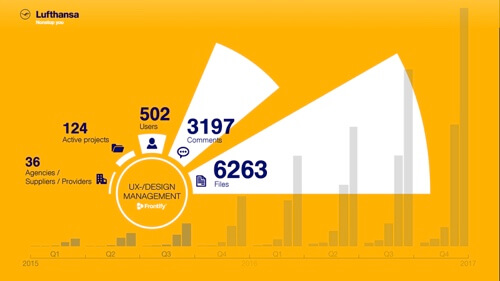
Because they’re able to create a project based on the style guide, employees are able to comply with the guidelines more easily. Again, this makes for a more homogenous experience and fosters trust in Lufthansa’s brand.
How To Apply An Integrated Approach
You’re probably asking yourself whether this makes sense in your case. Lufthansa’s approach isn’t restricted to companies of the same size. Because the problems are similar, perhaps just on a larger scale, it’s worth taking a look. And if you’re still not convinced, I’ve identified some reasons why you might want to consider an integrated approach.
In crowded markets (such as the consumer industry), companies are forced to differentiate themselves and to move quickly in the same (new) channels as their customers’. Companies that rely on trust (such as those in the financial, transportation and health industries) are concerned with how their brand is perceived. Brand consistency is one way to gain and retain trust.
For agencies and other players in the creative industry, one reason might simply be market needs: Their clients are looking for a solution to missing interactive or social aspects of their guidelines. Another reason is increasing costs, which force you to deliver faster and with better quality than before. To achieve that and keep a profit margin, you have to improve your process.
Not everyone needs or wants an integrated workflow. However, you would benefit from some or all of the recommendations here. Depending on your chosen path, there are some nifty tools that might help you. I’ll list some examples below, but I encourage you to inform yourself and seek the solutions that fit your needs best.
Online Collaboration
There are dozens of collaboration apps, and they have more or less similar features (like design feedback, revisions, asset management and approval workflow), but some have specifics that might fit your needs better than others:
- collaboration and prototyping: InVision
- collaboration and specifications: Frontify Workspace
- collaboration and video feedback: Cage
- collaboration and presentation: Notable
Online Style Guides
You will find style guides that focus either on the front end and UI patterns or on brand and design. But one need not exclude the other.
- The tools for front-end style guides are mostly generators, and there are quite a few of them. David Hund and Susan Robertson have categorized them in useful overviews. Unfortunately, most of the generators don’t make it easy to add editorial content. A notable one is Pattern Lab, also based on the atomic design principle.
- There are also many brand and design guideline tools. But few allow you to add interactive or reusable content. In most cases, they’re based on repurposed wikis or CMS solutions. An interesting one is Branding Manual, which allows for quick results.
- A combined solution is Frontify Style Guide which allows you to create style guides for branding, design and patterns, with interactive and reusable content.
Digital Assets
Digital asset management systems are widespread. Usually, they extend the functionality of an existing (collaboration) solution. However, there are also specific systems for brand assets, such as WebDAM, Bynder and Brandfolder.
Integrated Approach
Thanks to the widespread availability of APIs (and tools that connect apps), you can build basic integration all by yourself. This article has outlined all you need for that. I’m pretty sure your team would see the benefits quite soon. Still, we’ve built Frontify so that it can be managed and integrated without extensive technical knowledge.
So far, we haven’t found any other products that occupy this niche. We’re eager to hear about your experiences. Do you find it useful? Do you think integrating your design and development projects with a style guide to be unnecessary? How are you managing the process so far?
Conclusion
Working so closely with a large enterprise like Lufthansa could have been overwhelming for a startup such as ours. Luckily, it did not insist on special treatment, like getting custom-developed software. Its resolution was exemplary and not typical of large enterprises. Its attitude was, “If it’s good for others, it’s good for us. If we need a special solution that no one else needs, then we need to rethink our process.” In this project, Lufthansa’s way of thinking really facilitated the process and enabled us to follow our vision, which is to help brands grow — that’s not something you encounter in many companies.
Other Resources
Our product was shaped by the ideas, concepts and tools of countless influencers. Their pioneering work has fuelled us and continues to:
- Front-End Style Guides, Anna Debenham This pocket guide is a good digestible piece of work to get a quick introduction and deeper insights in various pattern library concepts.
- “Atomic Design,” Brad Frost This is the best way to explain to both developers and non-developers the benefits of modular development.
- Lean Branding: Creating Dynamic Brands to Generate Conversion, Laura Busche A book about branding from a startup’s perspective
- No Logo, Naomi Klein This book’s “analysis of our corporate and branded world,” by a well-known critic, opens up a completely different perspective on branding.
- “Publications Prof. Dr. Guido Hertel,” Organisational & Business Psychology, Westfaelische Wilhelms-University Hertel’s articles about virtual teams are recommended if you want to supplement your practical knowledge of online collaboration with scientific background.
Further Reading
- The State Of Airline Websites 2015: Lessons Learned
- How To Design Style Guides For Brands And Websites
- How To Make An Effective Style Guide
- A Hawaiian Airlines Case Study


 Take a break with a 3D game built on Netlify!
 Check the frontend report!
 Click here to kickstart your project for free in a matter of minutes.

