Infinite Scrolling, Pagination Or “Load More” Buttons? Usability Findings In eCommerce
What is the best UX pattern to display products on an e-commerce website: pagination, a “Load more” button or infinite scrolling? At Baymard Institute, we’ve conducted several year-long large-scale usability studies of more than 50+ leading e-commerce websites. We tested (among other things) these three design patterns for loading products, both on desktop and mobile.
Pagination is still the most popular way to load new items on a website because it ships by default in almost every single e-commerce platform. However, our usability test sessions found “Load more” buttons combined with lazy-loading to be a superior implementation, resulting in a more seamless user experience. We found that infinite scrolling can be downright harmful to usability — in particular, for search results and on mobile. However, it’s not black and white, because the performance of each method varies according to the context of the page.
In this article, we’ll present Baymard Institute’s usability research findings for both “Load more” buttons, infinite scrolling and pagination, including for both mobile and desktop. We’ll see how search results need to be implemented differently from category navigation, along with several pitfalls with implementation and examples from leading e-commerce websites.
The Test Findings
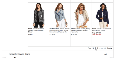
Throughout our large-scale usability study of e-commerce product lists and filtering, numerous test subjects explicitly complained about pagination. Test subjects generally perceived pagination to be slow, and the presence of more than a handful of pagination links would often discourage them from browsing the product list. More importantly, test subjects were observed to browse much less of the total product list than on websites that rely on “Load more” buttons or infinite scrolling. On the upside, they spent relatively more time on the first page of results.
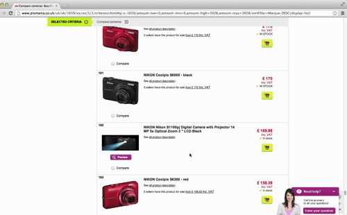
With infinite scrolling, sometimes referred to endless scrolling, the user largely experiences the page as if all products are loaded at once (regardless of whether they actually see all of the products), but without the performance penalty of potentially hundreds of products loading. Therefore, when infinite scrolling is implemented well, it can make for an incredibly smooth and seamless experience. The user can just scroll the list of products without any interruption. No interaction is needed — products simply appear as the user scrolls down the page.
It should come as no surprise, then, that subjects browsed vastly more products on websites with infinite scrolling than on websites with either pagination or “Load more” buttons. However, initial results received relatively less exposure. Infinite scrolling is, therefore, ideal for quickly showing the breadth of an entire category; but because users aren’t naturally halted when scrolling, they tend to scan more and focus less on individual products on the list.
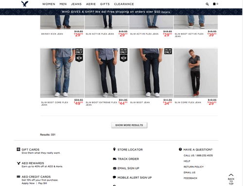
Infinite scrolling also impedes the user’s access to the website’s footer in some cases. This is one of the major design challenges of infinite scrolling: Because results continually load as the user approaches the bottom of the list, the user will see the footer for a second or two until the next set of results is loaded and suddenly inserted, pushing the footer out of view.
If many items are in the list (which is often the case with search and high-level categories), this effectively prevents the user from ever reaching the footer. This can be highly problematic because the footer often holds links to vital help pages, cross-navigation, inspirational category content, and information about customer support, shipping, and returns.
Only a few of the websites tested used a “Load more” button, but they were well received by subjects. In fact, when benchmarking the top 50 US e-commerce websites, we found only 8% use the “Load more” approach. “Load more” is a very simple design that doesn’t burden the user with having to figure out which page to go to, but rather simply asks, “Do you want to see more results?” This makes for a very simple interface and probably the smallest cognitive load possible for on-demand loading of additional items.
Subjects generally browsed more products on websites with a “Load more” button than on those with pagination links, but because loading additional products still required an active choice and click, subjects did tend to read the displayed items much more closely than on websites with infinite scrolling.
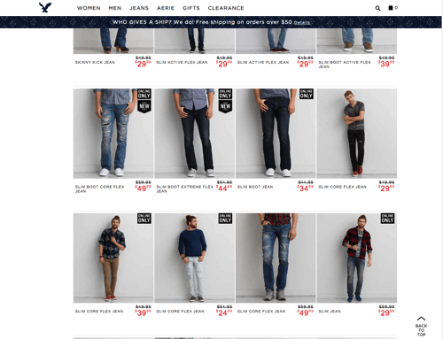
One of the benefits of the “Load more” and infinite scrolling implementations is that the product list grows, instead of results being replaced. “Load more” allows the user to compare more easily products across an entire list. Having one consolidated list of goods made it significantly easier for users to evaluate which products would be the best to navigate to and, consequently, increased the overall product discoverability rate.
So, which loading method should you use? Ideally, you should use multiple variations of “Load more,” as it turns out. Testing showed that no single method was perfect in all instances; different contexts warranted one of three different implementations of the “Load more” approach. We’ll cover these three variations for the remainder of this article:
- For categories, use a combination of “Load more” and lazy-loading.
- For search, use the “Load more” button, ideally with a dynamic number of results returned based on relevancy scores.
- On mobile, use the “Load more” button, but loading a lower number of products by default.
Note: These findings are from testing e-commerce websites. Performance might vary on other types of websites.
“Load More” For Categories
In our large-scale usability study on e-commerce home page and category navigation, we found the optimal solution for loading new products in categories to lie at the intersection of the “Load more” button and infinite scrolling in the form of lazy-loading:
Show 10 to 30 products on initial page load, and then lazy-load another 10 to 30 products, until you reach 50 to 100 products, and then display a “Load more” button; once that button is clicked, load another 10 to 30 products, and resume lazy-loading until the next 50 to 100 products have loaded, at which point show the “Load more” button once again.
The “Load more” button threshold of 50 to 100 items determines when to interrupt the user, while the lazy-loading threshold is merely a performance optimization to reduce loading time and server load.
Note that the number of products to load is purposely a range here. Testing shows that the ideal number will depend on your website’s context and industry. For lists with more spec-driven products (most consumer electronics, hardware, parts and supplies), use the lower range. In contrast, testing showed that users can deal with a higher number of items when the list contains more visual products (apparel, furniture, decor, etc.)
(For lazy-loading, a heap of code and plugins is available as a point of departure, just two of which are Mika Tuupola’s Lazy Load for jQuery and LazyLoad XT.)
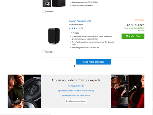
This way, pages load quickly because very few products are loaded initially. More importantly, for small and medium-sized categories, lazy-loading will let the user browse the breadth of products without interruption. In effect, it will be as though “View all” is enabled for most well-defined categories — in particular, when filters are applied.
For longer lists, the user will be met with a “Load more” button, which makes it very easy to continue viewing more products if the user wishes to do so, but provides a healthy break from scrolling, giving the user to easy access to the footer and giving them a moment to consider whether applying filters would be better than continuing to scroll hundreds of products.
One of the weaknesses of lazy-loading, and infinite scrolling in particular, is that the page’s height continually lengthens; if the user drags the scroll bar to the bottom, they will reach the footer and see it for a second or two as the next items load. The new items will then be appended to the list, and the footer will be pushed down and the scroll bar extended. During testing, this resulted in a jagged page experience. With the “Load more” combination, this is largely resolved because a break comes after just a jump or two.
However, if you’re looking to perfect your implementation, consider “faking” the height of the page by multiplying the height of a list item by the number of rows until the next “Load more” button — even if those product rows haven’t loaded yet. This faux page height will give the scroll bar the appropriate space from the beginning and, therefore, is a more accurate representation of the actual height of the list. It also gives the user access to the footer without any jumps whatsoever.
And lazy-loading will continue to load products as before — only now they are taking up the empty space instead of extending the page.
“Load More” For Search Results
Due to the open-ended-ness of search, it tends to have far more results than category browsing. In our usability study on e-commerce search, hundreds of search results were not an uncommon sight, and on mass merchant websites, search queries often return thousands of results.
Furthermore, with search, results are sorted by relevance. So, the fifth result is typically a lot more relevant to the user than the hundredth result. This means users shouldn’t have to scan upwards of a hundred products when searching — rather, they should be encouraged to examine the first items carefully. Search results should, therefore, load only 25 to 75 products by default, and infinite scrolling should never be used for the search results. (Interestingly, Etsy’s famous A/B split test of infinite scrolling also documented a significant hit to the search experience.) Pagination or a “Load more” button would be better for search results, then, because they don’t encourage quick scanning of a large number of products, but instead nudge the user to focus more on exploring the first set of results. Indeed, because of the fewer results, lazy-loading isn’t a requirement (but, if implemented for category navigation, may just as well be reused here).
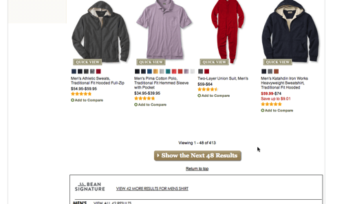
To take things to the next level, the threshold for how many products are loaded by default may be dynamically adjusted based on the relevancy scores of search results. Most search engines will rank each result with a relevancy score and return those with the highest relevance first. These scores can be used to determine a dynamic threshold that increases or decreases the number of products loaded according to whether the user should be encouraged to scan only the first few results or browse a wider breadth of items.
In practice, this can be done by detecting sudden drops in relevancy scores for the user’s search results and, based on these drops, determining an optimal number of the outcome to be returned for that particular search query. For example, if relevancy scores begin to drop steeply after the first 28 results, then the number of products loaded can be lowered to increase focus on those items. However, if the first 100 results all have very high relevancy scores, then the number of products loaded may be increased to encourage broader exploration.
“Load More” Buttons For Mobile

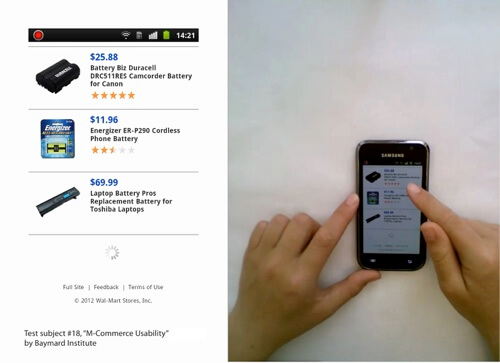
In our year-long study of mobile e-commerce, we found that pagination links can be tough to tap accurately and will typically result in a new page load. Meanwhile, infinite scrolling proved very effective at getting subjects to explore many products (in fact, test subjects scrolled through more than twice as many products on test websites with infinite scrolling as they did on those with pagination).
However, as mentioned, it can make the footer inaccessible. During mobile testing, it rendered vital mobile footer links — such as “Desktop site,” “FAQ” and “Shipping,” general cross-navigation, and similar elements — inaccessible to the test subjects, who all had clear expectations of these links being available in the footer.
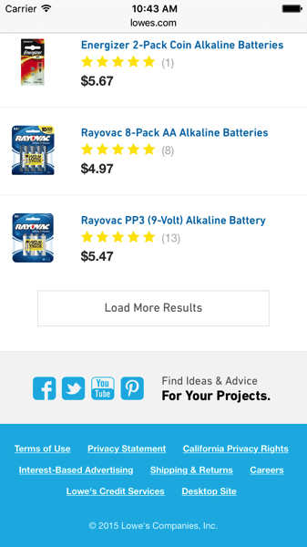
The best solution, therefore, is to have a single large “Load more” button at the end of the product list. However, mobile come with some unique constraints:
- Less screen real-estate
Because a mobile screen is much smaller, list items will take up a relatively largely portion of the screen, with typically only two to three items being displayed in the list-view layout. Therefore, 50 items would take up many more viewport heights on a mobile device than on a desktop computer. In other words, the user will have to interact (i.e. scroll) a lot more on a mobile device than for a comparable product list on the desktop. - Scrolling constraints
On a touch device, the user can usually scroll only by dragging and swiping with their finger. Contrast this with a desktop, where the user typically has numerous inputs for scrolling, such as the mouse’s scroll wheel (or a trackpad swipe), a draggable UI scrollbar, and various keyboard inputs (the up and down arrows, the page up and down keys, the spacebar, etc.). - Slow scrolling
Furthermore, in our tests, subjects demonstrated less control over continuous product-list scrolling. On the one hand, some would scroll too slowly by having to continually drag their finger across the screen; in this case, a list of even 50 products would take a long time to browse. On the other hand, some would scroll the list too fast because they would inadvertently invoke momentum scrolling by swiping in rapid succession; in this case, they would miss out on a lot of products whizzing by them. - JavaScript events
Finally, the way JavaScript events are fired on most touch devices means that the dynamic lazy-loading technique often can’t be implemented as well. JavaScript events fire only once the user’s scrolling ends; therefore, products can’t be fetched while the user is scrolling, only once scrolling stops.
For these reasons, we’d recommend loading only 15 to 30 products on mobile devices before showing the “Load more” button, and then simply loading them all at once (not lazy-loading).
Key Detail: Back Button Support Through history.pushState
In our seven years of usability testing, we’ve consistently observed how the technical implementation of loading a new page and the user’s expectation of a new page loading don’t always align on e-commerce websites. Dynamically loading content such as overlays, accordions, filters and AJAX-loaded products will often subvert the user’s expectation of how their back button works. (See our full research findings on the user’s back-button expectations.)
The “Load more” method requires careful consideration of back-button behavior. It’s critical that after a user has visited a particular product page from the product list, they are taken back to the same spot on that list upon clicking the browser’s back button. Of the e-commerce websites we benchmarked that have the “Load more” button, over 90% get this wrong. This necessarily impedes the user’s from jumping back and forth between the product list and product pages using the same browser tab — a severe navigational limitation.
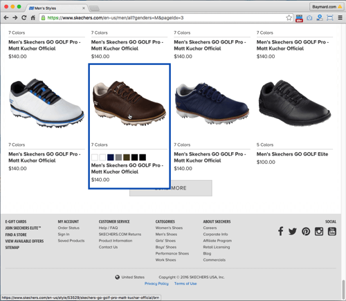
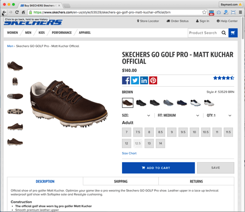
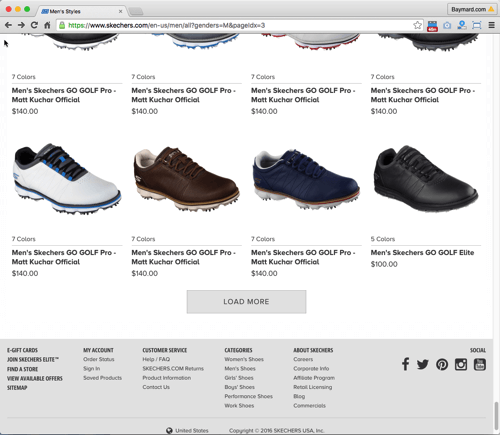
HTML5’s History API allows us to honor the user’s expectation. Specifically, the history.pushState() function enables us to invoke a URL change without reloading the page, thus matching the browser’s back-button behavior to the user’s expectation. The browser will remember the user’s scroll position, but we need to ensure that any “Load more” clicks are loaded by default when the user goes back.
Note that if you don’t have the technical resources to support proper back-button behavior, we recommend not experimenting with “Load more” at all, but rather sticking with the inferior pagination model.
“Load More” Shouldn’t Be Your Top Priority
While the debate over “Load more” versus infinite scrolling versus pagination has been debated for years, the product loading method shouldn’t be the first thing that most e-commerce vendors spend their development resources on.
Over the last seven years, we’ve documented plenty of severe UX issues on the vast majority of e-commerce websites. A selection of these issues have been explored in our past articles here on Smashing Magazine, including those on e-commerce search, category navigation, filtering, checkout and the mobile experience. Many of these issues, which are just as impactful, require significantly less design and technical resources to address than developing a solid “Load more” implementation.
That’s not to say the loading method is not critical. It is, and we observed during testing that it can change product exploration significantly. It just shouldn’t be at the top of the list of changes for most websites that still have plenty of low-hanging fruit that promise a better return on investment. “Load more” is thus reserved for those websites striving for UX perfection.
“Load More” Vs. Infinite Scrolling Vs. Pagination
In short, in our usability testing, the “Load more” button solved the usability issues observed with pagination (whereby users explored less of a product list, and comparison of products across pages of results was difficult), and it solved the severe issues observed with infinite scrolling (whereby users superficially scanned products and were often unable to reach the footer).
However, “Load more” buttons perform better only when the issue with the browser’s back button is dealt with — for example, through history.pushState() — and, ideally, when the implementation is adjusted based on the user’s context. In particular, the following three contextual adjustments were observed to be key to performance:
- For category navigation, use a combination of the “Load more” button and lazy-loading. Set the threshold for the “Load more” button to 50 to 100 items.
- For search results, use the “Load more” button, but set the threshold to 25 to 75 results only. Ideally, you would dynamically adjust the threshold for each unique list of search results based on any drops in the relevancy scores for the results.
- On mobile, use the “Load more” button but set the threshold to 15 to 30 products because of scrolling and screen size issues. Furthermore, because of how JavaScript events fire and the lower threshold, load all products at once, instead of lazy-loading.
You can find all 93 test findings on product list usability in our (not publicly available) report “Product Lists and Filtering.”
Further Reading
- Infinite Scrolling: Let’s Get To The Bottom Of This
- Get the Scrolling Right
- Reapplying Hick’s Law of Narrowing Decision Architecture
- 6 Design Principles To Evaluate Your Product
- How To Change User Behavior With UX Design And Psychology


 Start with a free demo —
 Take a break with a 3D game built on Netlify!

 Click here to kickstart your project for free in a matter of minutes.
 Check the frontend report!

