19 Delightful Bits Of Vintage Graphic Design Inspiration

Email Newsletter
Weekly tips on front-end & UX.
Trusted by 200,000+ folks.

 Take a break with a 3D game built on Netlify!
 Start with a free demo —
 Click here to kickstart your project for free in a matter of minutes.

 Check the frontend report!
Vintage design is an endless source of inspiration. Seeing how fellow designers tackled their job decades ago, with a limited set of tools, and how timeless, even classic, some of the pieces are still today, is fascinating.
With this posting, we want to leave behind current trends and indulge in the aesthetic of past times. We’ll dive into wanderlust-awaking travel posters, design manuals that wrote history, and, last but not least, we’ll bridge the gap to today by looking at how a mid-century design movement still influences designers. Buckle up… and off we are to a journey through pre-Photoshop, pre-Sketch and -Illustrator times!
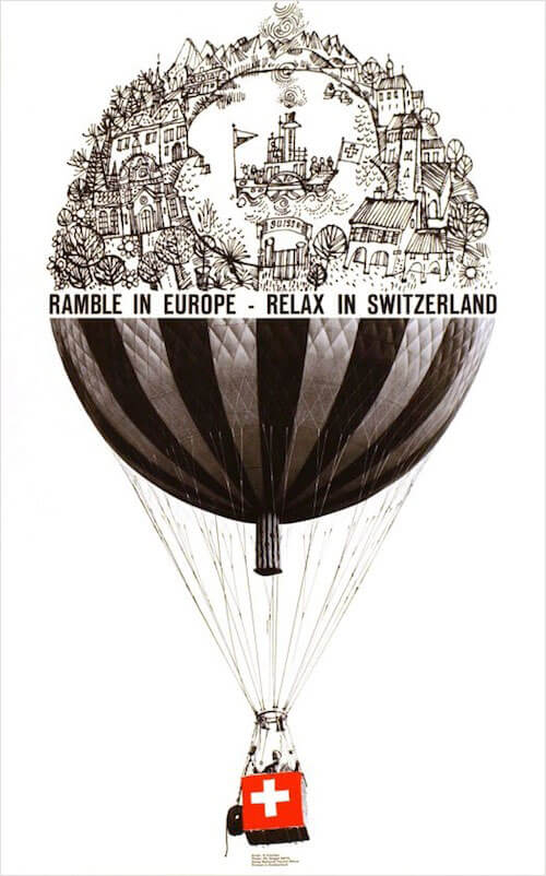
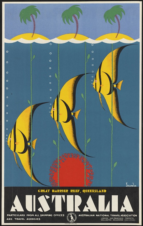
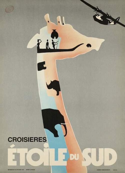
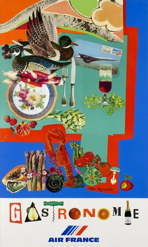
Designing Wanderlust
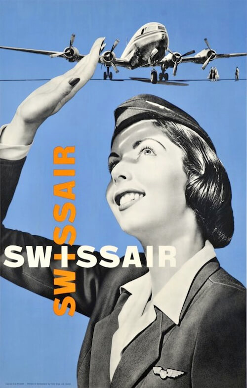
With the rise of passenger air travel, the world grew closer together. Once distant, unreachable places were suddenly within reach. And what could tell the story of excitement and adventure better than vibrant travel posters of the time?
In retrospect, our idea of the early days of travel are shaped by these posters. Depictions of exotic countries, famous landmarks, smiling flight attendants, happy passengers and proud pilots — that’s what traveling dreams were made of. But apart from these common stereotypes, there were also some timeless graphic design gems that are bound to fuel our ideas, and, well, wanderlust too, still today.
You’re up for some gold mining? Then Yulia Yudintseva’s immense collection of vintage airline posters is for you. The Travel Gear Reviews also showcases 100 vintage travel posters, not only flying-themed. And Galerie 123 (un deux trois) and Tamar Heller’s Pinterest board are rich sources for eye-candy, too.
These are just a few of our favorites:

At The Core Of The Design
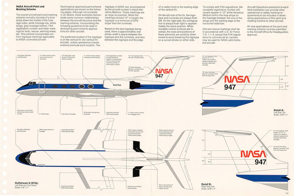
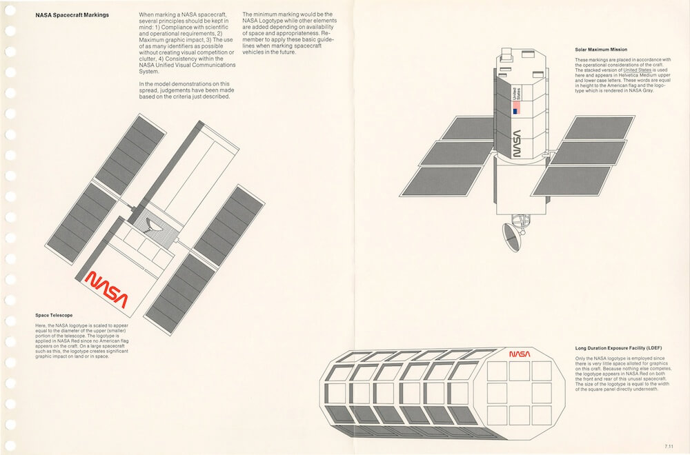
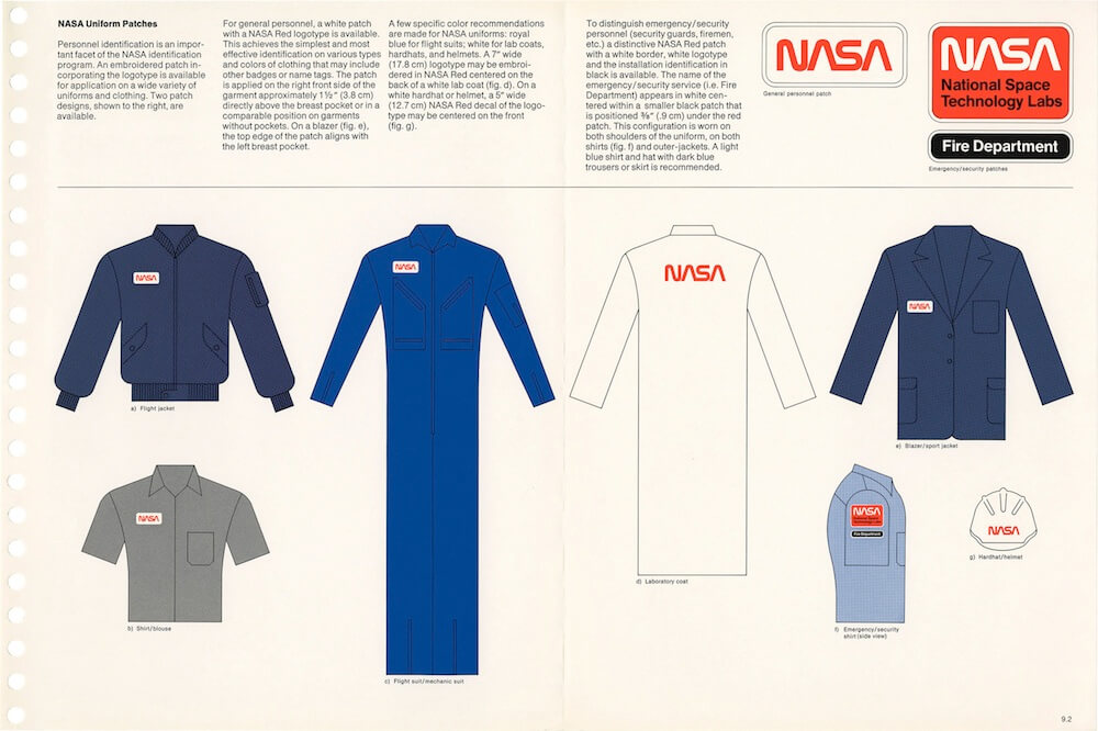
Eye candy is great, but sometimes you just want to dig deeper. How did the generations of designers before us work? How did they tackle their projects? Nothing could help us get closer to the core of their designs as the graphic standards they designed for them. In fact, some design manuals from decades ago didn’t only simplify design work back in the days, some turned into sought-after classics and have gotten a second life with a reprint of the original, such as the graphics manual for New York City’s transit authority or the NASA’s graphics standards.
A Face For New York City’s Subway
One of the most famous graphic standards dates back to 1970: Bob Noorda’s and Massimo Vignelli’s design manual for the New York City Transit Authority. It specifies the visual language of NYC’s subway in every little detail. Bold typography set in Standard Medium, color-coded disks, and an elaborate grid system form the base of the system that guides millions of commuters and travelers through the buzzing underground catacombs of the metropolis each year. The level of detail of the design manual is fascinating. Apart from providing examples of ways to not use the symbols, it even specifies the spacing between every possible letter combination.
Noorda’s and Vignelli’s work has paid off: The essence of the system is still in use today, apart from some changes (Standard Medium was replaced by Helvetica, for example, the white background with black writing by a black background with white writing to make it less prone to graffiti). A stellar example of how a well-thought-out minimal system can be adapted to needs as complex as those of an entire city’s public transportation system. Modular design, the analog way, so to say.


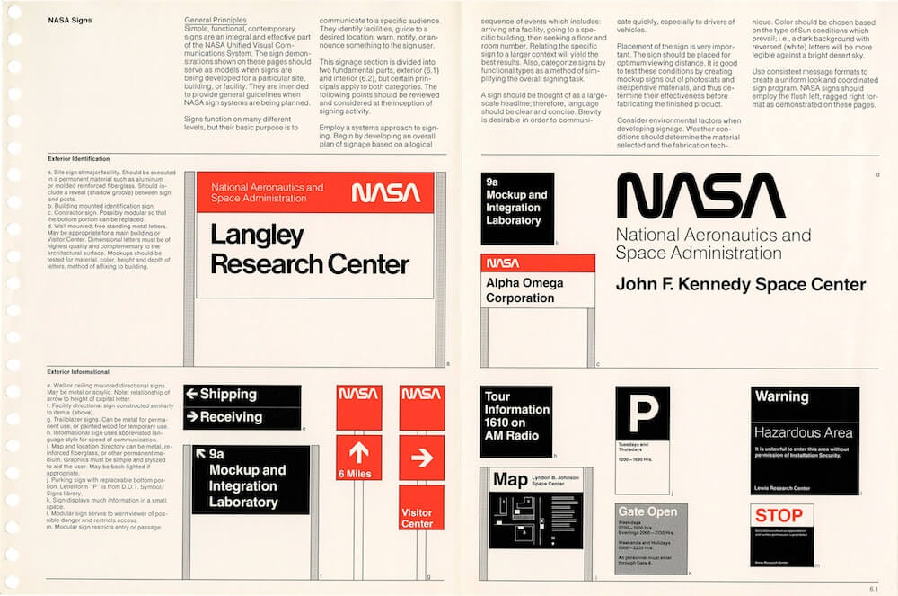
The NASA Universe
The NASA Graphics Standards Manual from 1975 is another classic. It describes the radical, often-criticized but later award-winning design that shaped the NASA’s appearance until 1992. Designed by Richard Danne and Bruce Blackburn, the graphics manual evolved for one decade until it finally reached an impressive 90 pages covering every aspect of the space administration — from office forms to satellite markings. The core piece is the logotype that became widely known as the “worm” because of its one-width, continuous stroke letters.
To dive deeper into the NASA universe, check out the high-resolution scans that Jesse Reed and Hamish Smyth provide of each page of the graphics manual. Stunning.
Olympic Minimalism
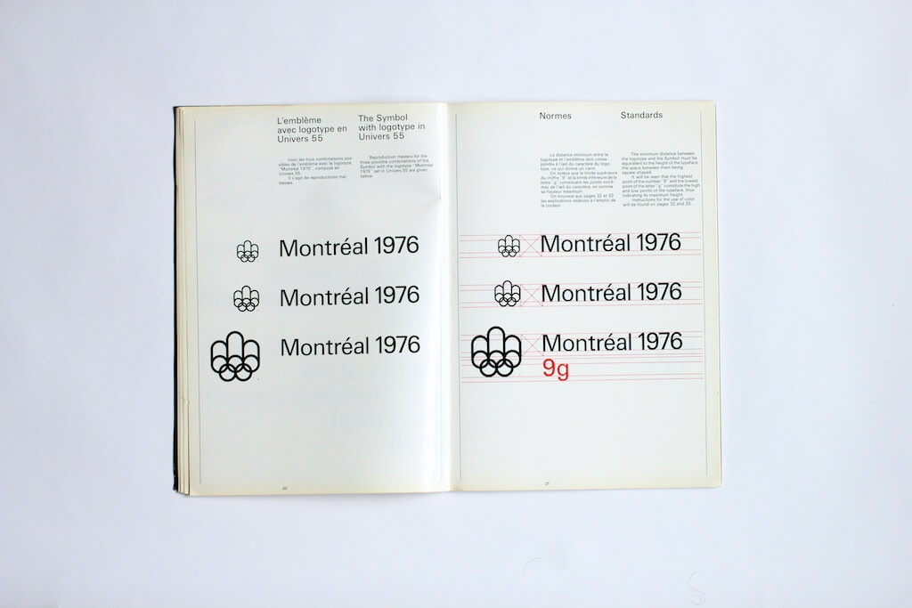
Few designs gain as much attention as the ones that give the Olympic Games a new face every four years. One of the most memorable designs is certainly Georges Huel’s and Pierre-Yves Pelletier’s concept for the 1976 Montreal Olympics. Luckily for us, Antonio Carusone’s gallery on Flickr lets us indulge in its minimalistic and timeless beauty still today.
The core part of the Montreal design is the logo for the Games. As stated in the design manual, it represents the letter “M” for Montreal which doubles as a crown to represent victory (the three arches above the Olympic rings), the running track, and, of course, the Olympic rings. Apart from standards on using and constructing the symbol and how to combine it with the official logotype from the Univers family, the manual (a graphics manual is obligatory for the Olympics since the 1964 Tokio Games, by the way) also defines acceptable and unacceptable uses of color and grids for positioning. If you’re up for more Olympic design inspiration, Olympic Design features sneak peeks into the graphic standards of nearly all Games since 1964.

Revisiting A Classic
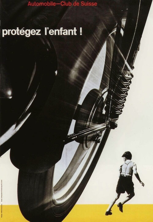
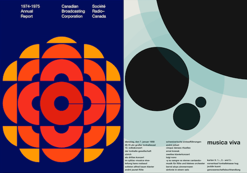
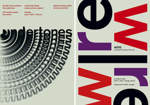
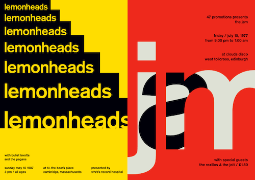
Every design is a child of its time, and graphic design in the 20th century wouldn’t have been the same without the influence of the International Typographic Style. The Swiss design movement has its roots in the 1940s and 50s and its signature style shaped much of the development of graphic design in the mid of the past century. Simplicity, legibility, and objectivity were the leading principles, sans-serif typefaces, grids, asymmetrical layouts, and bright, solid colors characteristic for the style. Especially posters — an effective means of communication during that time — have stayed in the collective memory and do inspire designers still today.
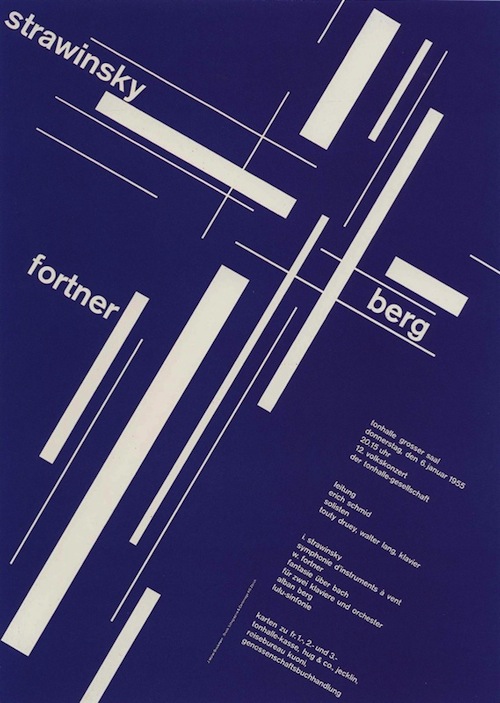
Fast forward to today, Swiss in CSS by front-end designer Jon Yablonski is one of the projects that are inspired by the Swiss style. As an homage to the design movement and the designers behind it, Jon recreates and animates posters of the era — mostly of concerts and exhibitions — in CSS and JavaScript. The animations give the classic designs a new dynamic, even a bit of a retrofuturistic feel. And for anyone who wants to dive deeper into the tech behind the posters, Jon shares the code on CodePen. A beautiful blend of classic aesthetic and state-of-the art techniques.
Swissted is another contemporary project based on the Swiss aesthetic, combining graphic designer Mike Joyce’s passion for punk rock and Swiss modernism. An unusual, but very inspiring mix. The posters are all set in Berthold Akzidenz-Grotesk Medium and are redesigns of vintage punk, hardcore, new wave and indie rock show flyers. The collection currently counts 200 pieces and is still growing. Impressive.
Now what will the designs of the past inspire you to?
More Vintage Eye-Candy
If the vintage graphics bug has caught you, check out the following resources for more inspiration. But be warned, browsing them could become quite addictive. Just sayin’.
Design Movements
- Mid-Century Modern Graphic Design: Visual catalogue of the mid-century modern graphic aesthetic, curated by Theo Inglis.
- Mid-Century Modern — Sticker, Label And Stamp Club: Flickr group with stickers, labels and stamps from the middle of the past century.
- Happy Eastern: Vintage Eastern-European design
- Swiss Graphic Design: Flickr album with Swiss graphic design examples from the beginning of the 20th century up to the 70s, maintained by Maryellen McFadden.
Travel & Transport
- MCM Travel: A lovely vintage travel posters set by Sandi Vincent.
- Vintage Travel Posters: Vintage travel posters from seven decades and from all over the world.
- Vintage Travel Art: A tribute to classic travel scenery and allure.
- Vintage Railway Publicity: A Flickr group with vintage railway ads and timetables.
- Vintage Road Maps: This Flickr group celebrates the design of old roadmaps.
Other
- Galerie 123 (un deux trois): A huge collection of vintage posters of all kinds.
- The Art Of Letter Design: Vintage type specimen.
- Vintage camera guides: This Flickr set is all about 1950s/60s camera manuals.
- Vintage Graphic Design Loves: A potpourri of 1.7K pieces of vintage graphic design (covers, posters, etc.) from all around the world, curated by Mirella Bruno.
You’ve stumbled across some vintage design goodies recently? We’d love to hear about them! Please feel free to share your findings in the comments below.
Further Reading
- 35 Beautiful Vintage and Retro Photoshop Tutorials
- 60 Rare and Unusual Vintage Signs
- Vintage and Retro Typography Showcase
- Rediscovering The Joy Of Design


