A Brief Overview On Responsive Navigation Patterns
To say that responsive web design has changed our industry would be an understatement at best. We used to ask our clients which resolutions and devices they wanted us to support, but we now know the answer is “as many as possible.” To answer a challenge like this and to handle our increasingly complex world, our industry has exploded with new thinking, patterns and approaches.
In this article, I want to look specifically at the issue of responsive navigation. We will first talk about information architecture, then the purpose of navigation, and finally we will look at three responsive navigation patterns that have served well over time.
The Information Architecture Challenge
The first things that are affected in a mobile-first world, or at least should be, are content and information architecture strategies. If our applications are primarily about facilitating tasks and sharing of information, then we must focus there first.
The industry went through a trend of megamenus and increasingly complex navigation structures, but responsive web design has forced us to rethink this complexity. How much does our navigation need to hold in order to be effective? Does an application really need several different types of navigation, or can it work fine with just one? You will find that most responsive navigation patterns have forced us to simplify and concentrate, and that is a benefit of a mobile-first approach.
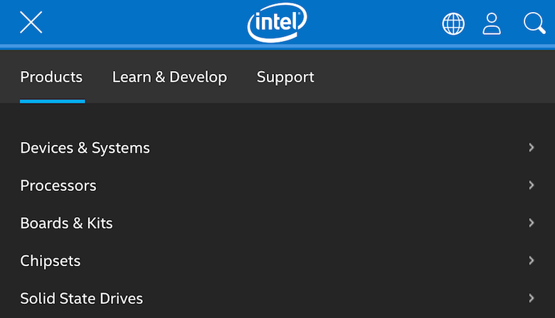
The truth is that if your information architecture isn’t optimized, then it doesn’t matter how slick your responsive navigation solution is. This was true long before we were debating the merits of media queries, but now the challenge is even greater. We must ensure that our navigation structures, when they are revealed on our websites, are clear and minimize any cognitive friction.
Here are a couple of questions to ask as you create your navigation:
- Is it painfully clear what each of your labels means, and is the value proposition (sometimes called “information scent”) clear to your visitors?
- How can you reduce the complexity in your navigation as much as possible? If your navigation structure is seven levels deep, not many are going to be up for that challenge.
- How can you ensure that the navigation doesn’t get lost throughout your resolution adaptations?
- Have you tested it thoroughly to ensure that the navigation aligns with the user’s goals in visiting the website?
The Purpose Of Navigation
Let’s take a quick moment to reflect on the purpose of navigation. This might seem elementary, but I’ve seen too many applications whose designers have forgotten these important principles. The best article I’ve read on this comes from one written over a decade ago by Derek Powazek (which shows that the heart of the matter remains the same). He writes:
"Navigation also has three parts, which are used to communicate to the user about their past, present, and future. Any good global navigation scheme should, at a glance, answer the top three questions every user has at the back of their mind on any page:
- Where am I? (Present)
- Where can I go? (Future)
- Where have I been? (Past)"
We must revisit these principles because I see that most responsive navigation solutions handle these very inconsistently. Most solutions handle the question “Where can I go?” pretty well, but most websites don’t even bother to show in their responsive solutions where the user is currently or where they’ve been. As you adapt some of the patterns we’ll look at, be sure to mold them to satisfy these important criteria.

Stephanie Lin has just posted an article entitled “The Rules for Modern Navigation,” which makes a good complement to this article. She covers important interaction design components to consider in your navigation.
Preferable Patterns Of Responsive Navigation
Remember that we have a lot of options today for responsive navigation, but here is my take on the best patterns. Brad Frost has done us all a service and cataloged most, if not all, of these patterns on his website This Is Responsive. He has also written two posts about these patterns: “Navigation Patterns” and “Complex Navigation Patterns for Responsive Design.”
1. The “Do Very Little” Pattern
This pattern is well illustrated on the UX London 2017’s website. Here is what it looks in small viewports.

Why It Works
I love this pattern because it fundamentally makes navigation a priority, and it doesn’t hide the navigation behind any progressive disclosure. Most responsive navigation patterns involve progressive disclosure, and while disclosure is a good option, it should only be pursued when a better option doesn’t exist. I agree with Nielsen Norman Group on this issue: If you can show navigation, show it. No one visiting this website has to wonder where the navigation is. A bonus is that this has no client-side dependencies, so you can keep your dependencies low and reduce failure points.
However, this is a hard sell for a lot of responsive applications. First of all, it doesn’t handle complex navigation well. If you need more than one level in your application shown at one time, then this pattern is not for you. Also, it could take up a lot of important vertical space in the application, so be sure that you can implement it like the UX London site and keep the allotted space in check.
2. The Multi-Level Toggle
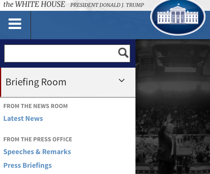
Most applications can get away with two levels of navigation, and I have found this is the sweet spot for many of my implementations. In small viewports, this pattern enables users to toggle the subsections easily and see the contents within. One modern example of this is the White House’s website.
Why It Works
It may not be the flashiest solution, but I have found it to be very stable. This pattern works well for the majority of navigation I need to support, and it effectively handles simple two-level navigation structures (which I’m hesitant to go beyond in most circumstances). Also, we must always build these solutions progressively, so that they work even when the code supporting them fails.
I used to use FlexNav to achieve this effect, but the project has been abandoned by its owner. A promising alternative is SmartMenus, but I have not used it yet. If you are interested in a pure CSS version of this, check out CSS Script’s code example.
3. The Simple Toggle
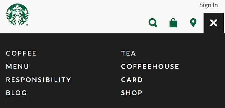
This is another good option and is really a variant of the previous pattern. In this case, we have no need for multiple levels, but the navigation items are still too numerous to allow for the “do very little” pattern. An example of this is found on Starbucks’ website.
Why It Works
With some clear iconography and colors, this option can really work well because it is very simple to implement and use. Variations of this pattern push content down or overlap it, and I feel both are acceptable. If you want a good script for this, check out Responsive Nav.
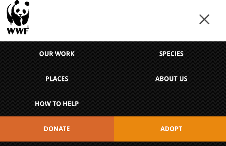
Remember that you do not necessarily have to support multiple levels in your responsive solution. For example, the World Wildlife Fund’s navigation at higher viewport resolutions has a dropdown, but at the lowest viewport it simply toggles and the top-level links go to landing pages, where the remaining navigation items are shown. You could also provide alternate ways to navigate, including breadcrumbs, which can be a helpful addition at any viewport size.
Honorable Mentions
As mentioned, there are many approaches you could choose from today to handle your project’s needs. Even though I like the three above the best, here are two other possibilities.
Off-Canvas
This is probably the most popular, but some implementations are better than others. It can be done well, and if you want a script, I have used MMenu with great results.

Priority Plus
This has picked up steam in the last year or so, and it can also be good in some situations. I have used it on websites that have really long horizontal navigation, to avoid having to hide the menu items too early as the viewport shrinks. The only big problem with this solution is that it forces you to make assumptions about what is most important, so be careful. I have used the PriorityNav.js script for this, and it has worked well.

The Dreaded Hamburger Icon
There is simply no way I can talk about responsive navigation and not mention the debate around the hamburger icon (there are also other variants of responsive “mystery meat” navigation indicators). The real issue here is: Does the icon convey enough meaning on its own, or does it need a textual indicator? The debate is essentially about the universality and recognizability of the hamburger icon. For me, very few icons have a universally clear meaning without some kind of text to support them, and the hamburger icon is just another example of why it’s best not to rely on the icon alone. Ask yourself, Is it worth confusing a visitor by not including it, or should I just include it to increase the likelihood that it will be understood? I lean towards including a textual indicator. Remember to always evaluate the context of your application to answer questions like these.
Here are some articles that talk about the issue if you want to learn more:
- “Obvious Always Wins,” Luke Wroblewski
- “Icons as Part of a Great User Experience,” Nick Babich, Smashing Magazine
- “Hamburger Menus and Hidden Navigation Hurt UX Metrics,” Kara Pernice and Raluca Budiu, Nielsen Norman Group
- “Testing the Hamburger Icon for More Revenue,” Peep Laja, CXL
Conclusion
The great news is that there are more options than ever for handling navigation in your responsive application. As long as you stick to clear information architecture design, testing and proven patterns, you will ensure that visitors will be able to use your website easily now and into the future. The next step is to start experimenting with these and other patterns to see what works best for your particular application. Behavior and needs change over time, so continually re-evaluate how you use these approaches. Another article on Smashing Magazine, “Responsive Navigation on Complex Websites,” provides case studies and code for you to go further.
My thanks to Ben Callahan and Jacqui Olkin for their feedback on drafts of this article.
Further Reading
- Responsive Navigation On Complex Websites
- Navigation For Mega-Sites
- Implementing Off-Canvas Navigation For A Responsive Website
- Responsive Menus: Enhancing Navigation On Mobile Websites


 Start with a free demo —
 Click here to kickstart your project for free in a matter of minutes.


 Take a break with a 3D game built on Netlify!

