Fluid Responsive Typography With CSS Poly Fluid Sizing
Fluid layouts have been a normal part of front-end development for years. The idea of fluid typography, however, is relatively new and has yet to be fully explored. Up until now, most developers’ idea of fluid typography is simply using Viewport units maybe with some minimum and maximum sizes.
When working with creative designers on web page designs, it’s fairly common to receive multiple Sketch or Photoshop artboards/layouts, one for each breakpoint. In that design, elements (like an h1 heading) will usually be different sizes at each breakpoint. For example:
- The
h1at the small layout could be22px - The
h1at the medium layout could be24px - The
h1at the large layout could be34px
The bare minimum CSS for this uses media queries:
h1 {
  font-size: 22px;
}
@media (min-width:576px) {
  h1 {
    font-size: 22px;
  }
}
@media (min-width:768px) {
  h1 {
    font-size: 24px;
  }
}
@media (min-width:992px) {
  h1 {
    font-size: 34px;
  }
}
This is a good first step, but you are limiting the font-size to only what was specified by the designer at the provided breakpoints. What would the designer say if you asked, “What should the font-size be at an 850px wide viewport?” The answer in most cases is that it would be somewhere between 24px and 34px. But right now, it’s just 24px according to your CSS, which is probably not what the designer was envisioning.
Your option at this point is to calculate what that size should be and add another breakpoint. That’s easy enough. But what about all the other resolutions? What should the font-size be at 800px wide? What about 900px? What about 935px? Obviously the designer is not going to provide you with a full layout for every single possible resolution. Even if they did, should you be adding dozens (or hundreds) of breakpoints for all the different font-sizes that are desired by the designer? Of course not.
Your layout is already fluidly scaling with the width of your viewport. Wouldn’t it be nice if your typography predictably scaled with your fluid layout? What else can we do to improve upon this?
Viewport Units To The Rescue?
Viewport units are another step in the right direction. They allow your text to fluidly resize with your layouts. And the browser support is great these days.
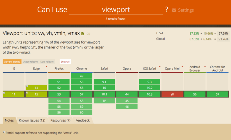
But the viability of Viewport units is very dependent on the original creative designs for a web page. It would be great to just set your font-size using vw and be done:
h1 {
  font-size: 2vw;
}

But this only works if your creative art-boards take this into account. Did the designer choose a text size that was exactly 2% of the width of each of his art-boards? Of course not. Let’s calculate what the vw value would need to be for each of our breakpoints:
22pxsize @576pxwide = 22/576*100 = 3.82vw24pxsize @768pxwide = 24/768*100 = 3.13vw34pxsize @992pxwide = 34/992*100 = 3.43vw
They are close but they aren’t all the same. So you would still need to use media queries to transition between text sizes and there would still be jumps. And consider this weird side-effect:
@ 767px, 3.82% of the viewport width is 29px. If the viewport is 1-pixel wider the font-size sudden drops back down to 24px. This animation of a viewport being resized demonstrates this undesirable side effect:

This dramatic change in font-size is almost definitely not what the designer was envisioning. So how do we solve this problem?
Statistical Linear Regression?
Wait. What? Yes, this is an article about CSS, but some basic math can go a long way towards an elegant solution to our problem.
First, lets plot our resolutions and corresponding text sizes on a graph:
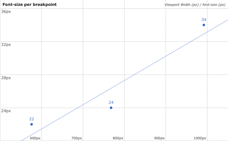
font-size and corresponding Viewport width (Google Spreadsheets) (View large version)Here you can see a scatter plot of the designer’s specified text sizes at the defined viewport widths. The x-axis is the viewport width and the y-axis is the font-size. See that line? That’s called a trendline. It’s a way to find an interpolated font-size value for any viewport width, based on the data provided.
The Trendline Is The Key To All Of This
If you could set your font-size according to this trendline, you would have an h1 that smoothly scales on all resolutions that would come close to matching what the designer intended. First, let’s look at the math. The straight line is defined by this equation:

- m = slope
- b = the y-intercept
- x = the current viewport width
- y = the resulting
font-size
The are several methods for determining the slope and y-intercept. When multiple values are involved, a common method is the Least Squares fit:

Once you run those calculations, you have your trendline equation.
How Do I Use This In CSS?
Okay, this is getting pretty heavy on the math. How do we actually use this stuff in front-end web development? The answer is CSS calc()! Once again, a fairly new CSS technology that is very well supported.
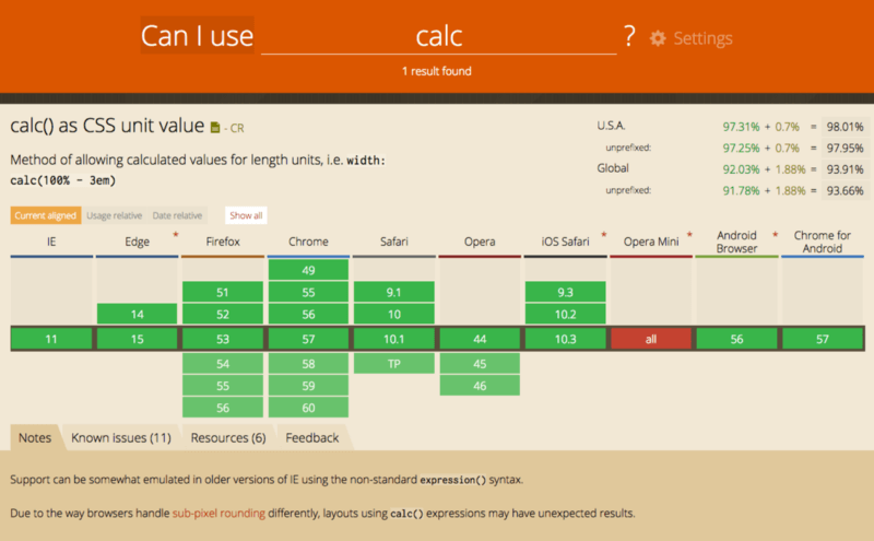
You can use the trendline equation like this:
h1 {
  font-size: calc({slope}*100vw + {y-intercept}px);
}
Once you find your slope and y-intercept you just plug them in!
Note: You have to multiply the slope by 100 since you are using it as a vw unit which is 1/100th of the Viewport width.
Can This Be Automated?
I ported the least squares fit method into an easy-to-use Sass function:
/// least-squares-fit
/// Calculate the least square fit linear regression of provided values
/// @param {map} $map - A Sass map of viewport width and size value combinations
/// @return Linear equation as a calc() function
/// @example
///   font-size: least-squares-fit((576px: 24px, 768px: 24px, 992px: 34px));
/// @author Jake Wilson <jake.e.wilson@gmail.com>
@function least-squares-fit($map) {

  // Get the number of provided breakpoints
  $length: length(map-keys($map));

  // Error if the number of breakpoints is < 2
  @if ($length < 2) {
    @error "leastSquaresFit() $map must be at least 2 values"
  }

  // Calculate the Means
  $resTotal: 0;
  $valueTotal: 0;
  @each $res, $value in $map {
    $resTotal: $resTotal + $res;
    $valueTotal: $valueTotal + $value;
  }
  $resMean: $resTotal/$length;
  $valueMean: $valueTotal/$length;

  // Calculate some other stuff
  $multipliedDiff: 0;
  $squaredDiff: 0;
  @each $res, $value in $map {

    // Differences from means
    $resDiff: $res - $resMean;
    $valueDiff: $value - $valueMean;

    // Sum of multiplied differences
    $multipliedDiff: $multipliedDiff + ($resDiff * $valueDiff);

    // Sum of squared resolution differences
    $squaredDiff: $squaredDiff + ($resDiff * $resDiff);
  }

  // Calculate the Slope
  $m: $multipliedDiff / $squaredDiff;

  // Calculate the Y-Intercept
  $b: $valueMean - ($m * $resMean);

  // Return the CSS calc equation
  @return calc(#{$m*100}vw + #{$b});

}
Does this really work? Open up this CodePen and resize your browser window. It works! The font sizes are fairly close to what the original design was asking for and they smoothly scale with your layout.
Least Squares Fit SCSS test user="jakobud"]See the Pen Least Squares Fit SCSS test by Jake Wilson (@jakobud) on CodePen.
Now, admittedly, it’s not perfect. The values are close to the original design but they do not quite match up. This is because a linear trendline is an approximation of specific font sizes at specific viewport widths. This is inherit of linear regression. There is always some error in your results. It’s a trade-off of simplicity vs. accuracy. Also, keep in mind, the more varied your text sizes are, the more error there will be in your trendline.
Can we do better than this?
Polynomial Least Squares Fit
In order to get a more accurate trendline, you need to look at more advanced topics, like a polynomial regression trendline that might look something like this:
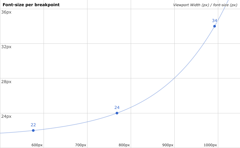
Now that is more like it! Much more accurate than our straight line. A basic polynomial regression equation looks like this:

The more accurate you want your curve, the more complicated the equation gets. Unfortunately, you can’t do this in CSS. calc() simply cannot do this type of advanced math. Specifically, you can’t calculate exponents:
font-size: calc(3vw * 3vw); /* This doesn’t work in CSS */So until calc() supports this type of non-linear math, we are stuck with linear equations only. Is there anything else we can do to improve upon this?
Breakpoints And Multiple Linear Equations
What if we were only calculating a straight line between each pair of breakpoints? Something like this:
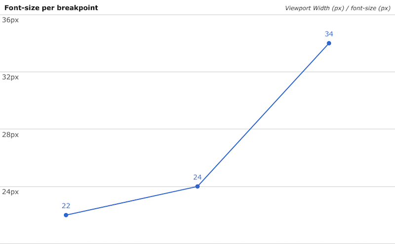
So in this example we would calculate the straight line between 22px and 24px and then another between 24px and 34px. The Sass would look like this:
// SCSS
h1 {
  @media (min-width:576px) {
    font-size: calc(???);
  }
  @media (min-width:768px) {
    font-size: calc(???);
  }
}
We could use the least squares fit method for those calc() values but since it’s just a straight line between 2 points, the math could be greatly simplified. Remember the equation for a straight line?

Since we are talking about just 2 points now, finding the slope (m) and y-intercept (b) is trivial:

Here is a Sass function for this:
/// linear-interpolation
/// Calculate the definition of a line between two points
/// @param $map - A Sass map of viewport widths and size value pairs
/// @returns A linear equation as a calc() function
/// @example
///   font-size: linear-interpolation((320px: 18px, 768px: 26px));
/// @author Jake Wilson <jake.e.wilson@gmail.com>
@function linear-interpolation($map) {
  $keys: map-keys($map);
  @if (length($keys) != 2) {
    @error "linear-interpolation() $map must be exactly 2 values";
  }
  // The slope
  $m: (map-get($map, nth($keys, 2)) - map-get($map, nth($keys, 1)))/(nth($keys, 2) - nth($keys,1));

  // The y-intercept
  $b: map-get($map, nth($keys, 1)) - $m * nth($keys, 1);

  // Determine if the sign should be positive or negative
  $sign: "+";
  @if ($b < 0) {
    $sign: "-";
    $b: abs($b);
  }

  @return calc(#{$m*100}vw #{$sign} #{$b});
}
Now, just use the linear interpolation function on multiple breakpoints in your Sass. Also, lets throw in some min and max font-sizes:
// SCSS
h1 {
  // Minimum font-size
  font-size: 22px;
  // Font-size between 576 - 768
  @media (min-width:576px) {
    $map: (576px: 22px, 768px: 24px);
    font-size: linear-interpolation($map);
  }
  // Font-size between 768 - 992
  @media (min-width:768px) {
    $map: (768px: 24px, 992px: 34px);
    font-size: linear-interpolation($map);
  }
  // Maximum font-size
  @media (min-width:992px) {
    font-size: 34px;
  }
}
And it generates this CSS:
h1 {
  font-size: 22px;
}
@media (min-width: 576px) {
  h1 {
    font-size: calc(1.04166667vw + 16px);
  }
}
@media (min-width: 768px) {
  h1 {
    font-size: calc(4.46428571vw - 10.28571429px);
  }
}
@media (min-width: 992px) {
  h1 {
    font-size: 34px;
  }
}

The Holy Grail Of CSS Sizing?
Lets wrap this all up in a nice Sass mixin (for the lazy and efficient!). I’m coining this method Poly Fluid Sizing:
/// poly-fluid-sizing
/// Generate linear interpolated size values through multiple break points
/// @param $property - A string CSS property name
/// @param $map - A Sass map of viewport unit and size value pairs
/// @requires function linear-interpolation
/// @requires function map-sort
/// @example
///   @include poly-fluid-sizing('font-size', (576px: 22px, 768px: 24px, 992px: 34px));
/// @author Jake Wilson <jake.e.wilson@gmail.com>
@mixin poly-fluid-sizing($property, $map) {
  // Get the number of provided breakpoints
  $length: length(map-keys($map));

  // Error if the number of breakpoints is < 2
  @if ($length < 2) {
    @error "poly-fluid-sizing() $map requires at least values"
  }

  // Sort the map by viewport width (key)
  $map: map-sort($map);
  $keys: map-keys($map);

  // Minimum size
  #{$property}: map-get($map, nth($keys,1));

  // Interpolated size through breakpoints
  @for $i from 1 through ($length - 1) {
    @media (min-width:nth($keys,$i)) {
      $value1: map-get($map, nth($keys,$i));
      $value2: map-get($map, nth($keys,($i + 1)));
      // If values are not equal, perform linear interpolation
      @if ($value1 != $value2) {
        #{$property}: linear-interpolation((nth($keys,$i): $value1, nth($keys,($i+1)): $value2));
      } @else {
        #{$property}: $value1;
      }
    }
  }

  // Maxmimum size
  @media (min-width:nth($keys,$length)) {
    #{$property}: map-get($map, nth($keys,$length));
  }
}
This Sass mixin requires a few Sass functions in the following Github gists:
The poly-fluid-sizing() mixin will perform linear interpolation on each pair of viewport widths and set a minimum and maximum size. You can import this into any Sass project and easily utilize it without needing to know any of the math behind it. Here is the final CodePen that uses this method.
Poly Fluid Sizing using linear equations, viewport units and calc() user="jakobud"]See the Pen Poly Fluid Sizing using linear equations, viewport units and calc()"] Poly Fluid Sizing using linear equations, viewport units and calc() by Jake Wilson (@jakobud) on CodePen.
A Few Notes
- Obviously this method applies not only to
font-sizebut to any unit/length property (margin,padding, etc). You pass the desired property name into the mixin as a string. - The Sass map of viewport width + size value pairs can be passed in any order into the
poly-fluid-sizing()mixin. It will automatically sort the map according to Viewport width from lowest to highest. So you could pass in a map like this and it would work out just fine:
  $map: (576px: 22px, 320px: 18px, 992px: 34px, 768px: 24px);
  @include poly-fluid-sizing('font-size', $map);
- A limitation for this method is that you cannot pass in mixed units into the mixin. For example,
3em@576pxwidth. Sass just won’t really know what to do mathematically there.
Conclusion
Is this the best we can do? Is Poly Fluid Sizing the Holy Grail of fluid unit sizing in CSS? Maybe. CSS currently supports non-linear animation and transition timing functions, so maybe there is a chance that calc() will also support it someday. If that happens, non-linear, polynomial regression might be worth a look again. But maybe not… Linear scaling might be superior anyways.
I began exploring this idea in early 2017 and eventually developed the above solution. Since then, I’ve seen a few dev’s come up with similar ideas and different pieces of this puzzle. I thought it was time for me to share my method and how I got there. Viewport units. Calc(). Sass. Breakpoints. None of these things are new. They are all browser features that have existing for years (with varying degrees of support). I’ve only used them together in a way that hadn’t been fully explored yet. Don’t ever be afraid to look at the tools you use every day and think out-of-the-box on how you can utilize them better and grow your skill set.
Further Reading
- Truly Fluid Typography With vh And vw Units
- Typographic Patterns In HTML Email Newsletter Design
- The Good, The Bad And The Great Examples Of Web Typography
- Tools And Resources For A More Meaningful Web Typography


 Check the frontend report!
 Click here to kickstart your project for free in a matter of minutes.
 Take a break with a 3D game built on Netlify!

