Using Design Workouts To Build World-Class Design Teams
What do the makers of the most successful products in the world, whether digital or physical, have in common? I bet they put design and user experience at the center of everything they do. These companies recognize that the smallest detail can make or break a product. The best design ideas, though, are made not in isolation, but by strong, well-rounded teams. So, how do you cultivate a strong design team?
In sports, it’s natural for a team to train before the big game. They repeat different drills, improve their core skills and learn how to work better as a team. One could say that launching a big feature is no different from playing a big game. Assuming that, why don’t design teams train as much as they could before their big game? Yes, a lot of companies pay for trips to conferences, and some even allow their employees to use 20% of their time to develop side projects. Those are great, but they are more focused on developing the individual, not the team. This is the problem we set out to solve when we were thinking about how to cultivate a strong design team.
What Is A Design Workout And Why Should You Care?
A design workout is a series of exercises that challenge people in various areas of design. During these exercises, people brainstorm ideas, polish core skills and learn how to work better together. The sessions can cover a lot of territory, from polishing up on the basics, like communication, user personas, user journeys and sketching, to more ambitious tasks, like creating a design without using squares. Our workouts are split into two parts. The first part is the warmup session, in which we do one quick exercise. Then, we move on to the actual workout, in which we usually do one or two big exercises. The whole session can take a few hours.

Granted, taking your whole design team and even some of your developers away from a product can be a big business cost. However, after doing this for quite some time, we’ve noticed some great long-term benefits that outweigh the cost. Here are some of the benefits.
A Team That Understands One Another Is Stronger
At MailerLite, our projects are based on small teams, where a designer works with a developer and a project owner. This especially helps a remote company like ours to be productive. The downside of this is that designers only collaborate on very big projects; most of the time, everyone does their own thing. By working on these design exercises together, we’ve noticed that we understand each other better. As a design team, we are more open to giving and taking criticism on whatever the issue.
Unexpected Solutions Are Revealed
Trying to find an elusive solution in a project can be daunting. Sure, you can ask someone for feedback, but because they are working on a different project, their advice will be general. During these exercises, we gain insights into how to approach problems from different angles. An idea could come from a simple drawing someone has made, but their explanation of how they approached the problem might inspire others to try out something similar.

How We Conduct Exercises In A Remote Work Environment
First, note that what works for us might not work for others, which is why we encourage you to experiment in the beginning and find your own best way. See how much time you want to spend and which exercises are most beneficial to your team. There is no right or wrong way to do this.
A lot of people at MailerLite work remotely. Some of us are in the office, but most are travelling at any time. Finding a way for everyone to participate seamlessly is crucial. Here is how we solve this problem.
Remote Workers
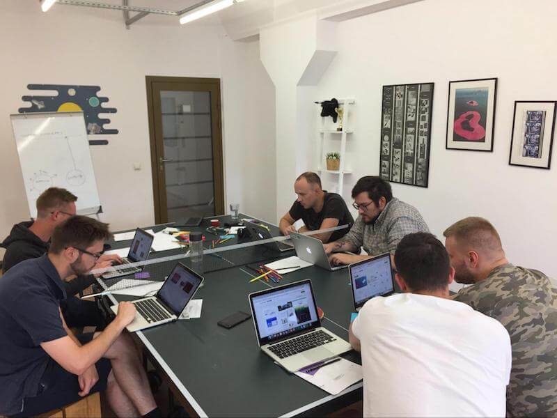
People who are in town head down to the office. We set up a large display and open up either Google Hangouts or Appear.in. The latter is quickly becoming our favourite app for conference calls.
Not Only Designers
It is important to note that not only designers can join this session. We encourage customer support people, developers and marketing colleagues to join as well. This brings a fresh perspective to the group and gets us out of our bubble.
Materials
Everyone is required to have a few sheets of paper and colored pencils for sketches.
Warmup
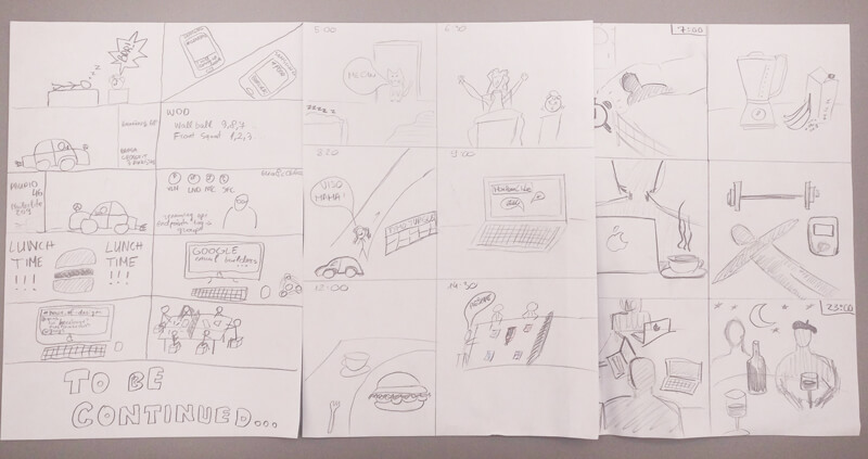
We begin our session with a warmup of 20 to 30 minutes, no more. Usually, we start with a sketching exercise. This could be anything from a quick logo to a six-part storyboard of how your day is going (more on the exercise ideas below). We never try to be perfect, but we always strive to be clear in what we want to say. After the warmup, we always present what we’ve done and explain why we did it. All of us believe that a designer should have a chance to explain how they solved a problem.

The Exercises
Now that the warmup is done, it’s time for the actual exercises! We spend about one to two hours on this part. Our choice of exercises depends on what we’re working on or what is important to us at the time. It could be brainstorming ideas for a big feature, solving a complex problem from a particular project or working on core skills.
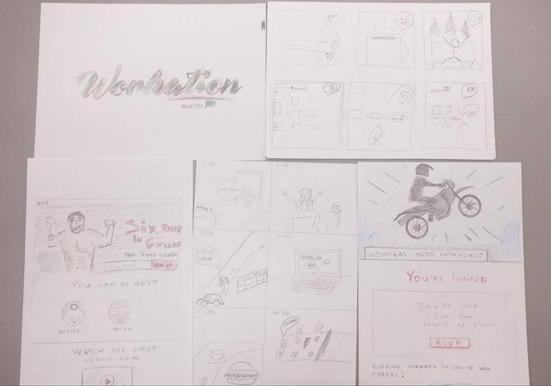
For example, during one session, we spent 30 minutes writing a user persona on what our customer looks like. Then, we digitally shuffled the persona’s attributes, giving everyone a random piece of information. In the second part of the exercise, we mocked up a landing page for that persona using pen and paper. After spending about an hour creating a landing page, we had to sell the landing page to the person who created the persona. This workout not only got us out of our comfort zone by having us create a landing page using pencils, but also gave us a much deeper understanding of how everyone views MailerLite’s customers. Also, we gained new insight into how everyone on the team thinks. On top of that, we got valuable critiques from our peers on things we needed to improve.
Exercise Ideas
Now that you’ve seen how we structure our workouts, let’s get to some exercises you can try out! Some of them have been found while researching on the Internet, while others were invented ourselves.
Day-In-The-Life Storyboard
Take an A4-sized paper and divide it into four to six parts. Draw a small comic-book-style user journey of how your day has gone. What did you do? Don’t try to be perfect with the drawing, but be as clear as possible. Someone else will have to explain what you did today. Spend about 30 minutes on this task. After having drawn it, choose someone else to explain your sketch.

Landing Page For A Fictional Character
Think of a person, any kind of a person. It could be a movie star or someone you know. Write on a piece of paper who they are, what they do and what they like. Spend about 10 to 15 minutes doing that. When you’re done, explain what you wrote and why you chose that person. Then, shuffle the descriptions, and have everyone sketch a landing page for that persona. Spend about one hour on that. As always, when you’re done, explain what you’ve made and why you chose that particular design.
Take A Picture Of The Office Building And Go Crazy With It
We see our office building all the time, but do we stop to think about how it could be different? For remote team members, share a photo of your office building, and then let everyone go crazy in Photoshop. There are no rules. The only goal is to make the coolest office building possible. People have Photoshopped helipads, rooftop bars, funky textures and spaceships. It can get a bit out of hand!

Your Product On Other Devices
How would your company work in 3D? Or on wearable devices? Pick a new medium and mock up what your product would look like there. When you’re done, have everyone explain why they chose their solutions.
Sell Your Product To A Customer
Following the user persona example, write about what you think your customer looks like. Shuffle the descriptions, and then create a slideshow selling your product and its key features, using no more than five slides.
Logo For Office Item
Pick any random item in your office and design a logo for that item. Use paper and pencils. Some people chose the robotic vacuum, others the coffee machine, still others a chair! It’s a fun, creative exercise.
Emoji Song
Foursquare did this first, and it is a fun exercise. Take a song that’s popular now and write it on a screen using emoji. People have two minutes to guess which song it is.
Theme Tune For Your Product
Scour the Internet for a theme tune for your product. It is a fun way to explain an abstract idea.
Sell A Stock Photo
Knowing how important copy is to the overall product, we at MailerLite all want to get better at writing. But how do you get better at it? Go to any big stock photo website, and search for one of these terms: intimacy, laughter, alone, regret, jump, strain, adventure, punishment, death, marketing. Pick one of the photos randomly and write a tagline for it. Imagine this photo will go on a billboard. What would be the best way to describe and sell what’s in the photo?
Redesign Your City Flag
Every city has a flag, and most of them are not very modern. What would a modern city flag look like? You can use digital or analog drawing tools. Start by redesigning your own city’s flag, or choose another city. When you’re done, present the work to the team and explain why you chose this approach.
Conclusion
I hope this article has shown you that it is not that hard to set up a space for your design team to train before the big game and tackle the product or problem at hand. Doing this at least once a month is a fun way for everyone to polish skills that they use every day. Not only that, the added benefit of team-building and knowledge-sharing will help everyone become the best versions of themselves. Have you tried design exercises with your team? Let us know in the comments!
Further Reading
- The Power Of Pen And Paper Sketching
- When Words Cannot Describe: Designing For AI Beyond Conversational Interfaces
- Top Front-End Tools Of 2023
- The Impact Of Agile Methodologies On Code Quality


 Get a Free Trial
 Try if for free!
 JavaScript Form Builder — Create JSON-driven forms without coding.


