I Used The Web For A Day On Internet Explorer 8
This article is part of a series in which I attempt to use the web under various constraints, representing a given demographic of user. I hope to raise the profile of difficulties faced by real people, which are avoidable if we design and develop in a way that is sympathetic to their needs.
Last time, I navigated the web for a day using a screen reader. This time, I spent the day using Internet Explorer 8, which was released ten years ago today, on March 19th, 2009.
Who In The World Uses IE8?
Before we start; a disclaimer: I am not about to tell you that you need to start supporting IE8.
There’s every reason to not support IE8. Microsoft officially stopped supporting IE8, IE9 and IE10 over three years ago, and the Microsoft executives are even telling you to stop using Internet Explorer 11.
But as much as we developers hope for it to go away, it just. Won’t. Die. IE8 continues to show up in browser stats, especially outside of the bubble of the Western world.
Browser stats have to be taken with a pinch of salt, but current estimates for IE8 usage worldwide are around 0.3% to 0.4% of the desktop market share. The lower end of the estimate comes from w3counter:

The higher estimate comes from StatCounter (the same data feed used by the “Can I use” usage table). It estimates global IE8 desktop browser proportion to be around 0.37%.
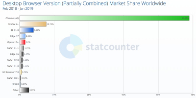
I suspected we might see higher IE8 usage in certain geographical regions, so drilled into the data by continent.
IE8 Usage By Region
Here is the per-continent IE8 desktop proportion (data from February 2018 — January 2019):
| 1. | Oceania | 0.09% |
| 2. | Europe | 0.25% |
| 3. | South America | 0.30% |
| 4. | North America | 0.35% |
| 5. | Africa | 0.48% |
| 6. | Asia | 0.50% |
Someone in Asia is five times more likely to be using IE8 than someone in Oceania.
I looked more closely into the Asian stats, noting the proportion of IE8 usage for each country. There’s a very clear top six countries for IE8 usage, after which the figures drop down to be comparable with the world average:
| 1. | Iran | 3.99% |
| 2. | China | 1.99% |
| 3. | North Korea | 1.38% |
| 4. | Turkmenistan | 1.31% |
| 5. | Afghanistan | 1.27% |
| 6. | Cambodia | 1.05% |
| 7. | Yemen | 0.63% |
| 8. | Taiwan | 0.62% |
| 9. | Pakistan | 0.57% |
| 10. | Bangladesh | 0.54% |
This data is summarized in the map below:

Incredibly, IE8 makes up around 4% of desktop users in Iran — forty times the proportion of IE8 users in Oceania.
Next, I looked at the country stats for Africa, as it had around the same overall IE8 usage as Asia. There was a clear winner (Eritrea), followed by a number of countries above or around the 1% usage mark:
| 1. | Eritrea | 3.24% |
| 2. | Botswana | 1.37% |
| 3. | Sudan & South Sudan | 1.33% |
| 4. | Niger | 1.29% |
| 5. | Mozambique | 1.19% |
| 6. | Mauritania | 1.18% |
| 7. | Guinea | 1.12% |
| 8. | Democratic Republic of the Congo | 1.07% |
| 9. | Zambia | 0.94% |
This is summarized in the map below:
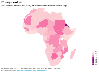
Whereas the countries in Asia that have higher-than-normal IE8 usage are roughly batched together geographically, there doesn’t appear to be a pattern in Africa. The only pattern I can see — unless it’s a coincidence — is that a number of the world’s largest IE8 using countries famously censor internet access, and therefore probably don’t encourage or allow updating to more secure browsers.
If your site is aimed at a purely Western audience, you’re unlikely to care much about IE8. If, however, you have a burgeoning Asian or African market — and particularly if you care about users in China, Iran or Eritrea — you might very well care about your website’s IE8 experience. Yes — even in 2019!
Who’s Still Using IE?
So, who are these people? Do they really walk among us?!
Whoever they are, you can bet they’re not using an old browser just to annoy you. Nobody deliberately chooses a worse browsing experience.
Someone might be using an old browser due to the following reasons:
- Lack of awareness
They simply aren’t aware that they’re using outdated technology. - Lack of education
They don’t know the upgrade options and alternative browsers open to them. - Lack of planning
Dismissing upgrade prompts because they’re busy, but not having the foresight to upgrade during quieter periods. - Aversion to change
The last time they upgraded their software, they had to learn a new UI. “If it ain’t broke, don’t fix it.” - Aversion to risk
The last time they upgraded, their machine slowed to a crawl, or they lost their favorite feature. - Software limitation
Their OS is too old to let them upgrade, or their admin privileges may be locked down. - Hardware limitation
Newer browsers are generally more demanding of your hard disk space, memory and CPU. - Network limitation
A capped data allowance or slow connection mean they don’t want to download 75MB of software. - Legal limitation
They might be on a corporate machine that only condones the use of one specific browser.
Is it really such a surprise that there are still people around the world who are clinging to IE8?
I decided to put myself in the shoes of one of these anonymous souls, and browse the web for a day using IE8. You can play along at home! Download an “IE8 on Windows 7” Virtual Machine from the Microsoft website, then run it in a virtualizer like VirtualBox.
IE8 VM: Off To A Bad Start
I booted up my IE8 VM, clicked on the Internet Explorer program in anticipation, and this is what I saw:

Hmm, okay. Looks like the default web page pulled up by IE8 no longer exists. Well, that figures. Microsoft has officially stopped supporting IE8 so why should it make sure the IE8 landing page still works?
I decided to switch to the most widely used site in the world.

It’s a simple site, therefore difficult to get wrong — but to be fair, it’s looking great! I tried searching for something:

The search worked fine, though the layout looks a bit different to what I’m used to. Then I remembered — I’d seen the same search result layout when I used the Internet for a day with JavaScript turned off.
For reference, here is how the search results look in a modern browser with JavaScript enabled:
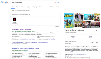
So, it looks like IE8 gets the no-JS version of Google search. I don’t think this was necessarily a deliberate design decision — it could just be that the JavaScript errored out:
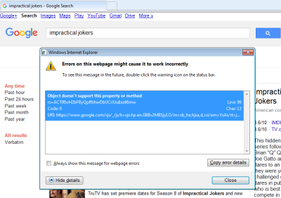
Still, the end result is fine by me — I got my search results, which is all I wanted.
I clicked through to watch a YouTube video.
YouTube

There’s quite a lot broken about this page. All to do with little quirks in IE.
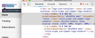
The logo, for instance, is zoomed in and cropped. This is down to IE8 not supporting SVG, and what we’re actually seeing is the fallback option provided by YouTube. They’ve applied a background-image CSS property so that in the event of no SVG support, you’ll get an attempt at displaying the logo. Only they seem to have not set the background-size properly, so it’s a little too far zoomed in.
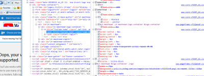
background-img on the logo span, which pulls in a sprite. (Large preview)For reference, here is the same page in Chrome (see how Chrome renders an SVG instead):
And what about that Autoplay toggle? It’s rendered like a weird looking checkbox:

This appears to be down to use of a custom element (a paper-toggle-button, which is a Material Design element), which IE doesn’t understand:

paper-toggle-button is a custom element. (The screenshot is from Chrome DevTools, alongside how the Autoplay toggle SHOULD render.) (Large preview)I’m not surprised this hasn’t rendered properly; IE8 doesn’t even cope with the basic semantic markup we use these days. Try using an <aside> or <main> and it will basically render them as divs, but ignoring any styling you apply to them.
To enable HTML5 markup, you have to explicitly tell the browser these elements exist. They can then be styled as normal:
<!--[if lt IE 9]>
   <script>
      document.createElement('header');
      document.createElement('nav');
      document.createElement('section');
      document.createElement('article');
      document.createElement('aside');
      document.createElement('footer');
   </script>
<![endif]-->
That is wrapped in an IE conditional, by the way. <!--[if lt IE 9]> is a HTML comment to most browsers — and therefore gets skipped — but in IE it is a conditional which only passes “if less than IE 9”, where it executes/renders the DOM nodes within it.
So, the video page was a fail. Visiting YouTube.com directly didn’t fare much better:

Undeterred, I ignored the warning and tried searching for a video within YouTube’s search bar.

IE8 traffic is clearly suspicious enough that YouTube didn’t trust that I’m a real user, and decided not to process my search request!
Signing Up To Gmail
If I’m going to spend the day on IE8, I’m going to need an email address. So I go about trying to set up a new one.
First of all, I tried Gmail.
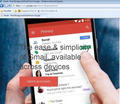
There’s something a bit off about the image and text here. I think it’s down to the fact that IE8 doesn’t support media queries — so it’s trying to show me a mobile image on desktop.
One way you can get around this is to use Sass to generate two stylesheets; one for modern browsers, and one for legacy IE. You can get IE-friendly, mobile-first CSS (see tutorial by Jake Archibald) by using a mixin for your media queries. The mixin “flattens” your legacy IE CSS to treat IE as though it’s always a specific predefined width (e.g. 65em), giving only the relevant CSS for that width. In this case, I’d have seen the correct background-image for my assumed screen size and had a better experience.
Anyway, it didn’t stop me clicking ‘Create an Account’. There were a few differences between how it looked in IE8 and a modern browser:

Whilst promising at first sight, the form was quite buggy to fill in. The ‘label’ doesn’t get out of the way when you start filling in the fields, so your input text is obfuscated:
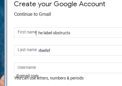
The markup for this label is actually a <div>, and some clever JS moves the text out of the way when the input is focussed. The JS doesn’t succeed on IE8, so the text stays stubbornly in place.

div which is overlaid on form input using CSS. (Large preview)After filling in all my details, I hit “Next”, and waited. Nothing happened.
Then I noticed the little yellow warning symbol at the bottom left of my IE window. I clicked it and saw that it was complaining about a JS error:

I gave up on Gmail and turned to MSN.
Signing Up To Hotmail
I was beginning to worry that email might be off-limits for a ten-year-old browser. But when I went to Hotmail, the signup form looked OK — so far so good:

Then I noticed a CAPTCHA. I thought, “There’s no way I’ll get through this…”

To my surprise, the CAPTCHA worked!
The only quirky thing on the form was some slightly buggy label positioning, but the signup was otherwise seamless:

Does that screenshot look OK to you? Can you spot the deliberate mistake?
The leftmost input should have been my first name, not my surname. When I came back and checked this page later, I clicked on the “First name” label and it applied focus to the leftmost input, which is how I could have checked I was filling in the correct box in the first place. This shows the importance of accessible markup — even without CSS and visual association, I could determine exactly which input box applied to which label (albeit the second time around!).
Anyhow, I was able to complete the sign-up process and was redirected to the MSN homepage, which rendered great.

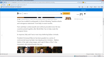
I could even read articles and forget that I was using IE8:
With my email registered, I was ready to go and check out the rest of the Internet!
I visited the Facebook site and was immediately redirected to the mobile site:

This is a clever fallback tactic, as Facebook need to support a large global audience on low-end mobile devices, so need to provide a basic version of Facebook anyway. Why not offer that same baseline of experience to older desktop browsers?
I tried signing up and was able to make an account. Great! But when I logged into that account, I was treated with suspicion — just like when I searched for things on YouTube — and was faced with a CAPTCHA.
Only this time, it wasn’t so easy.
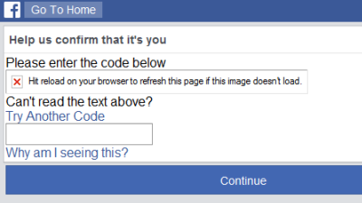
I tried requesting new codes and refreshing the page several times, but the CAPTCHA image never loaded, so I was effectively locked out of my account.
Oh well. Let’s try some more social media.
I visited the Twitter site and had exactly the same mobile redirect experience.

But I couldn’t even get as far as registering an account this time:

Oddly, Twitter is happy for you to log in, but not for you to register in the first place. I’m not sure why — perhaps it has a similar CAPTCHA scenario on its sign-up pages which won’t work on older browsers. Either way, I’m not going to be able to make a new account.
I felt awkward about logging in with my existing Twitter account. Call me paranoid, but vulnerabilities like the CFR Watering Hole Attack of 2013 — where the mere act of visiting a specific URL in IE8 would install malware to your machine — had me nervous that I might compromise my account.
But, in the interests of education, I persevered (with a temporary new password):
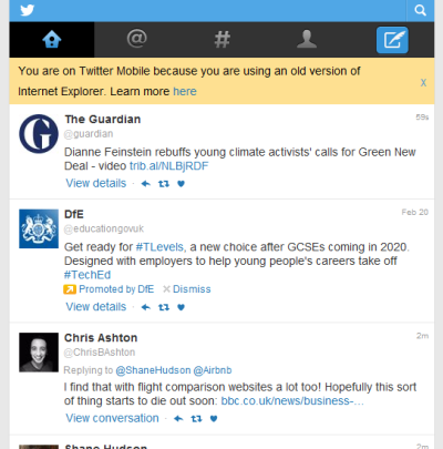
I could also tweet, albeit using the very basic <textarea>:
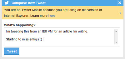
In conclusion, Twitter is basically fine in IE8 — as long as you have an account already!
I’m done with social media for the day. Let’s go check out some news.
BBC News

The news homepage looks very basic and clunky but basically works — albeit with mixed content security warnings.
Take a look at the logo. As we’ve already seen on YouTube, IE8 doesn’t support SVG, so we require a PNG fallback.
The BBC uses the <image> fallback technique to render a PNG on IE:

…and to ignore the PNG when SVG is available:
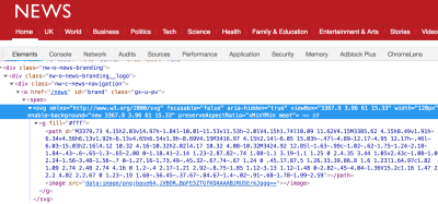
image part is ignored and the svg is rendered nicely. (Large preview)This technique exploits the fact that older browsers used to obey both <image> and <img> tags, and so will ignore the unknown <svg> tag and render the fallback, whereas modern browsers ignore rendering <image> when inside an SVG. Chris Coyier explains the technique in more detail.
I tried viewing an article:

It’s readable. I can see the headline, the navigation, the featured image. But the rest of the article images are missing:

This is to be expected, and is due to the BBC lazy-loading images. IE8 not being a ‘supported browser’ means it does not get the JavaScript that enables lazy-loading, thus the images never load at all.
Out of interest, I thought I’d see what happens if I try to access the BBC iPlayer:

And that got me wondering about another streaming service.
Netflix
I was half expecting an empty white page when I loaded up Netflix in IE8. I was pleasantly surprised when I actually saw a decent landing page:

I compared this with the modern Chrome version:

There’s a slightly different call to action (button text) — probably down to multivariate testing rather than what browser I’m on.
What’s different about the render is the centralized text and the semi-transparent black overlay.
The lack of centralized text is because of Netflix’s use of Flexbox for aligning items:
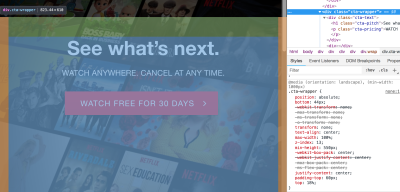
justify-content: center to align its text. (Large preview)A text-align: center on this class would probably fix the centering for IE8 (and indeed all old browsers). For maximum browser support, you can follow a CSS fallbacks approach with old ‘safe’ CSS, and then tighten up layouts with more modern CSS for browsers that support it.
The lack of background is due to use of rgba(), which is not supported in IE8 and below.

rgba(0,0,0,.5) is meaningless to older browsers. (Large preview)Traditionally it’s good to provide CSS fallbacks like so, which show a black background for old browsers but show semi-transparent background for modern browsers:
rgb(0, 0, 0); /* IE8 fallback */
rgba(0, 0, 0, 0.8);
This is a very IE specific fix, however, basically every other browser supports rgba. Moreover, in this case, you’d lose the fancy Netflix tiles altogether, so it would be better to have no background filter at all! The surefire way of ensuring cross-browser support would be to bake the filter into the background image itself. Simple but effective.
Anyway, so far, so good — IE8 actually rendered the homepage pretty well! Am I actually going to be watching Breaking Bad on IE8 today?
My already tentative optimism was immediately shot down when I viewed the sign-in page:

Still, I was able to sign in, and saw a pared-back dashboard (no fancy auto-expanding trailers):

I clicked on a programme with vague anticipation, but of course, only saw a black screen.
Amazon
Ok, social media and video are out. All that’s left is to go shopping.
I checked out Amazon, and was blown away — it’s almost indistinguishable from the experience you’d get inside a modern browser:

I’ve been drawn in by a good homepage before. So let’s click on a product page and see if this is just a fluke.

No! The product page looked good too!
Amazon wasn’t the only site that surprised me in its backwards compatibility. Wikipedia looked great, as did the Gov.UK government website. It’s not easy to have a site that doesn’t look like an utter car crash in IE8. Most of my experiences were decidedly less polished…!

But a deprecated warning notice or funky layout wasn’t the worst thing I saw today.
Utterly Broken Sites
Some sites were so broken that I couldn’t even connect to them!

I wondered if it might be a temporary VM network issue, but it happened every time I refreshed the page, even when coming back to the same site later in the day.
This happened on a few different sites throughout the day, and I eventually concluded that this never affected sites on HTTP — only on HTTPS (but not all HTTPS sites). So, what was the problem?
Using Wireshark to analyze the network traffic, I tried connecting to GitHub again. We can see that the connection failed to establish because of a fatal error, “Description: Protocol Version.”

Looking at the default settings in IE8, only TLS 1.0 is enabled — but GitHub dropped support for TLSv1 and TLSv1.1 in February 2018.

I checked the boxes for TLS 1.1 and TLS 1.2, reloaded the page and — voilà! — I was able to view GitHub!

Many thanks to my extremely talented friend Aidan Fewster for helping me debug that issue.
I’m all for backwards compatibility, but this presents an interesting dilemma. According to the PCI Security Standards Council, TLS 1.0 is insecure and should no longer be used. But by forcing TLS 1.1 or higher, some users will invariably be locked out (and not all are likely to be tech-savvy enough to enable TLS 1.2 in their advanced settings).
By allowing older, insecure standards and enabling users to continue to connect to our sites, we’re not helping them — we’re hurting them, by not giving them a reason to move to safer technologies. So how far should you go in supporting older browsers?
How Can I Begin To Support Older Browsers?
When some people think of “supporting older browsers”, they might be thinking of those proprietary old hacks for IE, like that time the BBC had to do some incredibly gnarly things to support iframed content in IE7.
Or they may be thinking of making things work in the Internet Explorer “quirks mode”; an IE-specific mode of operation which renders things very differently to the standards.
But “supporting older browsers” is very different to “hacking it for IE”. I don’t advocate the latter, but we should pragmatically try to do the former. The mantra I try to live by as a web developer is this:
“Optimize for the majority, make an effort for the minority, and never sacrifice security.”
I’m going to move away from the world of IE8 now and talk about general, sustainable solutions for legacy browser support.
There are two broad strategies for supporting older browsers, both beginning with P:
- Polyfilling
Strive for feature parity for all by filling in the missing browser functionality. - Progressive Enhancement
Start from a core experience, then use feature detection to layer on functionality.
These strategies are not mutually exclusive from one another; they can be used in tandem. There are a number of implementation decisions to make in either approach, each with their own nuances, which I’ll cover in more detail below.
Polyfilling
For some websites or web pages, JavaScript is very important for functionality and you simply want to deliver working JavaScript to as many browsers as possible.
There are a number of ways to do this, but first, a history lesson.
A Brief History Of ECMAScript
ECMAScript is a standard, and JavaScript is an implementation of that standard. That means that ES5 is “ECMAScript version 5”, and ES6 is “ECMAScript version 6”. Confusingly, ES2015 is the same as ES6.
ES6 was the popularized name of that version prior to its release, but ES2015 is the official name, and subsequent ECMAScript versions are all associated with their release year.
Note: This is all helpfully explained by Brandon Morelli in a great blog post that explains the full history of JavaScript versions.
At time of writing, the latest standard is ES2018 (ES9). Most modern browsers support at least ES2015. Almost every browser supports ES5.
Technically IE8 isn’t ES5. It isn’t even ES4 (which doesn’t exist — the project was abandoned). IE8 uses the Microsoft implementation of ECMAScript 3, called JScript. IE8 does have some ES5 support but was released a few months before ES5 standards were published, and so has a mismatch of support.
Transpiling Vs. Polyfilling
You can write ES5 JavaScript and it will run in almost every ancient browser:
var foo = function () {
  return 'this is ES5!';
};
You can also continue to write all of your JavaScript like that — to enable backwards compatibility forever. But you’d be missing out on new features and syntactic sugar that has become available in the evolving versions of JavaScript, allowing you to write things like:
const foo = () => {
  return 'this is ES6!';
};
Try running that JavaScript in an older browser and it will error. We need to transpile the code into an earlier version of JavaScript that the browser will understand (i.e. convert our ES6 code into ES5, using automated tooling).
Now let’s say our code uses a standard ES5 method, such as Array.indexOf. Most browsers have a native implementation of this and will work fine, but IE8 will break. Remember IE8 was released a few months before ES5 standards were published, and so has a mismatch of support? One example of that is the indexOf function, which has been implemented for String but not for Array.
If we try to run the Array.indexOf method in IE8, it will fail. But if we’re already writing in ES5, what else can we do?
We can polyfill the behavior of the missing method. Developers traditionally polyfill each feature that they need by copying and pasting code, or by pulling in external third-party polyfill libraries. Many JavaScript features have good polyfill implementations on their respective Mozilla MDN page, but it’s worth pointing out that there are multiple ways you can polyfill the same feature.
For example, to ensure you can use the Array.indexOf method in IE8, you would copy and paste a polyfill like this:
if (!Array.prototype.indexOf) {
  Array.prototype.indexOf = (function (Object, max, min) {
    // big chunk of code that replicates the behaviour in JavaScript goes here!
    // for full implementation, visit:
    // https://developer.mozilla.org/en-US/docs/Web/JavaScript/Reference/Global_Objects/Array/indexof#Polyfill
  })(Object, Math.max, Math.min);
}
So long as you call the polyfill before you pull in any of your own JS, and provided you don’t use any ES5 JavaScript feature other than Array.indexOf, your page would work in IE8.
Polyfills can be used to plug all sorts of missing functionality. For example, there are polyfills for enabling CSS3 selectors such as :last-child (unsupported in IE8) or the placeholder attribute (unsupported in IE9).
Polyfills vary in size and effectiveness and sometimes have dependencies on external libraries such as jQuery.
You may also hear of “shims” rather than “polyfills”. Don’t get too hung up on the naming — people use the two terms interchangeably. But technically speaking, a shim is code that intercepts an API call and provides a layer of abstraction. A polyfill is a type of shim, in the browser. It specifically uses JavaScript to retrofit new HTML/CSS/JS features in older browsers.
Summary of the “manually importing polyfills” strategy:
- ✅ Complete control over choice of polyfills;
- ✅ Suitable for basic websites;
- ⚠️ Without additional tooling, you’re forced to write in native ES5 JavaScript;
- ⚠️ Difficult to micromanage all of your polyfills;
- ⚠️ Out of the box, all your users will get the polyfills, whether they need them or not.
Babel Polyfill
I’ve talked about transpiling ES6 code down to ES5. You do this using a transpiler, the most popular of which is Babel.
Babel is configurable via a .babelrc file in the root of your project. In it, you point to various Babel plugins and presets. There’s typically one for each syntax transform and browser polyfill you’ll need.
Micromanaging these and keeping them in sync with your browser support list can be a pain, so the standard setup nowadays is to delegate that micromanagement to the @babel/preset-env module. With this setup, you simply give Babel a list of browser versions you want to support, and it does the hard work for you:
{
  "presets": [
    [
      "@babel/preset-env",
      {
        "useBuiltIns": "usage",
        "targets": {
          "chrome": "58",
          "ie": "11"
        }
      }
    ]
  ]
}
The useBuiltIns configuration option of @babel/preset-env is where the magic happens, in combination with an import "@babel/polyfill" (another module) in the entry point of your application.
- When omitted,
useBuiltInsdoes nothing. The entirety of@babel/polyfillis included with your app, which is pretty heavy. - When set to
"entry", it converts the@babel/polyfillimport into multiple, smaller imports, importing the minimum polyfills required to polyfill the targeted browsers you’ve listed in your.babelrc(in this example, Chrome 58 and IE 11). - Setting to
"usage"takes this one step further by doing code analysis and only importing polyfills for features that are actually being used. It’s classed as “experimental” but errs on the side of “polyfill too much” rather than “too little”. In any case, I don’t see how it’s possible that it would create a bigger bundle than"entry"orfalse, so is a good option to choose (and is the way we’re going at the BBC).
Using Babel, you can transpile and polyfill your JavaScript prior to deploying to production, and target support in a specific minimum baseline of browsers. NB, another popular tool is TypeScript, which has its own transpiler that transpiles to ES3, in theory supporting IE8 out of the box.
Summary of using @babel/preset-env for polyfilling:
- ✅ Delegate micromanagement of polyfills to a tool;
- ✅ Automated tool helps prevent inclusion of polyfills you don’t need;
- ✅ Scales to larger, complex sites;
- ⚠️ Out of the box, all your users will get the polyfills, whether they need them or not;
- ⚠️ Difficult to keep sight of exactly what’s being pulled into your application bundle.
Lazy Loading Polyfills With Webpack And Dynamic Imports
It is possible to leverage the new import() proposal to feature-detect and dynamically download polyfills prior to initializing your application. It looks something like this in practice:
import app from './app.js';

const polyfills = [];

if (!window.fetch) {
  polyfills.push(import(/* webpackChunkName: "polyfill-fetch" */ 'whatwg-fetch'));
}

Promise.all(polyfills)
  .then(app)
  .catch((error) => {
    console.error('Failed fetching polyfills', error);
  });
This example code is shamelessly copied from the very good article, “Lazy Loading Polyfills With Webpack And Dynamic Imports” that delves into the technique in more detail.
Summary:
- ✅ Doesn’t bloat modern browsers with unnecessary polyfills;
- ⚠️ Requires manually managing each polyfill.
polyfill.io
polyfill.io is polyfilling as a service, built by the Financial Times. It works by your page making a single script request to polyfill.io, optionally listing the specific features you need to polyfill. Their server then analyzes the user agent string and populates the script accordingly. This saves you from having to manually provide your own polyfill solutions.
Here is the JavaScript that polyfill.io returns for a request made from IE8:

Here’s the same polyfill.io request, but where the request came from modern Chrome:

All that’s required from your site is a single script call.
Summary:
- ✅ Ease of inclusion into your web app;
- ✅ Delegates responsibility of polyfill knowledge to a third party;
- ⚠️ On the flipside, you’re now reliant on a third-party service;
- ⚠️ Makes a blocking
<script>call, even for modern browsers that don’t need any polyfills.
Progressive Enhancement
Polyfilling is an incredibly useful technique for supporting older browsers, but can be a bloat to web pages and is limited in scope.
The progressive enhancement technique, on the other hand, is a great way of guaranteeing a basic experience for all browsers, whilst retaining full functionality for your users on modern browsers. It should be achievable on most sites.
The principle is this: start from a baseline of HTML (and styling, optional), and “progressively enhance” the page with JavaScript functionality. The benefit is that if the browser is a legacy one, or if the JavaScript is broken at any point in its delivery, your site should still be functional.
The term “progressive enhancement” is often used interchangeably with “unobtrusive JavaScript“. They do mean essentially the same thing, but the latter takes it a little further in that you shouldn’t litter your HTML with lots of attributes, IDs and classes that are only used by your JavaScript.
Cut-The-Mustard
The BBC technique of “cutting the mustard” (CTM) is a tried and tested implementation of progressive enhancement. The principle is that you write a solid baseline experience of HTML, and before downloading any enhancing JavaScript, you check for a minimum level of support. The original implementation checked for the presence of standard HTML5 features:
if ('querySelector' in document
  && 'localStorage' in window
  && 'addEventListener' in window) {
    // Enhance for HTML5 browsers
}
As new features come out and older browsers become increasingly antiquated, our cuts the mustard baseline will change. For instance, new JavaScript syntax such as ES6 arrow functions would mean this inline CTM check fails to even parse in legacy browsers — not even safely executing and failing the CTM check — so may have unexpected side-effects such as breaking other third-party JavaScript (e.g. Google Analytics).
To avoid even attempting to parse untranspiled, modern JS, we can apply this “modern take” on the CTM technique, taken from @snugug’s blog, in which we take advantage of the fact that older browsers don’t understand the type="module" declaration and will safely skip over it. In contrast, modern browsers will ignore <script nomodule> declarations.
<script type="module" src="./mustard.js"></script>
<script nomodule src="./no-mustard.js"></script>

<!-- Can be done inline too -->

<script type="module">
  import mustard from './mustard.js';
</script>

<script nomodule type="text/javascript">
  console.log('No Mustard!');
</script>
This approach is a good one, provided you’re happy treating ES6 browsers as your new minimum baseline for functionality (~92% of global browsers at the time of writing).
However, just as the world of JavaScript is evolving, so is the world of CSS. Now that we have Grid, Flexbox, CSS variables and the like (each with a varying efficacy of fallback), there’s no telling what combination of CSS support an old browser might have that might lead to a mishmash of “modern” and “legacy” styling, the result of which looks broken. Therefore, sites are increasingly choosing to CTM their styling, so now HTML is the core baseline, and both CSS and JS are treated as enhancements.
The JavaScript-based CTM techniques we’ve seen so far have a couple of downsides if you use the presence of JavaScript to apply CSS in any way:
- Inline JavaScript is blocking. Browsers must download, parse and execute your JavaScript before you get any styling. Therefore, users may see a flash of unstyled text.
- Some users may have modern browsers, but choose to disable JavaScript. A JavaScript-based CTM prevents them from getting a styled site even when they’re perfectly capable of getting it.
The ‘ultimate’ approach is to use CSS media queries as your cuts-the-mustard litmus test. This “CSSCTM” technique is actively in use on sites such as Springer Nature.
<head>
  <!-- CSS-based cuts-the-mustard -->
  <!-- IMPORTANT: the JS depends on having this rule somewhere in the CSS: `body { clear: both }` -->
  <link rel="stylesheet" href="mq-test.css"
      media="only screen and (min-resolution: 0.1dpcm),
      only screen and (-webkit-min-device-pixel-ratio:0)
      and (min-color-index:0)">
</head>
<body>
  <!-- content here... -->
  <script>
    (function () { // wrap in an IIFE to prevent global scope pollution
      function isSupported () {
        var val = '';
        if (window.getComputedStyle) {
          val = window.getComputedStyle(document.body, null).getPropertyValue('clear');
        } else if (document.body.currentStyle) {
          val = document.body.currentStyle.clear;
        }
        if (val === 'both') { // references the `body { clear: both; }` in the CSS
          return true;
        }
        return false;
      }
      if (isSupported()) {
        // Load or run JavaScript for supported browsers here.
      }
    })();
  </script>
</body>
This approach is quite brittle — accidentally overriding the clear property on your body selector would ‘break’ your site — but it does offer the best performance. This particular implementation uses media queries that are only supported in at least IE 9, iOS 7 and Android 4.4, which is quite a sensible modern baseline.
“Cuts the mustard”, in all its various guises, accomplishes two main principles:
- Widespread user support;
- Efficiently applied dev effort.
It’s simply not possible for sites to accommodate every single browser / operating system / network connection / user configuration combination. Techniques such as cuts-the-mustard help to rationalize browsers into C-grade and A-grade browsers, according to the Graded Browser Support model by Yahoo!.
Cuts-The-Mustard: An Anti-Pattern?
There is an argument that applying a global, binary decision of “core” vs “advanced” is not the best possible experience for our users. It provides sanity to an otherwise daunting technical problem, but what if a browser supports 90% of the features in your global CTM test, and this specific page doesn’t even make use of the 10% of the features it fails on? In this case, the user would get the core experience, since the CTM check would have failed. But we could have given them the full experience.
And what about cases where the given page does make use of a feature the browser doesn’t support? Well, in the move towards componentization, we could have a feature-specific fallback (or error boundary), rather than a page-level fallback.
We do this every day in our web development. Think of pulling in a web font; different browsers have different levels of font support. What do we do? We provide a few font file variations and let the browser decide which to download:
@font-face {
  font-family: FontName;
  src: url('path/filename.eot');
  src: url('path/filename.eot?#iefix') format('embedded-opentype'),
    url('path/filename.woff2') format('woff2'),
    url('path/filename.woff') format('woff'),
    url('path/filename.ttf') format('truetype');
}
We have a similar fallback with HTML5 video. Modern browsers will choose which video format they want to use, whereas legacy browsers that don’t understand what a <video> element is will simply render the fallback text:
<video width="400" controls>
  <source src="mov_bbb.mp4" type="video/mp4">
  <source src="mov_bbb.ogg" type="video/ogg">
  Your browser does not support HTML5 video.
</video>
The nesting approach we saw earlier used by the BBC for PNG fallbacks for SVG is the basis for the <picture> responsive image element. Modern browsers will render the best fitting image based on the media attribute supplied, whereas legacy browsers that don’t understand what a <picture> element is will render the <img> fallback.
<picture>
  <source media="(min-width: 650px)" srcset="img_pink_flowers.jpg">
  <source media="(min-width: 465px)" srcset="img_white_flower.jpg">
  <img src="img_orange_flowers.jpg" alt="Flowers" style="width:auto;">
</picture>
The HTML spec has carefully evolved over the years to provide a basic fallback mechanism for all browsers, whilst allowing features and optimisations for the modern browsers that understand them.
We could apply a similar principle to our JavaScript code. Imagine a Feature like so, where the foo method contains some complex JS:
class Feature {
  browserSupported() {
    return ('querySelector' in document); // internal cuts-the-mustard goes here
  }

  foo() {
    // etc
  }
}

export default new Feature();
Before calling foo, we check if the Feature is supported in this browser by calling its browserSupported method. If it’s not supported, we don’t even attempt to call the code that would otherwise have errored our page.
import Feature from './feature';

if (Feature.browserSupported()) {
  Feature.foo();
}
This technique means we can avoid pulling in polyfills and just go with what’s natively supported by each individual browser, gracefully degrading individual features if unsupported.
Note that in the example above, I’m assuming the code gets transpiled to ES5 so that the syntax is understood by all browsers, but I’m not assuming that any of the code is polyfilled. If we wanted to avoid transpiling the code, we could apply the same principle but using the type="module" take on cuts-the-mustard, but it comes with the caveat that it already has a minimum ES6 browser requirement, so is only likely to start being a good solution in a couple of years:
<script type="module">
  import Feature from './feature.js';
  if (Feature.browserSupported()) {
    Feature.foo();
  }
</script>
We’ve covered HTML, and we’ve covered JavaScript. We can apply localized fallbacks in CSS too; there’s a @supports keyword in CSS, which allows you to conditionally apply CSS based on the presence or absence of support for a CSS feature. However, it is ironically caveated with the fact that it is not universally supported. It just needs careful application; there’s a great Mozilla blog post on how to use feature queries in CSS.
In an ideal world, we shouldn’t need a global cuts-the-mustard check. Instead, each individual HTML, JS or CSS feature should be self-contained and have its own error boundaries. In a world of web components, shadow DOM and custom elements, I expect we’ll see more of a shift to this sort of approach. But it does make it much more difficult to predict and to test your site as a whole, and there may be unintended side-effects if, say, the styling of one component affects the layout of another.
Two Main Backwards Compatibility Strategies
A summary of polyfilling as a strategy:
- ✅ Can deliver client-side JS functionality to most users.
- ✅ Can be easier to code when delegating the problem of backwards-compatibility to a polyfill.
- ⚠️ Depending on implementation, could be detrimental to performance for users who don’t need polyfills.
- ⚠️ Depending on complexity of application and age of browser, may require lots of polyfills, and therefore run very poorly. We risk shipping megabytes of polyfills to the very browsers least prepared to accept it.
A summary of progressive enhancement as a strategy:
- ✅ Traditional CTM makes it easy to segment your code, and to manually test.
- ✅ Guaranteed baseline of experience for all users.
- ⚠️ Might unnecessarily deliver the core experience to users who could handle the advanced experience.
- ⚠️ Not well suited to sites that require client-side JS for functionality.
- ⚠️ Sometimes difficult to balance a robust progressive enhancement strategy with a performant first render. There’s a risk of over-prioritizing the ‘core’ experience to the detriment of the 90% of your users who get the ‘full’ experience (e.g. providing small images for noJS and then replacing with high-res images on lazy-load means we’ve wasted a lot of download capacity on assets that are never even viewed).
Conclusion
IE8 was once a cutting edge browser. (No, seriously.) The same could be said for Chrome and Firefox today.
If today’s websites are totally unusable in IE8, the websites in ten years time’ are likely to be about as unusable in today’s modern browsers — despite being built upon the open technologies of HTML, CSS, and JavaScript.
Stop and think about that for a moment. Isn’t it a bit scary? (That said, if you can’t abandon browsers after ten years and after the company who built it has deprecated it, when can you?)
IE8 is today’s scapegoat. Tomorrow it’ll be IE9, next year it’ll be Safari, a year later it might be Chrome. You can swap IE8 out for ‘old browser of choice’. The point is, there will always be some divide between what browsers developers build for, and what browsers people are using. We should stop scoffing at that and start investing in robust, inclusive engineering solutions. The side effects of these strategies tend to pay dividends in terms of accessibility, performance and network resilience, so there’s a bigger picture at play here.
We tend not to think about screen reader numbers. We simply take it for granted that it’s morally right to do our best to support users who have no other way of consuming our content, through no fault of our own. The same principle applies to people using older browsers.
We’ve covered some high-level strategies for building robust sites that should continue to work, to some degree, across a broad spectrum of legacy and modern browsers.
Once again, a disclaimer: don’t hack things for IE. That would be missing the point. But be mindful that all sorts of people use all sorts of browsers for all sorts of reasons, and that there are some solid engineering approaches we can take to make the web accessible for everyone.
Optimize for the majority, make an effort for the minority, and never sacrifice security.
Further Reading
- Inside Microsoft’s New Rendering Engine For The “Project Spartan”
- What We Wished For
- Level Up Your CSS Skills With The :has() Selector
- Useful DevTools Tips and Tricks


