Inspired Design Decisions With Bea Feitler: An Unstoppable Creative Force
Even if you didn’t study graphic design at art school, you might know a few famous names. With over a century of commercial art direction, there are plenty more names to discover. People who have done astonishing work which can encourage and inspire us to think about the web more creatively.
Discovering people with incredible talent has been one of the most rewarding aspects of studying art direction. Learning about one designer often leads me to another, and when I find someone who’s work I admire, I want to understand not just what they made, but why they made it.
After learning about Alexey Brodovitch’s influential work on Harper’s Bazaar until the 1950s, I wanted to know the impact his legacy had on the magazine. This led me to Bea Feitler and her creative partner Ruth Ansel who directed Harper’s Bazaar throughout the 1960s.
Feitler has been described as “the pioneering female art director you’ve never heard of.” I’ve never heard her mentioned at a design conference or seen her referenced in an article about web design.
But, Feitler’s confident and energetic designs are only part of what makes her life and work fascinating. Even more important was how her work reflected changes in society in America during the 1960s and the choices she made to influence it.
Only one exhibition has been staged about her work and one retrospective book published. “O Design de Bea Feitler,” written by her nephew, was published in her native Brazil in 2012. It took me months to track down a copy, but eventually, I found one. It’s the most expensive book I’ve bought.
Feitler has as much to teach people who design for the web as she did the magazine designers who followed her. I hope that in some small way, I can help people fall in love with Bea Feitler’s work the way I did.
Inspired By Bea Feitler

Bea Feitler was born in Rio de Janeiro in 1938. After working on album covers, book jackets, magazines, and poster designs, she left Brazil and moved to Manhattan. In 1961 — and still only 25 years old — she became an art assistant, then one of the youngest and first female co-art directors at Harper’s Bazaar alongside Ruth Ansel.
Just like Alexey Brodovitch — who’d stepped down from Harper’s Bazaar before her move to the United States — Feitler’s collaborations with artists and photographers helped define her work. At Harper’s Bazaar, Richard Avedon’s photograph of model Jean Shrimpton in her famous pink space helmet, then Annie Leibovitz’s naked John Lennon on the cover of Rolling Stone.
Although Feitler never met Brodovitch, it’s fascinating to see how she respected then developed his legacy. Feitler understood that magazine pages should be deliberately and individually constructed, yet at the same time should be connected to one another to form a harmonious rhythm.

“A magazine should flow. It should have rhythm. You can’t look at one page alone, you have to visualize what comes before and after. Good editorial design is all about creating a harmonic flow.” — Bea Feitler
Feitler combined Brodovitch’s mastery of the double-page spread with her choices of bold colors which were inspired by pop artists Jasper Johns, Roy Lichtenstein, and Andy Warhol, as well as street fashion and youth culture.
She wasn’t afraid to experiment with color or to break with conventions, twice placing lurid green text onto a neon pink background, first for a Harper’s Bazaar cover in April 1965 and later for feminist magazine Ms. in December 1972.

At the Harper’s Bazaar studio she shared with Ruth Ansel, a continually changing collage filled their inspiration wall; something I wish I had space for in my tiny studio. Feitler wasn’t afraid to mix media, and when she felt that one of her most iconic spreads wasn’t working, she combined one of Avedon’s most well-known photographs with a panel from a comic book she’d bought from a newsstand in the street below.

Feitler’s designs influenced and reflected the changes in American society in the 1960s. The magazines she art directed had a fast-paced, almost cinematic quality which perfectly suited the culture of the time but is also relevant to our work online today. Feitler believed that good editorial design is about creating a harmonious flow. This is as relevant to designing engaging user experiences and customer journeys as it is magazine pages.

Even though some people continue to recite the mantra that the web isn’t print, there’s a lot we can learn from Feitler’s work. Her designs can help us improve not only editorial design online but e-commerce websites and digital product designs too.
Feitler said that a book was “50/50 image to text.” On the web, we need to allow for interactive features and video too. Understanding how to successfully combine these components to create a consistent, engaging experience is a fundamental skill which every digital designer should develop.
As a mentor and teacher, Feitler shared many principles with Alexey Brodovitch. She encouraged her students to develop their own direction, and many themselves became prominent art directors. Feitler was demanding and accepted nothing less than the very highest standards of design excellence from everybody.
“Hold on to your passions and dig deep while trusting your instincts. Step outside of what is expected. Embrace accidents, and know that eventually you will discover the perfect solution to a creative dilemma and be very joyous while doing it.” — Ruth Ansel
Sadly, Bea Feitler died from cancer in 1982 aged just 44. I believe she has as much to teach those of us who design for the web as she did the magazine art directors who followed her. I hope her life and work will influence us to have courage in our convictions and make our own brave and confident choices.
Beauty Blast Off
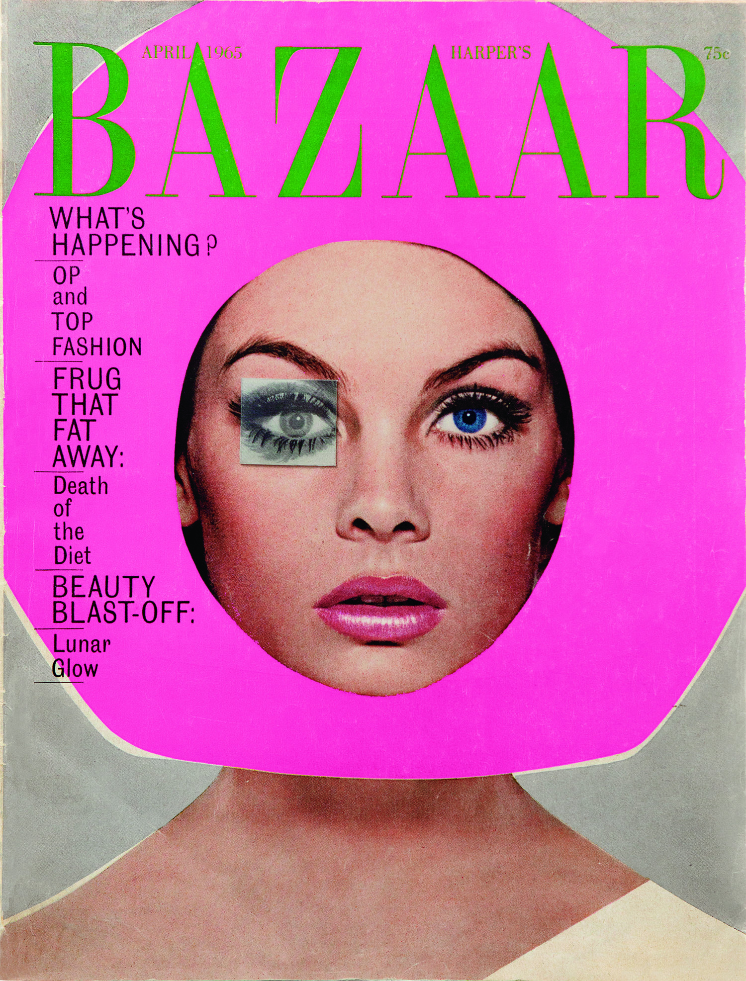 Harper’s Bazaar’s hadn’t had a guest editor before, but for its April 1965 edition, long-time collaborator Richard Avedon edited and photographed the entire issue.
Inside, Avedon photographed Donyale Luna — the first black woman to be featured on the cover of a mainstream fashion magazine — and Paul McCartney wearing a spacesuit borrowed from NASA. For the cover, Avedon chose an image of contemporary supermodel Jean Shrimpton wearing a space helmet which had been made by one of New York’s most famous milliners.
Avedon later recalled that at 11 PM — after their deadline had passed — the photograph he’d shot for the cover wasn’t working. So, Feitler cut the shape of a helmet from pink Day-Glo paper and placed it over Avedon’s photograph. No focus groups, no research, no audience testing, just a gutsy and intuitive design decision.
The result was a cover which went on to win the New York Art Director's Club medal and was placed at number fifteen in the American Society of Magazine Editor’s 2005 list of Top 40 Magazine Covers.
50⁄50 Image To Text
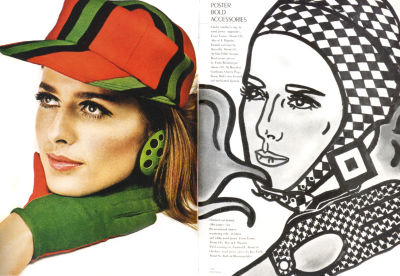
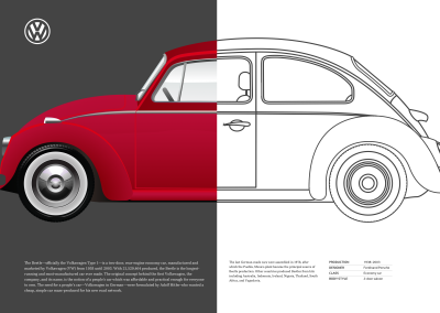
To implement my first Feitler-inspired design, my aim is to use the most minimal set of structural elements; a header plus main and aside elements for content. My header contains the split image of an iconic Volkswagen Beetle and a headline which includes an inline SVG Volkswagen logo. As this headline contains no text, I use an ARIA label to describe it. This will help people who use assistive technologies:
<header>
  <h1 aria-labelledby="Volkswagen logo">
    <svg>…</svg>
  </h1>
  <picture>…</picture>
</header>

<main>…</main>
<aside>…</aside>
For smaller screens, I need only foundation styles as the normal flow, handles my single column layout. First, I add a linear gradient behind the header image. Gradients are incredibly flexible, but despite their usefulness they’re surprisingly under-used:
header {
padding: 1rem 2vw;
background-image: linear-gradient(
to right,
#444 0%,
#444 50%,
#fff 50%,
#fff 100%);
text-align: center; }
My gradient starts on the left with a dark grey and ends on the right with white. Without color stops, the result would be a smooth gradient between those colors, but I want a hard line in the center of my header. To achieve this effect, I place two color stops at the same 50% position. To change the direction of my gradient, I needn’t adjust those percentages. I can simply change the gradient direction from to right to to left.
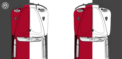

It’s important to maintain a consistent balance of visual weight while adapting designs to several size screens. I don’t want my header image so tall it pushes my running text off the first screen, so I set a maximum height of 75vh or three quarters the height of a small screen:
header img {
max-height: 75vh; }
To complete my small screen design, I establish the header as a positioning context. Then, I absolutely position the Volkswagen emblem and ensure its width will adapt to the screen by using a viewport width unit of 5vw:
header {
position: relative; }
h1 {
position: absolute;
top: 1rem;
left: 1rem;
width: 5vw; }
My portrait orientation image fits well into tall screens, but I need a wider format image for screens which are wider than they are tall. Orientation is a fabulous, but seldom used media query which tests the orientation of a viewport. This media query can be used in stylesheets as an alternative to more conventional width queries. It can also be applied to the source of a picture element. This query swaps my portrait image for a landscape alternative whenever width exceeds height, whether on a small phone or desktop size display:
<picture>
<source srcset="landscape.png"
media="(orientation: landscape)">
<img src="portrait.png" alt="Volkswagen Beetle">
</picture>
For my alternative landscape design, I use Grid to place the header, main, and aside elements. There are several options for placing these elements — including columns and rows, and template areas — but I’ve chosen to use grid-template-columns to define a symmetrical two-column grid on the body. I apply the linear gradient again and set its minimum height to the match the full viewport:
@media screen and (orientation: landscape) {
body {
display: grid;
grid-template-columns: [main] 1fr [aside] 1fr;
min-height: 100vh;
background-image: linear-gradient(
to right,
#444 0%,
#444 50%,
#fff 50%,
#fff 100%); }
}
In landscape orientation, my header fills the entire width of the screen. As I no longer need the linear gradient background image on this element, I can simply remove it:
header {
grid-column: 1 / -1;
background-image: none; }
Now, because this grid is so simple, I place my main and aside elements onto the grid using named lines:
main {
grid-column: main; }
aside {
grid-column: aside; }
The end result is a design which adapts its layout depending on whether a browser or device screen is in landscape or portrait orientation.
Comic Book Art
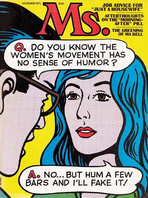 Bea Feitler regularly combined photographs with illustrations, and comic book art appears in work throughout her career.
For Harper’s Bazaar, she placed one of Avedon’s photographs of Jean Shrimpton wearing a spacesuit onto a comic book background. Later, she commissioned legendary comic artist Marie Severin to create this cover for Ms. Magazine in 1973.
Emphasize Scale


The Volkswagen Beetle was a small car with a big personality. I want my next design to have a character to match. The large screen design uses an enormous picture of the Beetle’s wheel to emphasize the smallness of that little car. But, before I get to large screens, I want to make sure I maintain a similar contrast in scale on small screens.
Three structural elements make up the markup I need to implement this design; a header for the large wheel picture, a figure which contain the smaller image of the car, and a main for my running text. As the header has no meaning for anyone who uses a screen reader, I choose to hide it by using an aria-hidden attribute:
<header aria-hidden="true">
<img src="header.png" alt="">
</header>

<figure>
<img src="figure.png" alt="Volkswagen Beetle">
</figure>

<main>…</main>
Foundation styles and normal flow take care of most aspects of my small screen design, but that doesn’t mean I can ignore what makes it the overall concept distinctive; the contrast between the large wheel and the small Volkswagen. To ensure my header always occupies one-third of the viewport height with identical whitespace between it and my content, I use viewport height units for both height and margin:
header {
margin-bottom: 33vh;
height: 33vh; }

One problem I often encounter when developing flexible layouts is the unintentional resizing of images. With a fixed height on my header and 100% width on its image, the giant wheel can distort. Fortunately, there’s a way to preserve its aspect ratio using the object-fit property. There are four possible options, plus none:
contain
Preserves an image’s aspect ratio while fitting inside a parent’s content box.cover
Preserves an image’s aspect ratio but this time fills the whole box. When this happens, parts of the image outside the content box will be hidden.fill
An image will be distorted so its width and height match its parent.scale-down
Similar to contain, reduces the size of an image or video to fit inside its parent.

I want my large wheel to fill the header completely without altering its aspect ratio. I’m also not concerned some parts of the image will be clipped, which makes cover the right choice for object-fit:
header img {
object-fit: cover;
object-position: center bottom;
width: 100%;
height: 100%; }
Now the wheel image is in position, I provide scale by contrasting its large size with a small image of the whole car. I restrict the Beetle’s maximum size to half the viewport width and centre it horizontally using its margins:
figure {
margin: 0 auto;
max-width: 50vw; }
This design uses a solid grey background to represent the road, so I add a background color and move the figure down by 10px, so the Beetle’s wheels sit firmly on the tarmac:
main {
padding: 2rem;
background-color: #f0f0f1; }

figure {
transform: translateY(10px); }
Bigger screens provide an opportunity to make a big impression, and for this design, I want the header image to occupy half the width and the full height of a large screen. I apply the same 6+4 compound grid I’ve used for many designs in this series. It has eight columns to which I add three rows. I give the middle and bottom rows a fixed height and allow the first row to occupy all remaining vertical space:
@media screen and (min-width : 64em) {
body {
display: grid;
grid-template-columns: 2fr 1fr 1fr 2fr 2fr 1fr 1fr 2fr;
grid-template-rows: 1fr 155px 155px;
grid-column-gap: 2vw; }
}
I want the body to always fill the full viewport height, so I apply a minimum height of 100vh and use a linear gradient to create the illusion of a road:
body {
min-height: 100vh;
background-image: linear-gradient(
to top,
#f0f0f1 0%,
#f0f0f1 155px,
#fff 155px,
#fff 100%); }
Using line numbers, I place the header on the grid, so it occupies half the columns and all the rows. The alignment of the small figure places it at the end of its grid module. Then, the main forms a single narrow column of running text:
header {
grid-column: 5 / -1;
grid-row: 1 / 4;
margin-bottom: 0;
height: auto;
background-color: #444; }

figure {
grid-column: 1 / 4;
grid-row: 2;
align-self: end;
max-width: auto; }

main {
grid-column: 4;
grid-row: 1 / 3;
align-self: center;
background-color: transparent; }

Knowing how scale influences someone’s understanding of a story is essential to telling it well. Sheer size is rarely enough on its own, so to make a significant impact, largeness must be relative to the size of other elements.
Bea Feitler understood scale and used it well. She often contrasted large foreground elements with smaller ones in the background to create designs which contained incredible depth. We can now follow in her footsteps by using scale to add impact to product and websites designs.
Confident Color Choices
Bea Feitler’s confident choice of colors was one of the hallmarks of her work, and it attracted me immediately. For my next Feitler-inspired design, I contrast a deep red with a vibrant yellow and reverse those colors on both sides of the design.
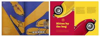
While this page is big on color, it is also small on markup. I need just two structural elements; a header and main. Inside both are a figure and a division:
<header>
<figure>…</figure>
<div>…</div>
</header>

<main>
<figure>…</figure>
<div>…</div>
</main>
Background and text colors are the starting point for implementing this design. I can leave everything else to the normal flow:
body {
background-color: #ba0e37;
color: #f8d72e; }

main {
background-color: #f8d72e;
color: #272732; }

For medium-size screens, I want the figures and divisions inside my header and main to occupy half the height and width of any viewport, so I apply a symmetrical two-column grid and a minimum height:
@media screen and (min-width : 48em) {
header, main {
display: grid;
grid-template-columns: 1fr 1fr;
min-height: 50vh; }
}
I place the header’s figure in the second column and the division in the first. Because this is the opposite of the content order, I need to assign both to the same row to avoid one column dropping below the other:
header figure {
grid-column: 2;

header div {
grid-column: 1;
grid-row: 1; }
The main element’s figure and division follow the content order, so I needn’t specify a grid-row for them:
main figure {
grid-column: 1;
align-self: end; }
main div {
grid-column: 2; }
I want to fill screens with color from edge to edge. For larger screens, I apply asymmetrical two-column grid which extends the full height of my body:
@media screen and (min-width : 64em) {
body {
display: grid;
grid-template-columns: 1fr 1fr;
min-height: 100vh; }
}
In this large-screen design, the figure and division in my header and main stack vertically instead of horizontally. I change the display property from grid to flex and set the direction to column. But, the visual order of the main is opposite to its content order, so I change its direction from column to column-reverse:
header, main {
display: flex;
flex-direction: column; }

main {
flex-direction: column-reverse; }
Then, to improve the readability of my running text, I use multi-column layout and specify a column width of 18em. A browser will generate as many columns of that width as will fit inside its parent element:
main div {
column-width: 18em;
column-gap: 2vw; }
Large blocks of solid color can be tiring for the eye, so I want to break them up by adding a playful, repeating background image pattern to the body using SVG:
body {
background-image: url("data:image/svg+xml"); }
Within the SVG, I specify both the fill color and set a low fill opacity for a subtle effect:
fill='#f8d72e'
fill-opacity='0.1'
I apply the same SVG image to the yellow background of my main, this time changing its fill color to white and increasing the fill-opacity:
main {
background-image: url("data:image/svg+xml"); }

fill='#fff'
fill-opacity='0.2'
Pattern and texture play a big part in many of Bea Feitler’s iconic magazine spreads, and yet they’ve fallen out of favor on the web. Next, I’ll show you how to use CSS and SVG patterns which will add depth to your designs.
Pattern And Texture Adds Depth

In this next Feitler-inspired design, I want to convey the curvaceousness of the Volkswagen Beetle by using circles. I need minimal HTML to implement this shapely design, just three elements; a header, main and aside:
<header aria-hidden="true">
<picture>…</picture>
</header>

<aside>
<div><img></div>
<div><img></div>
</aside>

<main>
<h1 aria-labelledby="Volkswagen logo">
<svg>…</svg>
</h1>
<p>…</p>
</main>
I don’t want the header announced by screen readers, so I add an aria-hidden attribute with a value of true. I do want screen readers to describe my top-level heading, so I add an aria-labelledby attribute to that.
Half-tone style dots add texture to this page, and it’s easy to implement patterns like this using multiple background gradients, and combinations of background-size and background-position:
body {
background-color: #ba0e37;
color: #fff;
background-image:
radial-gradient(rgba(255,255,255,.25) 15%, transparent 16%),
radial-gradient(rgba(255,255,255,.25) 15%, transparent 16%);
background-size: 6vw 6w;
background-position: 0 0, 3vw 3vw; }
I’ll break this style into three steps:
- Two radial gradients, separated by a comma. Each gradient includes two color steps, the first at
15%, and the second at16%which form the dots. - By using viewport width units to size the resulting pattern, I keep the dot size proportionate to the page width.
- Position the first radial gradient to the top left of the viewport (
0 0), and the second using viewport width units which are half the background sizes.

Lea Verou has been busy compiling a gallery of useful patterns which she developed using linear and radial gradients. As clever as Lea’s gallery is, there’s something about convoluted gradients being used to produce image-like patterns which bother me.

SVG patterns seem much more appropriate. They’re just as lightweight and are far more flexible. Add SVG to a background image using a URL, and if you’re concerned about HTTP requests, embed an SVG into a stylesheet as a data:image:
body {
background-image: url("data:image/svg+xml"); }
The aside in this design includes two divisions which each contain pictures of the Beetle’s fabulous front. I clip those divisions into circles to compliment its curves:
aside div {
-webkit-clip-path: circle();
clip-path: circle(); }

By making the pictures’ backgrounds fully transparent, I can change the color of their parent divisions whenever I need to. I add slightly transparent background colors which allow hints of the dot pattern to show through:
aside div:first-child {
background-color: rgba(57,135,106,.9); }

aside div:last-child {
background-color: rgba(248,215,46,.9); }
With so much color and texture in this design, my layout needs to be simple, so I apply a two-column asymmetrical grid where the narrowest column can never shrink below 260px:
@media screen and (min-width : 64em) {
body {
display: grid;
grid-template-columns: 4fr minmax(260px, 1fr); }
}
To improve the accessibility and readability of my paragraphs of running text against the red pattern, I add a subtle drop shadow in a color which matches my background:
p {
filter: drop-shadow(0 0 5px #ba0e37); }

In the past, filtering a picture to apply a blur, color change, or drop shadow, required adding destructive effects in an image editor, but today, many of those same filters are available in CSS. You can apply filters to other HTML elements too.
Applying a CSS filter is straightforward. First, declare the filter-function and then a value in parentheses. To reduce an element’s opacity to 25% using a filter — instead of the opacity property — I use the opacity filter:
.ihatetimvandamme {
filter: opacity(.25); }
Those values differ with each filter. Some filters use degrees, accept use pixels, percentages, or their equivalent decimal. For example, .25 is equal to 25%, and 1 is the equivalent of 100%.
There are ten stock CSS filters to choose from: blur, brightness, contrast, drop-shadow, greyscale, hue-rotate, invert, opacity, saturate, and sepia. You can also use the URL function to use a custom filter from SVG.
I want to remove all color from my header and reduce its opacity to 80%. I can combine any number of filters by separating them with a space. It’s important to remember that a browser will apply filters in the order they’re specified, so for my header, color will be removed before opacity is altered:
header {
filter: grayscale(1) opacity(.8); }
When I need a smooth shift between CSS filters and values, I can add a transition between states, perhaps by increasing the opacity of my header for an :hover pseudo-class:
header {
filter: grayscale(1) opacity(.8);
transition: filter 1s linear; }

header:hover {
filter: grayscale(1) opacity(1); }
I can use CSS to develop a more elaborate animation between filters by first defining my keyframes, setting filter values at any percentage between 0 and 100% of the animation’s duration:
@keyframes beetle {
0% {
filter: grayscale(1) opacity(.8) blur(5px); }
50% {
filter: grayscale(1) opacity(1) blur(0); }
100% {
filter: grayscale(1) opacity(.8) blur(5px); }
}
I then assign this animation to my header, using the animation-name plus values for animation-duration, animation-delay, and other optional settings:
header:hover {
animation-name: beetle;
animation-delay: 0s;
animation-direction: alternate;
animation-duration: 1s;
animation-fill-mode: forwards;
animation-iteration-count: 1;
animation-timing-function: linear; }
Una Kravets recreated Instagram filter effects using CSS filters and blend-modes for her CSSgram library. Building on Una’s work, developer Indrashish Ghosh made cssFilters, a tool for granular control over those Instagram-style effects, applying them to an uploaded image, and generating CSS values. Tools like Indrashish’s make it as easy to use CSS filters as any image editor.
A reaction to overly ornamental designs, flat design has been the dominant aesthetic for almost a decade. As gradients, patterns, shadows, and three-dimensional skeuomorphism fell out of fashion, designers embraced solid colors, square corners, and sharp edges.
Anti-skeuomorphism no doubt helped designers focus on feature design and usability without the distraction of what some might still see as flourishes. But, reducing both product and website designs to a bare minimum has had unfortunate repercussions. With little to differentiate their designs, products and websites have adopted a regrettable uniformity which makes it difficult to distinguish between them.
While I’m not advocating a return to the worst excesses of skeuomorphism, I hope product and website designers will realize the value of a more vibrant approach to design; one which appreciates how design can distinguish a brand from its competition. A method which uses gradients, patterns, shadows appropriately to tell stories and provide greater affordance. This will make products and websites not only easier to use but more enjoyable too.
Develop With SVG Filters

For this final inspired design, I need just two structural elements; a header which contains six brightly colored Beetles, and a main for my text:
<header>
<div><img src="car-red.png" alt=""></div>
<div><img src="car-green.png" alt=""></div>
<div><img src="car-cyan.png" alt=""></div>
<div><img src="car-magenta.png" alt=""></div>
<div><img src="car-yellow.png" alt=""></div>
<div><img src="car-black.png" alt=""></div>
</header>

<main>…</main>
Normal flow takes care of most of this design for small screens, but that doesn’t mean there’s nothing to do. I would lose the impact of those colorful cars if I were to shrink them all to fit a small screen. I also don’t want people to scroll past all six before they see my content, so my solution is to line them up horizontally in a scrolling panel.
Flexbox is the obvious choice for arranging those images, but the default left-right order would mean showing the back of the final car, instead of the front of the first. This is easily solved by changing the flex-direction from the default row to row-reverse:
header {
display: flex;
direction: row-reverse;
max-width: 100%;
overflow-x: scroll; }
I want all these cars to appear at the same size, so I use the flex-grow property and a value of 1. As I want to show the front of each car to indicate there’s more to see outside the viewport, I set the flex-basis value to 80%;
header div {
flex-grow: 1;
flex-grow: 0;
flex-basis: 80%;
/* flex: 1 0 80%; */  }
On medium-size screens, there’s space for a more elaborate layout for my collection of cars. For this design, I arrange my Beetles on an 8x12 modular grid, where each module is a 16:9 aspect ratio rectangle. The black Beetle furthest away from the viewer occupies a single module, and the cars appear progressively larger until the red Beetle in the foreground occupies the largest spacial zone.

To implement this modular grid, I apply Grid to my header element, followed by eight repeating evenly sized columns, and twelve rows which adapt to the minimum height of their content. By aligning the items to the end, rather than the start, of each row, the result looks more realistic:
@media screen and (min-width : 48em) {
header {
display: grid;
grid-template-columns: repeat(8, 1fr);
grid-template-rows: repeat(12, min-content);
grid-row-gap: 10px;
align-items: end; }
}

My next task is to place each Beetle onto the grid. I use a combination of child (>) and nth-child selectors to place each element using line numbers:
header > :nth-child(1) {
grid-column: 3 / -1;
grid-row: 10 / -1; }

header > :nth-of-type(2) {
grid-column: 3 / 7;
grid-row: 7 / 9; }

header > :nth-of-type(3) {
grid-column: 1 / 4;
grid-row: 5 / 7; }

header > :nth-of-type(4) {
grid-column: 2 / 4;
grid-row: 3; }

header > :nth-of-type(5) {
grid-column: 6 / 8;
grid-row: 2; }

header > :nth-of-type(6) {
grid-column: 3;
grid-row: 1; }
A design like this cries out for typographic details. Padding on the main element adds space around my running text, so to add interest to my type, I set column widths of 24em, and a browser will automatically create the right number of columns to fit the viewport:
p {
column-width: 24em;
column-gap: 2vw; }
To add extra interest to my type, I combine a first-of-type pseudo-class selector with a first-line pseudo-element to transform that first line into uppercase letters:
p:first-of-type::first-line {
text-transform: uppercase; }
To implement my design for larger screens, I double the number of columns from eight to sixteen and reposition my images to the new line numbers:
@media screen and (min-width : 64em) {
header {
grid-template-columns: repeat(16, 1fr); }

header > :nth-child(1) {
grid-column: 8 / 15;
grid-row: 9 / 13; }

header > :nth-of-type(2) {
grid-column: 6 / 11;
grid-row: 5 / 8; }

header > :nth-of-type(3) {
grid-column: 1 / 5;
grid-row: 4 / 6; }

header > :nth-of-type(4) {
grid-column: 4 / 6;
grid-row: 3; }

header > :nth-of-type(5) {
grid-column: 11;
grid-row: 2; }

header > :nth-of-type(6) {
grid-column: 5;
grid-row: 1; }
}
Compared to today’s Beetle — which weighs almost 3000lbs — the Volkswagen Type 1 was a lightweight and speedy little car for its time. I’d like to create the impression these cars are speeding past the viewer by adding motion blur. Blurring an element using a CSS filter is straightforward:
header > div {
filter: blur(5px); }
This filter allows me to blur an element by any amount using several length values, including pixels which seem to me to be the most appropriate unit. But, CSS filters only allow me to blur an element using the same amount horizontally and vertically, much like an image editor’s Gaussian blur. To add realistic motion to my design, I need to swap CSS for an SVG filter.

I cover just a small amount of detail about SVG filters in this issue, but SVG expert Sara Soueidan has written about them extensively. Start with Sara’s SVG Filters 101 tutorial.
While its ten stock filters are a relatively recent addition to CSS, their history goes way back to their SVG origins. Filters in SVG offer far greater flexibility with six more filters available and incredible customization possibilities. Whereas CSS blur allows just one value for both horizontal and vertical axes (X/Y,) in SVG I can use two values; one for the X-axis, the other for Y.
In SVG, every filter has its own identity, so to blur to an HTML element, reference its ID using the URL value in the filter property from a stylesheet:
.blur {
filter: url(#blur); }
Filters have their own element in SVG, it’s the filter element. Even though a filter won’t be visible in a browser, giving SVG a height of 0 will ensure it takes up no space:
<svg height="0">
<filter id="blur">…</filter>
</svg>
Each SVG filter primitive has its own name which is prefixed by fe, an abbreviation of “filter effect.” Unsurprisingly, the name for a blur is feGaussianBlur. The amount of blur is applied as a stdDeviation using either one uniform value or two separate values for horizontal and vertical. To reproduce the previous uniform 5px Gaussian blur in SVG, I add one value:
<filter id="blur">
<feGaussianBlur in="SourceGraphic"
stdDeviation="5"/>
</filter>
I’m looking for a more realistic motion effect where the image is blurred on just the horizontal axis. I apply blur to only the X-axis, leaving the Y-axis at zero:
<filter id="blur">
<feGaussianBlur in="SourceGraphic"
stdDeviation="15, 0"/>
</filter>
Now my car is speeding across the viewport, but when you look more closely. the result isn’t altogether realistic. That’s because the edges of my blurred elements are clipped by the bounding box. This is the rectangle which surrounds every element.

To make the entire filter effect visible, I need to increase the size of my filter region using x, y, width, and height values. I use negative values of -10% on both horizontal and vertical axes, then increase the width and height to 120% which allows more visible space for my images’ blurred edges:
<filter id="blur"
x="-10%" y="-10%"
width="120%" height="120%">
…
</filter>
When you watch cars speeding past, or you look out of a moving train window, objects closest to you appear to move faster than those further away. To make my design seem more realistic, I need a different set of blur values for objects in the foreground, middle ground, and background.
Foreground elements like the closet red Beetle need the highest amount of horizontal blur. I give this filter an identity of blur-foreground:
<filter id="blur-foreground"
x="-10%" y="-10%"
width="120%" height="120%">
<feGaussianBlur in="SourceGraphic" stdDeviation="15,0"/>
</filter>
Then, Beetles in the middle ground receive a slightly lower stdDeviation of 10:
<filter id="blur-medium"
x="-10%" y="-10%"
width="120%" height="120%">
<feGaussianBlur in="SourceGraphic" stdDeviation="10,0"/>
</filter>
Finally, objects in the background receive the least blurring. I give this filter an identity of blur-background so I can apply it in my stylesheet:
<filter id="blur-background"
x="-10%" y="-10%"
width="120%" height="120%">
<feGaussianBlur in="SourceGraphic" stdDeviation="5,0"/>
</filter>
With all my filters specified, in my stylesheet I apply them to Beetles in the foreground, middle ground, and background:
<img src="car-red.png" class="blur-foreground">
<img src="car-green.png" class="blur-medium">
<img src="car-cyan.png" class="blur-medium">
<img src="car-magenta.png" class="blur-medium">
<img src="car-yellow.png" class="blur-background">
<img src="car-black.png" class="blur-background">

.blur-foreground { filter: url(#blur-foreground); }
.blur-medium { filter: url(#blur-medium); }
.blur-background { filter: url(#blur-background); }
My set of six colorful Beetles are now racing across the viewport and my final Feitler-inspired design is a winner too.
NB: Smashing members have access to a beautifully designed PDF of Andy’s Inspired Design Decisions magazine and full code examples from this article.
Read More From The Series
- Inspired Design Decisions: Avaunt Magazine
- Inspired Design Decisions: Pressing Matters
- Inspired Design Decisions: Ernest Journal
- Inspired Design Decisions: Alexey Brodovitch
- Inspired Design Decisions: Neville Brody
- Inspired Design Decisions: Otto Storch
- Inspired Design Decisions: Herb Lubalin
- Inspired Design Decisions: Max Huber
- Inspired Design Decisions: Giovanni Pintori
- Inspired Design Decisions: Emmett McBain
- Inspired Design Decisions: Bradbury Thompson
NB: Smashing membersSmashing members have access to a beautifully designed PDF of Andy’s Inspired Design Decisions magazine and full code examples from this article. You can buy this issue’s PDF and examples as well as every other issue directly from Andy’s website.
Further Reading
- Rediscovering The Joy Of Design
- Revealing Images With CSS Mask Animations
- Knip: An Automated Tool For Finding Unused Files, Exports, And Dependencies
- Designing Sticky Menus: UX Guidelines


 Try if for free!
 Register for free today!
 JavaScript Form Builder — Create JSON-driven forms without coding.
 Get a Free Trial


