Material Design Text Fields Are Badly Designed
I’ve been designing forms for over 20 years now, and I’ve tested many of them for large organizations like Boots, Just Eat and Gov.uk. One topic that comes up a lot with forms is: where to put the label. In the early days, we talked about left-aligned labels versus top-aligned labels.
These days the focus is more about placeholders that replace labels and float labels. The latter start off inside the input. When the user starts typing, the label ‘floats’ up to make space for the answer:
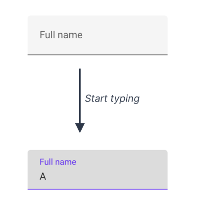
Some people assume float labels are best because Google’s Material Design uses them. But in this case, Google is wrong.
Instead, I recommend using conventional text fields which have:
- The label outside the input (to tell the user what to type),
- A distinct border all the way around (to make it obvious where the answer goes).
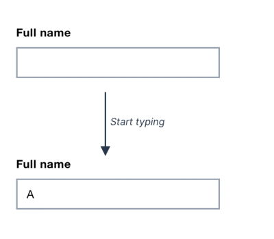
In this article, I’ll explain why I always recommend conventional text fields and why Google is wrong about using float labels for Material Design.
Float Labels Are Better Than A Common Alternative But They’re Still Problematic
Float labels were designed to address some problems with a commonly used alternative: placeholder labels. That’s where the label is placed inside the input but disappears when the user starts typing:
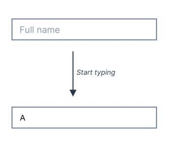
Having seen lots of people interacting with forms through my work first hand I know that placeholder labels are problematic.
This is because, for example, they:
- disappear as soon as the user types which can make it harder to remember what the input is for, especially for users with cognitive impairments;
- may be mistaken for an actual answer causing users to accidentally skip the field;
- are greyed out to indicate that it’s a label and not an answer — but this can make it harder to read.
Float labels don’t solve 2 of these problems: poor contrast and the chance of the label being mistaken for an actual answer. And while they attempt to address the problem of the label disappearing, in doing so, float labels introduce lots of other problems, too.
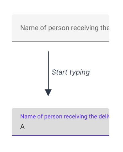
For example, the size of the label has to be tiny in order to fit inside the box, which can make it hard to read. And long labels cannot be used as they’ll get cropped by the input:
Conventional Text Fields Are Better Than Both Placeholder Labels And Float Labels
Conventional text fields don’t have the above problems because it’s clear where the answer goes and they have a legible, readily available label. The labels can be of any length and hint text, should it be needed, is easy to accommodate as well.
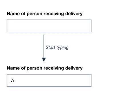
I’ve watched hundreds of people interact with forms and seen many of them struggle. But not once was that down to the use of a conventional text field. They take up a bit more vertical space. But saving space at the cost of clarity, ease of use and accessibility is a bad tradeoff to make.
Google’s Test Didn’t Include Conventional Text Fields
Google’s article, The Evolution of Material Design’s Text Fields shows that only 2 variants were tested, both of which used float labels.
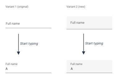
Crucially the test didn’t include conventional text fields which means they haven’t actually compared the usability of their float label design against conventional text fields. And having read Google’s responses to the comments on their article, it seems that usability was not their top priority.
Google Inadvertently Prioritized Aesthetics Over Usability
I looked into why Material Design uses float labels and discovered comments from Michael Gilbert, a designer who worked on them.
The comments indicate that they tried to balance aesthetics and usability.
This seems to imply that there was more of an emphasis on form over function [...] or even a desire to simply differentiate Material components from tried and true (boring) input boxes. [...] was there research conducted on the original inputs that validated that they met a goal that was not being met by box inputs? Is there something that stood out as valuable going with a simple underline?
The design decisions behind the original text field predate my time on the team, but I think the goal was likely similar [to this research]: Balance usability with style. I believe at the time we were leaning towards minimalism, emphasizing color and animation to highlight usability.
[...] this is one of those moments where I wonder why all of this research was necessary as I have long thought that the old design was flawed for all the reasons you mentioned.
[...] the goal of the research here wasn’t to simply determine that one version was better than another [...]. This study was instead focused on identifying the characteristics of the design that led to the most usable, most beautiful experiences.
Even though Google aimed for balance, in the end they inadvertently sacrificed usability for ‘minimalism’ and ‘a beautiful experience’.
But aesthetics and usability are not in competition with each other. Something can look good without causing problems for users. In fact, these qualities go hand in hand.
Conclusion
Float labels are certainly less problematic than placeholder labels. But conventional text fields are better than float labels because they look like form fields and the label is easy to read and available at all times.
Aesthetics are important, but putting the label inside the box does not make it look beautiful. What it does do, however, is make it demonstrably harder to use.
Smashing Editor’s note
At the moment of writing, here at Smashing Magazine we are actually using the floating label pattern that Adam heavily criticizes in this article. From our usability tests we can confirm that floating labels aren’t a particularly great idea, and we are looking into adjusting the design — by moving to conventional text fields — soon.
Acknowledgments
Thanks to Caroline Jarrett and Amy Hupe for helping me write this. And thanks to Maximilian Franzke, Olivier Van Biervliet, Dan Vidrasan, Fabien Marry for their feedback on an earlier draft of this article.


 Click here to kickstart your project for free in a matter of minutes.
 Check the frontend report!


 Take a break with a 3D game built on Netlify!

