Headless In Times Of Accessibility
This article has been kindly supported by our dear friends at Storyblok, a friendly headless CMS with a visual editor, nested components, and customizable content blocks for websites and apps. Thank you!
We should all care more about web accessibility. It’s the best tool to make the web a more inclusive, equal space — and, in my opinion, it’s our responsibility as developers, UX specialists, and designers to support this mission. While the CMS might, at first glance, seem like a small piece of the puzzle, it’s really the baseline to set your project up for success.
Let’s have a closer look at the basics of web accessibility, the difference between monolithic and headless content management systems, and how to make the most of your CMS in terms of accessibility.
What Is Web Accessibility?
Web accessibility means, in short, that we design and implement our projects in a way that people with disabilities can use them and participate as equally as possible. There are many different kinds of disabilities like physical, auditory, cognitive, speech, neurological, or visual disabilities. In the World Report on Disabilities by the WHO from 2011, it was found that over 15% of the global population experiences some form of disability throughout their lifetime — that’s 1 billion people in total; and with the global population generally growing older, it will only continue to rise.
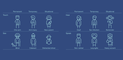
But the applications for web accessibility are even broader: making your website accessible benefits not only people with permanent disabilities but also those with situational or temporary impairments, like folks with a broken arm or new parents holding their baby (and only having one hand free to use a device). Looking at your phone in bright sunlight, you probably rely on sufficient color contrast, and captions enable you to watch videos without turning to volume up in a quiet environment.
In short: Web Accessibility benefits all of us.
But What Does That Mean In Practice?
Web Accessibility takes many shapes and forms, but it could mean, for example, including alternative texts for your images, adding captions to videos, and ensuring enough contrast between background and foreground for texts. Keyboard navigation is also essential in making your website more accessible, as many users rely on their keyboard or assistive technology to navigate the web. The same is true for writing semantic code — making sure you are using the right HTML elements and structure gives assistive tech lots of valuable context — while simultaneously improving your code.
While the whole task of making your website accessible may seem daunting at first, there are many good resources out there, like the Web Content Accessibility Guidelines (WCAG) for instance. These guidelines were developed to promote a unified, international standard for web accessibility. They include three different levels of accessibility (A, AA & AAA), A being the least and AAA the most inclusive.
Why Does The CMS Matter?
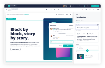
Ideally, your content management system is where it all comes together, right? And having the right tool for the job will make it much easier for everyone involved to create an accessible website. In short: once you have found the ‘right’ CMS, you have plenty more headspace to take care of overarching issues. Your content management system should not hinder you in developing accessible content, it should support you in doing so.
What Are Your Options?
In the world of CMSes, there are two big categories: monolithic and headless CMS. While radically different in their approach and architecture, they both have a lot of things going for them — it’s basically a matter of finding the right fit.
Monolithic CMS
Monolithic CMS, sometimes also called ‘traditional’ or ‘coupled’ content management systems, are ‘where it all started.’ In the early 2000s, open-source platforms like WordPress, Drupal and Joomla emerged — providing an easy way for people to create websites or personal blogs quickly.
The idea of a monolithic CMS is a ‘one-stop shop’ — usually, you have a database where the content is stored, an admin interface, and the frontend that combines the data from the database with the styling and logic — you don’t have to worry about hosting or writing code.
This might mean a few compromises: Since you are buying into the ‘package deal’ for all these solutions, your solution might not excel at every task. There are likely some features in the mix that really suit your approach (which is probably why you chose it in the first place) and others that are not really a good match or which you simply don’t need but which are just part of the whole package.
In terms of the tech stack, you probably highly depend on the CMS’ default — not much flexibility here. What attracts many people to platforms like WordPress, for example, are the ready-made templates and plugins to choose from — these tools make it relatively easy to extend your website’s functionality or change the styling.
All in all, not a terrible solution if you are looking to get started quickly and have little experience in setting up your own website from scratch.
The New Kid On The Block: Headless CMS
With the rise of mobile devices, the demands on the CMS ecosystem changed as well — an omnichannel approach became the new norm, and traditional systems weren’t fit to cope, at least not effectively. Out of this need, headless systems were born:
A headless content management system means decoupling the ‘head’ (aka ‘frontend’) from the ‘body’ (backend or content repository). The focus of a headless CMS is solely on storing and delivering structured content. Due to this approach, omnichannel becomes second nature: through an API, you can access your data and distribute it wherever you like — be it in a mobile app, on a website, or in an e-commerce store.
Headless follows the best-of-breed approach: connect the tools and services that fit your needs through the API but don’t worry about unnecessary baggage. And as a developer, headless gives you the freedom to choose any kind of tech stack that you would like for the frontend. Even if you need to change frameworks in the future, it won’t affect your headless CMS in the slightest.
Headless vs. Monolithic: What’s The Best Fit For You?
So, in the end, as always — it comes down to your needs. There is no definite answer. A headless CMS might likely be an excellent fit for you, especially if you are working with multiple output channels and are experienced with creating your own frontend. There has been a massive shift in the last couple of years towards headless — with good reason. If you prefer an out-of-the-box solution with little programming effort on the other hand and don’t mind working with templates, a monolithic approach could be the solution for you.
What’s More Accessible: Monolithic Or Headless CMSs?
The short answer is again: it depends.
Both monolithic and headless solutions are not inherently accessible, unfortunately. Many platforms make some effort to meet minimum requirements when it comes to web accessibility, but there is still a long way to go.
How Accessible Is A Monolithic CMS?
When it comes to monolithic platforms, generally speaking, your frontend can only be as accessible as your least accessible plugin. Let me expand a little here, using WordPress as an example:
How accessible or inaccessible your site is largely depends on what data is stored and how it is displayed. This is massively affected by the themes and plugins you may use. And while there are many themes that claim to be ‘accessibility ready’, not all of them are. And even if you manage to select an accessibility theme, it can become inaccessible if you install an inaccessible plugin. So it’s not impossible, but there are definitely some obstacles in your way.
One thing to keep in mind: when working with a monolithic CMS, you are generally limited to the accessibility features provided by the CMS (or plugins) itself — customizing the editing experience will be a lot more challenging than when working with a headless CMS.
Creating Your Own Themes
If you want to be in more control, it might be feasible to create your own themes — you could even use a base theme for the underlying HTML structure. By creating your own theme, you can ensure sufficient color contrast and solid keyboard navigation, make sure there aren’t exclusively visual cues to alert the user to changes, test for screen reader users, and implement things like motion control.
Plugins: Curse Or Blessing?
The beauty (and the danger) of plugins is, that you can choose from over 55.000 plugins in WordPress and install them at the click of a button. Each gives new functionality to your site — many being interactive. Especially these interactive plugins are full of potential accessibility pitfalls and need to be tested thoroughly.
Accessibility Plugins
There are also plugins that claim to make your website accessible. And while it’s tempting to fix your accessibility needs just by quickly installing a plugin, don’t be fooled. These tools promise you to fix issues like color contrast, enable zoom or add alt text to images — all good ideas in theory. But in most cases, trying to solve accessibility issues with quick fixes like plugins creates more issues than it solves. These tools usually create an overlay of your website, not actually fixing the issues but — well, painting over them.
While there have been significant advances in technology, automatically generated (alt) texts still need to be checked manually and are not always accurate, causing confusion for the users. Another big issue is that these automated tools often clash with the assistive technologies people might already be using. Before using an accessibility plugin in production, make sure to test it thoroughly — if it seems too good to be true, it usually is.
“I will recommend staying away from any plug-in that claims or implies that it will fix your site to help you meet accessibility guidelines—no plug-in is going to be able to seriously achieve that goal.”
— Joe Dolson
Accessibility In Times Of Headless CMS
Now you might wonder: is a headless CMS the answer? Well, again: it depends.
A headless CMS will give you a lot more freedom than a traditional CMS. You’ll have a lot more flexibility when it comes to:
- Choosing the best tools for the job
- Working with a tech stack you’re comfortable with
- Set up your project in ways that help all team members create accessible content
That being said, it is also not inherently accessible — and not every headless CMS gives you the same degree of freedom — so choose wisely. Luckily, there are things you can do to make your content more accessible and set your team up for success.
How Can I Make My CMS As Accessible As Possible?
As always, there is no one-size-fits-all approach here. But there are many things you can do, both when working with a headless CMS as well as when working with a custom theme in a monolithic approach. Let’s have a closer look at how you can implement more accessibility in your project:
Education Is Key
Make accessibility part of every discussion and educate each other on an ongoing basis. The more we talk about the things we learn, we can improve as a team. Provide resources and time to make sure web accessibility is not an afterthought in your project.
Semantic HTML
Start by ensuring semantic structure in your components — double check the HTML elements you are using and whether there might be more suitable ones that can give (screen reader) users context. Also, extend this to your CMS: when creating new Content Types or Pages, keep the HTML structure in mind when allowing specific components to these pages. Ensure you have only one <main> element, watch out for the headline hierarchy and ensure the right use of landmarks, for example.

In a headless CMS, the idea is to fully decouple the frontend from the content structure. That’s also why it’s strongly advisable to prevent people from writing markup in the content fields — it’s prone to error and difficult to maintain, making it less accessible in the long run. All your code should live in your codebase — where it can easily be tested and maintained.
Visual Context
Provide as much context as you can for people who are visually impaired. This could mean, for example:
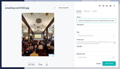
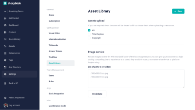
- Making alternative texts a requirement for image fields
- Including an option for increasing Zoom to up to 200%
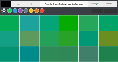
- Work with an accessible color palette and limit the use of colors to predefined brand colors with sufficient contrast.
Also, make sure to alert users to changes not only by color cues (e.g., when hovering or clicking a button, not only the color changes but the size changes, or there is another effect).
Create A Coherent Structure
Having consistency not only enforces your brand’s visual identity across your page but it also helps people navigate it — especially folks who are neurodivergent. This could, for example, mean using dedicated styles for specific CTAs or improving your UI to make it as easy as possible to find information in different ways. Reflect on the importance of topics in style and size, and stay away from flashy or very distracting animations.
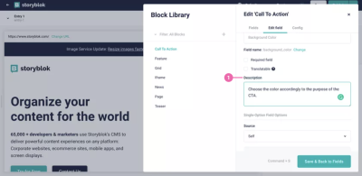
To ensure everybody keeps these brand guidelines in mind, include descriptions and notes for editors. These friendly reminders will help people comply with accessibility requirements and understand why it’s important.
Extend Your Experience
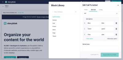
In many headless systems, you are able to add any kind of field you need — and you can make these fields a requirement for accessibility purposes. Like in this example showing how to set up an accessible iframe with a required title field. Setting fields as ‘required’ will make it a lot easier to ensure that they will not be forgotten when things get hectic in day-to-day life.
Besides creating your own field types, you can also easily extend the content management system by connecting any kind of tool you need to your headless architecture or even creating your own extensions and plugins. This could also include your own solutions to specific accessibility needs. One example could be an extension to run an accessibility check to flag any issues before publication. While it will be difficult to cover all potential issues, it might be a good addition to automated and manual testing.
Wrapping Up
When it comes to finding the right CMS, there is no cookie cutter answer — as always, it depends. It depends on your requirements, the accessibility needs you are aiming to fulfill, and how much time and resources you have. Neither a monolithic nor a headless system are inherently 100% accessible — but there are many things you can do to improve that.
While there might be some already predefined tools in monolithic CMS’ to help you out, you also heavily rely on other people not making false claims. With headless CMS, on the other hand, there is a lot more freedom and flexibility in setting your project up to be as accessible as possible. And that’s exactly how a content management system should be, right? Enabling you to focus on the tasks at hand and making it as easy as possible to meet your accessibility goals.
Feeling adventurous?Give it a go and see how quickly you can put together a headless project with your favorite tech stack.
Regardless of which system you choose, always remember: 10% done is better than nothing in the case of accessibility — every little step towards a more inclusive web counts.
Useful Resources
- “Creating An Accessible Website With Storyblok,” Christian Zoppi
- “The Complete Guide To Accessibility For WordPress Websites,” Ross Johnson
- “Accessibility In The Age Of The Headless CMS,” Rian Rietveld
- “Beware: WordPress Accessibility Plugins Can Make Your Site LESS Accessible,” Lindsay L.
- CMS And Accessibility
- Automated Accessibility Audits by axe Dev Tools or Lighthouse Accessibility Scoring

