A Practical Guide To Designing For Colorblind People

Email Newsletter
Weekly tips on front-end & UX.
Trusted by 200,000+ folks.

 Flexible CMS. Headless & API 1st


Too often, accessibility is seen as a checklist, but it’s much more complex than that. We might be using a good contrast for our colors, but then, if these colors are perceived very differently by people, it can make interfaces extremely difficult to use.
Depending on our color combinations, people with color weakness or who are colorblind won’t be able to tell them apart. Here are key points for designing with colorblindness — for better and more reliable color choices.
This article is part of our ongoing series on design patterns. It’s also a part of the video library on Smart Interface Design Patterns 🍣 and is available in the live UX training as well.
Colorweakness and Colorblindness
It’s worth stating that, like any other disability, colorblind users are on the spectrum, as Bela Gaytán rightfully noted. Each experience is unique, and different people perceive colors differently. The grades of colorblindness vary significantly, so there is no consistent condition that would be the same for everyone.

When we speak about colors, we should distinguish between two different conditions that people might have. Some people experience deficiencies in “translating” light waves into red-ish, green-ish or blue-ish colors. If one of these translations is not working properly, a person is at least colorweak. If the translation doesn’t work at all, a person is colorblind.
Depending on the color combinations we use, people with color weakness or people who are colorblind won’t be able to tell them apart. The most common use case is a red-/green deficiency, which affects 8% of European men and 0.5% of European women.
Note: the insights above come from “How Your Colorblind And Colorweak Readers See Your Colors,” a wonderful three-part series by Lisa Charlotte Muth on how colorblind and color weak readers perceive colors, things to consider when visualizing data and what it’s like to be colorblind.
Design Guidelines For Colorblindness
As Gareth Robins has kindly noted, the safe option is to either give people a colorblind toggle with shapes or use a friendly ubiquitous palette like viridis. Of course, we should never ever ask a colorblind person, “What color is this?” as they can’t correctly answer that question.
✅ Red-/green deficiencies are more common in men.
✅ Use blue if you want users to perceive color as you do.
✅ Use any 2 colors as long as they vary by lightness.
✅ Colorblind users can tell red and green apart.
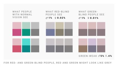
✅ Colorblind users can’t tell dark green and brown apart.
✅ Colorblind users can’t tell red and brown apart.
✅ The safest color palette is to mix blue with orange or red.
🚫 Don’t mix red, green and brown together.
🚫 Don’t mix pink, turquoise and grey together.
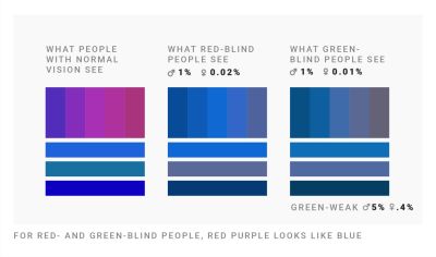
🚫 Don’t mix purple and blue together.
🚫 Don’t use green and pink if you use red and blue.
🚫 Don’t mix green with orange, red, or blue of the same lightness.
Never Rely On Colors Alone
It’s worth noting that the safest bet is to never rely on colors alone to communicate data. Use labels, icons, shapes, rectangles, triangles, and stars to indicate differences and show relationships. Be careful when combining hues and patterns: patterns change how bright or dark colors will be perceived.

Who Can Use? is a fantastic little tool to quickly see how a color palette affects different people with visual impairments — from reduced sensitivity to red, to red/green blindness to cataracts, glaucoma, low vision and even situational events such as direct sunlight and night shift mode.
Use lightness to build gradients, not just hue. Use different lightnesses in your gradients and color palettes so readers with a color vision deficiency will still be able to distinguish your colors. And most importantly, always include colorweak and colorblind people in usability testing.
Useful Resources on Colorblindness
- “How I Live With Color Blindness,” by Andy Baio
- Who Can Use This Color Combination?, by Corey Ginnivan
- Colorblind Accessibility Manifesto, by Federico Monaco
- “Designing for Colorblind Access,” by Alex Chen
- “The UX of Among Us: The Importance of Colorblind-friendly Design,” by Unma Desai
- “How To Choose Colors For Data Visualization,” by Lisa Charlotte Muth
- “Improving The UX For Color-Blind Users,” by Adam Silver
- “How To Test With Blind Users: A Cheatsheet,” by Slava Shestopalov, Eugene Shykiriavyi
Useful Colorblindness Tools
- Coblis, Color Blindness Simulator
- Colorblindness Web Page Filters
- Color Blindness Simulator Figma Plugin, by Sam Mason de Caires
- Colorblindly Chrome Extension, by Andrew Van Ness
Meet Smart Interface Design Patterns
If you are interested in similar insights around UX, take a look at Smart Interface Design Patterns, our 10h-video course with 100s of practical examples from real-life projects — with a live UX training starting March 7. Everything from mega-dropdowns to complex enterprise tables — with 5 new segments added every year. Jump to a free preview.

100 design patterns & real-life
examples.
10h-video course + live UX training. Free preview.


