Content Prototyping In Responsive Web Design: Related Resources

Email Newsletter
Weekly tips on front-end & UX.
Trusted by 200,000+ folks.
 Register!
 Flexible CMS. Headless & API 1st


This overview features the useful resources related to the article Content Prototyping In Responsive Web Design, written by Ben Callahan.
Related Resources
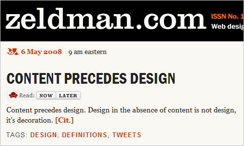
Content Precedes Design
An intense debate was born when this citation was made by Jeffrey Zeldman himself. The question indeed is, “Should content always precede design?”
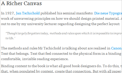
A Richer Canvas - Mark Boulton
On the Web, we usually have to abandon the notion of a page. Let’s look at this practically. To design a layout system for a website, we now have to consider many different variables.
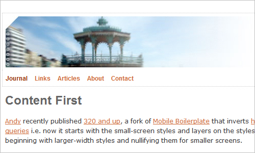
Content First - Jeremy Keith
This is a really exciting time for Web design. The increasing diversity of modern devices is driving people to try to figure out how to deal with mobile devices in the best possible ways.
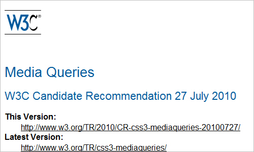
Media Queries - W3C Specification
A media query consists of a media type and a zero or more expressions that check for the conditions of particular media features. Among the other media features that can also be used in media queries are ‘width’, ‘height’ and ‘color’. By using media queries, presentations can be tailored to a specific range of output devices without changing the content itself.
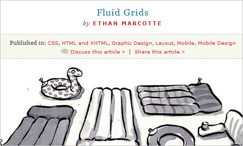
Fluid Grids - Ethan Marcotte
Fluid layouts are an undervalued commodity in Web design. They put control of our designs firmly in the hands of our users and their browsing habits. They’ve also utterly failed to seize the imagination of Web designers.
Powerful New CSS Techniques and Tools - Smashing UX Design
The hard work of front-end designers never ceases to amaze us. Over the last months, we’ve seen Web designers creating and presenting a plethora of truly remarkable CSS techniques and tools. Smashing Magazine has collected, analyzed, curated and featured thr latest useful resources for your convenience, so you can use them right away or save them for future reference.
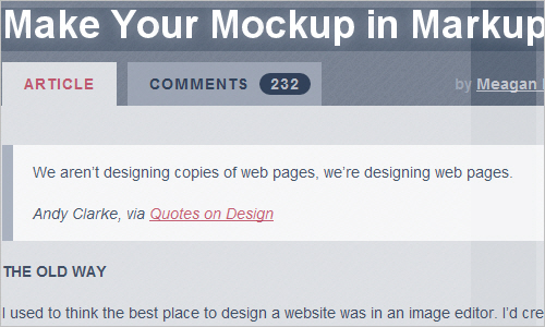
Make Your Mockup in Markup - Megan Fisher
A big thanks to our design hero Dan Cederholm; Megan Fisher came to the conclusion that a website’s design should begin where it’s going to live: in the browser.
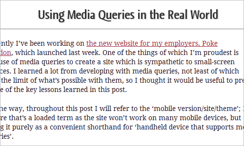
Using Media Queries in the Real World - Peter Gasston
In order to make pages that adapt easily to different device viewports, you must make decisions about how to mark up your content in a way that allows for that adaptation…

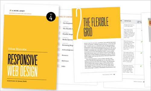
Responsive Web Design - Ethan Marcotte, A Book Apart
From mobile browsers to netbooks and tablets, users are visiting your sites from an increasing array of devices and browsers. Are your designs ready? Learn how to think beyond the desktop and craft beautiful designs that anticipate and respond to your users’ needs.
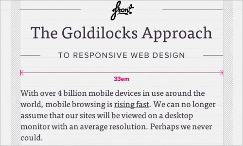
The Goldilocks Approach - Chris Armstrong
With over 4 billion mobile devices in use around the world, mobile browsing is rising fast. We can no longer assume that our sites will be viewed on a desktop monitor with an average resolution.
Media Query Bookmarklet - Rob Tarr
One thing that quickly gets noticed when starting building responsive websites is that we constantly resize our browsers. We would resize the browser to the largest media query, and then step down and watch the changes so we know what media query we are looking at. This is not quite the best way to design a website.
Samsung Smart Zipel Refrigerator - Gizmodo

The Mobile context - Mark Kirby
The mobile context is being discussed at a great deal at the moment in regards to mobile Web. What does it mean? How can we use it? How can we make assumptions about the context a user is in, based on their device?

You Say Responsive, I Say Adaptive - Ben Callahan
You’ve probably read the opinions floating around about how the term “responsive Web design” isn’t an adequate name for the technique. A lot of smart folks have weighed in, providing critique, explaining what they would call it if they had written the article — some even stating that it’s a great name.
Further Reading
- Using Sketch For Responsive Web Design
- Picking The Best Prototyping Software For Your Project
- How To Choose The Right Prototyping Tool
- Optimizing Your Design For Rapid Prototype Testing
 (mrn)
(mrn)

