Learning CSS3: A Reference Guide

Email Newsletter
Weekly tips on front-end & UX.
Trusted by 182,000+ folks.
 Claim Your Free Spot!
 Register Free Now
 SurveyJS: White-Label Survey Solution for Your JS App

This overview features a hand-picked and organized selection of the most useful Smashing Magazine’s articles related to CSS3 and published here over all the years.
Quick Overview
- Why We Should Start Using CSS3 And HTML5 Today
- Six CSS Layout Features To Look Forward To
- The Future Of CSS: Experimental CSS Properties
- The Future Of CSS Typography
- The Bright (Near) Future of CSS
- CSS3 vs. CSS: A Speed Benchmark
- CSS Three — Connecting The Dots
- How To Use CSS3 Media Queries To Create A Mobile Version Of Your Website
- How To Use CSS3 Pseudo-Classes
- CSS3 Flexible Box Layout Explained
- Using CSS3: Older Browsers And Common Considerations
- CSS3 Solutions For Internet Explorer
- An Introduction To CSS3 Keyframe Animations
- Adventures In The Third Dimension: CSS 3D Transforms
- Beercamp: An Experiment With CSS 3D
Why We Should Start Using CSS3 and HTML5 Today
For a while now, here on Smashing Magazine, we have taken notice of how many designers are reluctant to embrace the new technologies such as CSS3 or HTML5 because of the lack of full cross-browser support for these technologies. Many designers are complaining about the numerous ways how the lack of cross-browser compatibility is effectively holding us back and tying our hands — keeping us from completely being able to shine and show off the full scope of our abilities in our work. Many are holding on to the notion that once this push is made, we will wake to a whole new Web — full of exciting opportunities just waiting on the other side. So they wait for this day. When in reality, they are effectively waiting for Godot.
Just like the elusive character from Beckett’s classic play, this day of complete cross-browser support is not ever truly going to find its dawn and deliver us this wonderful new Web where our work looks the same within the window of any and every Web browser. Which means that many of us in the online reaches, from clients to designers to developers and on, are going to need to adjust our thinking so that we can realistically approach the Web as it is now, and more than likely how it will be in the future.
Six CSS Layout Features To Look Forward To
A few concerns keep bobbing up now and then for Web developers, one of which relates to how to lay out a given design. Developers have made numerous attempts to do so with existing solutions. Several articles have been written on finding the holy grail of CSS layouts 1, but to date, not a single solution works without major caveats. At the W3Conf, I gave a talk on how the CSS Working Group is attempting to solve the concerns of Web developers with multiple proposals. There are six layout proposals that are relevant to us, all of which I described in the talk:
Here is a little more about these proposals and how they will help you in developing websites in the future.
The Future Of CSS: Experimental CSS Properties
Despite contemporary browsers supporting a wealth of CSS3 properties, most designers and developers seem to focus on the quite harmless properties such as border-radius, box-shadow or transform. These are well documented, well tested and frequently used, and so it’s almost impossible to not stumble on them these days if you are designing websites.
But hidden deep within the treasure chests of browsers are advanced, heavily underrated properties that don’t get that much attention. Perhaps some of them rightly so, but others deserve more recognition. The greatest wealth lies under the hood of WebKit browsers, and in the age of iPhone, iPad and Android apps, getting acquainted with them can be quite useful.
The Future Of CSS Typography
There has been an increasing and sincere interest in typography on the web over the last few years. Most websites rely on text to convey their messages, so it’s not a surprise that text is treated with utmost care. In this article, we’ll look at some useful techniques and clever effects that use the power of style sheets and some features of the upcoming CSS Text Level 3 specification, which should give Web designers finer control over text.
Keep in mind that these new properties and techniques are either new or still in the works, and some of the most popular browsers do not yet support them. But we feel it’s important that you, as an informed and curious Web designer, know what’s around the corner and be able to experiment in your projects.
The Bright (Near) Future Of CSS Future of CSS”)
This article is an excerpt from Eric Meyer’s recent book Smashing CSS, published by Wiley in cooperation with Smashing Magazine.
In this article, the focus is on what’s coming: styling techniques you’ll use in the immediate and near-term future. From styling HTML 5 elements to rearranging layout based on display parameters to crazy selection patterns to transforming element layout, these are all techniques that you may use tomorrow, next month, or next year. With partial browser support, they’re all on the cutting edge of Web design.
Accordingly, be careful not to get cut! A number of useful sites can help you figure out the exact syntaxes and patterns you need to use these techniques. Furthermore, a number of JavaScript libraries can extend support for advanced CSS back into older browsers, in some cases as far back as IE/Win 5.5.
CSS3 vs. CSS: A Speed Benchmark
I believe in the power, speed and “update-ability†of CSS3. Not having to load background images as structural enhancements (such as PNGs for rounded corners and gradients) can save time in production (i.e. billable hours) and loading (i.e. page speed). At our company, we’ve happily been using CSS3 on client websites for over a year now, and I find that implementing many of these properties right now is the most sensible way to build websites.

Until today, all of that was based on an assumption: that I can produce a pixel-perfect Web page with CSS3 quicker than I can with older image-based CSS methods, and that the CSS3 page will load faster, with a smaller overall file size and fewer HTTP requests. As a single use case experiment, I decided to design and code a Web page and add visual enhancements twice: once with CSS3, and a second time using background images sliced directly from the PSD.
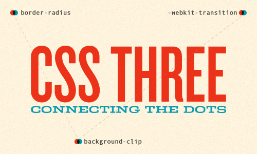
CSS Three — Connecting The Dots
As a web community, we’ve made a lot of exciting progress in regards to CSS3. We’ve put properties like text-shadow & border-radius to good use while stepping into background-clip and visual effects like transitions and animations. We’ve also spent a great deal of time debating how and when to implement these properties. Just because a property isn’t widely supported by browsers or fully documented at the moment, it doesn’t mean that we shouldn’t be working with it. In fact, I’d argue the opposite.
Best practices for CSS3 usage need to be hashed out in blog posts, during spare time, and outside of client projects. Coming up with creative and sensible ways to get the most out of CSS3 will require the kind of experimentation wherein developers gladly trade ten failures for a single success. Right now, there are tons of property combinations and uses out there waiting to be discovered. All we have to do is connect the dots. It’s time to get your hands dirty and innovate!
How To Use CSS3 Media Queries To Create A Mobile Version Of Your Website
CSS3 continues to both excite and frustrate web designers and developers. We are excited about the possibilities that CSS3 brings, and the problems it will solve, but also frustrated by the lack of support in Internet Explorer 8. This article will demonstrate a technique that uses part of CSS3 that is also unsupported by Internet Explorer 8. However, it doesn’t matter as one of the most useful places for this module is somewhere that does have a lot of support - small devices such as the iPhone, and Android devices.
In this article I’ll explain how, with a few CSS rules, you can create an iPhone version of your site using CSS3, that will work now. We’ll have a look at a very simple example and I’ll also discuss the process of adding a small screen device stylesheet to my own site to show how easily we can add stylesheets for mobile devices to existing websites.
How To Use CSS3 Pseudo-Classes
CSS3 is a wonderful thing, but it’s easy to be bamboozled by the transforms and animations (many of which are vendor-specific) and forget about the nuts-and-bolts selectors that have also been added to the specification. A number of powerful new pseudo-selectors (16 are listed in the latest W3C spec) enable us to select elements based on a range of new criteria.

Before we look at these new CSS3 pseudo-classes, let’s briefly delve into the dusty past of the Web and chart the journey of these often misunderstood selectors.
CSS3 Flexible Box Layout Explained
The flexible box layout module — or “flexbox,” to use its popular nickname — is an interesting part of the W3C Working Draft. The flexbox specification is still a draft and subject to change, so keep your eyes on the W3C, but it is part of a new arsenal of properties that will revolutionize how we lay out pages. At least it will be when cross-browser support catches up.

In the meantime, we can experiment with flexbox and even use it on production websites where fallbacks will still render the page correctly. It may be a little while until we consider it as mainstream as, say, border-radius, but our job is to investigate new technologies and use them where possible. That said, when it comes to something as fundamental as page layout, we need to tread carefully.
Using CSS3: Older Browsers And Common Considerations
With the arrival of IE9, Microsoft has signalled its intent to work more with standards-based technologies. With IE still the single most popular browser and in many ways the browser for the uninitiated, this is hopefully the long awaited start of us Web craftsmen embracing the idea of using CSS3 as freely as we do CSS 2.1.
However, with IE9 not being supported on versions of Windows before Vista and a lot of businesses still running XP and reluctant (or unable) to upgrade, it might take a while until a vast majority of our users will see the new technologies put to practice. While plenty of people out there are using CSS3, many aren’t so keen or don’t know where to start. This article will first look at the ideas behind CSS3, and then consider some good working practices for older browsers and some new common issues.
CSS3 Solutions For Internet Explorer
CSS3 is probably the hottest trend in web design right now, allowing developers the opportunity to implement a number of solutions into their projects with some very straightforward CSS while avoiding having to resort to nonsemantic markup, extra images, and complex JavaScript. Unfortunately, it’s not a surprise that Internet Explorer, even in its most recent version, still does not support the majority of the properties and features introduced in CSS3.
Experienced developers understand that CSS3 can be added to new projects with progressive enhancement in mind. This ensures that content is accessible while non-supportive browsers fall back to a less-enhanced experience for the user.
But developers could face a situation where a client insists that the enhancements work cross-browser, demanding support even for IE6. In that case, I’ve collected together a number of options that developers can consider for those circumstances where support for a CSS3 feature is required for all versions of Internet Explorer (IE6, IE7, & IE8 — all of which are still currently in significant use).
An Introduction To CSS3 Keyframe Animations
By now you’ve probably heard at least something about animation in CSS3 using keyframe-based syntax. The CSS3 animations module in the specification has been around for a couple of years now, and it has the potential to become a big part of Web design. Using CSS3 keyframe animations, developers can create smooth, maintainable animations that perform relatively well and that don’t require reams of scripting. It’s just another way that CSS3 is helping to solve a real-world problem in an elegant manner.
If you haven’t yet started learning the syntax for CSS3 animations, here’s your chance to prepare for when this part of the CSS3 spec moves past the working draft. In this article, we’ll cover all the important parts of the syntax, and we’ll fill you in on browser support so that you’ll know when to start using it.
Adventures In The Third Dimension: CSS 3D Transforms
Back in 2009, the WebKit development team proposed a new extension to CSS that would allow Web page elements to be displayed and transformed on a three-dimensional plane. This proposal was called 3D Transforms, and it was soon implemented in Safari for Mac and iOS. About a year later, support followed for Chrome, and early in 2011, for Android. Outside of WebKit, however, none of the other browser makers seemed to show much enthusiasm for it, so it’s remained a fairly niche and underused feature.
That’s set to change, though, as the Firefox and Internet Explorer teams have decided to join the party by implementing 3D Transforms in pre-release versions of their browsers. So, if all goes according to plan, we’ll see them in IE 10 and a near-future version of Firefox (possibly 10 or 11, but that’s not confirmed yet), both of which are slated for release sometime this year.
That being the case, this is an ideal time to get ahead of the curve and start learning about the possibilities and potential of adding an extra dimension to your Web pages. This article aims to help you do just that, by taking you on a flying tour of the 3D Transforms syntax.
Beercamp: An Experiment With CSS 3D
I recently had the pleasure of organizing this year’s Beercamp website. If you’re unfamiliar, Beercamp is a party for designers and developers. It’s also a playground for front-end experimentation. Each year we abandon browser support and throw a “Pshaw” in the face of semantics so that we can play with some emerging features of modern browsers.
This year’s experiment: a 3D pop-up book á la Dr. Seuss. If you’ve not seen it, hop on over and take a look. The website was a test to see how far SVG and CSS 3D transforms could be pushed. I learned a lot in the process and wanted to share some of the techniques that I found helpful when working in 3D space.

Before we jump in, please note that explaining everything about the website without boring you to death would be damn near impossible. For your sake and mine, I’ll provide just brief takeaways. As you skim through the code snippets, be aware that jQuery is being used and that a lot of code has been removed for simplicity (including browser prefixes).


