Learning From The Past: Design Legacies & Arts

Email Newsletter
Weekly tips on front-end & UX.
Trusted by 200,000+ folks.

 Register!
 Flexible CMS. Headless & API 1st


This is an overview of the most popular articles on design history, graphic lessons from the past and art published on Smashing Magazine over all the years.
Quick Overview
- The Beauty Of Typography: Writing Systems And Calligraphy Of The World
- The Beauty Of Typography: Writing Systems And Calligraphy, Part 2
- Lessons From Swiss Style Graphic Design
- The Art Of Film Title Design Throughout Cinema History
- Art Manifestos And Their Applications In Contemporary Design
- 100 Years Of Propaganda: The Good, The Bad And The Ugly
- Modern Art Movements To Inspire Your Logo Design
- The Beauty Of London In Design
- The Legacy Of Polish Poster Design
- Design Legacy: A Social History Of Jamaican Album Covers
- If Famous Graphic Artists Were Web Designers…
- Eight Inspiring Stories Of ASCII Art
- Pop Art Is Alive: Classics And Modern Artworks
- Pixels Go Mad: The Celebration Of Pixel Art
- The Celebration Of Cartoons And Comic Strip Art
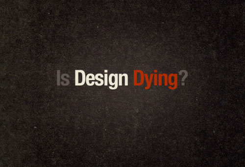
- The Dying Art Of Design
- The Story Of Scandinavian Design: Combining Function And Aesthetics
- Bauhaus: Ninety Years Of Inspiration
- Weird And Wonderful, Yet Still Illegible
- Japanese, A Beautifully Complex Writing System
- The Heritage Of Berlin Street Art And Graffiti Scene
- Designing The Well-Tempered Web
The Beauty Of Typography: Writing Systems And Calligraphy Of The World
The beauty of typography has no borders. While most of us work with the familiar Latin alphabet, international projects usually require quite extensive knowledge about less familiar writing systems from around the world. The aesthetics and structure of such designs can be strongly related to the shape and legibility of the letterforms, so learning about international writing systems will certainly help you create more attractive and engaging Web designs.
Pick any language you like: Arabic, Chinese, Japanese, maybe Nepali? Each is based on a different writing system, which makes it interesting to figure out how they work. Today, we’ll cover five categories of writing systems. This may sound tedious and academic, but it’s not. If you take the time to understand them, you’ll find that they all give us something special. We’ve tried to present at least one special feature of each language from which you can draw inspiration and apply to your own typography work. We’ll cover: East Asian writing systems, Arabic and Indic scripts (Brahmic). If you are interested, we will cover Cyrillic, Hebrew and other writing systems in the next post.
The Beauty Of Typography: Writing Systems And Calligraphy, Part 2
The beauty of writing systems is that each has something unique from which to draw inspiration. Two weeks ago, in the first part of this article, we covered Arabic and East-Asian languages (Chinese, Japanese, Korean and Vietnamese) and a few Indic scripts (Devanagari, Thai and Tibetan).
We are now back for the second (and last) part, which is a bit different but just as interesting. You will see that some features of the languages presented here clearly correspond to our Latin-based system, while others are unfamiliar. The point of this second part is to complete our look at writing systems of the world and to think more generally about what they signify. We’ll cover Hebrew, Modern European scripts, Mongolian, Inuktitut and International Phonetic Alphabet.
Lessons From Swiss Style Graphic Design
Also known as International Style, the Swiss Style does not simply describe a style of graphic design made in Switzerland. It became famous through the art of very talented Swiss graphic designers, but it emerged in Russia, Germany and Netherlands in the 1920’s. This style in art, architecture and culture became an ‘international’ style after 1950’s and it was produced by artists all around the globe. Despite that, people still refer to it as the Swiss Style or the Swiss Legacy.
This progressive, radical movement in graphic design is not concerned with the graphic design in Switzerland, but rather with the new style that had been proposed, attacked and defended in the 1920s in Switzerland. Keen attention to detail, precision, craft skills, system of education and technical training, a high standard of printing as well as a clear refined and inventive lettering and typoraphy laid out a foundation for a new movement that has been exported worldwide in 1960s to become an international style.
The Art Of Film Title Design Throughout Cinema History
Have you ever thought of what makes you remember a certain movie or TV show? Of course, it’s the story being told, you’ll say. But what about movies such as Goldfinger, Seven and Snatch? What’s the first thing that comes to mind? We are pretty sure their opening title sequences stick out for many of you.
Today we’ll take a closer look at that short space of time between the moment the lights go down and the first scene of a film, the part that so often sets our expectations of a movie, that sequence that speaks to our creative side: the art of the film title. We’ll look at the evolution of title design and some particularly interesting titles from various periods in the history of cinema and animation.
Film titles can be great fun. In them we see the bond between the art of filmmaking and graphic design — and perhaps visual culture as a whole. They have always served a greater purpose than themselves: to move the overarching story forward. Whether you are a motion graphic designer, a digital artist or a connoisseur of design, we hope you are inspired by these film titles and the ideas they suggest to your own creative endeavors. At the end of this post, you’ll find a listing of relevant typefaces and Web resources.
Art Manifestos And Their Applications In Contemporary Design
The way you express yourself with words is a crucial extension of your creative identity. Professional designers are usually busy focusing on the visual aspects of their craft, but visual arts and literary arts collide and coincide regularly. The two fields meet not just in typography, but also in press releases, social networking communication, slogans, promotional materials, ‘About Me’ pages, marketing strategies, and every single pitch, contract, and email you’ve ever sent to a client.
What might happen if you injected some of those materials with a healthy dose of poetry, humor, or bravado? Obviously, doing so will not be appropriate in some forums, but when it is, this may be a good way to express yourself and differentiate your brand from the crowd.
Some of the most electrifying examples of writing about art and design come in the form of the manifesto. The manifesto has played a pivotal role in some of the most important creative movements of the previous century: Futurism, Surrealism, and Cubism among them. Most graphic designers working today will probably not require their own manifesto, but it can be helpful to write a mission statement or expression of your creative goals. Likewise, most of us probably don’t intend to launch a full-scale ‘movement,’ but this genre of writing may inspire you to reconsider the literary content of your creative work and its public representation.
100 Years Of Propaganda: The Good, The Bad And The Ugly
Propaganda is most well known in the form of war posters. But at its core, it is a mode of communication aimed at influencing the attitude of a community toward some cause or position, and that doesn’t have to be a bad thing. Although propaganda is often used to manipulate human emotions by displaying facts selectively, it can also be very effective at conveying messages and hence can be used in web design, too.
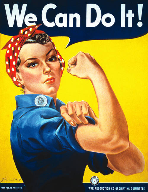
Notice that propaganda uses loaded messages to change the attitude toward the subject in the target audience. When applied to web design, you may experiment with techniques used in propaganda posters and use them creatively to achieve a unique and memorable design.
In this article, we look at various types of propaganda and the people behind it, people who are rarely seen next to their work. You will also see how the drive for propaganda shaped many of the modern art movements we see today. Notice that this post isn’t supposed to be an ultimate showcase of propaganda artists. Something or somebody is missing? Please let us know in the comments to this post!
Modern Art Movements To Inspire Your Logo Design
It’s always nice to go to a bookstore, grab a book of logo designs, sit down, inhale that new-book smell and absorb the goodness. But knowing where all of these designs, fonts and creative elements have come from is also good. In this article, we look at modern art movements and a series of diverse logos inspired by those movements. You may be surprised by how easily these colors, shapes and strokes can be adapted to logo design. Have a look, see how logo design works and maybe even draw inspiration for your own creativity.
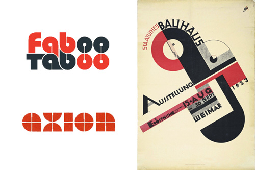
In 1919, the Bauhaus school was founded in Weimar Germany. More of a lifestyle than a school, Bauhaus was based on the static rules of Art Deco. One basic idea of the Bauhaus was to remove everything superfluous and break a design down to its essential elements. This static minimalism changed everything and can still be found in design today, such as in the logos of Faboo Taboo and Axion.
The Beauty Of London In Design
“There is no specific London style.” At least that’s what the ‘Super Contemporary’ show at London’s Design Museum proclaims. During an exploration of London’s art and design scene in September 2009, what did emerge was a city with a unique sense of its own personality and history, a fertile hub of international thinkers, and a community working towards a future that is designed to be interactive, environmentally responsible, and prosperous.
Here is a look at the visual personality of London, based on visits to the city’s major art museums, attendance at the 2009 London Design Festival, and interviews with artists and designers who call the great city home.
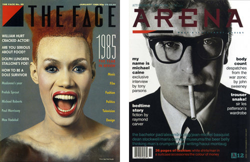
London magazines including The Face, i-D, Blitz, and Arena became major influences on international design during the eighties and nineties. The Face was known as a showcase of London street style and experimental graphic design during Neville Brody’s tenure as Art Director from 1982-86. Brody incorporated hand-drawn typefaces and custom graphic symbols into his page layouts.
The Legacy Of Polish Poster Design
Before the era of globalized entertainment made movie posters look the same in every country, Polish artists were creating their own versions for the internal market. What resulted was a whole school of artists trained in the art of the poster. This article presents a short historical look at how this movement was born and how it developed, form its art-related beginnings at the end of the 19th Century to the golden era of the film posters throughout the 20th Century.
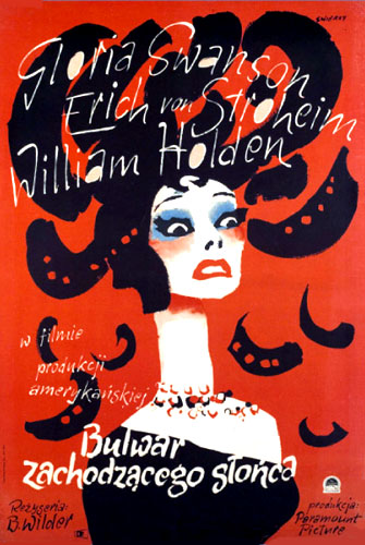
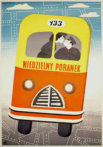
Toward the end of the 19th Century Poland was still absent from the maps. Its territory was split and controlled by Russia, Austria and Prussia. While Warsaw, then under Russian rule, was the biggest economic, trade and industrial center of the non-existent country, Krakow, under the less oppressive Austria, soon established itself as a cradle for artistic, cultural, scientific, political and religious life, becoming the ideal capital of the nation.
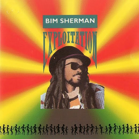
Design Legacy: A Social History Of Jamaican Album Covers
Mention Jamaican music to someone who isn’t a fan and you can bet that a fairly predictable image pops into the head of your listener. Chances are this image looks something like the cover of Bim Sherman’s Exploitation. Same old Rastafarian colors… Some guy with dreads… A title that refers broadly to political oppression or positive thinking without much in the way of self-critical awareness or irony.
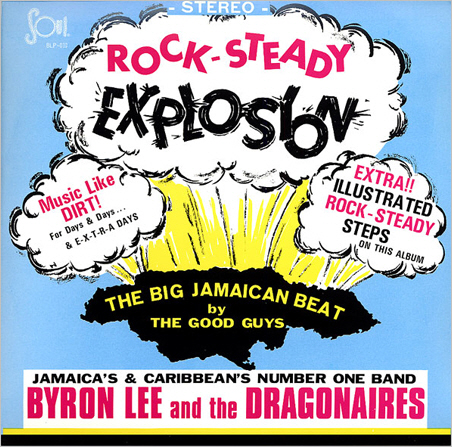
For many people, this vision — of roots reggae and its deified lead singer — is the only face that Jamaican music has to offer. (To be honest, the Jamaican music industry, in its eagerness to capitalize on the popularity of this face, hasn’t done much to contradict it.)
If Famous Graphic Artists Were Web Designers…
Styles in design are described and classified in many ways. Sometimes they are given a moniker, like “Web 2.0,” other times they are referred to by their appearance: grungy, minimalist, retro, big type. The people (and brands) to which modern design styles are attributed are as numerous as the styles themselves. Many designers look to a brand such as Apple as an example of great modern design because a designer’s sensibility is infused into everything it does.
Even though many current styles and trends can be connected to recent design pieces, they do not originate there. So much modern design originated before computers and the Web were even a glimmer in the eye of their creators.
Looking back and drawing inspiration from very early graphic and print design is a current trend nowadays, but that is not the beginning of the story. As you go further back, you’ll find groundbreaking design decades, even a century, ago. In this article we’ll explore inspirational paintings and artists who have influenced modern design. In reading this article, you will see some true evolution in design.
8 Inspiring Stories Of ASCII Art
Labels are fragile: text and pictures have always been closely connected. From the dawn of written language to the era of microcomputers, much of human creation has explored the relationship between the literal and the figurative, the form and the function. Within this is the future site of retro, ASCII art. It’s often used as a catch-all term for “text-based art,” regardless of the actual character set being used.

In this post, we’ll stroll through the past and present of ASCII art, assessing the influence of key pioneers, so that you might feel inspired to go forth and create. I hope you come across both familiar guideposts and unknown territory, and come away enlightened!
Pop Art Is Alive: Classics And Modern Artworks
As a visual art movement that emerged in the mid 1950s, pop art aims to emphasize the nature of things popular in our daily routine. In pop art, most artists use mechanical means of rendering techniques that downplay the expressive hand of the artist. Being an art movement, it has some expressive attributes other styles do not possess.
In pop art, a vivid manifestation of pop culture reflects in vibrant colors and busy, sometimes hardly recognizable artistic approaches. Street culture, trash, collage, comic books, grunge, graffiti and photo montage are typical design elements that were widely used by designers and artists a few decades ago. And since grunge found its way back and became popular again, it makes perfect sense to analyze the design elements of pop art which are similar to this artistic style.
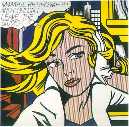
This post presents 75 outstanding examples of classic and modern pop art. Hopefully, everybody will find some inspiration for future works or at least smile when scanning the images presented below. Please notice: pop art can be quite vibrant and not necessarily pretty — in fact, some examples show that it doesn’t have to be pretty at all.
Pixels Go Mad: The Celebration Of Pixel Art
Pixel art lives both in and beyond computer screen. Artists design pixel art posters, magazine covers, album covers, desktop wallpapers, paintings, “pixelish” video ads and even pixelated tattoos. And there is a good reason behind it: in times when popular design solutions strive for real-life-look or perfection pixel art offers a distinctive and creative artistic approach which is extremely expressive. In fact, pixel art can be impressive as well. This post attempts to prove just that.
Below we present over 50 excellent pixel art designs — illustrations, paintings and posters as a part of our ongoing monday inspiration series. Some of the works presented below have an extremely high level of detail which is why you can observe pixel art for hours and still miss some details it contains. You can find ever more resources related to pixel-art in an overview we’ve presented in the end the post.
Please be patient: the images may take some time to load.
The Celebration Of Cartoons And Comic Strip Art
Comics aren’t just for children, as some people might think. There are many comics written with adults in mind, and this is reflected in the depth and scope of the artwork. Comic strips are widely read around the world in newspapers, magazines, books and the internet. Some are created simply to make people laugh, some are made to entertain (often with storylines worthy of a novel) and there are some that make political or social commentary.
Comic strips have a surprisingly long and interesting history. For instance, there’s evidence of comics in China from as long ago as the 11th century BC! Comics have evolved over the years with advances in technology and the changing styles of art and graphic design, and are often at the cutting edge of design.
The culture of an artist’s country is often a big influence on their work, and consequently comic styles are different around the world. We present you over 50 examples of beautiful comic strip artwork, from places as diverse as America, Europe, Asia and Latin America. Some interesting articles and resources are listed at the bottom of the post.
The Dying Art Of Design
Progress is good, but we need to make sure that we’re progressing in the right direction. Our fundamental skills and the craft of design have started to take a back seat. Using the right tools and techniques is certainly an important part of design. But do our tools and resources make us better designers? Taking a close look at the current state of design, we can see that sometimes modern design tools and processes do more harm than good.
Please note that in preparing this article, we presented basic questions to designers, from beginner to expert, in an unscientific poll. Close to 600 designers participated.
As a teenager, I loved comic books: the art, the stories, the super-powers I wished I had. I remember the point when I went from reading and enjoying comics to wanting to create them. I became obsessed with being able to draw exactly like the great comic book artists of that time, people like Jim Lee.
The Story Of Scandinavian Design: Combining Function And Aesthetics
For a long time, art has been heavily influenced by the social and political landscape. Searching through history, we find that while the social views of a certain period may no longer be relevant, the art and design of that time often are. Designers today constantly draw inspiration from history, consciously and unconsciously. Being aware of that history and knowing what has come before in your field can help you better convey the meaning in your work and forge deeper connections to your environment (artistic, social, political, etc.).
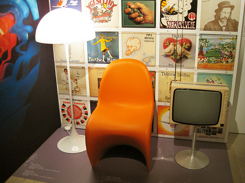
Looking back to the beginning of the 20th century and the styles and movements that ruled the art world at that time, we will look for influences and ideas that have evolved into what has been known since the mid-20th century as “Scandinavian design”. This article also offers some thoughts on how to incorporate its principles in your work today.
Bauhaus: Ninety Years Of Inspiration
Inspired by a vision of bringing artists and craftsmen together to start a movement in art which would change the future of the world, Water Gropius opened the doors to Bauhaus. The year was 1919 when Gropius founded Staatliches Bauhaus Weimar. Germany was bankrupt after a devastating World War I and the younger generation was eager to make positive changes.
“Architects, painters, sculptors, we must all return to crafts! For there is no such thing as “professional art”. There is no essential difference between the artist and the craftsman. The artist is an exalted craftsman. By the grace of Heaven and in rare moments of inspiration which transcend the will, art may unconsciously blossom from the labour of his hand, but a base in handicrafts is essential to every artist. It is there that the original source of creativity lies.
Let us therefore create a new guild of craftsmen without the class-distinctions that raise an arrogant barrier between craftsmen and artists! Let us desire, conceive, and create the new building of the future together. It will combine architecture, sculpture, and painting in a single form, and will one day rise towards the heavens from the hands of a million workers as the crystalline symbol of a new and coming faith.”
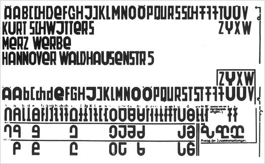
Weird And Wonderful, Yet Still Illegible
The paradigm shift—wrought by the personal computer, Postscript and desktop publishing—should have had a massive impact on the shapes of our typographic characters, just as the advances of the World Wide Web further changed the way we viewed words (even though letterforms change at the pace of the most conservative reader). Thus, radical innovations like Kurt Schwitters’ Systemschrift, (a phoenetic alphabet from 1927), are doomed to fail.
Our writing, which is derived from either Roman or Gothic forms (and sometimes both), is historic and non-systematic, said Schwitters. His “optophoenetic” approach was to make the shapes of the letters more accurately reflect how they sounded. But in order for it to work, massive re-education would be required.
Licko was paraphrasing Sir Cyril Burt who wrote, “almost everyone reads most easily matter set up in the style and size to which he has become habituated.” (A Psychological Study of Typography, Cambridge, 1959, p. 18). So we do not necessarily respond to “beautiful” type. You may find Centaur elegant, but others will find the spiky serifs distracting. For this reason, rather dull typefaces (like Times Roman), come to dominate our graphic landscape. My purpose here is to examine some failed attempts at creating economy, or furthering the cause of legibility.
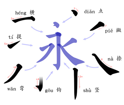
Japanese, A Beautifully Complex Writing System
As a Japanese person living in Europe, I’m sometimes asked: “Japanese is a difficult language, isn’t it?” Those asking are often surprised when my answer is a simple: “No, actually, it’s not.”
While it is true (at least to many Westerners) that Japanese is an exotic language, when compared to learning other European languages, it may seem harder because it has no relation to their own language. But from my own experiences of learning English and German (and also from seeing some European friends learning Japanese), I can say with confidence that learning spoken Japanese is, in fact, not so difficult. The grammar is in many ways simpler than most European languages. Take for example the fact that we don’t have cases, grammatical genders, nor articles. However, reading and writing in Japanese is… well, not so simple.
While discussing typography we most often focus on English language problems, which is only natural considering that the majority of design material is written in English. However, a lot can be gleamed by looking at how other languages are used as part of communication and design — it helps to lend context and a different point of view.
The Heritage Of Berlin Street Art And Graffiti Scene
Art critic Emilie Trice has called Berlin “the graffiti Mecca of the urban art world.” While few people would argue with her, the Berlin street scene is not as radical as her statement suggests. Street art in Berlin is a big industry. It’s not exactly legal, but the city’s title of UNESCO’s City of Design has kept local authorities from doing much to change what observers call the most “bombed” city in Europe. From the authorities’ point of view, the graffiti attracts tourists, and the tourists bring money to a city deep in debt.
This article looks at the development of the Berlin street art scene, from its beginnings as a minor West Berlin movement in the late ’70s to its current status: the heritage of a now unified city.
Designing The Well-Tempered Web
As technology evolves, so does the art and craft of Web design. New technology creates new challenges, which require new solutions. Often we’re working in uncharted territory, where the solutions demanded really are new. Other times, we’re faced with problems of a more universal nature, problems that have a history.

Given the limited history of Web design, we have to look beyond our immediate domain for answers to the more challenging questions. We do this all the time when we draw on the rich history of graphic design and visual arts. But we’re not limited to sibling disciplines. If we can identify the abstractions and patterns that constitute our challenges, we can look to any source for guidance. We can look to a seemingly unrelated field, such as psychology or music. We can even look to an episode from the early 18th century about Johann Sebastian Bach.
In this article we’ll look at what Bach has to do with modern Web challenges – Particularly the challenge of designing for devices with diverse attributes and capabilities.
Related Posts
You might be interested in the following “Best of” selections as well:


