Mastering CSS Principles: A Comprehensive Guide

Email Newsletter
Weekly tips on front-end & UX.
Trusted by 182,000+ folks.
 See the full picture →


 Celebrating 10 million developers
 SurveyJS: White-Label Survey Solution for Your JS App
This overview features a hand-picked and organized selection of the most useful and popular Smashing Magazine’s articles related to CSS and published here over the years.
Quick Overview
- CSS Float Property
- Negative Margins
- Equal Height Column Layouts With Borders And Negative Margins In CSS
- Z-Index CSS Property
- CSS Specificity And Inheritance
- !important CSS Declarations
- Advanced CSS Selectors
- Mastering CSS, Part 1: Styling Design Elements
- Mastering CSS, Part 2: Advanced Techniques And Tools
- The :before And :after Pseudo-Elements In CSS
- CSS Font Stacks
- Backgrounds In CSS
- Designing CSS Buttons
- The Future Of CSS: Embracing The Machine
- The Guide To CSS Animation: Principles and Examples
- Fixed vs. Fluid vs. Elastic Layout: What’s The Right One For You?
- Modern CSS Layouts: The Essential Characteristics
- Modern CSS Layouts: The Essential Techniques
- Styling Elements With Glyphs, Sprites And Pseudo-Elements
- The Mystery Of CSS Sprites
- CSS Sprites
- CSS Sprites Revisited
- CSS Differences In Internet Explorer 6, 7 & 8
- Cross-Browser CSS Coding
- Improving Code Readability With CSS Styleguides
- Mastering CSS Coding: Getting Started
- 70 Expert Ideas For Better CSS Coding
- An Introduction To Object Oriented CSS (OOCSS)
- An Introduction To LESS, And Comparison To Sass
- Writing CSS For Others
- How To Set Up A Print Style Sheet
- CSS Wishlist: New Ideas, Debates And Solutions
The Mystery Of The CSS Float Property
Years ago, when developers first started to make the transition to HTML layouts without tables, one CSS property that suddenly took on a very important role was the float property. The reason that the float property became so common was that, by default, block-level elements will not line up beside one another in a column-based format. Since columns are necessary in virtually every CSS layout, this property started to get used — and even overused — prolifically.
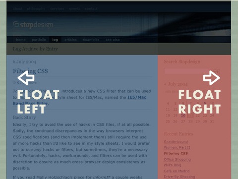
The CSS float property allows a developer to incorporate table-like columns in an HTML layout without the use of tables. If it were not for the CSS float property, CSS layouts would not be possible except using absolute and relative positioning — which would be messy and would make the layout unmaintainable.
In this article, we’ll discuss exactly what the float property is and how it affects elements in particular contexts. We’ll also take a look at some of the differences that can occur in connection with this property in the most commonly-used browsers. Finally, we’ll showcase a few practical uses for the CSS float property. This should provide a well-rounded and thorough discussion of this property and its impact on CSS development.
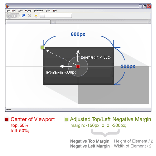
The Definitive Guide To Using Negative Margins
Since the recommendation of CSS2 back in 1998, the use of tables has slowly faded into the background and into the history books. Because of this, CSS layouts have since then been synonymous with coding elegance.
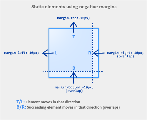
Out of all the CSS concepts designers have ever used, an award probably needs to be given to the use of Negative Margins as being the most least talked about method of positioning. It’s like an online taboo — everyone’s doing it, yet no one wants to talk about it.
Equal Height Column Layouts With Borders And Negative Margins In CSS
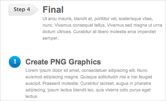
“What? Another “Equal Height Columns” article? Enough already!” If this is what you think, then think again because this solution is different. It does not rely on any of the usual tricks. It does not use images, nor extra markup, nor CSS3, nor pseudo-classes, nor Javascript, nor absolute positioning. All it uses is border and negative margins. Please note that this article will also demonstrate different construct techniques and will brush up on a few concepts.
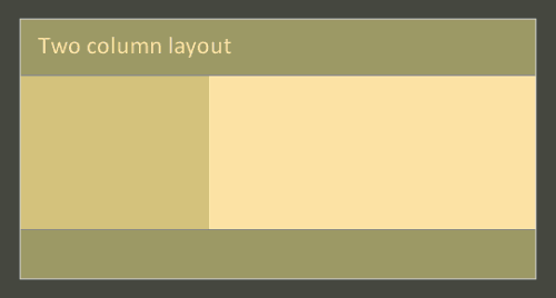
In this post we will build three layouts using CSS: a two column layout with no wrapper div, a two column layout with two vertical borders between the columns and a three column layout with a single wrapper. All layouts have coding examples and demos for your convenience.
The Z-Index CSS Property: A Comprehensive Look
Most CSS properties are quite simple to deal with. Often, applying a CSS property to an element in your markup will have instant results — as soon as you refresh the page, the value set for the property takes effect, and you see the result immediately. Other CSS properties, however, are a little more complex and will only work under a given set of circumstances.
The z-index property belongs to the latter group. z-index has undoubtedly caused as much confusion and frustration as any other CSS property. Ironically, however, when z-index is fully understood, it is a very easy property to use, and offers an effective method for overcoming many layout challenges.
In this article, we’ll explain exactly what z-index is, how it has been misunderstood, and we’ll discuss some practical uses for it. We’ll also describe some of the browser differences that can occur, particularly in previous versions of Internet Explorer and Firefox. This comprehensive look at z-index should provide developers with an excellent foundation to be able to use this property confidently and effectively.
CSS Specificity And Inheritance
CSS’ barrier to entry is extremely low, mainly due to the nature of its syntax. Being clear and easy to understand, the syntax makes sense even to the inexperienced Web designer. It’s so simple, in fact, that you could style a simple CSS-based website within a few hours of learning it.
But this apparent simplicity is deceitful. If after a few hours of work, your perfectly crafted website looks great in Safari, all hell might break loose if you haven’t taken the necessary measures to make it work in Internet Explorer. In a panic, you add hacks and filters where only a few tweaks or a different approach might do. Knowing how to deal with these issues comes with experience, with trial and error and with failing massively and then learning the correct way.
Understanding a few often overlooked concepts is also important. The concepts may be hard to grasp and look boring at first, but understanding them and knowing how to take advantage of them is important.
!important CSS Declarations: How And When To Use Them
When the CSS1 specification was drafted in the mid to late 90s, it introduced !important declarations that would help developers and users easily override normal specificity when making changes to their stylesheets. For the most part, !important declarations have remained the same, with only one change in CSS2.1 and nothing new added or altered in the CSS3 spec in connection with this unique declaration.
Let’s take a look at what exactly these kinds of declarations are all about, and when, if ever, you should use them. But before we get into !important declarations and how exactly they work, let’s give this discussion a bit of context. In the past, Smashing Magazine has covered CSS specificity in-depth, so please take a look at that article if you want a detailed discussion on the CSS cascade and how specificity ties in.
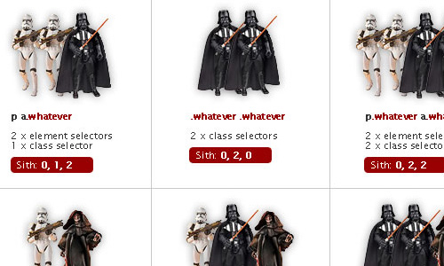
Taming Advanced CSS Selectors
CSS is one of the most powerful tools that is available to web designers (if not the most powerful). With it we can completely transform the look of a website in just a couple of minutes, and without even having to touch the markup. But despite the fact that we are all well aware of its usefulness, CSS selectors are still not used to their full potential and we sometimes have the tendency to litter our HTML with excessive and unnecessary classes and ids, divs and spans.
The best way to avoid these plagues spreading in your markup and keep it clean and semantic, is by using more complex CSS selectors, ones that can target specific elements without the need of a class or an id, and by doing that keep our code and our stylesheets flexible.
Mastering CSS, Part 1: Styling Design Elements
CSS is one of the most important building blocks of modern web design. Standards demand the use of CSS for formatting and styling pages, and with good reason. It’s lighter-weight and capable of much more than older methods like tables.
And CSS isn’t nearly as tricky as some people tend to believe. Below are fresh tips and techniques for creating and styling design elements with CSS. They’re a good place to start if you’re new to CSS but are valuable even if you’re a veteran designer. Not all the techniques are strictly CSS; some include integration with JavaScript or XHTML to extend the functionality of your site.
Mastering CSS, Part 2: Advanced Techniques and Tools
CSS is one of the most basic building blocks of modern web design. It creates the structure and style that surrounds your content and is capable of making your site a joy to use or a pain in the neck. Mastering CSS is one of the most important things a web designer can do, and has really become an essential criteria for being a successful designer.
In Part 1: Styling Design Elements we covered the basics of web design with CSS. In Part 2 we’re offering up some more advanced techniques and effects you can achieve with CSS. Everything from creating your own online apps (like calendars) to styling web pages for use with the iPhone to some basics of working with CSS3 is covered here.
Learning To Use The :before And :after Pseudo-Elements In CSS
If you’ve been keeping tabs on various Web design blogs, you’ve probably noticed that the :before and :after pseudo-elements have been getting quite a bit of attention in the front-end development scene — and for good reason. In particular, the experiments of one blogger — namely, London-based developer Nicolas Gallagher — have given pseudo-elements quite a bit of exposure of late.
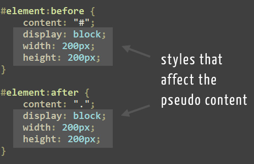
To complement this exposure (and take advantage of a growing trend), I’ve put together what I hope is a fairly comprehensive run-down of pseudo-elements. This article is aimed primarily at those of you who have seen some of the cool things done with pseudo-elements but want to know what this CSS technique is all about before trying it yourself.
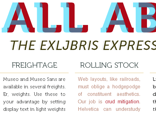
Guide To CSS Font Stacks: Techniques And Resources
CSS Font stacks are one of those things that elude a lot of designers. Many stick to the basic stacks Dreamweaver auto-recommends or go even more basic by just specifying a single web-safe font. But doing either of those things means you’re missing out on some great typography options. Font stacks can make it possible to show at least some of your visitors your site’s typography exactly the way you intend without showing everyone else a default font. Read on for more information on using and creating effective font stacks with CSS.
There are a huge variety of font stacks recommended. It seems every designer has their own favorites, what they consider to be the “ultimate” font stack. While there is no definitive font stack out there, there are a few things to keep in mind when using or creating your own stacks.
First of all, make sure you always include a generic font family at the end of your font stacks. This way, if for some strange reason the person visiting your site has virtually no fonts installed, at least they won’t end up looking at everything in Courier New. Second, there’s a basic formula to creating a good font stack: ‘Preferred Font’, ‘Next best thing’, ‘Something common and sorta close’, ‘Similar Web-safe’, and ‘Generic’. There’s nothing wrong with having more than one font for any of those, but try to keep your font stack reasonably short (six to ten fonts is a pretty good maximum number).
Backgrounds In CSS: Everything You Need To Know
Backgrounds are a core part of CSS. They are one of the fundamentals that you simply need to know. In this article, we will cover the basics of using CSS backgrounds, including properties such as background-attachment. We’ll show some common tricks that can be done with the background as well as what’s in store for backgrounds in CSS 3 (including four new background properties!).
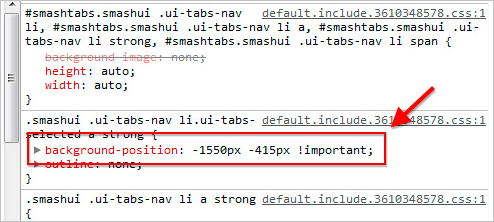
We have five main background properties to use in CSS 2. They are as follows: background-color, background-image, background-position, background-repeat and background-attachment. These properties can all be merged into one short-hand property: background. One important thing to note is that the background accounts for the contents of the element, including the padding and border. It does not include an element’s margin. This works as it should in Firefox, Safari and Opera, and now in IE8. But in IE7 and IE6 the background does not include the border, as illustrated below.
Designing CSS Buttons: Techniques And Resources
Buttons, whatever their purpose, are important design elements. They could be the end point of a Web form or a call to action. Designers have many reasons to style buttons, including to make them more attractive and to enhance usability. One of the most important reasons, though, is that standard buttons can easily be missed by users because they often look similar to elements in their operating system. Here, we present you several techniques and tutorials to help you learn how to style buttons using CSS. We’ll also address usability.
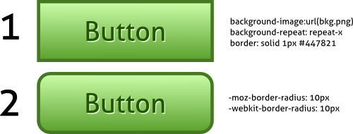
Before we explain how to style buttons, let’s clear up a common misconception: buttons are not links. The main purpose of a link is to navigate between pages and views, whereas buttons allow you to perform an action (such as submit a form).
The Future Of CSS: Embracing The Machine
Designers hold CSS close to their hearts. It’s just code, but it is also what makes our carefully crafted designs come to life. Thoughtful CSS is CSS that respects our designs, that is handcrafted with precision. The common conception among Web designers is that a good style sheet is created by hand, each curly bracket meticulously placed, each vendor prefix typed in manually.

But how does this tradition fit in a world where the websites and applications that we want to create are becoming increasingly complex?
The Guide To CSS Animation: Principles and Examples
With CSS animation now supported in both Firefox and Webkit browsers, there is no better time to give it a try. Regardless of its technical form, whether traditional, computer-generated 3-D, Flash or CSS, animation always follows the same basic principles. In this article, we will take our first steps with CSS animation and consider the main guidelines for creating animation with CSS. We’ll be working through an example, building up the animation using the principles of traditional animation. Finally, we’ll see some real-world usages.

Fixed vs. Fluid vs. Elastic Layout: What’s The Right One For You?
The problem has boggled the minds of Web designers for years: fixed, fluid, elastic or a hybrid layout design? Each option has its benefits and disadvantages. But the final decision depends so much on usability that it is not one to be made lightly. So, with all the confusion, is there a right decision? By considering a few factors and properly setting up the final design, you can end up with a successful layout design that reaps all the benefits.
This article discusses the pros and cons of each type of layout. Either one can be used to make a successful website layout, as long as you keep usability in mind.
Modern CSS Layouts: The Essential Characteristics
Now is an exciting time to be creating CSS layouts. After years of what felt like the same old techniques for the same old browsers, we’re finally seeing browsers implement CSS 3, HTML 5 and other technologies that give us cool new tools and tricks for our designs.
But all of this change can be stressful, too. How do you keep up with all of the new techniques and make sure your Web pages look great on the increasing number of browsers and devices out there? First you’ll learn the five essential characteristics of successful modern CSS websites. In the second part of this article, you’ll learn about the techniques and tools that you need to achieve these characteristics.
We won’t talk about design trends and styles that characterize modern CSS-based layouts. These styles are always changing. Instead, we’ll focus on the broad underlying concepts that you need to know to create the most successful CSS layouts using the latest techniques. For instance, separating content and presentation is still a fundamental concept of CSS Web pages. But other characteristics of modern CSS Web pages are new or more important than ever. A modern CSS-based website is: progressively enhanced, adaptive to diverse users, modular, efficient and typographically rich.
Modern CSS Layouts, Part 2: The Essential Techniques
In Modern CSS Layouts, Part 1: The Essential Characteristics, you learned that modern, CSS-based web sites should be progressively enhanced, adaptive to diverse users, modular, efficient and typographically rich. Now that you know what characterizes a modern CSS web site, how do you build one? Here are dozens of essential techniques and tools to learn and use to achieve the characteristics of today’s most successful CSS-based web pages.
Just as in the previous article, we’re not going to be talking about design trends and styles; these styles are always changing. Instead, we’re focusing on the specific techniques that you need to know to create modern CSS-based web pages of any style. For each technique or tool, we’ll indicate which of the five characteristics it helps meet. To keep this shorter than an encyclopedia, we’ll also just cover the basics of each technique, then point you to some useful, hand-picked resources to learn the full details.
Styling Elements With Glyphs, Sprites And Pseudo-Elements
In 2002, Mark Newhouse published the article “Taming Lists”, a very interesting piece in which he explained how to create custom list markers using pseudo-elements. Almost a decade later, Nicolas Gallagher came up with the technique pseudo background-crop which uses pseudo-elements with a sprite.
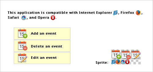
Today, on the shoulders of giants, we’ll try to push the envelope. We’ll discuss how you can style elements with no extra markup and using a bidi-friendly high-contrast proof CSS sprite technique (you’ll find an example below). The technique will work in Internet Explorer 6⁄7 as well.
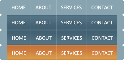
The Mystery Of CSS Sprites: Techniques, Tools And Tutorials
CSS Sprites are not new. In fact, they are a rather well-established technique and have managed to become common practice in Web development. Of course, CSS sprites are not always necessary, but in some situation they can bring significant advantages and improvements – particularly if you want to reduce your server load. And if you haven’t heard of CSS sprites before, now is probably a good time to learn what they are, how they work and what tools can help you create and use the technique in your projects.
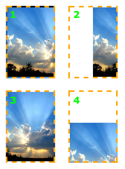
The term “sprite” (similar to “spirit,” “goblin,” or “elf”) has its origins in computer graphics, in which it described a graphic object blended with a 2-D or 3-D scene through graphics hardware. Because the complexity of video games has continually increased, there was a need for smart techniques that could deal with detailed graphic objects while keeping game-play flowing. One of the techniques developed saw sprites being plugged into a master grid (see the image below), then later pulled out as needed by code that mapped the position of each individual graphic and selectively painted it on the screen.
CSS Sprites: Useful Technique Or Potential Nuisance?
Ah, the ubiquitous CSS sprites — one of the few web design techniques that was able to bypass “trend” status almost instantly, planting itself firmly into the category of best practice CSS. Although it didn’t really take off until well after A List Apart explained and endorsed it, it was discussed as a CSS solution as early as July, 2003 by Petr StanÃcek.
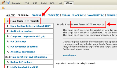
Most web developers today have a fairly strong grasp of this technique, and there have been countless tutorials and articles written on it. In almost every one of those tutorials, the claim is made that designers and developers should be implementing CSS sprites in order to minimize HTTP requests and save valuable kilobytes. This technique has been taken so far that many sites, including Amazon, now use mega sprites.
Is this much-discussed benefit really worthwhile? Are designers jumping on the CSS sprite bandwagon without a careful consideration of all the factors? In this article, I’m going to discuss some of the pros and cons of using CSS sprites, focusing particularly on the use of “mega” sprites, and why such use of sprites could in many cases be a waste of time.
CSS Sprites Revisited
I’m pretty confident that I won’t surprise anyone here by saying that CSS sprites have been around for quite a while now, rearing their somewhat controversial heads in the Web development sphere as early as 2003.
Still, the CSS sprite hasn’t truly found its way into the everyday toolkit of the common Web developer. While the theory behind CSS sprites is easy enough and its advantages are clear, they still prove to be too bothersome to implement, especially when time is short and deadlines are looming. Barriers exist to be breached, though, and we’re not going to let a couple of tiny bumps in the road spoil the greater perks of the CSS sprite.
If you want more background information on best practices and practical use cases, definitely read “The Mystery of CSS Sprites: Techniques, Tools and Resources.” If you’re the defensive type, I would recommend “CSS Sprites: Useful Technique, or Potential Nuisance?,” which discusses possible caveats.
I won’t take a stance on the validity of CSS sprites. The aim of this article is to find out why people still find it difficult to use CSS sprites. Also, we’ll come up with a couple of substantial improvements to current techniques. So, start up Photoshop (or your CSS sprite tool of choice), put on your LESS and Sass hats, and brush up your CSS pseudo-element skills, because we’ll be mixing and matching our way to easier CSS sprite implementation.
CSS Differences In Internet Explorer 6, 7 and 8
One of the most bizarre statistical facts in relation to browser use has to be the virtual widespread numbers that currently exist in the use of Internet Explorer versions 6, 7 and 8. As of this writing, Internet Explorer holds about a 65% market share combined across all their currently used browsers. In the web development community, this number is much lower, showing about a 40% share.
The interesting part of those statistics is that the numbers across IE6, IE7, and IE8 are very close, preventing a single Microsoft browser from dominating browser stats — contrary to what has been the trend in the past. Due to these unfortunate statistics, it is imperative that developers do thorough testing in all currently-used Internet Explorer browsers when working on websites for clients, and on personal projects that target a broader audience.
This article will attempt to provide an exhaustive, easy-to-use reference for developers desiring to know the differences in CSS support for IE6, IE7 and IE8.
The Principles Of Cross-Browser CSS Coding
It is arguable that there is no goal in web design more satisfying than getting a beautiful and intuitive design to look exactly the same in every currently-used browser. Unfortunately, that goal is generally agreed to be almost impossible to attain. Some have even gone on record as stating that perfect, cross-browser compatibility is not necessary.
While I agree that creating a consistent experience for every user in every browser (putting aside mobile platforms for the moment) is never going to happen for every project, I believe a near-exact cross-browser experience is attainable in many cases. As developers, our goal should not just be to get it working in every browser; our goal should be to get it working in every browser with a minimal amount of code, allowing future website maintenance to run smoothly.
In this article, I’ll be describing what I believe are some of the most important CSS principles and tips that can help both new and experienced front-end developers achieve as close to a consistent cross-browser experience as possible, with as little CSS code as possible.
Improving Code Readability With CSS Styleguides
Once your latest project is finished, you are very likely to forget the structure of the project’s layout, with all its numerous classes, color schemes and type setting. To understand your code years after you’ve written it you need to make use of sensible code structuring. The latter can dramatically reduce complexity, improve code management and consequently simplify maintainability. However, how can you achieve sensible structuring? Well, there are a number of options. For instance, you can make use of comments — after all, there is always some area for useful hints, notes and, well, comments you can use afterwards, after the project has been deployed.
Indeed, developers came up with quite creative ways to use comments and text formatting to improve the maintainability of CSS-code. Such creative ways are usually combined into CSS styleguides — pieces of CSS-code which are supposed to provide developers with useful insights into the structure of the code and background information related to it.
This article presents 5 coding techniques which can dramatically improve management and simplify maintainability of your code. You can apply them to CSS, but also to any other stylesheet or programming language you are using. You can browse through the references listed under the article — they containt further information about how you can achieve a well-organized and well-structured code.
Mastering CSS Coding: Getting Started
CSS has become the standard for building websites in today’s industry. Whether you are a hardcore developer or designer, you should be familiar with it. CSS is the bridge between programming and design, and any Web professional must have some general knowledge of it. If you are getting your feet wet with CSS, this is the perfect time to fire up your favorite text editor and follow along in this tutorial as we cover the most common and practical uses of CSS.
We’ll start with what you could call the fundamental properties and capabilities of CSS, ones that we commonly use to build CSS-based websites: Padding vs. margin, Floats, Center alignment, Ordered vs. unordered lists, Styling headings, Overflow and Position. Once you are comfortable with the basics, we will kick it up a notch with some neat tricks to build your CSS website from scratch and make some enhancements to it: Background images, Image enhancement, PSD to XHTML conversion.
70 Expert Ideas For Better CSS Coding
CSS isn’t always easy to deal with. Depending on your skills and your experience, CSS coding can sometimes become a nightmare, particularly if you aren’t sure which selectors are actually being applied to document elements. An easy way to minimize the complexity of the code is as useful as not-so-well-known CSS attributes and properties you can use to create a semantically correct markup.
We’ve taken a close look at some of the most interesting and useful CSS tricks, tips, ideas, methods, techniques and coding solutions and listed them below. We also included some basic techniques you can probably use in every project you are developing, but which are hard to find once you need them.
And what has come out of it is an overview of over 70 expert tips, which can improve your efficiency of CSS coding. You might be willing to check out the list of references and related articles in the end of this post.
We’d like to express sincere thank to all designers who shared their ideas, techniques, methods, knowledge and experience with their readers. Thank you, we, coders, designers, developers, information architects - you name it - really appreciate it.
An Introduction To Object Oriented CSS (OOCSS)”)
Have you ever heard the phrase “Content is King”? Being a Web developer, and therefore having a job that’s often linked to content creation, it’s likely you have. It’s a fairly overused but true statement about what draws visitors to a site.
From a Web developer’s perspective, however, some may argue that speed is king. More and more, I’m starting to favour that stance. In recent years many experienced front-end engineers have offered their suggestions on how we can improve the user experience by means of some performance best practices.
Unfortunately, CSS seems to get somewhat overlooked in this area while many developers (for good reason) focus largely on JavaScript performance and other areas.
In this post, I’ll deal with this often overlooked area by introducing you to the concept of object oriented CSS and how it can help improve both the performance and maintainability of your Web pages.
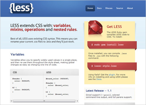
An Introduction To LESS, And Comparison To Sass
I’ve been using LESS religiously ever since I stumbled upon it months ago. CSS was never really a problem for me, in and of itself, but I was intrigued by the idea of using variables to create something along the lines of a color palette for my websites and themes. Having a color palette with a fixed number of options to choose from helps prevent me from going color crazy and deviating from a chosen style.

Writing CSS For Others
I think a lot of us CSS authors are doing it wrong. We are selfish by nature; we get into our little bubbles, writing CSS (as amazing as it may be) with only ourselves in mind. How many times have you inherited a CSS file that’s made you say “WTF” at least a dozen times?

HTML has a standard format and syntax that everyone understands. For years, programmers have widely agreed on standards for their respective languages. CSS doesn’t seem to be there yet: everyone has their own favorite format, their own preference between single-line and multi-line, their own ideas on organization, and so on.
How To Set Up A Print Style Sheet
In a time when everyone seems to have a tablet, which makes it possible to consume everything digitally, and the only real paper we use is bathroom tissue, it might seem odd to write about the long-forgotten habit of printing a Web page. Nevertheless, as odd as it might seem to visionaries and tablet manufacturers, we’re still far from the reality of a paperless world.
In fact, tons of paper float out of printers worldwide every day, because not everyone has a tablet yet and a computer isn’t always in reach. Moreover, many of us feel that written text is just better consumed offline. Because I love to cook, sometimes I print recipes at home, or emails and screenshots at work, even though I do so as rarely as possible out of consideration for the environment.
Print style sheets are useful and sometimes even necessary. Some readers might want to store your information locally as a well-formatted PDF to refer to the information later on, when they don’t have an Internet connection. However, print styles are often forgotten in the age of responsive Web design. The good news is that a print style sheet is actually very easy to craft: you can follow a couple of simple CSS techniques to create a good experience for readers and show them that you’ve gone the extra mile to deliver just a slightly better user experience. So, how do we start?
CSS Wishlist: New Ideas, Debates And Solutions
The future of CSS is arriving fast, and many tools, languages, and solutions have been developed that make CSS a job not just for Web designers but developers, too. In many ways, the job could become more complex and confusing, but in many other ways, the new changes will provide more opportunity and better technology for the future of the Web.
CSS will get a number of new changes. Among them are alternative syntaxes, CSS programming concepts and the ability to allow more common design techniques without using images. In this article, we’ll go over some current solutions, what we’d like to see in the future and the pros and cons of them all.


