Our charming Printed Books


Accessible UX Research
Accessible UX Research is your guide to making UX research more inclusive — from planning and recruiting to facilitation, asking better questions, avoiding bias, and building trust. This book is for anyone who cares about research, accessibility, and making products that endure. Michele A. Williams takes you on a deep dive into the real world of UX research, with a roadmap for including users with different abilities and needs.
High-quality hardcover. Written by Dr. Michele A. Williams. Foreword by Jared Smith of WebAIM. Cover art by Espen Brunborg.

Success At Scale
Success at Scale is a curated collection of best-practice case studies capturing how production sites of different sizes tackle performance, accessibility, capabilities, and developer experience at scale. Case studies are from industry experts from teams at Instagram, Shopify, Netflix, eBay, Figma, Spotify, Wix, Lyft, LinkedIn, and many more. Guidance that stands the test of time.
High-quality hardcover. Curated by Addy Osmani. Cover art by Espen Brunborg.
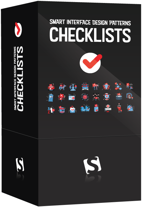
Smart Interface Design Patterns Checklists (Print + PDF)
Every UI component, no matter if it’s an accordion, a hamburger navigation, a data table, or a carousel, brings along its unique challenges. Inventing a new solution to every problem takes time, and very often it’s really not necessary. We can rely on smart design patterns and ask the right questions ahead of time to avoid issues down the line. Jump to table of contents.
Meet Interface Design Patterns Checklists, a deck of 166 cards with common questions to ask when tackling a common interface challenge — carousel, table, date picker, autocomplete, filtering, search, configurator, slider, timeline, map, web forms, testimonials, onboarding, pricing plan, authentication and many others. Created to help us all keep track of the things we need to consider to design better interfaces, faster. Check the preview. (PDF, 825KB)
You’ll get:
- 166 checklist cards on everything from hamburger navigation and carousels to web forms and tables, carefully curated and designed,
- Practical examples and guidelines (400 slides),
- Editable text file to adjust for your needs,
- Life-time access to the deck, updated regularly.

Understanding Privacy
Privacy is a scary topic? It doesn’t have to be. Our new book Understanding Privacy helps you understand what data privacy is really about beyond scary headlines. It is an introduction to the beliefs, concepts, and ideas that inform privacy as it exists — or has failed to exist — on the open web that we build. Whether you’re a designer, developer, or project manager, this book will equip you with the knowledge you need to put your users first in everything you do and build a better web for tomorrow. Jump to table of contents.
288 pages. High quality hardcover. Written by Heather Burns.
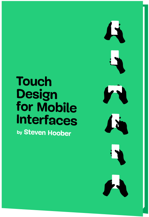
Touch Design for Mobile Interfaces
How do we design for touch in 2022? Mobile and touch are the new default for computing, but there are still many myths, rumors, errors and out-of-date practices on how to design for them. Let’s change that!
In our brand-new book Touch Design for Mobile Interfaces, Steven Hoober shares his in-depth research and guidelines on designing for touch. You’ll learn how people hold devices and interact with interfaces, along with strategies and best practices for designing better mobile interfaces. A jam-packed book for designers and developers working on interfaces for mobile. Jump to table of contents.
400 pages. High quality hardcover + eBook (PDF, ePUB, Kindle). Written by Steven Hoober. Shipping now.

Image Optimization
Images have always been a key part of the web. Our brains are able to interpret images much faster than text, which is why high-quality visuals drive conversions and user engagement.
That said, loading images efficiently at scale isn’t a little project for a quiet afternoon. It requires understanding of compression techniques, loading behavior, image decoding and image CDNs, adaptive media loading and caching.
This book will equip you with everything you need to know to optimize how you compress, serve and maintain images — boosting performance along the way. Jump to table of contents.
528 pages. High quality hardcover + eBook (PDF, ePUB, Kindle). Written by Addy Osmani.
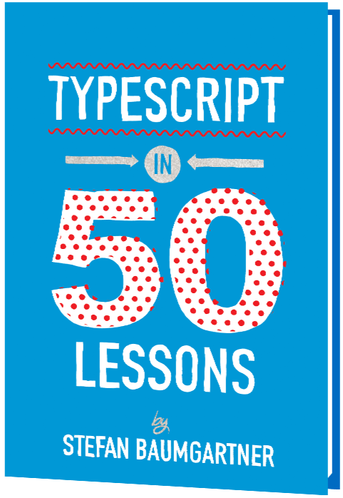
TypeScript in 50 Lessons
In TypeScript in 50 Lessons, Stefan Baumgartner breaks down the quirks of TypeScript into short, manageable lessons. You’ll make sense of TypeScript concepts, tooling for TypeScript and how to get most out of it without learning a new language. Everything TypeScript explained, from start to finish. Jump to table of contents.
Written for seasoned and not-so-seasoned developers who know enough JavaScript to be dangerous, or want to dive deeper into TypeScript. With code walkthroughs, hands-on examples and common gotchas, that’s a book you might want to keep close.
You’ll learn:
- TypeScript concepts, and how to make sense of them all.
- TypeScript tooling, needed to use the language effectively.
- How to get most out of TypeScript without learning a new language.
- Structural type systems, their semantics, and why they matter.
- Low-maintenance types and how to write types once, and let them grow automatically as code evolves.
- How to bend the type system to make it fit the needs of your projects.
- TypeScript culture and how the language is evolving.
464 pages. High quality hardcover + eBook (PDF, ePUB, Kindle). Written by Stefan Baumgartner. Designed by Rob Draper.
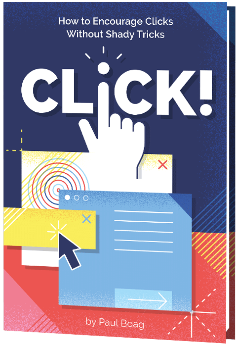
Click! How to Encourage Clicks Without Shady Tricks
The web has become a noisy place with millions of companies trying to get users’ attention. No wonder many of them apply increasingly desperate techniques to encourage users to act on their websites. We’ve seen an explosion of dark patterns attempting to manipulate users into handing over personal data or make a purchase. Jump to table of contents.
However, these manipulative techniques come with hidden costs in customer service, maintenance, support, return processing fees, and social media backlash. They cost a fortune and hurt business irrevocably. Download a free PDF sample (17.3 MB) (ePUB, Kindle).
How, then, do we encourage users to act? If dark patterns are not the answer, then what is? How do we increase clicks without shady tricks? These are the questions that Click! answers.
In the book, you’ll learn how to:
- measure conversion effectively
- build a user-centric sales funnel
- address objections and reduce risks
- build trust and overcome skepticism
- persuade people well without alienating them
- boost business KPIs sustainably
- apply quick wins to help business today
- establish long-term strategy for better conversion.
304 pages. High quality hardcover + eBook (PDF, ePUB, Kindle). For designers, marketers, entrepreneurs and product owners. Written by Paul Boag. Designed by Veerle Pieters.

The Ethical Design Handbook
Over the past 20 years, user privacy has become merely a commodity on the web: there, but hardly ever respected — and often swiftly discarded. No wonder ad-blockers and tracking-blockers have gained traction, and in times when ad-blocking, browsers and new legislation (e.g. GDPR/CCPA) introduce constraints on data collection, we need viable alternative business models that companies can rely on. Models that respect customer choices and are built and designed with ethics in mind. Jump to table of contents.
But how do we get there? Meet The Ethical Design Handbook, our new guide on ethical design for digital products, with practical guidelines on how to help companies leave dark patterns behind and boost business KPIs along the way. 368 pages. Download a free PDF excerpt (5.9 MB) (also as ePUB, Kindle).
You’ll learn how to:
- explain what ethical design is
- justify and prove a business case for ethical design
- grow a sustainable business built on ethical design principles
- strike the balance between data collection and ethics
- embed ethical design into your workflow
- get started with ethical transformation
Inclusive Components
At its heart, “Inclusive Components” is a detailed, practical handbook for building fully accessible interfaces. The book examines common interface patterns — accordions, tables, tabs, toggles and everything in-between — through the lens of inclusion. The result is a dozen of fully accessible and robust patterns we author, plug in, and use daily. Jump to table of contents.
The book features 12 common UI components, broken down in detail, one by one. The in-depth explorations are meticulously illustrated and code examples culminate as bulletproof code snippets, applicable to your work right away. Plus a strategy for building accessible interfaces for your own components — all in one book. Download a free PDF excerpt (1.1 MB).
You’ll learn how to build:
- accessible buttons and toggle buttons,
- navigation menus and dropdowns,
- keyboard-friendly tooltips,
- “dark mode” themes,
- accessible content sliders,
- inclusive notifications,
- semantic sortable data tables,
- accessible dialogs and modals.

Smashing Print #1: Ethics & Privacy
For a long time, we wanted to create a printed magazine that hasn’t existed before. Not a magazine about fleeting design trends or ever-changing frameworks, but topics that would make us all think, and remain useful as time passes by. A magazine exploring topics that often get lost in a myriad of blog posts out there. Written by the community for the community. Jump to table of contents.
We kick off with a 60-pages issue exploring topics very close to our hearts — ethics, privacy and security. We explore the usual suspects — tracking, advertising, privacy law (e.g. GDPR), data protection and addictive interfaces. What follows is a collection of essays which sit very well together, yet tackle different aspects of the issues at hand. You may not agree with all of them, but we hope they'll make you think. Download a free PDF preview (3 MB).
Art Direction for the Web
The web can be more than plain rectangles and perfect circles. Art Direction for the Web exists because we wanted to explore how we all, designers and front-end developers alike, can break out of generic web experiences prevailing today.
In the book, Andy explores original compositions, unexpected layouts, critical design thinking and front-end techniques that will help you create something that stands out.
To achieve this, the book applies art direction to examine a new approach to designing for the web. This book is supposed to make you think, and ask questions, and polish every pixel with clear intent and purpose. It will show you how art direction will:
- Connect your brand with customers
- Create connected experiences
- Improve engagement and conversions
- Bring personas and user stories to life
- Take design beyond frameworks

Smashing Book 6: New Frontiers In Web Design
It’s about time to finally make sense of all the front-end and UX madness. Meet our new book with everything from design systems to accessible single-page apps, CSS Custom Properties, CSS Grid, Service Workers, performance patterns, AR/VR, conversational UIs and responsive art direction.
Finding your way through front-end and UX these days is challenging and time-consuming. But frankly, we all just don’t have time to afford betting on a wrong strategy. Smashing Book 6 sheds some light on new challenges and opportunities, but also uncovers new traps and pitfalls in this brave new front-end world of ours. Take a look at the excerpt.

Design Systems
As the web continues to become more complex, designing static pages has become untenable, so that many of us have started to approach design in a more systematic way. In this book, Alla Kholmatova sets out to identify what makes an effective design system that can empower teams to create great digital products.
Not all design systems are equally effective. Some can generate coherent user experiences, others produce confusing patchwork designs. Some inspire teams to contribute to them, others are neglected. Some get better with time, more cohesive and better functioning; others get worse, becoming bloated and cumbersome. Download a free PDF sample (0.7 MB).
Form Design Patterns
Without forms, the web is a passive experience where content is just consumed. But with forms the web can be collaborative, creative and productive. Forms are at the center of every meaningful interaction, so they’re worth getting a firm handle on. Jump to table of contents.
On first glance, forms are simple to learn. Made up of just a handful of inputs, you can create a form in little time. But when we consider the journeys we need to design, the users we need to design for, the browsers and devices of varying sizes, capabilities and bugs being used; and ensuring that the result is simple and inclusive, form design becomes a far more interesting and bigger challenge.
User Experience Revolution
Many companies try to create a great experience for customers. But few are willing to make the changes required to deliver on that promise. In fact most don’t even realize just how bad their experience can be.
Do you feel like the only person at your company who understands what a huge competitive advantage a good user experience provides? Are you frustrated that your management team doesn’t see the value of creating great user experiences? Do you struggle to convince colleagues to approach projects from a users perspective?

White Hat UX
Most things in life come with a dark side. For years, the online space has acted as a playground for thieves, bandits and murky types who will use every trick in the book to make you do the opposite of what you set out to do. But there is hope. The next generation in user experience is coming.
Small websites are not the only ones tempted by the dark forces. Many of the world’s largest brands make use of dark patterns — some do so because of ignorance, while others lack the courage to admit their wrong doings. White Hat UX focuses on creating unique user experiences without a dark side. Leave the dark side and read the book. It is filled with inspiration to free yourself from the dark forces and join the next generation in user experience – White Hat UX.
Digital Adaptation
Nothing is more frustrating than stubborn management entangled in dated workflows and inefficient processes. That’s why we created “Digital Adaptation”, a new practical book on how to help senior management understand the Web and adapt the business, culture, team structure and workflows accordingly.
The web has changed the rules of business. The best practices of the industrial economy no longer apply in the digital age. What was once safe ground is no longer so, and organizations need to adapt.
Inclusive Design Patterns
We might not realize it, but as developers, we build inaccessible websites all the time. It’s not for the lack of care or talent though — it’s a matter of doing things the wrong way. In our new book, Inclusive Design Patterns, we explore how we can craft accessible interfaces without extra effort — and what front-end design patterns we can use to create inclusive experiences.
Accessibility has always been a slightly unsettling realm for web developers. Surrounded with myths, misunderstandings and contradicting best practices, it used to be a domain for a small group of experts who would “add” accessibility on top of the finished product. Today, in many simple and complex websites, it’s still unclear what makes up an accessible interface and what developers need to know to get there.
Smashing Book #5
Responsive design is a default these days, but we are all still figuring out just the right process and techniques to better craft responsive websites. That’s why we created a new book — to gather practical techniques and strategies from people who have learned how to get things done right, in actual projects with actual real-world challenges.
Neatly packed in a gorgeous hardcover, the book features practical front-end techniques and patterns from well-respected designers and developers. The book isn’t concerned with trends or short-lived workarounds — it should stand the test of time and as such, it’s focused on actual techniques used today in real-life projects. The techniques that you could apply to your websites today, too.

The Sketch Handbook
If you’re designing for the web today, you are probably using Sketch. We do, too, so we created “The Sketch Handbook”, filled with many practical examples and tutorials in 12 jam-packed chapters.
If you’re designing for the web today, you are probably using Sketch. We do, too, so we created The Sketch Handbook: our brand new Smashing book, filled with many practical examples and tutorials in 12 jam-packed chapters. This book will help you master all the tricky, advanced facets of Sketch, so that you’ll become more proficient and fast when using the app.