The Death Of The Blog Post

Email Newsletter
Weekly tips on front-end & UX.
Trusted by 182,000+ folks.
 Register for Free

 Celebrating 10 million developers
 Custom Web Forms for Angular, React, & Vue. Your backend.
Let’s face it: the classic blog post is boring.Barring the text and images, each one generally has the exact same layout. We see little originality from one post to the next. Of course, consistency and branding are extremely important to consider when designing a website or blog, but what about individuality? Does a blog post about kittens deserve the same layout as one about CSS hacks?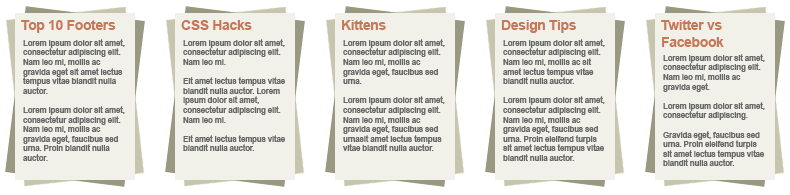
Too Easy?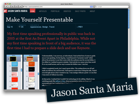 Because installing a WordPress theme is so easy, anyone can have a blog up and running in minutes. While this is great, and we now have a wealth of blogs on countless topics, perhaps it’s too easy? Just thinking about the endless hours of effort that a print designer puts into creating the custom layout of a magazine article makes one respect the finished product so much more.A few individuals out there, though, are really breaking the mold of the blogosphere.
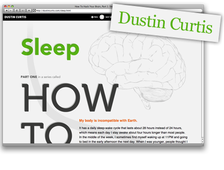 These guys aren’t using standard WordPress themes or cutting corners to make their lives easier. Rather, they are challenging themselves and producing some fantastic content.Pushing yourself to create original layouts and designs customized to the content of each post is a fascinating and entertaining way to build a blog.
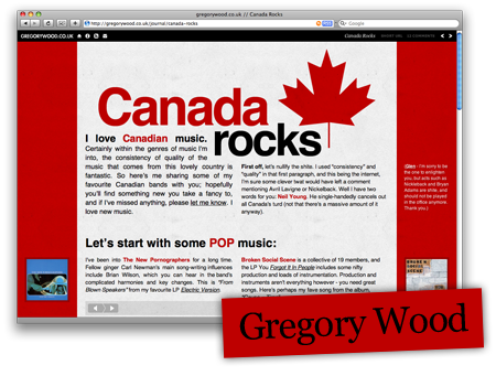
But why has this trend of melding blog post and magazine article, the “blogazine,” not caught on with the masses?
The
Let’s now look at three people who exhibit all four qualities:
The Pioneers
Jason Santa Maria
is one of the early innovators of this style of blogging and has been creating custom blog post designs since June 2008. With a background in print design, Jason had a vision to create a blog more in the style of a magazine, rather than obey the established rules of blog design.
While, yes, this is a redesign of sorts, I consider it much more a rethinking.
~ Jason Santa Maria
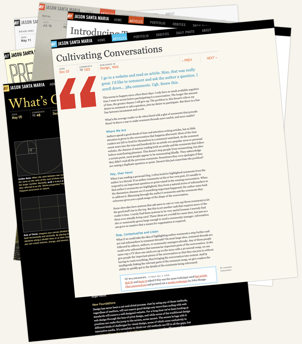
Jason’s blog posts are fascinating and cover a wide range of topics, including design, typography, books, photography and film. The differences in the designs are sometimes just subtle changes in background or typography, but each conveys an entirely distinct message that it couldn’t if it was uniform with the rest.
Sometimes the changes are radical, but every one still has an element of “Jason-ness.” The header and footer are usually consistent, but even without them, you can still tell a Jason Santa Maria post from a quick glace.
We’ve made so many advancements in how we publish content that we haven’t looked back to what it is we’re actually creating. Many of us see the clear separation between things like print design and web design, but I’ve really been questioning the reality of why things are this way.
~ Jason Santa Maria
We Web designers don’t want to be regarded as lazy. Do we?
We have some of the
most creative and inspiring designers
in our profession, so why don’t we show our true potential in our blog articles?
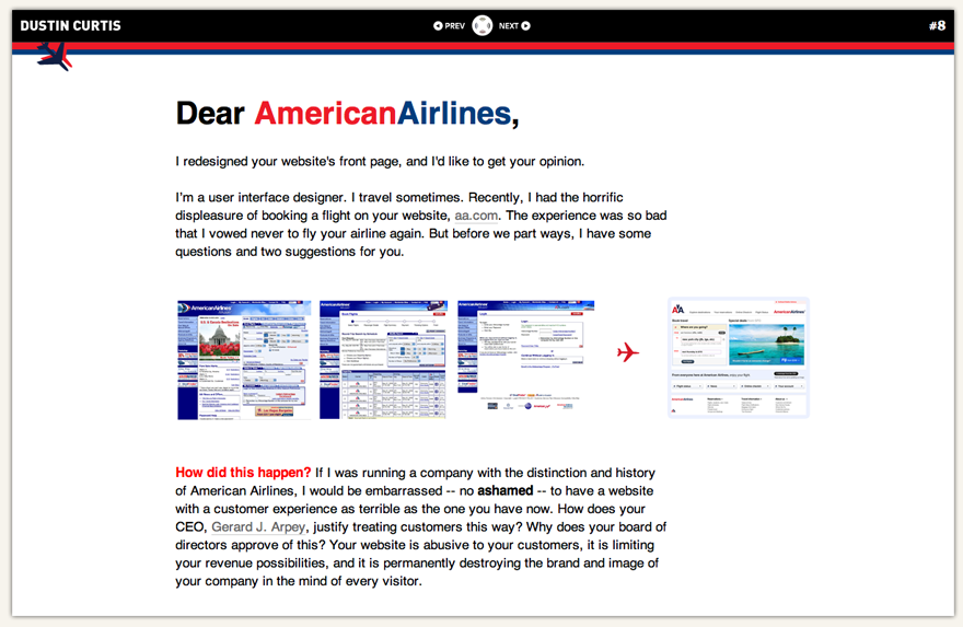
Dustin Curtis
got a lot of publicity with his open letter to American Airlines, in which he suggests a dramatic redesign and rethinking of its online customer experience. The articles on Dustin’s blog are incredibly fascinating, and this user experience designer has clearly put serious thought into each one.
I got the chance to speak with Dustin about his work:
What prompted you to create a “blogazine” instead of a traditional blog?
I’m never satisfied with my work. Invariably, two weeks after finishing a design, I feel like I can do better. When I originally tried to design my blog, I kept finishing a design, hating it and starting over. This happened ten or twelve times until I finally gave up. Eventually, I realized that each post could stand on its own and be its own design that fit the content. Despite the holdbacks of HTML and CSS, it has worked much better than I had even anticipated.
Does having a blogazine really boost your creativity when it comes to creating a post?
The blogazine style does seem to boost creativity, and by a huge amount. I feel an intense amount of freedom when I’m not constrained by the box of a pre-formed design. I can open Photoshop and use it as a word processor with design functionality. The design really does complement — and become — the content, because they are built simultaneously, without regard for any of the other stuff on the website.
I feel an intense amount of freedom when I’m not constrained by the box of pre-formed design.
Where do you get your inspiration for your blog articles?
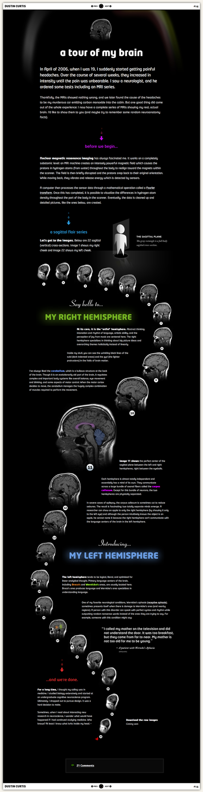
I get inspiration from everywhere. I’m fascinated by medicine and the human brain. So many of my articles center on interesting things that I’ve learned while studying neuroscience. Sometimes I’ll start with a single word, like “sleep,” and develop it into a whole article as I research the fringes of the field. There’s really no set source of inspiration.
Advantages?
Disadvantages?
The main advantage is one I didn’t anticipate. Doing a blogazine article requires a lot more work than a traditional blog post, and that has kept me on my toes; because such a large investment is required, I publish only what I feel are my best articles.
The biggest disadvantage is that CSS and HTML are terrible technologies that weren’t designed for page layout. They were designed for structured content presentation, like for a newspaper, where all the elements throughout the website are the same and are re-used. But I’m trying to make a magazine, where the content and presentation are inextricably mixed and unique. The way presentation CSS is supposed to be decoupled from the content HTML is totally counter to the mission I am trying to accomplish, and it makes coding the articles frustrating, messy and time-consuming.
This seems to keep the quality fairly high. I start four or five articles for every one I publish. If I had a normal blog, that wouldn’t be the case — the other four articles would be published too, even though they wouldn’t be as good as the ones I do end up publishing.
My solution to this problem has basically been to ignore convention and use inline styling for most of the presentation code and extract the website-wide presentation layer into a separate CSS document. This takes forever and is not ideal. To put it lightly, I’ve developed a love-hate relationship with CSS.
What if a print magazine
used the same template for every article?
It would be pretty boring, no?
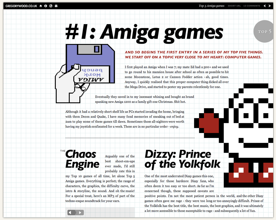
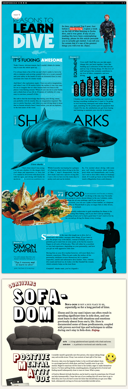
Gregory Wood
is a website designer at Erskine Design and has created his website as an experiment in art direction. Not allowing himself to use the same old templates, Greg has created a fascinating website, with custom designs for each blog post.
Here’s what Greg had to say when I spoke with him:
What prompted you to create a blogazine instead of a traditional blog?
Well, I’ve had a blog for ages and have always been bad at keeping it regularly updated, until I custom-designed a few of the posts sometime last year. I generally hate writing about Web-related stuff (I find it all a little boring), and I love designing, so I wrote about what I wanted (music and zombies) and designed each post around the content, although still housed in my old blog layout. The reception to the posts was really nice, and I enjoyed creating them, so for my latest website I set out to cater to that same audience and keep myself happily occupied at the same time.
Does having a blogazine really boost your creativity when it comes to creating a post?
I wouldn’t say it boosts my creativity; the website is more of an outlet for it. Despite spending all week being creative at Erskine Design, it’s still quite liberating to design whatever you want, however you want, with no external influence.
Because it’s all nicely designed, readers are drawn in and end up reading more than one post.
Where do you get your inspiration for your blog articles?
Usually I think of my best ideas when cycling or sitting on a tram or bus. It’s been a big thing on the Web over the years, where you get your inspiration from, and I’ve never really understood it. I think that looking at other people’s work all the time for inspiration is massively constricting. I find staring out a window for a while usually helps.
Advantages?
Disadvantages?
The obvious advantage is that it looks better. But the content is infinitely more captivating as well. I’m not a great writer, and I probably write a lot of bullshit, but because it’s all nicely designed, readers are drawn in and end up reading more than one post. It’s also very fun to create and helps me grow as a designer.
I guess some would say the time factor is a disadvantage, but if you love doing something, spending a lot of time doing it is justified.
I can’t think of any disadvantages.
The Microblogging Revolution
Twitter, Posterous, Flickr, Facebook, the iPhone and countless other services make it incredibly easy for us to instantly post short musings, photos, video, thoughts and creations, which in turn has created a big gap between the micro post and the macro post.
Time for the macro post to shine
Longer blog posts with valuable content might not get the recognition they deserve, because the 140-character mindset turns people off of reading several pages of text. One way to combat this and make your content more appealing is by creatively altering the layout, using the blogazine technique.
Bridging the gap
We don’t know exactly where the world of blogging is headed in the next few years, but the increase in micro-blogging will definitely be a strong influence. Shorter attention spans call for drastic changes to the length of blog posts. Blogazines could cater to a generation accustomed to the longer articles of newspapers and magazines, becoming a bridge between the traditional article and the TwitPic.
Forces you to think more creatively
Slipping into the habit of typing up your thoughts and clicking “Post,” without thinking about the layout of each article, is easy. By taking a little extra time for the art of blogging, your creativity will increase with your efforts.
Something different and exciting for your readers
If .Net or Computer Arts printed every article with the same layout, every month, would you still subscribe? Your readers would more likely return for new articles if they anticipate something new and rewarding.
Reduces the number of short simple posts
Your blog posts will have much more weight if you take the time to create a full article, rather than knock of a rushed post.
Makes wordy posts more readable
If all you have is text, text, text, then people will be less likely to read it. Put a little effort into styling the content, and your post will become much more readable.
It takes serious effort
Hand-crafting each blog post won’t be easy, but the rewards will be well worth it.
You need CSS and HTML experience
Anyone can download a WordPress theme and merrily post an article. But building a custom layout requires some experience with CSS and HTML.
Inconsistency
The layout of your blog will change dramatically from post to post and, if not done right, may strike your readers as being awkwardly inconsistent. Just look at Jason Santa Maria’s work. Every post is radically different for a reason, but a consistent vein runs through the posts.
No print layout experience
Because this style borrows many elements from print design, anyone who has worked only in Web design may find it difficult to change their way of thinking. Rules of typography and white space, for example, may throw you off. But practice makes perfect, and an endless supply of inspiration can be found in creative magazines.

Obviously this style isn’t suitable for every website. It wouldn’t be practical for blogs that pump out three or four articles a day, but certain types of websites could benefit from it especially.
Portfolios
We have a habit of following trends very easily, especially in our portfolios. Instead of following the tired old practice of positioning screenshots of your work in a nice grid one after the other, why not use the blogazine technique and design a fresh page for each project according to the subject, client and color scheme?
Online Shops
Many online shops suffer from a certain blandness, following the pattern of: thumbnail grid, name, short description and then pagination.
This layout may be good for usability, but there is a middle ground between scannability and visual appeal.
The design changes do not have to be dramatic. In fact, drastically changing the layout would not be advisable for online stores.
But perhaps even subtle changes to design elements could give your online shop the distinction that makes it more noticeable?
CSS Galleries
A new CSS gallery seems to pop up every day, making it increasingly difficult to distinguish between all of them. While some of the higher-profile examples like SiteInspire are fantastic for gaining inspiration, the constant influx of CSS galleries makes the inclusion of your own design in one of them somewhat less of an achievement.
It would be interesting to see a really high-class CSS gallery adopt the blogazine technique, with a custom page made for each worthy website, using large high-quality images instead of the typical screenshots.
The websites in a CSS gallery are not all about the same topic and do not have the same style or same content, so why should they receive the same treatment and same type of screenshot?
Merely for consistency?
Think about a painting that is worthy of being displayed in an art gallery. Should it be given the same treatment, cut to the same size, positioned the same way? Why do we treat gallery-worthy websites this way, then?
Quiet Blogs
Bloggers often lack the motivation to keep their blog running. Many of them feel they have to keep it fresh by updating it every day, and failing to meet their own expectations results in both frustration and a neglected blog.
Updating a blog daily isn’t ideal, and more often than not…
seven half-hearted articles a week does not equal one very polished, interesting article.
RSS readers are jam-packed with articles every day, and chances are, the articles that don’t get your full attention will get lost in the crowd. Keep your short musings and thoughts for Posterous and Twitter, and spend some real time hand-crafting well-thought-out articles. You’ll satisfy both yourself and your readers.
Look at Jason, Dustin and Greg. They do not blog that often: sometimes once a week, sometimes once a month. But the quality is always stellar.

You have endless possibilities to be more creative with your blog. Why stay tied down to one theme and one layout when you can experiment with your skills and push your creativity to its limit with a blogazine? With the Internet suffocating with blogs, people have developed incredibly short attention spans, and they probably won’t stop for your content if you have “just another blog.”
Why not throw away the blogging rule book and make your articles stand out from the crowd?