Usability & User Experience

Email Newsletter
Weekly tips on front-end & UX.
Trusted by 182,000+ folks.
 Register for Free


 Custom Web Forms for Angular, React, & Vue. Your backend.
 Celebrating 10 million developers
This overview features a hand-picked and organized selection of the most useful and popular Smashing Magazine’s articles related to Usability and User Experience and published here over all the years.
Quick Overview
- Persuasion Triggers In Web Design
- Why User Experience Cannot Be Designed
- A Design Is Only As Deep As It Is Usable
- The Elements Of Navigation
- Redefining Hick’s Law
- The Path To Advertising Nirvana
- Taking A Customer From Like To Love: The UX Of Long-Term Relationships
- Stop Designing Pages And Start Designing Flows
- Inclusive Design
- Gamification And UX: Where Users Win Or Lose
- Better User Experience With Storytelling – Part One
- Better User Experience With Storytelling, Part 2
- Designing The Well-Tempered Web
- Lean UX: Getting Out Of The Deliverables Business
- 10 Useful Usability Findings And Guidelines
- 10 Principles Of Effective Web Design
- Five More Principles Of Effective Web Design
- Improve The User Experience By Tracking Errors
- 9 Common Usability Mistakes In Web Design
- 10 Usability Nightmares You Should Be Aware Of
- 30 Usability Issues To Be Aware Of
- 12 Useful Techniques For Good User Interface Design
- 10 Useful Techniques To Improve Your User Interface Designs
- 10 Useful Web Application Interface Techniques
- An Extensive Guide To Web Form Usability
- Innovative Techniques To Simplify Sign-Ups and Log-Ins
- New Approaches To Designing Log-In Forms
- Redesigning The Country Selector
- Comprehensive Review Of Usability And User Experience Testing Tools
- Idiots, Drama Queens and Scammers: Improving Customer Service with UX
- Design To Sell: 8 Useful Tips To Help Your Website Convert
- Fundamental Guidelines Of E-Commerce Checkout Design
- Improving The Online Shopping Experience, Part 1: Getting Customers To Your Products
- Improving The Online Shopping Experience, Part 2: Guiding Customers Through The Buying Process
- Clear Indications That It’s Time To Redesign
- Stop Redesigning And Start Tuning Your Site Instead
- The Data-Pixel Approach To Improving User Experience
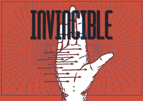
Persuasion Triggers In Web Design
How do you make decisions? If you’re like most people, you’ll probably answer that you pride yourself on weighing the pros and cons of a situation carefully and then make a decision based on logic. You know that other people have weak personalities and are easily swayed by their emotions, but this rarely happens to you. You’ve just experienced the fundamental attribution error — the tendency to believe that other people’s behaviour is due to their personality (“Josh is late because he’s a disorganised person”) whereas our behaviour is due to external circumstances (“I’m late because the directions were useless”).

Cognitive biases like these play a significant role in the way we make decisions so it’s not surprising that people are now examining these biases to see how to exploit them in the design of web sites. I’m going to use the term ‘persuasion architects’ to describe designers who knowingly use these techniques to influence the behaviour of users. (Many skilled designers already use some of these psychological techniques intuitively — but they wouldn’t be able to articulate why they have made a particular design choice. The difference between these designers and persuasion architects is that persuasion architects use these techniques intentionally).
Why User Experience Cannot Be Designed
A lot of designers seem to be talking about user experience (UX) these days. We’re supposed to delight our users, even provide them with magic, so that they love our websites, apps and start-ups. User experience is a very blurry concept. Consequently, many people use the term incorrectly. Furthermore, many designers seem to have a firm (and often unrealistic) belief in how they can craft the user experience of their product. However, UX depends not only on how something is designed, but also other aspects. In this article, I will try to clarify why UX cannot be designed.

I recently visited the elegant website of a design agency. The website looked great, and the agency has been showcased several times. I am sure it delivers high-quality products. But when it presents its UX work, the agency talks about UX as if it were equal to information architecture (IA): site maps, wireframes and all that. This may not be fundamentally wrong, but it narrows UX to something less than what it really is.
A Design Is Only As Deep As It Is Usable
There are well-known proverbs that imply (or state outright) that beauty is superficial and limited in what it can accomplish. “It’s what’s inside that counts” and “Beauty is only skin deep” are a few simple examples. Because the Web design industry is now flooded with a lot of raw talent, and because virtually anyone can create a “beautiful” website, recognizing a truly beautiful website experience is becoming increasingly difficult. What appears beautiful to the eye might in fact be more of a hindrance.
In this article, I hope to provide a clear demarcation between what is perceived by most to be beautiful in Web design and what is truly beautiful, along with some guiding principles to help designers today create websites whose beauty is not superficial, but rather improves and enhances the user experience.
The Elements Of Navigation
When users look for information, they have a goal and are on a mission. Even before you started to read this article, chances are you did because you either had the implicit goal of checking what’s new on Smashing Magazine, or had the explicit goal of finding information about “Navigation Design”.
This article is about the tiniest of details that goes into creating the main centerpiece of your digital product—the construction of the elements of your navigation. This is the most important aid you can possibly give to your users as they are constantly seeking a reason to walk out on you.
Redefining Hick’s Law
Hick’s Law has always been a popular reference point for designers. You’ll find it cited in the endless lists of basic laws and principles that all designers should be familiar with. Given our assumed comfort level with this design cornerstone, I am surprised to see so many people getting it wrong.
What we think we understand about Hick’s Law as it pertains to Web design is oversimplified and incomplete. We need to more deeply investigate what Hick’s Law can do for Web design. In the end, we will see why this design principle is undervalued, and we will see how we have been designing incorrectly for the user’s decision-making process. In order to get there, we need to look at our current approach to Hick’s Law and why it’s wrong.
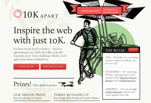
The Path To Advertising Nirvana
With advertising, a curious thing happens: most people want its benefits but are rarely willing to put up with its hassles. Those who run websites and applications have enough on their plates without having to worry about handling transactions, putting banners across their website or hearing requests from advertisers. Moreover, users have little to no interest in even looking at advertisements that flank a website’s content, some going so far as to block ads before they’re delivered. So, what’s a website owner to do?
Advertising hasn’t always been this way. Some people even enjoy them. Scary thought, I know, but stay with me. You know those previews shown before movies and those signs outside of gas stations announcing fuel prices? Those are rarely seen as advertisements at all. That’s because people find them informative, helpful and engaging. Heck, some people say they watch the Superbowl for the advertisements themselves. So why are websites any different? What has changed online that people (apparently) find less acceptable than offline? Not much, really… well, not much unless you count that whole “Internet” thing.
As a general rule, when people surf the Web, they’re in control of the experience. If someone wants information about a particular topic, they might query Google or look up an article on Wikipedia. Regardless of what they do, they choose how to obtain the information they want. The traditional advertising model — shout at your audience until it listens (as Groundswell would put it) — is diametrically opposed to this.
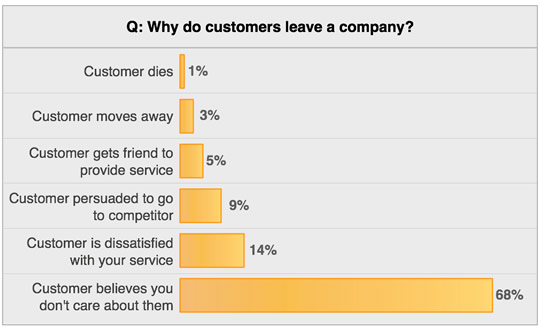
Taking A Customer From Like To Love: The UX Of Long-Term Relationships
User experience designers are great at making software friendly and usable for new customers. We design clean, clear sign-up forms, smooth on-boarding experiences, and even helpful blank slates once users are inside the app. Once customers have used the software for some time and have integrated it in their workflow, their relationship with the software becomes more complex. UX designers have no stencils for designing “how the customer feels about the software after six months.” This matters because the software-as-a-service (SaaS) model depends on loyalty, on the idea that customers won’t flinch when they see your monthly charge.
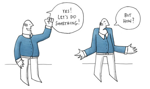
Stop Designing Pages And Start Designing Flows
For designers, it’s easy to jump right into the design phase of a website before giving the user experience the consideration it deserves. Too often, we prematurely turn our focus to page design and information architecture, when we should focus on the user flows that need to be supported by our designs. It’s time to make the user flows a bigger priority in our design process.
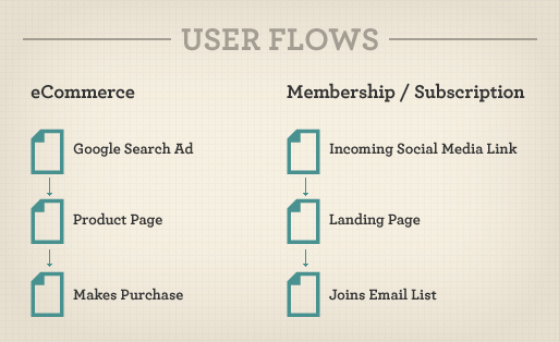
Design flows that are tied to clear objectives allow us to create a positive user experience and a valuable one for the business we’re working for. In this article, we’ll show you how spending more time up front designing user flows leads to better results for both the user and business. Then we’ll look in depth at a common flow for e-commerce websites (the customer acquisition funnel), as well as provide tips on optimizing it to create a complete customer experience.
Inclusive Design
We’ve come a long way since the days of the first Macintosh and the introduction of graphical user interfaces, going from monochrome colors to millions, from estranged mice to intuitive touchscreens, from scroll bars to pinch, zoom, flick and pan. But while hardware, software and the people who use technology have all advanced dramatically over the past two decades, our approach to designing interfaces has not. Advanced technology is not just indistinguishable from magic (as Arthur C. Clarke said); it also empowers us and becomes a transparent part of our lives. While our software products have definitely empowered us tremendously, the ways by which we let interfaces integrate with our lives has remained stagnant for all these years.
In the accessibility industry, the word “inclusive” is relatively commonplace; but inclusive design principles should not be reserved for the realm of accessibility alone, because they apply to many more people than “just” the lesser-abled. Interface designers frequently think in binary terms: either all of the interface is in front of you or none of it is. But people are not binary. People aren’t either fully disabled or not at all, just like they aren’t merely old or young, dumb or smart, tall or short. People sit along a vast spectrum of who they are and what they are like; the same is true when they use interfaces, except that this spectrum is of expertise, familiarity, skill, expectations and so on.
So, why do we keep creating interfaces that ignore all of this? It’s time for us to get rid of these binary propositions!
Gamification And UX: Where Users Win Or Lose
The gaming industry is huge, and it can keep its audience consumed for hours, days and even weeks. Some play the same game over and over again — and occasionally, they even get out their 15-year-old Nintendo 64 to play some Zelda.
Now, I am not a game designer. I actually don’t even play games that often. I am, though, very interested in finding out why a game can keep people occupied for a long period of time, often without their even noticing that they’ve been sitting in front of the screen for hours. I want my apps and products to affect my visitors in the same way.
In this article, we’ll explore how and when to use gamification to improve the user experience of websites and apps, and also when not to use it.
Better User Experience With Storytelling – Part One
Stories have defined our world. They have been with us since the dawn of communication, from cave walls to the tall tales recounted around fires. They have continued to evolve with their purpose remaining the same; To entertain, to share common experiences, to teach, and to pass on traditions.
Today we communicate a bit differently. Our information is fragmented across various mass-media channels and delivered through ever-changing technology. It has become watered down, cloned, and is churned out quickly in 140-character blurbs. We’ve lost that personal touch where we find an emotional connection that makes us care.

Using storytelling, however, we can pull these fragments together into a common thread. We can connect as real people, not just computers. In this article we’ll explore how user experience professionals and designers are using storytelling to create compelling experiences that build human connections.
Better User Experience With Storytelling, Part 2
In the first part of this Better User Experience With Storytelling series, we explored some of the basic structures and story patterns found in myths and religions. We saw how these patterns continued into modern stories such as The Matrix and Star Wars. We also explored some of the basics of bringing storytelling into the user experience process and some places to get started.

Concluding this two-part article, we hear from creative professionals who are leading the way in this relatively new world of combining the craft of storytelling with user experience. We’ll also see how storytelling can be applied to more than just interactive experiences: we find it in everything from packaging to architecture.
Designing The Well-Tempered Web
As technology evolves, so does the art and craft of Web design. New technology creates new challenges, which require new solutions. Often we’re working in uncharted territory, where the solutions demanded really are new. Other times, we’re faced with problems of a more universal nature, problems that have a history.

Given the limited history of Web design, we have to look beyond our immediate domain for answers to the more challenging questions. We do this all the time when we draw on the rich history of graphic design and visual arts. But we’re not limited to sibling disciplines. If we can identify the abstractions and patterns that constitute our challenges, we can look to any source for guidance. We can look to a seemingly unrelated field, such as psychology or music. We can even look to an episode from the early 18th century about Johann Sebastian Bach.
In this article we’ll look at what Bach has to do with modern Web challenges — Particularly the challenge of designing for devices with diverse attributes and capabilities.
Lean UX: Getting Out Of The Deliverables Business
User experience design for the Web (and its siblings, interaction design, UI design, et al) has traditionally been a deliverables-based practice. Wireframes, site maps, flow diagrams, content inventories, taxonomies, mockups and the ever-sacred specifications document (aka “The Spec”) helped define the practice in its infancy. These deliverables crystallized the value that the UX discipline brought to an organization.
Over time, though, this deliverables-heavy process has put UX designers in the deliverables business — measured and compensated for the depth and breadth of their deliverables instead of the quality and success of the experiences they design. Designers have become documentation subject matter experts, known for the quality of the documents they create instead of the end-state experiences being designed and developed.
10 Useful Usability Findings And Guidelines
Everyone would agree that usability is an important aspect of Web design. Whether you’re working on a portfolio website, online store or Web app, making your pages easy and enjoyable for your visitors to use is key. Many studies have been done over the years on various aspects of Web and interface design, and the findings are valuable in helping us improve our work. Here are 10 useful usability findings and guidelines that may help you improve the user experience on your websites.
A study by UX Matters found that the ideal position for labels in forms is above the fields. On many forms, labels are put to the left of the fields, creating a two-column layout; while this looks good, it’s not the easiest layout to use.
Why is that? Because forms are generally vertically oriented; i.e. users fill the form from top to bottom. Users scan the form downwards as they go along. And following the label to the field below is easier than finding the field to the right of the label.
10 Principles Of Effective Web Design
Usability and the utility, not the visual design, determine the success or failure of a web-site. Since the visitor of the page is the only person who clicks the mouse and therefore decides everything, user-centric design has established as a standard approach for successful and profit-oriented web design. After all, if users can’t use a feature, it might as well not exist.
We aren’t going to discuss the implementation details (e.g. where the search box should be placed) as it has already been done in a number of articles; instead we focus on the main principles, heuristics and approaches for effective web design — approaches which, used properly, can lead to more sophisticated design decisions and simplify the process of perceiving presented information.
In order to use the principles properly we first need to understand how users interact with web-sites, how they think and what are the basic patterns of users’ behavior.
Five More Principles Of Effective Web Design
Web design has significantly improved over the last years. It’s more user-friendly and more appealing today — and there is a good reason behind it: over the years we’ve found out that design with focus on usability and user experience is just more effective. Modern cut-edge design isn’t filled with loud happy talk and blinking advertisements. We’ve learnt to initiate the dialogue with visitors, involve them into discussions and gain their trust by addressing their needs and speaking with them honestly and directly.
Few weeks ago we’ve presented 10 Principles Of Effective Web Design — a comprehensive article about effective Web design and provided you with insights about how users actually think as well as with some examples of how effective designs can be achieved.
This article highlights 5 further principles, heuristics and approaches for effective Web design — approaches which, used properly, can lead to more sophisticated design decisions and simplify the process of perceiving presented information.
Improve The User Experience By Tracking Errors
It’s easy to see your top-visited pages, navigation patterns and conversion metrics using visitor-tracking tools like Google Analytics. However, this data doesn’t show the roadblocks that users typically run into on your website. Tracking and optimizing error messages will help you measurably improve your website’s user experience. We’ll walk through how to add error tracking using Google Analytics, with some code snippets. Then, we’ll assemble the data and analyze it to figure out how to improve your error message drop rates.
9 Common Usability Mistakes In Web Design
By now, all good designers and developers realize the importance of usability for their work. Usable websites offer great user experiences, and great user experiences lead to happy customers. Delight and satisfy your visitors, rather than frustrate and annoy them, with smart design decisions. Here are 9 usability problems that websites commonly face, and some recommended solutions for each of them.
Hyperlinks are designed to be clicked, so to make them usable, it makes sense to ensure that they’re easy to click. Why would we want a larger clickable area? Simple. Because our hand movement with the mouse isn’t very precise. A large clickable area makes it easier to hover the mouse cursor over the link. To ensure we get a large clickable area, we could either make the whole link bigger or increase the padding around the link using the CSS “padding” property.
10 Usability Nightmares You Should Be Aware Of
Sometimes you just want to get the information you’re after, save it and move along. And you can’t. Usability nightmares — which are rather the daily routine than an exception — appear every now and again; usually almost every time you type your search keywords in Google. In his article Why award-winning websites are so awful” Gerry McGovern points out that “the shiny surface wins awards, real substance wins customers” and that is absolutely true.
In this article we take a look at some of the usability nightmares you should avoid designing functional and usable web-sites. At the end of the article you’ll also find 8 usability check-points you should probably be aware of.
30 Usability Issues To Be Aware Of
You don’t have to agree upon everything. As a professional web developer you are the advocate of your visitors’ interests and needs; you have to protect your understanding of good user experience and make sure the visitors will find their way through (possibly) complex site architecture. And this means that you need to be able to protect your position and communicate your ideas effectively — in discussions with your clients and colleagues. In fact, it’s your job to compromise wrong ideas and misleading concepts instead of following them blindly.
![]()
In this article we present 30 important usability issues, terms, rules and principles which are usually forgotten, ignored or misunderstood. What is the difference between readability and legibility? What exactly does 80⁄20 or Pareto principle mean? What is meant with minesweeping and satisficing? And what is Progressive Enhancement and Graceful Degradation? OK, it’s time to dive in.
12 Useful Techniques For Good User Interface Design
Last week, we presented 10 Useful Web Application Interface Techniques, the first part of our review of useful design trends in modern Web applications. Among other things, we highlighted embedded video blocks, specialized controls and context-sensitive navigation. We also encouraged designers to disable pressed buttons, use shadows around modal windows and link to the sign-up page from the log-in page.
This post presents the second part of our review: 12 useful techniques for good user interface design in Web apps. We also discuss how to implement these techniques so that they are properly used. Please feel free to suggest further ideas, approaches and coding solutions in the comments below.
10 Useful Techniques To Improve Your User Interface Designs
Web design consists, for the most part, of interface design. There are many techniques involved in crafting beautiful and functional interfaces. Here’s my collection of 10 that I think you’ll find useful in your work. They’re not related to any particular theme, but are rather a collection of techniques I use in my own projects. Without further ado, let’s get started.
Links (or anchors) are inline elements by default, which means that their clickable area spans only the height and width of the text. This clickable area, or the space where you can click to go to that link’s destination, can be increased for greater usability. We can do this by adding padding and, in some cases, also converting the link into a block element.
10 Useful Web Application Interface Techniques
More and more applications these days are migrating to the Web. Without platform constraints or installation requirements, the software-as-a-service model looks very attractive. Web application interface design is, at its core, Web design; however, its focus is mainly on function. To compete with desktop applications, Web apps must offer simple, intuitive and responsive user interfaces that let their users get things done with less effort and time.
In the past we didn’t cover web applications the way we should and now it’s time to take a closer look at some useful techniques and design solutions that make web-applications more user-friendly and more beautiful. This article presents the first part of our extensive research on design patterns and useful design solutions in modern web applications. Below you’ll find a collection of 10 useful interface design techniques and best practices used in many successful web-applications.
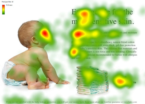
An Extensive Guide To Web Form Usability
Contrary to what you may read, peppering your form with nice buttons, color and typography and plenty of jQuery plugins will not make it usable. Indeed, in doing so, you would be addressing (in an unstructured way) only one third of what constitutes form usability.
In this article, we’ll provide practical guidelines that you can easily follow. These guidelines have been crafted from usability testing, field testing, website tracking, eye tracking, Web analytics and actual complaints made to customer support personnel by disgruntled users.
Innovative Techniques To Simplify Sign-Ups and Log-Ins
There are many ways to design sign-up and log-in forms. Most designers are familiar with the conventional ways. But understanding and applying a few innovative techniques could make your forms simpler and more efficient to fill out. In this article, we’d like to present a couple of new ideas that might be useful for your next designs. Please notice that before using these techniques, you should make sure that they make sense in the context in which you are going to use them. We’d love to hear about your case-studies and usability tests that affirm or dismiss the suggestions proposed below.
The purpose of every sign-up form is for users to complete it successfully and send it in. However, if the form is long and complicated, then the user’s excitement for your website could turn to displeasure. Here are a few innovative techniques that will make your forms faster and easier to fill out.
New Approaches To Designing Log-In Forms
For many of us, logging into websites is a part of our daily routine. In fact, we probably do it so often that we’ve stopped having to think about how it’s done… that is, until something goes wrong: we forget our password, our user name, the email address we signed up with, how we signed up, or even if we ever signed up at all.
These experiences are not just frustrating for us, but are bad for businesses as well. How bad? User Interface Engineering’s analysis of a major online retailer found that 45% of all customers had multiple registrations in the system, 160,000 people requested their password every day, and 75% of these people never completed the purchase they started once they requested their password.
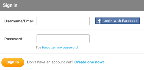
To top it off, visitors who are not logged in do not see a personalized view of a website’s content and recommendations, which reduces conversion rates and engagement. So, log-in is a big deal — big enough that some websites have started exploring new designs solutions for the old problem.
Redesigning The Country Selector
The country selector. It’s there when you create an account for a new Web service, check out of an e-commerce store or sign up for a conference. The normal design? A drop-down list with all of the available countries.
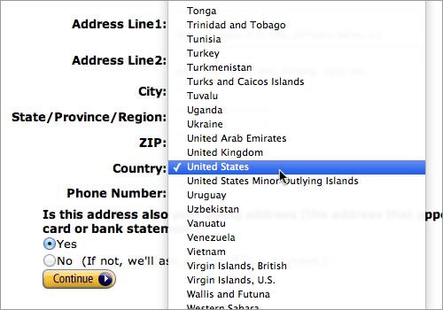
However, when conducting a large session of user testing on check-out usability (which we wrote about here on Smashing Magazine back in April 2011), we consistently found usability issues with the massive country selector drop-downs. Jakob Nielsen reported similar issues as far back as 2000 and 2007 when testing drop-downs with a large number of options, such as state and country lists.
So, this past summer we set out to redesign the country selector. This article focuses on the four design iterations we went through before arriving at the solution (free jQuery plugin included).
Comprehensive Review Of Usability And User Experience Testing Tools
Usability and user experience testing is vital to creating a successful website, and only more so if it’s an e-commerce website, a complex app or another website for which there’s a definite ROI. And running your own user tests to find out how users are interacting with your website and where problems might arise is completely possible.
But using one of the many existing tools and services for user testing is a lot easier than creating your own. Free, freemium and premium tools are out there, with options for most budgets. The important thing is to find a tool or service that works for your website and then use it to gather real-world data on what works and what doesn’t, rather than relying purely on instinct or abstract theories.
Idiots, Drama Queens and Scammers: Improving Customer Service with UX
User experience design isn’t just about building wireframes and Photoshop mock-ups. It extends to areas that you wouldn’t necessarily think are part of the discipline.
For example, your customer service department can have a huge impact on your website’s overall user experience. Similarly, the design of your user experience could have an awfully big effect on your customer service department. Of course, not all of your users will interact with the customer service department, but for those who do, their experience can improve or destroy the customer relationship.
Design To Sell: 8 Useful Tips To Help Your Website Convert
As we see more and more businesses move their services online, and even more that begin their life on the Web, a greater need arises for websites that are designed and built to sell. A great-looking website may achieve the goal of shaping and delivering a strong brand, but its good looks alone aren’t enough to sell the products or services on offer. For that, you need to introduce the element of marketing.
Research shows that objects and images you see around you can prime you for certain behaviors. For example, a study on children showed that after being shown a Santa Claus cap, they were more likely to share candy with others. The cap embodied the concept of sharing and giving in their minds, and exposure to it primed them for regarding sharing more positively. The same study also exposed kids to a “Toys ‘R’ Us” logo, which had the opposite effect of the Santa Claus cap, making them less likely to share their candy.
Fundamental Guidelines Of E-Commerce Checkout Design
Here is the harsh reality of e-commerce websites: according to recent e-commerce studies, at least 59.8% of potential customers abandon their shopping cart (MarketingSherpa puts it at 59.8%, SeeWhy at 83% and MarketLive at 62.14%). The main question is why do customers abandon their shopping cart so often? Is there some fundamental mistake that designers of e-commerce websites do very often? Are there any common guidelines or rules of thumbs that make it more difficult for our users to purchase products? And is there some meaningful way to improve the conversion rates for our products?
Well, that’s exactly what we wanted to find out. In 2010, we recruited a batch of Web users and conducted a usability study, focusing only on the checkout user experience, from “Cart” to “Completed order.” The study was conducted using the “think aloud” protocol and was documented by recording everything that happened on the computer screen. The behavior of the test subjects was then analyzed by scrutinizing these recordings at a later date.
Improving The Online Shopping Experience, Part 1: Getting Customers To Your Products
Amazon turned sweet sixteen this year, and, by extension, so did online shopping as we know it. As online shopping has grown over the past 16 years, so have user needs and expectations related to the online shopping experience. Setting up shop online is easy, but creating an experience that satisfies target users is a different story altogether.
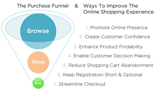
In the traditional journey of a purchase, commonly depicted as a funnel, a business loses potential customers as they move closer to the purchasing stage. While this is natural and expected, improving the user experience can reduce this loss by removing unnecessary barriers to shopping online.
The guidelines, techniques and best practices in this two-part series address common user experience issues on e-commerce websites. They are intended as a starting point; books have been written on many of these topics, and a few are recommended at the end. Improving the user experience requires a good understanding of your users and their goals on your website. Use that lens as you read through, to see which of the techniques will improve the online shopping experience for your users.
This first part covers the upper part of the funnel: getting customers to your website and helping them find your products. Part 2 will address the lower part of the funnel: guiding customers through the decision-making process and check-out.
Improving The Online Shopping Experience, Part 2: Guiding Customers Through The Buying Process
Part 1 of “Improving the Online Shopping Experience” focused on the upper part of the purchase funnel and on ways to get customers to your website and to find your products. Today, we move down the funnel, looking at ways to enable customers to make the decision to buy and to guide them through the check-out process.
Clear Indications That It’s Time To Redesign
Redesign. The word itself can send shudders down the spines of any Web designer and developer. For many designers and website owners, the imminent onslaught of endless review cycles, coupled with an infinite number of “stakeholders” and their inevitable “opinions,” would drive them to shave their heads with a cheese grater if given a choice between the two. Despite these realities, redesigns are a fact of any online property’s life cycle. Here are five key indications that it’s time to redesign your website and of how extensive that redesign needs to be.
Stop Redesigning And Start Tuning Your Site Instead
In my nearly two decades as an information architect, I’ve seen my clients flush away millions upon millions of dollars on worthless, pointless, “fix it once and for all” website redesigns. All types of organizations are guilty: large government agencies, Fortune 500s, not-for-profits and (especially) institutions of higher education.
Worst of all, these offending organizations are prone to repeating the redesign process every few years like spendthrift amnesiacs. Remember what Einstein said about insanity? (It’s this, if you don’t know.) It’s as if they enjoy the sensation of failing spectacularly, publicly and expensively. Sadly, redesigns rarely solve actual problems faced by end users.
I’m frustrated because it really doesn’t have to be this way. Let’s look at why redesigns happen, and some straightforward and inexpensive ways we might avoid them.
The Data-Pixel Approach To Improving User Experience
There are many ways to skin a redesign (I think that’s how the saying goes). On a philosophical level, I agree with those who advocate for realigning, not redesigning, but these are mere words when you’re staring a design problem in the face with no idea where to start. This article came out of my own questions about how to make the realignment philosophy practical and apply it to my day-to-day work?—?especially when what’s needed is more than a few tweaks to the website here and there.

I propose an approach to redesign through realignment, by using a framework adapted from Edward Tufte’s principles on the visual display of quantitative information.


