Web Design Elements: Examples And Best Practices

Email Newsletter
Weekly tips on front-end & UX.
Trusted by 200,000+ folks.


 Register!
 Flexible CMS. Headless & API 1st
This overview features a hand-picked and organized selection of the most useful and popular Smashing Magazine’s articles featuring various building blocks of a website and published here over all the years.
Quick Overview
- Call-to-Action Buttons
- Image Caption Design
- Breadcrumbs Design
- The Holy Search Box
- “Read More” And “Continue Reading” Links
- Shopping Carts Gallery
- Progress Trackers
- Building An Effective ‘Coming Soon’ Page
- Designing “Coming Soon” Pages
- Maps In Modern Web Design
- Pricing Tables
- Search Results Design
- Block Quotes and Pull Quotes
- Date Stamps And Calendars
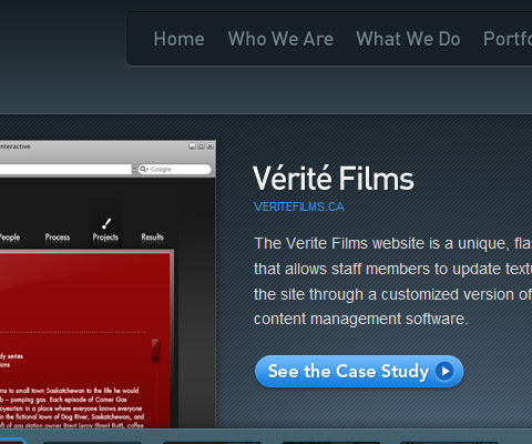
- Case Studies in Design Portfolios
- “Meet the Team” Pages
- “About me”-Pages
- Effective Maintenance Pages
- Defensive Web Design
- 404 Error Pages, One More Time
- 404 Error Pages: Reloaded
- Wanted: Your 404 Error Pages
Call-to-Action Buttons: Examples and Best Practices
Call-to-action in web design — and in user experience (UX) in particular — is a term used for elements in a web page that solicit an action from the user. The most popular manifestation of call-to-action in web interfaces comes in the form of clickable buttons that when clicked, perform an action (e.g. “Buy this now!”) or lead to a web page with additional information (e.g. “Learn more…”) that asks the user to take action.
How can we create effective call-to-action buttons that grab the user’s attention and entice them to click? We’ll try to answer this question in this post by sharing some effective design techniques and exploring some examples.
Image Caption Design: Techniques and Trends
Image captions are an often-overlooked element of Web design. They’re often thought of more in terms of function than form. As long as they include the proper photo credits or identifying information about the image subject, not much more thought is given to them.
But image captions are a great place to add a bit more style to your website or to give some unique insight into the subject of the image. Whether the captions are for photos on a news website or design samples in a portfolio, they present an opportunity for reinforcing the overall look of the website. When done properly, they can even add more visual interest and become a distinguishing trademark of a particular brand or website.
There are two basic kinds of photo captions. There is the simple, minimalist, down-to-business style. These usually have a simple sans-serif font in white, black or shades of gray. They are usually positioned either to the side or below an image, though sometimes they overlay or are above it. This type is commonly found on news websites but is also seen in portfolios and other websites.
The other major style is more graphic. This often include effects, such as the caption only appearing on a mouse-over or a “Details” button displayed that leads to the full caption. While fonts are still generally sans-serif, much more color is used, and the captions are often overlaid on the actual image. These types of image captions are generally seen on portfolio websites of designers and ad agencies. Of course, there are websites that use a crossover-type image caption, displaying elements of both styles.
Breadcrumbs In Web Design: Examples And Best Practices
On websites that have a lot of pages, breadcrumb navigation can greatly enhance the way users find their way around. In terms of usability, breadcrumbs reduce the number of actions a website visitor needs to take in order to get to a higher-level page, and they improve the findability of website sections and pages. They are also an effective visual aid that indicates the location of the user within the website’s hierarchy, making it a great source of contextual information for landing pages.
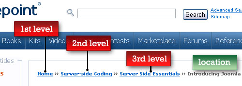
A “breadcrumb” (or “breadcrumb trail”) is a type of secondary navigation scheme that reveals the user’s location in a website or Web application. The term comes from the Hansel and Gretel fairy tale in which the two title children drop breadcrumbs to form a trail back to their home. Just like in the tale, breadcrumbs in real-world applications offer users a way to trace the path back to their original landing point.
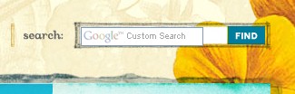
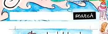
Designing The Holy Search Box: Examples And Best Practices
On content-heavy websites, the search box is often the most frequently used design element. From a usability point of view, irritated users use the search function as a last option when looking for specific information on a website. If a website’s content is not organized properly, an efficient search engine is not only helpful but crucial, even for basic website navigation. In fact, search is the user’s lifeline to mastering complex websites. The best designs offer a simple search box on the home page and play down advanced search and scoping.

In practice, websites tend to grow over time, adding new content and, more importantly for us, adding new navigation options, such as additional content sections. However, these new content islands do not necessarily fit the whole information architecture that was well-designed and thoroughly structured when the website was initially designed. The consequence is a poor navigation scheme that is more irritating than helpful, because the content appears to be scattered all over the place instead of contained in separate, very distinct folders (in fact, this is a problem we encountered here at Smashing Magazine recently).
Designing “Read More” And “Continue Reading” Links
Most bloggers and website designers understand how difficult it can be to attract visitors to a website. In fact, most websites have just moments to attract potential readers. Several factors contribute to how well a website attracts its readers. These factors include well-written headlines, interesting content and design quality. While all of these aspects are important, today we will focus on a very specific and sometimes overlooked element in a website’s design: the “Read more” or “Continue reading” link that follows a headline or summary of an article.
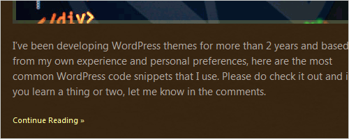
Every website has its own way of asking readers to click on an article link. Some websites have very prominent links, others are a bit subtler. Either way, website and user interface designers have thought up some very creative and innovative ways of inviting readers to read on. In this showcase, we will present 45 websites that have excellent “Read more” and “Continue reading” links in their design. Hopefully, these websites will serve as inspiration for your future projects or at least remind you not to ignore this important design element.
Shopping Carts Gallery: Examples And Good Practices
Imagine that you are designing an online-store. Since stakeholders are only interested in the number of sells, the success of your work directly depends on how well you manage to drive users to the “Checkout”-button. In this case you might want to consider some design approaches which will set you apart from your competitors. After all, the probability that they’ve done it wrongly is extremely high.
One of the simplest examples of flawed design decisions is the incorrect use of the shopping cart icon — a traditional icon which stands for the virtual holding place for any products of the store. Used properly, this little yet powerful element can help users to buy a product as quickly and painless as possible. As such, it is essential for the purchasing procedure and therefore deserves to be considered carefully during the design process.
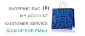

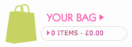
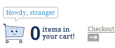
In this post we present attractive, creative and user-friendly shopping carts, bags, trolleys, buckets and baskets — any kind of carts as they are used in the online-stores. Besides, we also cover related creative ideas, design approaches and usability guidelines.
Progress Trackers In Web Design: Examples And Best Practices
When designing a large website, especially one that contains a store, you may be required to design a system for ordering online, or a multi-step process of another sort. Walking users through this process by making it easy and intuitive is key to helping increase conversion rates. Any frustration along the way may cause them to leave and pursue other options. Progress trackers are designed to help users through a multi-step process and it is vital that such trackers be well designed in order to keep users informed about what section they are currently on, what section they have completed, and what tasks remain.


In this article we will look at various uses of progress trackers and see how they’ve been implemented, what they are doing well, and what they are not doing well.
You may not be familiar with the term ‘progress tracker’, also called a ‘progress indicator’ — but chances are good that you have encountered one at one time or another. They are used in online stores when placing an order, signing up to an online product or service, or even when booking a holiday online. Progress trackers guide the user through a number of steps in order to complete a specified process.
Building An Effective ‘Coming Soon’ Page For Your Product
I recently had to design a couple of teaser pages for a client and a personal project, and this led me to think about what exactly makes for a good teaser page — or to be more precise a “coming soon” page that companies often put up before they’re ready to launch their product. After careful research and many scientific tests in the brand new field of teaserology, I’ve developed a patented Teaser Effectiveness Analysis Matrix™, consisting of four elements.
The perfect teaser page must score high on all four axis of the following: memorability, virality, desirability and data collection-ability. I know that “data collection-ability” is not proper English, but inventing new words is one of the perks of being a scientist. As we’ll see, most teaser pages focus strongly on two or three of these elements but rarely hit all four.
Designing “Coming Soon” Pages
Deciding what to do once you’ve purchased a domain but haven’t yet launched the website is always a bit of a conundrum. Leaving up your domain registrar or Web host’s generic page seems unprofessional, especially if you’re trying to drum up advance press for your new project. At the same time, you don’t want to spend too much time on a temporary page when you really should be working on the website itself.
The best thing to do is create a simple “Coming soon” page to notify visitors of what will eventually be there. Good “Coming soon” pages come in two basic varieties: the informational design, which simply tells visitors what will be there after launch; and the page that invites early visitors to sign up for updates or even to request a beta (or alpha) invitation. Below are some great examples of each, followed by some best practices for creating your own “Coming soon” page. You definitely won’t see among these the generic “Under construction” page (with the cute construction graphic) that used to litter the Web.
Maps In Modern Web Design: Showcase And Examples
Geo-location was a hot topic in 2009. With so many applications on GPS-enabled smartphones, more maps than ever were accessible to the average person. But how can Web designers and developers take advantage of an increasingly location-aware user base? This article explores existing trends, conventions and the possible future of interactive maps online.
When most people think of maps on the Internet, Google, MapQuest and TomTom might come to mind. These are the giants in the industry, but they are far from the most creative. These companies provide maps as a service. As you’ll see from the mapping applications featured throughout this article, Google doesn’t own the market. There is still plenty of room for creative map innovation.
Pricing Tables: Examples And Best Practices
Pricing tables play an important role for every company that offers products or services. They are a challenge from both a design and usability standpoint. They must be simple but at the same time clearly differentiate between features and prices of different products and services.
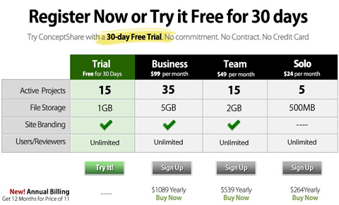
A pricing table should help users pick the most appropriate plan for them. A company should carefully examine its product portfolio and pick the most important features to present in its pricing plans. Visitors should be given only the information they would be interested in: available features, options and costs. The rule of thumb is: every unnecessary cell in your pricing table increases the probability of losing potential customers, because you make it more difficult for them to compare various plans and select the best one.
Once you have identified the most important features, go ahead and create a more detailed list of features for users who are interested in a particular plan. Users must know what kind of a product they are spending their money on and all of the features associated with it.
Search Results Design: Best Practices And Design Patterns
If you’ve been assigned to design or provide the architecture for a large e-commerce project or other information-heavy website whose success depends on content findability, it is vital that the design and layout of the search functionality for that website is considered carefully.
The search results page is the prime focus of the search experience, and can make or break a site’s conversion rates. Therefore, bridging the gap between a user and the content or products they seek is a crucial factor in the success of any large website. The responsibility to design an effective search results page is best considered after a thorough examination of some of the features and functions found on search results pages from a number of popular niches.
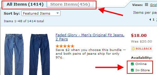
In this article, we’ll look at a number of trends and practices incorporated on a variety of websites. From this examination, we’ll conclude with a summary of the best practices learned from the examples those sites have set.
Block Quotes And Pull Quotes: Examples And Good Practices
Quotes are used to emphasize excerpts of text. Since users almost never read but scan we need to provide them with some focus anchors to fix their attention to the most important parts of our articles. Furthermore, quotes are always used for testimonials and sometimes for blog comments. They can be styled using graphics, CSS and a little bit of JavaScript. Sometimes, creative dynamic solutions can be applied as well.
This post presents creative examples and best practices for design of pull quotes. We’ve tried to identify some common solutions and interesting approaches you may want to use or develop further in your projects.
Gallery Of Date Stamps And Calendars
Designer’s attention to small details often has a significant impact on how visitors perceive the overall design of a web-site. Although users’ main focus usually lies on finding information, it’s nice to find the content being supported by finest visual details. This holds for favicons, shopping carts, pagination and tag clouds we’ve covered in our earlier posts. But it also holds for… well, date stamps and calendars. Apparently, the latter are used not only in weblogs, but also on large web-sites where events, news and any kind of time-planning is involved.
 |  |  |
In such designs a tear-off calendar is often used to symbolize the date in a most intuitive way. However, it’s not always the case. In fact, designers seem to experiment with a number of different approach one wouldn’t really expect from such a tiny design element. Out collection of appealing and interesting calendar icons and date stamps is supposed to prove it. It might provide you with some fresh ideas once you need to design some original date stamp, but don’t know where to start from. All images are clickable.
Some of presented examples may not look nice at the first glance, but they all have some idea behind them — an idea you may use and develop further.
Showcase Of Case Studies In Design Portfolios
Portfolio websites are critical for designers who want to get exposure for their work and attract new clients. While all portfolio sites will showcase the work of the designer, some have chosen to provide additional information about the project through case studies.
In this post we will be featuring more than 30 portfolio sites to show how they are using case studies from their own design projects to communicate with potential clients. Not all of them are referred to as “case studies” on the site, but all provide much more information than just giving a screenshot with the client’s name.
If you are considering ways to make your existing work more relevant or appealing to visitors who may be potential clients, providing case studies is one option. Take a look at the sites featured here and you may come up with some ideas of how they could be used on your own site.
“Meet The Team” Pages: Examples And Trends
In any industry where the people behind a company are as important as the company itself, you’re likely to find a kind of expanded “about” page that includes information on individual employees. “Meet the Team” pages are popular among web design and other creative firms, but are also found on sites within various other industries. These pages are a valuable addition to any site where human contact is an important part of the industry. It adds a personal touch to the company and can lend trust to visitors.
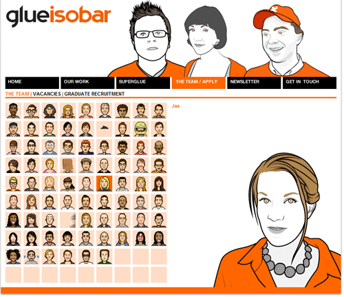
There’s suddenly faces behind the names, and it becomes a “real” company to the visitor, rather than just another website. This builds credibility for many, especially considering how concerned many people are with online scams and phishing schemes. Adding information to a website on a company’s key employees is a simple but effective way to make that company stand out in the mind of its prospective clients. Below are a handful of trends and some interesting examples of “Meet the Team” pages.
Best Practices For Effective Design Of “About me”-Pages
The “about me”-page is one of the most overlooked pages in development and one of the highest ranked pages on many websites. In a world that’s becoming increasingly connected through the Web, it’s important that you engage your audience in a personal and friendly way, otherwise you risk just being another faceless web designer among a sea of websites.
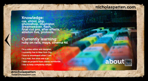
We had to go through hundreds of sites to come up with the following list. It seems most designers and developers run out of steam by the time they got around to developing their about pages. Most designers we came across simply threw up a few hastily written words about themselves instead of treating the page as an important asset. Others, however, have truly taken the time to treat their about page as if it were important as the home page. In fact, some went as far as using their about pages as their home page.
We present 60 beautiful and effective about pages that engage users and neatly present their designers. We also examine the growing trend of Business Card Websites (BCW’s).
Effective Maintenance Pages: Examples And Best Practices
Every website has to perform maintenance at some point or another. Whether it’s just to upgrade a portion of the site or because of some problem with the site, it’s an inevitable fact of website ownership. And in many cases, maintenance requires taking your site offline for at least a few minutes.
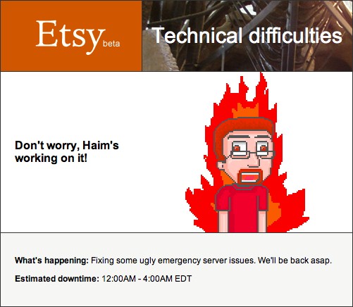
So what should you do if your site is going to be down for maintenance? You don’t want users coming to a 404 or other error page. And hopefully you’d like to encourage them to come back to your site sooner rather than later, right? If that’s the case, you’ll need to build a custom maintenance page. Below we present a list of best practices to building effective maintenance pages that will help keep your visitors, whether new or returning, happy.
Getting Started With Defensive Web Design
Nothing ruins a great website UI like people using it. At least, it often feels that way. You put in days or weeks building the interface, only to find that a vast majority of visitors abandon it partway through the process that it supports. Most of the time, visitors leave because they’ve hit a roadblock: a problem that lets them go no further. They typed their credit card number wrong or clicked the wrong link or mistyped a URL. And it’s not their fault.
A good design assumes that people make mistakes. A bad one leaves visitors stuck at a dead end because they mistyped one character. The best professionals account for this with smart, defensive design strategies (also known as contingency design).
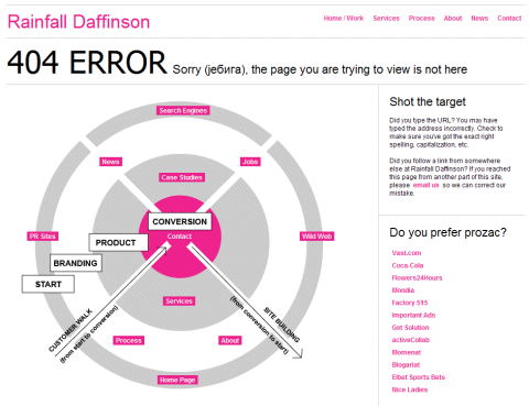
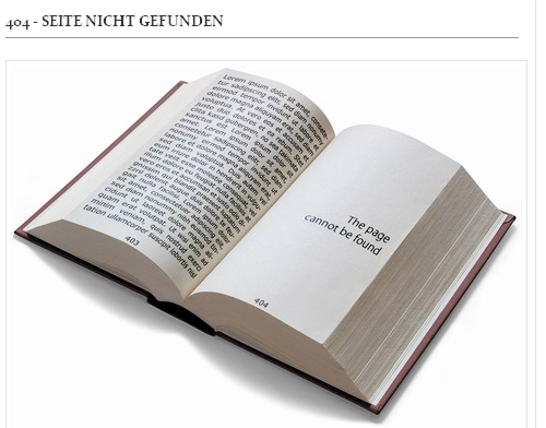
404 Error Pages, One More Time
The design of 404 error pages is often overlooked and underestimated. However, designed carefully, these pages can make a random visitor stay on your website, take a look around and eventually find the information he or she was looking for in the first place. Effective 404 error pages communicate why a particular page couldn’t be displayed and what users can do next. A search box and list of useful resources (possibly related to the missing page) could be helpful in this case.
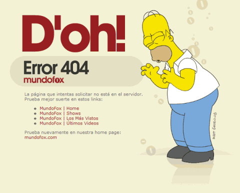
We’ve already covered the design of 404 error pages in previous posts. In them, we also covered some interesting and useful ideas for designing 404 pages. Now, it’s time for a fresh dose of 404-error inspiration. This article presents 50 more examples of beautiful and original 404 error designs. Some of them are beautiful but not user-friendly, others are user-friendly but not really beautiful. Please use these examples as a source of inspiration; hopefully, this showcase has something for everybody.
Also note that some examples used in this post were suggested by our Twitter followers: please follow us on Twitter to vote on which article gets published next, discuss new ideas, get fresh updates and suggest great ideas for our next posts. Thank you.
404 Error Pages: Reloaded
Three weeks ago we’ve showcased some of the most beautiful, creative and user-friendly 404 Error Pages; we’ve collected some interesting ideas one can use to help out the visitors once they got lost ony your page. We’ve also asked our readers to design their own 404 pages and promised to present the best solutions afterwards.
We’ve received over 100 entries. The choice wasn’t easy, so evaluating the quality of the entries we’ve considered - among other things - the communication with visitors, precise and clear navigation, the use of graphics, creative ideas and some outstanding solutions. Some of the solutions presented below might not be as helpful as they could or should be, however they include some creative approaches you should be aware of designing your 404 error pages.
We’d like to thank to everyone who participated, your input means a lot for us and for web-designers worldwide. You help to improve the quality of the Web. Don’t underestimate it.
So here is what you’ve come out with: over 45 working examples of user-friendly, creative and outstanding 404 error pages - in a brief overview.
Wanted: Your 404 Error Pages
Every day you visit one of them. The pages, which don’t exist any longer, have moved to a new server or have never existed at all. Once you’ve missed your intended destination, either through a bad or outdated link, or a typo in the page you were hoping to reach, you’ll hopefully get an internal error message from the server. However, by default these messages aren’t that helpful - after all, you are looking for the information, not for the reason you can’t find this information.
Good news: it doesn’t have to be this way. You can style server error messages just the way you style any other pages. It’s not only a more elegant way to deal with errors, but is also extremely useful for keeping users on your web-site, finding new clients or communicating with the old ones.
We’d like you to create a beautiful, functional and user-friendly 404 error page for your own web-site. We’ll collect the most creative, usable and elegant solutions and review them in one of our next posts.
Further Reading
- 10 Useful Usability Findings and Guidelines
- Web Design Showcases From Various Industries
- Progress Trackers in Web Design: Examples and Best Practices
- Can User Experience Be Beautiful? An Analysis Of Navigation In Portfolio Websites


