Web Form Design: Showcases And Solutions

Email Newsletter
Weekly tips on front-end & UX.
Trusted by 182,000+ folks.
 Custom Web Forms for Angular, React, & Vue. Your backend.
 Celebrating 10 million developers


This overview features a hand-picked and organized selection of the most useful and popular Smashing Magazine’s articles related to Web form design and published here over all the years.
Quick Overview
- Useful Ideas And Guidelines For Good Web Form Design
- Web Form Design: Showcases And Solutions
- Web Form Design: Modern Solutions and Creative Ideas
- An Extensive Guide To Web Form Usability
- In Search Of The Perfect CAPTCHA
- Web Form Validation: Best Practices and Tutorials
- Form-Field Validation: The Errors-Only Approach
- Web Form Design Patterns: Sign-Up Forms
- Web Form Design Patterns: Sign-Up Forms, Part 2
- New Approaches To Designing Log-In Forms
- Innovative Techniques To Simplify Sign-Ups and Log-Ins
- CSS-Based Forms: Modern Solutions
- Forms On Mobile Devices: Modern Solutions
- Removing Stumbling Blocks In Mobile Forms
- Free Download: Cheat Sheet For Designing Web Forms
Useful Ideas And Guidelines For Good Web Form Design
The input form is an essential element of almost any website or application these days. Input is a core method of interaction, and in many cases it represents the hard conversion point between success and failure. With the amount time and effort we put into bringing users to our sign-up and contact forms, it’s surprising that we tend not to spend a proportional amount of time on the forms themselves.
A number of techniques and elements can be used in Web forms to turn them from abject failures into successful conversion points. In this article, we’ll present some interesting examples and useful guidelines for Web form design.
An Extensive Guide To Web Form Usability
Contrary to what you may read, peppering your form with nice buttons, color and typography and plenty of jQuery plugins will not make it usable. Indeed, in doing so, you would be addressing (in an unstructured way) only one third of what constitutes form usability.

In this article, we’ll provide practical guidelines that you can easily follow. These guidelines have been crafted from usability testing, field testing, website tracking, eye tracking, Web analytics and actual complaints made to customer support personnel by disgruntled users.
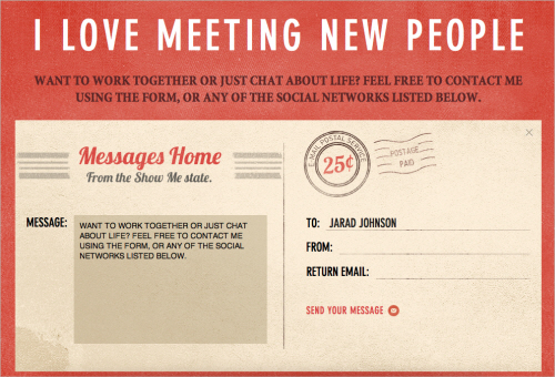
Web Form Design: Modern Solutions And Creative Ideas
Web form is often the main communication channel between visitors and site owners. Feedback is always important which is why it’s necessary to make sure that web forms are easy to understand and intuitive to use. Nevertheless, even in form design one can afford some healthy portion of creativity.
Web forms don’t have to be boring and, using CSS or Flash, you can easily make sure that they are appealing and effective. To get noticed, you need to come up with something unique and interesting — symbols, icons, colors, position or the size of web form are often used to achieve interesting design solutions. We’ve searched for some examples and we’ve found them. Creative, original and unusual web forms.
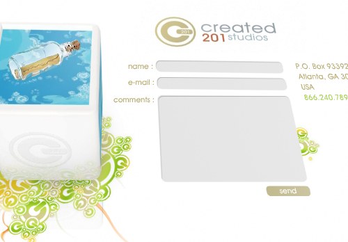
Below we present over 40 (really) beautiful examples of web forms as well as modern solutions and creative ideas related to web form design. Some of the examples are Flash-based; however, in most cases you can easily create similar designs with pure CSS and (X)HTML.
In Search Of The Perfect CAPTCHA
CAPTCHAs, or Completely Automated Public Turing Tests to Tell Computers and Humans Apart, exist to ensure that user input has not been generated by a computer. These peculiar puzzles are commonly used on the Web to protect registration and comment forms from spam. To be honest, I have mixed feelings about CAPTCHAs. They have annoyed me on many occasions, but I’ve also implemented them as quick fixes on websites.
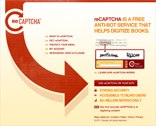
This article follows the search for the perfect solution to the problem of increasing amounts of human-generated spam. We’ll look at how and why CAPTCHAs are used and their effect on usability in order to answer key questions: what is the perfect CAPTCHA, and are they even desirable?
Web Form Validation: Best Practices And Tutorials
Ideally, users will fill the web form with necessary information and finish their job successfully. However, people often make mistakes. This is where web form validation comes into play. The goal of web form validation is to ensure that the user provided necessary and properly formatted information needed to successfully complete an operation. In this article we will go beyond the validation itself and explore different validation and error feedback techniques, methods and approaches.
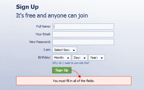
User’s input can be validated on the server and on the client (web browser). Thus we have server-side and client-side validation. We’ll discuss pros and cons of each. In the server-side validation, information is being sent to the server and validated using one of server-side languages. If the validation fails, the response is then sent back to the client, page that contains the web form is refreshed and a feedback is shown.
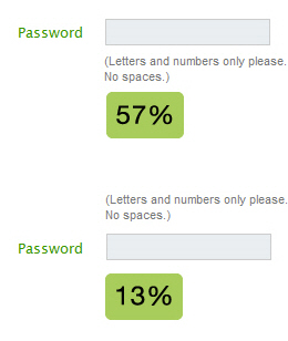
Form-Field Validation: The Errors-Only Approach
Error pages for form-field validation are dreadful. You’ve just filled out 20 form fields, yet you get the same bloated page thrown back in your face because a single field failed to validate.
I clearly recall the often loud sighs of despair during our last usability study each time a test subject encountered a validation error page.
We also noticed that test subjects who had been exposed to validation errors began to take preventive actions to avoid them in subsequent steps, by writing things such as “N/A” in the “Company name” field if in doubt about whether the field was optional.

At Baymard Institute, we reflected on this problem and got an idea that we call “error fields only” — which is exactly what this article is about. Before exploring this idea, let’s look at three traditional types of validation techniques: “same page reload,” “optimized same page reload” and “live inline validation.”
Web Form Design Patterns: Sign-Up Forms
If you want to maximize the revenue of your service you need to maximize completion rates of your web forms. Unless you have some revolutionary ideas to impress your visitors at first glance, it is not enough to simply enable users to sign up on your site. To make it possible for the service to reach a maximal exposure we, designers, need to provide users with a good user experience. We need to invite them, describe to them how the service works, explain to them why they should fill in the form and suggests the benefits they’ll get in return. And, of course, we should also make it extremely easy for them to participate.
However, designing effective web forms isn’t easy. And it has one simple reason: nobody likes to fill in forms — neither offline nor online. Therefore, as designers, we need to figure out sound design decisions to make the form completion easy, intuitive and painless.
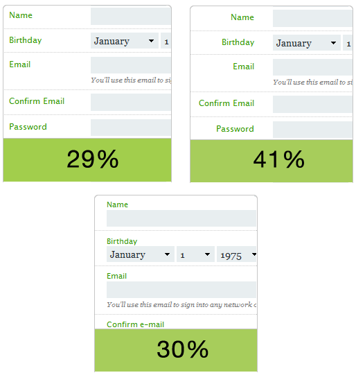
But how exactly can we figure out these decisions? Where should the link to the form be placed in the layout? How should we design it? How should we highlight the labels and how should we align them? How do web form design patterns look like in modern web-sites? These were exactly the questions we’ve asked ourselves. And to get the answers we’ve conducted a survey.
Below we present findings of our survey of current web form design patterns — the results of an analysis of 100 popular web-sites where web-forms (should) matter. We have decided to start with sign-up forms first. We present the first part of our findings below; the second part of the survey results will be published next week.
Update: the second part of the survey results is now also published: Web Form Design Patterns: Sign-Up Forms Part 2.
Web Form Design Patterns: Sign-Up Forms, Part 2
Last week we have presented first findings of our web forms survey. The main objective of the survey was to provide designers and developers with some intuition of how effective web forms are designed; we also presented some guidelines of how an effective and user-friendly web form can be achieved.
We have focused on sign-up forms as we wanted to consider further crucial forms (e.g. checkout forms) separately. Afterwards we’ve gone through each and every one sign-up form of the selected sites and analyzed the design approaches implemented in these forms. Below we present the second part of our findings — the results of our survey among web-forms of 100 popular web-sites where web-forms (should) matter.
Please notice that this post is not about checkout forms — that’s a topic for another discussion, we may consider them separately in one of the upcoming posts. We would like to thank Wufoo for providing us with a framework to conduct our survey.
New Approaches To Designing Log-In Forms
For many of us, logging into websites is a part of our daily routine. In fact, we probably do it so often that we’ve stopped having to think about how it’s done… that is, until something goes wrong: we forget our password, our user name, the email address we signed up with, how we signed up, or even if we ever signed up at all.
These experiences are not just frustrating for us, but are bad for businesses as well. How bad? User Interface Engineering’s analysis 1 of a major online retailer found that 45% of all customers had multiple registrations in the system, 160,000 people requested their password every day, and 75% of these people never completed the purchase they started once they requested their password.

To top it off, visitors who are not logged in do not see a personalized view of a website’s content and recommendations, which reduces conversion rates and engagement. So, log-in is a big deal?—?big enough that some websites have started exploring new designs solutions for the old problem.
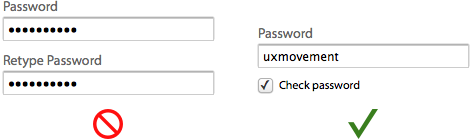
Innovative Techniques To Simplify Sign-Ups and Log-Ins
There are many ways to design sign-up and log-in forms. Most designers are familiar with the conventional ways. But understanding and applying a few innovative techniques could make your forms simpler and more efficient to fill out. In this article, we’d like to present a couple of new ideas that might be useful for your next designs. Please notice that before using these techniques, you should make sure that they make sense in the context in which you are going to use them. We’d love to hear about your case-studies and usability tests that affirm or dismiss the suggestions proposed below.
CSS-Based Forms: Modern Solutions
Registration and feedback forms can be found everywhere. Every start-up tries to attract visitors’ attention, so web-forms are becoming more and more important for the success of any company. In the end, exactly those web-forms are responsible for the first contact with potential customers. Let’s take a look, which modern solutions a web-developer can use, designing his/her next css-based form. Links checked: May/08 2008.
Forms On Mobile Devices: Modern Solutions
Mobile forms tend to have significantly more constraints than their desktop cousins: screens are smaller; connections are slower; text entry is trickier; the list goes on. So, limiting the number of forms in your mobile applications and websites is generally a good idea. When you do want input from users on mobile devices, radio buttons, checkboxes, select menus and lists tend to work much better than open text fields.
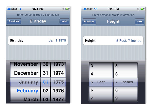
But constraints breed innovation, and mobile forms are no different. The limitations of mobile devices have forced developers and designers to find new ways to allow users to input data faster and more easily. Thanks to the modern solutions covered in this article, the mobile space may not be a place to avoid forms much longer. Instead, it may become the place to encourage them.
Removing Stumbling Blocks In Mobile Forms
A few weeks ago, I was quite surprised when I saw the pavement quickly approaching while I was out for a walk. Laying there stunned, I soon realized what had happened: I fell. Ouch. B-minus. I normally try to be as attentive as possible, but this time a big crack in the pavement caught my shoe and threw me completely off balance.

When it comes to filling out forms on a mobile phone, I have observed many users running into a similar experience, merely less painful in its physical aspect. Many elements within a mobile form affect how smoothly users will get to a service or product hiding behind a form of any kind.
There are several factors that can be considered to be stumbling blocks throughout the journey of filling out a form. Specifically on a portable device, this journey is complicated by the fact that we have to consider contextual parameters such as time, location, or limited input options, in comparison to a firm desktop experience. In this post we will look at the most common stumbling blocks for mobile devices. Moreover, I will discuss design strategies to avoid stumbling blocks and to facilitate a safe and quick stroll through forms for mobile users.
Free Download: Cheat Sheet For Designing Web Forms
Forms, forms, forms: so often overlooked in design. In this post, we are pleased to release the Form Design Cheat Sheet, created by Joe Leech and released for Smashing Magazine and its readers. This crib sheet contains an Omnigraffle template, as well as Photoshop (PSD) and PDF examples for you to download and use as you wish. Print out the sheet, stick it to your wall, send it to clients, and just generally help make everyone’s forms a bit better.

The designers of the crib sheet have spent years designing and testing forms, and they’ve decided to summarize the most common problems and issues that come up in their projects.
Further Reading
You might be interested in the following “Best of” selections as well:
- Web Design Elements: Examples And Best Practices
- Web Design Navigation Showcases
- Usability & User Experience


