Five More Principles Of Effective Web Design

Email Newsletter
Weekly tips on front-end & UX.
Trusted by 182,000+ folks.
 Register for Free
 Custom Web Forms for Angular, React, & Vue. Your backend.
 Celebrating 10 million developers


Web design has significantly improved over the last years. It’s more user-friendly and more appealing today — and there is a good reason behind it: over the years we’ve found out that design with focus on usability and user experience is just more effective. Modern cut-edge design isn’t filled with loud happy talk and blinking advertisements. We’ve learnt to initiate the dialogue with visitors, involve them into discussions and gain their trust by addressing their needs and speaking with them honestly and directly.
Few weeks ago we’ve presented 10 Principles Of Effective Web Design — a comprehensive article about effective Web design and provided you with insights about how users actually think as well as with some examples of how effective designs can be achieved.
This article highlights 5 further principles, heuristics and approaches for effective Web design — approaches which, used properly, can lead to more sophisticated design decisions and simplify the process of perceiving presented information.
Please notice that you might be interested in 30 Usability Issues explains important usability issues, terms, rules and principles which are usually forgotten, ignored or misunderstood.
1. Use An Effective Marketing Principle
In order to sell a product or a service you need to be able to effectively inititate the dialogue with random visitors of your site. Since your visitors have actually come to your site, they are willing to hear to you and learn what you have to offer. So how do you approach this potential clientele to maximize your earning at the end of the month?
Suggested by Strong in 1925, AIDA is the effective marketing model which describes a common list of events that are very often undergone when a person is selling a product or service:
- A - Attention (Awareness): attract the attention of the customer.
- I - Interest: raise customer interest by demonstrating features, advantages, and benefits.
- D - Desire: convince customers that they want and desire the product or service and that it will satisfy their needs.
- A - Action: lead customers towards taking action and/or purchasing.
- Nowadays some have added another letter to form AIDA(S): S - Satisfaction - satisfy the customer so they become a repeat customer and give referrals to a product.
In this context customers should notice that AIDA is usually the way how potential buyers are tricked into buying products or services they actually don’t need. To gain users’ trust designers need to make sure that the site provides genuine information and there is no hidden context in which the content can be understood in a different way.
It’s also more effective to offer visitors concrete arguments, situations and ideas of how a product or a service can be used instead of bombarding them with loud and empty ad-slogans.
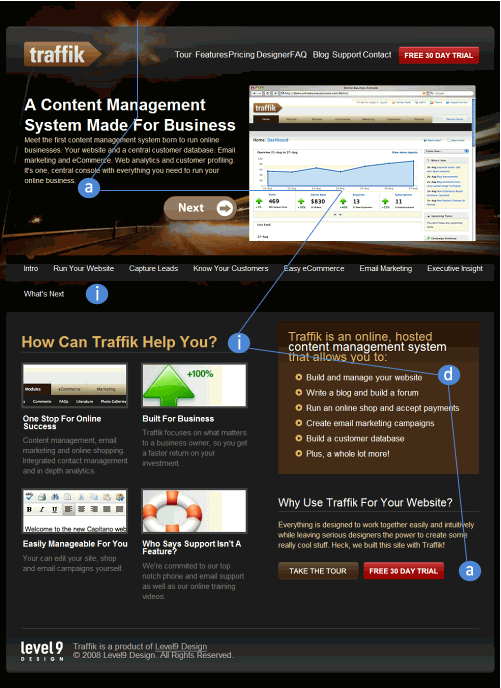
Consider the example presented above. traffik follows the AIDA principle. If the visitors expect some information about a Content Management System they expectation is immediately confirmed with a brief introduction at the top of the site. Thus, potential customers are attracted and remain on the site (Attraction, a). The interest is then raised by showcasing features and benefits of the product (Interest, i).
To communicate how the service will satisfy user’s needs the brown info-block at the right hand at the bottom of the page is used (Desire, d). Finally the users are guided to “Take the tour” and “Free 30 day trial” buttons which attempt to lead customers towards purchasing (Action, a).
A lot of other models are known in order to sell, e.g. the BOSCH-Formula (developed by Peter Hubert):
- Be inquisitive, ask open questions
- Offer solutions, talk about the endresult benefits for the customer
- Stimulate the senses, let the customer test your product
- Cross your sales, think of all the necessary accessories
- Hit the closing point, sell when the customer is ready to buy.
2. Experiment With Few Colors
Dark body copy on white background and light body copy on black background are passive. Vibrant colors can help to highlight some specific elements of the site which you’d like to point users’ attention to.
However, you don’t need to use a vibrant palette to create an effective Web design. Sometimes it’s useful to pick a moderate number of colors and use them efficiently. Thus your visitors will immediately see what’s more important. It will also be easier for you to focus their attention on the most important areas of the site.
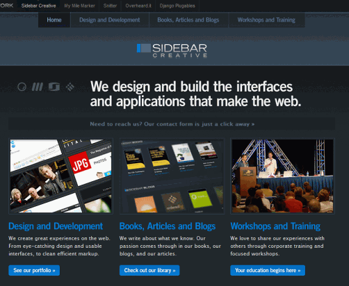
Sidebarecreative.com uses only one dominant vibrant color — blue color stands for links, buttons and clickable elements. White stands for important information which summarizes the content of the current page. The rest is the content of the site with some light blueish hover effects. Excellent, modest and expressive use of colors. That’s effective.
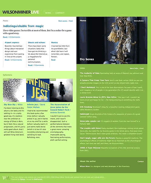
Wilson Miner uses green, blue and pink. The dominating green color looks fresh and comforting. Blue stands for the links and pink for the hover effect. Notice the structure of the site. Although only few colors are actually used, one can immediately recognize clickable areas and detect the different sections of the site.
3. Strive For Balance
In Web design balance is important because it provides users with some sense of closure and gives the feeling of permanence and stability. Balanced designs are easier to digest and to understand, because they create a visual hierarchy which clearly displays what is more important on the web-site and what is less important.
Source: The Elements of Design Applied to the Web
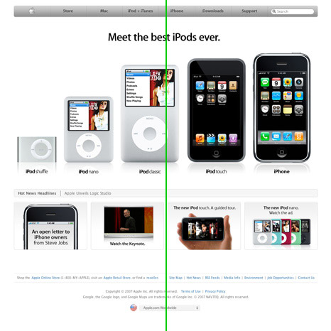
Apple’s design is probably one of the best examples of the symmetrical (also called formal) balance. Single design elements have either very distinctive (above) or very similar (below) weight. They are placed on both sides of an imaginary vertical line on the page which goes through the middle of the user’s screen. The design is rather static and restful which makes it easier for the visitors to comprehend the information which is presented through it. Result: balance creates a simple visual harmony.
Why is Apple’s design so efficient? Because it’s user-centric and product-centric. The design of Apple’s site resembles a theatre stage where visitors are the audience and the product is the entertainer. Notice that the site presents only the product and nothing else. Apple manages to initiate the dialogue offering only most important options.
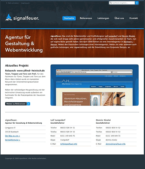
Signalfeuer uses an asymmetrical (informal) balance which allows for the more dynamic use of white space (and this is probably the main advantage of asymmetrical balance). The left block is smaller than the right one, however the site offers a very strong balance by using an impressive and balanced grid. Also the choice of colors is quite impressive.
According to the (gone) article Principles of Design, “asymmetrical balance may be unequal in position and intensity. To create asymmetrical balance, there must be an increase in intensity to compensate for the change in position. Intensity can be increased by changing size, shape, or tone. For a particular job, the designer might choose to position the elements to one side of the picture plane. The white space opposing must then act as a counter-balancing force.”
4. Strive For Clarity
Independently of the design approach, the clarity of both layout and presented information should be given one of the highest priorities in the design process. If there is any chance of misunderstandings and ambiguious titles make sure to get rid of them or specifiy explicitly what is meant. Being more specific is usually better than being less specific.
To achieve clarity you don’t need to make use of “standard” design layouts or basic templates. Risk design experiments if you want to, but keep the clear visual hierarchy and structure of the site’s content in mind. The more organized your categories are, the easier it will be for your visitors to find their path through your site.
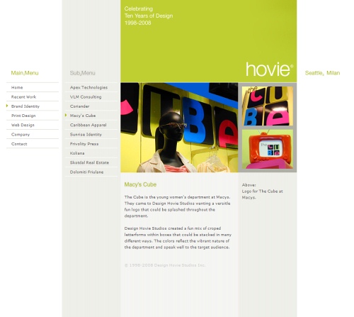
Hovie displays an unusual yet very clear design solution. The site consists of five blocks; the first one stands for the main menu which appears when the site is loaded. Sub-menu appears when some section in the main menu is selected.
The current position is displayed by arrows next to the selected option in the navigation menu. In the content area a brief description and the caption of the images displayed above is presented. The design is consistent throughout all pages. Is there any possibilty to somehow misunderstand the design? Not really. That’s simple, clear and effective.
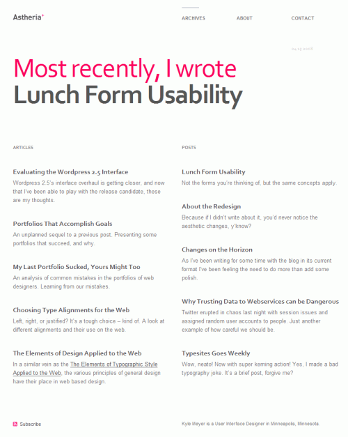
Another example: Astheria focuses on white space and has a balanced grid-based design solution. Although the design is rather subtle and uses only one appealing color, you can see immediately where you are now and what options are available. Power of typography at its best. Unfortunately, the site doesn’t display which links have already been visited (Update: Kyle Meyer has added :visited-state now).
5. Address Your Users’ Needs
As web-developer you have the primary task to comfort your visitors, addressing their needs and providing them with sufficient clues for seamless and intuitive navigation. However, to achieve this you need more than just considering an average profile of your users and stick to the decision he/she will be happy with.
To maximize your exposure you have to consider various types and profiles of your visitors. You need to identify major groups and offer each group the functionality its members would be comfortable with. That doesn’t mean that you need to create multiple versions of your web-site; it rather means that you can integrate multiple levels of user interaction in one single design layout.
For instance, according to Shneiderman’s principles of User Interface Design, it’s important to enable frequent users to use shortcuts — to increase the pace of interaction use abbreviations, special keys, hidden commands etc.
Ffffound.com offers both usual navigation and a Javascript-based keyboard navigation. This functionality is not directly seen to newbies who can browse through the site in a usual manner. Advanced users, however, are able to navigate more efficiently. Of course, you need to make it explicit and clear how to use any advanced functionality and what benefits it offers.
Another possibilities would be bookmarklets, toolbars or some specific tools such as e.g. Flickr uploader. Offering these tools you’ll offer your users easier ways to use your service and they’ll have no need to search for alternatives.
Conclusion
Effective Web design doesn’t have to be colorful and pretty — it needs to be clear and intuitive. Make sure you help your visitors to understand the benefits of your web-site and offer them an easy way to explore and use your site.
Symmetrical and asymmetrical balance can be helpful in achieving a solid and clear design solution and thus provide a foundation for rich user interaction. To maximize your exposure, consider different types of users and offer them multiple levels of user interaction which would bring them back to your site.


