7 Principles Of Clean And Optimized CSS

Email Newsletter
Weekly tips on front-end & UX.
Trusted by 182,000+ folks.
 Celebrating 10 million developers


 Custom Web Forms for Angular, React, & Vue. Your backend.
Some of you may remember the days when 30KB was the recommended maximum size of a web page, a value which included HTML, CSS, JavaScript, Flash, and images. I find with every new project with even the slightest bit of complexity, it’s not long before that 30 KB ideal is well out of my reach.
With the popularity of CSS layouts and JavaScript-enriched web page experiences, it’s not uncommon, particularly for large sites, for the CSS files alone to jump well beyond that 30KB ceiling.
But there are some principles to consider during and after you write your CSS to help keep it tight and optimized. Optimization isn’t just minimizing file size — it’s also about being organized, clutter-free, and efficient. You’ll find that the more knowledge you have about optimal CSS practices, smaller file size will inevitably come as an direct result of their implementation.
You may already be familiar with some of the principles mentioned below, but they are worth a review. Being familiar with this concepts will help you write optimized CSS code and make you a better all-around web designer.
1. Use Shorthand
If you’re not already writing in shorthand, you’re late to the party. But fortunately, this party never ends. Using shorthand properties is the single easiest practice you can do to cut down your code (and coding time). There’s no better time than the present to start this efficient coding practice, or to review it.
Margin, border, padding, background, font, list-style, and even outline are all properties that allow shorthand (and that’s not even an extensive list!).
CSS Shorthand means that instead of using different declarations for related properties…
p { margin-top: 10px;
    margin-right: 20px;
    margin-bottom:  30px;
    margin-left: 40px; }
… you may use shorthand properties to combine those values like so:
p { margin: 10px 20px 30px 40px; }By specifying a different number of values, browsers would interpret the rules in a specified manner, illustrated in the diagram below.

Illustration of how shorthand declarations are interpreted depending on how many values are specified for a property. This order also applies to padding and border-width among other properties.
Font is another helpful shorthand property that helps save some room and keystrokes.
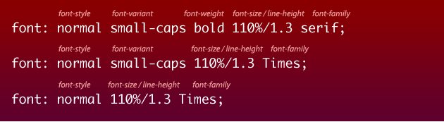
Examples of the font shorthand property. Note: leaving some values unspecified will mean that those properties will reset to thier initial values.
Those are just two examples of shorthand, but by no means should be considered a comprehensive guide. Even if you are familiar with the rules above, be sure to look at the articles mentioned below for more helpful reminders of those powerful properties that help keep your code succinct. Because of the number of lines and characters saved, going from a previous version of a CSS file which used no shorthand properties to one that makes full use of shorthand can have dramatic effect on file size.
See CSS Shorthand Guide (dustindiaz.com) and Efficient CSS with shorthand properties (456bereastreet.com) for more information about shorthand properties.
2. Axe the Hacks
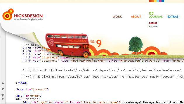
Jon Hick’s blog makes use of conditional comments
Hacks against dead browsers are safe, but hacks against the living aren’t. None of them. Ever.Keep CSS Simple - Peter-Paul Koch (digitial-web.com)
If you’re like me, those words from Peter-Paul Koch’s nearly 5-year-old article may make you feel a little embarrased. After all, who hasn’t served hacks to Internet Explorer 6 and even Internet Explorer 7? As bad as we may want IE6 to lay six pixels under, the truth is it’s far from dead.
But now we know that using conditional comments to serve hacks correctional declarations for IE6 and IE7 is an accepted practice, even recommended by the Microsoft IE development team. Using conditional comments to serve IE-specific CSS rules has the added benefit of serving a cleaner, and therefore smaller, default CSS file to more standards-compliant browsers, while only those browsers that need the hackery daiquri (i.e. IE) will download the additional page weight.
Here’s how to use conditional comments to serve styles only to Internet Explorer 6:
<!--[if IE 6]>
        <link rel="stylesheet" type="text/css" href="ie6.css">
    <![endif]-->
For IE7, you can use the above and substitute “6” for “7”.
Alternatively, if there is hack-less way of getting the desired result using CSS, with all other things being equal, go for it! The less hacks you have to write, the simpler and lighter the code.
3. Use whitespace wisely
Whitespace, including spaces, tabs, and extra line breaks, is important for readability for CSS code. However, whitespace does add, however miniscule it may be, to page weight. Every space, line-break, and tab you can eliminate is like having one less character.
But this is one area where I would not encourage you to skimp just to get a smaller file. It’s still important that you write in a way that is readable to you (and hopefully to others), and if that includes using whitespace for formatting, so be it. After all, if you can’t read it, you’re going to have a hard time applying the other principles mentioned in this article. Just be aware of the fact that whitespace is like air - you might not be able to see it, but it does weigh something.
The figure below shows two different extremes in formatting style, with much whitespace, and the other with very little. I happen to favor the single-line formatting option without tabs, as I can scan the selectors a little easier, and I develop using the full width of my wide-screen monitor. But that’s just me. You may like your selectors to appear nested, and your declarations on each line.
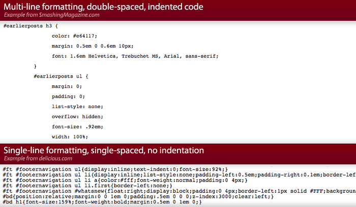
Illustration of two extremes in CSS formatting: lots of whitespace vs. very little whitespace
Using whitespace effectively is great, and a recommended practice for easy-to-manage code, but be aware that the less whitespace you have, the smaller the file. Even if you choose work with whitespace with your working file, you can choose to remove it for the production version of your CSS file, so your files stay skinny where it really counts.
4. Prune frameworks and resets
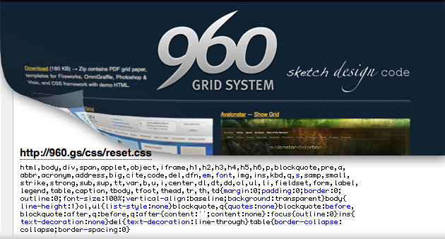
Nathan Smith’s 960 Grid System CSS framework uses a reset rule.
If you’ve chosen to use a CSS framework (including ones you’ve written yourself), take the time to review the documentation as well as every line of the CSS file. You may find that the framework includes some rules that you don’t care to use for your current project, and they can be weeded out. Also, you may find that the framework includes a more elegant and concise way of achieving a presentational detail than what you normally use, and knowing about them can help prevent you duplicating rule sets unintentionally.
This goes for resets as well. YUI Grid CSS uses a reset, and Eric Meyer’s Reset is also very popular. Resets are great to use because they help to neutralize a browser’s default style. But if you know the nature of the site you are building, you may find some declarations that you know you’ll never need. <pre> and <code> will likely go unused on my Aunt Martha’s recipe blog. A design portfolio probably won’t ever use <sub>, <dfn>, <var>, etc. So ditch what you don’t need. It’s not only ok, it’s encouraged, even by Eric Meyer:
As I say on the reset page, those styles aren’t supposed to be left alone by anyone. They’re a starting point.Crafting Ourselves - Eric Meyer (meyerweb.com)
Using a framework and/or a reset set of rules can help keep your work optimized, but they should not be accepted in their default state. Considering each declaration and cutting back on unneccessary ones can further help you keep your CSS files lean and readable.
5. Future-proof your CSS
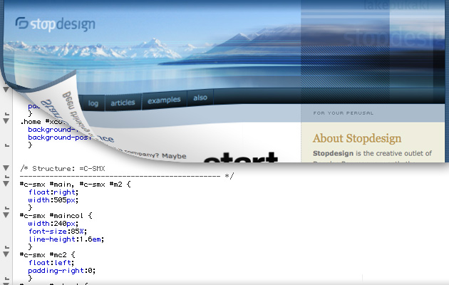
Doug Bowman’s CSS reveals specially crafted selectors used for layout.
Another way to optimize your code is to separate layout-specific declarations from the rest of your rules. I’ve heard options of separating typography and colors from layout-specific rules in the CSS file. I’ve never been fond of this practice, as I don’t care to repeat selectors just because I have different types of declarations to associate with them.
However, I’m warming up to the idea of separating layout styles from the rest of the styles, and giving layout it’s own file, or at least it’s own section. This is also advocated in Andy Clarke’s Transcending CSS. Within the book, Clarke reminds us of the following:
Full CSS layouts have always been a compromise. The current CSS specifications were never designed to create the visually rich and complex interface layouts that modern Web demands. The current methods — floats and positioning — were never intended as layout tools.
One way of interpreting this is that floats and positions to establish sidebars and columns are, well, layout hacks. And though we really don’t have an alternative, we hopefully will once a layout standard is agreed upon and browsers start supporting them. When that happens, it should be easy to swap out those hacked up box-model properties for ones intended for layout. Though it will be a while before new layout modules are here, using the right properties to handle layout instead of compensating for the quirks of our current limited set of properties will most certainly help condense page weight.
6. Document your work
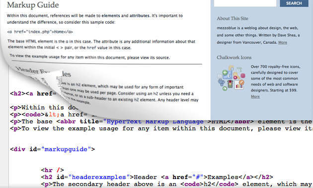
David Shea’s markup guide illustrates the proper usage for HTML tags and how those are represented on his site. Even sites without dynamic HTML can have this simple and effective guide (using its own CSS file, of course!) as a starting point of documentation.
For a team of designers, it is extremely important to communicate regularly so that markup and style rules are created in a consistent way, and also to create site standards. For example, if someone comes up with way to markup a tab interface for the site, documentation will keep others from duplicating that effort, preventing code bloat in the HTML and CSS.
Documentation, including markup guides and style sheet guides, is not just for group efforts — they are just as important for a one-man design team. After all, a year after working on other things, revisiting one of your own projects can feel quite foreign. Your future self might appreciate reminder of how your CSS grid framework is supposed to work, or what pages already have a treatment for a secondary action form button, and it will save you or someone else from appending redundant and unnecessary rules to your CSS.
The choice to use documentation has a bonus side effect of being a great place to park explanations that otherwise must be included as CSS comments. CSS comments are great for sectioning off chunks of long CSS files, but verbose comments that are used to explain design choices can add to file size, and might be better suited to a markup and style guide. Documenting your code using CSS comments within your working file is most definitely better than nothing at all, but housing that material in separate documentation is a great way to keep the code focus and free from bloat.
7. Make use of compression
Some great applications have been created to compress and optimize CSS for you, allowing you to serve a human-unreadable but still browser-friendly files that are a fraction of the origional working copies. Applications like CSSTidy and the YUI Compressor can compress whitespace, detect and correct for CSS properties that are overwrite each other, and look for opportunites to use CSS shorthand that you may have missed. (These types of applications are excellent sources to read about, if for no other reason, to learn what things you can further do by hand).
Even popular text editors like BBEdit, TextMate, and TopStyle, can help format your CSS files to your liking. There are also options serve zip versions of your CSS files using PHP. You can find more CSS compressors and optimizers in the post List of CSS Tools.
It is important to note that these applications do their best to minimize errors, but they aren’t always perfect. Also, they work best when browser hacks are not included in the file set (which is yet another reason to keep those hacks external).
There is one last type of application that can help prune CSS file size I’d like to mention. It can crawl a web site and log which CSS rules and declarations are not being applied, then bring these to your attention. Unfortunately, this tool hasn’t been inventend yet, but I would gladly pay for such a application.
I can recall times when I’ve been afraid to delete certain rules because there is no documentation that explains to me that those selectors are leftover from previous iterations of development. If an app can bring those rules to my attention, that will help with maintenance and keeping CSS files lean.
Conclusion
Clean and optimized code is important not just for file size, but for maintenance and readability as well. The principles mentioned above are good considerations not just for CSS, but can be applied to HTML, JavaScript, and other programming languages. CSS files are not as prominent as the rendering of your web site to an end-user, but consideration of the above principles can help with both the user experience (in the form of smaller file sizes) and the developer experience (cleaner code). Apply these principles to your current and future projects, and and you will surely appreciate the efforts.


