Pricing Tables: Examples And Best Practices

Email Newsletter
Weekly tips on front-end & UX.
Trusted by 182,000+ folks.
 Register for Free

 Custom Web Forms for Angular, React, & Vue. Your backend.
 Celebrating 10 million developers
Pricing tables play an important role for every company that offers products or services. They are a challenge from both a design and usability standpoint. They must be simple but at the same time clearly differentiate between features and prices of different products and services.
A pricing table should help users pick the most appropriate plan for them. A company should carefully examine its product portfolio and pick the most important features to present in its pricing plans. Visitors should be given only the information they would be interested in: available features, options and costs. The rule of thumb is: every unnecessary cell in your pricing table increases the probability of losing potential customers, because you make it more difficult for them to compare various plans and select the best one.
Once you have identified the most important features, go ahead and create a more detailed list of features for users who are interested in a particular plan. Users must know what kind of a product they are spending their money on and all of the features associated with it.
For a good grounding in exactly how to design and present a pricing table, let’s examine some that other designers have created and analyze them according to the following important criteria:
- Design: colors, style, typography, icons.
- Usability: What happens if we turn off CSS and JavaScript? Is it still usable?
You may also want to take a look at the following related articles:
- Top 10 CSS Table Designs
- Block Quotes and Pull Quotes: Examples and Good Practices
- Pagination Gallery: Examples and Good Practices
- Tag Clouds Gallery: Examples and Good Practices
Best Practices and Guidelines
Designing a pricing table is a tricky task. A pricing table is a design element that requires the designer to communicate information clearly and precisely, exposing as many features as possible and making it as easy and as intuitive as possible for a user to make the best choice.
1. Communicate not too much and not too little
Intuitively, one would assume that a feature-rich pricing table with dozens of various aspects would make a good impression on potential customers. However, the more information you provide, the more information visitors need to absorb.
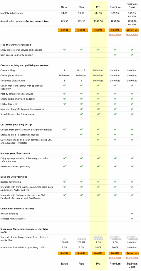
TypePad (screenshot below) uses a quite lengthy pricing table. Although it’s informative and goes into detail to explain the differences between various plans, it is really hard to scan: users need to remember which plan each column represents. Furthermore, although the plan titles are mentioned at the bottom of the table, the prices are not mentioned there. So a user who has landed below the middle of the table will have to scroll to the top to see how much each plan costs.
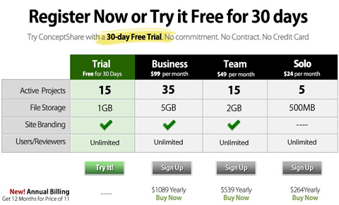
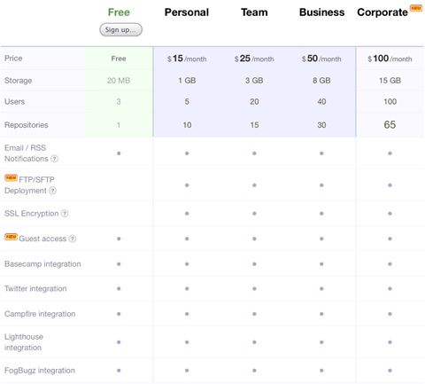
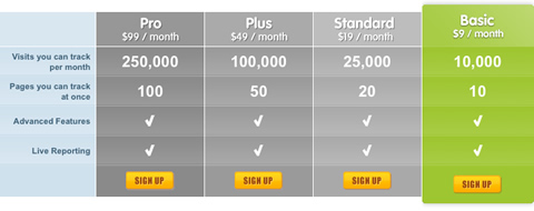
ConceptShare is an example of a short but concise and visually appealing form. Notice that the fourth row of the table combines two aspects (users and reviewers) in a single row and avoids a fifth unnecessary field. This is a beautiful and informative pricing table.
Still, it’s important that your visitors get a good understanding of the differences between different plans. Communicate not too much and not too little. If a potential customer walks into your store and wants to know the difference between two specific devices, you wouldn’t explain the similarities between the devices first, right? Communicate the information that your visitors are looking for; they will be grateful. This leads to our second point.
2. Communicate differences, not similarities
Instead of focusing on displaying similar features of available plans, communicate the differences between them. It is often a good idea to visually distinguish between similar features (available in all plans) and special features (available in only some plans). To achieve this, you could place the most distinctive features at the top of the table while leaving the common features at the bottom of the table.
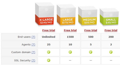
Take a look at eTribes.com’s pricing table (screenshot below). The design manages to communicate the differences effectively while conveying additional information. The choice of icons fits the overall design and supports, rather than distracts, the visitor. This is effective and user-friendly.
3. Make the price stand out
Price is the first thing users want to see when they visit a product or service website, and leaving it out is the number one design mistake on B2B and B2C websites. So, you had better make sure you show it to your visitors as quickly and as clearly as possible.
Font selection usually depends on the type of product or service offered, and it also must be consistent with the overall design. On many pricing tables, the font size of prices, titles and important headlines are larger and stronger to make them stand out. As a designer, you need to make sure that the price is given the appropriate weight, both visually and semantically.
It is also a good idea to sort pricing plans by price, from highest to lowest or vice versa. Because users scan websites in an F-shape, some designers put the cheapest offer on the left side of the table, so that users see it first. It’s in designer’s best interest to make sure that users see the most attractive offer first.
4. Use visuals sparingly
Unfortunately, many of the designs we are considering in this showcase have one major shortcoming: they use overly vibrant visuals too often and often for the wrong purpose. Designers try to make pricing plans look as attractive as possible, and, apparently, numerous green check marks and red crosses are supposed to help to achieve this effect.
And if these icons are spread widely across the table, then with each additional feature it becomes increasingly harder for visitors to read the table and identify differences between plans.
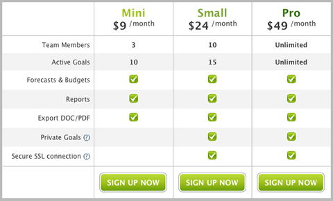
Beanstalk communicates its information effectively while avoiding the visual noise. The support of a feature is indicated by a neutral circle that doesn’t distract the eye but conveys the message. Plans that do not have a particular feature simply do not have a circle in the corresponding cell.
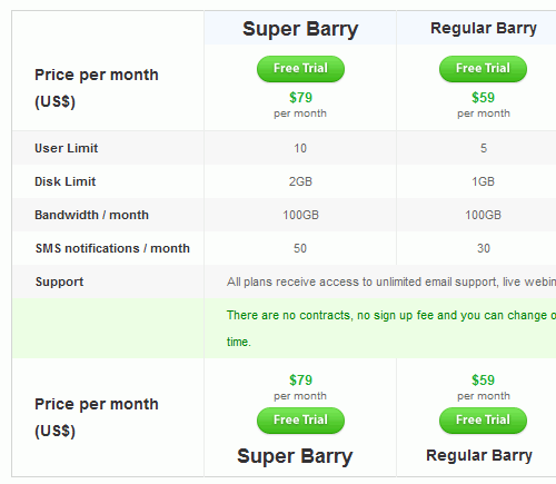
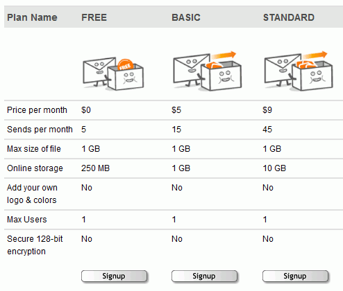
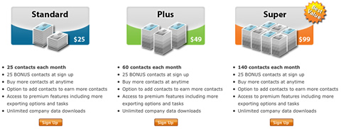
Goodbarry.com uses color to indicate the main details in the table. Notice how the font-size is used to make the different pricing plans more distinctive. Also notice how well green is used to animate the visitors into trying out the product.
So, use visuals sparingly and avoid visual noise. Feel free to use icons if you are sure they are not too vibrant and if they help a user’s understanding of the table and, more importantly, convey some information. For instance, a green check mark next to the word “Unlimited” does not convey any information.
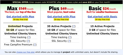
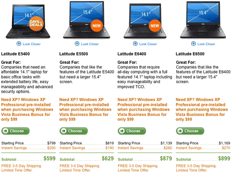
It’s important also that icons and thumbnails be extremely useful. For instance, if a table compares physical products, then thumbnail of those products should be present.
Almost all of the pricing tables we’ve examined use different background colors to differentiate pricing plans. Designers use color theory and vivid colors to keep the visitor’s focus on the specific plan that the company wants the most sales on.
5. Illustrate the difference vividly
Some designers use illlustrations and vivid images to clearly illustrate the difference between various plans in a memorable way. Metaphors (e.g. cartoons) are used very often. For instance, if a company is offering the poll service in several various plans, you may want to use a “lightweight” box with tools for a lite version and a bigger, larger toolbox for the corporate version. In fact, that’s what wany designers do.
6. Be consistent in your design
All website elements, not only pricing tables, should be consistent with the overall design. BigFilebox.com makes the mistake of breaking this rule:
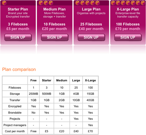
The second pricing table’s design is not consistent with the website’s whole design.
7. Don’t lose your customers
On a product or service website, pricing tables play an important role in making a successful sale. Pricing tables are the window to a product; therefore, it is important that they be usable and accessible to everyone.
Pricing tables should support not just modern Web browsers, but all forms of Web browsers, screen readers, etc. Companies can create pricing tables that are rich in features and effects, but they should make these features unobtrusive for users with browsers that do not have CSS or JavaScript enabled.
This is one example of how a pricing table should look when CSS and JavaScript is disabled:
An example of a pricing table that uses JavaScript obtrusively is on Mailchimp:
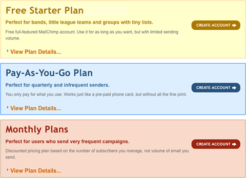
If you go to this pricing table and click on the “View plan details…” links, you will see a JavaScript accordion effect showing hidden elements. If we disable JavaScript in our browsers, the links don’t work anymore. One solution to this problem would be to show all hidden elements when JavaScript is disabled.
Pricing Table Showcase 2008
Horizontal or vertical? Which should a designer choose? Either a horizontal or vertical layout is good as long as the plan’s features are clearly separated; although there is a strong trend towards column-based (vertical) layouts.
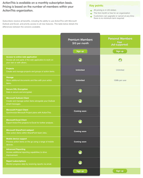
ActionThis
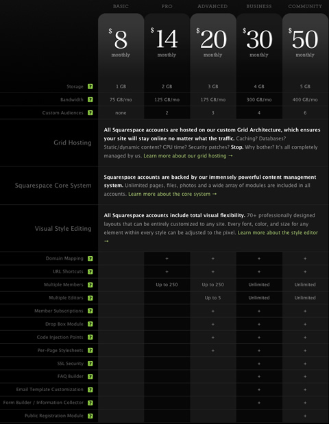
Squarespace
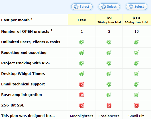
Tickspot
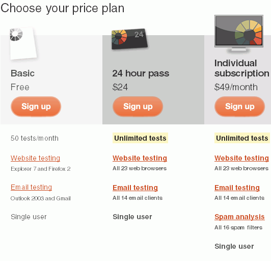
Litmusapp.com
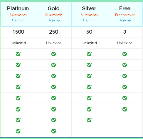
Goodbarry
Bigcartel
Blinksale.com
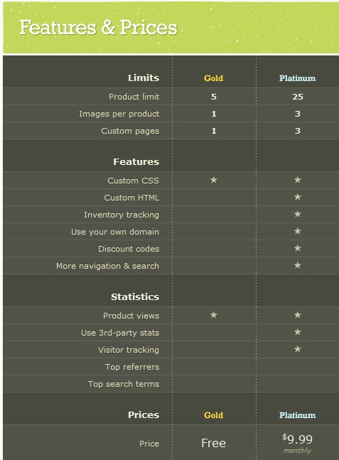
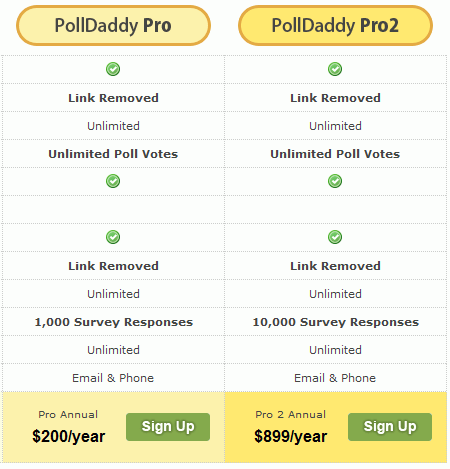
Polldaddy.com
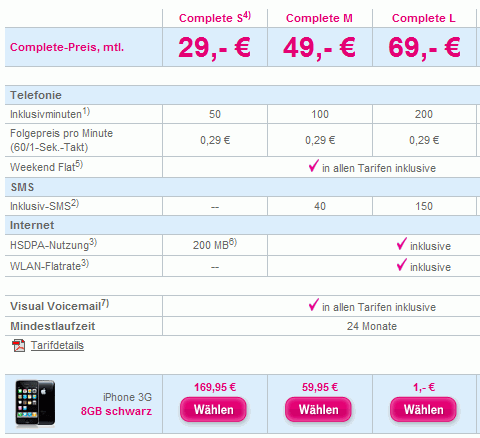
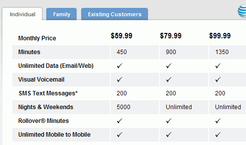
iPhone T-Mobile
Fluxiom.com
Dropsend.com
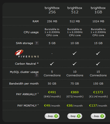
Brightbox.com
Spokeo.com/hr

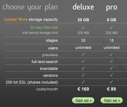
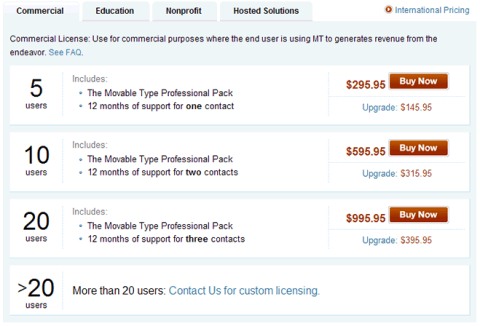
Movabletype (the pricing table is no longer available)
Zendesk (the pricing table is no longer available)
iPhone
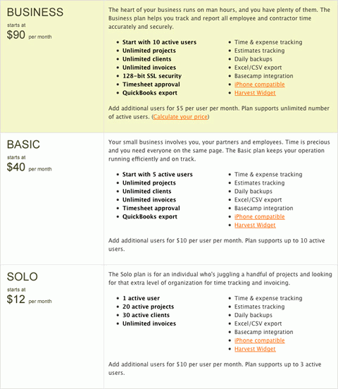
Harvest
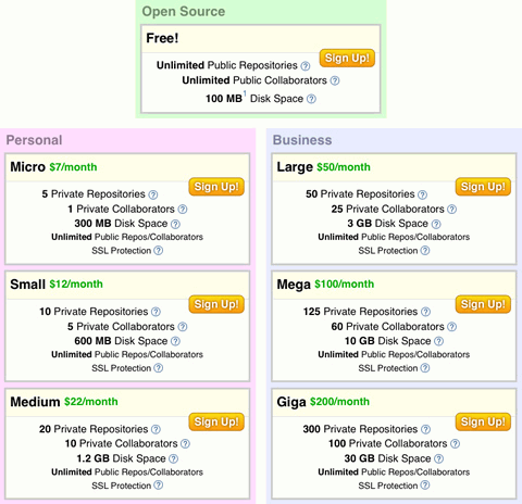
Github.com
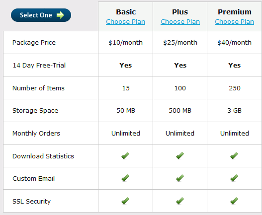
FetchApp.com
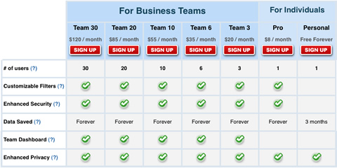
RescueTime
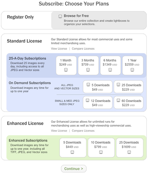
Shutterstock
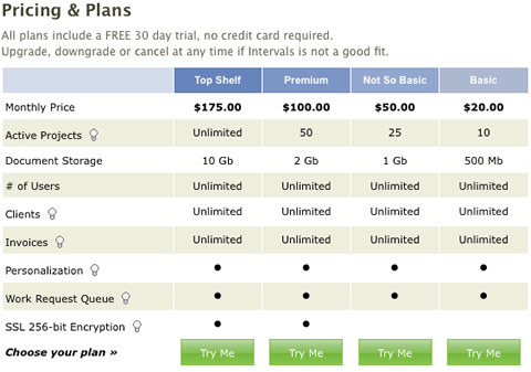
Intervals
Jigsaw
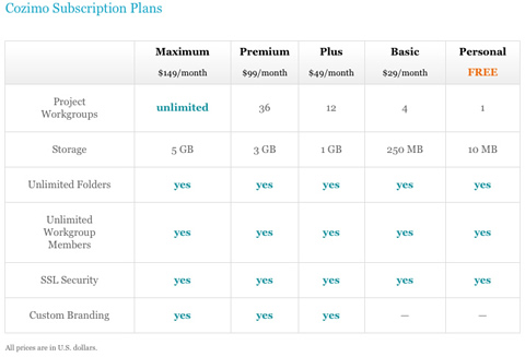
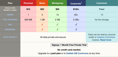
DabbleDB
activeCollab
Squarespace
Tickspot
Litmusapp.com
Goodbarry
Bigcartel
Blinksale.com
Polldaddy.com
iPhone T-Mobile
Fluxiom.com
Dropsend.com
Brightbox.com
Spokeo.com/hr
Movabletype (the pricing table is no longer available)
Zendesk (the pricing table is no longer available)
iPhone
Harvest
Github.com
FetchApp.com
RescueTime
Shutterstock
Intervals
Jigsaw
DabbleDB
activeCollab
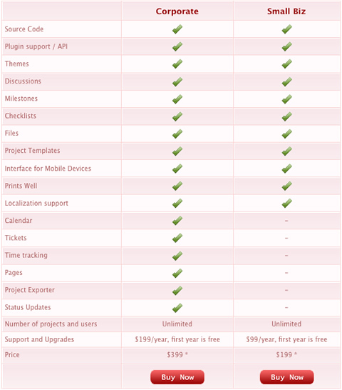
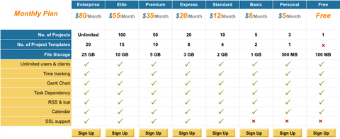
Zoho Projects
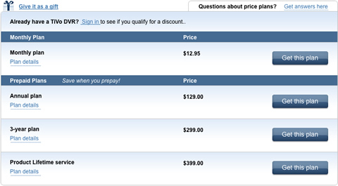
TiVo
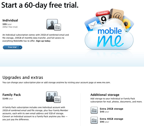
Apple MobileMe
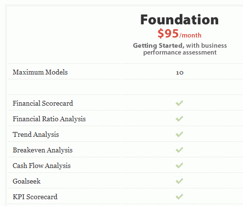
Analysis-one
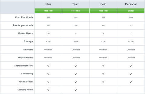
ProofHQ
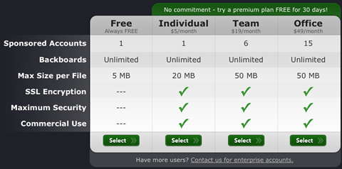
Backboard
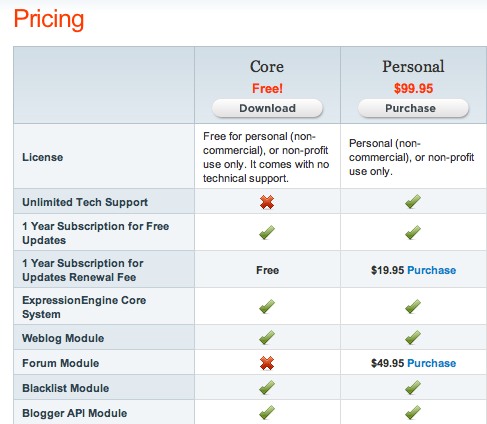
ExpressionEngine
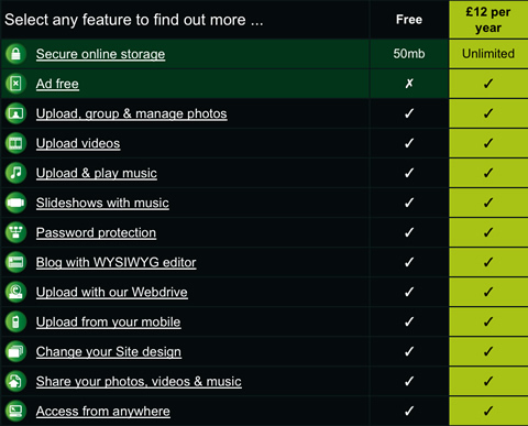
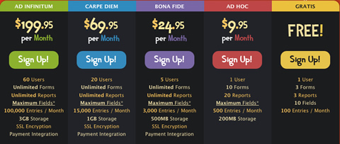
You can find more examples of pricing tables in Christian Watson’s showcase Pricing Tables.
Best Practices: Summary
- All elements, including pricing tables, should be consistent with the overall design of your website.
- Use background colors to visually separate different plans, but sparingly.
- Just as photographers draw attention to where they want in their images, so with price tables, make the sections that you want to draw attention to stand out.
- Use different font sizes and colors for titles and important headlines.
- Place important features at the top left of the table, according to the F-pattern of scanning Web pages.
- Use unobtrusive CSS and JavaScript techniques when designing a pricing table.
- Always show the prices of your plans.
- If your feature list is too long (i.e. doesn’t fit in the browser’s visible area), then make sure to present your plan names, prices and selection options at both the top and bottom of the pricing table.
- Mention the currency of your prices to avoid confusion, because a “$” sign could represent US, Canadian or Australian dollars.


