Behind The Design: 5 Stories Of Great Inspiration
Email Newsletter
Weekly tips on front-end & UX.
Trusted by 182,000+ folks.
 Register for Free
 Celebrating 10 million developers
 Custom Web Forms for Angular, React, & Vue. Your backend.

We grow our creative talents through experience: whether it’s learning from a veteran designer about how things came to be or finding fresh delight in Smashing Magazine posts, no great artist exists without inspiration. Famously declared in reference to scientific progress: “If I have seen further it is by standing on the shoulders of Giants”, said Isaac Newton.
The same is true of aesthetic and philosophical flourishings. By better understanding where we’ve come from and cherishing the brilliant minds who have come before us, we have a greater understanding of creative possibilities. Here are some design tales that have made for a substantially richer, more beautiful world. All are worth knowing — and moving forth from.
You might be interested in the following related posts:
- Bauhaus: Ninety Years of Inspiration
- Finding Inspiration in Uncommon Sources: 12 Places to Look
- Inspiring Everyday Graphic Design
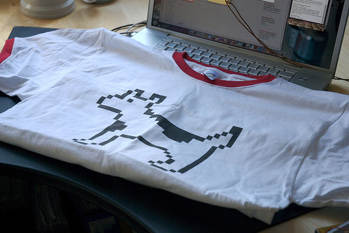
Computer Icon Inventor: Susan Kare
All right, this is a stretch. But not much of one, and here’s why: once upon a time, computers were dreadfully unfriendly compared to today. They were controlled by flipping series of switches and eventually by text-heavy command lines; it was only a matter of time before icons, which were an intriguing repurposing of hieroglyphs, made their debut as visual capabilities evolved.

Enter Susan Kare. Zealously believing that every pixel matters, she was the primary creator of the original icon set for the Mac in 1983, sowing the seeds for a mass icon evolution in the years to come. If you’ve ever used a modern GUI, you’ve seen either Kare’s work or design influenced by it. Not satisfied with that, Kare went on to create many more influential pieces of pixelart: perhaps you’ve seen the cards in Windows Solitaire? Or, in more recent times, the Facebook graphics adorning many Facebook gifts?
Like Vangelis’ “Chariots of Fire,” Kare’s work is known by millions of more people than those who know the artist’s name. Smashing Magazine has featured numerous compilations of great icons that draw on Kare’s style: nowadays, they’re enhanced by a variety of glammy 3D effects and soft shading, but undeniably, their lineage can be traced back to this one designer.
Never one to lack a sense of humor, Susan is also behind such computing in-jokes as Clarus the Dogcow, which are elegant in their simplicity and eloquent in the reactions they elicit:
Kare’s vast yet understated influence extends to typefaces too: ever seen pixelfonts, which have seen increasing waves of popularity over the last stretch of years? In a bitmapped time before PostScript and OpenType, Kare made some of the first computer fonts. And consistent with her propensity to be prolific, she designed such time-tested classics as Chicago, which would see a resurgence in the first iPods:

Continuing onwards, Kare’s done work for the Web appliance Chumby, and it remains to be seen if this will be looked on as fondly in hindsight as the rest of her canon. In the meantime, you can find impressive tributes to her craft, such as this nod to the original Mac stopwatch/waiting icon:
Calligraphic Foresight: Steve Jobs
"The whole duty of typography, as of calligraphy, is to communicate to the imagination, without loss by the way, the thought or image intended to be communicated by the author." — Thomas James Cobden-Sanderson
True to the above statement, the Mac (and Apple) wouldn’t have happened without Steve Jobs. As an exemplar, along with Jonathan Ive, of the marriage of form and function, he’s already synonymous with many other benchmarks in the technology industries, and Macs continue to be popular among creative designers.
It’s surprising now, but back then it wasn’t important that computers have beautiful typography. Strongly regarded as matter-of-fact business machines before being appreciated as extensions of our imagination, computers had limited resolution and other technical constraints that discouraged even slight efforts for more flexible type. It’s even amusing that, having the plethora of choices that we do today, some intentionally want to recreate the rigid, monospaced MS-DOS look.
Thankfully for us, as he boldly recounts in his Stanford commencement address, Jobs noticed that Reed College, which he attended, had gorgeous penmanship everywhere he looked. Consequently, he took a calligraphy class and learned the language of type. And even years later, when it was an unlikely application of his then-theoretical knowledge, he nevertheless pushed this desire and passion on the Macintosh. The big question he answered: “What if computers could have beautiful typesetting as we do on paper?”
It seems so natural now. Fonts, including many quality freebies, flourish. Easier ways of editing them, such as FontStruct (a brilliant “gateway” promotional tool for FontShop), have lowered the barrier to type hobbyists. Today, we find it shocking if a creative application doesn’t allow us to choose from different fonts — unless it’s expressly built not to allow them. With Jobs, as with Kare, hindsight once again comes very much into play.
It’s been worth it, even if some of what’s cropped up has looked awkward:
Motion Graphics Maven: Andrew Kramer
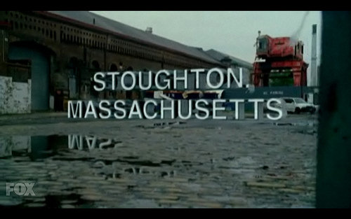
There’s a new hit show, Fringe, which has already proven controversial not just because of its gory paranormal parallels to The X-Files, but because of how it sets its scene-location titles in glorious, almost intrusive 3D. While X-Files was content with vintage typewriter lettering appearing as if pounded out on an Underwood, Fringe’s adds complexity by, for instance, floating a title over puddles with a reflection, as if there’s really a big block of letters where the characters are congregating.
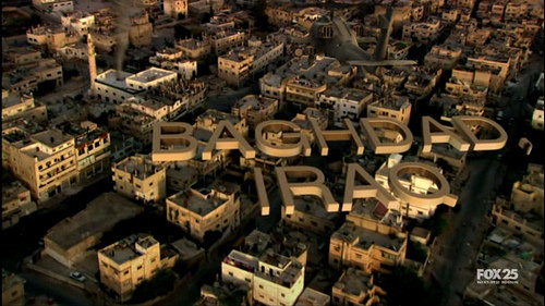
These effects, and to a much greater extent the opening titles, reflect the influence of Andrew Kramer and his Video Copilot team. In fact, Kramer created the motion graphics-heavy opening titles, which depict text flying away as layers of organic debris scroll in sync with the Philip Glass-esque theme music. The choice of Futura- and Helvetica-like fonts harkens back to 1960s academic and science textbooks: they are at once striking, retro yet unabashedly modern and CG-imbued.
What’s so special about Kramer besides this? While there are a number of companies out there that include elementary instructions with their visual effects creation tools, only Kramer and Co. go the extra mile and provide dozens of video tutorials that are of key interest to the website’s core audience: aspiring visual effects artists and those who simply love eye candy. Many common (and hotly requested) motion graphics techniques are available for the benefit of all.
In teaching many others how to do these “tricks of the trade” and receiving thousands of comments in praise in return, Kramer, through his exceptional knowledge-sharing, has propagated his style and encouraged others to adapt and improve on it. And should you want to make your own Fringe-like location titles, Kramer’s got a “3D Shadows” video tutorial for that too.
The Godfather Of Photoshop: Russell Brown
Photoshop is inextricably synonymous with image editing. Even if our tools of choice are Paint Shop Pro, Paint.net or even Picnik, should our tweaks be less than flawless, we risk hearing cries of “That’s Photoshopped!”
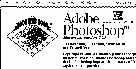
In the beginning – of Photoshop, that is – there were the Knoll brothers. There was also Russell Brown, a wild-eyed maverick whose name you can find alongside the Knolls on the early “About” dialog boxes. Brown would help Adobe acquire Photoshop, then champion it for over 20 years to come. That’s endurance nearly unheard of in the rapidly shifting technology field! You can presently find him hosting wacky, inimitable tutorials on Adobe TV that teach you how to improve your Photoshop Fu.
Insanely great design is one thing. But great marketing is another, and marketing isn’t just about selling ad space: it’s about empowering your users with the skills to use your product or service with confidence, so that they get more value out of it and, in turn, share it with friends. Guy Kawasaki popularized it as “evangelism.” Before Internet viral marketing was all the rage, Brown realized this and went on the road (as he still does) promoting the good of Photoshop as if it were some blessed enabler of creative vision. Which it is.

(With the wacky hair, you might even mistake Brown for the Don King of Photoshop, although I’ve had the privilege of communicating with Brown and he’s considerably nicer.)
Tools, especially those with steep learning curves, benefit greatly from practical examples, whether they’re tutorials or easy-start presets. As we’ve already seen with Andrew Kramer, these lessons smooth the way for greater exploration, rewarding you with greater results for more time spent on the tool. User interface design is also part of the whole equation, with terms like “discoverable” and “intuitive” deployed often. As Photoshop and other Adobe applications enter the CS4 era, Brown is mindful of showing off shortcuts in style, helping turn wide-eyed acolytes into power users. He also simply says:
“Learning about Adobe Photoshop should never be boring.”
How right he is, and we can learn a lot about inspirational design at its highest levels from him.
Honor And Humanity: Tomoyasu Hotei
More than ever before, multimedia experiences are at the forefront of our senses. Visual style informs sonic riffing: thus, it’s suitable that the last person I’m going to look at is not a visual designer, but an accomplished musician (among other things).
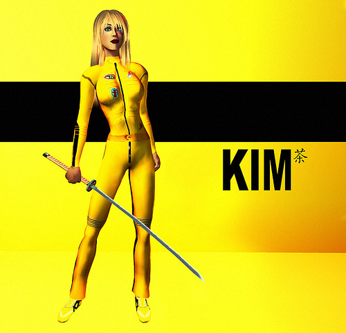
Ever heard of Quentin Tarantino’s Kill Bill? A case has already been made for the striking imagery that was used to promote the film: Uma Thurman in a yellow tracksuit with stark black text, recalling Bruce Lee with a glint of anime. Even Second Life avatars have gotten in on the fun:
The film itself, divided into two volumes, is a buffet of multicultural cinematic samplings and sound design, drawing on a broad range of influences; it draws admiration from those who “get” the references and motivates others to look up what they’re all about.
Suitably, the film’s soundtrack is diverse. Surprisingly yet expectedly, Tomoyasu Hotei’s guitar-blazing “Battle Without Honor or Humanity” scored the trailer, which was parodied many times over (including a sly allusion during the princess fight sequence in Shrek 3). Hotei is one of the world’s best-selling guitarists, and his performances have encouraged many a Japanese youth to pick up an ax to grind.
“Battle” itself has several lesser-known variations, featured on Hotei’s Electric Samurai album, which are full of dynamic changes and slick sound effects alongside the meaty beats. And what of those beats? Well, in the most popular version of “Battle,” the drums are none other than a sampled loop from Led Zeppelin’s “When the Levee Breaks,” which has also been used to bombastic effect in Enigma’s “Return to Innocence,” among many other songs.
By taking the beat of a classic rock song from 1971 (which in turn is based on a song from 1929), Hotei recontextualizes its driving force, shedding its political message in favor of instrumental strength, yet losing none of its power. Not stopping there, Hotei and J-rappers Rip Slyme mashed up their talents in “Battle Funkastic,” leading to a tightly edited, energetic music video. Get a taste of what combining those disparate sources can do:
What have we learned from all this? Not only do sight and sound work together to create a compelling whole — which can aid branding and memorability — as I stated in the beginning, no great artist exists without inspiration. Say it however you like; there are many quotes on the topic, one of the best-known being:
“Good artists copy. Great artists steal.” — Pablo Picasso
I think this was meant somewhat tongue-in-cheek, but ultimately it all comes down to delving into the artistic atmosphere around you, choosing what appeals to you most, and uniquely improvising on it for your oeuvre.
“Absorb what is useful, discard what is useless, and add what is uniquely your own.” — Bruce Lee
I believe the best artists create both what is copied and stolen, traveling ahead without equal, inspiring many in their wake. What will you take away from these stories? I hope they’ll help fuel the next directions you take and make. And if you’ve got a story of great inspiration, share it without hesitation in the comments!


