Don’t Follow Web Design Trends: Set Them!

Email Newsletter
Weekly tips on front-end & UX.
Trusted by 182,000+ folks.
 Register for Free
 Custom Web Forms for Angular, React, & Vue. Your backend.


 Celebrating 10 million developers
Use this to your advantage and fashion a unique style that will set your website apart from the rest — a style that will impress and delight your users.
Throughout history, great artists always found new ways to express themselves and create new techniques to set their work apart from the rest. Think about the styles of Leonardo da Vinci, Vincent van Gogh, Pablo Picasso, Salvador Dali and Jackson Pollock. Think about the different movements of art, from Impressionism and Expressionism to Surrealism and Minimalism. These styles couldn’t be more different from each other — and that’s the point. The artists’ names live on because their art is unique.

Do you want to simply follow the latest design trends and create a website that works well but looks just like many other websites out there? Following trends won’t set you apart from the rest; it won’t help your work make a strong impression. To make something memorable, you’ll need an element of creativity and novelty.
Unlike certain other forms of art, such as painting and sculpture, Web design is very limited in its expression because more often than not your website has to serve a very specific function and achieve certain goals. Successful designs are influenced and driven by those goals. There is, however, still room to develop your own unique style and aesthetic. Doing so will help you stand out from the competition and allow you to develop a strong identity.
Web design isn’t art
Having said all that, Web design isn’t art. Art is self-expression that is meant to be enjoyed and appreciated on its own. Design is communication; and, more specifically, Web design is an interface for content. Sure, there are websites out there that are purely art, but the large majority of them perform a certain function or deliver information. The website acts as the interface between the user and that function or information. This means it not only has to look nice, it actually has to do its job well, too. Indeed, in most cases, function should come before form.
I believe I can say that websites today are much better than they were 10 years ago. What do I mean by “better”? I mean to say that Web designers have learned from their mistakes over the years and have picked all the low-hanging fruit of usability. Websites today are more usable and more user-friendly because we have greater experience in and increased knowledge of how to build websites that work and interfaces that are easy to figure out.
Yet, I cannot say that art today is “better” than it was ten or a hundred or a thousand years ago. Impressionism isn’t “better” than Realism. Expressionism isn’t “better” than Minimalism. They’re just different.
Web design as architecture
While Web design incorporates an aspect of art, it also incorporates function. In this way, I think it actually has a lot of similarities to architecture, for which you need a healthy dose of both style and function.
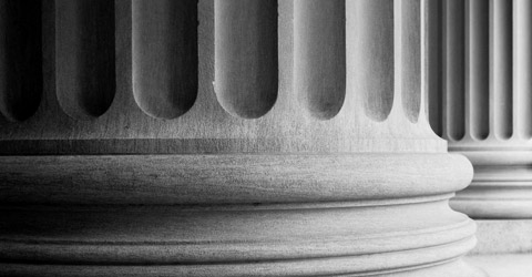
The world’s earliest treatise on architecture, “De architectura,” written by Vitruvius in around 25 BC, outlined three principles that all good construction should fulfill: firmitatis, utilittis and venustatis: durability, utility and beauty. I believe that today these three principles apply to Web design as well.
Your work should be durable in that it should scale well – or handle a lot of traffic – which is ensured by having code that is clean and optimized. As well as a means of making future modifications and updates with ease. It should fulfill the goals and function of the website, whether they be to advertise a product, sell goods, show off a portfolio or perhaps display articles from a blog. Finally, it should look good; it should have its own look and feel. We need to make the Web browsing experience enjoyable for our visitors by crafting a pleasing aesthetic.
Over centuries, architects and engineers have figured out better ways to construct buildings, to make them stronger and larger. These advances in function are similar to advances we’ve seen in Web design. We’ve figured out better ways to make registration forms, navigation menus that are easier to use, layouts that are simpler to figure out. Generally speaking, we have greatly improved the usability of our websites. This is because we’ve had years to look at how people use the Web and to fix the usability problems that pop up most of the time. We see what works best and implement those things in new websites that we build.
Venustatis
But let’s not forget Vitruvius’ third principle of beauty. In architecture we see different waves of style. Different centuries bring different looks and feels to buildings. Houses are designed to be lived in, but life would be really dull if they all looked the same and focused only on function.
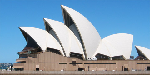
The design of the Opera House in Sydney is so distinct that it’s more than just a building – it’s an iconic city landmark.
In Web design we have very similar waves. Most notable is the Web 2.0 style, in which we had things like glossy buttons, mirrored floors, starbursts and so on; it even inspired various Web 2.0-style logo and website generators, because the style was so formulaic in nature.
New trends like this appear, and some get picked up and quickly adapted across the Web. Does your current website design follow a trend? Perhaps it is setting one? If you copy other trends, then your website will be just that, a copy, but if you can go the extra mile and create a unique look that differentiates your website, then your website will be memorable. Of course, being different isn’t the only thing you’ll need. The unique style and layout must also be attractive and must accomplish its goals.
Web Design Trends & Fresh inspiration
So how do you go about creating something different? Where do you find inspiration to create something unique? When Cordell Ratzlaff and his team were designing the new interface for the Mac OS X operating system, they found their ideas in the most unusual places.
Cordell saw a great opportunity to change to an appearance that was fresh and fun, in contrast to the existing state of the art. He decided to change from gloomy, square, and bevelled, to light, fun, and colorful, with a very fluid expression. He asked, What’s the opposite of a computer interface? He came up with things like candy, liquor, and liquids, to inspire a new visual design of the interface. The designers collected magazine ads for liquor, with delicious looking liquids in glasses with ice cubes, sparkling with reflections and highlights.Bill Moggridge, Designing Interactions
When working on your new website or Web application interface, don’t simply look at what everybody else is doing. If you look inward to your own industry and similar websites, you will no doubt find a lot of likeness. This is because many of these websites borrow from each other, and when new websites launch, they borrow from them in turn. What we have is a monotonous experience in which you are only looking inward, blind to the world of possibilities outside.

Take a lesson from Cordell Ratzlaff and seek inspiration from new sources. Look at nature, look at real world objects, look at the things that symbolize and evoke the kinds of emotions and feelings you really want to elicit with your design and aesthetic. Cordell looked at things like ice cubes in liquor, which inspired him to create the liquid Aqua interface for Mac OS X. The glossy gel buttons and other user interface elements in Aqua have since inspired many Web designers in the rise of Web 2.0 and all of the glossy and shiny visuals it brought.
Conclusion
If you want to craft an iconic website that stands out from the competition, you need to come up with a unique and novel aesthetic. You need to design a look and feel that’s different – something that doesn’t look like all of the other websites in your industry. Getting inspired by great work and beautiful things is a good thing, but you have to make sure you don’t fall into the trap of mimicking other designs too closely, or else your website could end up looking like a cheap copy.
Seek inspiration from outside your industry. Focus on the emotions you want to evoke and the character you want to give your website, rather than on what everybody else is doing. Design a layout unique to your website or application by focusing on its goals and objectives rather than on what other people have done.
You might be interested in the following related posts:
While Web design isn’t art. And while there are limits to how much you can express yourself and how many visuals you can use, there is still plenty of room for a unique style. Just as Vincent van Gogh’s post-Impressionism style and Pablo Picasso’s unique art set them apart from the rest, breaking the mold will give your website a powerful and memorable identity that others will want to mimic.
Don’t follow web design trends: set them. (al)


