50 Beautiful And Creative Portfolio Designs

Email Newsletter
Weekly tips on front-end & UX.
Trusted by 182,000+ folks.
 Register for Free
 Celebrating 10 million developers


 Custom Web Forms for Angular, React, & Vue. Your backend.
Design portfolios come in various forms. Traditionally, they have been print-based and something you would carry to a client pitch or meeting to showcase what you’ve done and how you did it. Today, many designers take advantage of the Internet to publish and showcase their work via their online portfolios. Having your work displayed online removes the geographical restraints that traditional portfolios impose on you.
With many portfolios online, it’s often hard to stand out from the sea of competition out there. It takes a creative design to grab the user’s attention long enough for him or her to enjoy sifting through your work. Adding rich interactive elements, framing your work in a unique way, and concocting a means of providing a unique experience can not only get the user’s attention but also show your capabilities as a designer.
In this showcase, you’ll find a variety of beautiful, unique and highly creative portfolio designs. The aim here is to stimulate your creativity and inspire you to create your own portfolio or re-think your existing one. You’ll see portfolios from a wide range of fields, including Web design, product design, illustration, photography and even animation. So, we now present to you 50 beautiful and creative portfolio designs.
You may also want to take a look at the following related articles:
- Creating A Successful Online Portfolio
- 10 Steps To The Perfect Portfolio Website
- Portfolio Web Design Showcases
- My (Simple) Workflow To Design And Develop A Portfolio Website
50 Beautiful and Creative Portfolios
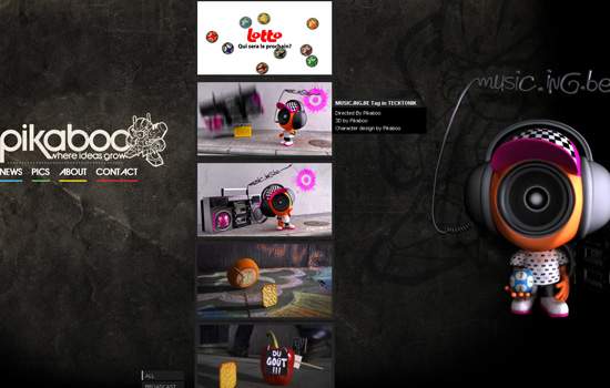
Pikaboo This portfolio showcases a creative navigation scheme; use the scroll button on the mouse to navigate up and down the showcase. Alternatively, the designer gives you a columned view of the showcased work if you click on “Overview.”
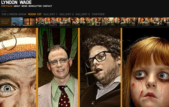
Lyndon Wade This portfolio effectively integrates the interface of the design. Clicking a category link of the portfolio expands a “film-strip” view of the thumbnails in the section. Upon clicking a thumbnail, it expands to a full-screen view; clicking on the left or right allows you to navigate through all of the showcased paragraphs in full-screen mode.
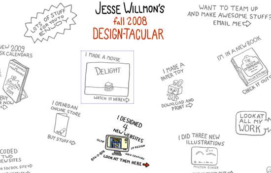
Jesse Willmon’s fall 2008 DESIGN-TACULAR Jesse Willmon presents his portfolio in a unique fashion, through “doodles,” giving it a memorable user interface.
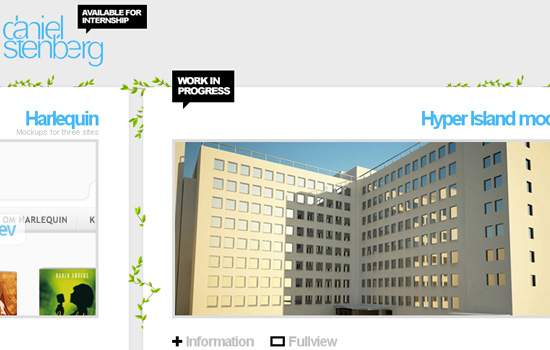
Daniel Stenberg Daniel Stenberg frames each of his works beautifully and allows users to navigate through them horizontally. The result is a clean and simple but effective portfolio design.
Domenico Tedone Design Unconventional navigation schemes can be a great way to leave a lasting impression on users (but they can also make users leave in an instant); Domenico Tendone capitalizes on Flash’s strength of being responsive to user events by showcasing his work via a revolving 3-D wheel. Use the scroll button to scroll through his work.
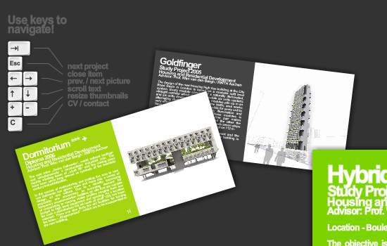
Marc Dahmen Marc Dahmen gives us a creative user interface by showing his projects as business cards. Clicking on a business card gives you a nifty animation as it enlarges. To make navigation easier, the portfolio provides keyboard shortcuts (you can see them at the top left of the page).
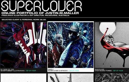
SuperLover The excellent selection of colors in this portfolio complements the showcased artwork, and the organization of each piece makes it stand out.
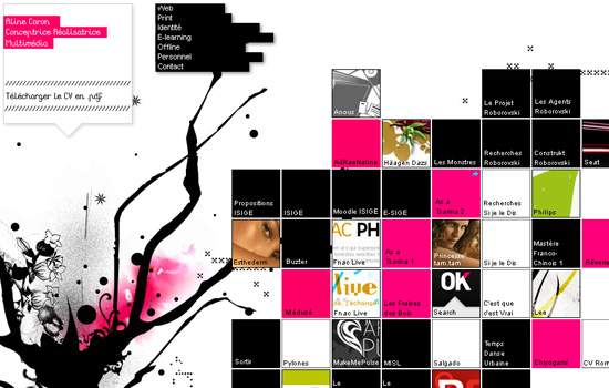
Aline Caron Portfolio The presentation of the thumbnails in this portfolio gives it a unique interface, reminiscent of the chemical table of elements.
chris woods
Minimalist portfolios focus the user’s attention on the works being presented, as seen in the portfolio of Chris Woods.

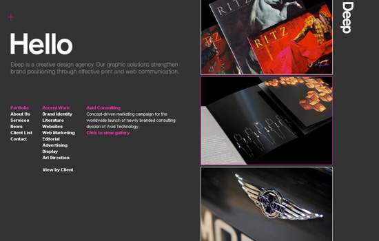
Deep Deep’s portfolio gives users a unique navigation interface; the plain solid background and text make the showcase the highlight of the home page.
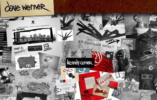
Dave Werner’s Portfolio Dave Werner’s portfolio gallery is shown as an artistic collage; clicking on a piece in the collage expands it.
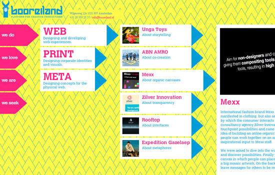
Booreiland Booreiland’s portfolio gives users a “breadcrumb” navigation scheme so that they can easily jump through sections.
vivified In this showcase, the projects dominate the entire page, and a thumbnail gallery on the right-hand side gives you a way to browse through the projects.

nisgia.com Interactive designers can show off their creative skill in user interaction by having a portfolio with distinctive interactive elements, as shown by nisgia’s portfolio.
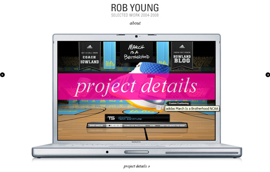
Rob Young Rob Young frames his projects in a MacBook Pro laptop, alluding to the nature of his job as an art director and designer.
Sid Lee This clean and simple portfolio gives focus to the active work being viewed by allowing it to take up a large part of the viewing area. Hovering over the right-hand side of the page opens up an alternate navigation menu.
Nile Inside Artwork is displayed in a “film-strip” view, and clicking on a piece expands it without navigating away from the film strip. Even with the rich interactivity of the portfolio, it doesn’t rely on Flash.
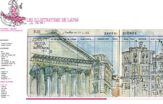
Les illustrations de Lapin Illustrations displayed side by side beautifully showcase the illustrations made in the artist’s sketchbook, giving the portfolio an unprocessed, raw, natural look.
Contrast Conventional design portfolios are visual, but that isn’t the case with Contrast’s portfolio, which displays its “thumbnail” gallery in a text-based format.
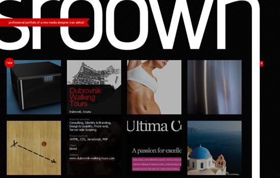
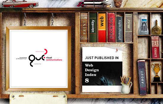
sroown sroown effectively uses its logo to frame its design gallery. Note the red “Jump back to top” element along the right-hand side that follows you along as you scroll down the page, a subtle enhancement of the interface that gives you insight into the small details they pay attention to in their designs.
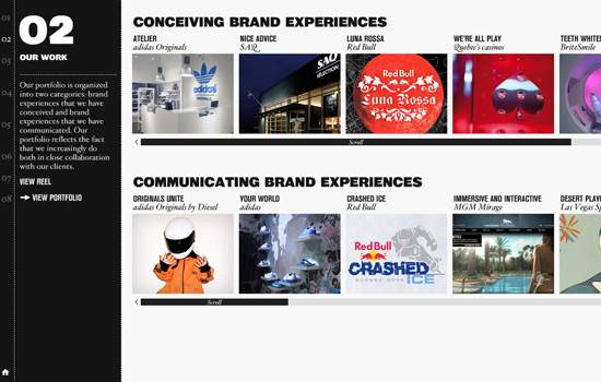
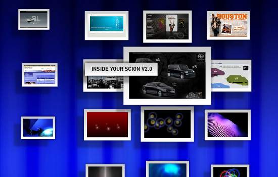
OnWired OnWired showcases its design process by taking us from conception to final product in each of its projects.
EveningLab A creative interface makes EveningLab’s portfolio stand out.
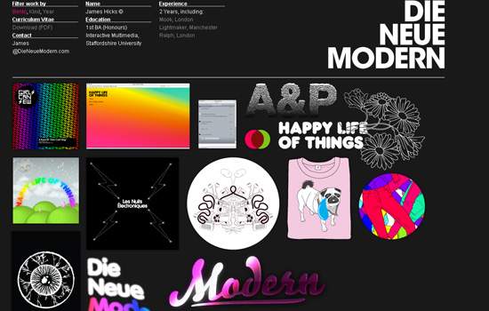
Die Neue Modern Irregular shapes and sizes of the thumbnails in this portfolio give it a unique and “systematic disorder.”
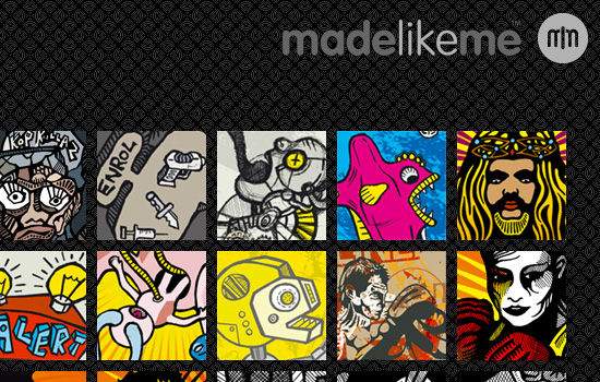
Made Like Me This portfolio shows the typical way of displaying thumbnail galleries; but by leveraging the artwork’s vivid colors and placing the art against a dark background, each piece pops out of the page and the gallery achieves a unified look.
Marius Roosendaal An accordion user interface gives Marius Roosendaal’s portfolio a nifty way of showcasing his work while allowing it to remain compact, thus maximizing valuable screen real estate.
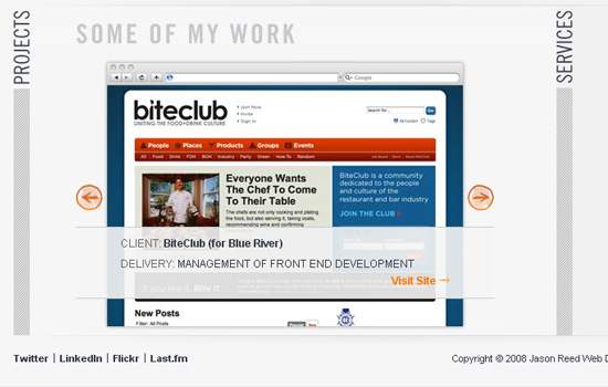
Jason Reed Web Design Jason Reed’s portfolio features a horizontal accordion menu, which minimizes the need to scroll and, again, makes the design compact.
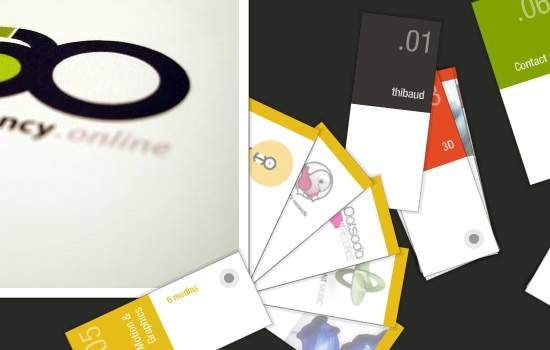
Thibaud’s portfolio Thibaud’s portfolio uses color swatches as interactive elements, which not only hints at the nature of his work but also effectively showcases his skill, experience and creativity in interactive design.
bcandullo.com Brad Candullo beautifully frames his creations with worn notebook pages, giving them an organic look and feel.
James Lai Creative James Lai Creative’s portfolio sits on the front page. Each thumbnail is in a frame, and you can navigate through them horizontally.
formrausch This portfolio puts each project in a beautiful frame, showing the designer’s meticulous attention to detail.
Serial Cut Another minimalist portfolio design that focuses attention on the artwork.

Dawghouse Design Studio Dawghouse Design Studio displays its projects on a notebook paper background. The hand-drawn concept is carried through with each graphical element, including the “View site” button and the “Next” and “Previous” buttons.
Hot Meteor Eye-catching, smooth animation that uses horizontal and vertical movement creates a memorable user experience.

Oneover.com The unconventional 3-D showcase seen in this portfolio provides a great user experience.
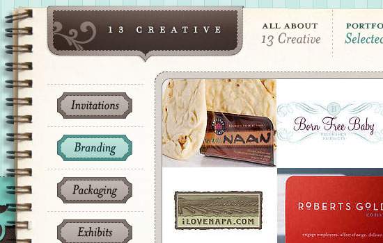
13 Creative 13 Creative houses its portfolio on a steno pad. A beautiful navigation scheme and subtle, fluid animation make this portfolio a memorable design.
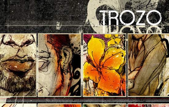
TROZO GALLERY
Eduardo Valdivieso’s style of art transcends the canvas and works well as part of a Web design, allowing the two media to complement each other.
Danny Blackman Danny Blackman’s animated navigation makes navigating through his projects a pleasant experience.
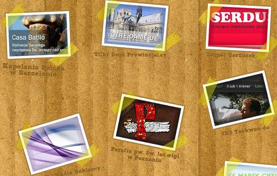
Frisk Web Frisk Web displays thumbnails of its projects as taped-on Polaroid shots, giving the portfolio design an uncommon and remarkable layout.
foxie’s graphic design
This creative portfolio interface uses books sitting on a bookshelf for navigation.
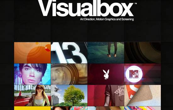
Visualbox Visualbox takes advantage of the vivid colors of its work by placing its portfolio against a plain dark background, effectively emphasizing the “Visual” in its company name.
Ed Peixoto An unconventional layout for a thumbnail gallery and subtle yet memorable hover-over animation make this portfolio design impressive.

Odd Web Things
Odd Web Things stays true to its name by showcasing its work in an unusual fashion. You just might think about the design long enough to remember the company’s name, or even explore the rest of its website looking for an explanation.
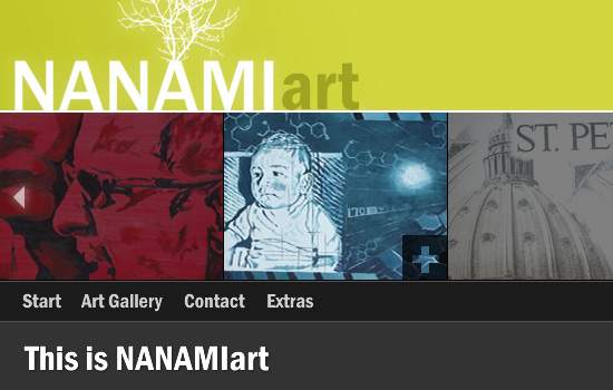
NANAMIart NANAMIart integrates its portfolio in the design by displaying it near the header, giving users access to it at all times.
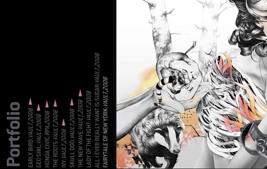
Vault49 This portfolio is text-based until you click on the name of a project; the name then expands to show a preview of the artwork.
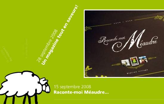
adncom A rotating display that revolves around an illustrated sheep gives adncom’s portfolio a unique twist.
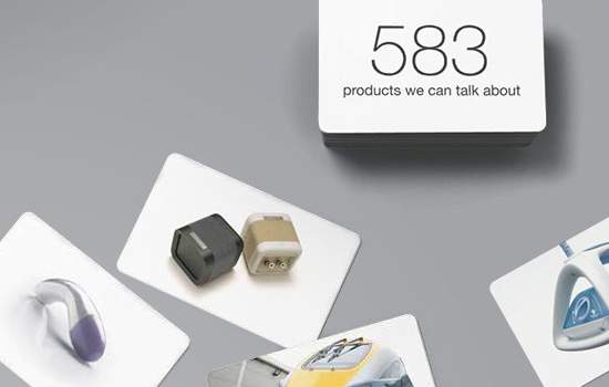
SeymourPowell The deck-of-cards introduction gives users a sense of what SeymourPowell is all about in a matter of seconds.
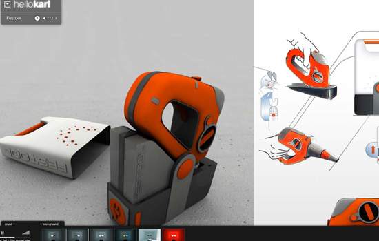
hellokarl hellokarl combines subtle, fluid animation along with great large-scale product shots to create an engrossing mood.
Related posts
- 99 Creative And Beautiful Looking Portfolio Designs
- 45 brilliant design portfolios to inspire you
- 50 Inspirational & Creative Personal Portfolio Websites


