Push Your Web Design Into The Future With CSS3

Email Newsletter
Weekly tips on front-end & UX.
Trusted by 182,000+ folks.
 Register for Free
 Celebrating 10 million developers


 Custom Web Forms for Angular, React, & Vue. Your backend.
**Editor's Note (May 22, 2024):** CSS has significantly evolved since the original publication of this article in 2009. Since then, CSS has shipped an incredible number of new features including [responsive layout methods](https://www.smashingmagazine.com/2019/04/display-two-value/), fluid typography, [variable fonts](https://www.smashingmagazine.com/2019/12/smashing-podcast-episode-5/), [color function](https://www.smashingmagazine.com/2023/08/oklch-color-spaces-gamuts-css/)s, [math function](https://www.smashingmagazine.com/2015/12/getting-started-css-calc-techniques/)s, and [new units](https://www.smashingmagazine.com/2023/12/new-css-viewport-units-not-solve-classic-scrollbar-problem/), as well as novel approaches for [managing the cascade](https://www.smashingmagazine.com/2022/01/introduction-css-cascade-layers/) and even a way for [elements to respond to other elements](https://www.smashingmagazine.com/2021/05/complete-guide-css-container-queries/). A few notes have been added throughout this article to reflect current front-end practices, but you can also read ["Writing CSS In 2023](https://www.smashingmagazine.com/2023/07/writing-css-2023/)" for a more cent roundup of modern CSS features.
Realistically, you won’t be able to use these on your everyday client projects for another few years, but for design blogs and websites aimed at the Web design community, these features can help you push the boundaries of modern Web design today, adding that extra spice to your design and helping the industry move forward.
Also, consider the following related articles:
- HTML5 and The Future of the Web
- Mastering CSS Principles: A Comprehensive Guide
- The Future Of CSS: Experimental CSS Properties
Here are five techniques snatched from the future that you can put into practice in your website designs today.
1. Border Radius
Probably the most common CSS3 feature currently being used is border-radius. Standard HTML block elements are square-shaped with 90-degree corners. The CSS3 styling rule allows rounded corners to be set.
-moz-border-radius: 20px;
          -webkit-border-radius: 20px;
          border-radius: 20px;
Border-radius can also be used to target individual corners, although the syntax for -moz- and -webkit- is slightly different:
-moz-border-radius-topleft: 20px;
          -moz-border-radius-topright: 20px;
          -moz-border-radius-bottomleft: 10px;
          -moz-border-radius-bottomright: 10px;
          -webkit-border-top-right-radius: 20px;
          -webkit-border-top-left-radius: 20px;
          -webkit-border-bottom-left-radius: 10px;
          -webkit-border-bottom-right-radius: 10px;
Supported in Firefox, Safari and Chrome.
Editor's Note (May 22, 2024): Vendor prefixes are no longer necessary for the CSS border-radius property nor any other features released in CSS3. While some prefixed properties still exist, browsers often make experimental properties and other CSS features available prior to an official release as "feature flags" that are enabled in the browser settings.As used by: Twitter.
See also:
2. Border Image
Editor's Note (May 22, 2024): See "The Complex But Awesome CSS border-image Property" for deeper coverage on using border images.
border-image, as the name suggests, allows an image file to be used as the border of an object. The image is first created in relation to each side of an object, where each side of the image corresponds to a side of the HTML object. This is then implemented with the following syntax:
border: 5px solid #cccccc;
          -webkit-border-image: url(/images/border-image.png) 5 repeat;
          -moz-border-image: url(/images/border-image.png) 5 repeat;
          border-image: url(/images/border-image.png) 5 repeat;
border: 5px specifies the overall width of the border, and then each border-image rule targets the image file and tells the browser how much of the image to use to fill up that 5px border area.
Border images can also be specified on a per-side basis, allowing for separate images to be used on each of the four sides as well as the four corners:
border-bottom-right-image
    border-bottom-image
    border-bottom-left-image
    border-left-image
    border-top-left-image
    border-top-image
    border-top-right-image
    border-right-image
Supported in Firefox 3.1, Safari and Chrome.
Editor's Note (May 22, 2024): CSS has moved away from "physical" directions such astop,bottom>,left, andrightin favor of "logical" directions that are based on the writing direction of the document. For example,border-topis equivalent to the "starting" edge of the "block" dierction, orborder-block-start. See "Understanding Logical Properties and Values" to learn more.
As used by: Blog.SpoonGraphics.
See also:
3. Box Shadow and Text Shadow
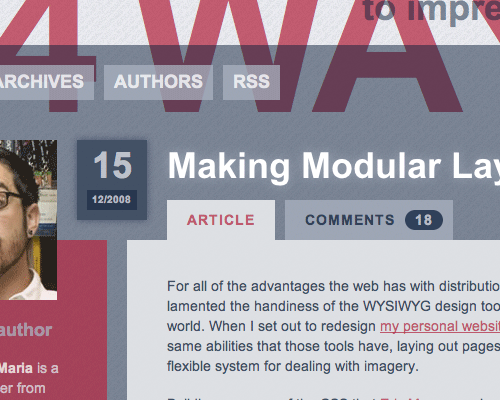
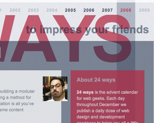
Drop shadows: don’t you just love them?! They can so easily make or break a design. Now, with CSS3, you don’t even need Photoshop! The usage we’ve seen so far has really added to the design, a good example being this year’s 24 Ways website.
-webkit-box-shadow: 10px 10px 25px #ccc;
          -moz-box-shadow: 10px 10px 25px #ccc;
          box-shadow: 10px 10px 25px #ccc;
Editor's Note (May 22, 2024): Vendor prefixing is no longer necessary for the CSS box-shadow property.The first two attributes determine the offset of the shadow in relation to the element, in this case, 10 pixels on the x and y axis. The third attribute sets the level of blurriness of the shadow. And finally, the shadow color is set.
Also, the text-shadow property is available for use on textual content:
text-shadow: 2px 2px 5px #ccc;The CSS box-shadow and text-shadow properties are fully supported by modern browsers.
As used by: 24 Ways.
See also:
4. Easy Transparency with RGBA and Opacity
Editor's Note (May 22, 2024): While thergba()syntax that is presented below is still valid and works, a more modern version was released in 2023 that removes commas from the function's argument list, e.g.rgb(0 0 0)instead ofrgb(0, 0, 0)). Addtionally,. the "a" inrgba()is no longer necenessary for declaring alpha transparency, which has been replaced by a forward slash in thergb()syntax, e.g.rgb(0 0 0 / .5)instead ofrgba(0, 0, 0, .5).
The use of PNG files in Web design has made transparency a key design feature. Now, an alpha value or opacity rule can be specified directly in the CSS.
rgba(200, 54, 54, 0.5);
        /* example: */
        background: rgba(200, 54, 54, 0.5);
        /* or */
        color: rgba(200, 54, 54, 0.5);
The first three numbers refer to the red, green and blue color channels, and the final value refers to the alpha channel that produces the transparency effect.
Alternatively, with the opacity rule, the color can be specified as usual, with the opacity value set as a separate rule:
color: #000;
          opacity: 0.5;
Supported in Firefox, Safari, Chrome, Opera (opacity) and IE7 (opacity, with fixes).
As used by: 24 Ways (RGBA).
See also:
- W3C Working Draft
- RGBA on CSS3.info
- Pure CSS Opacity
5. Custom Web Fonts with @font-face
Editor's Note (May 22, 2024): New types of font files are now available, including .woff2 which is currently viewed as the best choice at the time of this update. Please see "Using @font-face in CSS" over at CSS-Tricks for more information on browser support and fallback approaches.
There has always been a set of safe fonts that can be used on the Web, as you know: Arial, Helvetica, Verdana, Georgia, Comic Sans (ahem…), etc. Now the @font-face CSS3 rule allows fonts to be called from an online directory and used to display text in a whole new light. This does bring up issues of copyright, so there are only a handful of specific fonts that can be used for @font-face embedding.
The styling is put into practice like so:
@font-face {
        font-family:'Anivers';
        src: url('/images/Anivers.otf') format('opentype');
        }
The rest of the font family, containing secondary options, is then called as usual:
h1 { font-family: ‘Anivers’, Helvetica, Sans-Serif;Supported in Firefox 3.1, Safari, Opera 10 and IE7 (with lots of fixes: if you are brave enough, you can make font-face work in IE (thanks for heads up, Jon Tan))
As used by: TapTapTap.
See also:
Although CSS3 is still under development, the rules listed here are supported by some browsers right now. Safari in particular has extensive support for these new features. Unfortunately, despite being a top-quality browser, Safari has a relatively low number of users, so it is probably not worthwhile adding extra features solely for this group of users. But with Apple’s Mac computers making their way into everyday life, Safari’s usage is likely to continually increase.
Firefox, on the other hand, now has a considerably large user base. What’s more, the soon-to-be-released Firefox 3.1 has added support for a range of CSS3 features. Assuming that most users of Firefox will update their browsers, there will soon be a large group of users with support for these new styling rules.
Google Chrome was released this year. Based on the WebKit engine, this browser has much of the same support as Safari. While Safari makes up a good proportion of Mac users, Chrome has burst onto the scene, making up a decent proportion of Windows users.
Percentage-wise, the W3’s browser statistics indicate that, as of November 2008, 44.2% of W3School’s users across the Web were browsing with Firefox, 3.1% with Chrome and 2.7% with Safari. That means almost 50% of all Internet users should be able to view these features. Within the Web design community in particular, which is much more conscious of browser choice, the range of users with CSS3 support is much higher, at 73.6% (according to the stats at Blog.SpoonGraphics).
Editor's Note (May 22, 2024): Browser statstics have changed significantly since this article was originally published. For example, Microsoft has dropped support for Internet Exploter in favor of Edge, which was originally running it's own rendering engine but has since become a Chromium fork, the same engine that powers Google Chrome.
6. The downside
Editor's Note (May 22, 2024): All of the CSS features covered in this article enjoy full browser support at the time of this update.
Your website may now have a range of fancy new design features, but there are a few negatives to take into consideration:
- Internet Explorer: 46% of Internet users won’t see these features, so don’t use them as a crucial part of the design of your website. Make sure that secondary options are in place, such as a standard border in place of border-image
and a normal font in place of @font-face. Please notice that Internet Explorer supports@font-facewith EOT (more details) since v4 (thanks for heads up, Jon Tan). - Invalid style sheets: These CSS3 features have not been released as a final specification. They are currently implemented with tags that target different browsers. This can invalidate your style sheet.
- Extra CSS markup: Following the last point, having to add a different tag for each browser to specify the same rule, as well as include the standard rule for the final CSS specification, adds a lot of extra code to your CSS markup.
- Potentially horrific usage: Just as is done with traditional Photoshop filters, the use of these new styling features could result in some eye-wrenching designs. Drop shadows in particular ring warning bells for us; we’re not looking forward to seeing the Marketing Department’s choices with that one!
 (al, gg)

