10 Useful Web Application Interface Techniques

Email Newsletter
Weekly tips on front-end & UX.
Trusted by 182,000+ folks.


 Custom Web Forms for Angular, React, & Vue. Your backend.
 Celebrating 10 million developers
More and more applications these days are migrating to the Web. Without platform constraints or installation requirements, the software-as-a-service model looks very attractive. Web application interface design is, at its core, Web design; however, its focus is mainly on function. To compete with desktop applications, Web apps must offer simple, intuitive and responsive user interfaces that let their users get things done with less effort and time.
In the past we didn’t cover web applications the way we should and now it’s time to take a closer look at some useful techniques and design solutions that make web-applications more user-friendly and more beautiful. This article presents the first part of our extensive research on design patterns and useful design solutions in modern web applications. Below you’ll find a collection of 10 useful interface design techniques and best practices used in many successful web-applications.
You may want to take a look at the following related articles:
- 5 Useful Coding Solutions For Designers and Developers
- 10 Useful Techniques To Improve Your User Interface Designs
- 10 Principles Of Effective Design
- Five More Principle Of Effective Design
1. Interface elements on demand
Simplicity is important in user interface design. The more controls you display on the screen at any time, the more time your users will have to spend figuring out how to use your interface. When there is less choice, the available functions become more apparent and are easier to scan. Simplifying an interface isn’t easy though, especially if you don’t want to limit the app’s functionality.
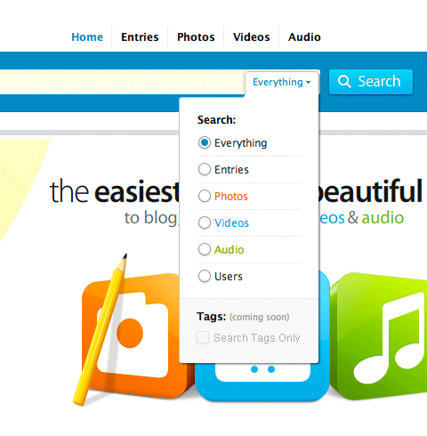
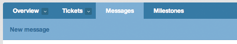
When you click on the search link in Kontain’s search box, a similar drop-down menu appears. So, if you need to narrow your search, you can use the menu to select the sort of content you’re looking for. Tucking these options away simplifies the search box.
One way of making things simpler is to hide or conceal advanced functionality. Find out the most commonly used functions of your interface and tuck away the rest. You can do this with pop-up menus and controls, which are very common on desktop software. For example, if your search bar has advanced filters, put them away in a special drop-down menu at the end. If users need those filters, they can enable them with just a couple of clicks. Deciding what to keep and what to conceal isn’t a simple task, though, and will depend on how important and how frequently used each of the controls is.
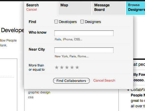
When you click on the search link in CollabFinder, you aren’t taken to a different page. Instead, the search box controls drop down, allowing you to begin your search straight away.
2. Specialized controls
It’s important to select the right interface controls for the situation. Different situations can be handled in different ways, and certain controls are better at their intended task than others.
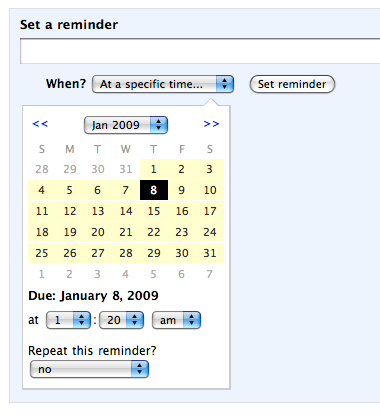
Backpack has a compact calendar date and time picker for selecting a reminder date.
For example, you can select a date by using drop-down lists for day, month and year. Drop-downs aren’t very efficient, however, when compared to a calendar picker, where you can click directly on a day you want. Calendar pickers also help you see the days, weeks and months (and especially workdays and weekends) more easily and so allow you to make a more informed decision more quickly than you would with a simple drop-down list.
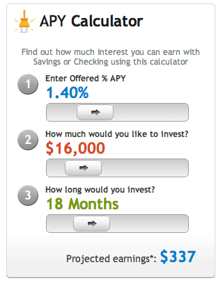
MyBankTracker’s APY calculator features easy-to-use slider controls for quickly trying out different projections.
Another good example of this are sliders. Yes, you can always input a number manually, but for certain situations, slider controls do a much better job. Not only are they easy to use — just click and drag — but you can also see how your selection fits between the minimum and maximum of an available range.
3. Disable pressed buttons
One of the problems Web applications encounters with forms is the submission process. With very simple forms, if you click the “Submit” button twice or more very quickly, the form will be submitted two or more times. This is obviously problematic because it will create duplicates of the same item. Preventing duplicate submissions isn’t very hard, and it is essential to do this for most Web apps.
There are two tiers to this safeguard: client-side and server-side. We won’t go through the server-side safeguard here because this will vary depending on the programming language you use and your back-end architecture. What you should essentially do is put in a check to ensure during the processing stage that whatever is being submitted is not a duplicate, and if it is to block it.
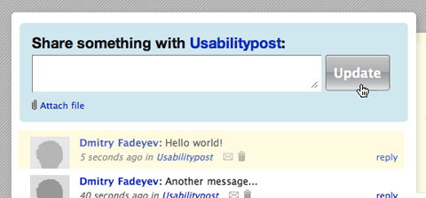
Yammer disables the “Update” button while your new message is being submitted.
The client-side stage is much simpler. All you have to do is disable the “Submit” button the very moment it is clicked. The easiest way to do this is to add a piece of JavaScript to the “Submit” button like this:
<input type=“submit” value=“Submit” onclick=“this.disabled=true” />
Of course, we would advise you to also implement server-side checks to be sure that duplicates don’t get through.
4. Shadows around modal windows
Drop shadows around pop-up menus and windows aren’t just eye candy. They help the menu or window stand out from the background by reinforcing its dimensions. They also block out the noise of the content beneath the window by darkening the area around it with a shadow.
This technique hat its roots in traditional desktop applications and helps the user to focus his/her attention on the appearing window. Since most modal windows aren’t as easy to distinguish from the main content as in desktop applications, shadows help them to appear closer to readers, because the window appears to be three-dimensional and lay above the rest of the page.
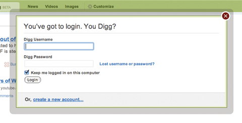
Digg’s log-in window has a thick shadow around it to block out the noise of the page beneath.
To achieve this effect, designers often create a container with a transparent PNG-image as background and place the content inside the container - with equidistant padding on all sides of the box. Another option is to use a background image with transparent borders and position the content box within this box using absolute positioning. This is exactly what Digg does — this is the image they are using (dialog.png). And this is the markup and CSS-style they are using:
(X)HTML:
  <div id=“container”>
    <div style=“display: block; top: 236px; opacity: 1;” class=“dialog”>
      <div class=“body”>
            <div class=“content”>
              …
            </div>
          </div>
        </div>
      </div>
CSS:
.dialog {
    position: absolute;
    left: 50%;
    margin-left: -315px;
    width: 630px;
    z-index: 100001;

}
.dialog .body {
    background: url(/img/dialog.png) 0 0; /* semi-transparent .png image */
    padding: 40px 13px 10px 40px;
}
Alternatively, you can also use JavaScript-based lightboxes or drop shadows using CSS3-attributes we’ve described earlier, but you need to be aware that Internet Explorer won’t support them.
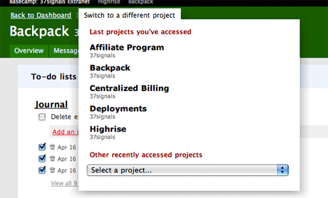
Basecamp’s project switcher window has a large soft drop shadow that helps the menu area stand out.
5. Empty states that tell you what to do
When you’re designing a Web application, it’s important not only to test it with sample data, but to ensure that it looks good and is helpful when there is nothing there yet. You should design the empty states.
When there is no information for a page or query yet, a helpful message telling the user how to start could go in that empty space. For example, a project management application’s home page may list the user’s projects, but if there are no projects yet, you could provide a link to the project creation page. Even if there is already a button to do that on the page, an extra bit of help doesn’t hurt.
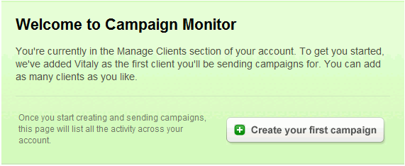
Campaign Monitor points you in the right direction when you start building an email campaign.
This technique encourages users to actually try out the service and proceed directly with using the service after registration. Guiding the user through single steps of the application may help him or her to understand what advantages the application offers and if it’s useful or not. It is also important to present most important options to the users and only them — it doesn’t make sense to overflood them with numerous options. Keep in mind that users usually want to get a more or less concrete idea of what is offered to them, but they don’t want to jump into details — they have neither time nor interest in it.
Using empty states to motivate users and animate actions, you can significantly reduce the amount of “drop-outs” and help your potential clients to gain a better understanding of how the system works.
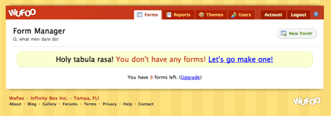
Wufoo’s forms page has a large, friendly message inviting you to create a new form if none yet exist.
6. Pressed button states
Many Web applications have custom-styled buttons. These are anchors or input buttons that have custom images assigned as their backgrounds. The default input buttons may not be suitable in some cases, and the text links are sometimes too subtle. The challenge is, when you make your links look like buttons, they should act like buttons — and this includes having a “pressed” look when the user clicks on them.
This isn’t a purely visual tweak. Giving instant feedback to the user will make the application feel more responsive and bring the experience closer to what the user experiences on desktop applications.
You can add a pressed button state with CSS by styling the active pseudo-class of the link in question. So for example, if your anchor has the class add_task_button, you can style its active class by targeting add_task_button:active.
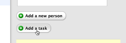
Buttons in Highrise actually show a pressed state when you click on them, providing the user with a satisfying responsive feel.
7. Link to the sign-up page from the log-in page
Some people who haven’t yet signed up to your application will inevitably end up on the log-in page. They likely want to try out your application but can’t find the registration page in a hurry. Perhaps they’ve tried accessing a feature that’s only available to registered users.
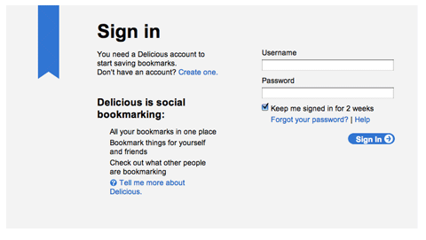
Don’t have a Delicious account? No problem; a sign-up link is provided on the Delicious log-in page.
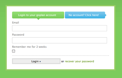
Goplan has a nice colored button on the log-in page pointing to the sign-up page.
Make things easy for these folks by placing a registration link on your log-in pages. If they haven’t got an account yet, they shouldn’t have to look for a registration page. Our studies confirm: 18% have a sign-in form or a link to the sign-in form placed next to it (e.g. YouTube, Reddit, Digg, Lulu, Metacafe).
8. Context-sensitive navigation
It’s important to think about what the user expects to see and what they need in every given context. You don’t need to display the same navigation controls everywhere because users simply may not need them in every situation.
One of the best examples of context-sensitive controls is the recent change in the Microsoft Office 2007 interface, in which the default set of toolbars was replaced by ribbon controls. Each tab on the ribbon holds different controls relating to a particular activity, be it editing graphs, proofreading or simply writing. Web applications can also benefit from such context-sensitive controls because these controls help unclutter interfaces by showing only what the user needs, not everything that’s available.
Lighthouse features a familiar tabbed navigation menu; however, it also has a second level of menus right under the set of tabs. This level displays only the items associated with the active section of the website.
9. More emphasis on key functions
Not all controls hold the same importance. For example, on a screen for creating a new item, you may have two buttons: “Create” and “Cancel.” The “Create” link is more important because that’s what the user will be doing most of the time. Only rarely will they need to cancel the screen. So if these controls are located side by side, you may not want to give both the same emphasis.
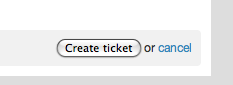
The “Create ticket” button in Lighthouse. You can see the “cancel” link next to it, in plain text. The button not only commands more importance but also has a larger clickable area and is easier to spot because of its frame.
To shift emphasis to the “Create” link, we can simply use different styles or types of controls. Some applications use the form input button for the create action, and have the cancel action as a text anchor. This not only gives the create button more clickable area, it also helps to grab the users gaze better when they’re looking for it.
10. Embedded video
While pictures and text are a great way to communicate and teach your users about your app’s features, video can be an even better alternative if you have the resources to produce it. Video has been gaining popularity on the Web in recent years. For Web apps, videos are generally used on the marketing website as a kind of screencast to show off a product’s features; however, this isn’t the only way to use video.
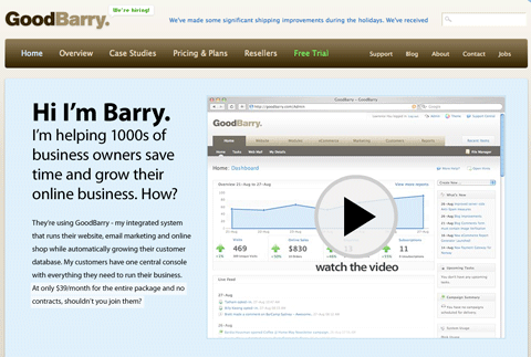
GoodBarry features a video screencast on its front page showing off the product. It also uses screencasts inside the app to teach people on how to get started.
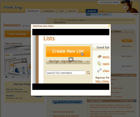
MailChimp includes tutorial videos right on the admin panel to help out new users.
Some Web apps use video inside the application itself to teach users how to use certain features. Video is a fantastic way to quickly demonstrate how your product can be used, because it is easier to consume than a page of text, and it is also much clearer because the viewer can see exactly what to do.
 (al)
(al)

