Colors In Corporate Branding And Design

Email Newsletter
Weekly tips on front-end & UX.
Trusted by 182,000+ folks.
 See User Testing Live


 Celebrating 10 million developers
 Custom Web Forms for Angular, React, & Vue. Your backend.
Color is a major consideration in any Web design. Whether for an individual, small company, or major corporation, color scheme is one of the most significant factors in the overall look and appearance of a website. In some cases, the designer may have the sole discretion in making color choices, but many times a color scheme has already been established and needs to be followed. In situations where a company already has a strong brand, color usage for the website can either build or take away from this.
You may want to take a look at the following related posts:
- The Code Side Of Color
- Color Theory for Designers, Part 1: The Meaning of Color
- Color Theory For Designers: Creating Your Own Color Palettes
In this article, we’ll take a look at the impact that website color schemes have on the overall branding of a company, and we’ll also look at plenty of examples. We won’t be going into the subjects of color choices for branding or the psychology of colors, but rather we’ll look at established companies to see if the colors in their website branding are consistent with the rest of their marketing.
There are companies in every imaginable industry that have spent many years and a lot of money along the way to create a specific image and brand recognition with customers. In these cases, their corporate websites should obviously benefit from this established identity and should work to make it even stronger. However, as we’ll see throughout this article, this is not always the case. Some companies do an excellent job of blending their traditional offline image with a modern website, and others have not taken full advantage of their existing brand images when building their websites.
The example websites we’ll be looking at in this article all belong to companies that have built their brand using specific colors. When you think of these companies, you think of a specific color, and probably a familiar logo that contains these colors. Because branding is so dependent on customer perception, customers also have certain assumptions and expectations of companies that have an established brand.
Many of these examples are major retailers, restaurants and companies that have physical locations where customers can go to purchase products or services. In these cases, each company typically has established colors for the store itself, signage outside the stores, advertising and promotion campaigns and a company website. The branding is usually more effective if the company’s website has a similar feel to that of the physical stores and the identity that the company has developed over time.
Impact of a Website’s Colors
Whether you’re looking at a website, a flier in a newspaper, a magazine ad or a retail catalog, color choices are critical to the branding of a company. Most companies have chosen a standard color scheme that is used consistently throughout their marketing materials. When a website is well designed and effectively uses colors that have been branded over the years, the website and the company benefit from the familiarity that the website and the brand have with customers. Loyal customers to the company may be new to the website, but if the website is branded consistently with the company as a whole, those visitors are likely to feel at home instantly because of the consistency.

Colors are critical to building the brand’s image, just as logos are important for the same reason. With many retail companies looking to boost revenue through increased online sales, converting traditional retail shoppers to online customers is a critical step. Many retailers are effectively creating websites that have a very similar look and feel to the actual retail stores themselves. The style and colors of the brand are often replicated as much as possible throughout the website, which creates a more unifying experience for online visitors who have also shopped at the physical retail locations in the past. By building one consistent brand image, the company is able to more effectively meet its customers in the marketplace, whether that is online of offline.
Impact of Color on Visitors
When visitors come to the website of a brand they know very well, they’ll often have certain things they expect to find. Of course, they’ll expect to see a company logo that they’re accustomed to seeing. They’ll expect a certain type of content according to the type of website it is. They’ll expect a design style that fits the corporate identity. And they’ll expect to see familiar colors. In many cases, they probably don’t even realize they have all of these expectations; but imagine a company that has branded itself with a particular color for years and years, and now you visit the company’s website and that color is not a major part of the design. You’ll probably be a little surprised, and the website is unlikely to have as familiar a feel as it would have with the traditional colors.
If a company has branded itself a certain way and with specific colors, customers and others familiar with the company will have subconsciously associated those colors with the company. When these people arrive at the company’s website, those colors will be a big part of the experience and determine whether the visitor feels connected to the website or senses a disassociation with the rest of the company’s branding efforts.
Evaluating Use of Color
In order to take a good look at this subject, we’ll need to evaluate a number of companies and websites. In the examples here, we’ll see some that do an effective job of working with the company’s existing branded image and color scheme, and we’ll see some that don’t use company colors in quite the way that you might expect. All of these companies have used specific colors very significantly in their branding. Most are very well-established international companies that everyone is familiar with, and in most cases you could associate a color with the brand just by hearing the company name.
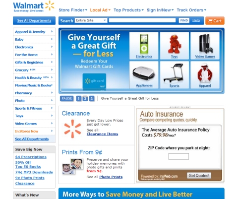
Wal-Mart
Wal-Mart has branded itself over the years as the leader in low-cost retail goods. Along the way, it has used the color blue in just about all of its branding efforts. In recent years, Wal-Mart has been trying to upgrade its image in the eyes of customers, but the familiar blue color has not gone away, although the logo did get an update not too long ago.
Like most retailers’ websites, Wal-Mart’s is primarily white, but there is plenty of blue to give it the familiar feel. Navigation and headlines are blue throughout most of the website – the same blue color and same Wal-Mart logo found at Wal-Mart’s retail locations, in fliers and advertisements and in all of its other marketing materials. Throughout the website, orange and yellow are used as secondary colors, but the heavy use of blue in graphics, navigation and headers is what really gives the website a familiar Wal-Mart feel.
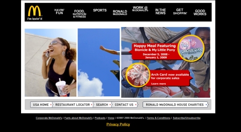
McDonald’s
Fast food giant McDonald’s is very well recognized for its golden arches and prominent red. However, the US home page for McDonald’s does little to build on this strong brand that has been built over a long period of time. The golden arches logo is there, but black is used much more heavily than the gold and red color scheme. Certainly, the website does need to be more than just gold and red, as that would be very hard on the eyes, but it seems that the McDonald’s website doesn’t quite feel like McDonald’s because of this color difference.
Even by just using a white background instead of a black background, the gold and red would stand out more in the design, instead of being overpowered by the black. An area for potential improvement is the primary navigation menu at the top of the page. A red background here would do more to promote the McDonald’s brand and build familiarity with visitors and customers. With the navigation menu currently designed on a black background, gold could be used either in the text colors or on hover.
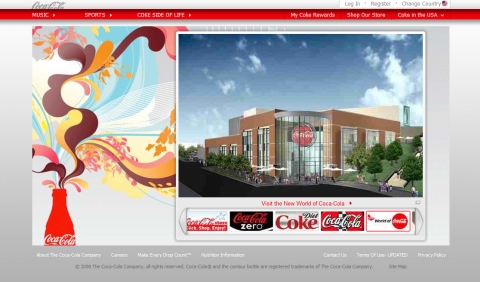
Coca-Cola
For decades, the Coca-Cola brand has been built with a very familiar red and white color scheme. Everything from product packaging to displays in retail stores to advertisements has predominantly used the same color scheme, and as a result the Coke brand is one of the strongest in the world. The Coca-Cola website does use the red and white color scheme, but there is much less red than you would expect.
The website could easily be a better fit with the company’s corporate identity with a design that has a red background instead of the gray currently being used. The well-known Coca-Cola logo is also not used prominently on the home page. There is a very small logo at the top of the page above the main navigation, which can also be seen on a few of the product labels displayed. The corporate identity could possibly be enhanced by using a larger logo at the top of the page and by showing it in red, or in white on a red background, rather than in gray on a white background.
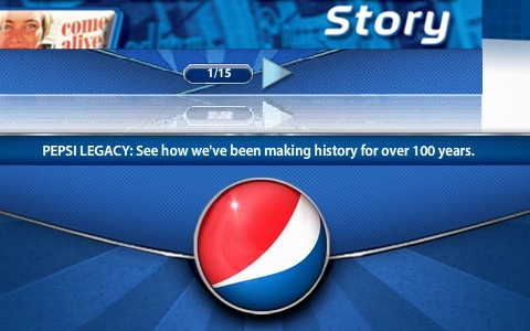
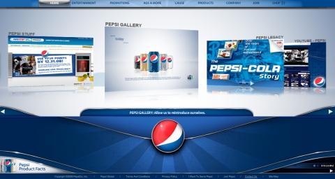
Pepsi
Coca-Cola’s major competitor, Pepsi, has also used a standard color scheme in its own branding efforts over the years. The red, white and blue color scheme is a Pepsi staple, and the website is true to form in this area. Most of the website is blue and white with some red in the logo, which stands out more because red is used sparingly. Just about everything on the home page is red, white or blue.
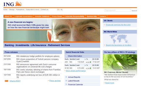
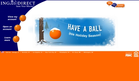
ING
Financial services provider ING has branded itself with a blue and orange color scheme. As expected, its website strongly uses these company colors, with orange and blue being almost the only colors used on the website, aside from the white background and the dark gray text. The main navigation menu is orange, and headlines are blue. Of course, the logo also uses orange and blue on the white background.
ING’s online banking customers also see the familiar orange and blue every time they visit their accounts at ING Direct. This website uses more orange in the design, but the color scheme and branding are consistent.
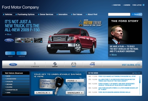
Ford
US automaker Ford has built its own brand with steady and consistent use of blue. The Ford website obviously is an extension of this branding effort as blue is used as the background color. Although a brand’s colors don’t necessarily have to be used as the background color of the website (most companies still use a white background), Ford manages to push its brand with heavy use of blue on the website. Even design elements such as the search button and the secondary navigation towards the bottom of the screen use shades of blue.
One potential area for improvement in terms of corporate identity would be to use the Ford logo in the header, rather than just the words “Ford Motor Company.” The logo does appear on the home page, but it’s smaller and a bit less noticeable than it would be in the header.
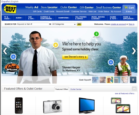
Best Buy
Best Buy customers know that the company makes heavy use of its blue and yellow color scheme. Even store employees are easily recognizable in their blue shirts. Consistent with the rest of the company’s marketing and branding, the Best Buy website uses the familiar color scheme. Blue is used throughout the website, in the header navigation and even in graphical elements. Yellow is used more sparingly but is certainly a significant part of the website’s design. Because yellow is used in only a few places, it has more of an impact in contrast to the blue colors, and the items in yellow really stand out and draw attention. The Best Buy logo, the yellow shopping cart, the “Go” button on the search form and the “see Steven’s story” button all stand out because of the yellow color. As a result, Best Buy’s website is able to use very little color outside of its standard blue and yellow, and it is still able to emphasize what it wants.
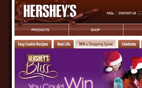
Hershey’s
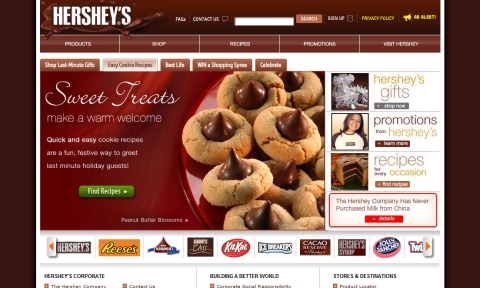
Chocolate maker Hershey’s has naturally used the color brown for its own branding. Within the Hershey’s family, several smaller brands each has its own identity and marketing approaches, but for the company as a whole, brown is the predominant color. It should be no surprise then that the Hershey’s website is very brown. In my opinion, the Hershey’s website is more effective at using the company’s established brand and colors on its website than just about any other website featured here. The white background in the content area keeps the website user-friendly, but there’s no mistaking the Hershey’s brand, and the website makes you want to eat one of its products.
Brown is used for the background of the website (with a white background for the content area), as well as the header and primary navigation, the links lower on the page, the items in the sidebar and the website footer. The design does a good job of matching the color scheme to the colors of products in photos that appear on the website, such as the one shown in the screenshot below.
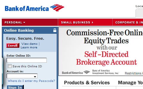
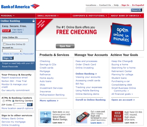
Bank of America
Bank of America makes use of the US national colors of red, white and blue as the company’s typical color scheme. It’s not unusual that a company attempts to brand itself with national colors, the intent being to benefit from customers’ loyalty to those colors. The Bank of America website clearly builds on this established brand by using only these colors on the website. The background is white, with a red navigation menu and blue used for links and the log-in box at the left of the screen.
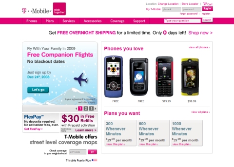
T-Mobile
T-Mobile typically uses a bright pink in its marketing and branding. Often, this color is not the most heavily used color because it can be overpowering and too much to look at if overused, but it will always appear somewhere in the company’s branding. The website makes effective use of this color in the navigation menu, the logo, as well as headlines and links throughout the website. The white background keeps the color scheme from being too over-the-top and makes the website easy to look at, but still maintains the familiar T-Mobile look.
Aside from pink and white, other colors on the website are gray and a soft blue. Pictures of the products used throughout help to give the website a more engaging appearance. The other colors that are used help to soften the look of a design that features as bright a color as pink, but the identity and branding impact of the pink is still obvious.
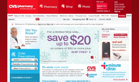
CVS
CVS Pharmacy traditionally uses red and white at its retail stores and throughout its branding. The familiar red color is used heavily in the CVS website in the background (although the content area has a white background) and in the header. There are a few different shades of red used throughout the design, and various shades of blue and gray are also used. Product photos have some additional colors, but throughout the website there is no way to miss the common red and white of the CVS corporate identity. In this case, the red in the header and background has more of an impact than the blues used in the main content area. If those colors were reversed, the website would have a much different feel and would lack similarity with the corporate identity.
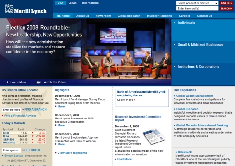
Merrill Lynch
Financial services provider Merrill Lynch has traditionally used a lot of blue in its branding. The Merrill Lynch website uses a few different shades of blue, along with a white background. The color blue is used for links throughout the website and headings in some places. Aside from the blue, there are a few red highlights, but mostly just black and gray. The Merrill Lynch bull logo is shown in white on the blue header.
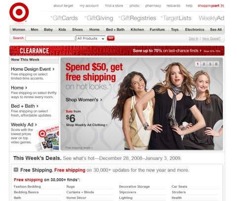
Target
Target’s retail stores and all of its marketing use red and white as the company colors. Inside the stores, you’ll see Target employees in red shirts as well. When shopping online at Target’s website, you’ll also see the standard color scheme. The website uses a white background and a good bit of gray, but there is still plenty of red to give the Target feel. On the white background, the red in the Target logo really stands out. The logo is a big part of the company’s identity, so allowing it to stand out by using a white background is effective.
The color red is used for maximum impact in the design. The red bar advertising the clearance sale, the words “Spend $50, get free shipping” and the text “Free shipping” in a few places all stand out because of the red. If red were used more heavily instead of white and gray, this effect would not be possible.
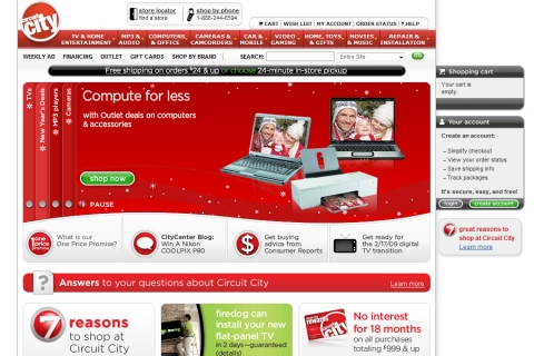
Circuit City
Circuit City also uses red and white in its branding and marketing. As with Target’s website, white and gray are used throughout, but the red still has a dominant presence. Circuit City actually uses more red than Target. The primary navigation menu, the featured product area and a few other design elements are all red.
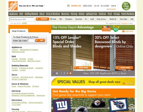
Home Depot
Home Depot’s marketing materials and its retail stores rely heavily on the use of its familiar orange. Surprisingly, the company website does little to build on that existing brand. Orange is used in the logo, although the logo is very small, and is only used for a few other elements throughout the website, such as buttons.
A larger logo would help for corporate identity purposes, and an orange header or main navigation menu (instead of the dark gray) could also help. Although the orange is used sparingly, it doesn’t make as much of an impact as the red in Target’s design because the Home Depot website uses a greater number of colors. The green and yellow, as well as the colors in the product photos, reduce the impact of the orange.
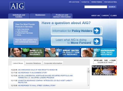
AIG
International insurance company AIG uses blue in its branding and marketing. Appropriately, the company’s website is mainly blue and white. The blue and white logo sits on a blue background just above a tabbed navigation menu that is also blue. By using different shades of blue, AIG has created a design that doesn’t need several other colors, which wouldn’t help build on the corporate identity anyway.
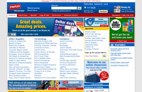
Staples
Office supplies retailer Staples consistently uses red in its stores and throughout its marketing materials. Surprisingly, the company’s website makes much less use of red than you would expect. Blue is actually used more prominently than red, which doesn’t seem to be the case with any other type of branding that the company does. As a result, the website doesn’t fit so well with the corporate identity and seems to be a bit out of place.
The website could have a much more familiar Staples feel if it had a red header or a red background, instead of the gray that sits outside of the content area. Additionally, red could be used for the headers “Office Supplies,” “Technology” and “Furniture,” instead of blue. Another option would be to use fewer colors and more white and gray, which would give the red more impact. As it is, the website uses a lot of different colors, but makes little impact with any of them.
UPS
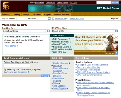
UPS probably uses color in its branding as much as any other company. UPS’s familiar brown color appears on everything from its trucks to employee uniforms, and is even referred to by name in its marketing efforts. However, brown is not used as heavily on the UPS website as you might expect. Brown is used in the header and in some headlines throughout the website, but it seems to break the mold that UPS has been building so strongly in its branding with the color brown.
One option would be to use different shades of brown, rather than some of the other colors that are used, such as green and blue. The website would have a much different feel if the green area of the header, where it says “UPS United States,” were also brown and if the primary navigation were a slightly different shade of brown. Another option would be to center align the website and use a brown background outside of the content area (currently, the website is left aligned with an all-white background).
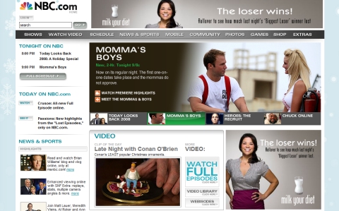
NBC
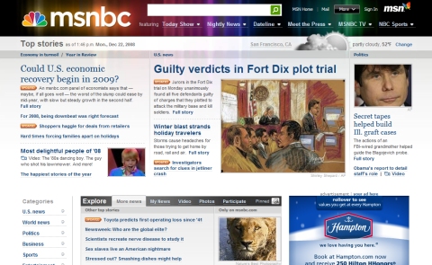
NBC’s multi-colored peacock logo is very well known and has been around for a long time. Although the logo is used several times throughout the NBC website, the colors aren’t really used repeatedly. More color could be used in the navigation menu, instead of white on gray. Another option would be to use some color in the headlines instead of the gray that is used in many places. MSNBC makes better use of the familiar colors in its header.
How Does this Affect You as a Designer?
All of the examples we looked at throughout this article were websites of major companies that, in most cases, have an international presence. The average Web designer works mostly on websites for small- to medium-sized businesses and will likely never work for companies of this size and magnitude. However, there are still some lessons that can be applied to websites of smaller companies that don’t have an established brand recognized around the world:
1. Consistency. As we’ve seen, consistency throughout all marketing media is powerful. Any business attempting to build a strong branded image should include its website in its overall marketing plan, and the design should reflect the image being built. This includes logos, color schemes, taglines and anything else used to develop the business’s identity. Whether the business is big or small, consistency is needed.
2. The subconscious of customers. Most of the time, customers do not consciously associate specific colors with a company. But over the course of time, with a company’s successful branding efforts, those customers will match the colors and company whether they realize it or not. This means that what customers subconsciously associate with a company can affect their experience on the website. Even with smaller businesses, customers and website visitors may have some prior experience with the business that can affect how they perceive the business.
3. The impact of re-branding and redesign. During a website redesign, even for a small business, choices of color and its impact on overall branding should be considered. As we’ve seen with the example websites, once a brand has been established, customers and visitors will have certain expectations of the website. Even small businesses that have been working to build their brand could take a step backwards if significant branding changes are made during the redesign process. Of course, there may be times and reasons to go ahead with a re-branding attempt, but the impact should be considered and the pros and cons weighed.
4. Make color choices wisely from the start. Because it can be difficult to make significant changes to color schemes once considerable branding efforts have been made, it is not a decision that should be rushed in the first place. When a company is being established or a new website is being planned and developed, colors should be given plenty of thought and consideration. A solid choice from the start will make everything easier down the road.


