9 Common Usability Mistakes In Web Design

Email Newsletter
Weekly tips on front-end & UX.
Trusted by 182,000+ folks.
 Register for Free

 Celebrating 10 million developers
 Custom Web Forms for Angular, React, & Vue. Your backend.

By now, all good designers and developers realize the importance of usability for their work. Usable websites offer great user experiences, and great user experiences lead to happy customers. Delight and satisfy your visitors, rather than frustrate and annoy them, with smart design decisions. Here are 9 usability problems that websites commonly face, and some recommended solutions for each of them.
You may also be interested in the following related posts:
- 30 Usability Issues To Be Aware Of
- 12 Useful Techniques For Good Interface Design
- 10 Useful Web Application Interface Techniques
1. Tiny clickable areas
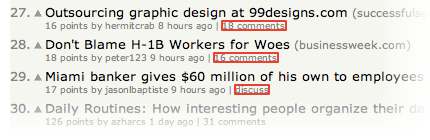
Hyperlinks are designed to be clicked, so to make them usable, it makes sense to ensure that they’re easy to click. Here’s an example of links that are far too small; clicking them is harder than it should be. These are the comments links on Hacker News, a social news website. (Clickable areas are highlighted in red):
Here’s an example of the same interface element, the comments link, but this time with a much larger clickable area:
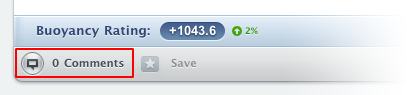 Newspond comments link.
Why would we want a larger clickable area? Simple. Because our hand movement with the mouse isn’t very precise. A large clickable area makes it easier to hover the mouse cursor over the link. To ensure we get a large clickable area, we could either make the whole link bigger or increase the padding around the link using the CSS “padding” property. Here’s the code:
<a href="https://www.examplesite.com" style="padding: 5px;">Example Site<a>The CSS has been placed inline together with the markup to make the example simpler, but in real life you’ll likely want to add this styling to your CSS file by giving the link a class or id and targeting it with that.
You can read more about padded link targets for better mousing in a 37signals article on padded link targets. According to the article, padding provides users with “a feeling of comfort. It’s just really easy to click the links. It feels like the links are working with you instead of against you.”
2. Pagination used for the wrong purpose
Pagination refers to splitting up content onto several pages. This is often found on websites that have long lists of items; for example, products in a store or pictures in a gallery. Using pagination for this purpose makes sense because displaying too many items on one page would make the page slower to download and process.
 FeedMyApp uses pagination in the right way: to display its vast list of apps in digestible chunks.
But there is another way that pagination is used on the Web today. Content pages, like blog articles, are sometimes split into several pages. Why is this done? What’s the gain? It’s unlikely that the article is so long that it requires pagination; in most cases, it is used to increase page views. Because a lot of blogs and magazines get their revenue through advertising, getting more page views (i.e. individual page loads) boosts their viewing statistics and allows them to charge more for each ad.
![]() _The Wired article about Google’s logo is split into eight pages, making it very difficult to read._
_The Wired article about Google’s logo is split into eight pages, making it very difficult to read._
While this may seem like an easy way to squeeze more money from your ads, it poses two main problems. The first is that it’s just really, really annoying. Having to load several pages just to read one article isn’t fun. You’re creating a barrier for your visitors that doesn’t have to be there.
The second reason has to do with SEO (search engine optimization). Search engines use the content on your page to make sense of what it is about and then index it accordingly. If the content is split into several pages, it is diluted, and so each page makes less sense on its own and holds less keywords about its topic. This may negatively affect the ranking of the article in search engine results.
3. Duplicate page titles
The title of each Web page is important. Page titles are the pieces of text we write between the <title> tags in the <head> section of our HTML code. Sometimes people create a generic title while working on their website’s template – their website’s name, for example – and then re-use the same title across the whole website. This is wrong because it robs each page of a couple of key benefits.
The first benefit is that a good title communicates to your visitors a lot of information about what the page is about. People can quickly figure out if they’re in the right place or not. Remember that this title doesn’t just show at the top of the browser window; it’s also shown on the search engine results pages. When people see a list of results on a search engine like Google, they read the page title to figure out what each page is about. This alone is a good enough reason to spend a little time optimizing your page titles.
The second reason has to do with SEO. Search engines need different information to rank the results of a particular query. Page title is one of the more important pieces of information they use to gauge how relevant your page is to a particular search term. This doesn’t mean you should load as many keywords as possible into the title – that defeats the first benefit – but you should ensure that each title succinctly describes the content of the page, including a couple of words you think people will search for.
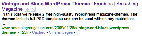
Here’s an example of a good page title. This is a Smashing Magazine page title as seen in Safari:
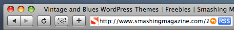
Here we have the title of the article, the category of the article and the name of the website. Putting the name of the website last puts more emphasis on what the page itself is about, rather than on website branding, which is still there. Here’s what the HTML code looks like in the markup:
<title>Vintage and Blues WordPress Themes | Freebies | Smashing Magazine</title>And here’s how the page is displayed in a Google search result:
4. Content that is difficult to scan
To ensure that your website is usable, you cannot only have a good design; you also need good copy. Copy is a term used to describe all of the text content on a website. Yes, good design will guide your visitors around the website, focus their attention on the things that matter and help them make sense of information chunks; but visitors will still need to read text to process information. This makes copy an essential part of your overall website design.
Before you can write good copy, though, you need to understand how people will actually view your website. Don’t assume that your visitors will read everything from top to bottom. That would certainly be great, but unfortunately that’s not how it works. The Web bombards people with information, and most of us try to consume as much of it as possible. This leads to very frantic browsing behavior: we jump from one piece of content to another, from one website to the next. People tend not to read websites top to bottom; they start reading whatever pops out at them first, and then move to the next thing that captures their interest. The pattern looks a little like this:
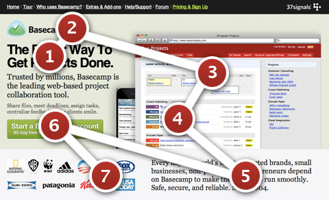 The Basecamp landing page.
The red circles indicate the areas where visitors tend to focus their gaze, and the numbers indicate the order in which they look at these elements. Users dash from one interesting part of the page to another. To take advantage of this chaotic browsing pattern, you need to structure your copy a certain way. Here are a few pointers:
- Have a few points of focus. These are the parts of your page that attract the attention of visitors. This can be achieved by stronger, higher-contrast colors and larger fonts. You can also use images, such as icons, next to text to give these areas even more visual pull.
- Each focus point should ideally be accompanied by a descriptive heading. Without reading the copy any further, visitors should be able to understand what this bit of content is about. Don’t make headings mysterious or vague to draw people in. Keep them informative yet concise. People want information quickly, and withholding it only annoys them.
- Any other text should be short and easy to digest. Provide just the essentials, and strip out the rest. In most cases, extra text that copy writers put in to make a point less ambiguous only adds dead weight. People will read bite-sized pieces of text but are put off by long paragraphs. Cut your copy down until no fat is left to cut.
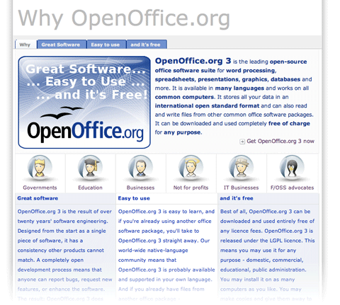 The “Why you should use OpenOffice” page could definitely use improvement. No clear points of focus are provided, aside from the large banner at the top; and the copy is grouped together in huge chunks, making it daunting to read.
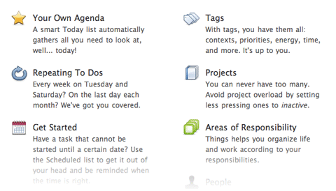 Things app’s features page splits up each feature into little bite-sized segments, each with its own icon and heading. This makes the list easy to scan. To make copy even more effective, list actual benefits rather than feature names.
5. No way to get in touch
User engagement is important if you want to build a successful community, and communities are important if you want to build successful websites and social Web apps. User engagement is also important if you want to build loyal customers. Quickly answering people’s questions and fixing their problems doesn’t just mean that you have good customer service – it means you care, and your customers and visitors will appreciate it.
But many websites still don’t give visitors an easy channel for getting in touch with the company. Some websites don’t even have an email address or contact form on them.
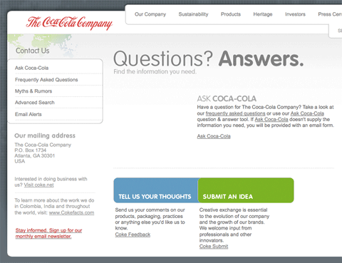
When you click on the contact link on the official Coca-Cola website. you’re presented with this page. No email, no phone number. Most of the links lead to automated FAQs; the feedback form requires your address and age and has a 500-character limit; the “Submit an idea” form is two pages long, with terms and conditions attached. It doesn’t look like Coca-Cola really wants you to contact them.
Sure, putting your email address on the Web will likely attract a lot of spam, but there are a couple of solutions.
Enkoder is my favorite solution for putting email addresses on the Web. Enkoder is an application that comes in two flavors: a free one for Mac OS X, and another free one as a Web app. It encrypts any email address that you give it and gives you a bunch of gibberish JavaScript code to put on your page. When the page with the code loads, your email magically appears as a clickable link. Bots scouring for email addresses won’t be able to interpret the code – at least that’s the plan.
You could also use contact forms to bypass the problem of showing your email address on a page; however, you’re still likely to receive spam unless you put some good Captchas or other spam protection mechanism in place. Keep in mind that things like Captchas are barriers to user interaction and will likely degrade the user experience.
Forums to the rescue. Online forums are a great communication channel that can be an alternative way for users to get in touch. A public forum is better than a simple contact form or email because your customers can help each other on a forum. Even if you don’t personally respond to a customer, another helpful customer may help that person out, solving his or her problem.
GetSatisfaction is a Web app that works like a forum. Users can post their problems and feedback as topics on the board, and customers and staff can respond to them. Users can add comments to elaborate on their problem. Whether you go with a hosted solution like GetSatisfaction or roll your own message board, a two-way communication channel like this is a great way to keep in touch with your customers.
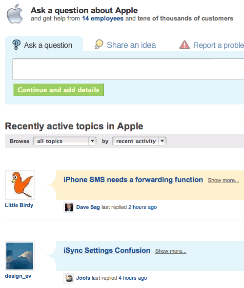 The former GetSatisfaction forum for Apple.
6. No way to search
A lot of people start looking for a search box as soon as they arrive on a page. Perhaps they know exactly what they’re looking for and don’t want to spend time learning the website’s navigation structure. Jakob Nielsen calls these people search-dominant users:
Our usability studies show that more than half of all users are search-dominant, about a fifth of the users are link-dominant, and the rest exhibit mixed behavior. The search-dominant users will usually go straight for the search button when they enter a website: they are not interested in looking around the site; they are task-focused and want to find specific information as fast as possible.
Whether you run an online shop or blog, you need search. People may come looking for a particular product or for an article they remember reading a while back, and chances are they’ll want to find it with a quick search. The good news, if you haven’t already implemented search on your website, is that it’s very easy to do.
You don’t need to code your own search feature; search engines like Google and Yahoo have very likely already indexed most, if not all, of your website’s pages, so all you need to do is pick the one you want to use and plug in a search box. Here’s the form code for using Google as your search engine:
<form action="https://www.google.com/search" method="get">
<fieldset>
<input type="hidden" name="sitesearch" value="smashingmagazine.com" />
<input type="text" name="q" size="31" maxlength="255" value="" />
<input type="submit" value="Google Search" />
</fieldset>
</form>
And here’s the one for Yahoo:
<form action="https://search.yahoo.com/search" method="get">
<fieldset>
<input type="hidden" name="vs" value="smashingmagazine.com" />
<input type="text" name="p" />
<input type="submit" value="Yahoo Search" />
</fieldset>
</form>
To make it work, all you need to do is change the value of the “hidden” field to your website’s domain name. This will limit the scope of the Google or Yahoo search query to just your website. You may also want to modify the value of the “Submit” text to say whatever you want.
7. Too much functionality that requires registration
Your website may have some content or features that require visitors to register before using. That’s great, but be careful how much content is put behind this registration shield. Very interactive Web applications, such as email, document editing and project management, restrict 100% of their functionality to registered users. Other websites, such as social news websites, do not. I can browse all the stories on Digg and Reddit without having to log in; users do not have to identify themselves to enjoy some functionality.
When you implement a log-in barrier, be careful that you don’t lock away features that don’t really need user identification. Some blogs require people to register before posting. Sure, that will significantly decrease spam, but it will also significantly decrease the number of comments you see, too.
User participation on your website is affected by how many barriers there are. Removing barriers such as registration will almost certainly increase user participation. Indeed, once users start using your website, they will more likely sign up, because they’re already involved.
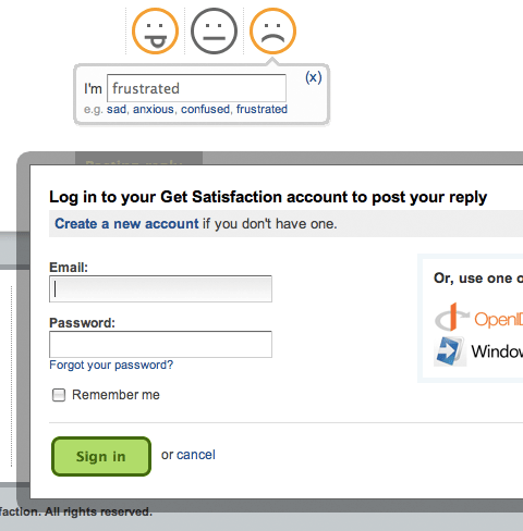
The GetSatisfaction interface allows you to fill in your comment about a company or product and then click the “Post” button. Instead of seeing your feedback posted, you’re greeted with an unexpected “Log in or register” message. Not good, considering the customer may already be frustrated.
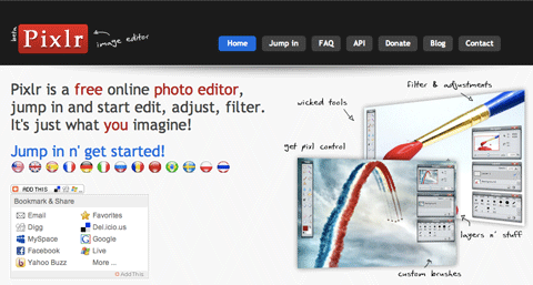
The landing page for Pixlr, an online graphic editing app, has a link titled “Jump in n’ get started!” Clicking on it opens the app. No trials, no registration; you test drive the app right away.
8. Old permalinks pointing nowhere
A permalink is a link to a page that isn’t meant to change; for example, a link to a blog article such as the one you’re reading now. Problems occur, though, when a website moves to another domain or has its structure reorganized. Old permalinks pointing to existing pages on the website become dead unless something is done about them. That something is called a 301 redirect.
301 redirects are little instructions stored on your server that redirect visitors to appropriate pages. So, if someone arrives on your website using an old link, they won’t see a 404 error page (“Page not found”): the 301 redirect forwards them to the right location, provided that you’ve set it up correctly. The number “301” designates the type of redirect that it is: permanent.
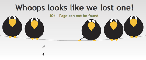 Frye / Wiles 404 error.
There are various ways to do 301 redirects. How they’re implemented depends partly on the Web server you’re using. Here are the basics of handling 301 redirects on the most popular Web server right now, Apache.
The following code should go in a file called “.htaccess” in your main website folder. Yes, the file name begins with a full stop. This means it’s a system file, which standard file browsers tend to hide by default. So, if you can’t see it using your file browser or FTP client, turn your “Display invisible files” option on. Just create or (if it’s already there) edit this file using your editor of choice. This file is retrieved whenever a visitor arrives on your website, and any redirect rules you put in there will be applied.
Here’s a simple 301 redirect code:
RewriteEngine on
Redirect 301 /oldpage.html /newpage.html
The code is fairly self-explanatory. When somebody tries to access “yoursite.com/oldpage.html,” they will immediately be redirected to “yoursite.com/newpage.html.” The “RewriteEngine on” bit at the top ensures that the mod_rewrite engine is turned on (the default is off). This is the engine that handles the redirects.
9. Long registration forms
Registration forms are barriers. They are barriers because it takes effort to fill them in, and the task itself is no fun. People have to invest time and effort to register, and then they have to invest even more time and effort in future to remember what user name and password they used.
We can shrink this barrier by making the sign-up form as short as possible. At the end of the day, the purpose of a registration system is simply to be able to identify each user; so, the only requirements are a unique identifier, such as a user name or email address, and a password. If you don’t need more information, don’t ask for it. Keep the form short.
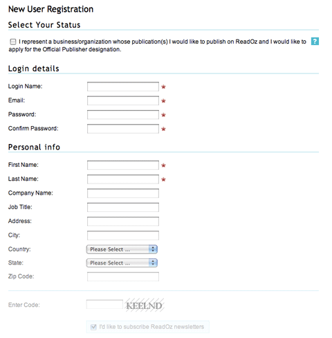 The ReadOz sign-up form is very long. On closer inspection, we find that half of the fields are optional. If they’re optional, they don’t really need to be there. Such a form would likely scare off a user seeing it for the first time. Show only what the person needs to register; the rest can be filled in later.
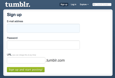 Tumblr has one of the shortest sign-up forms around. Just three fields: email, password and the URL of your new blog.
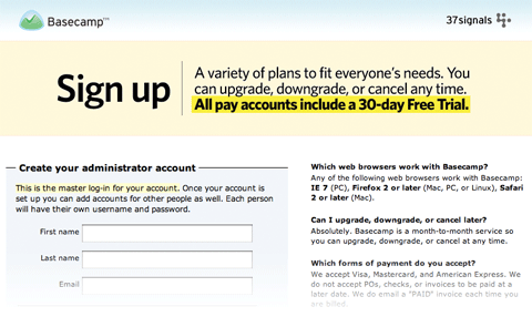 The Basecamp sign-up page has a smart trick. It has no website navigation aside from a home-page link. This keeps the user focused on the sign-up process, without any distractions or means of leaving the page.
Less Thinking
Usability is all about making things easier to use. Less thinking, less frustration. A website should do all the work and present visitors only with the things they’re looking for. Usability is also about the experience people have using your website, so attention to detail matters, as do the presentation and feel of the page.
Drop your thoughts on these and any other usability problems you run into in the comments section below! (al)


