10 Principles Of Readability And Web Typography

Email Newsletter
Weekly tips on front-end & UX.
Trusted by 182,000+ folks.
 Register for Free


 Celebrating 10 million developers
 Custom Web Forms for Angular, React, & Vue. Your backend.
Readability is one of the more important aspects of Web design usability. Readable text affects how users process the information in the content. Poor readability scares readers away from the content. On the other hand, done correctly, readability allows users to efficiently read and take in the information in the text. You want users to be able to read your content and absorb it easily.
In this post, we’ll explain some Web typography terms and how they play into readability; we’ll present numerous tips to help improve the readability of your content; and we’ll showcase very readable websites, layouts and articles.
Further Reading on SmashingMag:
- 8 Simple Ways to Improve Typography In Your Designs
- Using White Space For Readability In HTML And CSS
- Applying Macrotypography For A More Readable Web Page
- Photoshop-Inspired Techniques with 100% CSS
The Terms, And What Each Means For Readability
There are many factors that play into the readability of text. There are also a number of terms, all very important. Here are a few of the more common Web typography terms and an explanation of how each term affects readability.
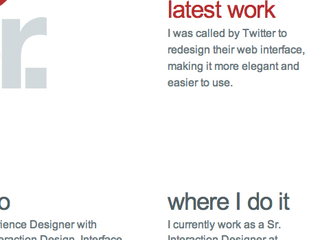
Hierarchy Every typographic layout needs the essential element of hierarchy. Hierarchy defines how to read through content. It shows the user were to start reading and where to read through. It differentiates headers from body text. Although colors of text boxes can be used to contrast headers and body text, hierarchy refers to the difference in size between these elements. Hierarchy plays a huge part in how scannable a layout is. It is an important technique that needs to be mastered to achieve readable Web typography.
 UXBooth uses a very clean hierarchy to achieve readable Web typography.
Contrast Contrast is the core factor in whether or not text is easy to read. Good contrasts will make text easy on the eyes, easy to scan quickly, and overall more readable. On the other hand, poor contrast will force the user to squint and make reading the body text almost painful, not to mention a lot slower.
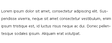
As shown in the following illustration, black on white is very readable. Black on white is obviously the standard contrast colors, and to achieve readable content it is good to stay in the range of black-on-white contrast.
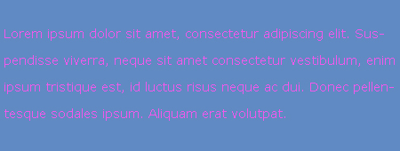
This one, however, pink on blue, is nearly impossible to read. This example my be a little extreme, but it shows how such an awful contrast can have a major impact on the text. You probably won’t see websites using such poor contrast, but it still shows why you need to be very smart about it.
Line Height Line height is a very common term meaning the space between individual lines of text. Line height is another factor in the readability of body text and even headers. Sufficient line height is especially important in Web design because it makes the text ultimately more scannable. Line height that is too short will cause users to squint while reading. If it is too large, the text will seem like separate bodies instead of grouped together as one.
Letter Spacing Like line height, letter spacing affects readability in Web typography. Letter spacing is, as the name suggests, the space between each letter in words. In print layout, negative letter spacing is a common technique to add a more fun feel to the layout, but it should never be used in body text. In any text, letter spacing is an obvious factor in legibility.
Line Length Line length is often overlooked in Web typography but should not be. Line length is, of course, the number of words per line. A good line length is one that allows the reader’s eyes to flow from the end of one line to the beginning of the next very easily and naturally.
The Keys to Readable Typography
Achieving readability is relatively easy; all it takes is to follow a few key practices. A readable Web page can go a long way with your users, and readability has a huge impact on their experience. Designing for the Web is all about making the user’s experience as pleasant as possible. Here are 9 tips that will help you work towards readability.
1. User-Friendly Headers Headers are a key element in typography, Web and print alike. As mentioned, they are part of the text hierarchy and a major factor in scannable content.
First off, header size is just as important as the size of the body text. Going too big with the header with a large amount of content can throw the user off balance when reading and cause them to lose their spot. It will ultimately ruin the flow of the content and be a distraction. Headers that are too small will ruin the hierarchy of the article, too. If the header is too small, it will not draw the user’s attention as it should.
Next, it is important to provide ample space between the header and body text.
2. Scannable Text I have already mentioned “scannable” text many times, and you have surely heard it elsewhere. Scannable text goes hand in hand with readable text. Making copy scannable consists of good use of headers, hierarchy and focus points to guide the user through the content.
So, what makes copy scannable? Well, there are many factors, most of which have already been mentioned. Header size and position, body text size, text line height, text contrast and the way focus points are differentiated all impact how scannable copy is.
Focus points are certain elements or objects within the layout that attract, or are supposed to attract, the user’s attention. This could be a header, a graphical element, a button, etc.
3. White Space In content-heavy layouts, spacing contributes to the readability of content. White space helps to offset large amounts of text and helps the user’s eyes flow through the text. It also provides separation between elements in the layout, including graphics and text.
In the example below, white space and only white space is used to separate text elements. The layout is very clean and efficient. The user’s eyes flow from text element to text element with ease, because of the large amounts of white space.
4. Consistency Consistency is often regarded as an important technique for usability, but it also applies to readability. Consistency in the hierarchy is important to a user-friendly layout. This means that all headers of the same importance in the hierarchy should be the same size, color and font. For example, all <h1> headers in an article should look identical. Why? This consistency provides users with a familiar focus point when they are scanning, and it helps to organize the content.
5. Density of Text Density of text refers to the amount of words you place in one area. Density of content has a major impact on your content’s readability. Density is affected by spacing options such as line height, letter spacing and text size. If you find a balance between all of these so that the content is neither too compact nor too widely spaced, you will have perfect density that is both readable and scannable.
6. Emphasis of Important Elements Another key factor is emphasis of certain elements within the body content. This includes highlighting links, bolding important text and showing quotes. As mentioned, focus points are essential in Web typography. By emphasizing these objects, you provide focus points for the user. These points and objects help break up monotonous text.
Scannable text is extremely important. By providing these focus points,, you make the body text extremely scannable. Bolding key lines of text immediately attracts the user’s eye and is therefore a very important element in presenting important information.
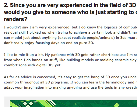
Pictured below is an article from UXBooth. This article uses bolding and italics to point out important information in the article. This is a very readable article and very easy article to scan for information.
7. Organization of Information Believe it or not, the way you organize information in an article can strengthen readability. Users are guided with ease through content that is properly organized because information is easier to find. This veers into issues beyond the scope of this article but is still very important.
8. Clean Graphical Implementation Every text body needs some sort of visual support, be it an image, icon, graph or illustration. Placing the graphic in the article can be challenging. Sufficient space is needed between the graphic and text.
If the graphical element is an image, then a clean border is a good idea for providing a clean separation from the text. Borders can help guide the user’s eyes and are good for adding style to content. It is important, however, to keep borders in content simple. They should have a subtle color palette and shouldn’t be too large.
In the case of graphical elements such as icons and illustrations, space is the only separator that should be used. The content should move cleanly around the graphic without disrupting the text.
9. Use of Separators Separators are a simple and easy way to divide text into sections in a clean and organized manner. They can be used to divide hierarchy elements, such as headers and body text. They can also be used to divide content into sections.
The simplest form of divider is a single line. These are most often used to divide hierarchy elements and are very useful for making subtle divisions that still play a big role in readability.
Another common way to divide content is to use boxes. Text boxes are excellent for separating unrelated content on a single page. They help move the user’s eyes through a complex layout. Below is an example of this on Pixelmator’s website. It uses boxes to separate content in a clean way. Notice how the boxes are defined by their background instead of a border.
![]()
10. Good Margins You hear people say that you should use white space, but why? White space actually helps draw the user’s eye to the text. The blank area (white space) forces the eye to focus on the text. So white space will influence the flow and readability of content. Margins are one of the best white space elements and support text elements well. Margins on either side will force the user’s eye to focus inward on the core content of the article.
Margins also support the article in another way. They help separate content from the rest of the design and layout. Text shouldn’t bleed into other layout elements, especially if it is a long article. Margins help define the article and its separation.
In the grid-based layout below, margins and only margins are used to set apart bodies of text. The result is a clean, clear and concise page.
Effects To Give Typography Some Flair
For the most part, text is text, simply words on a plain single-colored background. Not too complex, but it works. Occasionally, though, the text layout will need some styling and decoration. This may be a header or typography used in the overall design of the website (as opposed to the article content). No matter what the form, it is important to always stay within the limits of readability. Yes, it is essential to be creative and use decorative styling, but the typography must be legible or else it becomes almost useless.
Fancy Text One good way to style typography is to use a fancy or unique font within the layout along with standard fonts. It is important to use simple and standard fonts for body text, but using fancy fonts elsewhere is an easy way to mix it up and add a little more to the theme. Using a single font throughout the entire website gets boring and, although readable, shouldn’t be done.
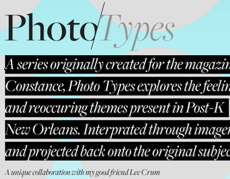
Letterpress Another very common form of Web typography styling is letterpress. The example below uses a letterpress technique to add depth and embellish the layout. It looks very nice and flows cleanly, and the text is still completely readable.
Style the Background Adding a nice background can be just as effective as styling text. By decorating the text body background, you are styling the text. Styling the background can be visually beautiful but can also reduce legibility. This is potentially a big problem but easily avoidable.
Keep the Contrast First and foremost, it important to keep contrast within a readable range. For the background, use colors that are much subtler and duller than those of the text. This will allow the user’s eye to focus on the text and not be distracted by the background.
Textures Work Nicely The best road to take with the background is to use a nice texture, which won’t detract from the typography.
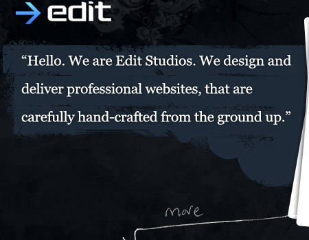
Here is a dark website with a good typographic style. The typography has a decorative background, but the contrast still works nicely. The text itself has no styling, but the background makes up for it.
This is another great texture that supports the typography. The background texture resembles a canvas, and the typography takes on the form of a watercolor.
Link Styling Within long text, links are one more type of focus point, and you should find a way to make them pop. In sum, the best way to do this is to use underlining, a different color than the body text, italics and a different font. You can combine these to great effect or just use one. The example below underlines and uses a different color for links.
Showcase of Help Elements
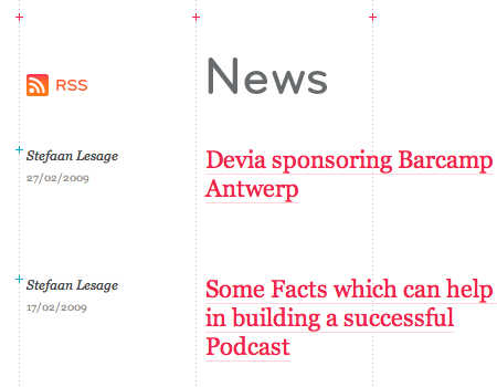
Help elements are integrated in many websites, and you often don’t notice them. Here are a few examples of usable help elements.
Blog Articles Readability is important in blog articles especially. Here are a few excellent examples.
PSD.TUTSPLUS and every Envato blog have very readable content. This particular example showcases a good use of headers in a well-structured hierarchy.
AppStorm: This website uses very good colors and header sizes to show hierarchy, and the articles flow very smoothly. Also note the significant amount of spacing above each sub-header.
Macalicious This article makes good use of alternating colors in its headers. The body text is also very readable and has a legible contrast.
Tutorial9 Pay attention to how this article on Tutorial9 provides a good amount of spacing and a nice border around images. The text flows, and the image doesn’t detract from the text.
Fuel Your Creativity Articles on Fuel Your Creativity have very smart spacing between the headers and sub-headers. The white space supports the text.
Good Graphics Use The following examples show how to make graphic elements support the readability of the content.
Apple Apple’s core content plays very nicely with the visual layout. All images blend into the background of the website. This allows for a visually pleasing layout that flows smoothly and looks awesome.
Pixelmator The layout of this page is perfectly spaced. The text moves around the image.
![]()
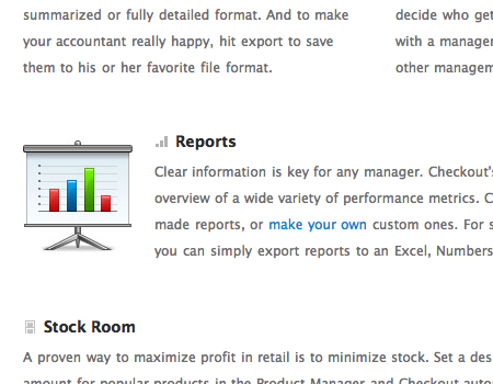
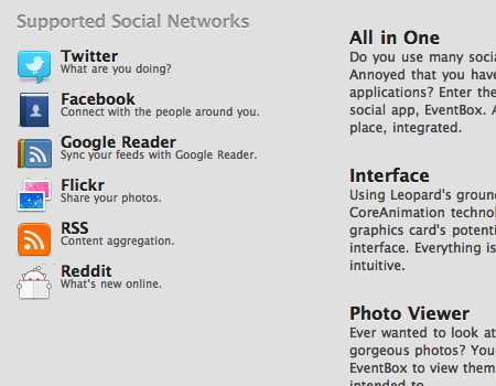
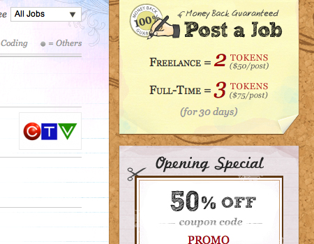
Checkout App This beautiful and minimalist website uses detailed icons to support the titles and information. The icons improve the scannability of the content.
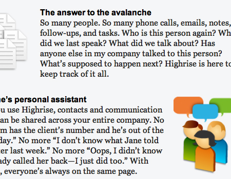
Highrise A readable and scannable layout that packs a large amount of information into a clean layout. They also use large icons as focus points.
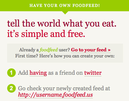
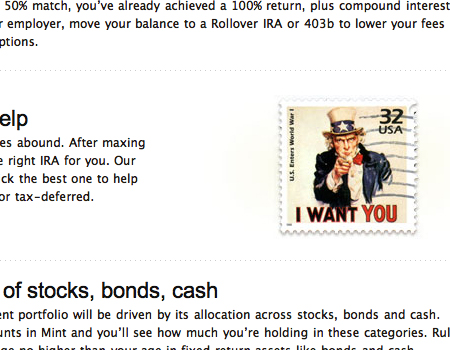
Mint This is an all-around beautiful website. It uses a significant amount of white space, dashed divider lines and large visuals.
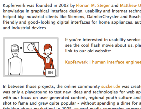
Kupferwerk Nice images between paragraphs and good borders around images.
Web Designer Wall A well-spaced image layout, with a slight but noticeable border and ample padding, which looks great.
Well-Styled Typography
The following examples show creative uses of typography.
IAAH Fancy header text and a good background highlight the body here.
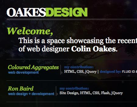
OakesDesign Good contrast of typography and color makes for a striking website.
The Cosmic Machine An example of letterpress that fits the style of the website.
Web Designer Wall Job Board This text is well styled. The sketched style works nicely with the rest of the website and is still completely readable, because the sketching texture is used only for text and does not disrupt it.
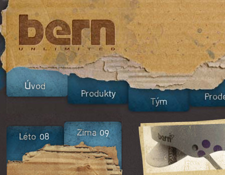
Bern This is a good example of typography used cleanly in a grunge layout. You may notice that the letterpress style is also used here.
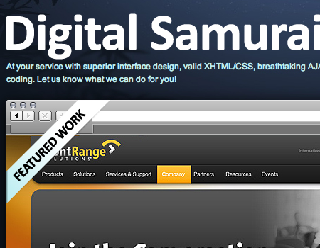
Digimurai Here is an example of styled typography with a good hierarchical structure beyond the article.
Product Planner This header has a clean gradient that contrasts well with the dark background.

Paramore Redd More simple but beautiful text effects.

Tao Effect A beautiful and scannable layout, with icons and different text styles to break up the article.
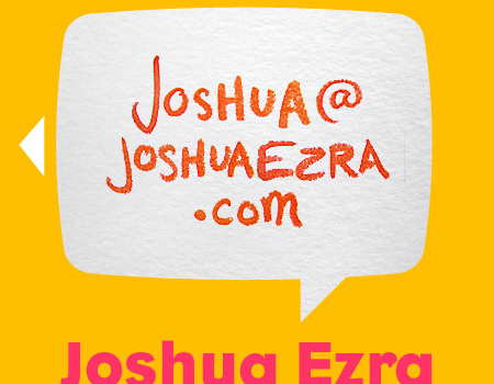
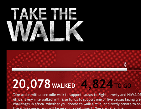
Take the Walk Readable but strongly textured text.
Flash Gaming Summit Good coloring and a perfect hierarchy.

Brynn Sheperd A header hierarchy similar to what you would find in a print layout, but it flows seamlessly here.
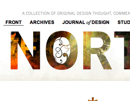
Northtemple Using images for text is another excellent technique.
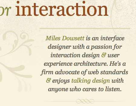
Miles Dowsett Extremely beautiful typography, with a nice background, a good color pallet and plenty of focus points.
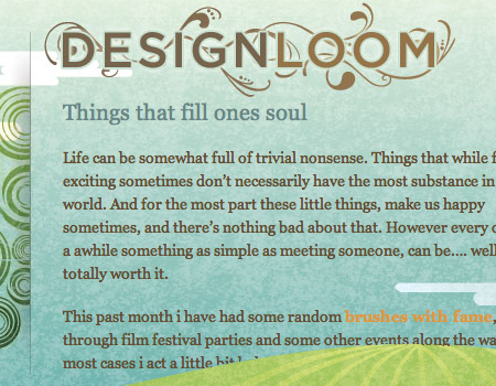
Design Loom Good frilly typography that flows with the illustration.
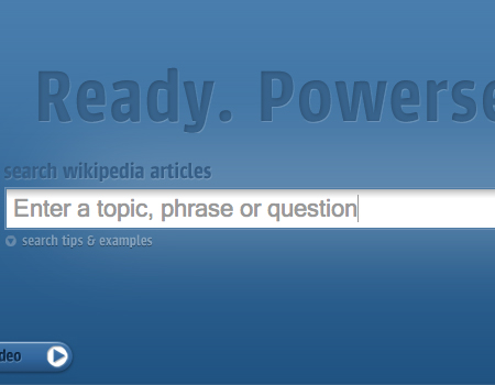
Powerset Another example of letterpress style.
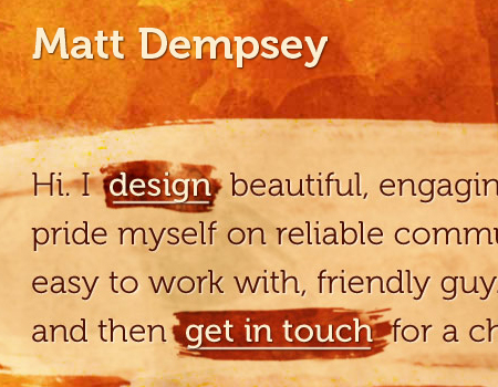
Matt Dempsey Amazing typography with a painted background.
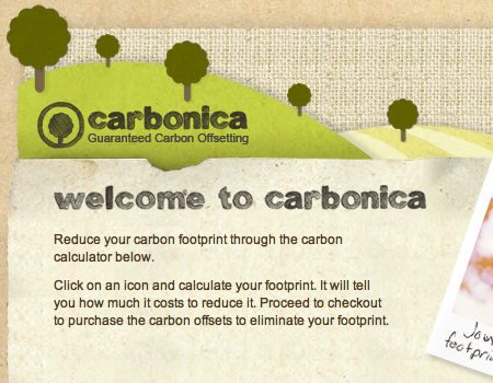
Carbonica A sketched style that works with the rest of the website.
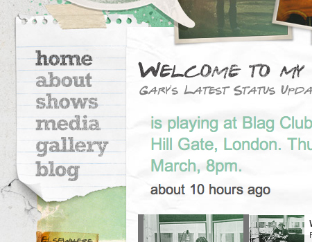
Gary Nock One last example of hand-drawn text, this time on a paper background.