5 Universal Principles For Successful eCommerce-Sites

Email Newsletter
Weekly tips on front-end & UX.
Trusted by 182,000+ folks.
 Custom Web Forms for Angular, React, & Vue. Your backend.
 Celebrating 10 million developers


There is no “Consumer Trust for Dummies,” but as eCommerce designers, we need to focus on some fundamentals. The following topics may seem as obvious as walking into a seven-foot Wookie, but rest assured you will find plenty of websites with a mouth full of fur.
You may want to take a look at related articles:
- 15 Common Mistakes in E-Commerce Design
- Fundamental Guidelines Of E-Commerce Checkout Design
- A Little Journey Through (Small And Big) E-Commerce Websites
- Improve Your E-Commerce Design With Brilliant Product Photos
1. Paint Your Pictures At Home
If your core demographic is women between the ages 35 and 65 who have an annual income of $60,000+, you would treat them different than the 18- to 25-year-old male demographic. First and foremost in e-tail: forcing your visitor to think is a bad idea. When creativity stops being subjective and can be measured by a dollar amount, making sure you’re designing for the customer is a no-brainer.
Years ago, I had an SVP of DotCom tell my team, “You can go home if you want to paint pictures.” And for the rest of the day, I couldn’t wait to get there so that I could make sure the next morning his inbox was full of expletive material illegal in most counties. After calming down, I realized he was right. All along, what he was telling us was simply to design for the customer and not ourselves. This was a challenge for designers working in an eCommerce corporate atmosphere but a very important lesson to learn.
2. Good UX Is Like A Perfect Movie Score

Build brand loyalty to gain patient, forgiving customers for a lifetime. For instance, Apple’s customer loyalty exceeds all other brands with an unusual cult following. Apple lovers forgive the company when it makes mistakes and zealously defend the company’s products and reputation.
How do you make your customers trust you this much? The answer is to give the user an “Experience.” It is not enough simply to make a website usable. The experience you create for the customer has to make them not realize that they are “using” it. It’s a tough concept to grasp, and the recipe changes from website to website, but the right combination of usability, creative design, writing, psychology and metrics and a strong brand will create an experience through which your customers learn to trust you.
Like the perfect score to a film, a good user experience is unobtrusive and transparent to the consumer because “it just works.” The Apple model will not work for everyone, but I often find myself challenged with a W.W.J.D. moment. Ask, “What would Jobs do?” and then look at other websites for inspiration.
3. eCommerce UX Pitfalls To Avoid
Just because a website is usable, does not mean customers will use it. Usability and user experience are in the same family, but more often than not user experience is the forgotten child. There are key areas in which the two must co-exist. Below are suggestions for some areas where websites should spend as much, if not more time, on the user experience.
Product Detail page
The product detail (PD) page is where some retail websites drop the ball. Too much focus is put on the design and usability of the home page, and that effort does not continue through to the rest of the website. More of the user’s time is spent on the product detail page than any other. Here, you need to offer customers all of the information they are looking for but present it in an intelligent way as well.
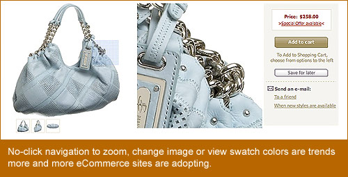
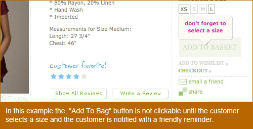
A few recent trends on eCommerce websites are “no-click” alternate images and swatches. A user simply has to roll over an image, without clicking, to get immediate feedback. The same approach can be used to zoom in to the image. Other UX options for the PD page are smart fields that let users know they still have to perform a required action before proceeding, without getting a typical error message.
The Checkout Process
Much like the PD page, the checkout process is a critical piece that engages the customer on a somewhat intimate level. However, unlike the PD page, where customers want to spend time to make sure they want what they are looking at, the checkout process should have as few steps as possible. Too many steps and the customer feels trapped.
But too quick and they feel like they have lost control. For instance, asking for credit card information too soon will seem out of order and no doubt scare even the most seasoned online shopper into abandoning their cart. Hidden taxes and shipping costs will make them feel like you are trying to take advantage of them.
Security
Always making sure your customer knows that your website is secure and that their privacy will never be compromised goes back to the issue of trust. It does not take much effort to display a message telling your customers that they are safe in your hands; a footer link to your privacy policy is not always enough.
Page Weight
A page’s weight is determined by its file size, by adding up every image, every line of code and anything that gets loaded when the user first hits the page. Libraries such as Scriptaculous, jQuery, MooTools and even Flash Shared Objects are often forgotten, but they all add to a page’s “weight.”
Some fascinating things are on the horizon for developers related to user experience and page weight. One notable development as of late was the release of Safari 4 Beta, which has support for HTML 5 media tags, CSS animation and CSS effects. As more and more of these features become standard in browsers across the board, we can look forward to offering users a better experience by using features directly in the browser.
4. The Value Of Content And Then SoMe
We cannot talk about user experience without touching on content and social media (SoMe). In order to be profitable, eCommerce retailers need to engage customers with their content and use social media outlets within and outside their own websites.
93% of social media users believe a company should have a presence in social media, according to Cone, while an overwhelming 85% believe a company should not only have a presence in but also interact with its consumers via social media.
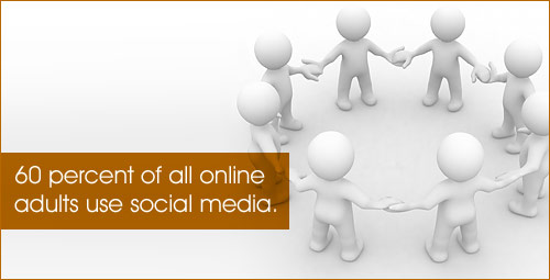
- 60% of all online adults use social media.
- 85% believe a company should not only have a presence in but also interact with its consumers via social media.
- 56% of users feel a stronger connection with, and feel better served by, companies when they can interact with them in a social media environment.
When a website such as Facebook, which just turned 5 years old in February, has an active user base of over 175 million people, it is easy to see the unlimited potential to increase your wallet share simply by giving your customers what they want. Some options are:
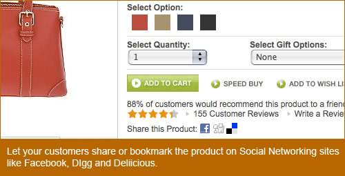
- Give your customer the ability to add your website or product detail pages to websites such as Delicious, StumpleUpon, Digg, Twitter and Facebook.
- Give them the ability to customize their experience on your website. These experiences can range from customizing the home page as they see fit to uploading their image to go beside their product reviews.
- Create an RSS feed for your website. If your website has a blog or some other content area that changes regularly, give your customers the option to add it to their favorite RSS reader.
They say, “Content is king,” but if you cannot account for your king’s whereabouts, he needs to be beheaded. Your website’s content is only as relevant as its success. So, test as much as you can. Some tests you can perform to get hard data include:
- Website and email A/B testing Split your promotion views between your customers. 50% see version A, and 50% see version B. You can perform these tests for just about any purpose, but make sure your goals are clear before beginning. Figure out what you are trying to solve, and then move forward with the testing. From changing your website’s navigation to simply testing the style of your promotion’s copy, doing an A/B test will give you the relevant data you need to decide whether to update or remain the same.
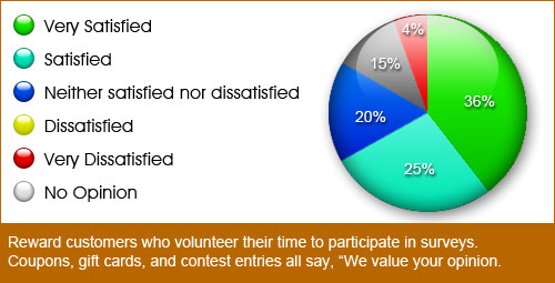
- Polls. Polls are quick and simple but, depending on your pool of users, can give you mountains of data. To get more people to take your poll, consider giving some kind of incentive to participate. Some polls are fun to take, but if you’re asking, “Which brand of television is better?” and not, “Who’s hotter, Jessica Simpson or Britney Spears?” then you may want to think more carefully about how much the feedback is worth.
5. Using Type And Color To Influence
Using color and typography is nothing new to designers. Using them in eCommerce is not much different. When designing for a retail website, your client is the customer. You are trying to convince thousands, tens of thousands, even millions of potential customers to click on your promotion and buy whatever you are selling. Consider the following.
Can It Be Read?
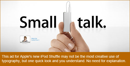
Most designers love to play with typography: twisting, shaping and contorting letters and word to obey your every whim, forming a beautiful masterpiece of skill and beauty. However, if your customer is not an artist, chances are they won’t get what you’re doing, and you’ve just lost a sale. Up front and to the point messaging is not always the answer either.
Consider using fun copy as an alternative. For example, if you sell banjos, instead of saying, “Shop New Banjo Supplies,” you could say, “Add More Twang to Your Thang.” As stated earlier with regard to designing for the customer, this depends a lot on what your target demographic is.
Can It Be Red?
No big surprise, red is the color of choice for error messages. But consider this when thinking about the user experience. What color does Target.com use for its error messages? Makes you think, right? Good! By the way, it uses red, too. The point is to consider alternatives. If your company has red in its brand, and the website has a lot of red as well, consider another color. You’re trying to get the user’s attention, so blue text with an alert icon could work just as well.
Consistency in Type: Stylistically and Creatively.
Making sure your headers, sub-headings and body copy are consistent across your website is easy. Making sure your website has a well-defined style guide is not. A style guide requires a lot of patience and care and is never complete. A website’s style guide should be a living, breathing document that continues to grow as your company and brand grows.
There is nothing wrong with this. As you find certain styles that perform better than others, find a way to add them to the guide. This document, depending on the complexity of your brand and the size of your website, could potentially be split into two separate documents: a creative style guide and a copy style guide. Each guide serves a different purpose but live together harmoniously.
Inspiration and Sources
Designing for the user experience in eCommerce is a multi-faceted puzzle. Some solutions work across the board, and some are specific to your website alone. The good news is that finding the solutions that best fit your particular needs is the most challenging and rewarding work a designer can do. It takes a rare breed to fully appreciate the value of the user experience, and if you are part of it, I hope this article and these resources give you as much pleasure as they have given me.
- Jakob Nielsen’s Alert Box - Current Issues in Web Usability
- Human Factors International
- User Interface Engineering
- UX Booth
- Pattern Tap
- Usability Post
- 960 Grid System
- I Love Typography
- Web Designer Depot
- A List Apart
- Function
- Endless.com
- Free People
- Facebook Statistics
- … and, of course, Smashing Magazine


